EDS 240: Discussion 2
Recreating US Drought Monitor viz
Part 1: graphic form
Week 2 | January 14th, 2025
What is the U.S. Drought Monitor?
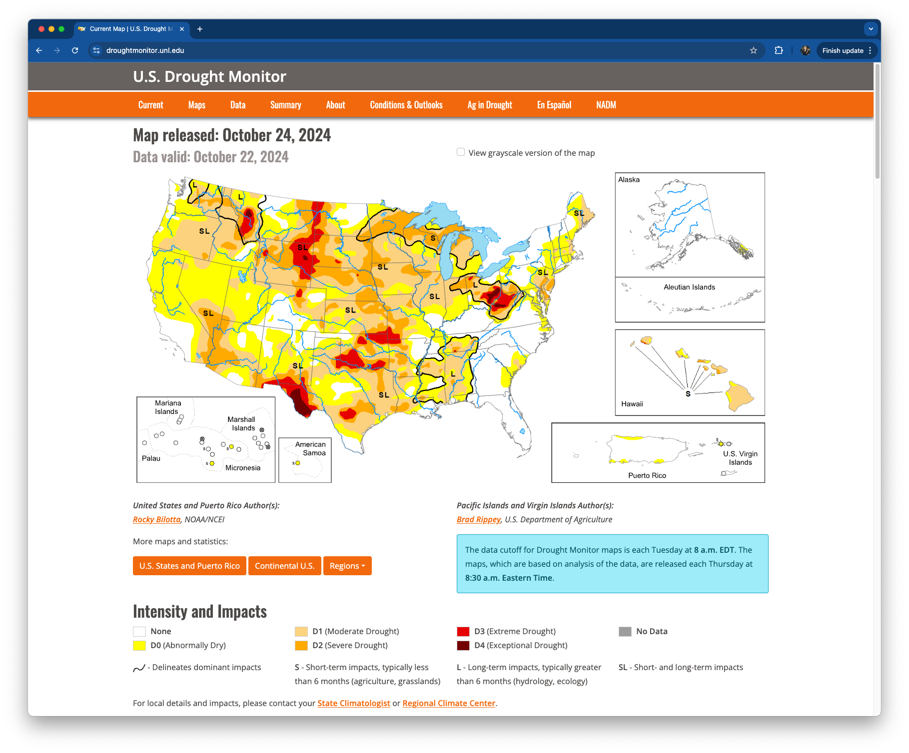
The U.S. Drought Monitor (USDM) is a collection of measures that allows experts to assess droughts in the United States.
It is produced through a partnership between the National Drought Mitigation Center at the University of Nebraska-Lincoln, the United States Department of Agriculture and the National Oceanic and Atmospheric Administration. You can download and explore comprehensive statistics through their data portal.
What is the TidyTuesday?
TidyTuesday is a “weekly social data project” organized by the Data Science Learning Community. It’s goal is to “make it easier to learn to work with data, by providing real-world datasets.”

Since 2018, participants of all skill levels have imported, wrangled, and visualized weekly data sets, then shared their creations + code on social media. It’s a fun, low-stakes way to learn new data visualization skills and approaches from one another – check it out!
USDM x TidyTuesday
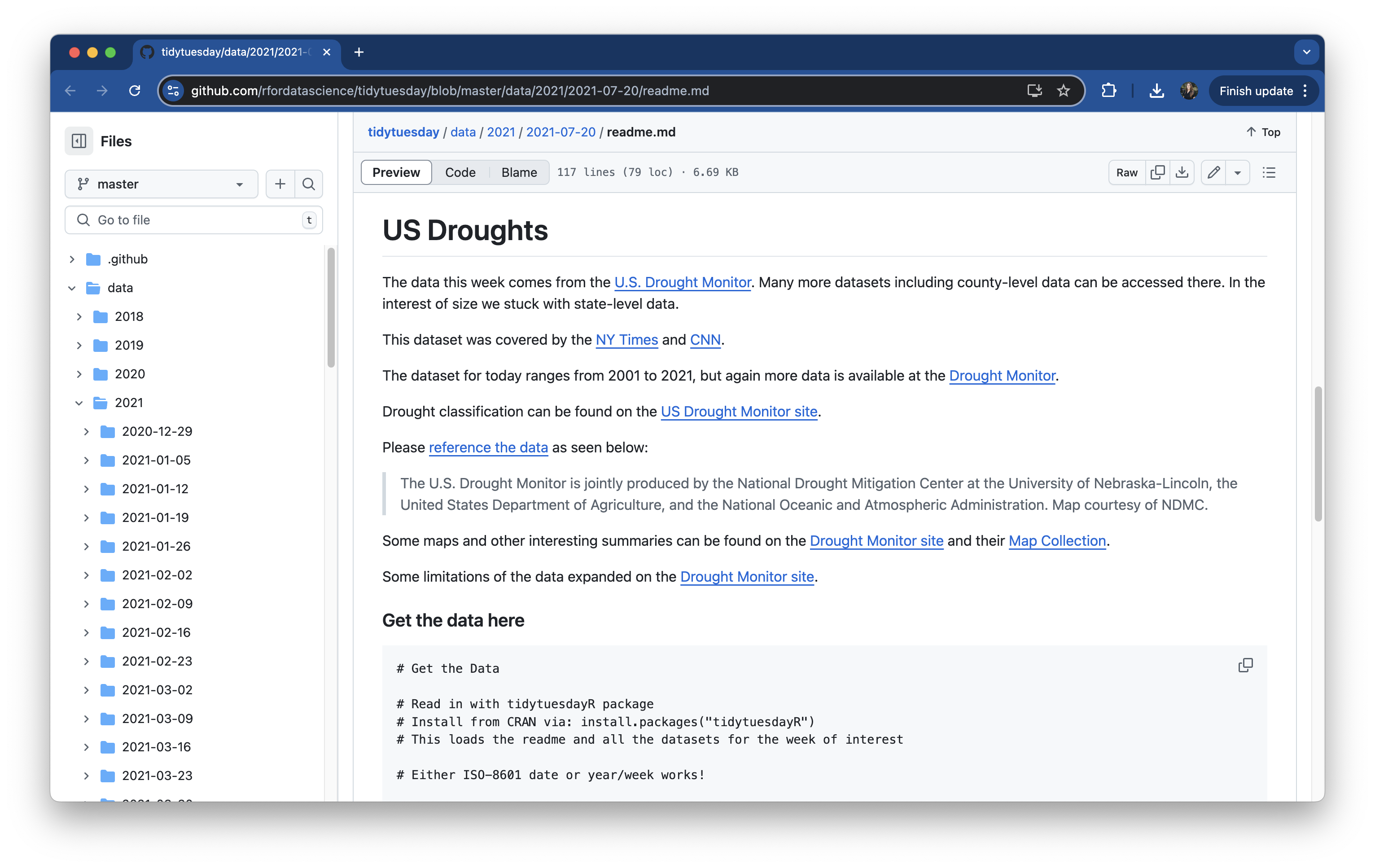
The TidyTuesday community wrangled and visualized USDM data back in 2021 (2021-07-20, week 30), so we’ll import some *minimally-tidied data directly from the TidyTuesday GitHub repository.

*TidyTuesday always provides the cleaning script that the organizers used to pre-process any of the data provided – these USDM data comprise three separate data sets, which were converted from wide to long format, joined together, and had some columns renamed.
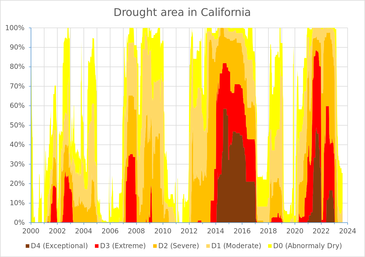
Let’s recreate this USDM viz!
We’ll be recreating this data visualization produced by U.S. Drought Monitor (you can find on the Droughts in California Wikipedia page!):

This week, we’ll focus on the data layer, geometric layer, and scales. During week 4 discussion, we’ll work on tweaking the theme (all non-data elements) to get it to look just like the U.S. Drought Monitor’s version.