EDS 240: Lab 2

Recreating US Drought Monitor viz


Week 3 | January 22nd, 2026

What is the U.S. Drought Monitor?


The U.S. Drought Monitor (USDM) is a collection of measures that allows experts to assess droughts in the United States.


It is produced through a partnership between the National Drought Mitigation Center at the University of Nebraska-Lincoln, the United States Department of Agriculture and the National Oceanic and Atmospheric Administration. You can download and explore comprehensive statistics through their data portal.

What is the TidyTuesday?


TidyTuesday is a “weekly social data project” organized by the Data Science Learning Community. It’s goal is to “make it easier to learn to work with data, by providing real-world datasets.”

Since 2018, participants of all skill levels have imported, wrangled, and visualized weekly data sets, then shared their creations + code on social media. It’s a fun, low-stakes way to learn new data visualization skills and approaches from one another – check it out!

USDM x TidyTuesday


The TidyTuesday community wrangled and visualized USDM data back in 2021 (2021-07-20, week 30). We will replicate this TidyTuesday with more recent data (up to 2026!)


Themes modify non-data plot elements


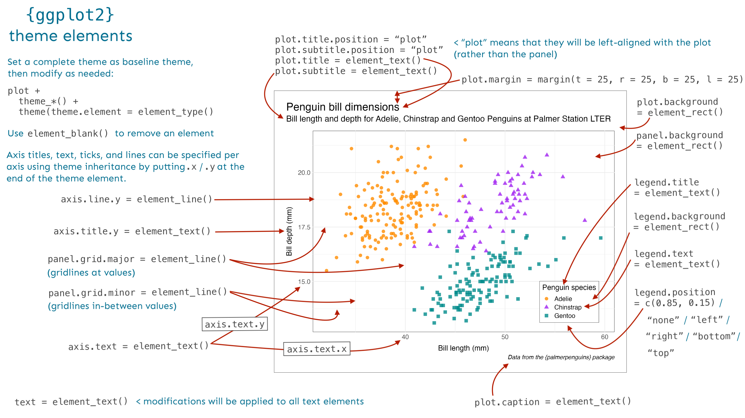
Themes are used to modify the non-data components of plots (e.g. titles, labels, fonts, background, gridlines, legend).


In addition to using pre-built themes (available via the {ggplot2} package and also from extension packages), you can fine-tune the appearance of your plots theme by making adjustments using the theme() function.

Pre-built themes


{ggplot2} comes with eight complete themes, which can be applied as-is, or further modified using theme(). There are also many additional themes which can be applied via ggplot extension packages. A small handful of packages with additional themes:

Keep an eye out for plot-specific themes


Keep your eye out for extension packages that supply both a geom(s) and a pre-build theme(s) designed specifically to work with that geom. For example, the {ggridges} package provides both a few different ridgeline plot geoms and a pre-built theme_ridges() theme to pair with them:


Use ggplot2::theme() for fine-tune control


Let’s recreate this USDM viz!


We’ll be recreating this data visualization produced by U.S. Drought Monitor (you can find on the Droughts in California Wikipedia page!

We will first focus on the data layer, geometric layer, and scales. Then, we’ll work on tweaking the theme (all non-data elements) to get it to look just like the U.S. Drought Monitor’s version.

Reference the graphic on the previous slide (and of course, documentation – run ?theme or check out online documentation) to start tweaking plot elements until it matches the original USDM graphic (below). It’s common to start with a pre-built theme and modify from there.