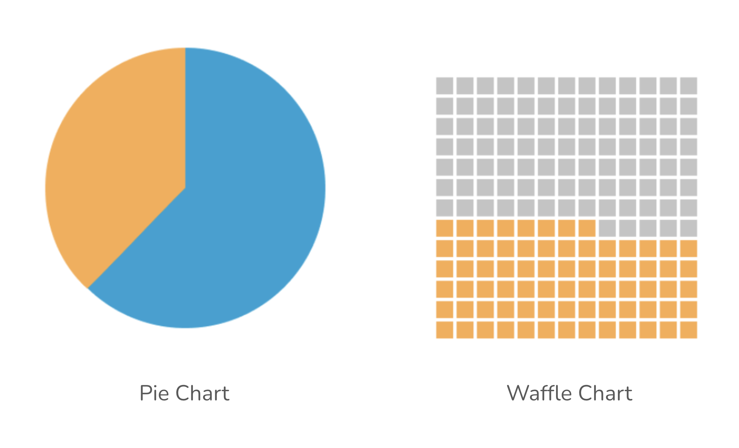
Image source: How to visualise your data: parts-to-whole charts, by Tom McKenzie


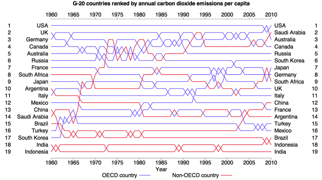
Image source: How to visualise your data: parts-to-whole charts, by Tom McKenzie
Anyone may report a Bigfoot sighting to the Bigfoot Field Researchers Organization (BFRO). TidyTuesday featured these compiled BFRO reports on 2022-09-13.
Anyone may report a Bigfoot sighting to the Bigfoot Field Researchers Organization (BFRO). TidyTuesday featured these compiled BFRO reports on 2022-09-13.
G-20 countries ranked by actual carbon dioxide emissions per captia, by Tim Brock | Image source: The Ferlage Twins
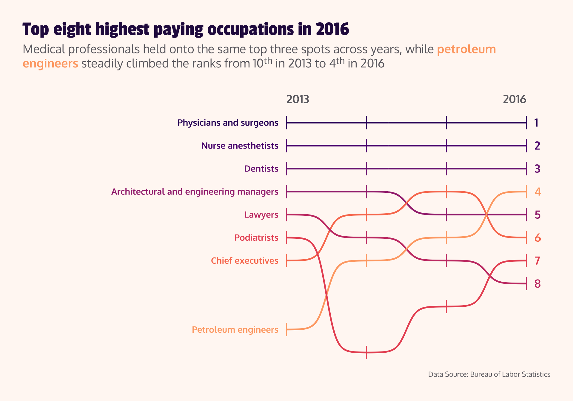
The US Bureau of Labor Statistics provides data on occupations and earnings. TidyTuesday featured these compiled data on 2019-03-05.
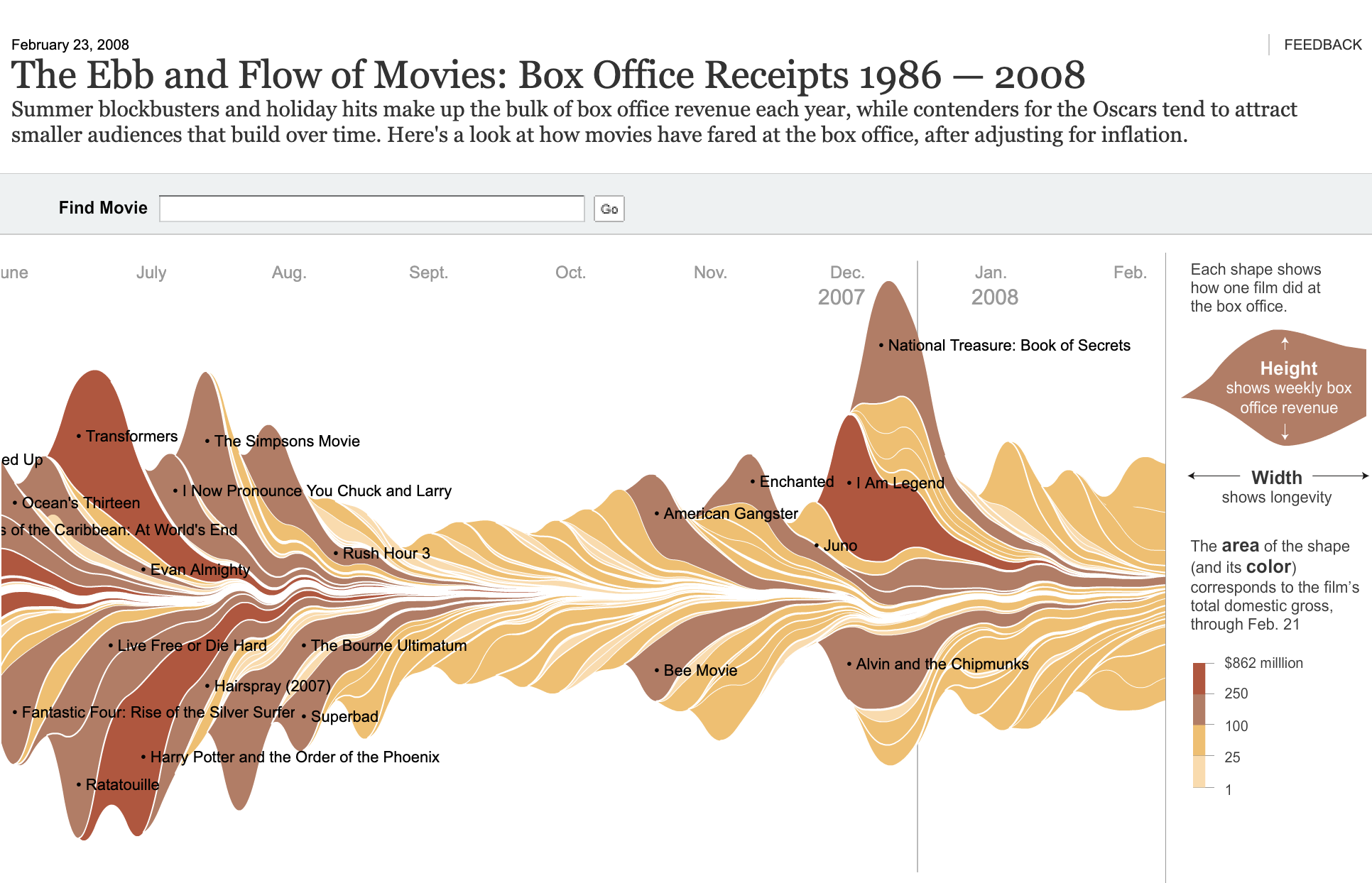
Image source: Streamgraphs: how to make them and what you need to know
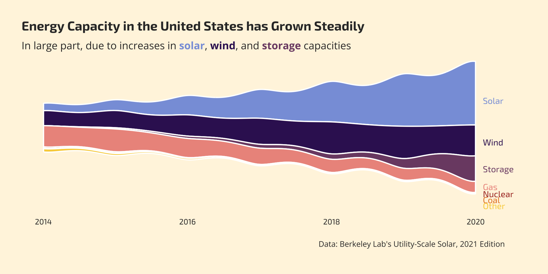
Berkeley Lab’s “Utility-Scale Solar, 2021 Edition” provides data on energy capacity by type (e.g. solar, wind, gas, etc.) in the United States. TidyTuesday featured these compiled data on 2022-05-03.