EDS 240: Lecture 7.2

Annotations


Week 7 | February 18th, 2026

Good data visualization design considers:


  • data-ink ratio (less is more, within reason)
  • how to reduce eye movement and improve readability / interpretability (e.g. through alternative legend positions, direct annotations)
  • putting things in context
  • how to draw the main attention to the most important info
  • consistent use of colors, spacing, typefaces, weights
  • typeface / font choices and how they affect both readability and emotions and perceptions
  • using visual hierarchy to guide the reader
  • color choices (incl. palette types, emotions, readability)
  • how to tell an interesting story
  • how to center the people and communities represented in your data
  • accessibility through colorblind-friendly palettes & alt text

This lesson will focus on the use of annotations in a good data visualization.


02:00

02:00


02:00
02:00

Why annotate?


  • clarify meaning / significance of data (especially particular data points or groups)
  • facilitate interpretation
  • build a narrative

The average attention span of an internet user is ~8 seconds (shorter than a goldfish!). It’s imperative that we respect our readers’ time.


Aim to:

  • tell your readers what you want them to see
  • guide your readers eyes & attention
  • remind your readers what they’re looking at

The more time you spend making your visualization crystal clear, the more time you save your readers needing to decipher it.

We’ll practice annotating our dumbbell plot


Building custom annotations


There are two primary ways to add custom text annotations:


  1. geom_text() (for plain text) & geom_label() (adds a rectangle behind text), which take aesthetics mappings; these draw the geom once per each row of the data frame
  2. annotate(), which does not take aesthetics mappings and instead draws only the information provided to it


Let’s try to add an annotation to our plot using both approaches to better understand the difference.

geom_text() doesn’t look right . . .


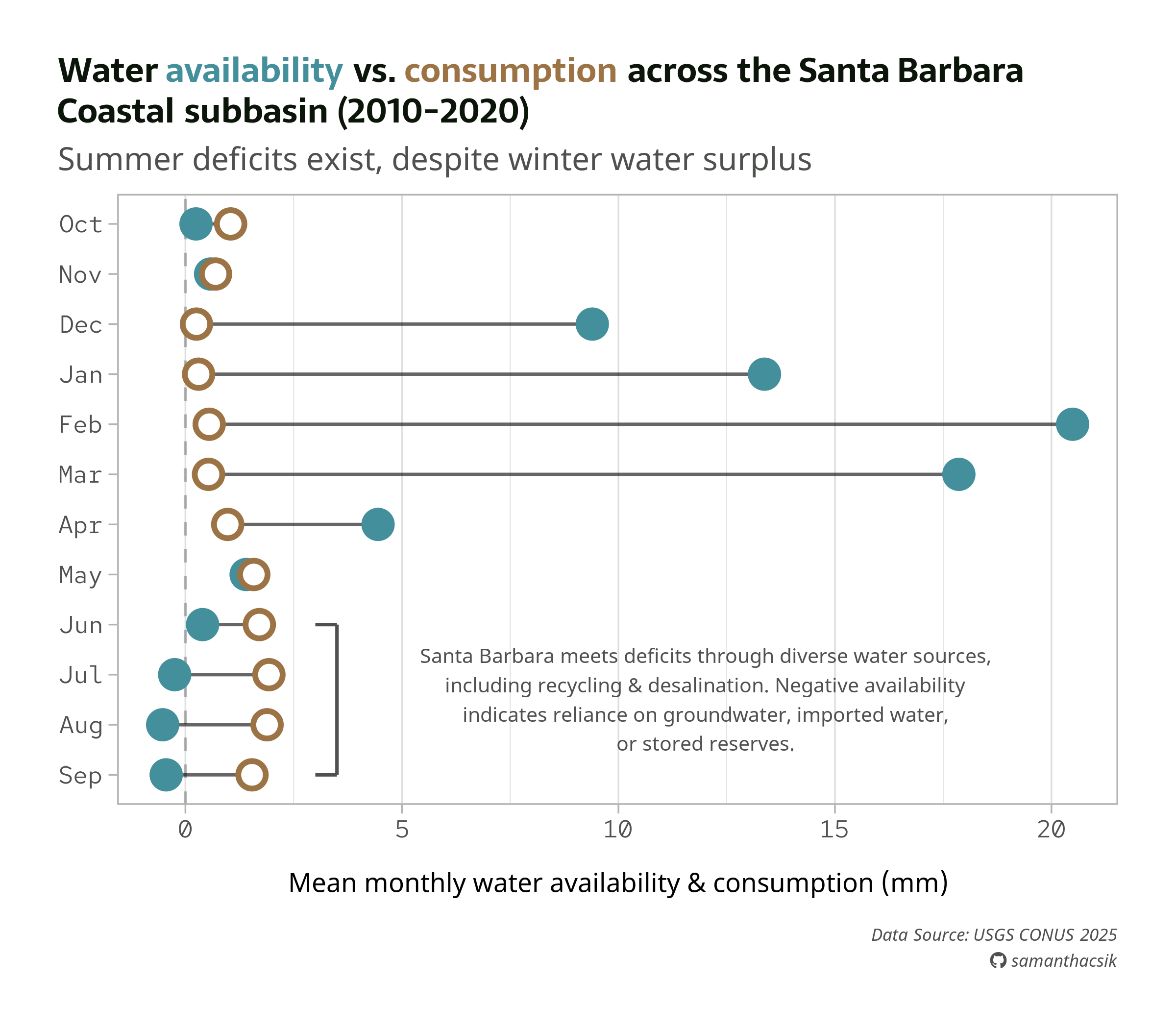
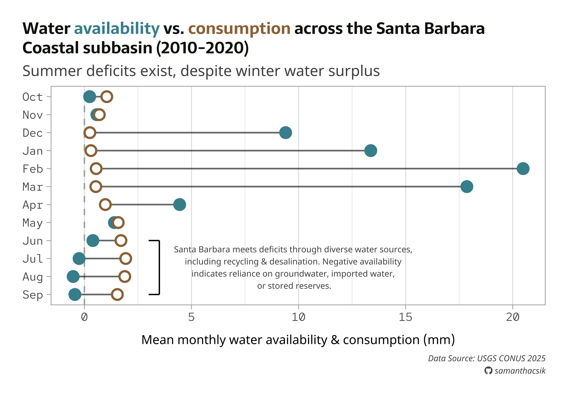
Here, we use geom_text() to add text to our plot. We need to supply coordinates to place it on our plot. Notice that our text looks oddly blurry and bold…


#..............enable {showtext} for newly opened GD.............
showtext_auto(enable = TRUE)

#...........................build plot...........................
water_plot + # `water_plot` represents all our plot code from the typography lecture
    geom_text(
        x = 10,
        y = 3, # or y = "Jul"
        label = "some annotation text",
        size = 5,
        color = pal["light_gray"],
        hjust = "center",
        family = "noto-sans"
    )

#...............turn off {showtext} text rendering...............
showtext_auto(enable = FALSE)

geom_text() is a data-driven layer


All geom_*()s are data-driven by default. Just like geom_point() will plot a single point for each row in our data frame, geom_text() plots a single label (some annotation text) for each row in our data frame – there are 12 rows in sbc_subbasin_monthly, so our label is plotted 12 times (one on top of the other on our defined x and y coordinates):


str(sbc_subbasin_monthly)
tibble [12 × 3] (S3: tbl_df/tbl/data.frame)
 $ month      : Factor w/ 12 levels "Sep","Aug","Jul",..: 9 8 7 6 5 4 3 2 1 12 ...
 $ mean_avail : num [1:12] 13.37 20.49 17.86 4.45 1.4 ...
 $ mean_consum: num [1:12] 0.304 0.549 0.533 0.977 1.579 ...


We should instead use annotate() to plot a single text element, independent of our data.

Use annotate() to add a single text element


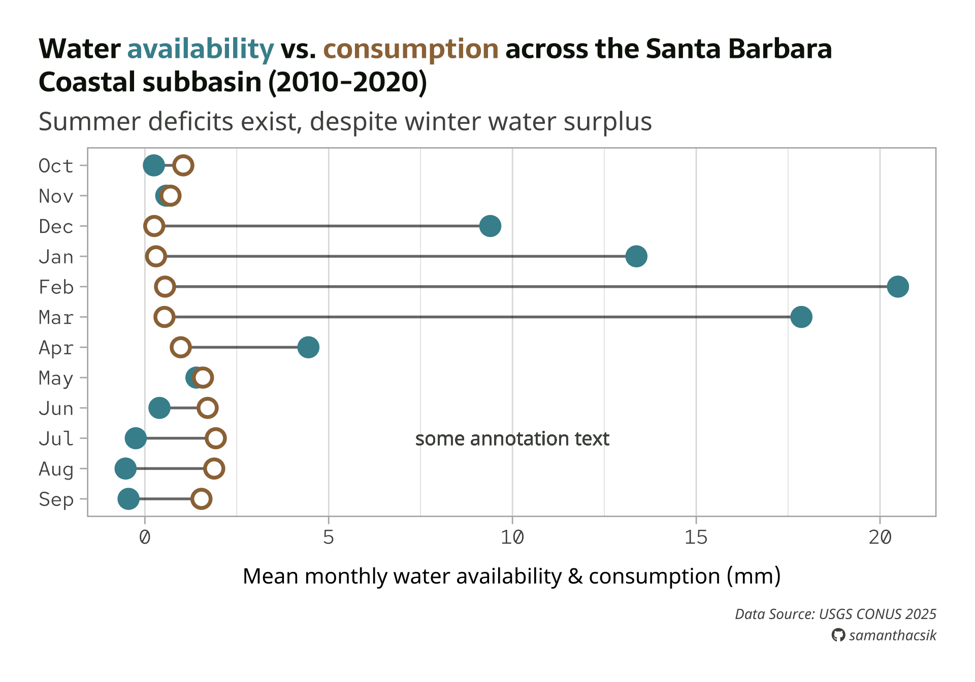
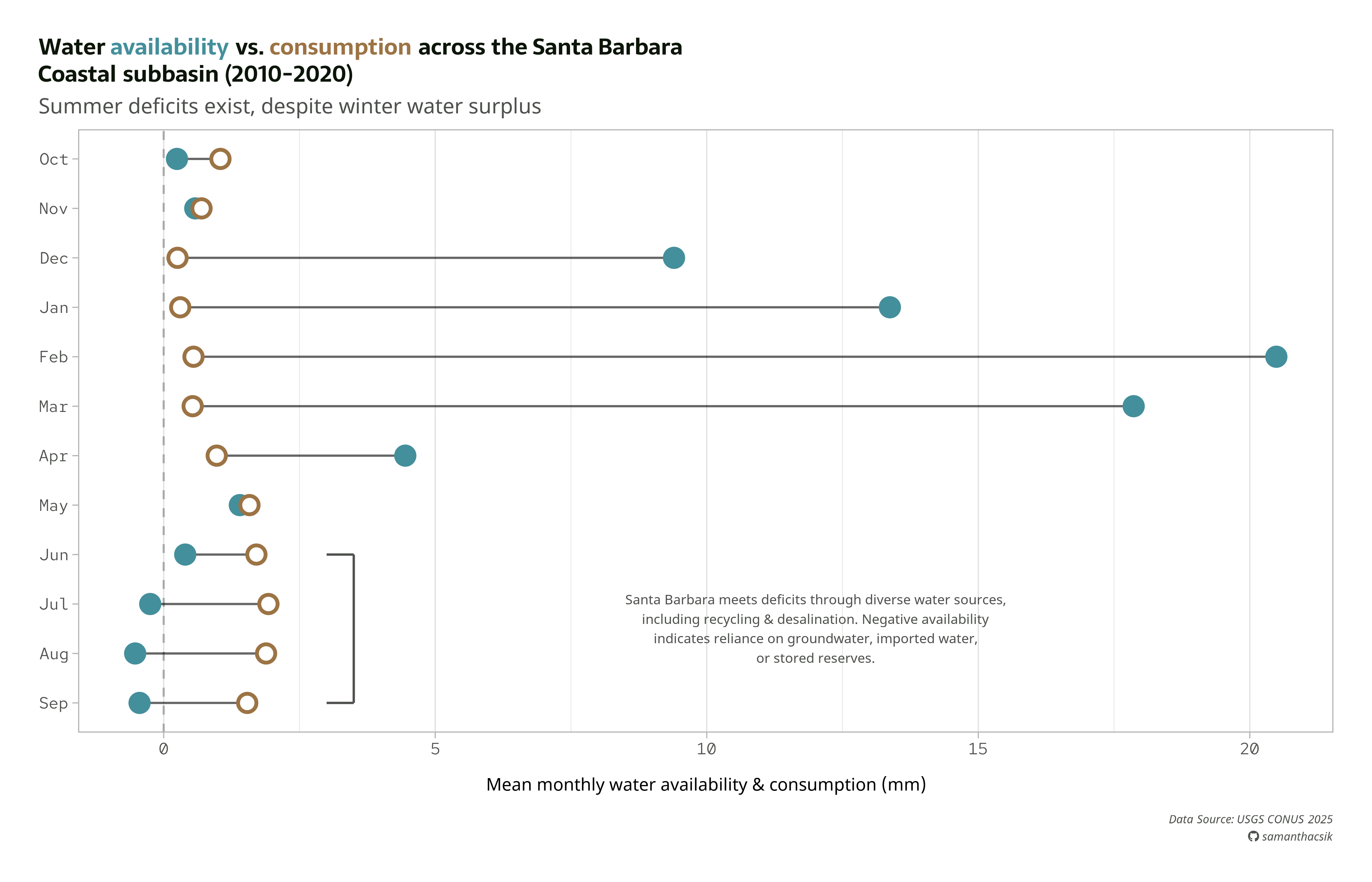
annotate() requires that we define a geom type (e.g. "text", "rect", "curve", "segment").

#..............enable {showtext} for newly opened GD.............
showtext_auto(enable = TRUE)

#...........................build plot...........................
water_plot + 
    annotate(
        geom = "text",
        x = 10,
        y = 3,
        label = "some annotation text",
        size = 5,
        color = pal["light_gray"],
        hjust = "center",
        family = "noto-sans"
    )

#...............turn off {showtext} text rendering...............
showtext_auto(enable = FALSE)

Add a more informative annotation


Now that we know the right approach for adding single text elements to our plot, let’s add something a bit more helpful and aesthetic. We’ll construct a bracket to bound the data for Jun > Sep, then add text that describes how Santa Barbara handles water deficits, as well as how to interpret negative availability values. Full plot text is included:

#......................create color palette......................
pal <- c("avail" = "#448F9C",
         "consum" = "#9C7344",
         "dark_gray" = "#0C1509",
         "light_gray" = "#4E514D") 

#........................preview palette.........................
# monochromeR::view_palette(pal)

#..........................create title..........................
title <- glue::glue("Water
                    <span style='color:#448F9C;'>availability</span> 
                    vs. 
                    <span style='color:#9C7344;'>consumption</span>
                    across the Santa Barbara<br>
                    Coastal subbasin (2010-2020)")

#.........................create caption.........................
github_icon <- "&#xf09b"
github_username <- "samanthacsik"

caption <- glue::glue(
  "Data Source: USGS CONUS 2025<br>
  <span style='font-family:fa-brands;'>{github_icon};</span>
  {github_username}"
)

#........................create annotation.......................
annotation <- glue::glue(
  "Santa Barbara meets deficits through diverse water sources, 
  including recycling & desalination. Negative availability 
  indicates reliance on groundwater, imported water, 
  or stored reserves."
)
 
#..............enable {showtext} for newly opened GD.............
showtext_auto(enable = TRUE)

#...........................build plot...........................
water_plot <- ggplot(sbc_subbasin_monthly) +
  geom_vline(xintercept = 0, 
             linetype = "dashed", 
             color = pal["light_gray"], 
             alpha = 0.4) +
  geom_linerange(aes(y = month,
                     xmin = mean_consum, xmax = mean_avail),
                 alpha = 0.6) + 
  geom_point(aes(x = mean_avail, y = month), 
             color = pal["avail"], 
             size = 5,
             stroke = 2) +
  geom_point(aes(x = mean_consum, y = month), 
             color = pal["consum"], 
             fill = "white",
             shape = 21,
             size = 5,
             stroke = 2) +
  annotate("segment", 
           x = 3.5, xend = 3.5,
           y = 4, yend = 1, # or y = "Jun", yend = "Sep"
           linewidth = 0.8) +
  annotate("segment",
           x = 3.5, xend = 3,
           y = 4, yend = 4, 
           linewidth = 0.8) +
  annotate("segment",
           x = 3.5, xend = 3,
           y = 1, yend = 1, 
           linewidth = 0.8) +
  annotate(geom = "text",
           x = 12,
           y = 2.5,
           label = annotation,
           size = 3.5,
           color = pal["light_gray"],
           hjust = "center",
           family = "noto-sans") +
  labs(title = title,
       subtitle = "Summer deficits exist, despite winter water surplus",
       caption = caption,
       x = "Mean monthly water availability & consumption (mm)") +
  theme_light(base_size = 17) +
  theme(
    plot.title.position = "plot",
    plot.title = ggtext::element_markdown(family = "sarala",
                                          face = "bold",
                                          size = rel(0.98), 
                                          lineheight = 1.2,
                                          color = pal["dark_gray"]), 
    plot.subtitle = element_text(family = "noto-sans",
                                 size = rel(0.9), 
                                 color = pal["light_gray"],
                                 margin = margin(b = 8)),
    axis.text = element_text(family = "red",
                             size = rel(0.7), 
                             color = pal["light_gray"],),
    axis.title.x = element_text(family = "noto-sans",
                                size = rel(0.75), 
                                margin = margin(t = 15)),
    axis.title.y = element_blank(),
    plot.caption = ggtext::element_markdown(family = "noto-sans",
                                            face = "italic",
                                            size = rel(0.5),
                                            color = pal["light_gray"],
                                            halign = 1, 
                                            lineheight = 1.5), 
    panel.grid.major.y = element_blank(),
    plot.margin = margin(t = 1, r = 1, b = 1, l = 1, "cm")
  )

water_plot

#...............turn off {showtext} text rendering...............
showtext_auto(enable = FALSE)

We can use ggsave() to save our plot as a PNG file


ggsave() creates a new graphical device (here, we specify a PNG device) to write the output file. By default, {showtext} uses a resolution of 96 DPI (dots per inch) when rendering our plot on screen, while ggsave() uses a default resolution of 300 DPI to write our plot to file. Ensure these match to avoid inconsistent font renderings across devices.

#..............enable {showtext} for newly opened GD.............
showtext_auto(enable = TRUE)

#...................set resolution to match GD...................
showtext_opts(dpi = 300)

#..............write plot to file (aka save as png)..............
ggsave(
  filename = here::here("week7", "images", "sbc-hydro.png"),
  plot = water_plot,
  device = "png",
  width = 8, 
  height = 7,
  unit = "in",
  dpi = 300
)

#...............turn off {showtext} text rendering...............
showtext_auto(enable = FALSE)

You may need to make adjustments, depending on size


Depending on your saved image dimensions, you may need to update your base font size, elements with absolute sizes (e.g. point sizes), or shift elements (e.g. adjust your caption location).


Looking for more annotation examples?


To see more annotation examples (including how to use geom_text() & geom_label() + the {ggrepel} package to label individual points, how to draw arrows & boxes, etc.), you can check out the archived version of the annotations lecture.

Take a Break

05:00