how to reduce eye movement and improve readability / interpretability (e.g. through alternative legend positions, direct annotations)
putting things in context
how to draw the main attention to the most important info
consistent use of colors, spacing, typefaces, weights
typeface / font choices and how they affect both readability and emotions and perceptions
using visual hierarchy to guide the reader
color choices (incl. palette types, emotions, readability)
how to tell an interesting story
how to center the people and communities represented in your data
accessibility through colorblind-friendly palettes & alt text
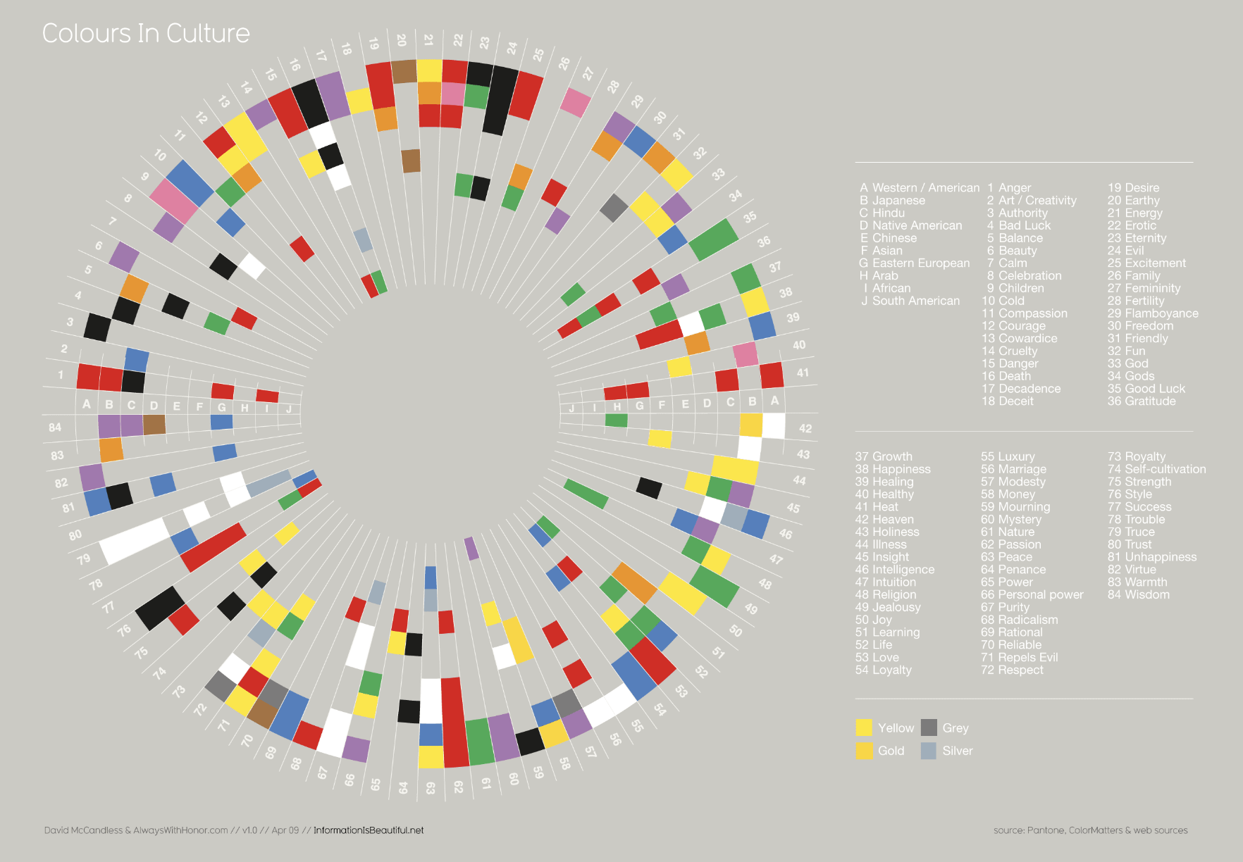
This lesson will focus on the use of colors in a good data visualization.
Why do we use color?
Spend a couple minutes discussing with your Learning Partners the following:
Why and / or when should we use color in data visualizations?
Find an example(s) of a data viz that uses color to convey information to share in #eds-240-data viz. Note some of your own observations about the color choices (i.e. why these colors? palette arrangement?).
02:00
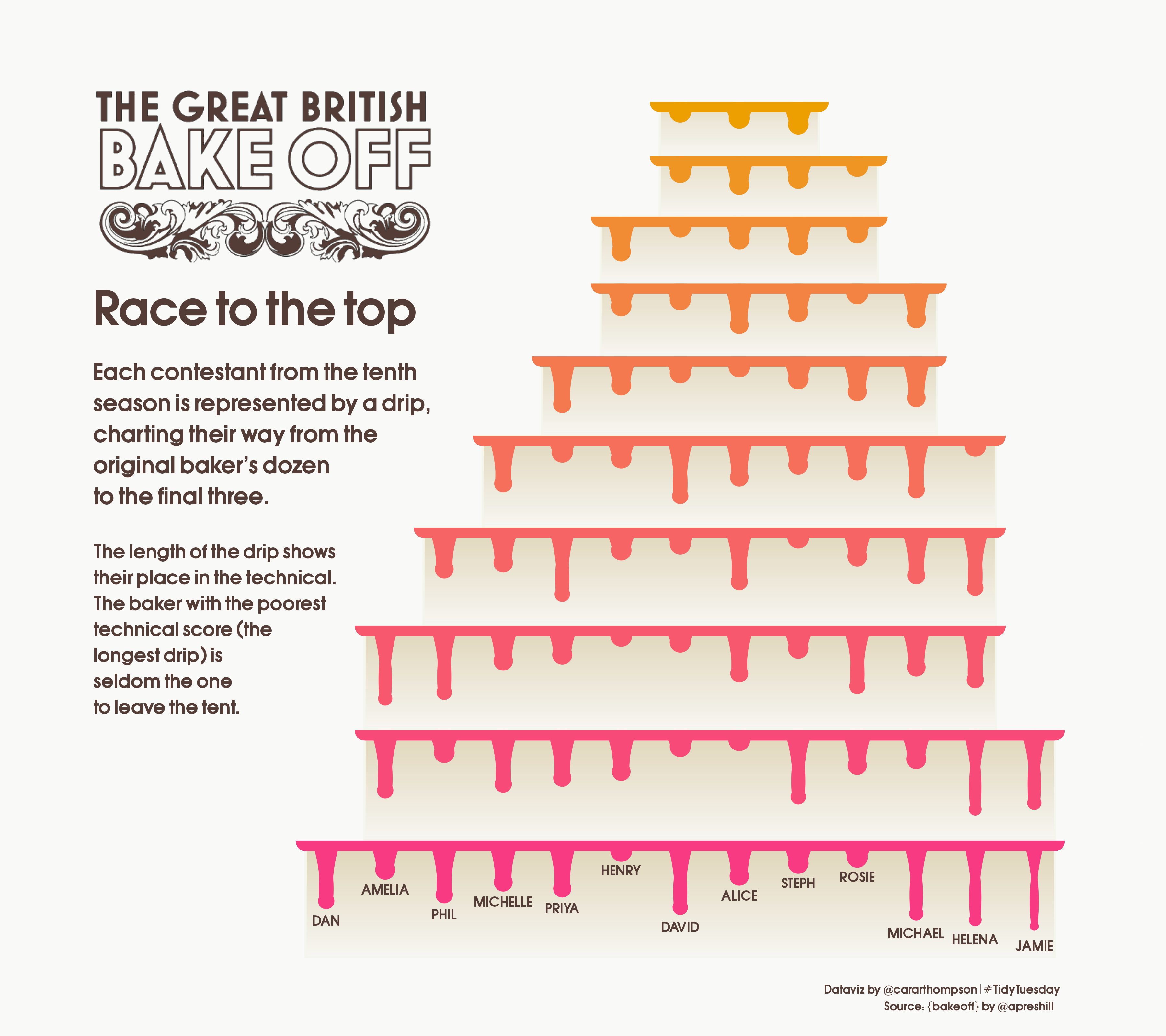
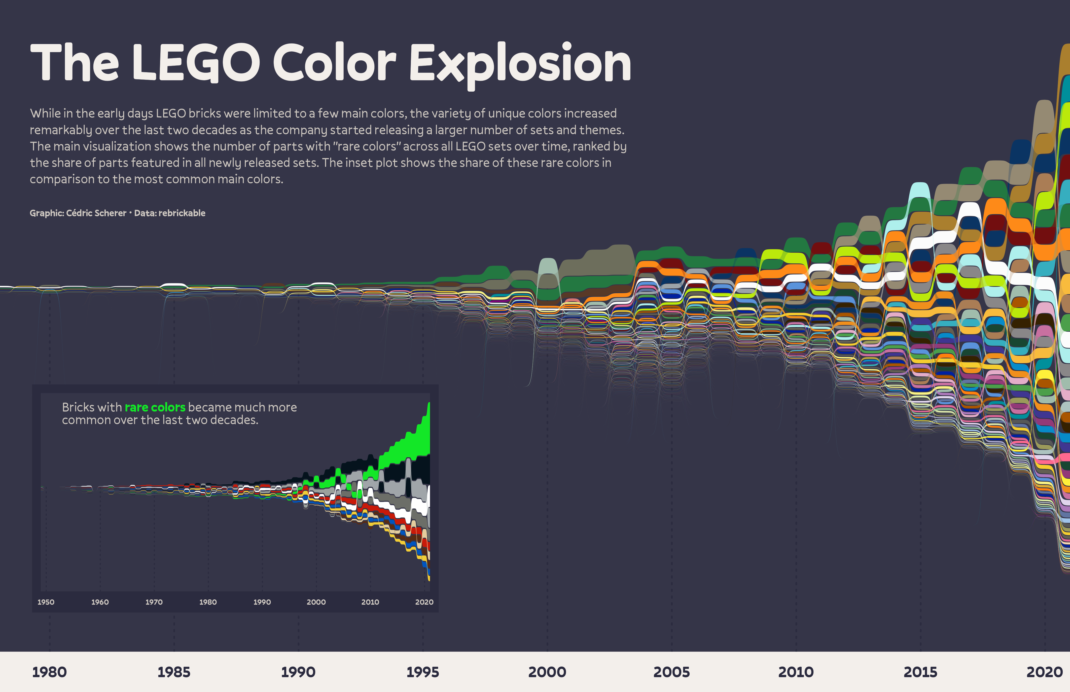
Choosing colors is difficult and it should be done so purposefully
You’ll probably iterate on them as you sit with your visualization and of course, as you get feedback from others.
Some places to start / things to consider:
is using color the best and / or only way to visually represent your variable(s)?
are you designing for a particular organization / brand?
what emotions are you trying (or not trying) to elicit?
who is your audience?
are your data commonly represented using a particular color scheme?
what data types (e.g. numeric vs. categorical, discrete vs. continuous?) are you working with?
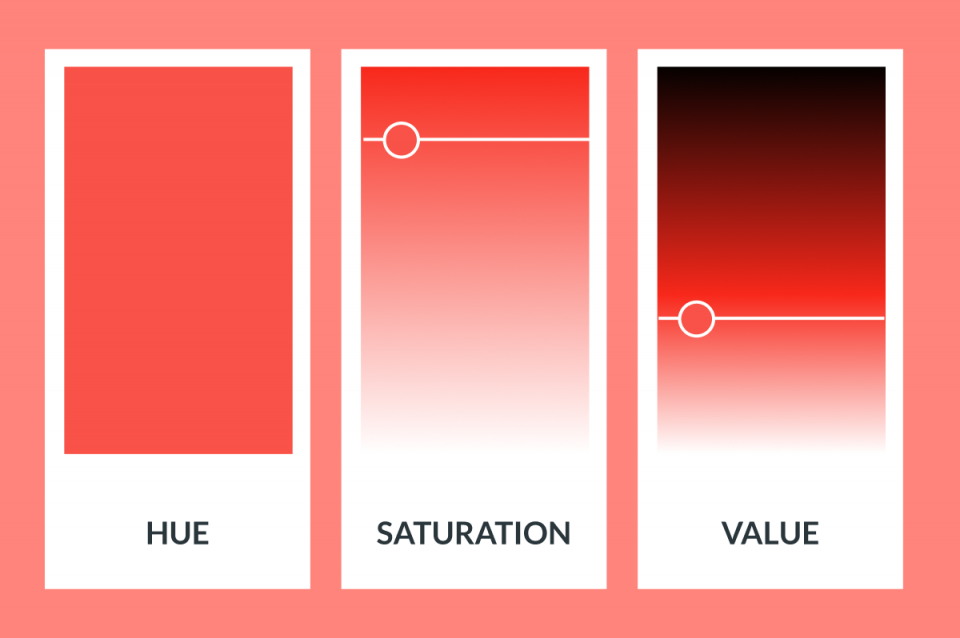
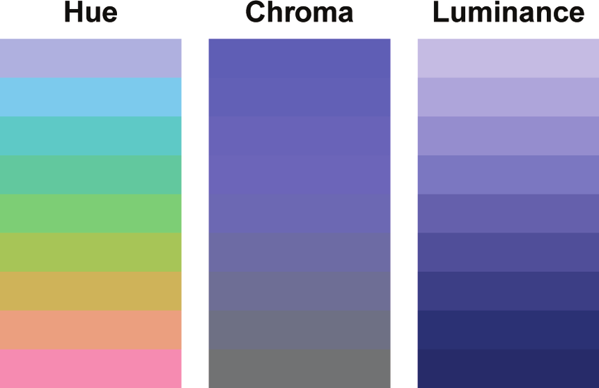
You don’t need to worry much about the underlying theory of color spaces, but know that changing any of the parameters (e.g. hue, saturation, etc.) can influence how we perceive information in a data visualization.
02:00
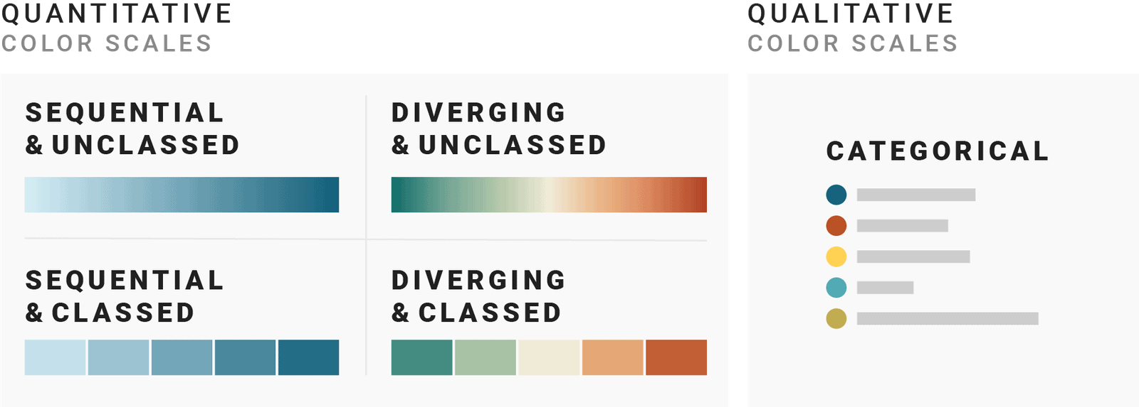
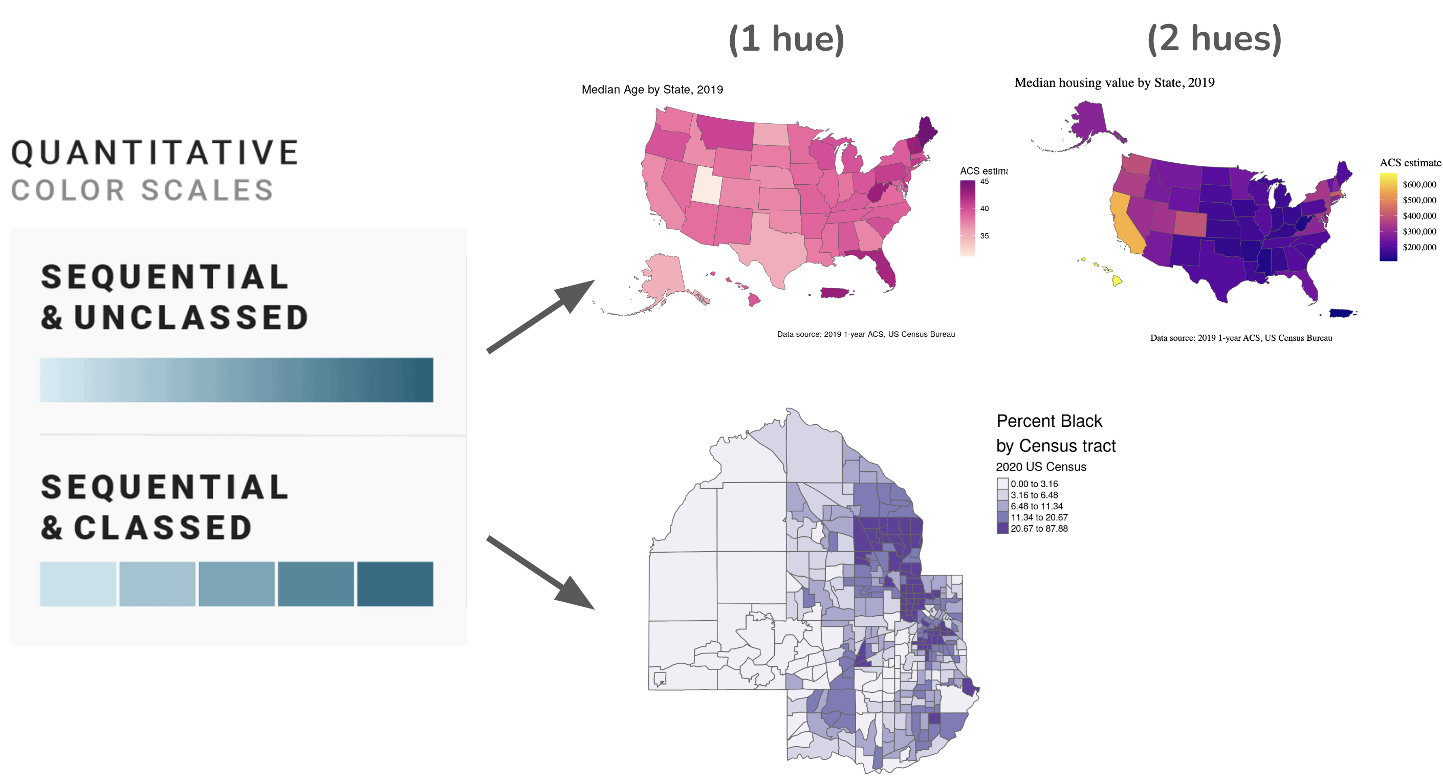
Different color scales for different data types
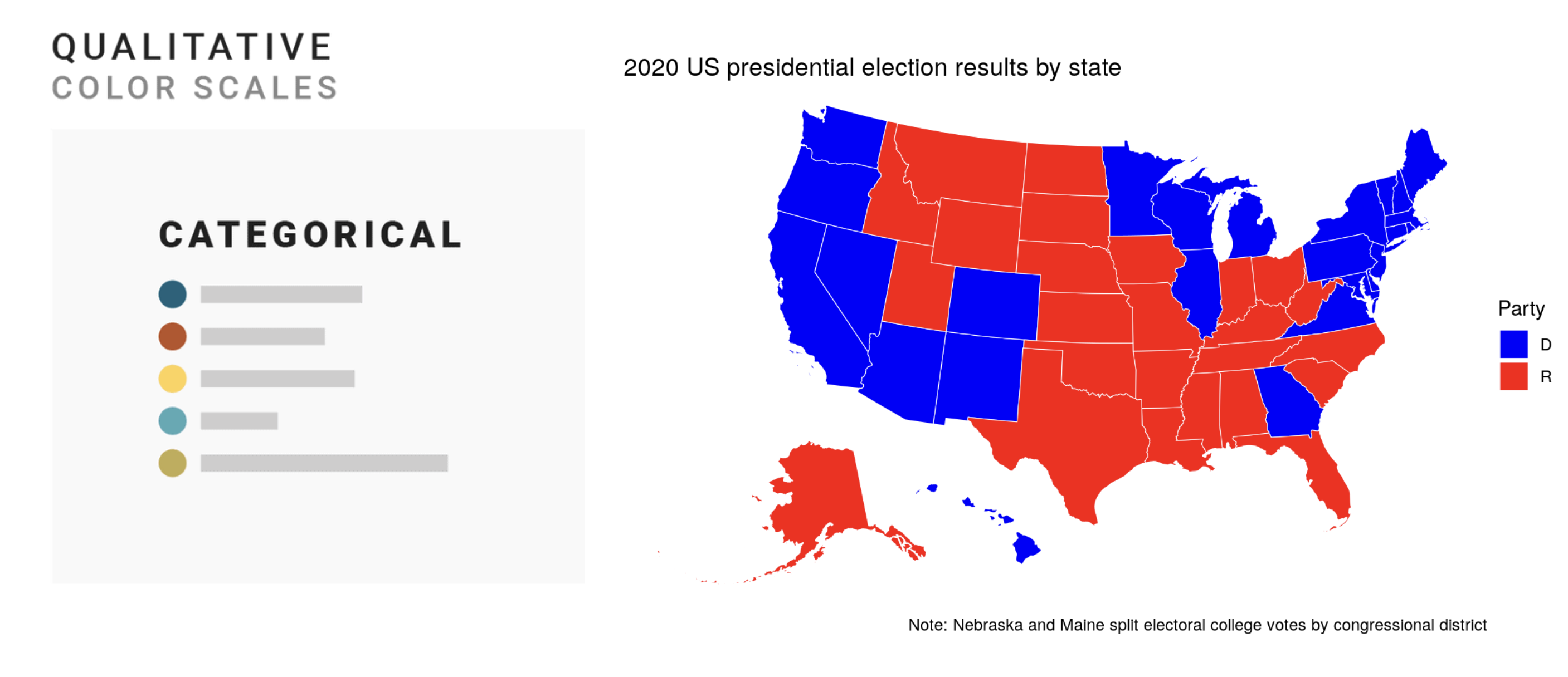
Categorical scales
mainly formed by selecting different hues
hues assigned to each group must be distinct and ideally have different lightnesses
limit to no more than 7 hues
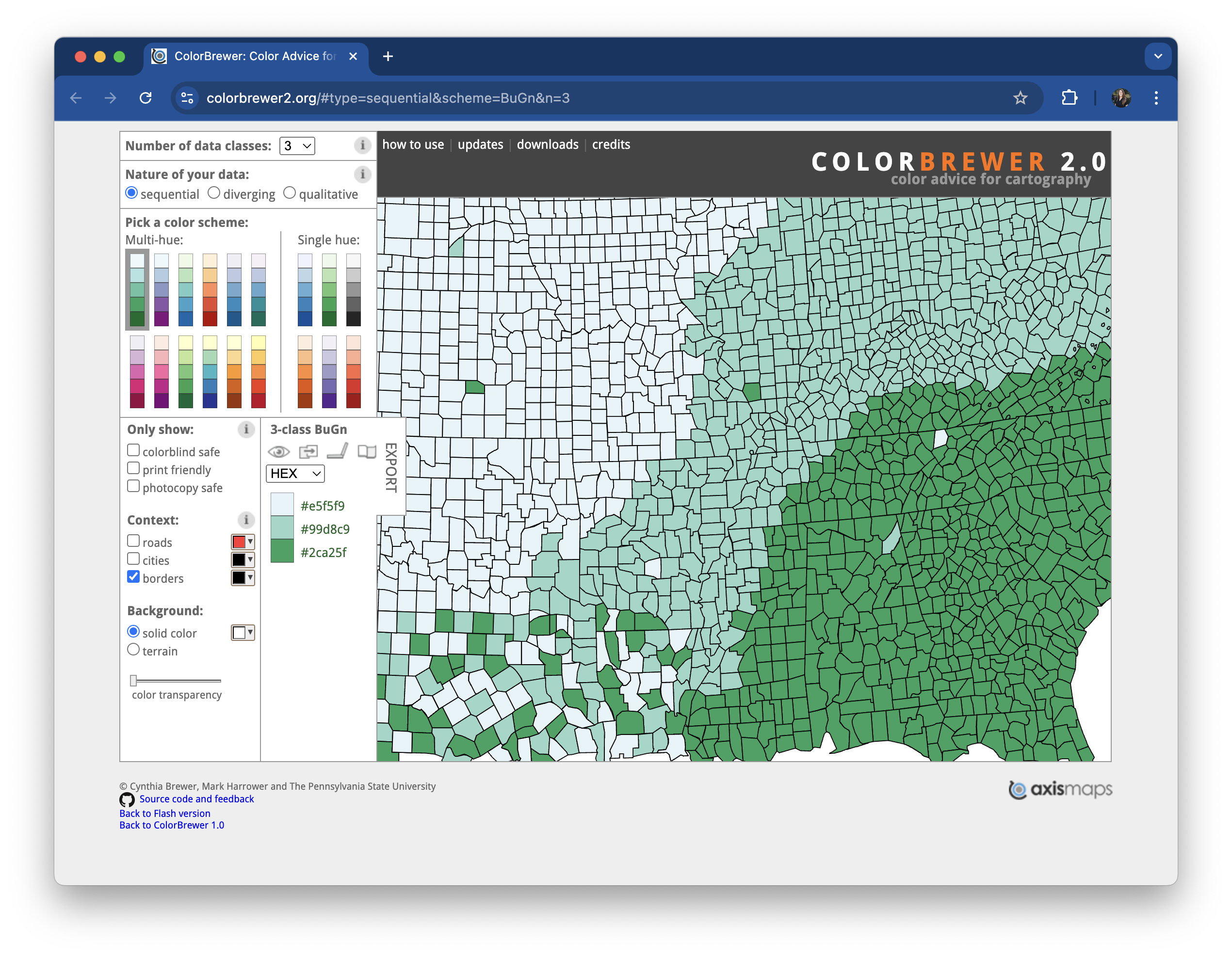
Sequential scales
colors assigned to data values on a continuum, based on lightness, hue, or both
lower values typically associated with lighter colors & higher values associated with darker colors (though not a hard and fast rule; make choices clear with legend)
can use a single hue or two hues
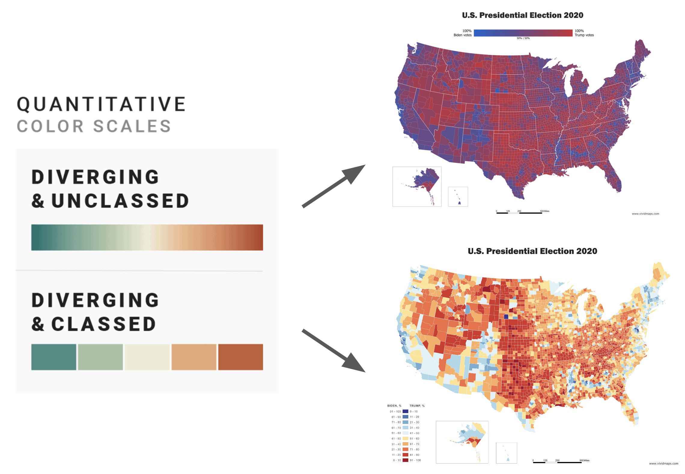
Diverging scales
combination of two sequential palettes with a shared endpoint at the central value
central value is assigned a light color (light gray is best)
use a distinctive hue for each of the component palettes
Base plots (for applying color scales to)
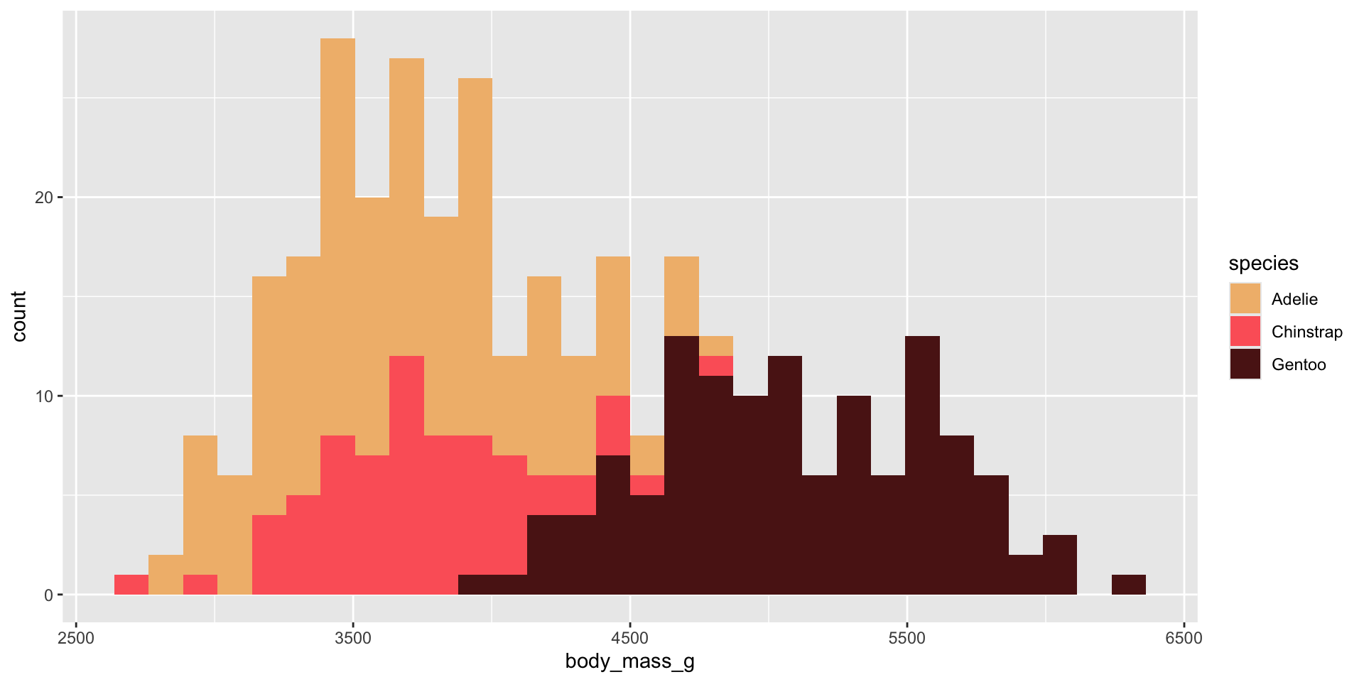
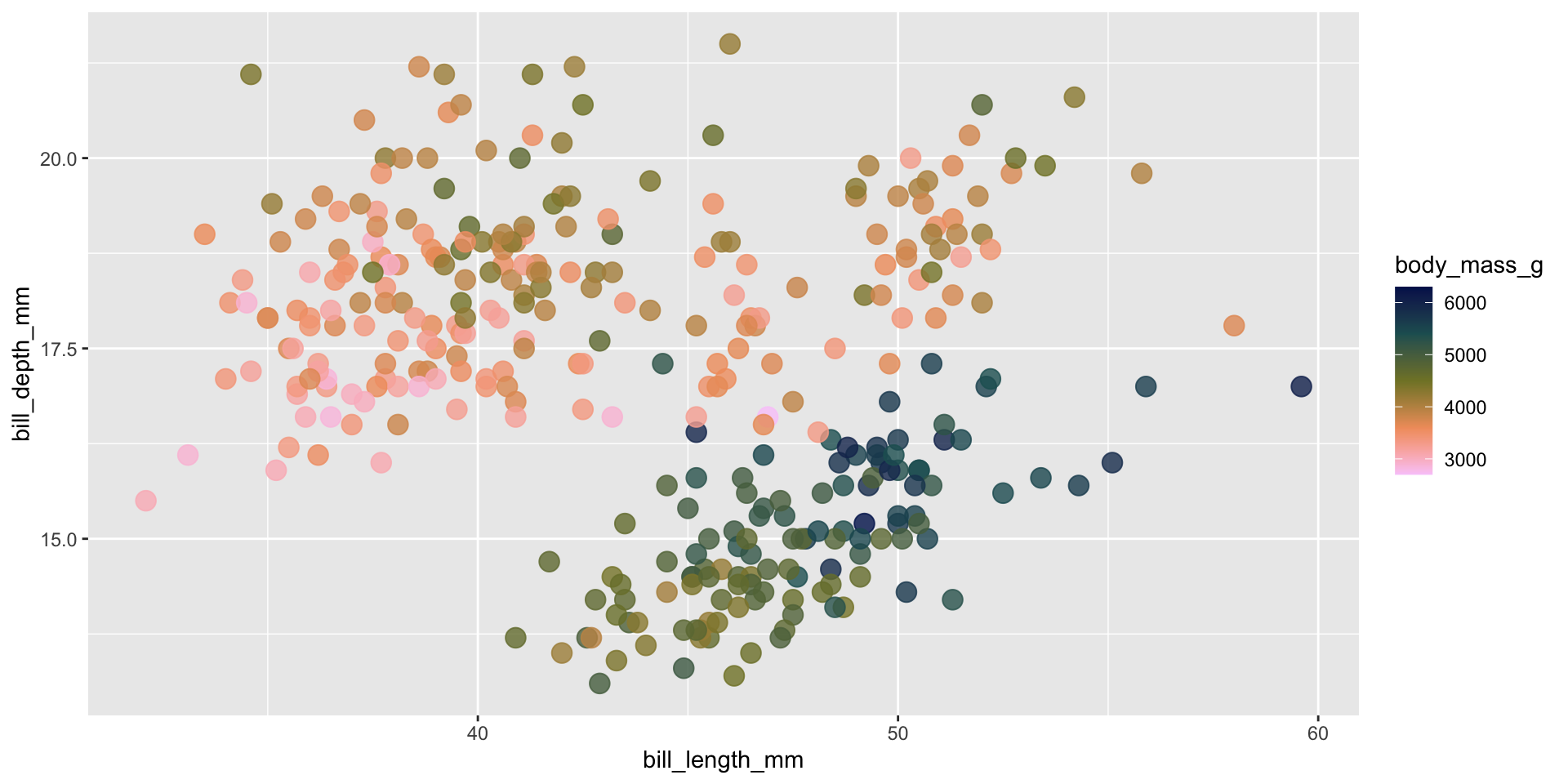
We’ll be testing out different palettes throughout this lesson. Instead of having to retype the code for our plots each time, let’s create and save two versions of a penguin scatter plot. We can then call either of these plot objects to modify with different color scales:
library(palmerpenguins)library(tidyverse)
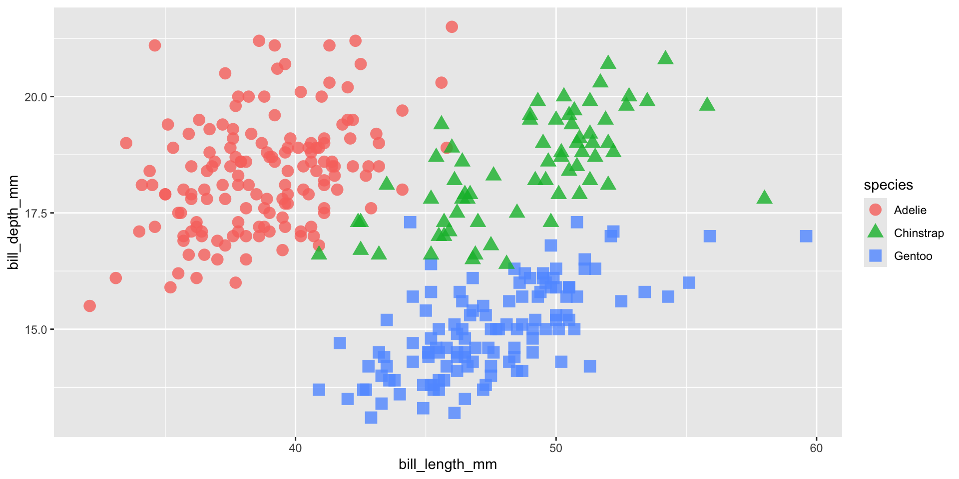
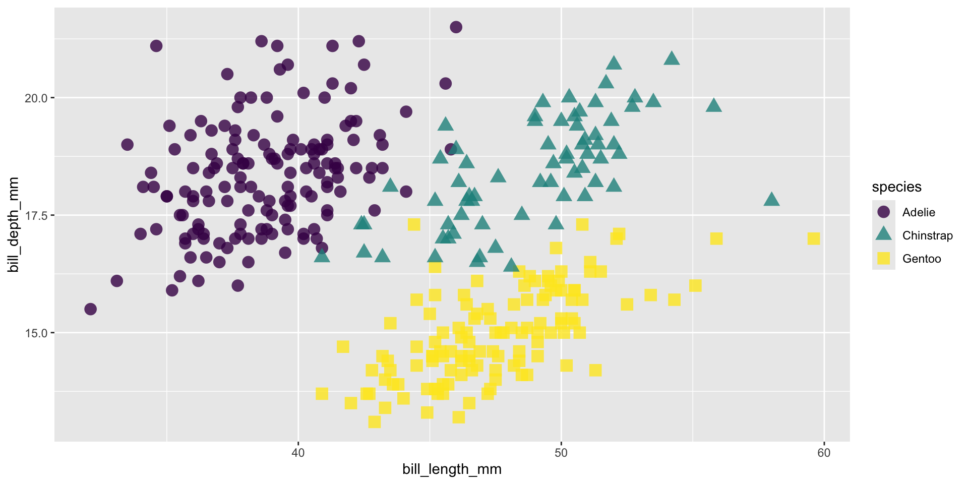
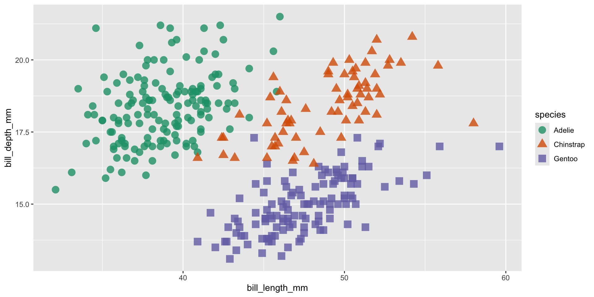
Requires a categorical color scale
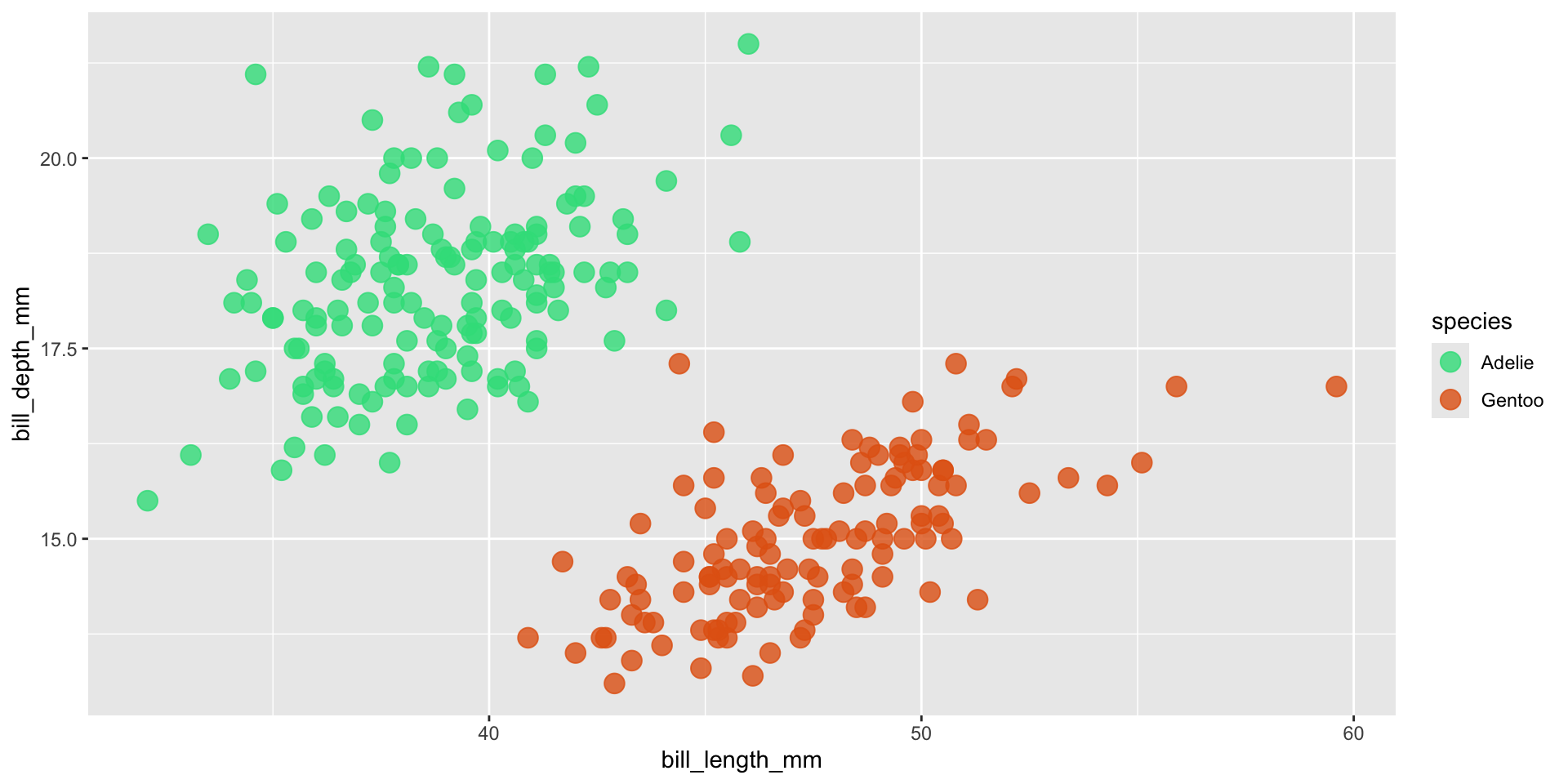
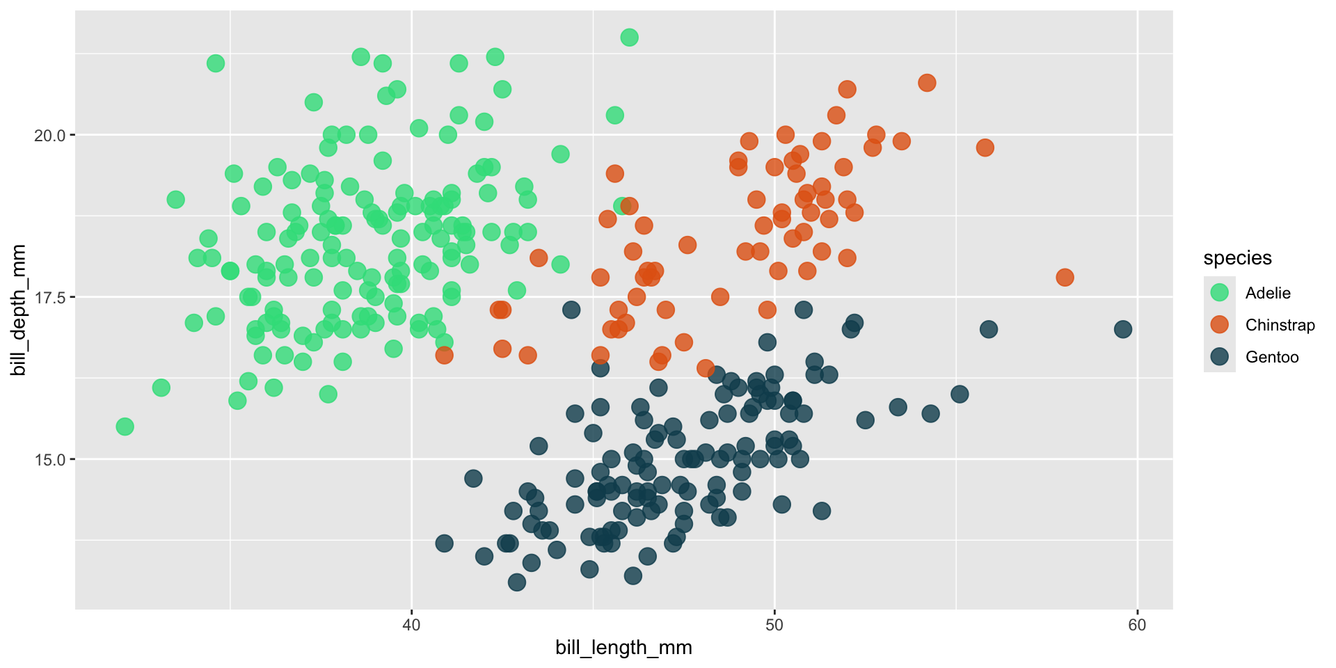
cat_color_plot <-ggplot(penguins, aes(x = bill_length_mm, y = bill_depth_mm, color = species, shape = species)) +geom_point(size =4, alpha =0.8)cat_color_plot
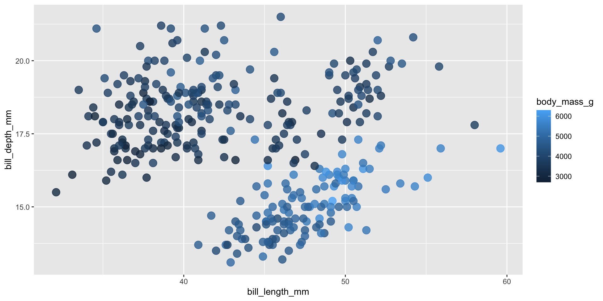
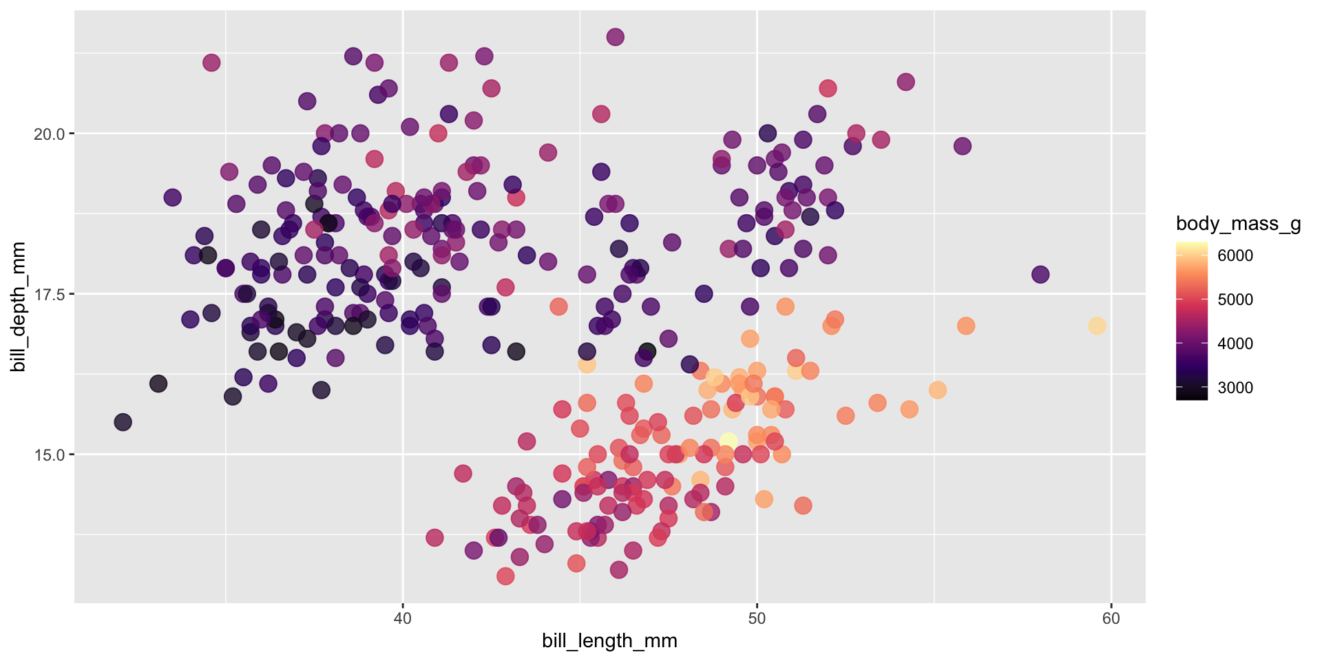
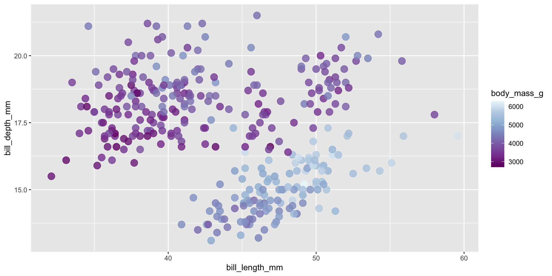
Requires a continuous color scale
con_color_plot <-ggplot(penguins, aes(x = bill_length_mm, y = bill_depth_mm, color = body_mass_g)) +geom_point(size =4, alpha =0.8) con_color_plot
Ensuring inclusive and accessible design through your color choices
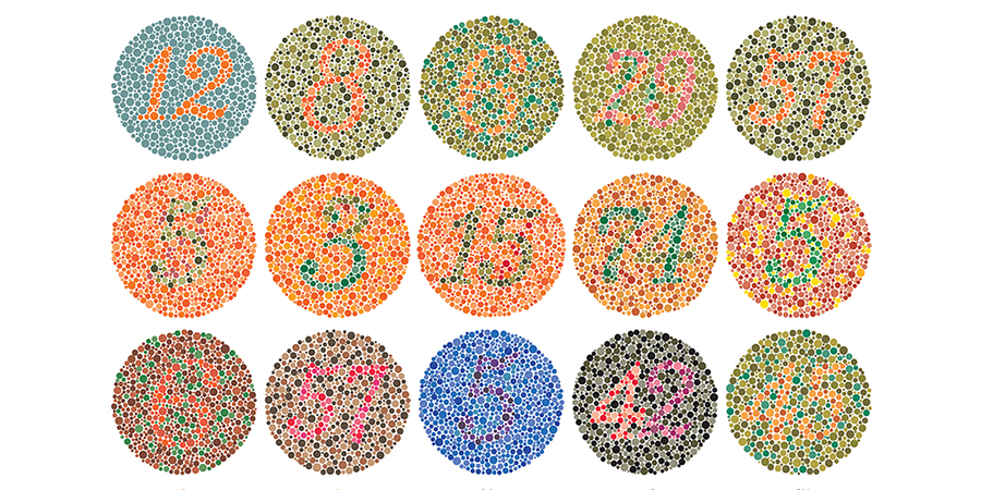
What is colorblindness?
Color vision deficiency aka colorblindness is the decreased ability to see color or differences in color. It’s estimated that about 1 in 12 men (8%) and 1 in 200 women (0.5%) are affected (Wikipedia).
Color plate tests are used to help identify different forms of color blindness. Try using the Let’s get color blind Chrome extension to emulate different forms of colorblindness while looking at the above plates. Image source: American Optometric Association
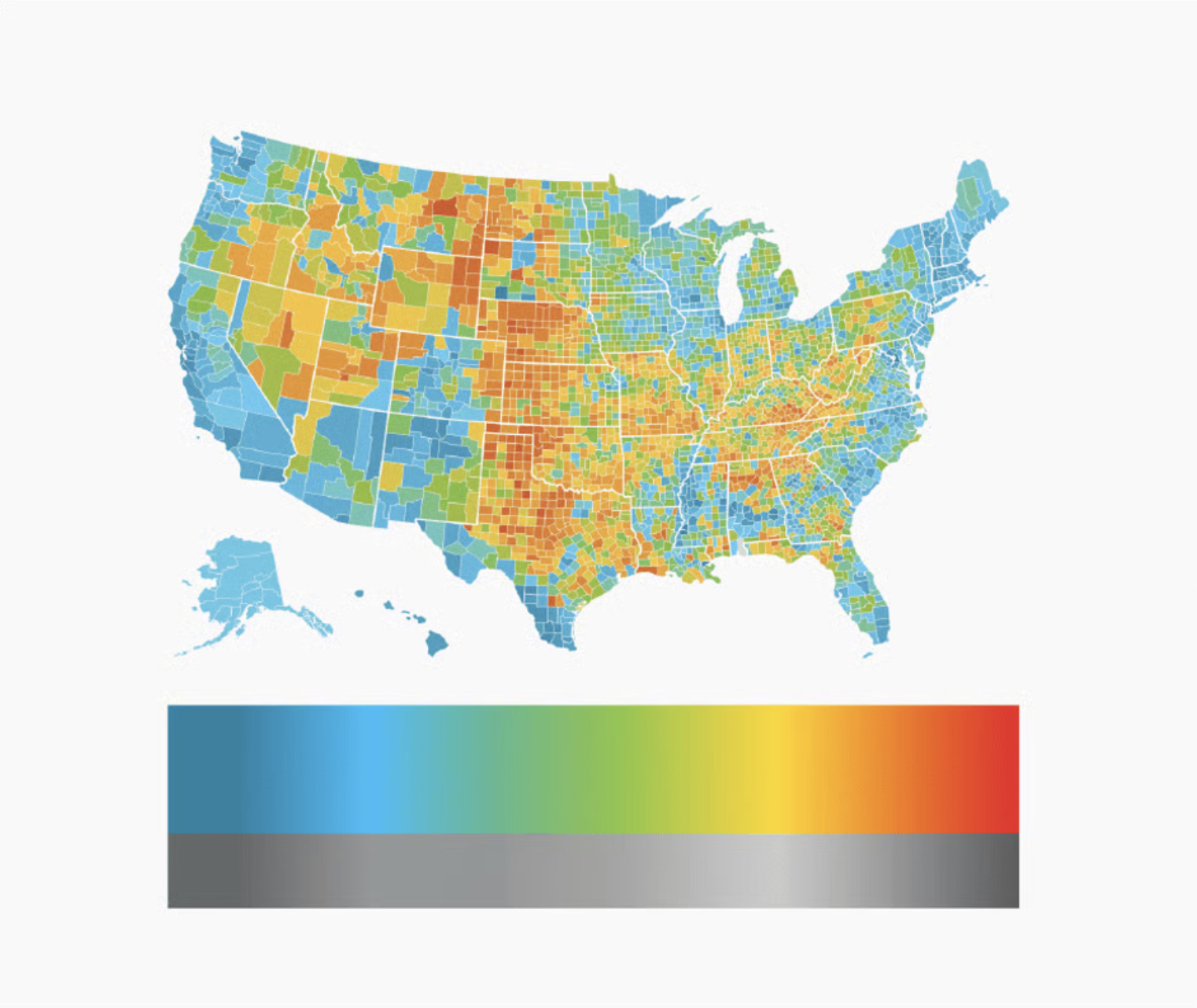
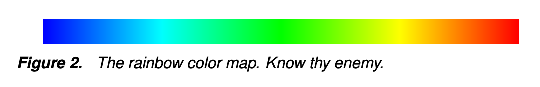
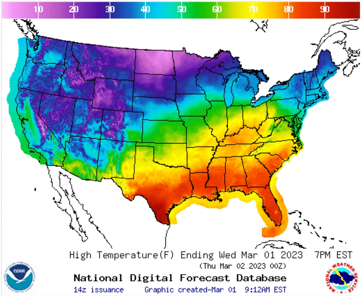
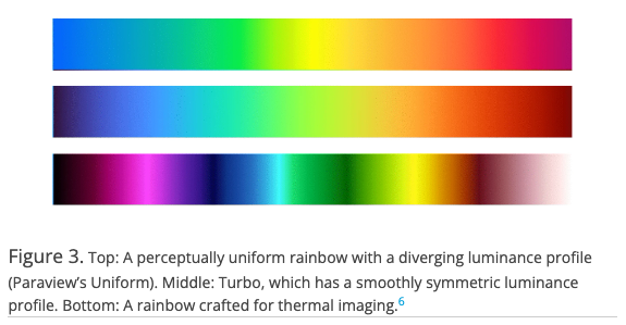
The problem with rainbow color maps
colors don’t follow any natural perceived ordering (no innate sense of higher or lower)
perceptual changes in rainbow colors are not uniform (e.g. colors appear to change faster in yellow region than green region)
insensitive to color vision deficiencies
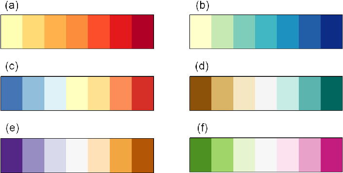
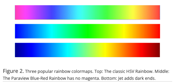
If you’re going to use a rainbow colormap. . .
Try one of these improved versions (right), instead:
Problematic, perceptually nonuniform and unordered rainbow colormaps
Improved, perceptual uniform and diverging rainbow colormaps
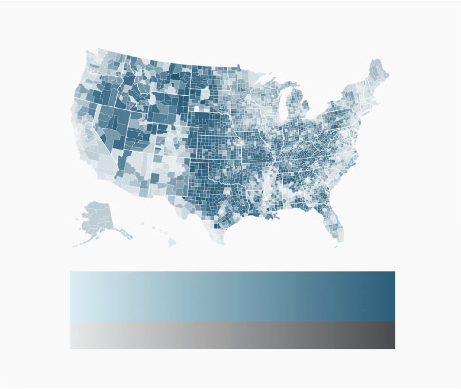
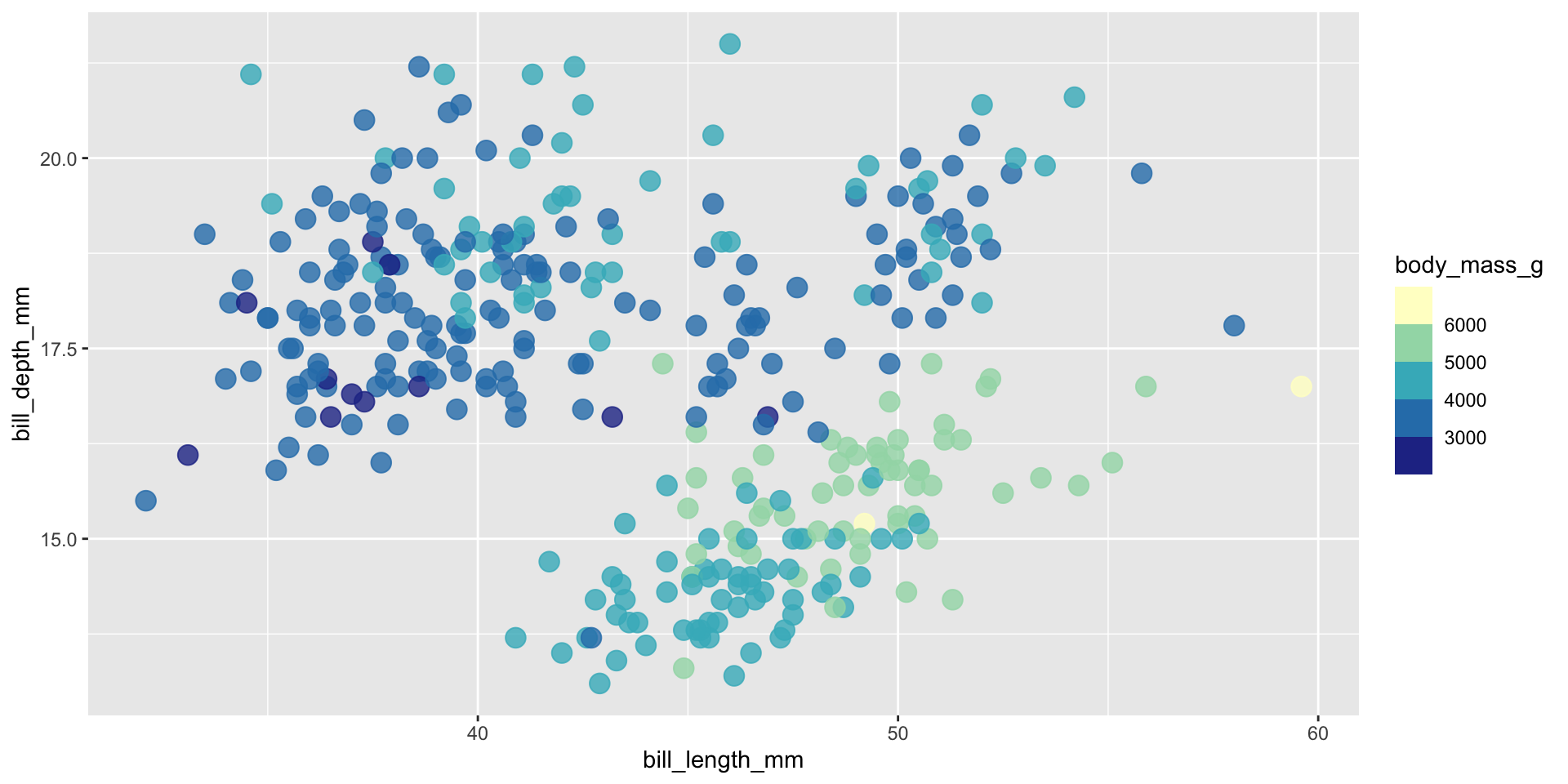
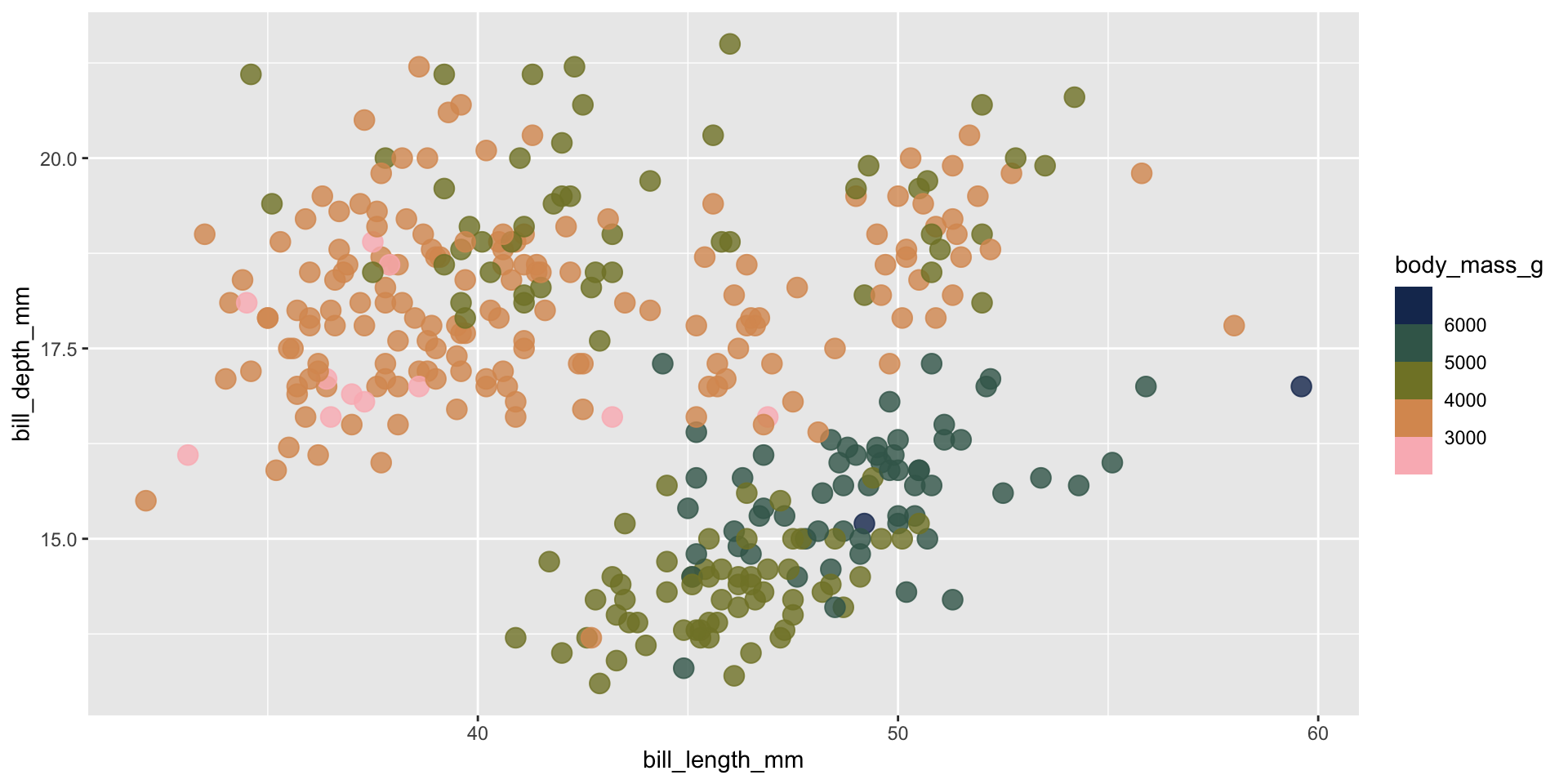
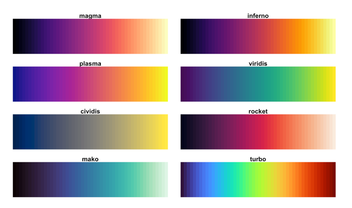
ALTERNATIVE: Viridis
The viridis color scales are perceptually-uniform (even when printed in gray scale) and colorblindness-friendly:
Continuous viridis scales
Binned viridis scales
There are a number of different ways to apply viridis color scales, but I often opt for scale_*_viridis_*() functions, which come as part of {ggplot2}.
Using viridis color scales
Try out the palette options below, then check out the documentation and play around with some alternative options as well.
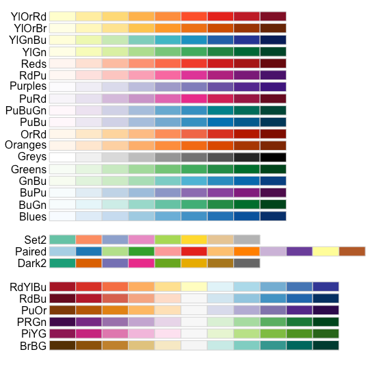
ColorBrewer offers a number of colorblind-friendly color schemes for maps and other graphics. Check them out using {RColorBrewer} or the web-based interface.
Check out the documentation and play around with some alternative options.
There are so many other great pre-made color palettes to explore, many of which take into consideration color vision deficiencies (but always double check!)
Use paletteer to access TONS of pre-made palettes
The {paletteer} package provides a common interface for accessing a near-comprehensive list of palettes (over 2,500!!) across various packages.
Climate and environmental science visualizations can (should) draw from community standards, when possible
Some widely-used climate science palettes
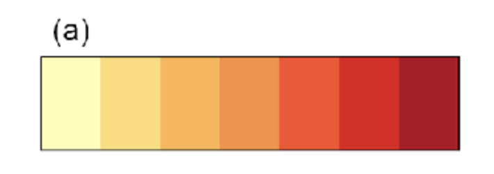
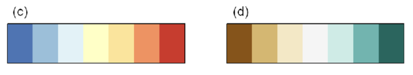
Figure 4. Appropriate diverging and sequential colour schemes for the following climate data (a), absolute temperature (b), absolute precipitation (c), temperature anomaly (d), precipitation or runoff anomaly (e and f) other climate variables with no symbolic association . Schemes in this figure are 7 class ones designed by Cynthia Brewer, (Brewer et al. 2003)
Want to design your own palette? Here are some helpful guidelines and considerations…
“lightness, brightness, and saturation can communicate the level of seriousness, intensity, and emotional weight in a visual work” -Cédric Scherer
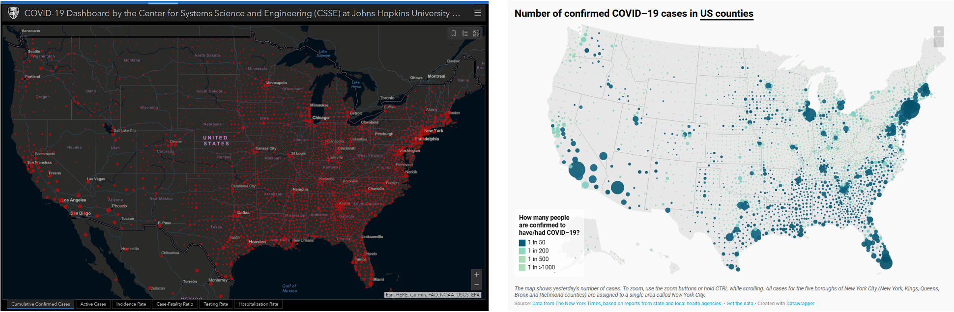
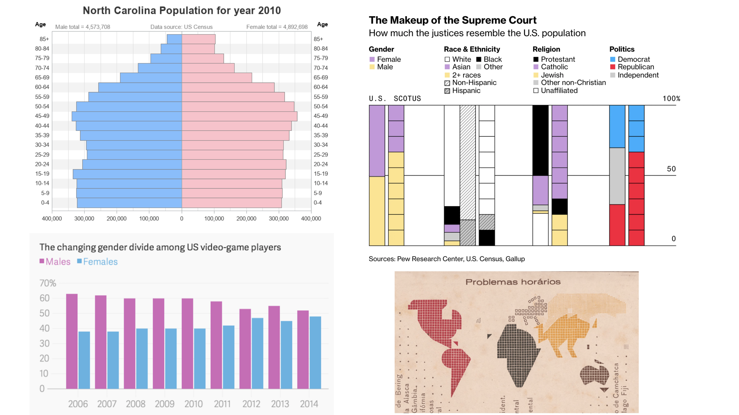
(Right) COVID-19 tracker by the Johns Hopkins University (screenshot from 2020-07-27, courtesy of Cédric Scherer). Red tends to elicit panic / fear. (Left) A map of confirmed COVID-19 cases by Datawrapper (screenshot from 2020-07-27, courtesy of Cédric Scherer). Blues and greens help to avoid such a strong fearful emotional response.
Colors elicit emotional responses
“We show the current or confirmed cases in another color than red. The coronavirus is not a death sentence. Most infected people will survive. If you’re infected, you want to find yourself on a map as a blue (or yellow, or beige, or purple…) dot, not as a “attention, danger, run!”-screaming red dot. Related, we show deaths in black, not red – it feels more respectful.”
Though it may be temping to use bright / bold colors to grab attention, it can lead to eye strain and make it more challenging for your readers to focus on your chart.
Though it may be temping to use bright / bold colors to grab attention, it can lead to eye strain and make it more challenging for your readers to focus on your chart.
ensure that you’re picking colorblind-friendly color combos
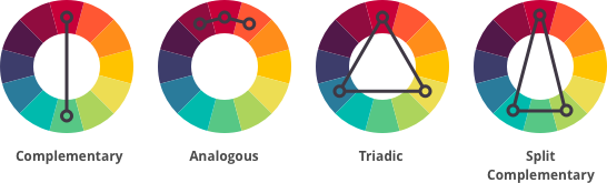
use color wheels to identify color harmonies
think carefully about what emotions / messages your color choices will convey
avoid lots of pure / fully-saturated hues
And also consider some other important sources of inspiration:
your company or organization’s brand / logo
steal colors from your favorite / relevant images using tools like Color Thief
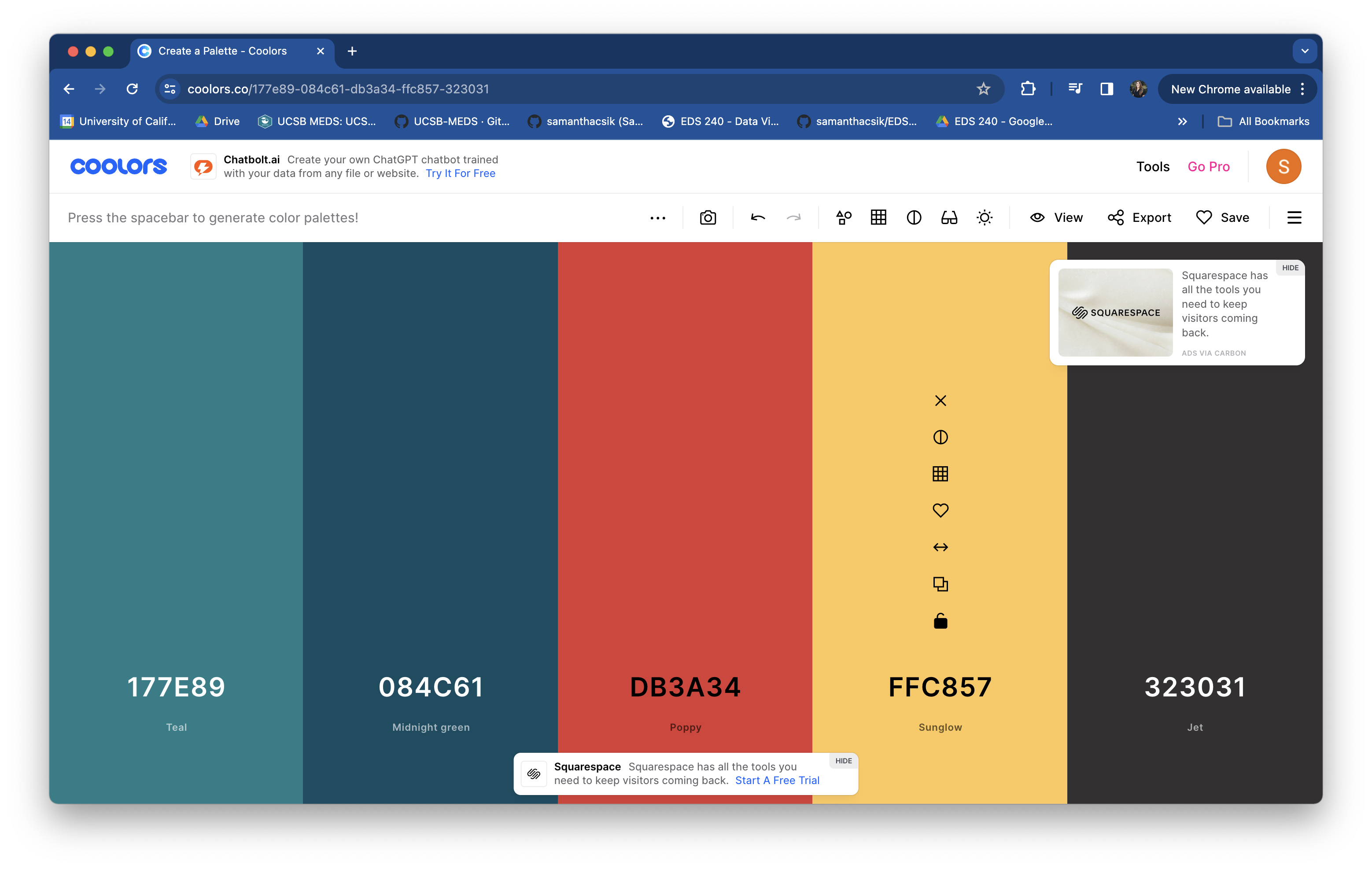
use a randomized palette generator, like coolors.co
find a color picker for generating HEX codes – my favorite it HTML Color Codes
TIP: Save your palette outside of your ggplot
I recommend saving your palette to a named vector outside of your ggplot – this prevents lengthy palettes from creating cluttered ggplot code and allows you to reuse your palette across multiple plots:
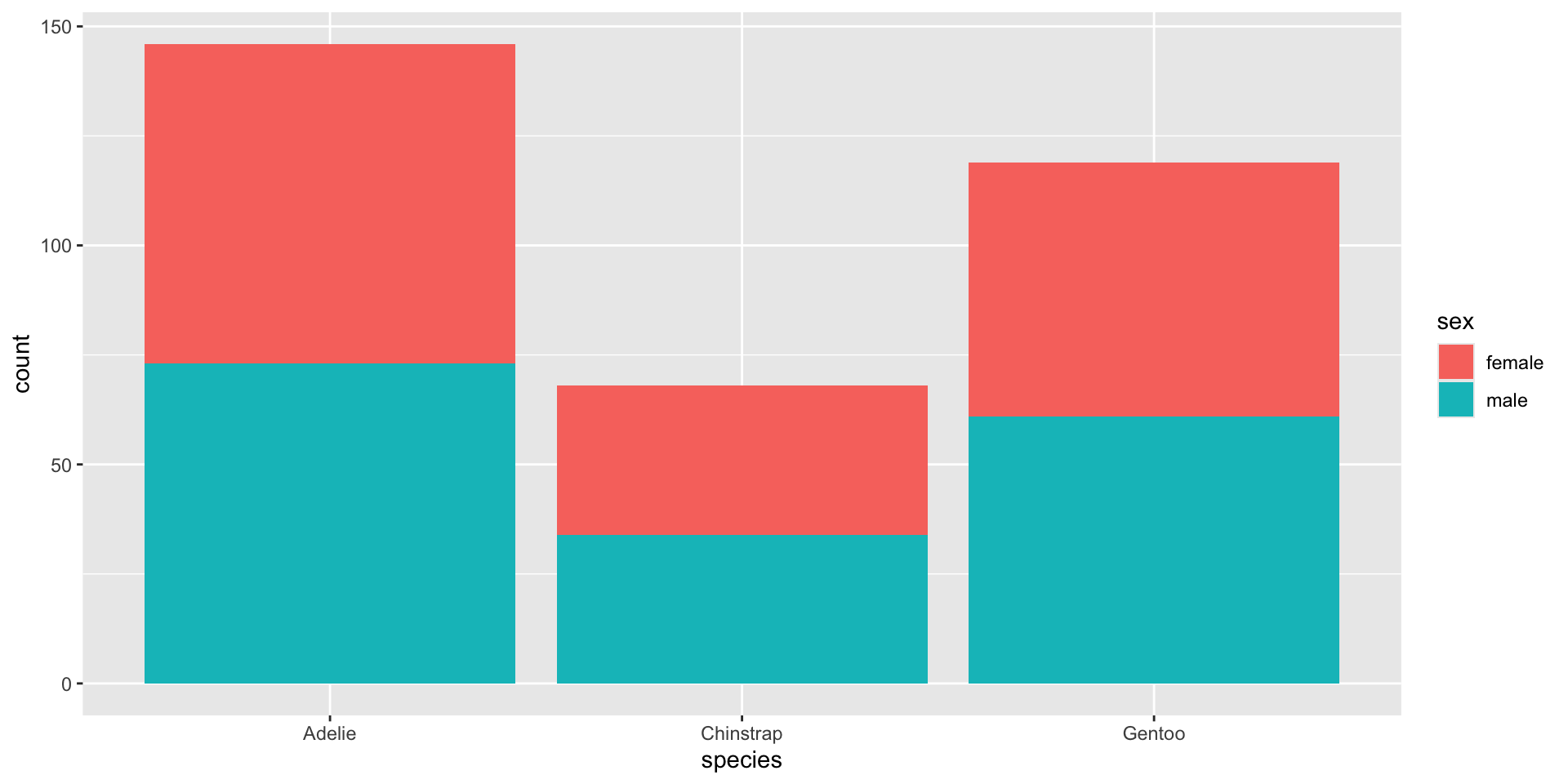
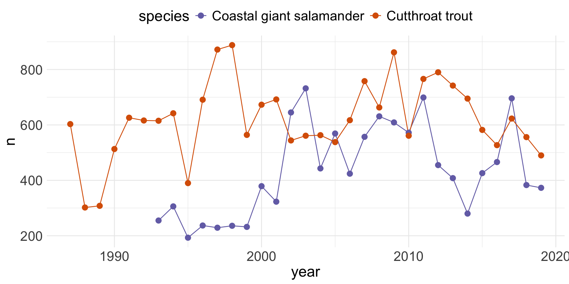
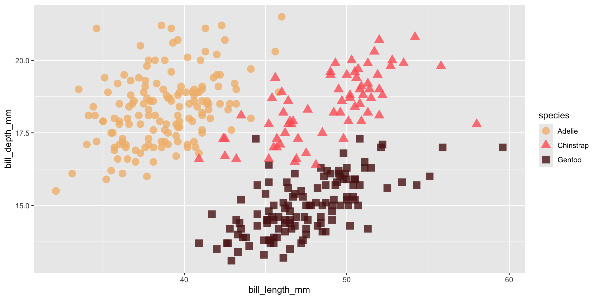
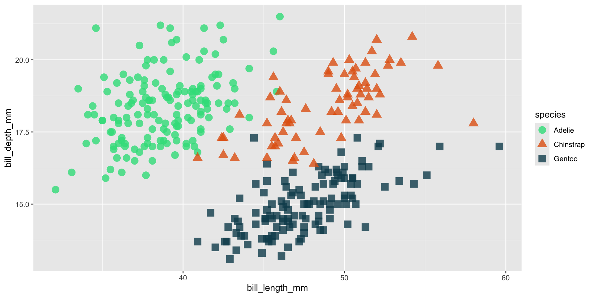
We should always be consistent with our colors. E.g. if Gentoo penguins are blue in one plot, they should be blue in all plots. Notice that our colors don’t “stick” with the species they represent, but rather they’re applied in the order that they appear in our palette:
my_palette <-c("#32DE8A", "#E36414", "#0F4C5C")
Adelie, Chinstrap & Gentoo penguins
ggplot(penguins, aes(x = bill_length_mm, y = bill_depth_mm, color = species)) +geom_point(size =4, alpha =0.8) +scale_color_manual(values = my_palette)
Just Adelie & Gentoo penguins
penguins |>filter(species !="Chinstrap") |>ggplot(aes(x = bill_length_mm, y = bill_depth_mm, color = species)) +geom_point(size =4, alpha =0.8) +scale_color_manual(values = my_palette)
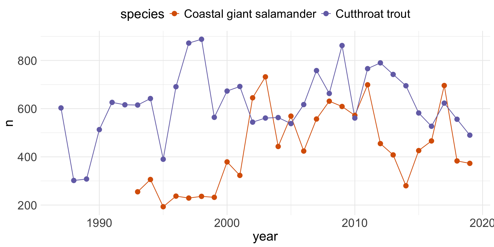
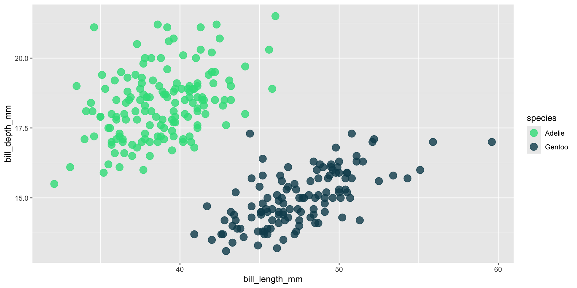
TIP: Set color names (2/2)
Setting the names of our vector elements (colors) ensures that they stick with those factor levels across all of our visualizations:
ggplot(penguins, aes(x = bill_length_mm, y = bill_depth_mm, color = species)) +geom_point(size =4, alpha =0.8) +scale_color_manual(values = my_palette_named)
Just Adelie & Gentoo penguins
penguins |>filter(species !="Chinstrap") |>ggplot(aes(x = bill_length_mm, y = bill_depth_mm, color = species)) +geom_point(size =4, alpha =0.8) +scale_color_manual(values = my_palette_named)
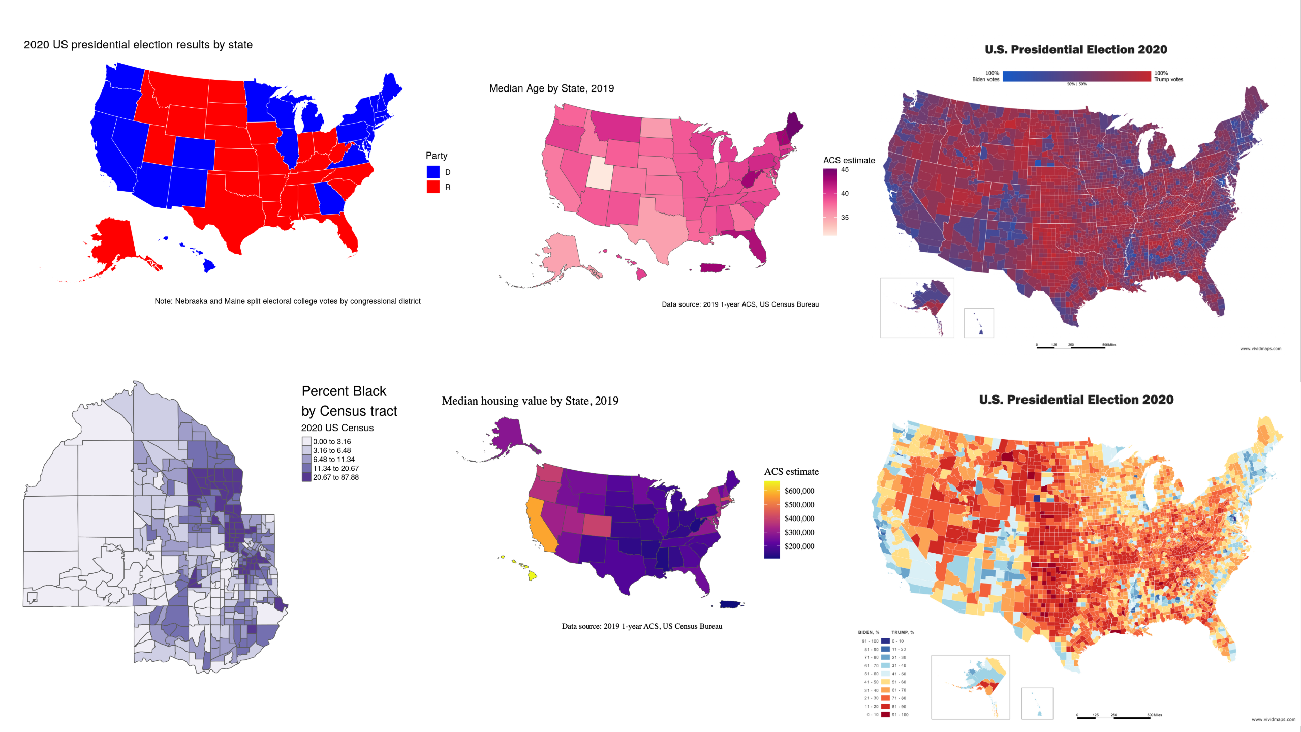
See if you can figure out some additional color “rules” by identifying how to improve the following data viz examples.
What can we improve?
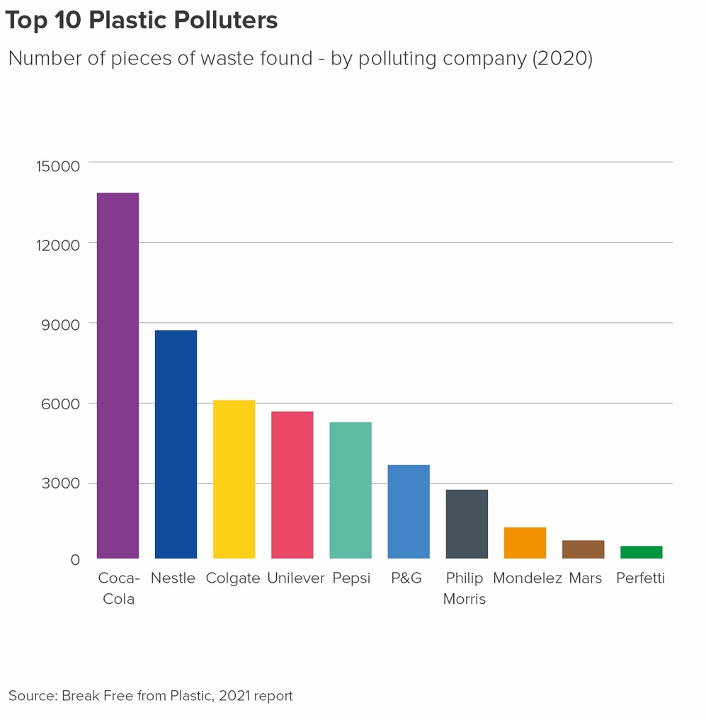
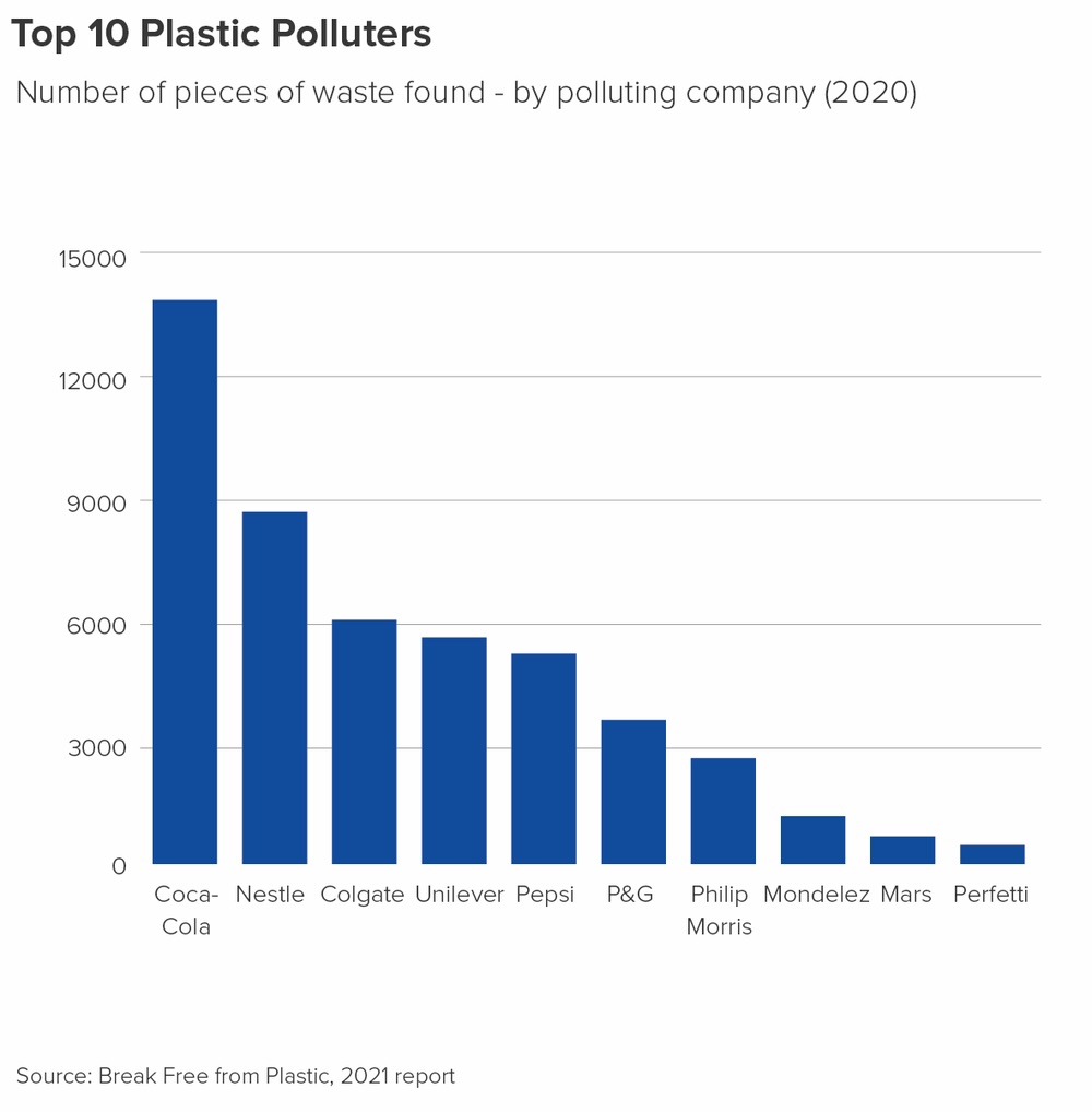
Don’t use color unnecessarily
The x-axis already identifies each bar, so adding color provides no additional information. Use color intentionally, and only when it communicates something meaningful!
What can we improve?
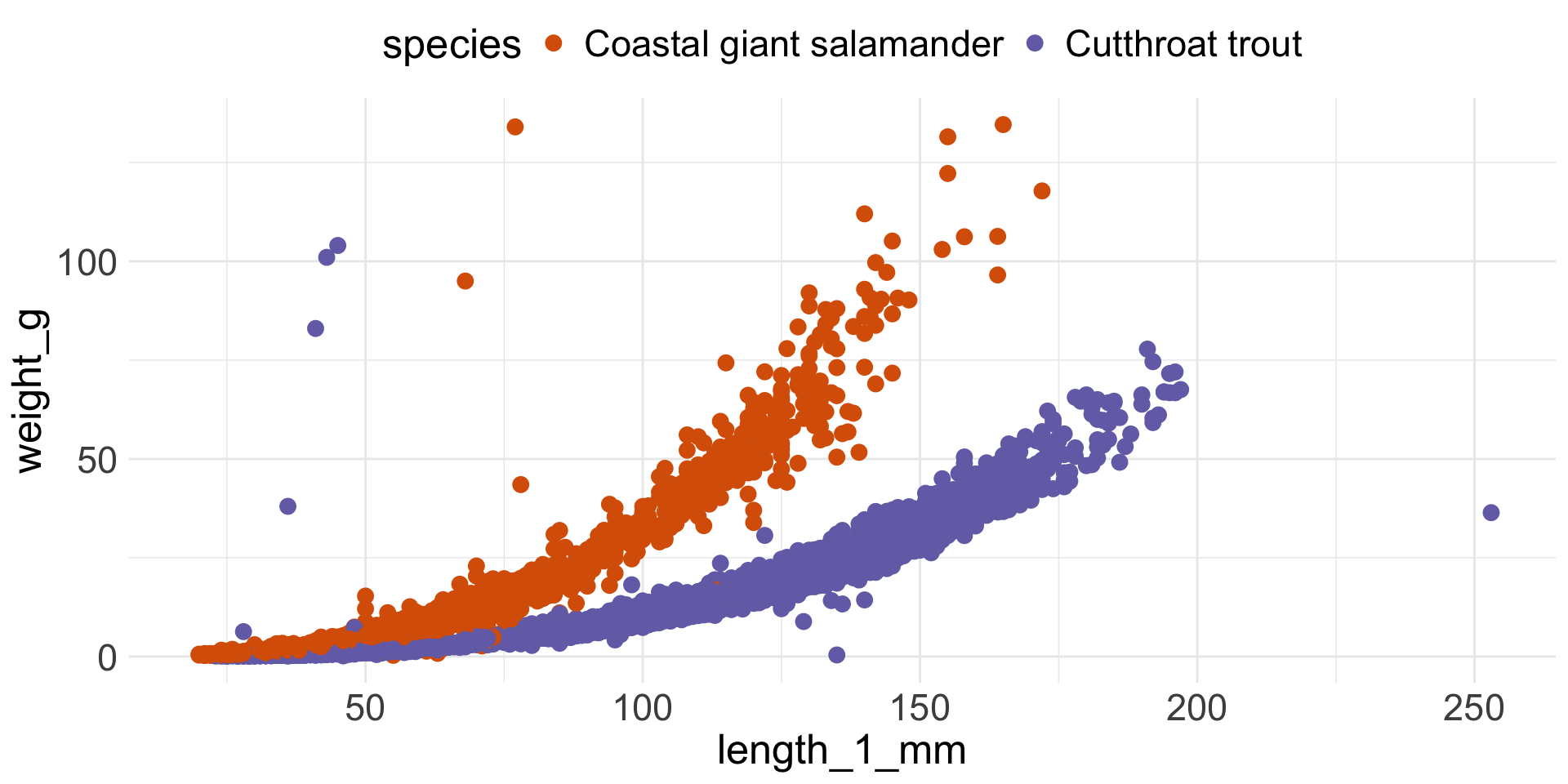
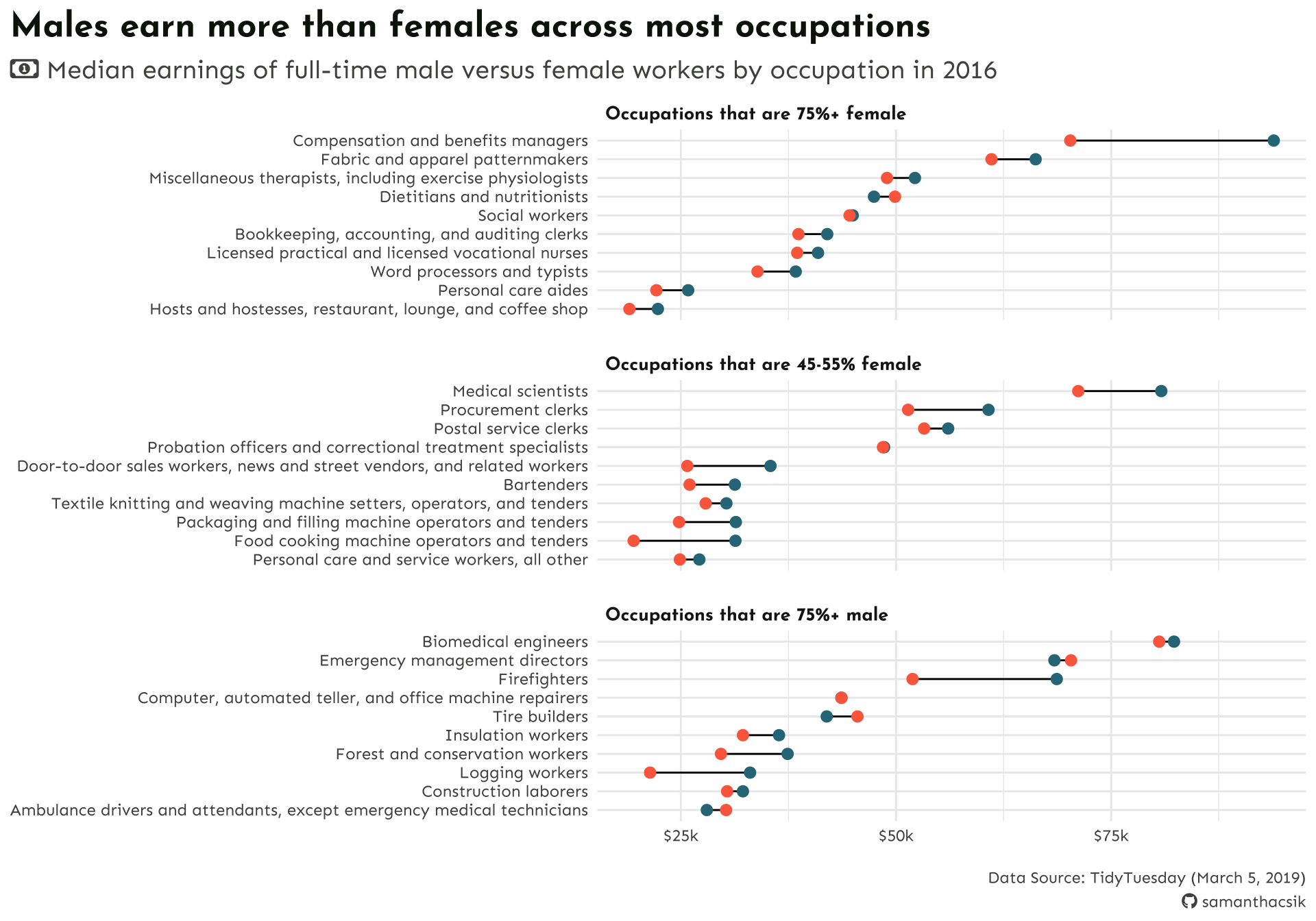
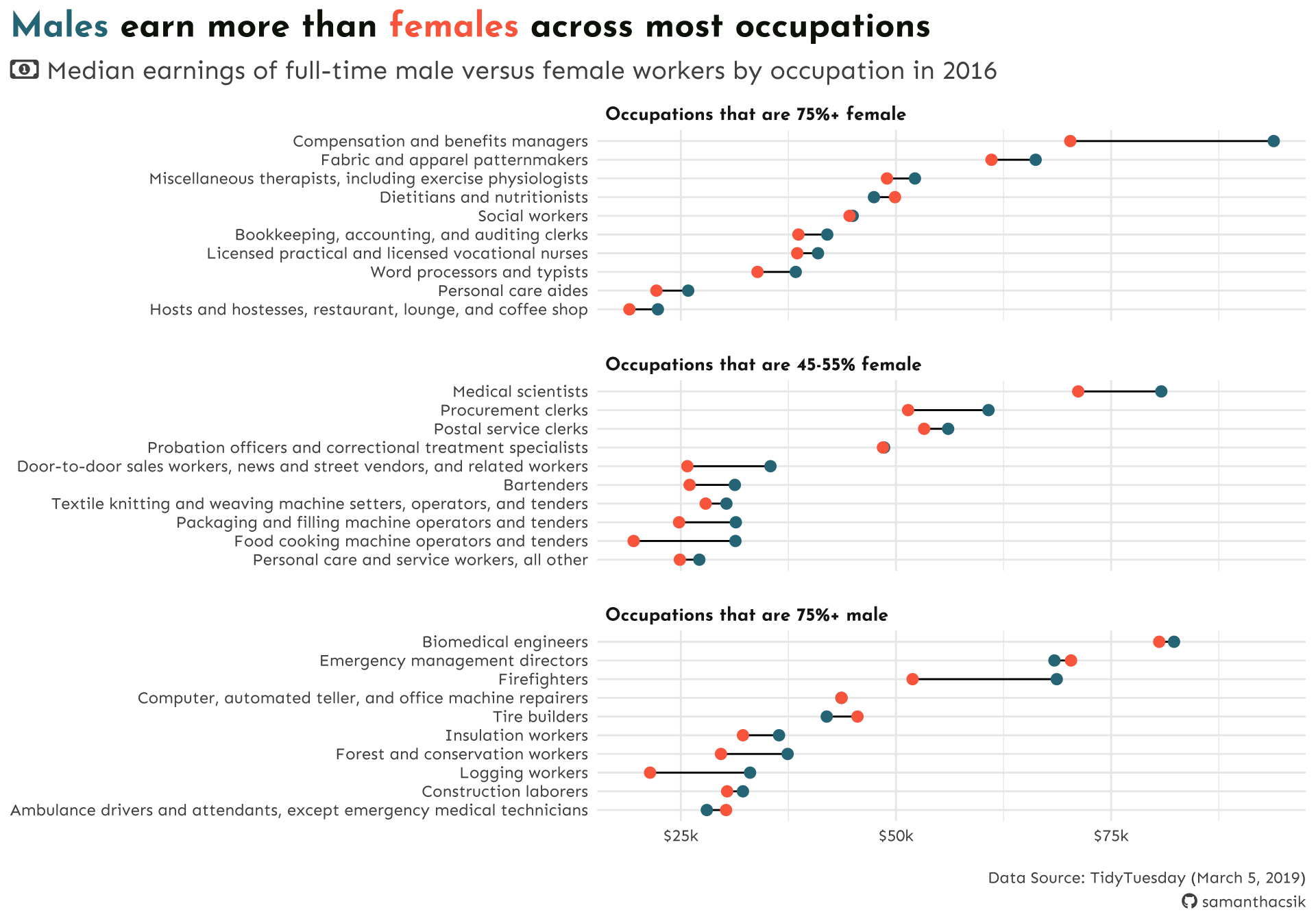
Use color consistently across visualizations
Ensure consistent use of colors across multiple visualizations that display the same groups.
What can we improve (for each of these charts)?
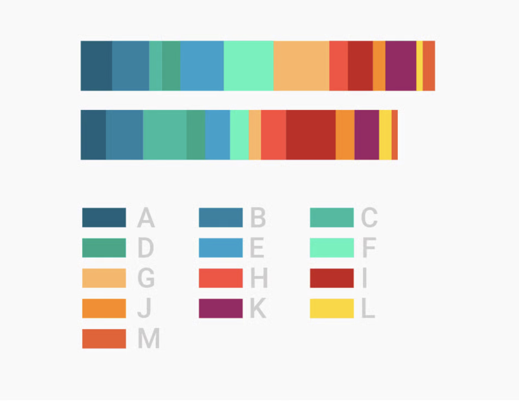
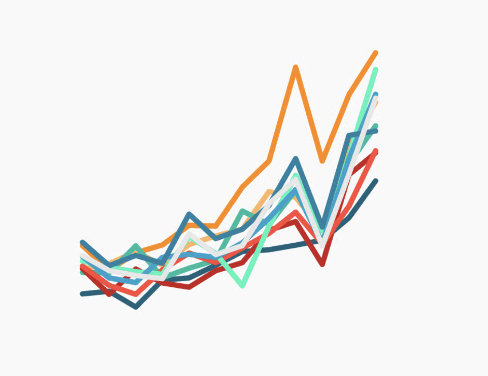
Don’t use too many (7+) colors in a single viz
The more colors you use, the more difficult to becomes to distinguish between groups. Consider an entirely different chart type, or use color to highlight the only the group(s) of interest. | “Consider the color grey as the most important color in Data Vis.” -Lisa Charlotte Muth
What can we improve?
Always explain what your colors encode
Always include a color key, in the form of a traditional legend or otherwise.
What can we improve?
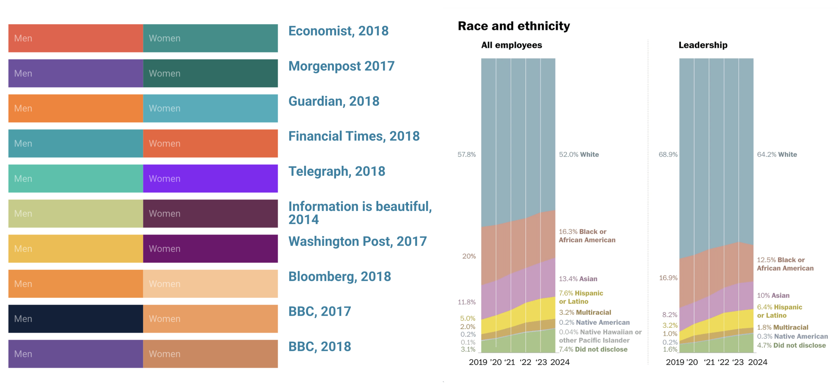
Avoid stereotypes
Many newsrooms avoid pink/blue altogether, but choices are not consistent | Avoid steretypical skin colors, don’t use gray for “other” or “multiracial” categories, use less saturated colors (saturated colors have strong associations, e.g. green as positive or right, red as dangerous or important), and keep shuffling your colors!
What can we improve?
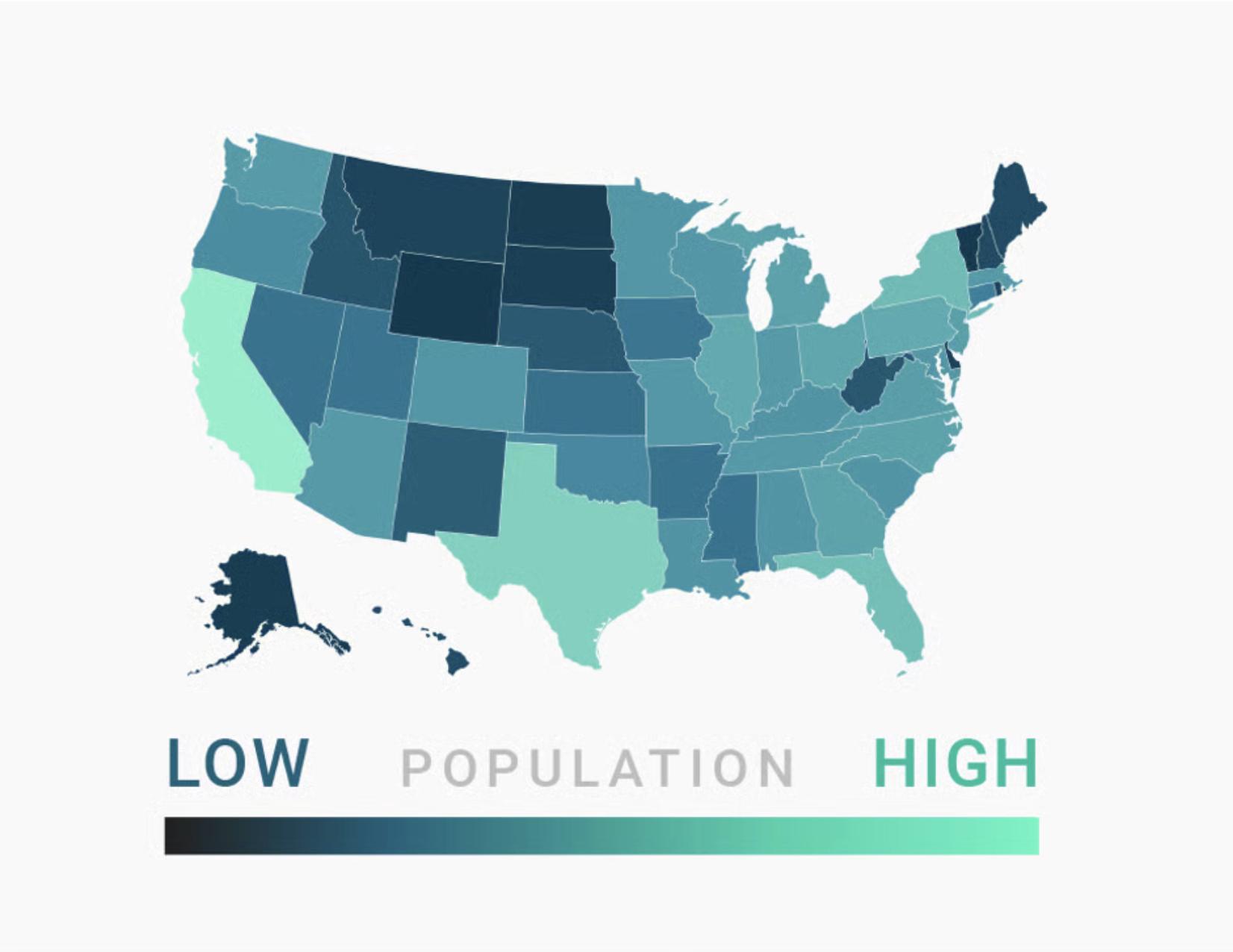
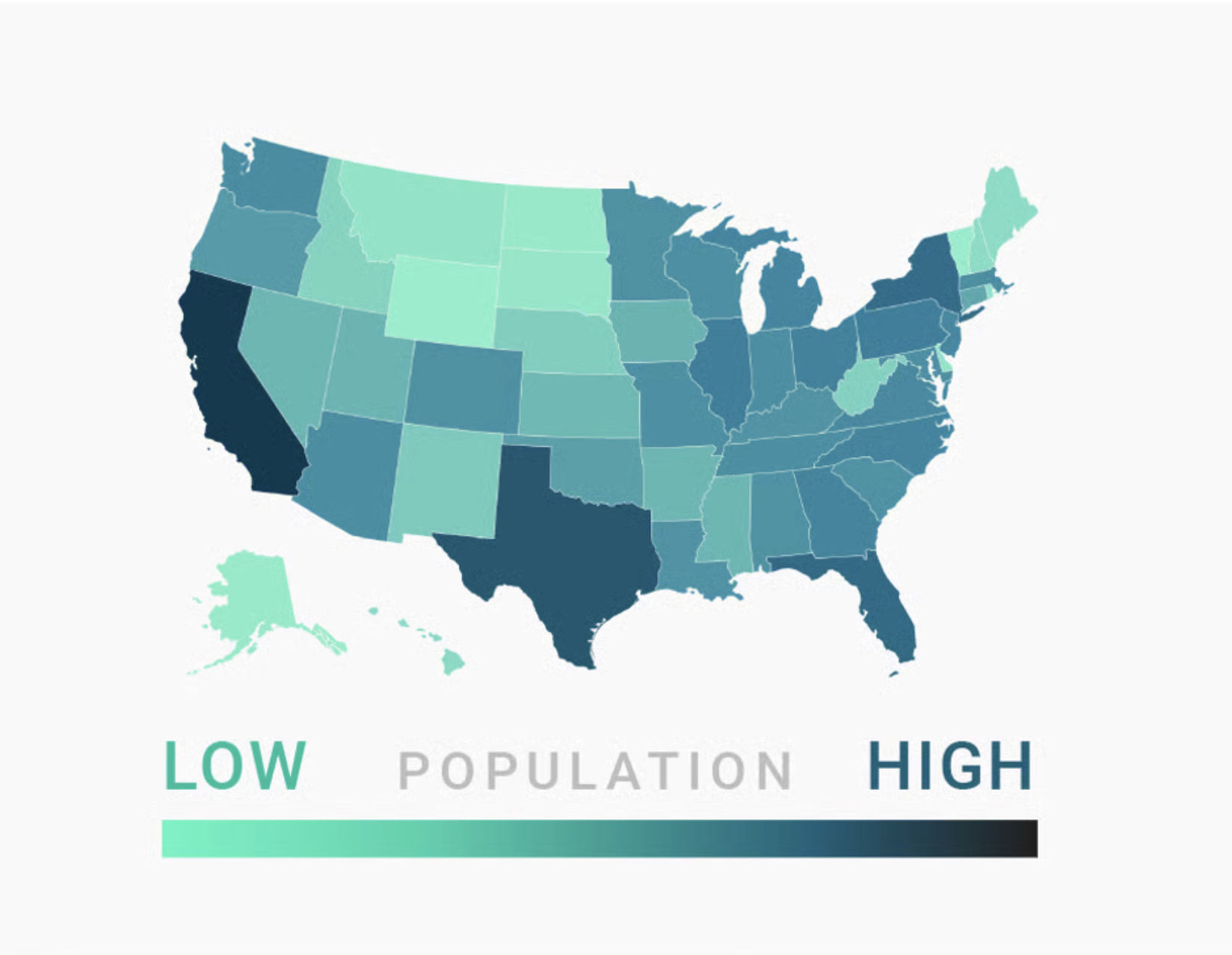
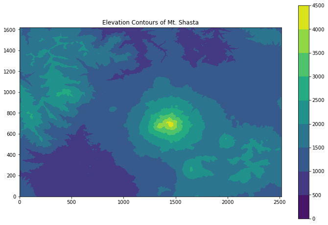
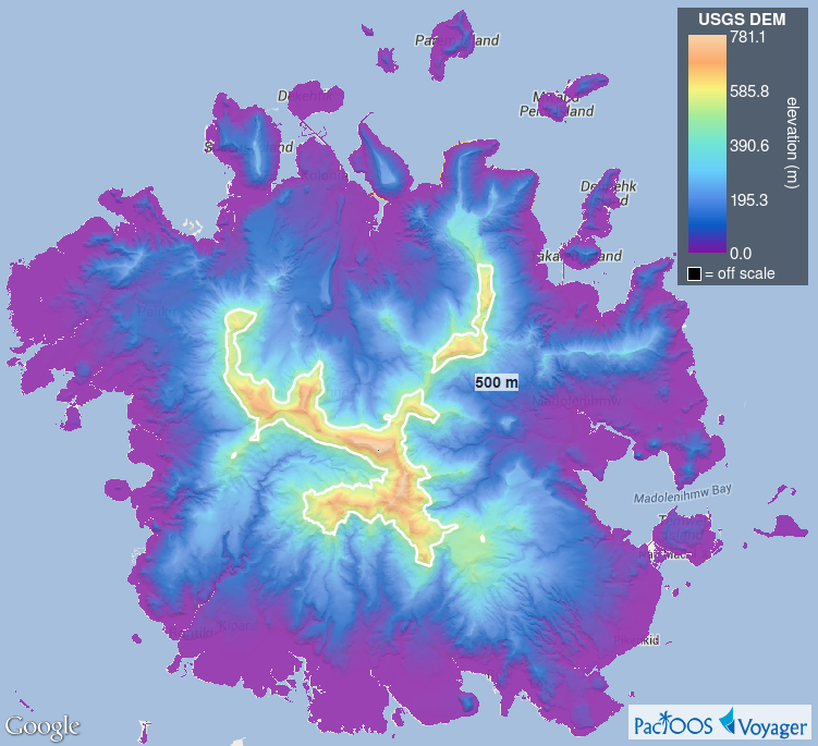
Bright = Low, Dark = High
In most cases, readers will associate bright colors with lower values and darker colors with higher values. Build gradients accordingly.
Except in some cases. . .
“humans perceive bright colors on elevation maps to represent a high altitude, with darker colors representing naturally low-lying and shady areas like valley” (Cédric Scherer, Colors and Emotions in Data Visualization)
Filled contour plot of Mt. Shasta. Image source: EarthLab
USGS Digital Elevation Model of Pohnpei (Micronesia). Image source: PacIOOS
What can we improve?
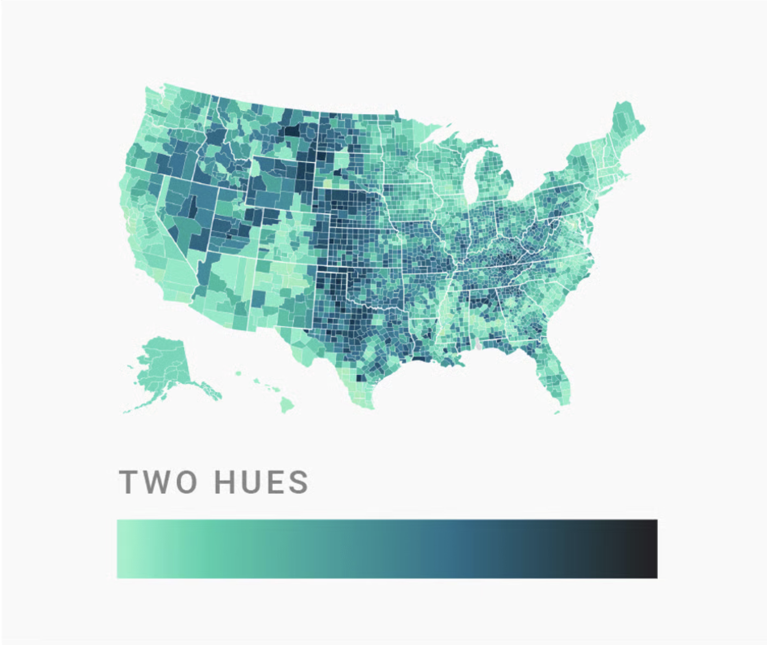
Use lightness (and ~2 hues) to build gradients
Color gradients should transition from a bright color (e.g. white) to a dark color (e.g. dark blue) in a consistent way, and they should work in black and white. Readers are also generally better able to distinguish colors on a gradient better if they are encoded through both lightness and two (sometimes three) carefully-selected hues.

 :
: :
: :
: