-from Wikipedia
EDS 240: Lecture 1.2
Data visualization: an intro
Week 1 | January 6th, 2025
What is data visualization?
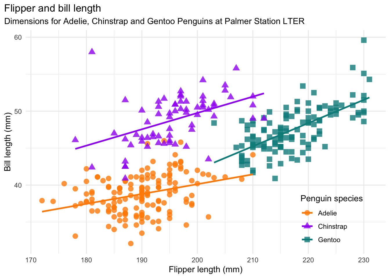
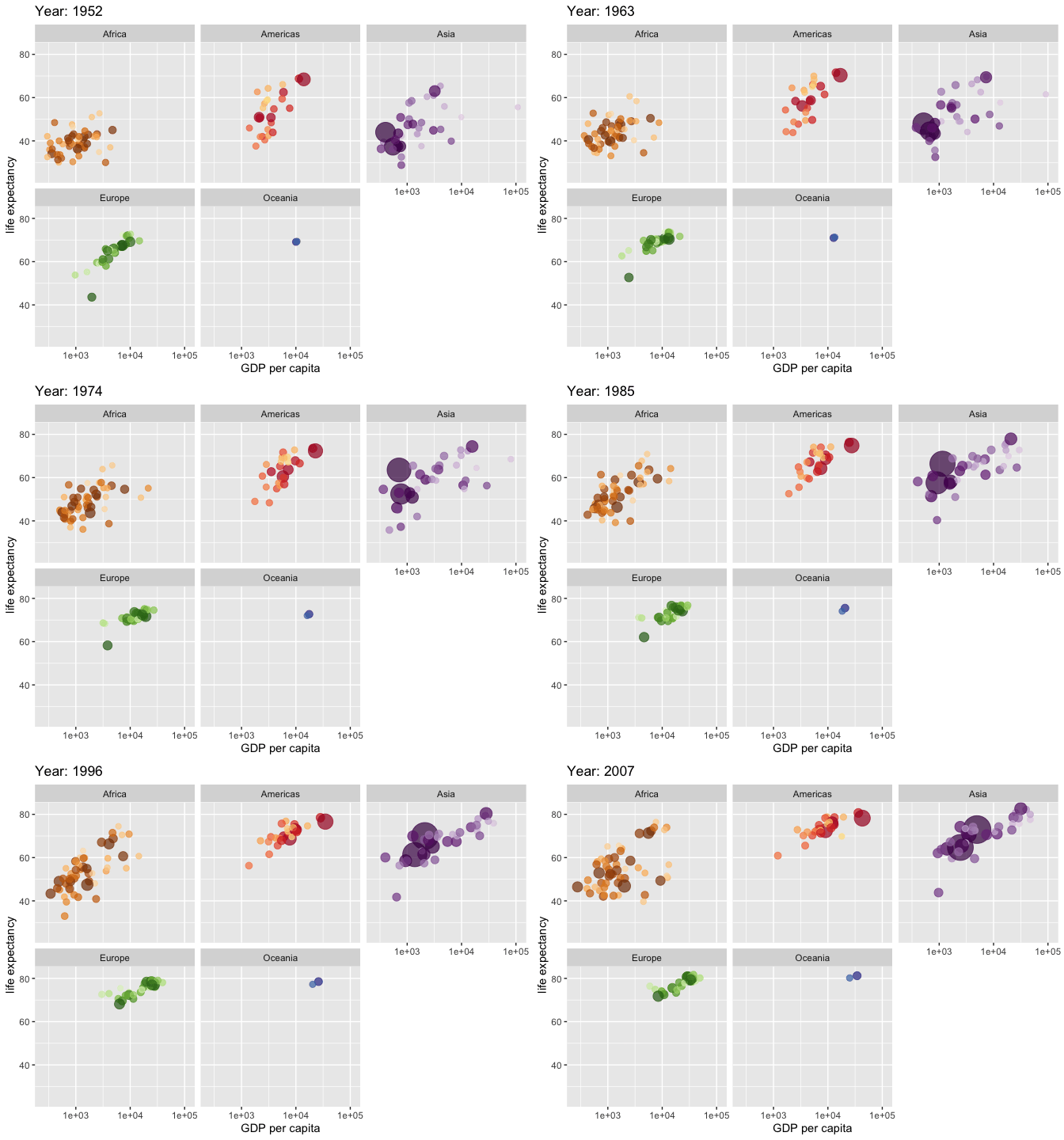
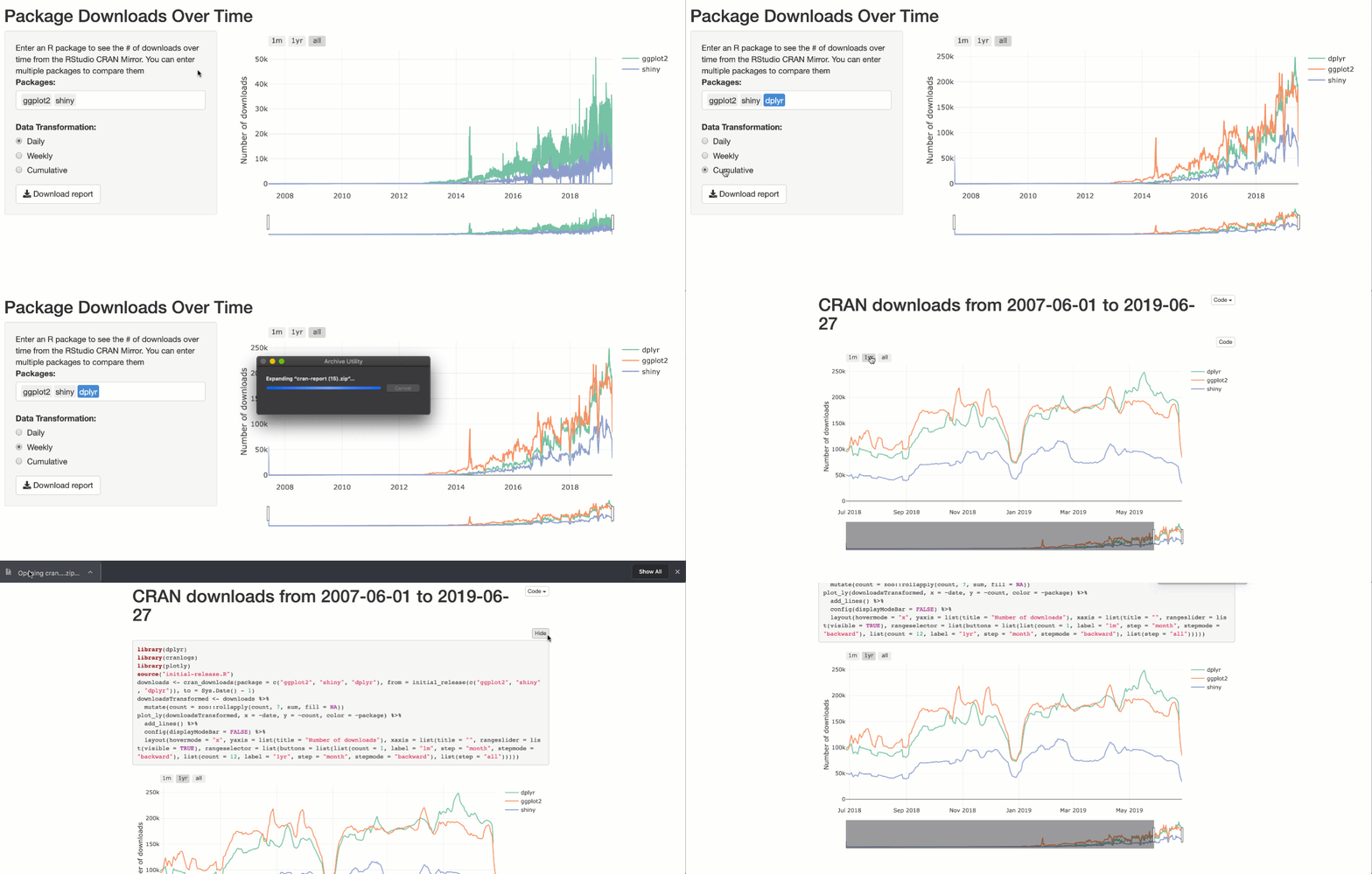
“…the practice of designing and creating easy-to-communicate and easy-to-understand graphic or visual representations of a large amount of complex quantitative and qualitative data and information with the help of static, dynamic or interactive visual items.”
-from Wikipedia

What is data visualization?
“any graphical representation of information and data”
“part art and part science”
(A little bit of the) History of data visualization
16,500 years ago, Pleistocene
The Lascaux Cave Paintings are thought to be some of the first charted stars and constellations.
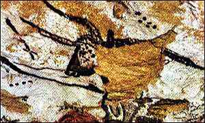
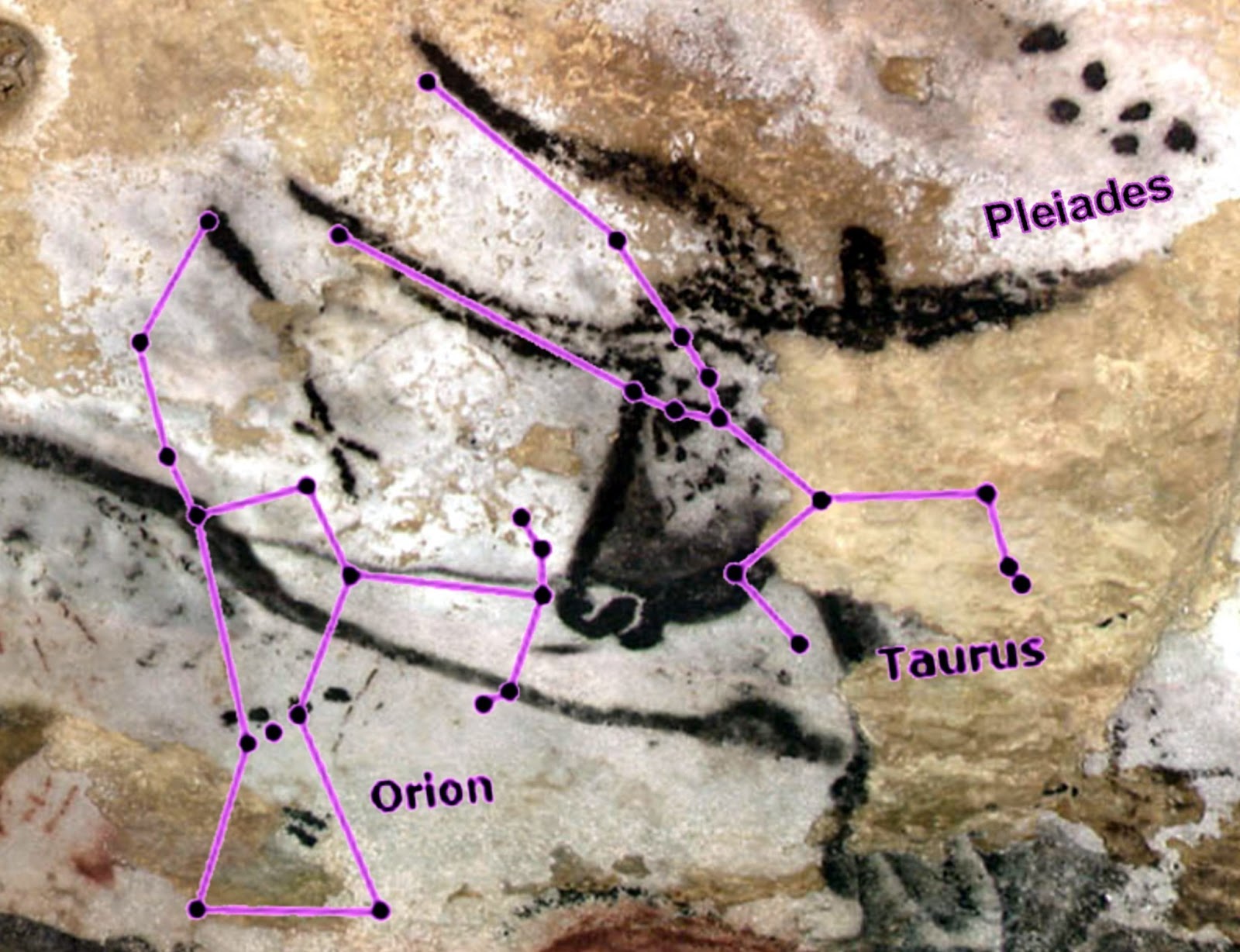
Sources: BBC & Rock Art Blog
16,500 years ago | ~1150 BC | 1400 - 1532 AD | 1644 | 1786 | 1846 | 1856 | 1869 | 1900 | modern day
(A little bit of the) History of data visualization
~1150 BC
Oldest known geologic map, the Turin Papyrus Map, depicts a dry riverbed (Wadi Hammamat) and major mining region in Egypt’s Eastern Desert.
Source: Wikipedia
16,500 years ago | ~1150 BC | 1400 - 1532 AD | 1644 | 1786 | 1846 | 1856 | 1869 | 1900 | modern day
(A little bit of the) History of data visualization
1400 - 1532 AD
Quipus (kee-poos) were recording devices used by the Inca Empire for data collection, census records, calendaring, etc.
Source: Smithsonian
16,500 years ago | ~1150 BC | 1400 - 1532 AD | 1644 | 1786 | 1846 | 1856 | 1869 | 1900 | modern day
(A little bit of the) History of data visualization
1644
Michael Florent van Langren, Flemish astronomer, created the first (known) statistical graph showing differences in estimates of longitudinal distance between Toledo and Rome.
Source: Wikipedia
16,500 years ago | ~1150 BC | 1400 - 1532 AD | 1644 | 1786 | 1846 | 1856 | 1869 | 1900 | modern day
(A little bit of the) History of data visualization
1786
William Playfair, Scottish engineer and political economist, is credited as the creator of the first bar chart (featuring Scottish trade data, 1780 - 1781), as well as line and pie charts.
Source: Wikipedia
16,500 years ago | ~1150 BC | 1400 - 1532 AD | 1644 | 1786 | 1846 | 1856 | 1869 | 1900 | modern day
(A little bit of the) History of data visualization
1846
Emma Hart Willard, America’s first professional female cartographer, created the Temple of Time, which depicts the fall and rise of empires throughout history. It won a medal at the 1851 World’s Fair in London.
Source: The Marginalian
16,500 years ago | ~1150 BC | 1400 - 1532 AD | 1644 | 1786} | 1846 | 1856 | 1869 | 1900 | modern day
(A little bit of the) History of data visualization
1856
Florence Nightingale was an English wartime nurse who campaigned to improve sanitary conditions of military hospitals. The Diagram of the Causes of Mortality in the Army of the East shows that deaths from preventable diseases (blue) outnumbered combat fatalities (red) in military hospitals in 1854 & early 1855.
Source: Scientific American
16,500 years ago | ~1150 BC | 1400 - 1532 AD | 1644 | 1786} | 1846 | 1856 | 1869 | 1900 | modern day
(A little bit of the) History of data visualization
1869
Charles Minard, a French civil engineer, produced what is referred to as, “the greatest visualization created.” Napoleon’s Russian Campaign displays 6 types of data in 2D (# troops, distance traveled, temperature, lat / lon, direction of travel, location relative to specific dates).
Source: Wikipedia
16,500 years ago | ~1150 BC | 1400 - 1532 AD | 1644 | 1786} | 1846 | 1856 | 1869 | 1900 | modern day
(A little bit of the) History of data visualization
1900
W.E.B. DuBois, was an African American writer, scholar and activist. He used photographs and data visualizations to commemorate the lives of African Americans at the turn of the century and challenge the racist caricatures and stereotypes of the day.
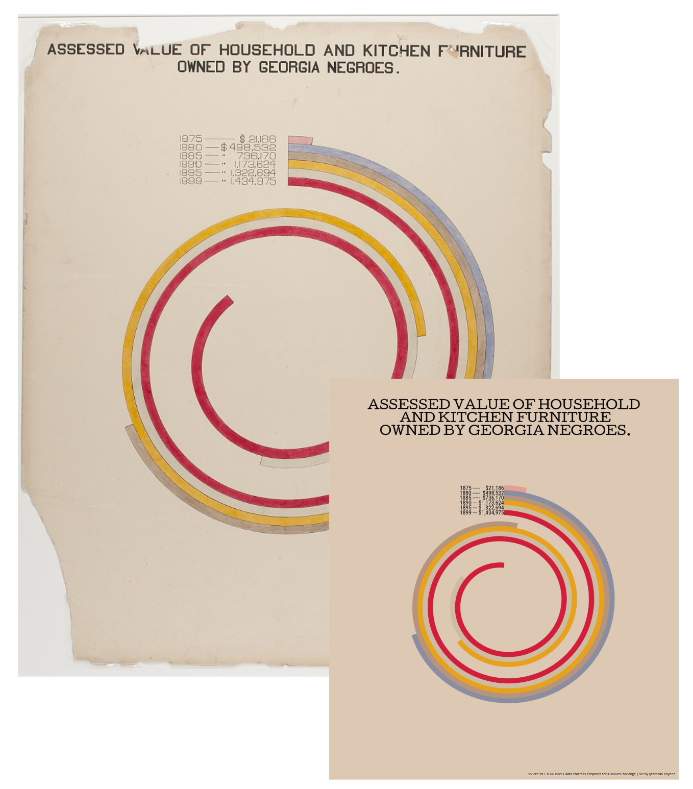
Assessed value of household and kitchen furnitures owned by Georgia Negroes Recreation by Ijeamaka Anyene for the 2021 #DuBoisChallenge
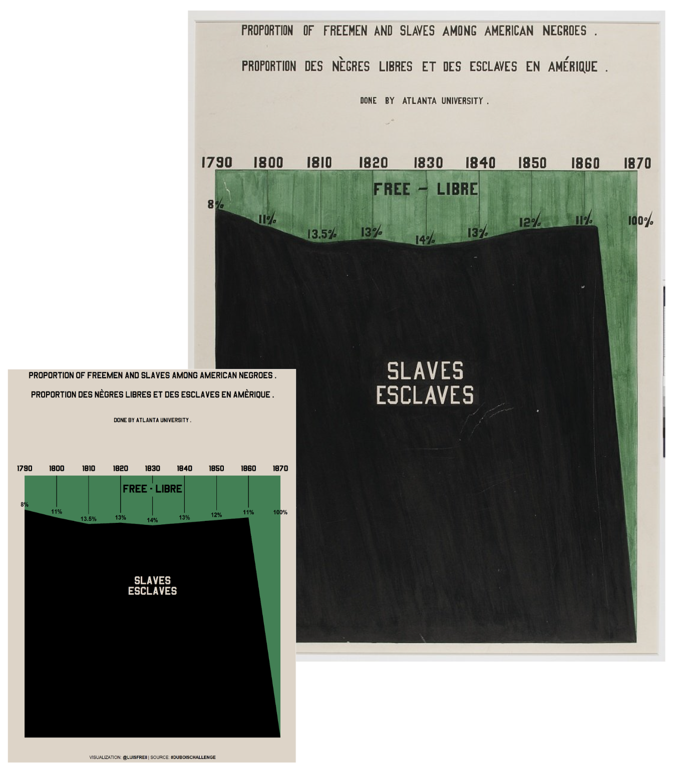
Proportion of Freemen and Slaves Among American Negroes. Recreation by Luis Freites for the 2021 #DuBoisChallenge. Source: Twitter
16,500 years ago | ~1150 BC | 1400 - 1532 AD | 1644 | 1786} | 1846 | 1856 | 1869 | 1900 | modern day
(A little bit of the) History of data visualization
The emergency of programming languages and tools in recent years has made data visualization design easier than every before.
16,500 years ago | ~1150 BC | 1400 - 1532 AD | 1644 | 1786} | 1846 | 1856 | 1869 | 1900 | modern day
Why do we visualize data?
Spend the next few minutes discussing with your Learning Partners, and if possible, pull up some example visualizations that demonstrate your thoughts / discussion points
03:00
. . . to answer questions / derive insights
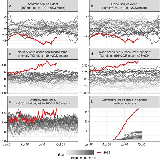
Fig Caption: Unusual climate anomalies in 2023 (the red line, which appears bold in print). Sea ice extent (a, b), temperatures (c–e), and area burned in Canada (f) are presently far outside their historical ranges. These anomalies may be due to both climate change and other factors. Sources and additional details about each variable are provided in supplemental file S1. Each line corresponds to a different year, with darker gray representing later years.
A nice Twitter thread on key takeaways from the above paper
. . . to explore & generate new questions
“Exploratory data analysis (EDA) is not a formal process with a strict set of rules. More than anything, EDS is a state of mind…you should feel free to investigate every idea that occurs to you. Some of these ideas will pan out, and some will be dead ends. As your exploration continues, you will hone in on a few particularly productive insights that you’ll eventually write-up and communicate to others.”
-Hadley Wickham, author of R for Data Science
. . . to identify trends
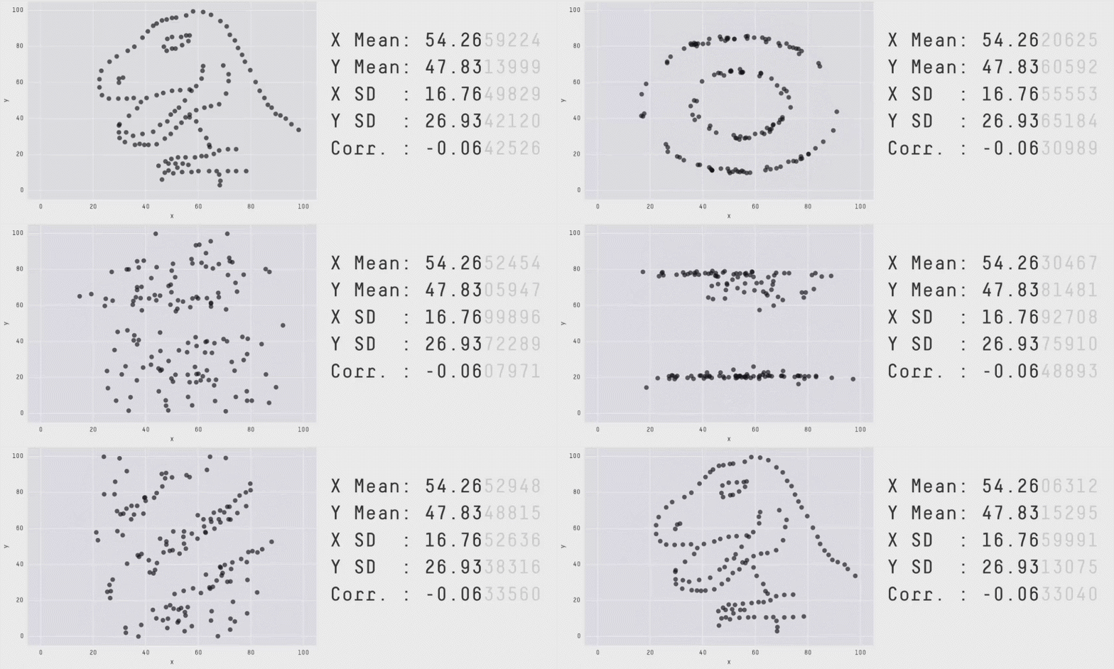
Same summary statistics, different distributions!
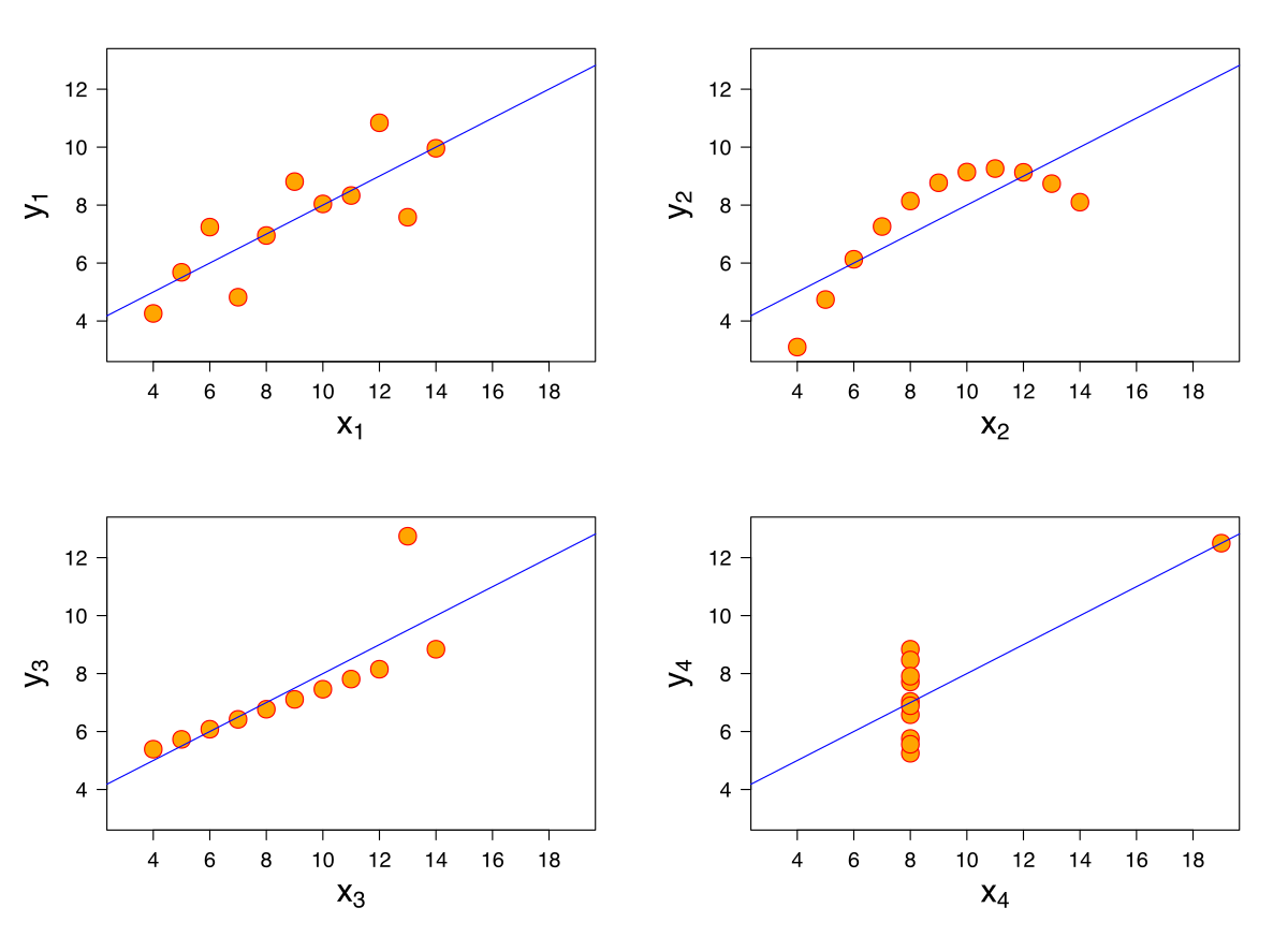
Anscombe’s Quartet
(Anscombe 1973)
Datasaurus Dozen
(Matejka & Fitzmaurice 2017, expanding upon Alberto Cairo’s Datasaurus)
. . . to prompt discussion
. . . to prompt discussion
gif created from Antti Lipponen’s Temperature Anomolies.
. . . to prompt discussion
gif created from Mark SubbaRao’s Climate Spiral. For a similar visualization with accompanying {ggplot2} code, see Nicola Rennie’s TidyTuesday contribution!
. . . to create art / tell a story


Patchwork Kingdoms, by Nadieh Bremer portraying the “digital divide” in schools across the world
. . . to create art / tell a story
To enlarge, Right click > Open Image in New Tab
Find the data on the TidyTuesday repo
Vertices of Visualization
Vertices of Communication by Alberto Cairo, as presented by Cédric Scherer during his 2022 Graphic Design with ggplot2 workshop (slides)
Why R for data viz?
{ggplot2} extensions)

Take a Break
~ This is the end of Lesson 2 (of 3) ~
05:00