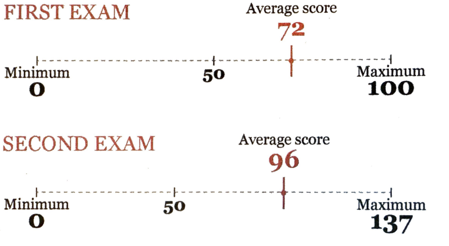
Alberto Cairo’s visualization of the scores from Thaler’s exam case study, from The Truthful Art
EDS 240: Lecture 2.1
Choosing the right graphic form
Week 2 | January 13th, 2024
We understand complex numbers better when they’re represented visually
“Exams will have a total of 137 points rather than the usual 100. This scoring system has no effect on the grade you get in the course, but it seems to make you happier”
-Richard H. Thaler, economist & professor

Alberto Cairo’s visualization of the scores from Thaler’s exam case study, from The Truthful Art
Vision is our most well-developed sense
Mapping data into visual properties is powerful
Mapping?
How values of a variable(s) of interest are represented by visuals (e.g height of bar, shaded region of area plot, color of data points)
How do you choose the right graphic form to represent your data?
“If I had the answer to that, I’d be rich by now…I have no idea, but I can give you some clues to make your own choices based on what we know about why and how visualization works”
-Alberto Cairo1, in his book, The Truthful Art
1Someone who, in fact, knows a lot about effectively visualizing data
Exercise: Map data to visual properties
02:00
Let’s say you want to compare unemployment rates of 5 countries: A, B, C, D, E (the actual values here are not important).
How would you map the unemployment rates to visual properties in a way that enables your readers to accurately compare values without having to read all the numbers?
Example adapted from Alberto Cairo’s, The Truthful Art
Different methods of encoding the same data
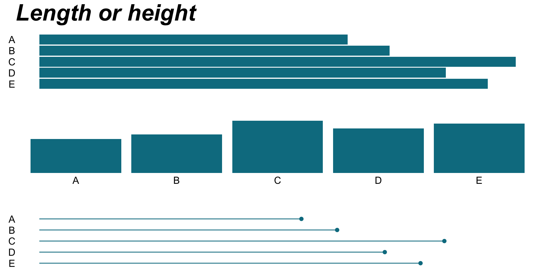
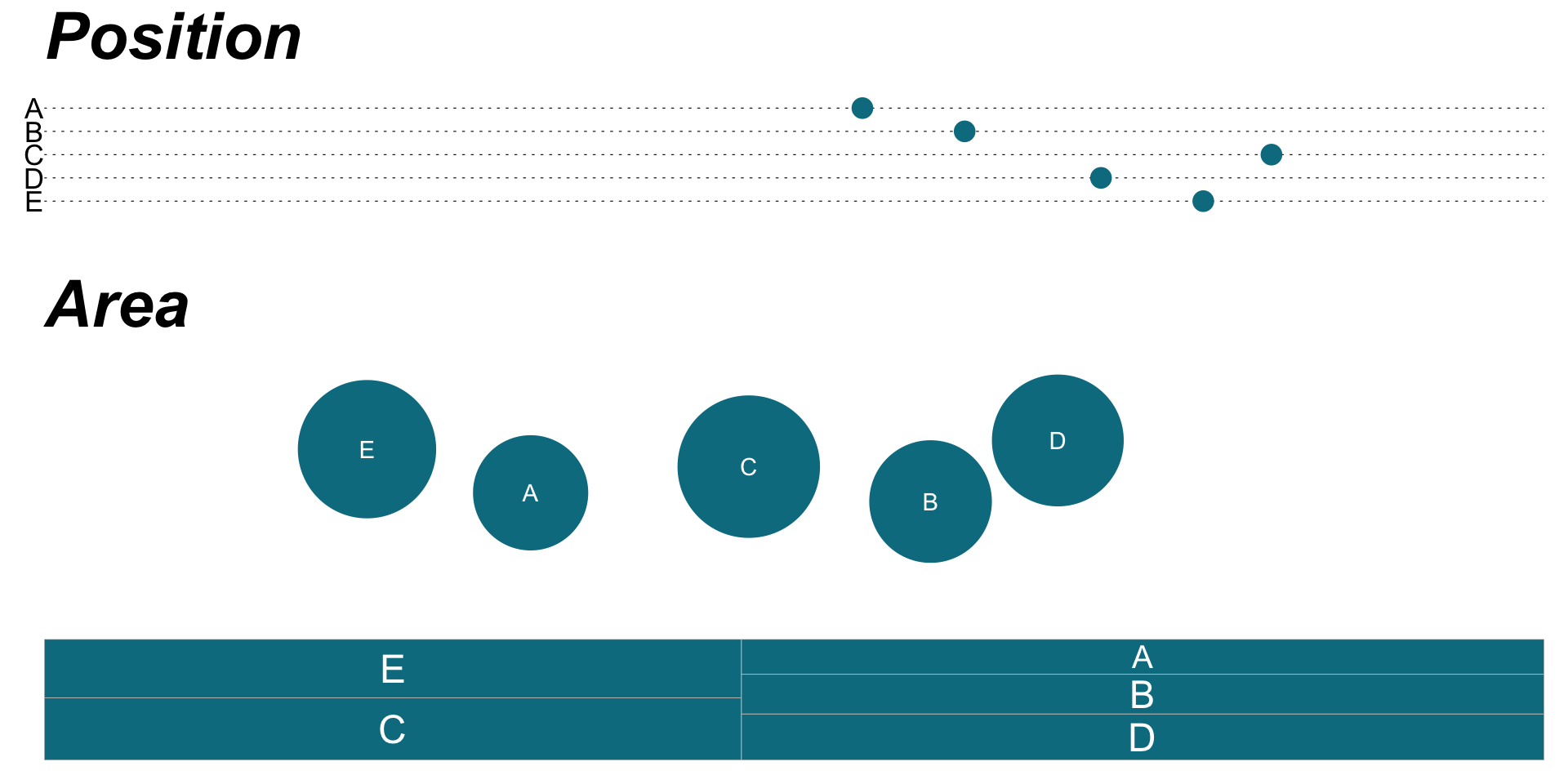
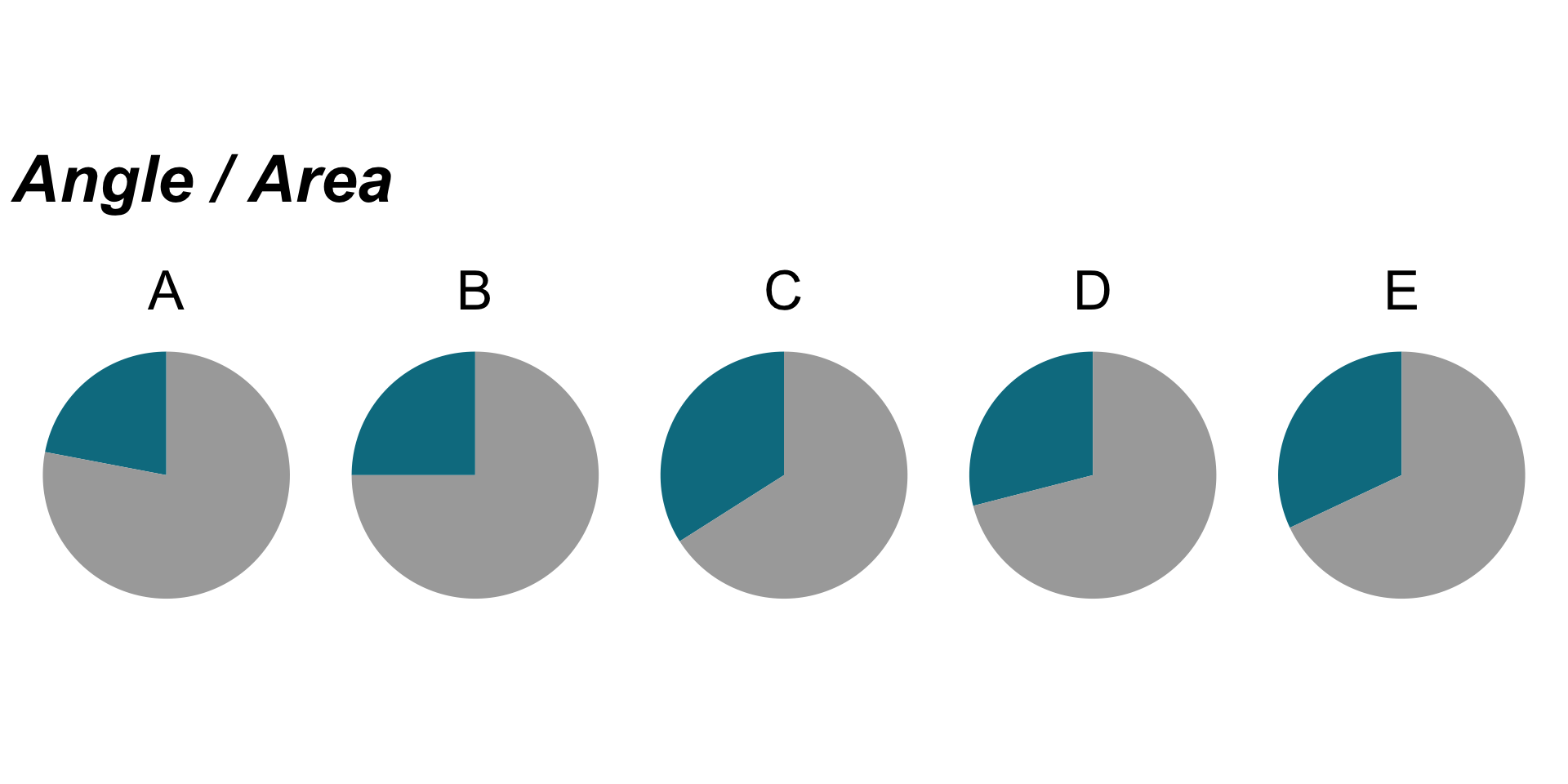
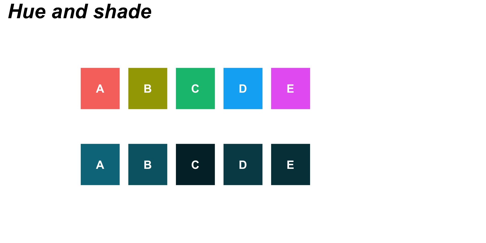
Graphs recreated based on Alberto Cairo’s example (Fig 5.2) in The Truthful Art
For all graphics: A (22%), B (25%), C (34%), D (29%), E (32%)
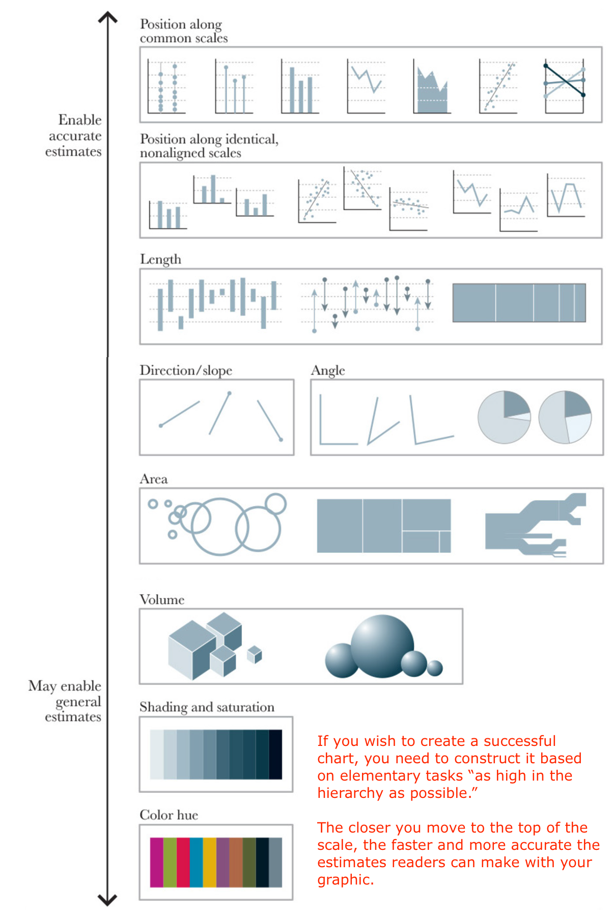
“Hierarchy of elementary perceptual tasks”
William S. Cleveland & Robert McGill (1984) Graphical Perception: Theory, Experimentation, and Application to the Development of Graphical Methods, Journal of the American Statistical Association, 79:387, 531-554, DOI: 10.1080/01621459.1984.10478080
a viewer performs one or more of these mental-visual tasks (judging position, perceiving angles / areas, etc.) to extract the values of real variables represented on most graphs
successful charts are constructed based on elementary tasks “as high in the hierarchy as possible”
Alberto Cairo’s recreation of Cleveland & McGill’s Hierarchy of Elementary Perceptual Tasks
Exercise: How many times bigger is the larger circle?
00:30
Exercise: How many times bigger is the larger bar?
00:30
Both the circles & rectangles differ by a magnitude of 7


Caveats to the hierarchy
1. Cleveland & McGill only considered statistical charts. What about data maps, for example, that rely on area / shading / hue, which fall lower on the hierarchy?
Caveats to the hierarchy - an example
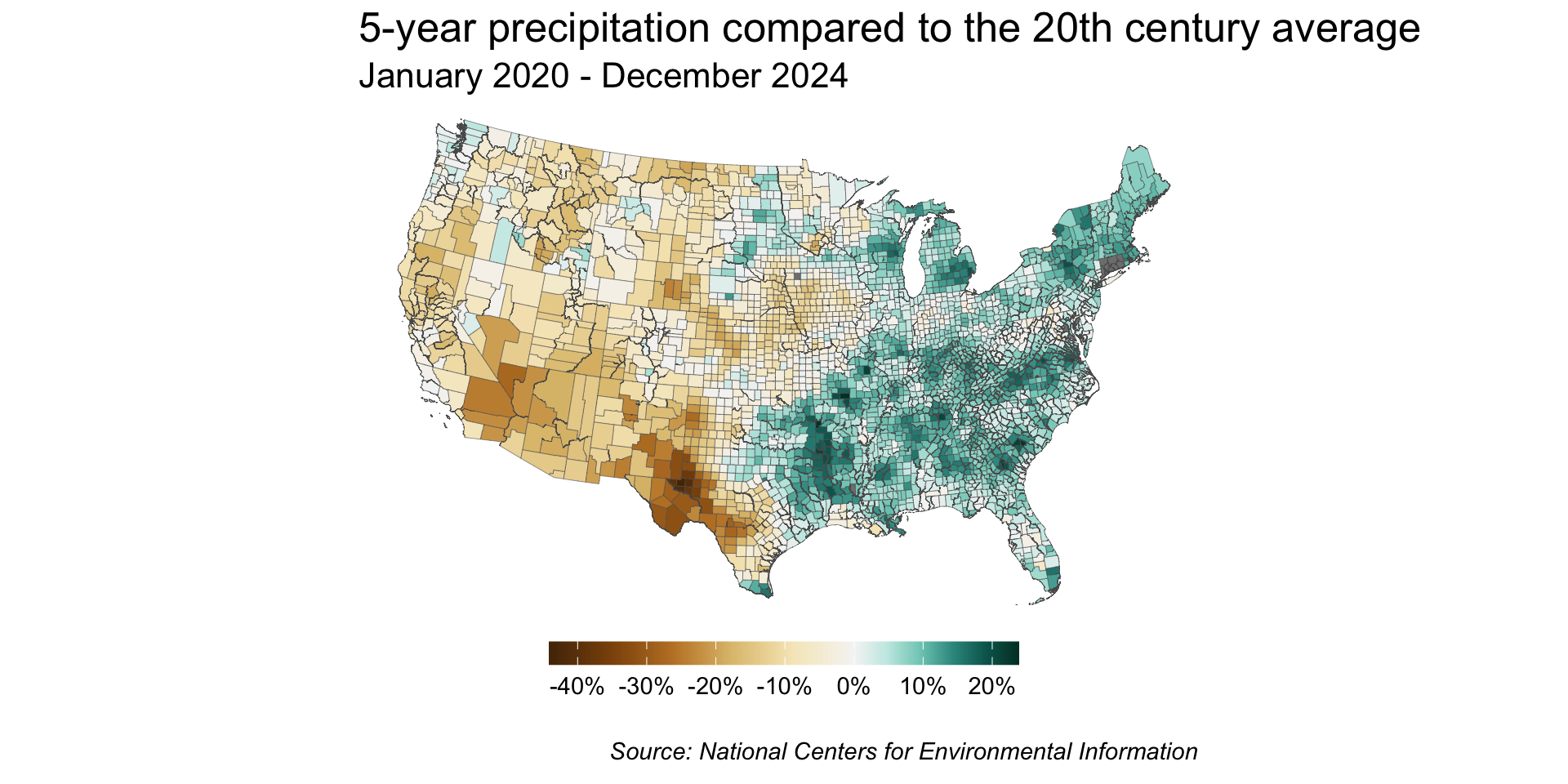
Lower scale methods can be appropriate when the goal is to reveal general patterns. For example, a choropleth map displays divided geographical areas / regions, which are colored in relation to a numeric variable.
Map created using precipitation data from NOAA’s National Centers for Environmental Information.
Caveats to the hierarchy
1. Cleveland & McGill only considered statistical charts. What about data maps, for example, that reply on area / shading / hue, which fall lower on the hierarchy?
2. No method of choosing a graphic form is perfect! It’s important to think critically about your graphic’s purpose and how best to represent your data to serve that purpose.
Caveats to the hierarchy - an example
Consider how you might display the same data in the following Sankey diagram, which depicts the flow of refugees in 2022, using graph types from the top of Cleveland & McGill’s hierarchy. What is the purpose of this chart?

Graphic recreated using the {networkD3} package following Louise E. Sinks’ blog post, TidyTuesday: Exploring Refugee Flow with A Sankey Diagram
Unique visualizations are important!
“Charts are often designed to persuade, educate, and motivate. Designing for serendipitous discovery, educational impact, hedonic response, or changes in behavior is in some cases only tangentially connected with the precision of a particular visualization”
Bertini E, Correll M, Franconeri S (2020) Why Shouldn’t All Charts Be Scatter Plots? Beyond Precision-Driven Visualizations. IEEE Visualization Conference (VIS), pp 206-210.
Tips for choosing the right graphic form
Most of the above tips are adapted from Alberto Cairo’s The Truthful Art
1. What task(s) to enable / message(s) to convey
2. Number of variables & data points, data types
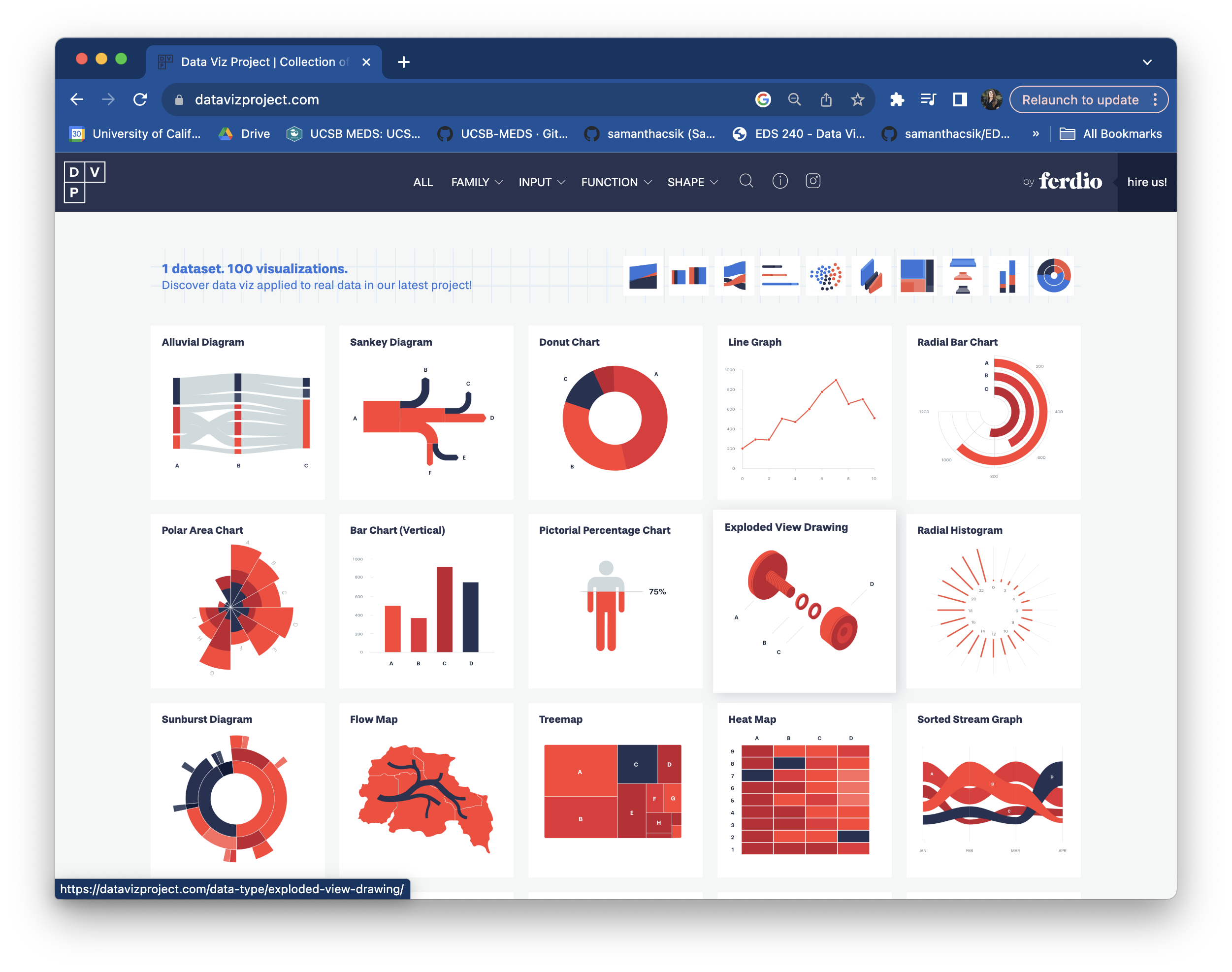
Data Viz Project displays one small data set 100 different ways
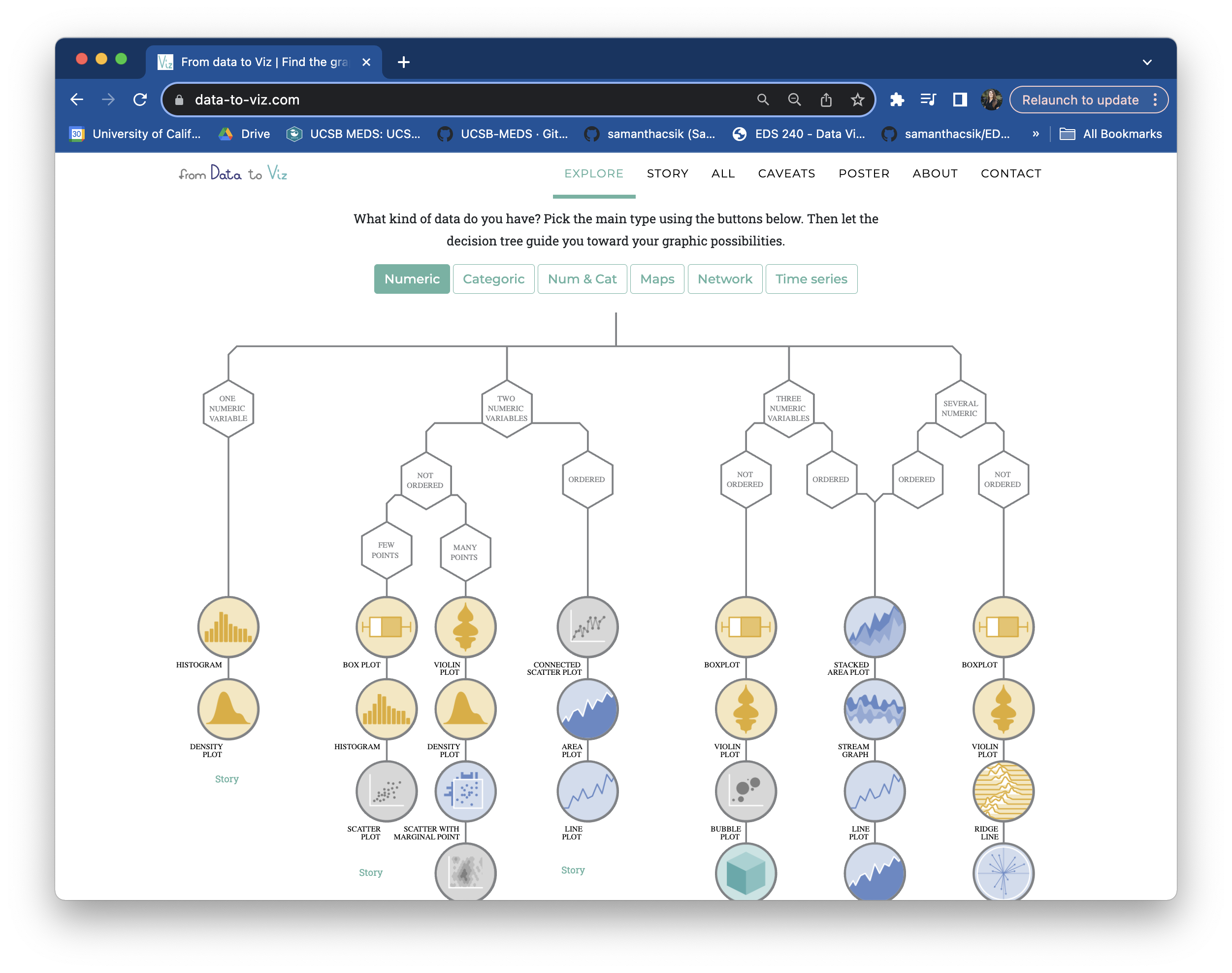
From Data to Viz search graphic types by data type or by function (+ R & Python Graph Gallery)
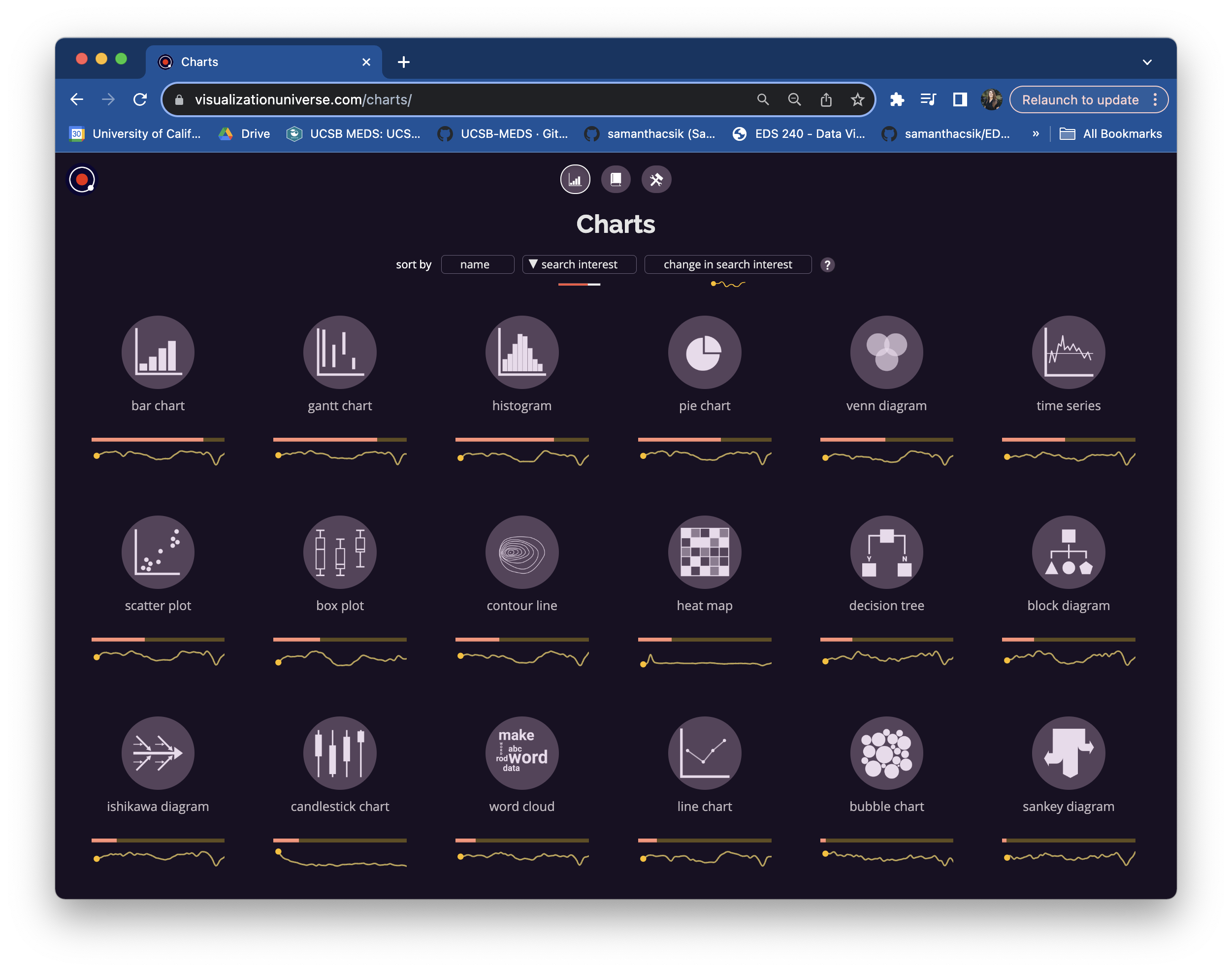
The Visualization Universe compares most popular graphic forms
Spend a couple minutes exploring these tools.
02:00
2. Number of variables & data points, data types
Quantitative data
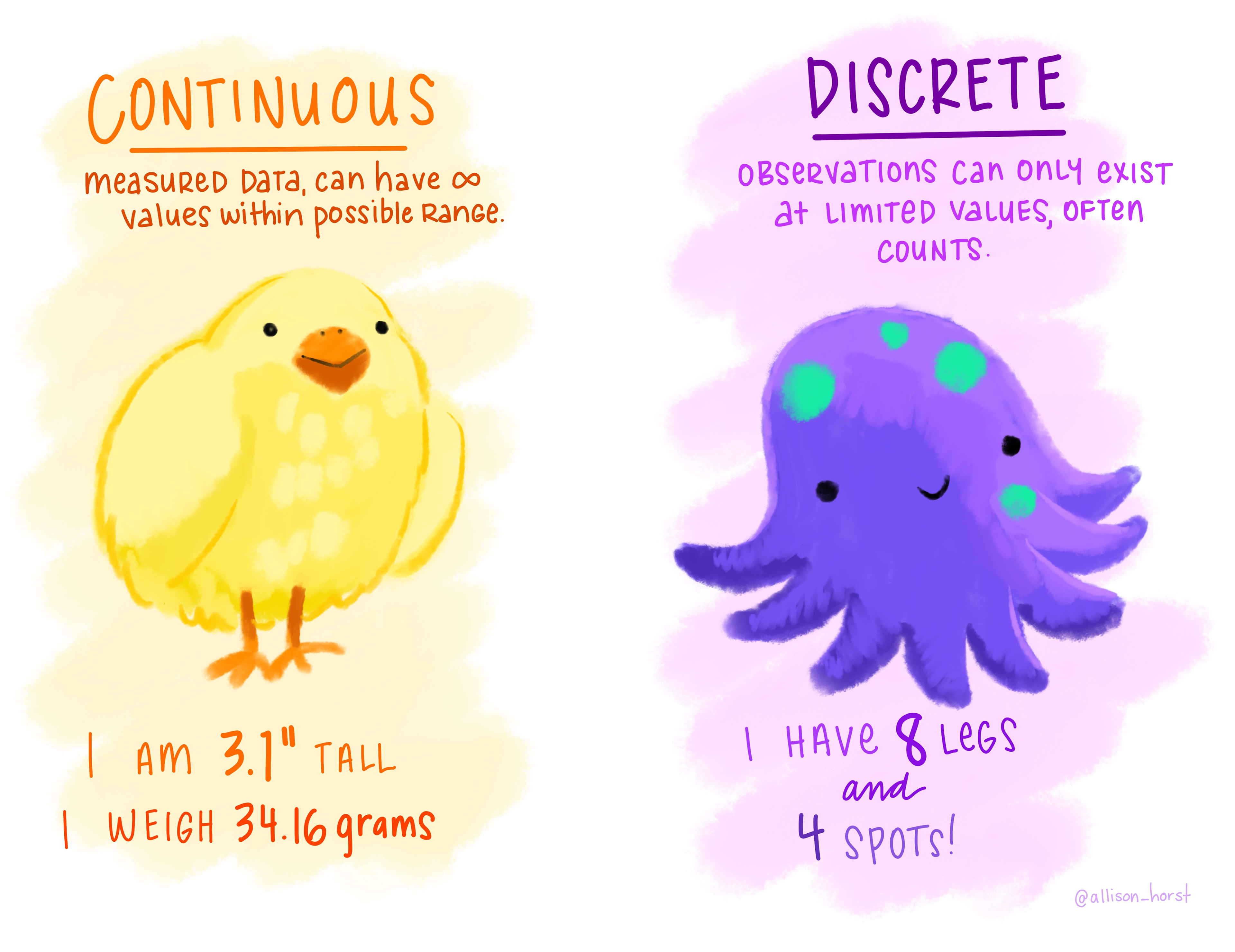
Continuous variables: temperature (10.6°C, 14.9°C, 8.1°C), rainfall (1.7”, 3.3”, 9.4”)
Discrete variables: # of species counted in a region (1, 4, 6), a county’s population size (1,578, 10,324, 540,013)
Art by Allison Horst
2. Number of variables & data points, data types
Quantitative data

Continuous variables: temperature (10.6°C, 14.9°C, 8.1°C), rainfall (1.7”, 3.3”, 9.4”)
Discrete variables: # of species counted in a region (1, 4, 6), a county’s population size (1,578, 10,324, 540,013)
Qualitative data
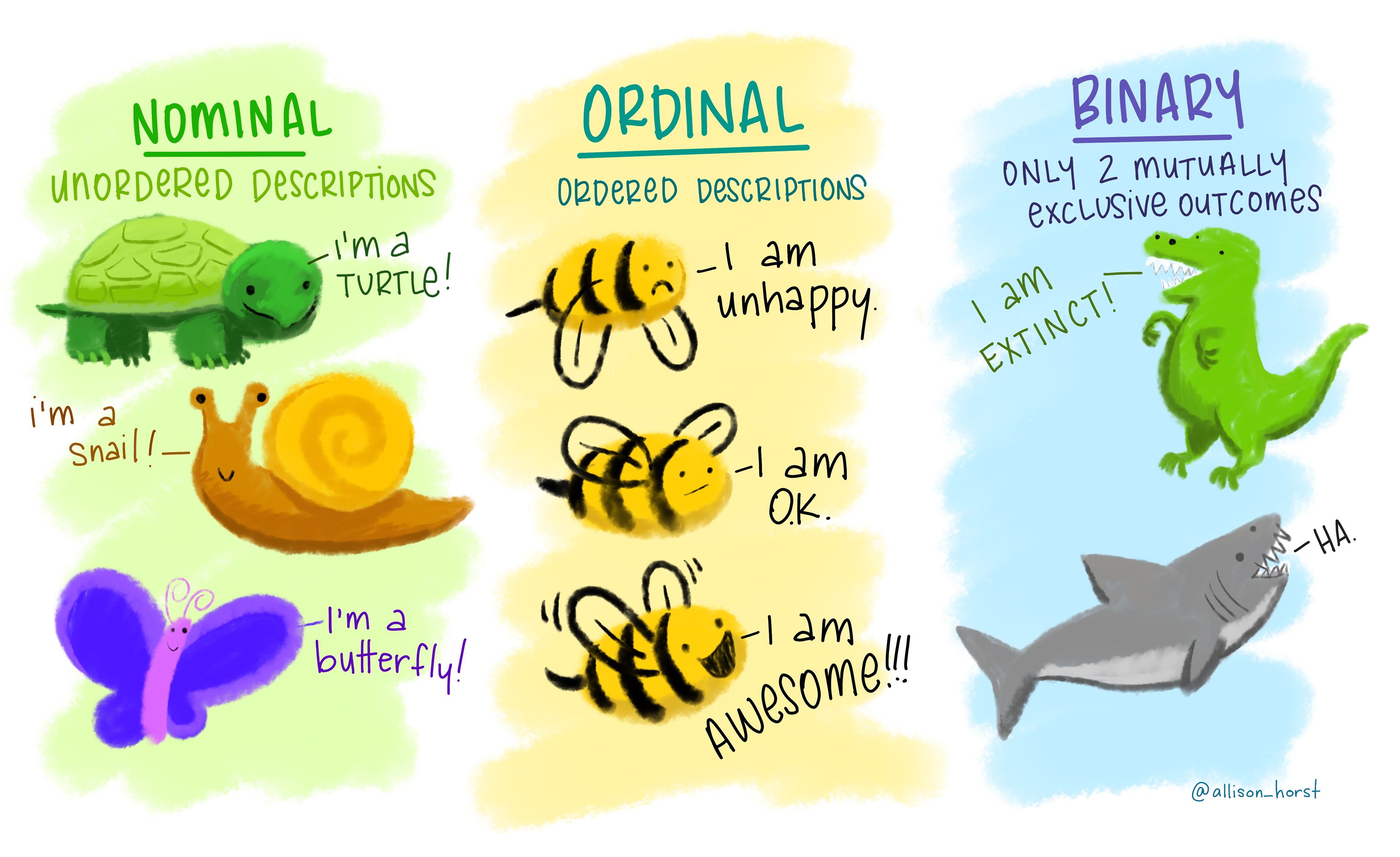
Nominal variables: gender identity (cisgender, transgender, non-binary), species (dog, cat, bird), land use (residential, parks, agriculture)
Ordinal variables: income level (low / middle / high), satisfaction level (unsatisfied, neutral, satisfied)
Binary: penguin sex (male / female), habitat type (shade / sun)
Art by Allison Horst
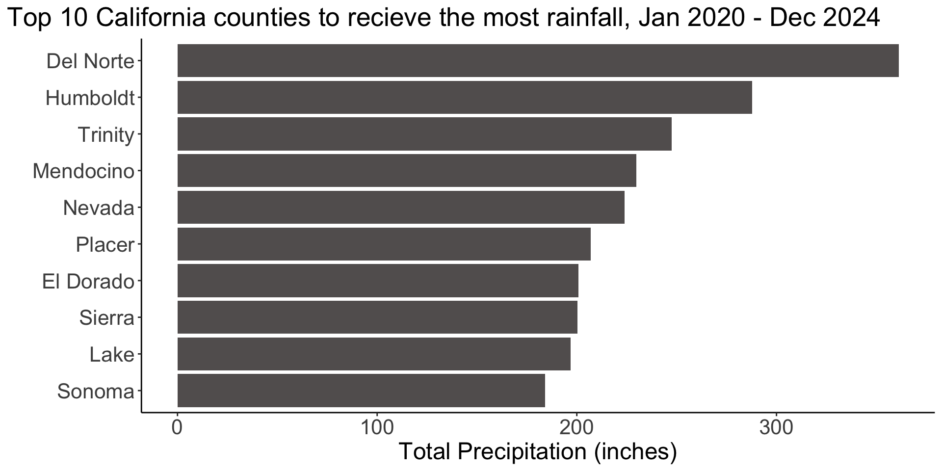
3. Try different graphic forms
If we want to show both big picture patterns and detailed comparisons, we may consider including multiple graphic forms in the same visualization.
4. Arrange components of the graphic
How does the influence of in-theater advertising change across generations?
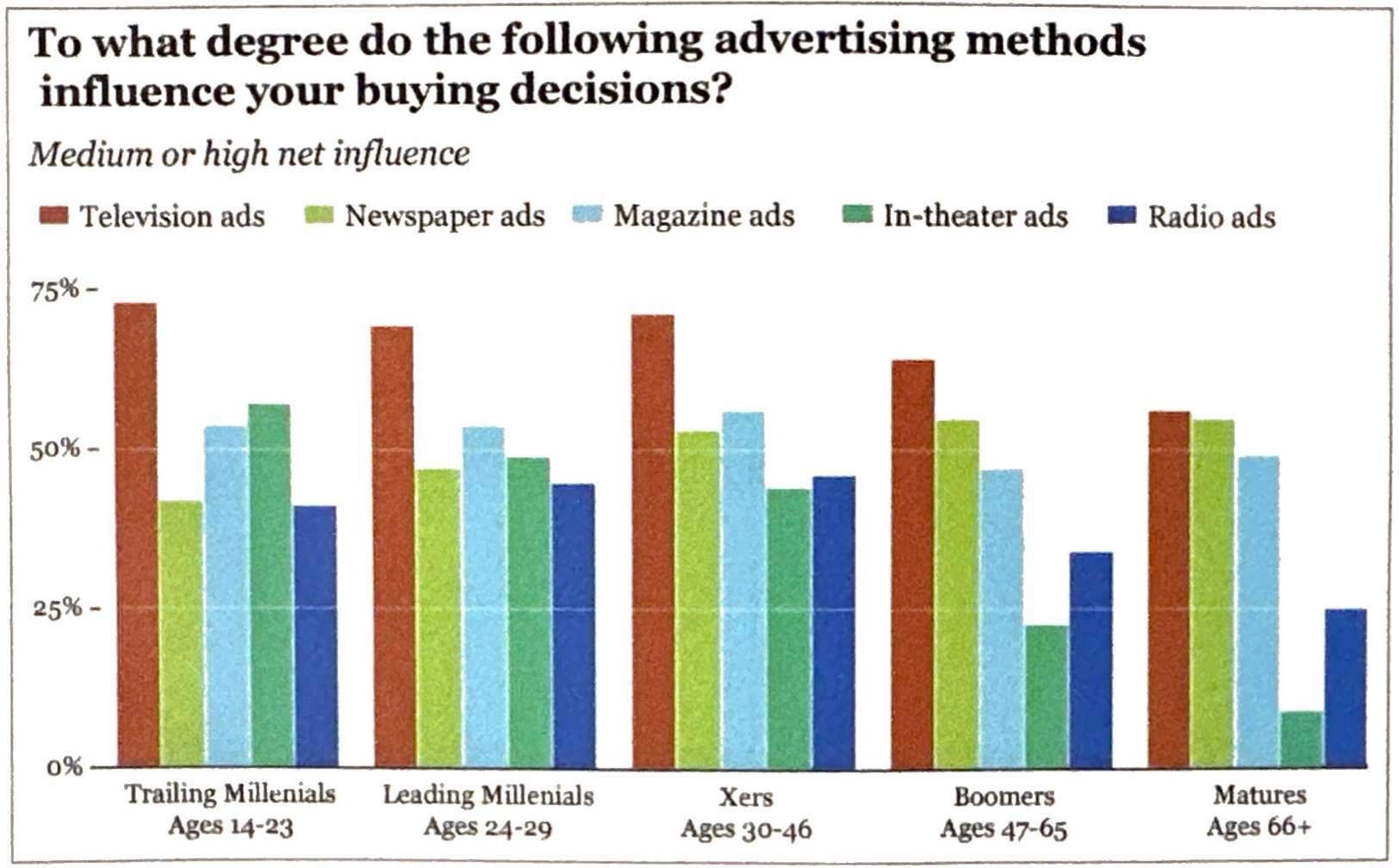
Images from Alberto Cairo’s The Truthful Art
01:00
4. Arrange components of the graphic
How does the influence of in-theater advertising change across generations?

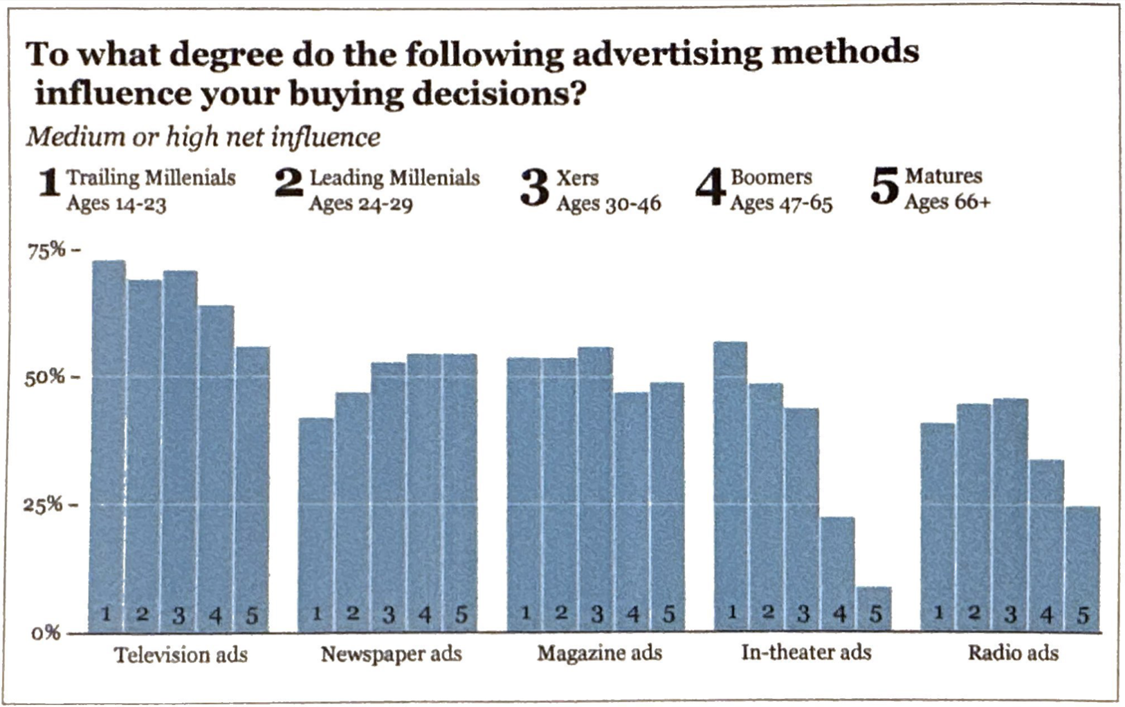
Images from Alberto Cairo’s The Truthful Art
4. Arrange components of the graphic
Let’s say we’re interested in:
Example from Derek L. Sonderegger’s online textbook, STA 141 - Exploratory Data Analysis and Visualization
4. Arrange components of the graphic
Let’s say we’re interested in:
changes in the amount spent on Social Security relative to other major spending categories over time (2012-2015)?
the amount of money spent on Social Security over time (2012-2015)?
Example from Derek L. Sonderegger’s online textbook, STA 141 - Exploratory Data Analysis and Visualization
4. Arrange components of the graphic
Do we want to convey:
Example from Claus Wilke’s, Fundamentals of Data Visualization
4. Arrange components of the graphic
Do we want to convey:
internet usage in 2016? or
how early or late adoption of internet relates to current-day usage?
Example from Claus Wilke’s, Fundamentals of Data Visualization
5. Test the outcomes of your graphic on others
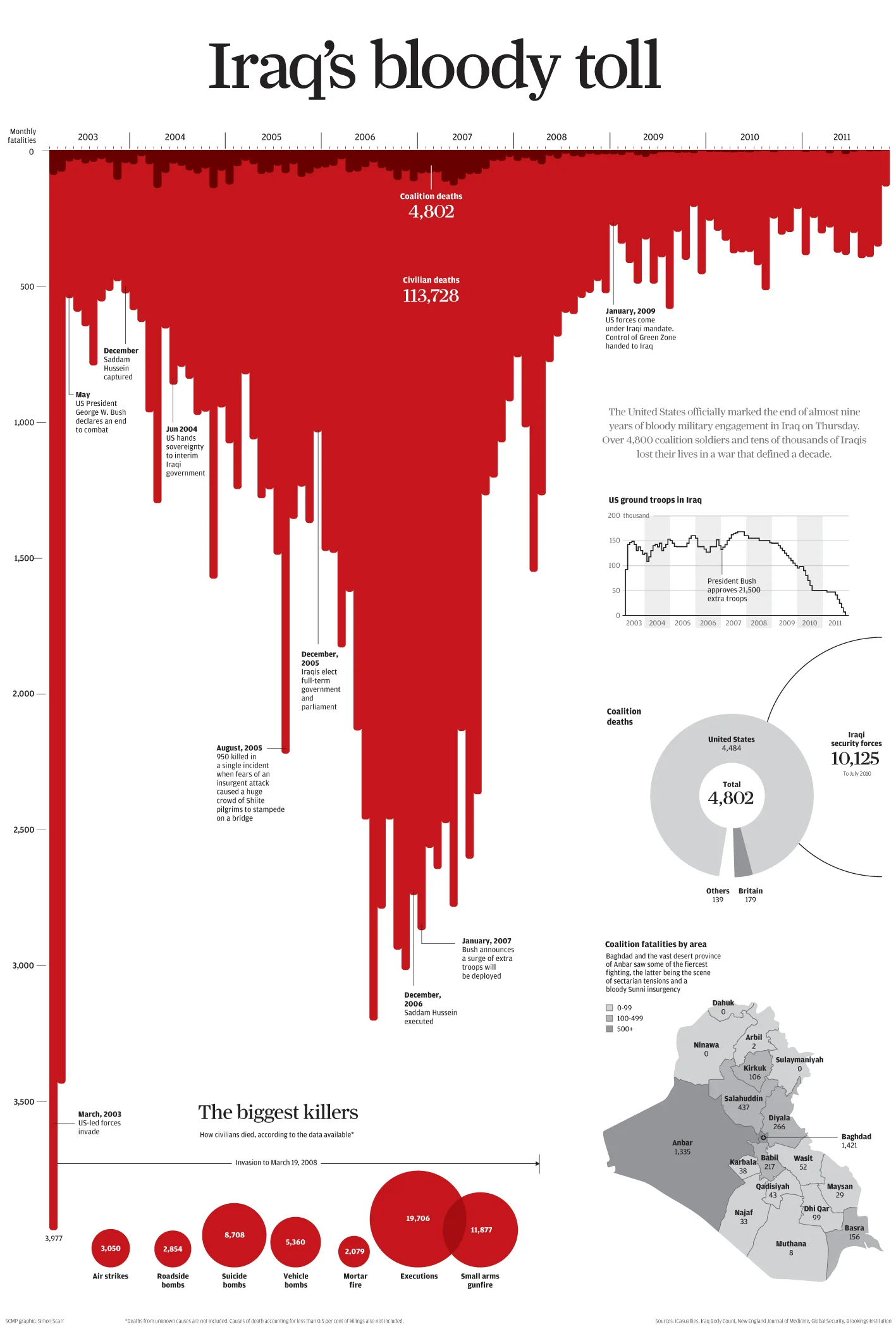
Source: Iraq’s bloody toll, by Simon Scarr
To enlarge image (in Chrome), right click on image > Open image in New Tab
02:30
5. Test the outcomes of your graphic on others
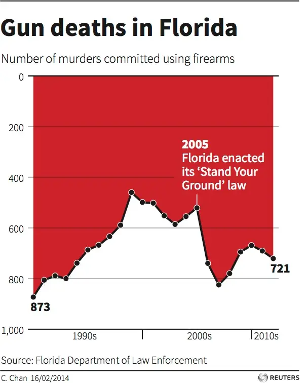
To enlarge image (in Chrome), right click on image > Open image in New Tab
02:30
5. Test the outcomes of your graphic on others

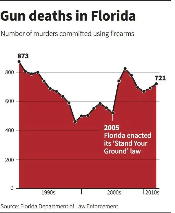
Baseline at the top is clear, suggesting that bars are falling from it. Clear metaphor (dripping blood).

Eyes are drawn to baseline at the bottom, on top of which data are sitting. Headline indicates rise but visually represented by falling. Thick black line makes white area stand out over red (data).
Critique by Alberto Cairo in his post In visualization, baselines and negative space matter (NOTE 2025-01-10: link broken, haven’t found replacement)
5. Test the outcomes of your graphic on others
Business Insider published an updated graphic (originally designed by Reuters), which was submitted by a reader that, “more clearly shows that gun deaths increased between 2005 and 2007 by flipping the y-axis”:

Take a Break
~ This is the end of Lesson 1 (of 3) ~
05:00