Visualizing the spread of a numeric variable
EDS 240: Lecture 2.2
Visualizing distributions
Week 2 | January 13th, 2024
Visualizing data distribution?
Visualizing the spread of a numeric variable

“Core” distribution chart types
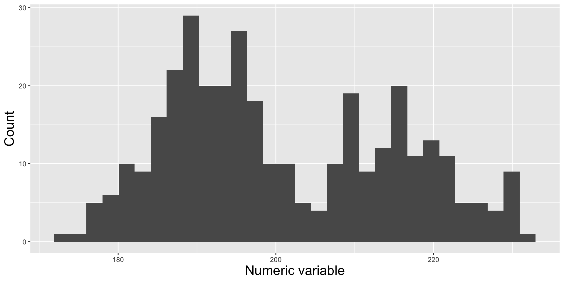
Histograms
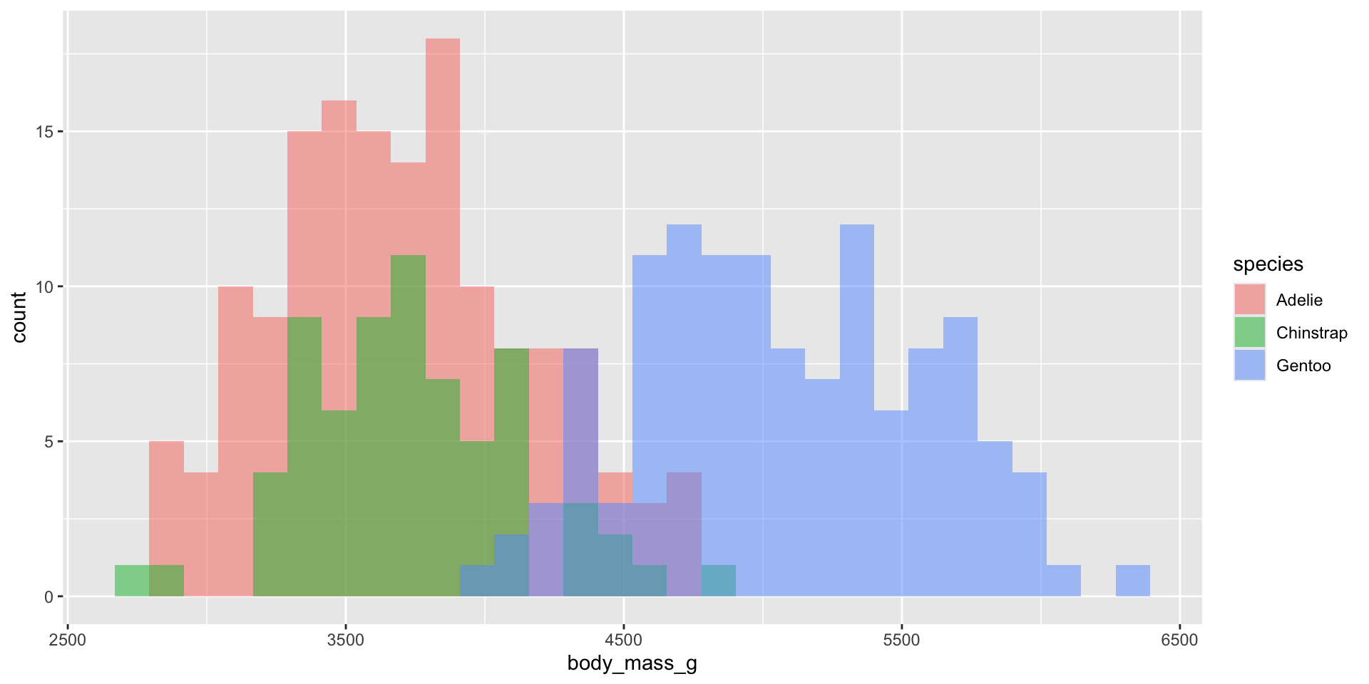
Density plots
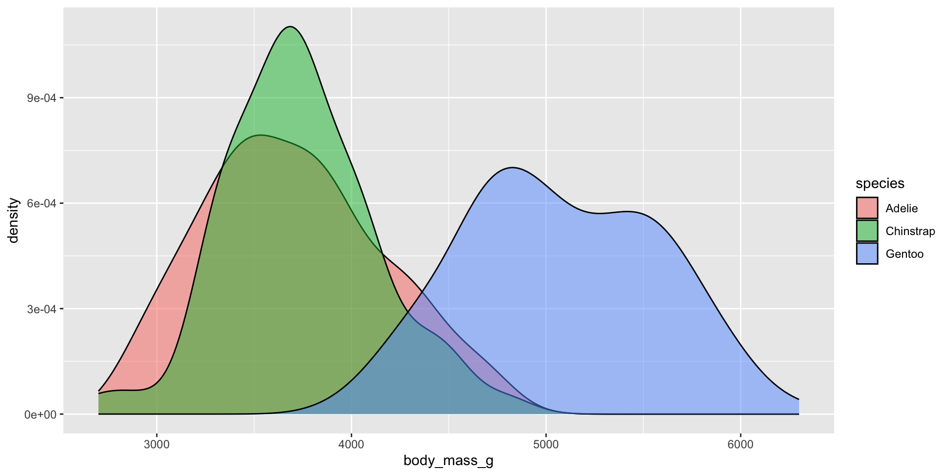
Ridgeline plots
Box plots

Violin plots
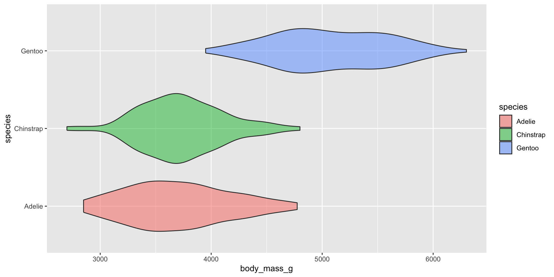
Examples show the distribution of penguin body masses (g) for Adelie, Chinstrap & Gentoo penguins.
The data: bottom temperatures at Mohawk Reef
The Santa Barbara Coastal Long Term Ecolgical Research (SBC LTER) site was established in 2000 to understand the ecology of coastal kelp forest ecosystems. A number of coastal rocky reef sites are outfitted with instrumentation that collect long-term monitoring data.


We’ll be exploring bottom temperatures recorded at Mohawk Reef, a near-shore rocky reef and one of the Santa Barbara Coastal (SBC) LTER research sites.
Data wrangling
[UPDATE reading data in from EDI not working; fix later]
Data are imported directly from the EDI Data Portal. Explore the metadata package online to learn more about these data.
##~~~~~~~~~~~~~~~~~~~~~~~~~~~~~~~~~~~~~~~~~~~~~~~~~~~~~~~~~~~~~~~~~~~~~~~~~~~~~~
##                                    setup                                 ----
##~~~~~~~~~~~~~~~~~~~~~~~~~~~~~~~~~~~~~~~~~~~~~~~~~~~~~~~~~~~~~~~~~~~~~~~~~~~~~~

#..........................load packages.........................
library(tidyverse)
library(chron)
library(naniar)
library(ggridges)
library(gghighlight)
library(ggbeeswarm)
library(see)
library(palmerpenguins) # for some minimal examples

#..........................import data...........................
# mko <- readr::read_csv("https://portal.edirepository.org/nis/dataviewer?packageid=knb-lter-sbc.2007.17&entityid=02629ecc08a536972dec021f662428aa")
mko <- read_csv(here::here("course-materials", "lecture-slides", "data", "mohawk_mooring_mko_20250117.csv"))

##~~~~~~~~~~~~~~~~~~~~~~~~~~~~~~~~~~~~~~~~~~~~~~~~~~~~~~~~~~~~~~~~~~~~~~~~~~~~~~
##                                wrangle data                              ----
##~~~~~~~~~~~~~~~~~~~~~~~~~~~~~~~~~~~~~~~~~~~~~~~~~~~~~~~~~~~~~~~~~~~~~~~~~~~~~~

mko_clean <- mko |>

  # keep only necessary columns ----
  select(year, month, day, decimal_time, Temp_bot, Temp_top, Temp_mid) |>

  # create datetime column (not totally necessary for our plots, but it can be helpful to know how to do this!) ----
  unite(date, year, month, day, sep = "-", remove = FALSE) |>
  mutate(time = chron::times(decimal_time)) |>
  unite(date_time, date, time, sep = " ") |>

  # coerce data types ----
  mutate(date_time = as_datetime(date_time, "%Y-%m-%d %H:%M:%S", tz = "GMT"),
         year = as.factor(year),
         month = as.factor(month),
         day = as.numeric(day)) |>

  # add month name by indexing the built-in `month.name` vector ----
  mutate(month_name = month.name[month]) |>

  # replace 9999s with NAs ----
  naniar::replace_with_na(replace = list(Temp_bot = 9999,
                                         Temp_top = 9999,
                                         Temp_mid = 9999)) |>

  # select/reorder desired columns ----
  select(date_time, year, month, day, month_name, Temp_bot, Temp_mid, Temp_top)

##~~~~~~~~~~~~~~~~~~~~~~~~~~~~~~~~~~~~~~~~~~~~~~~~~~~~~~~~~~~~~~~~~~~~~~~~~~~~~~
##                            explore missing data                          ----
##~~~~~~~~~~~~~~~~~~~~~~~~~~~~~~~~~~~~~~~~~~~~~~~~~~~~~~~~~~~~~~~~~~~~~~~~~~~~~~

#..........counts & percentages of missing data by year..........
see_NAs <- mko_clean |>
  group_by(year) |>
  naniar::miss_var_summary() |>
  filter(variable == "Temp_bot")

#...................visualize missing Temp_bot...................
bottom <- mko_clean |> select(Temp_bot)
missing_temps <- naniar::vis_miss(bottom)
Histograms - ggplot2::geom_histogram()
What are they?
Need:
Important considerations:

Histograms - avoid plotting too many groups
Twelve groups (month_name) is too many groups – especially when the range of temperature values for each of our groups largely overlap:
Histograms - adjustments
If you want to plot all groups, consider splitting them into small multiples. If so, does color add any valuable information? Remove if not:
Let’s instead compare just three months: April (generally the coldest month), October (generally a hot month), June (somewhere in between):
Use fill to fill bars with a specified color(s) and color to outline bars with a specified color(s):
mko_clean |>
  mutate(month_name = factor(month_name, levels = month.name)) |>
  filter(month_name %in% c("April", "June", "October")) |>
  ggplot(aes(x = Temp_bot, fill = month_name)) +
  geom_histogram(position = "identity", alpha = 0.5,  color = "black") +
  scale_fill_manual(values = c("#2C5374", "#ADD8E6", "#8B3A3A"))
Modify binwidth (30 bins by default) – does a bin width of 1 (degree Celsius) actually make sense? Consider scale of interest. Also be mindful when using bins – too few bins will result in loss of distribution shape.
mko_clean |>
  filter(month_name %in% c("April", "June", "October")) |>
  mutate(month_name = factor(month_name, levels = month.name)) |>
  ggplot(aes(x = Temp_bot, fill = month_name)) +
  geom_histogram(position = "identity", alpha = 0.5, binwidth = 1) +
  scale_fill_manual(values = c("#2C5374", "#ADD8E6", "#8B3A3A"))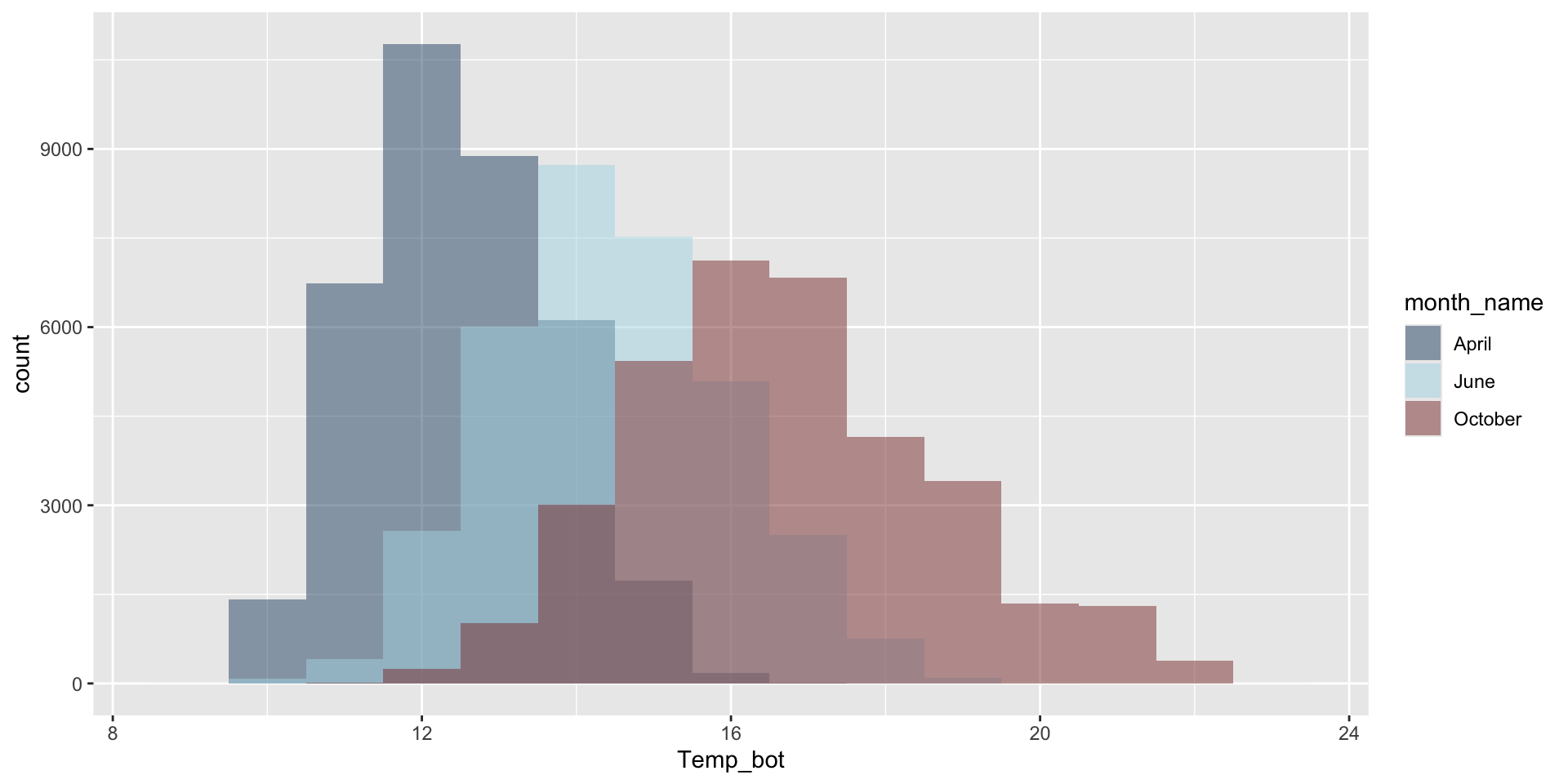
Density plots - ggplot2::geom_density()
What are they?
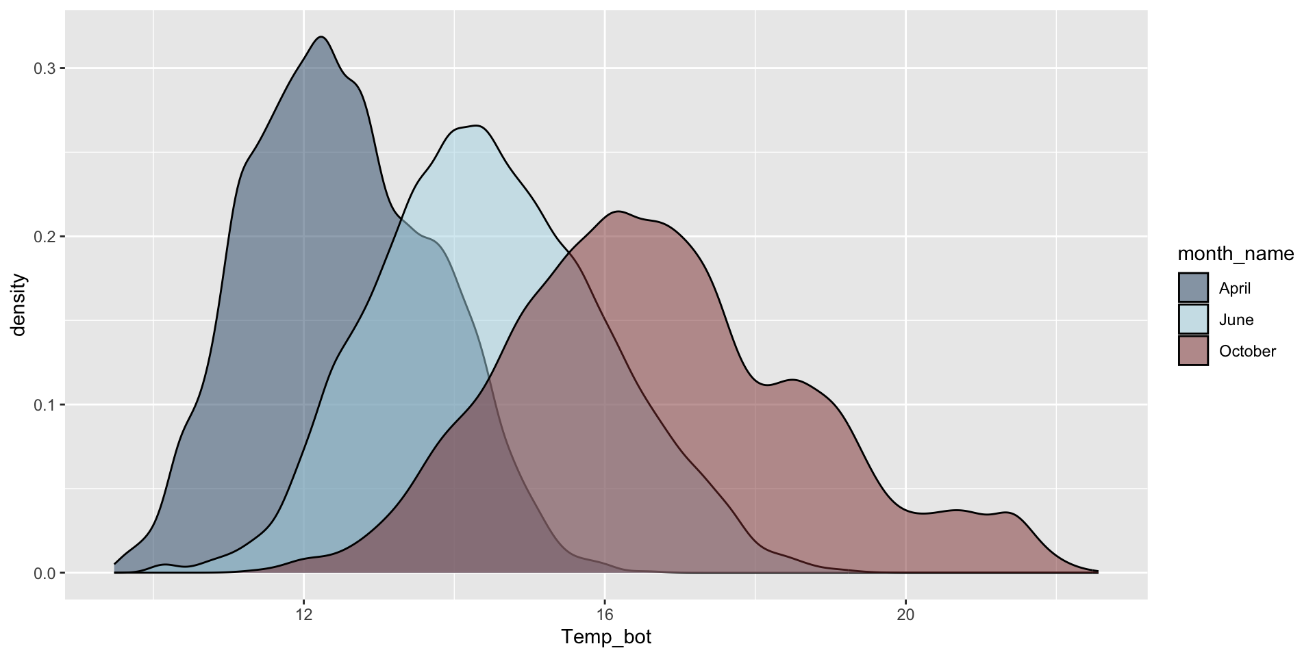
A smoothed version of a histogram. Density plots are representations of the distribution of a numeric variable(s), which uses a kernel density estimate (KDE) to show the probability density function of the variable. The y-axis represents the estimated density, i.e. the relative likelihood of a value occurring. The area under each curve is equal to 1. Use a density plot when you are most concerned with the shape of the distribution.
Need:
Important considerations:
Check out this cool interactive tool, by Matthew Conlen, for a visual explanation of KDE.
Density plots - avoid plotting too many groups
Similar to the histogram, twelve groups (month_name) is too many groups! Consider small multiples (using facet_wrap()) if you want to keep all groups.
Density plots - adjustments
If you want to plot all groups, consider splitting them into small multiples. If so, does color add any valuable information? Remove if not:
Let’s instead compare three months: April (generally the coldest month), October (generally a hot month), June (somewhere in between):
Modify bandwidth by declaring a multiplier of the default bandwidth adjustment. Reducing the adjust argument reduces the amount of smoothing (default adjust = 1):
An important distinction
Histograms show us the counts (frequency) of values in each range (bin), represented by the height of the bars.
Density plots show the proportion of values in each range (area under the curve equal 1; peaks indicate where more values are concentrated, but it does not tell us anything about the the number of observations).
We’ll use some dummy data to demonstrate how this differs visually:
Here, we have two groups (A, B) of values which are normally distributed, but with different means. Group A also has a smaller sample size (100) than group B (200).
An important distinction
It’s easy to see that group B has a larger sample size than group A when looking at our histogram. Additionally, we can get a good sense of our data distribution. But what happens when you reduce the number of bins (e.g. set bins = 4)?
We lose information about sample size in our density plot (note that both curves are ~the same height, despite group B having 2x as many observations). However, they’re great for visualizing the shape of our distributions since they are unaffected by the number of bins.
Rug plots added as an alternative way to visualize the data distribution and also as an indicator of sample size.
Combining geoms - histogram & density plot
We can overlay histogram and density plots to check that smoothing assumptions of the density curve align with the actual data distribution. This requires rescaling the histogram to match the density curve scale. Adding y = after_stat(density) within the aes() function rescales the histogram counts so that bar areas integrate to 1:
Check out this great blog post on the after_stat() function, by June Choe
Scaled density plots for comparing groups to a whole
In a normal density plot, the area under the curve(s) is equal to 1. In a scaled density plot, the area under the curve reflects the number of observations for each group.
We can use scaled density plots to compare individual group distributions to the total distribution. Demonstrated here, using the penguins data set:
# use `after_stat(count)` to plot density of observations ----
ggplot(penguins, aes(x = body_mass_g, y = after_stat(count))) +

  # plot full distribution curve with label "all penguins"; remove 'species' col so that this doesn't get faceted later on ----
  geom_density(data = select(penguins, -species),
               aes(fill = "all penguins"), color = "transparent") +

  # plot second curve with label "species" ----
  geom_density(aes(fill = "species"), color = "transparent") +

  # facet wrap by species ----
  facet_wrap(~species, nrow = 1) +

  # update colors, x-axis label, legend position ----
  scale_fill_manual(values = c("grey","green4"), name = NULL) +
  labs(x = "Body Mass (g)") +
  theme(legend.position = "top")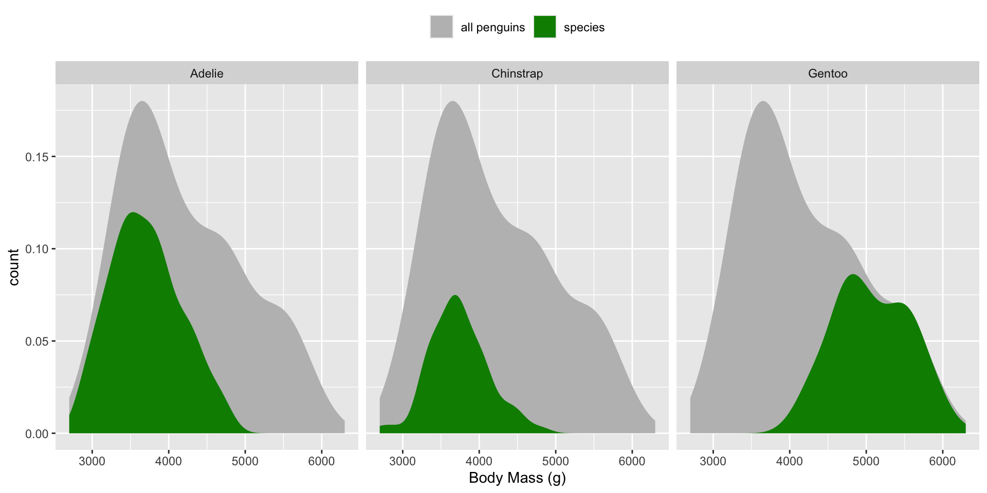
Example adapted from Meghan Hall’s CMU 36-315 Lecture 7. For more on scaled density plots, check out this post, by Andrew Collier.
Ridgeline plots - {ggridges}
What are they?
Need:
Important considerations:
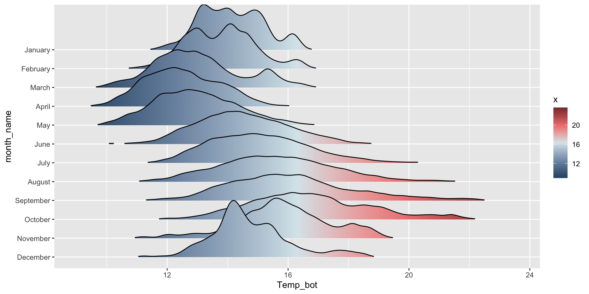
Ridgeline plots - good for multiple groups
The {ggridges} package has a number of different geoms for creating ridgeline plots that work well for data sets with larger group numbers (e.g. months). Two great geoms to explore (to start):
geom_density_ridges() to create a basic ridgeline plot:
fill = after_stat(x) tells ggplot to compute the x values (representing Temp_bot) after the statistical transformation (density estimation) and map those computed x values to the fill aesthetic. As a result, the gradient fill of each density curve will reflect the temperature values along the x-axis.
Ridgeline plots - adjustments
Order by month (ideal, since months have an inherent order; alternatively, do in data wrangling step, e.g. mutate(month_name = factor(month_name, levels = rev(month.name)))):
Order by mean or median (makes more sense when you have unordered groups):
mko_clean |>
  mutate(month_name = fct_reorder(month_name, Temp_bot, .fun = mean)) |>
  ggplot(mko_clean, mapping = aes(x = Temp_bot, y = month_name, fill = after_stat(x))) +
  ggridges::geom_density_ridges_gradient() +
  scale_fill_gradientn(colors = c("#2C5374","#849BB4", "#D9E7EC", "#EF8080", "#8B3A3A"))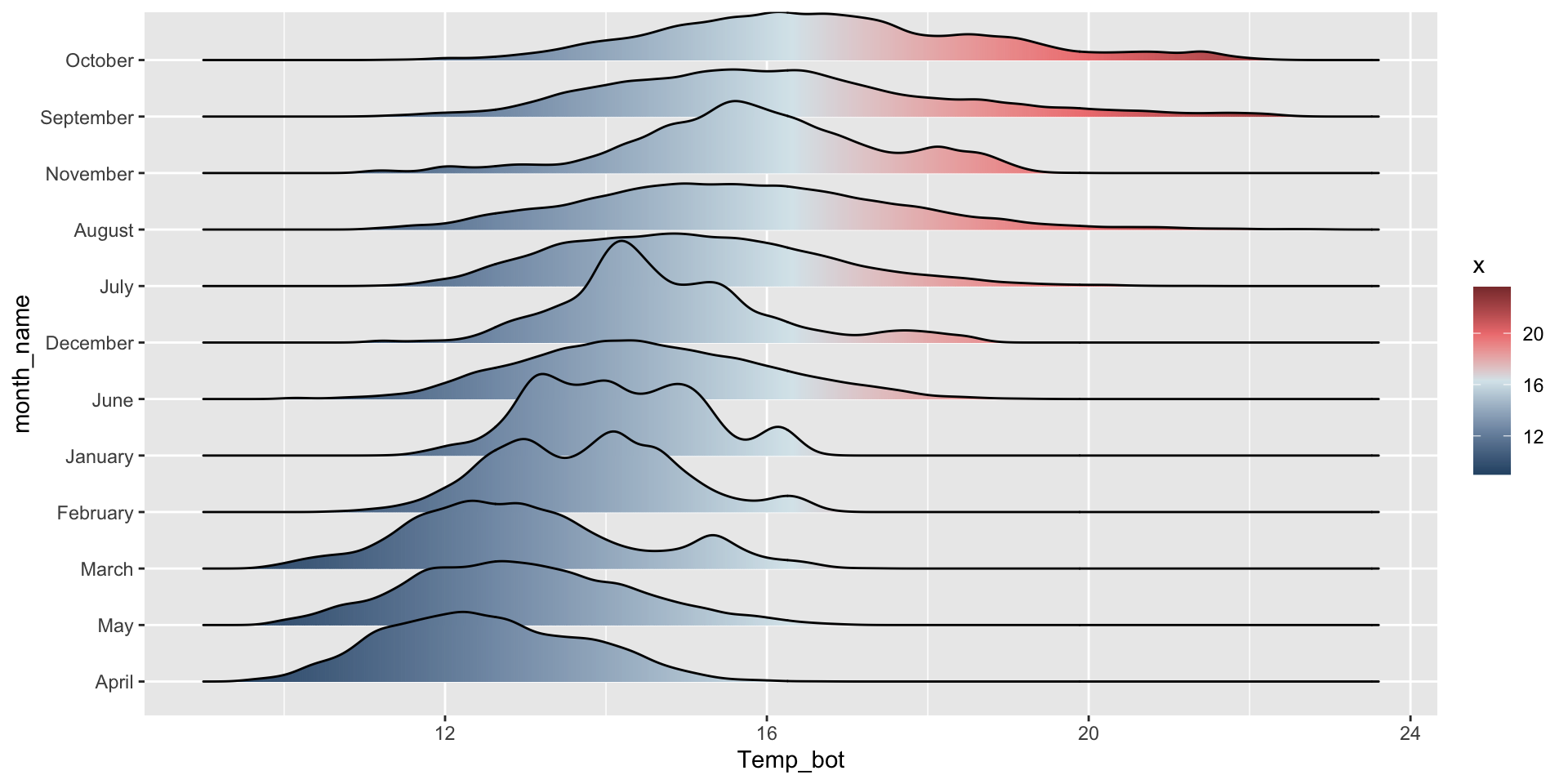
rel_min_height sets the threshold for the relative height of density curves – any density values below this threshold are treated as 0. scale controls the extent to which the different densities overlap)
Include a median line by using the stat_density_ridges() geom and setting the number of quantiles to 2:
Visualize the raw data underlying the density ridges (since our temperature data is too large (>473,000 rows), so we’ll use the {palmerpenguins} penguins data set to demo):
Jittered points
Box plots - ggplot2::geom_boxplot()
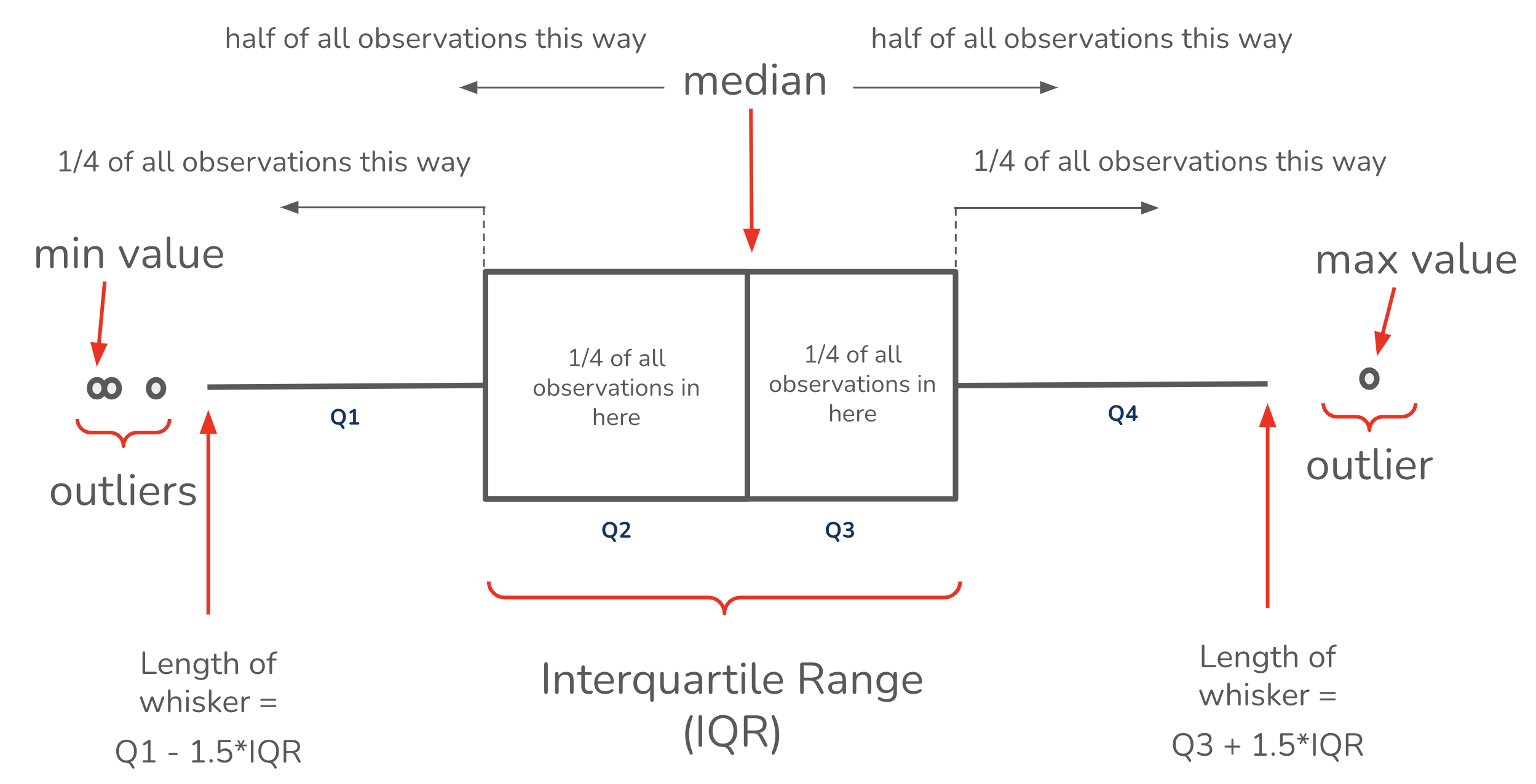
What are they?
Need:
Important considerations:
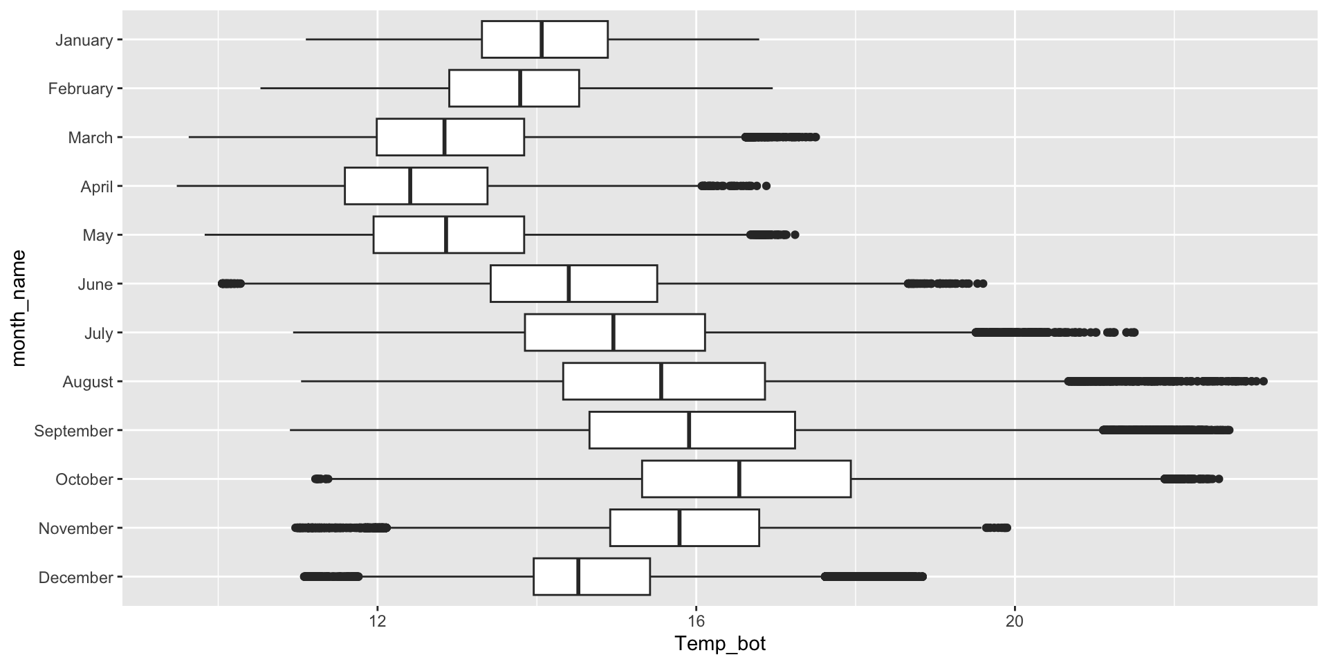
Box plots - good for multiple groups
Box plots are great for a few to multiple groups (too many boxes just results in a lot of information to synthesize, as a viewer). If your x-axis text is long, consider flipping your axes to make them less crunched:
Box plots - adjustments
You can modify outlier aesthetics inside geom_boxplot():
Highlight a group of interest – one easy way to do so is by using the {gghighlight} package. Here, we specify a specific month ("October") to highlight:
Since box plots hide sample size, consider overlaying raw data points using geom_jitter() (since our temperature data is too large (almost 500k rows), we’ll use the penguins data set to demo):
NOTE: Be sure to remove outliers, since plotting raw data will result in those data points being a second time:
You may have data where you want to include an additional grouping variable – for example, let’s say we want to plot penguin body masses by species and year. We’ll need to at least dodge our overlaid points so that they sit on top of the correct box. Preferably, we both jitter and dodge our points:
Similar to overlaying the raw jittered data points, we can combine our box plot with a beeswarm plot using {ggbeeswarm}. Beeswarm plots visualize the density of data at each point, as well as arrange points that would normally overlap so that they fall next to one another instead. Consider using a standalone beeswarm plot here as well! We’ll again use the penguins data set to demo:
Violin plots - ggplot2::geom_violin()
What are they?
Need:
Important considerations:

Violin plots - good for multiple groups with lots of data
Violin plots are great for a few to multiple groups, and are often a better choice than box plots when you have a very large data set (and overlaying jittered points looks busy or downright unreasonable). If your x-axis text is long, consider flipping your axes to make them less crunched:
Combining geoms - adjustments
Overlaying a box plot inside a violin plot can be helpful in providing your audience with summary stats in a compact form:
The {see} package provides geom_violindot(), which is useful for simultaneously visualizing distribution and sample size. Because it can quickly get overcrowded with large sample sizes (like Temp_bot), we’ll use penguins to demo here:
Take a Break
~ This is the end of Lesson 2 (of 3) ~
05:00