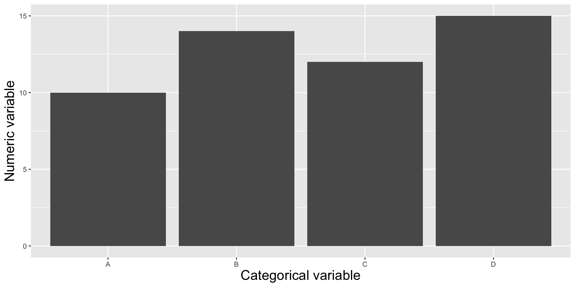
Showing the relationship between a numeric and categorical variable(s), i.e. comparing categorical groups based on their numeric values.
Roadmap
We’ll first explore two (highly interchangeable) chart types for visualizing amounts across a categorical variable (great for highlighting rank or hierarchy):
1. bar charts 2. lollipop charts (and dot plot variant)
We’ll also learn about a couple alternatives, which may be better suited for you data depending on the context, data structure, and narrative you want to tell:
3. heat maps (for when you have 2 categorical + 1 numeric variable and / or want to focus on patterns rather than precise amounts)
4. dumbbell charts (for visualizing change / difference between two groups)
The data: women in the workforce
According to the American Association of University Women (AAUW), the 1gender pay gap is defined as “…the gap between what men and women are paid. Most commonly, it refers to the median annual pay of all women who work full time and year-round, compared to the pay of a similar cohort of men.” We’ll explore income data from the Bureau of Labor Statistics and the Census Bureau, which has been moderately pre-processed by TidyTuesday organizers for the March 5, 2021 data set.
We’ll use these data to explore: (1) occupations with the highest median earnings (across males and females)? (2) how earnings change across years for different occupations (3) how median earnings differ between males and females within occupations?
##~~~~~~~~~~~~~~~~~~~~~~~~~~~~~~~~~~~~~~~~~~~~~~~~~~~~~~~~~~~~~~~~~~~~~~~~~~~~~~## setup ----##~~~~~~~~~~~~~~~~~~~~~~~~~~~~~~~~~~~~~~~~~~~~~~~~~~~~~~~~~~~~~~~~~~~~~~~~~~~~~~#..........................load packages.........................library(tidyverse)library(scales)#..........................import data...........................jobs <-read_csv("https://raw.githubusercontent.com/rfordatascience/tidytuesday/master/data/2019/2019-03-05/jobs_gender.csv")##~~~~~~~~~~~~~~~~~~~~~~~~~~~~~~~~~~~~~~~~~~~~~~~~~~~~~~~~~~~~~~~~~~~~~~~~~~~~~~## wrangle data ----##~~~~~~~~~~~~~~~~~~~~~~~~~~~~~~~~~~~~~~~~~~~~~~~~~~~~~~~~~~~~~~~~~~~~~~~~~~~~~~jobs_clean <- jobs |># add col with % men in a given occupation (% females in a given occupation is already included) ----mutate(percent_male =100- percent_female) |># rearrange columns ----relocate(year, major_category, minor_category, occupation, total_workers, workers_male, workers_female, percent_male, percent_female, total_earnings, total_earnings_male, total_earnings_female, wage_percent_of_male) |># drop rows with missing earnings data ----drop_na(total_earnings_male, total_earnings_female) |># make occupation a factor (for reordering groups in our plot) ----mutate(occupation =as.factor(occupation)) |># classify jobs by percentage male or female (these will become facet labels in our dumbbell plot) ----mutate(group_label =case_when( percent_female >=75~"Occupations that are 75%+ female", percent_female >=45& percent_female <=55~"Occupations that are 45-55% female", percent_male >=75~"Occupations that are 75%+ male" ))
Bar charts & lollipop charts
interchangeable | focus is on highest and lowest values (as well as overall rank / hierarchy) | best for visualizing amounts across a single categorical variable | encode values using LENGTH
Bar & lollipop plots to visualize rankings
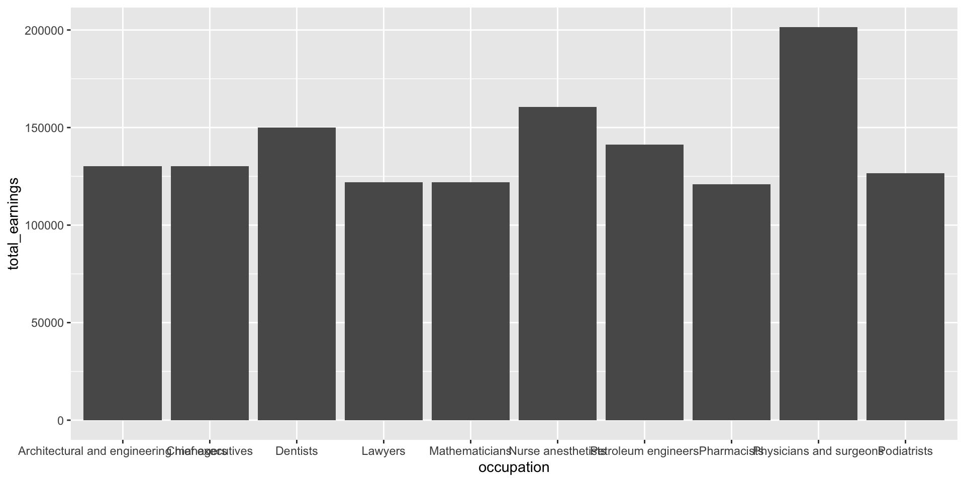
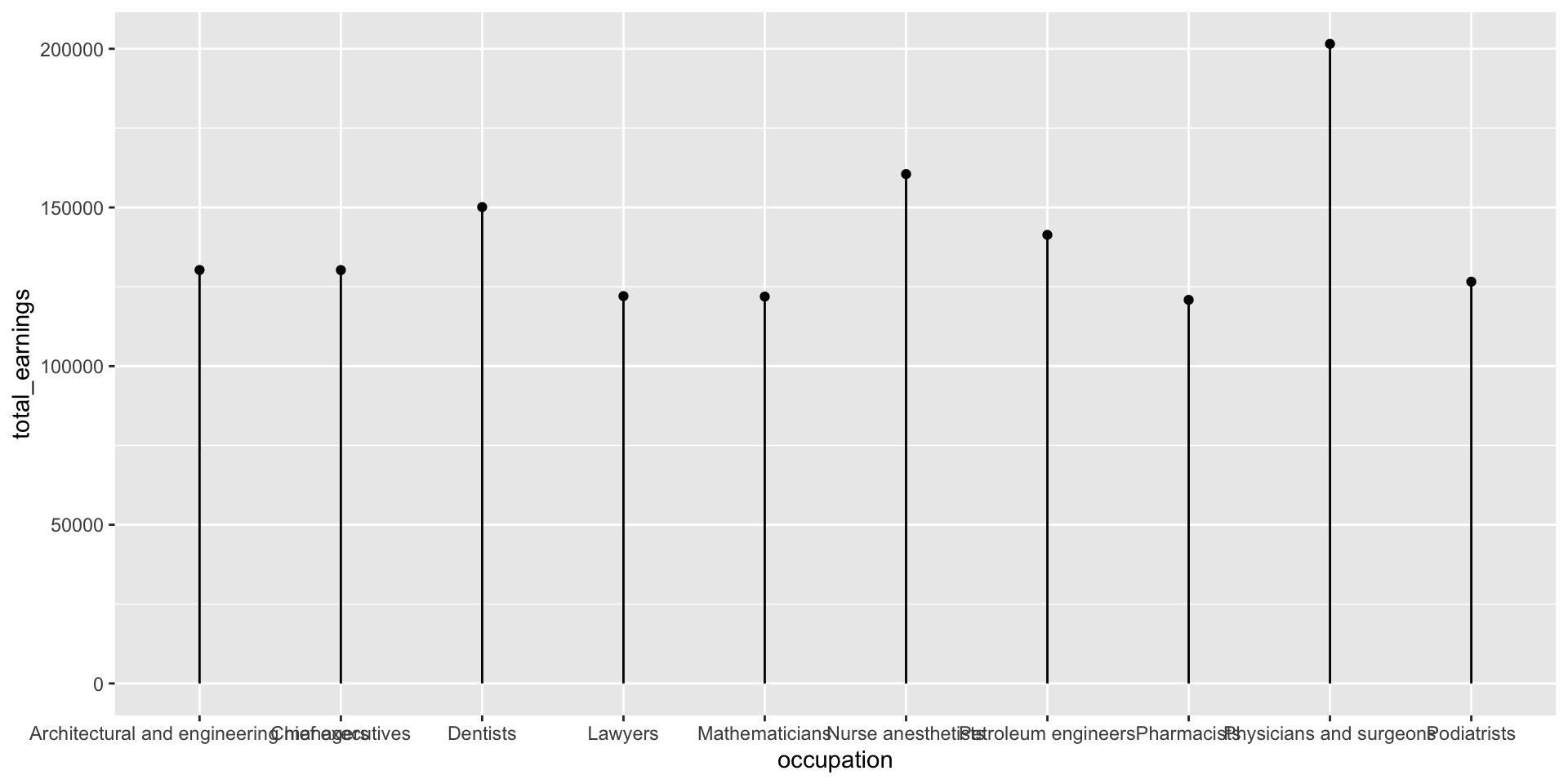
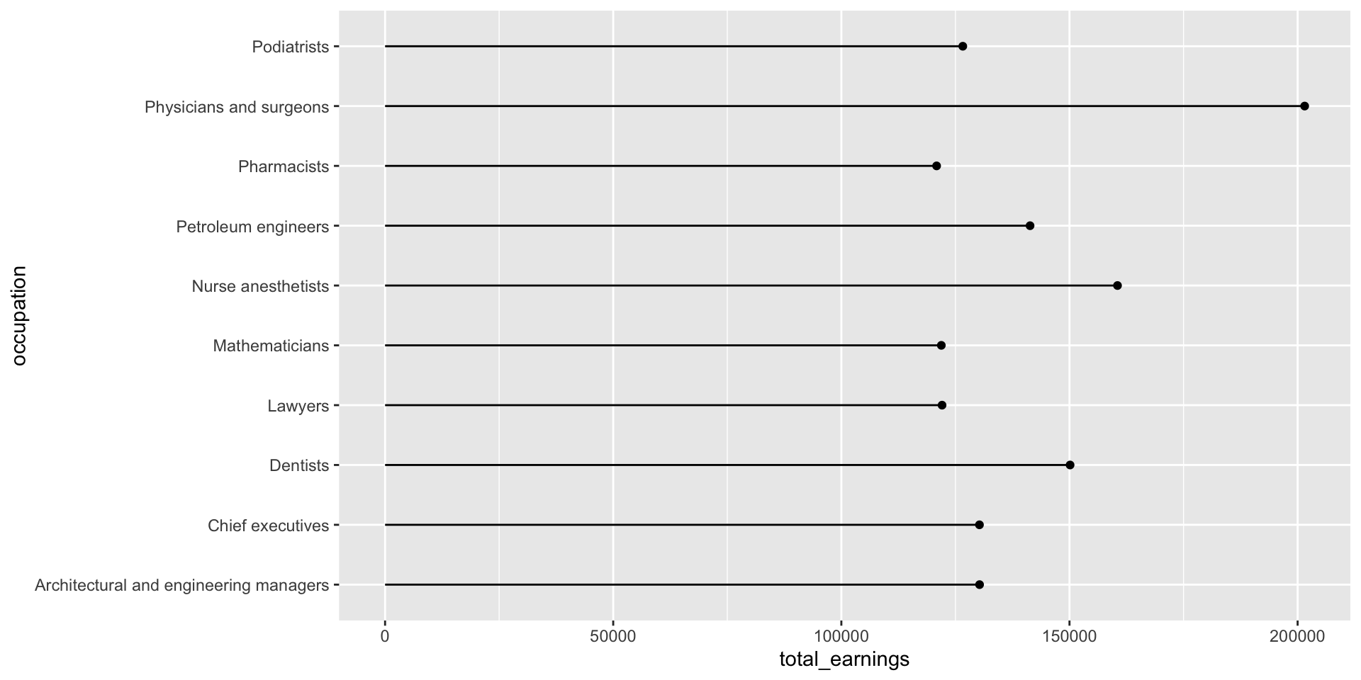
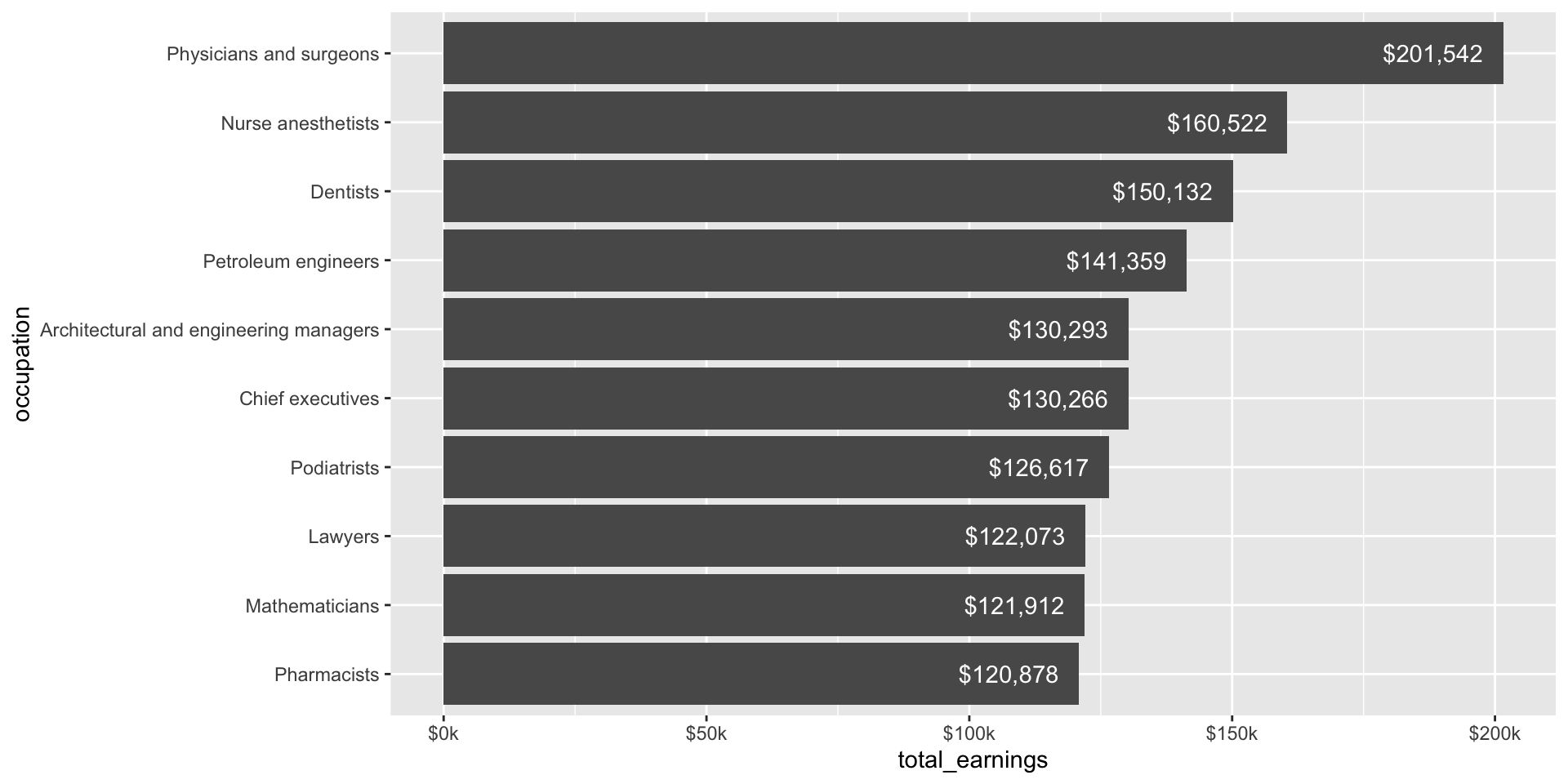
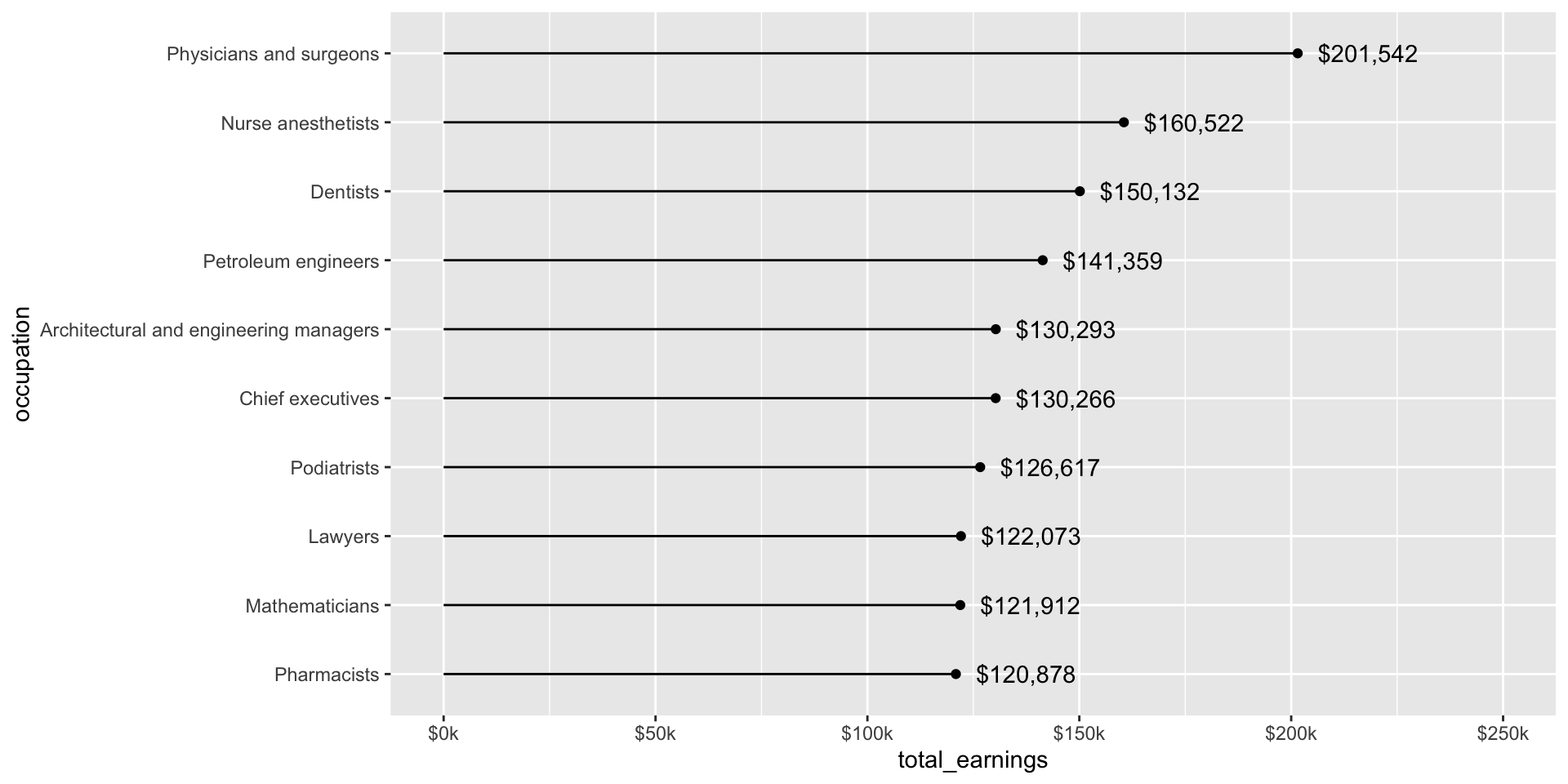
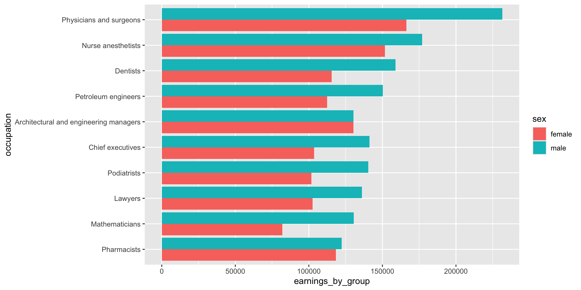
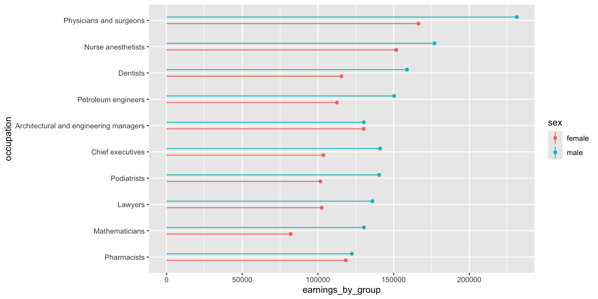
Let’s first explore the top ten occupations with the highest median earnings in 2016 (full-time workers > 16 years old). The heights of both the bars and lollipops represent the total estimated median earnings (total_earnings).
jobs_clean |>filter(year ==2016) |>slice_max(order_by = total_earnings, n =10) |># keep top 10 jobs with most `total_earnings`ggplot(aes(x = occupation, y = total_earnings)) +geom_col()
jobs_clean |>filter(year ==2016) |>slice_max(order_by = total_earnings, n =10) |>ggplot(aes(x = occupation, y = total_earnings)) +geom_point() +geom_linerange(aes(ymin =0, ymax = total_earnings))
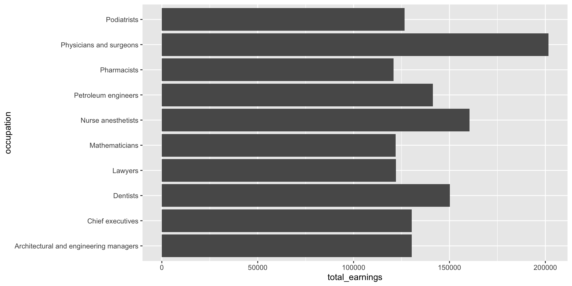
Make space for long x-axis labels
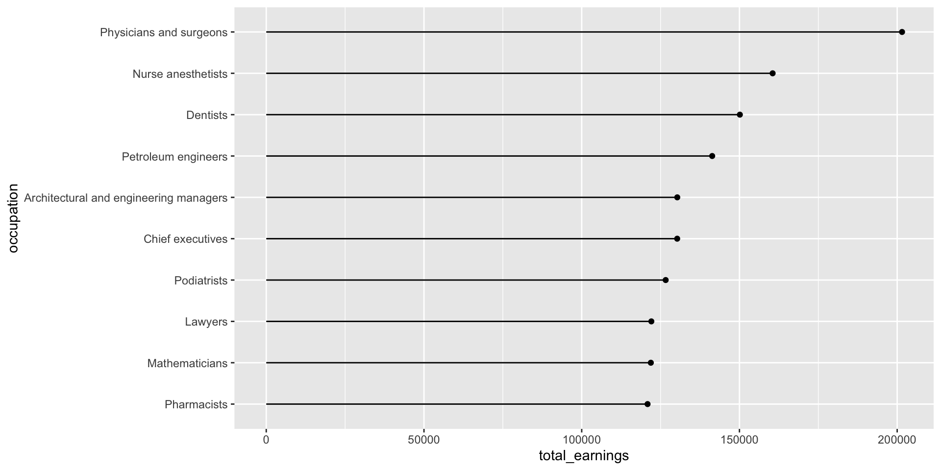
Give those long x-axis labels some breathing room using coord_flip(), which flips cartesian (x,y) coordinates so that the horizontal becomes the vertical and vice versa. Alternatively, you can map your variables to the opposite axes in aes() (e.g. aes(x = total_earnings, y = occupation)).
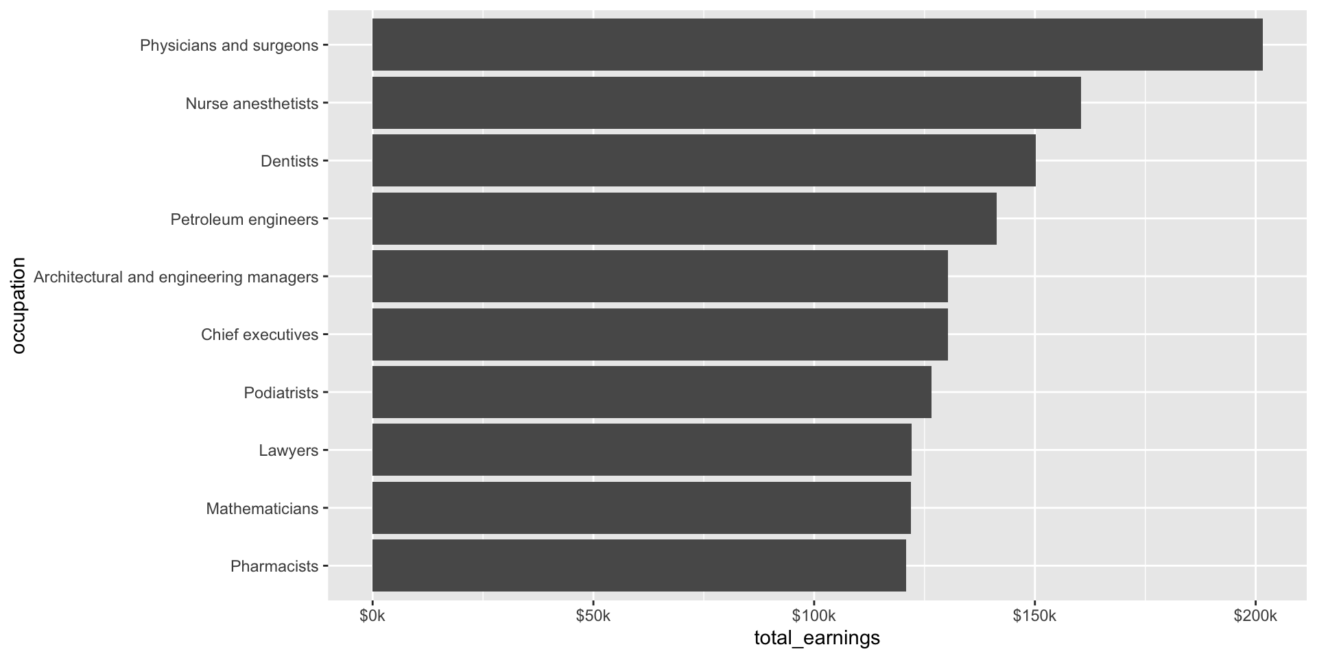
jobs_clean |>filter(year ==2016) |>slice_max(order_by = total_earnings, n =10) |>ggplot(aes(x = occupation, y = total_earnings)) +geom_col() +coord_flip()
Here, we use forcats::fct_reorder() to reorder the levels of our x-axis variable, occupation, based on a numeric variable, total_earnings (NOTE: we don’t have to reorder based on the same numeric variable that’s plotted on the y-axis, though here it makes sense to do so.
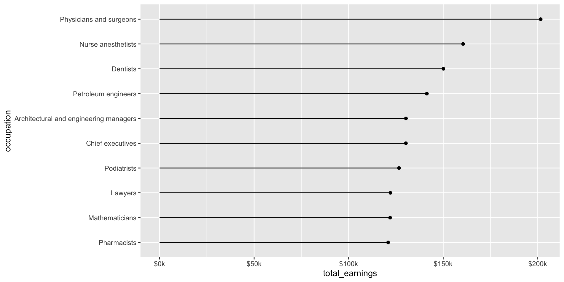
While we’re on the topic of making things easier to read, let’s use the {scales} package to update our labels so that they read more like dollar values:
jobs_clean |>filter(year ==2016) |>slice_max(order_by = total_earnings, n =10) |>mutate(occupation =fct_reorder(.f = occupation, .x = total_earnings)) |>ggplot(aes(x = occupation, y = total_earnings)) +geom_point() +geom_segment(aes(y =0, yend = total_earnings)) +geom_text(aes(label = scales::dollar(total_earnings)), hjust =-0.2) +scale_y_continuous(labels = scales::label_currency(accuracy =1, scale =0.001, suffix ="k"),limits =c(0, 250000)) +# expand axis to make room for valuescoord_flip()
An aside: geom_col() vs. geom_bar()
Use geom_col() when your data is already summarized or you have a variable in your data set that includes y-axis values, which will map to the height of the bars. E.g. we already have a numeric variable in our data set called, total_earnings – those numeric values are mapped to the height of each bar in our plot.
jobs_clean |>filter(year ==2016) |>slice_max(order_by = total_earnings, n =10) |>ggplot(aes(x = occupation, y = total_earnings)) +geom_col() +coord_flip()
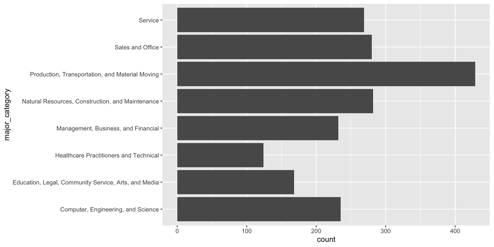
Use geom_bar() if you want to ggplot to count up numbers of rows and map those counts to the height of bars in your plot. E.g. we want to know how many occupations are included for each major category in our jobs_gender_clean data set (NOTE: we don’t have a count column in our data frame):
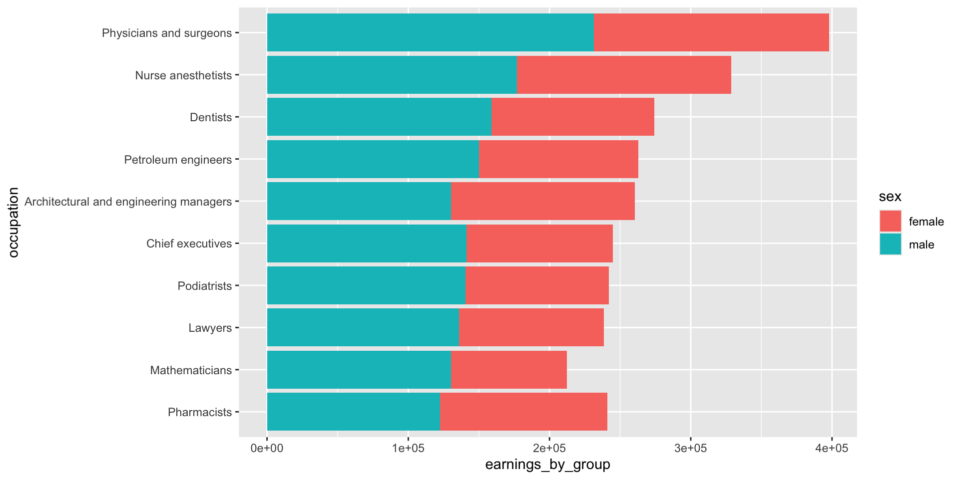
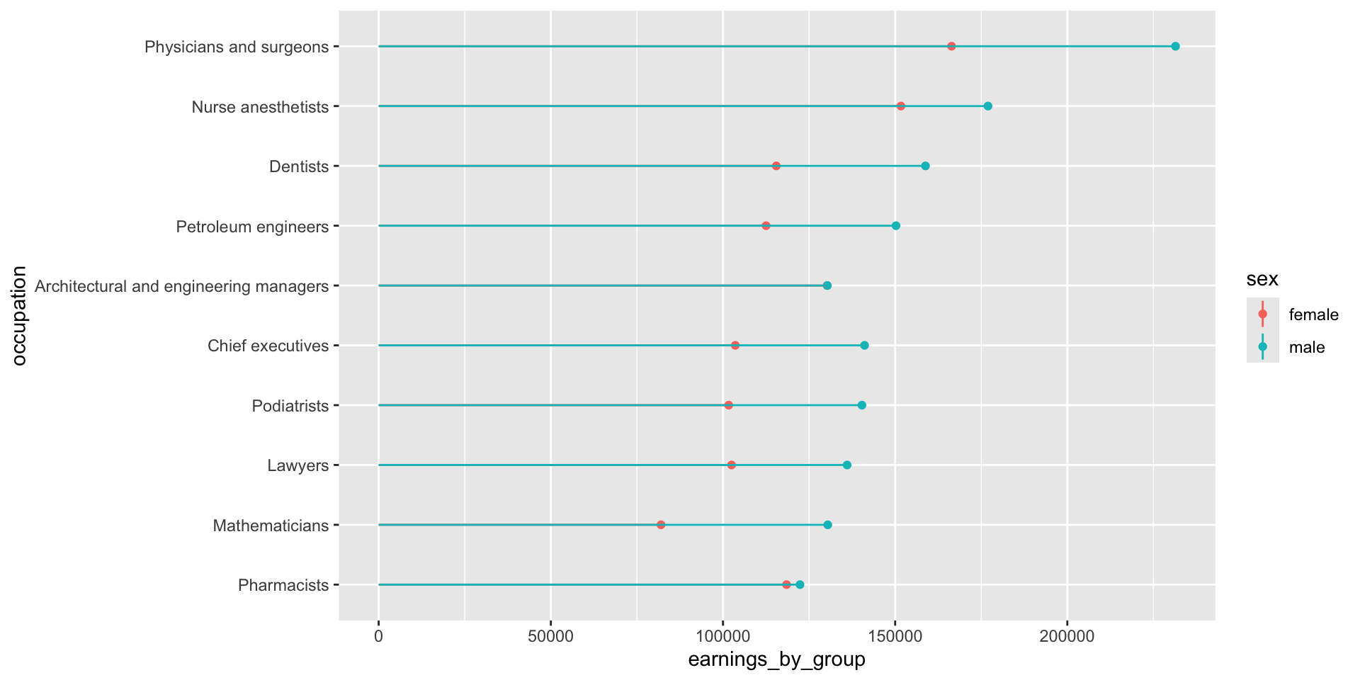
Plotting 2+ groups (e.g. male vs. female earnings)
We’ll need to transform our data from wide to long format, where total earning for males and females are in the same column (we’ll name this earnings_by_group), and a secondary column denotes which group those earnings are associated with (total_earnings_female, total_earnings_male):
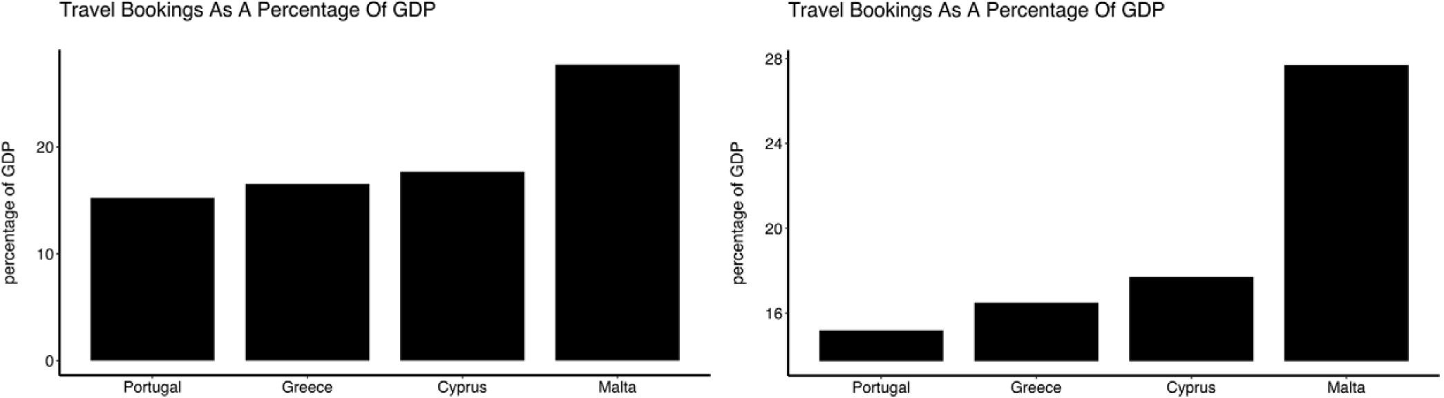
The axis of a bar (or related) plot must start at zero
Truncated axes leads viewers to perceive illustrated differences as larger or more important than they actually are (i.e. a truncation effect). Yang et al. (2021) empirically tested this effect and found that this truncation effect persisted even after viewers were taught about the effects of y-axis truncation.
Figure 2 from Yang et al. 2021. The left-most plot without a truncated y-axis was presented to the control group of viewers. The right-most plot with a truncated y-axis was presented to the test group of viewers.
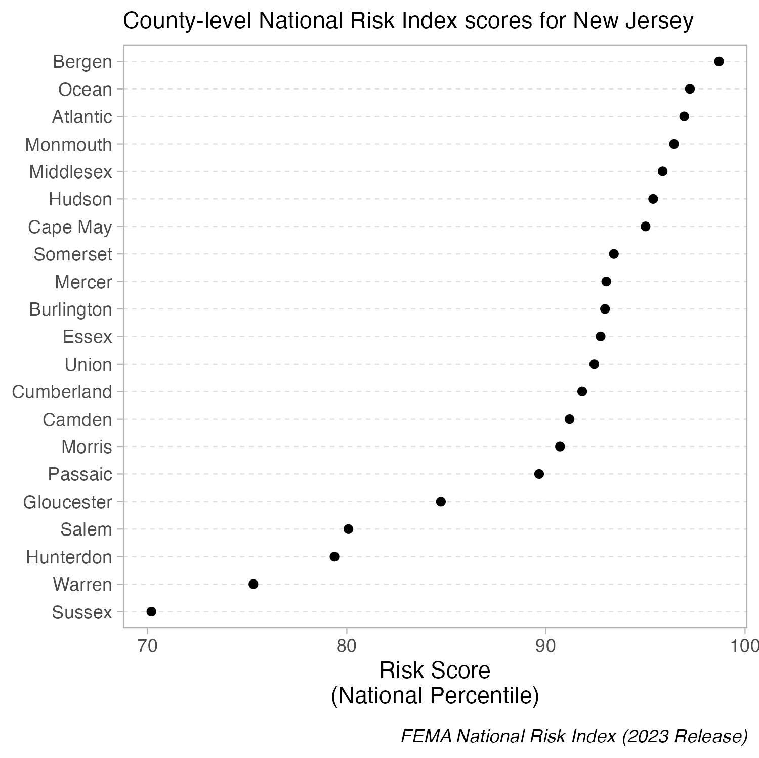
But you can cut the y-axis of dot plots!
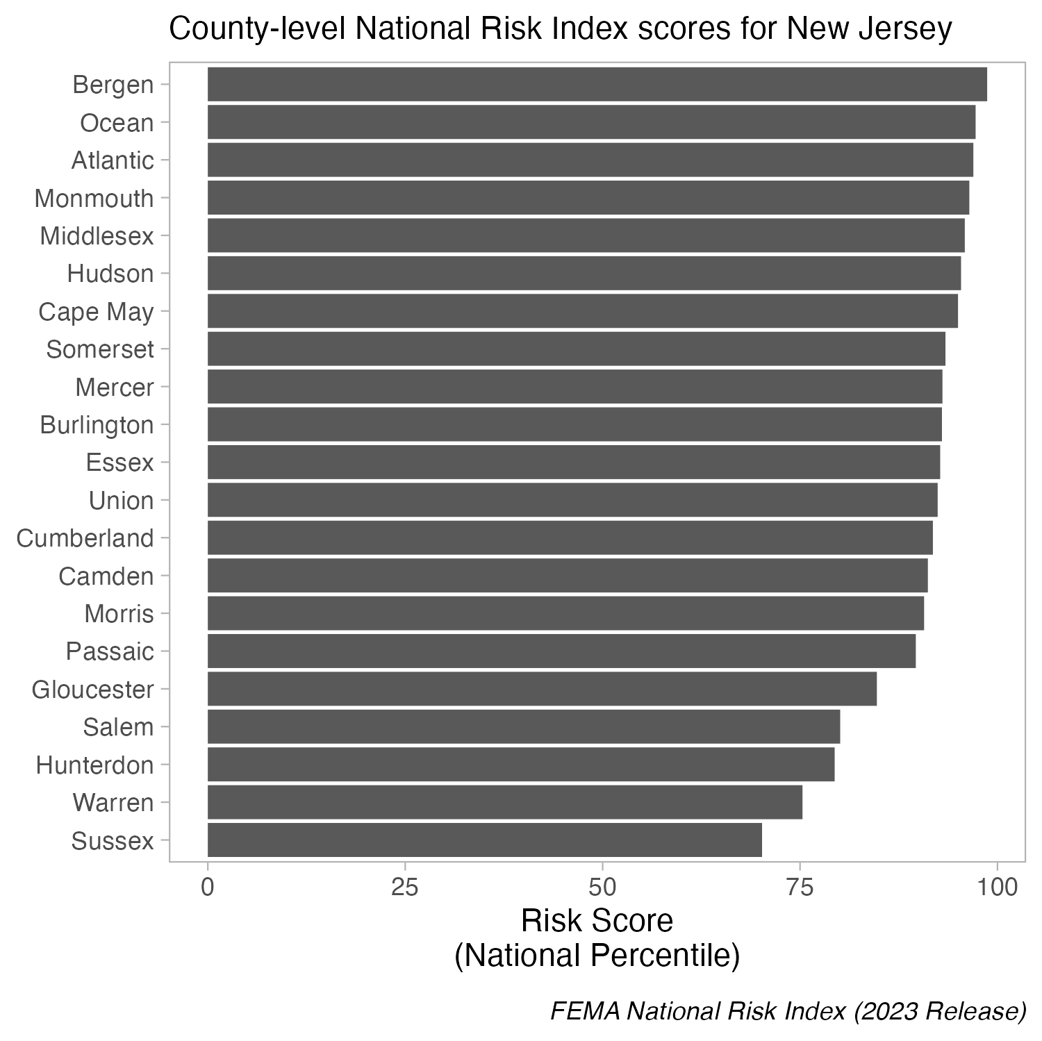
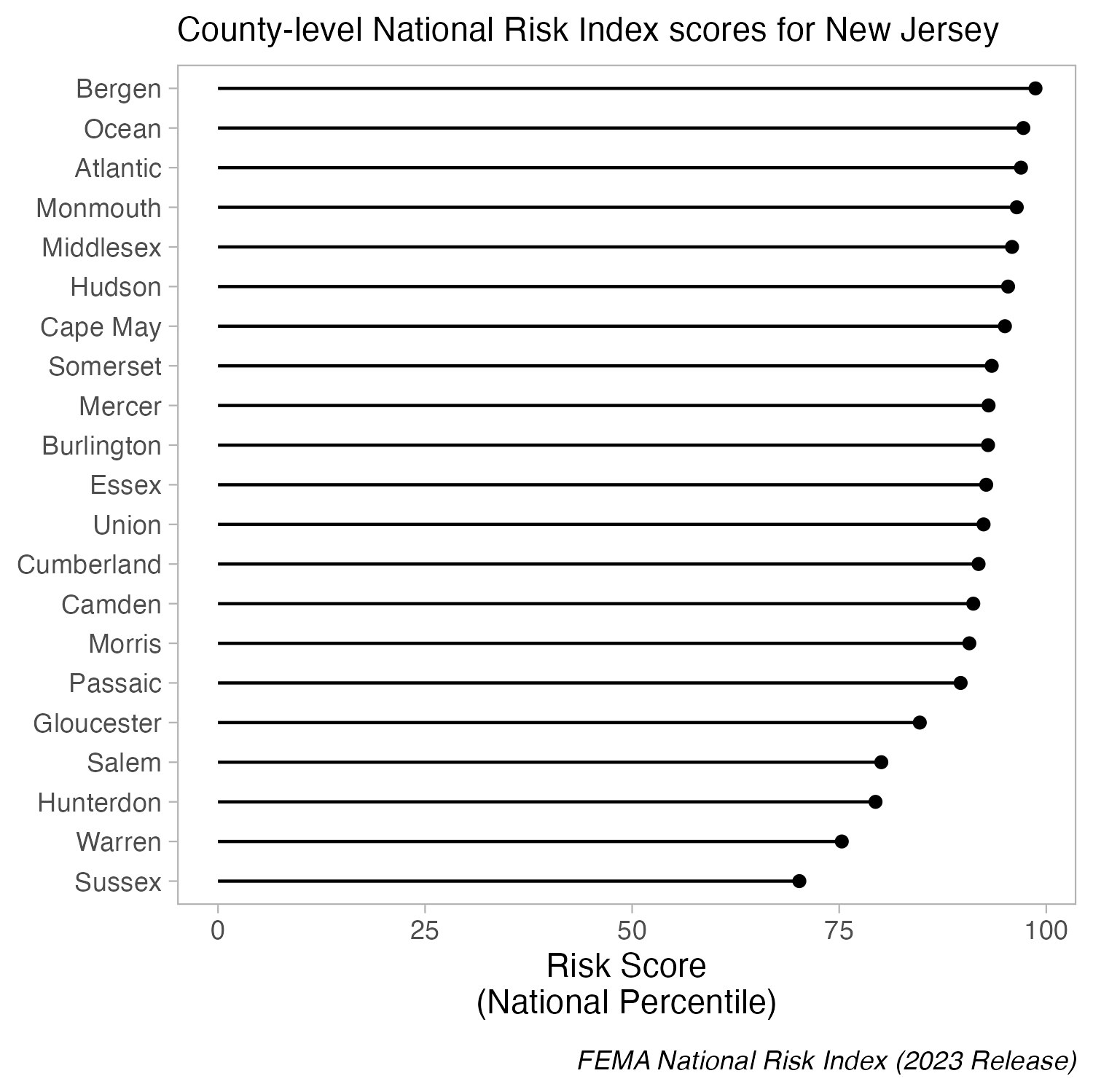
When bars are all long and have nearly the same length, the eye is drawn to the middle of the bars rather than to their end points. A lollipop plot is a bit less distracting (less ink), but still difficult to differentiate risk scores across counties. When we limit the axis range in a dot plot, it becomes easier to identify differences in the max and min values.
Create a dot plot using geom_point(), then adjust panel.grid lines inside theme().
Be cautious when using bar plots to summarize continuous data
Bar plots shine when you need to compare counts (e.g. populations size of different countries). However, you should proceed with caution when using bar plots to visualize the distribution of / summarize your data. Doing so can be misleading, particularly when you have small sample sizes. Why?
bar plots hide the distribution of the underlying data (many different distributions can lead to the same plot)
when used this way, the height of the bar (typically) represents the mean of the data, which can cause readers to incorrectly infer that the data are normally distributed with no outliers (this of course may be true in some cases, but certainly not always)
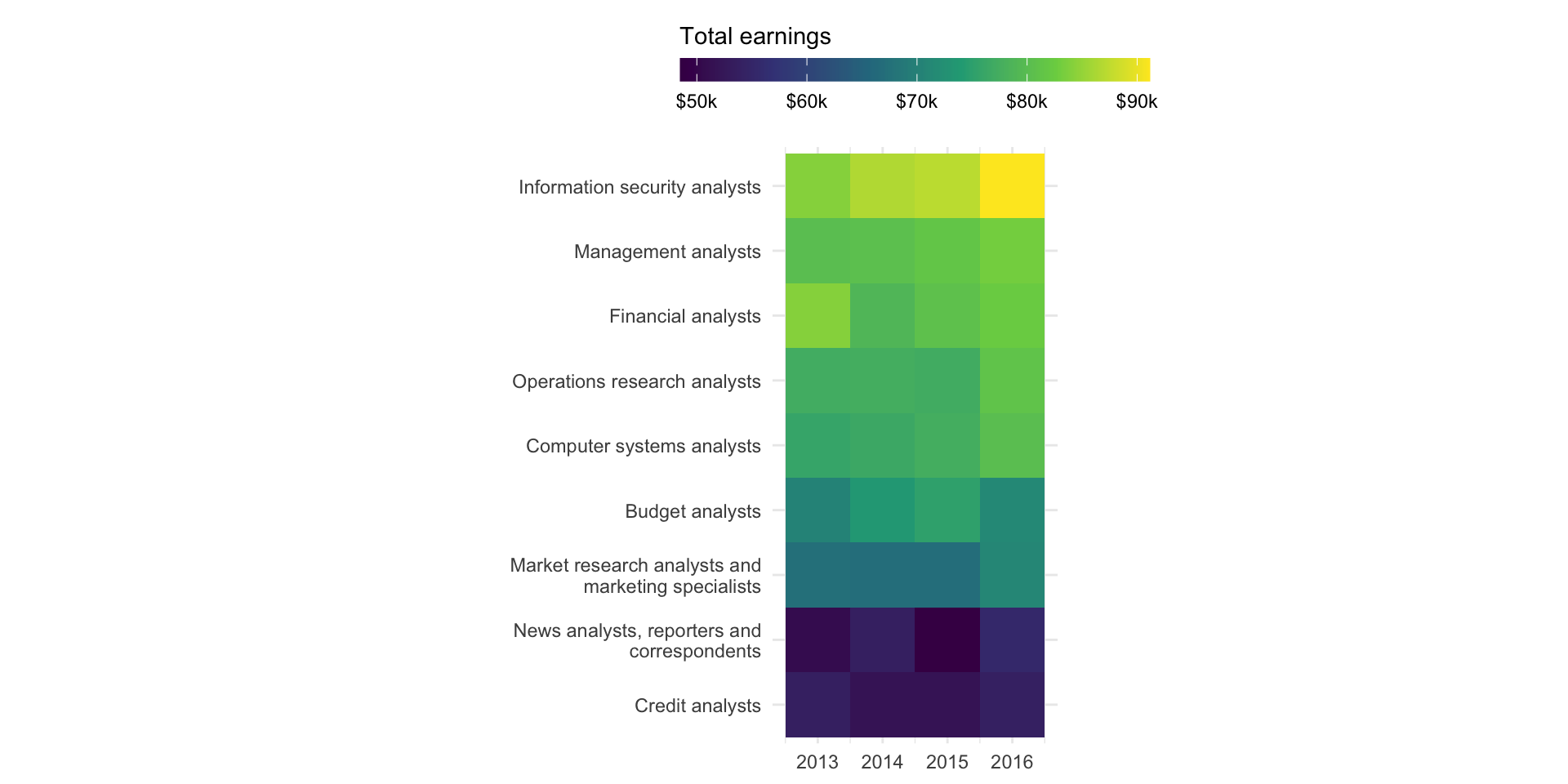
Heatmaps
great option for visualizing matrices of data (e.g. 2 categorical + 1 numeric variable) | focus is on patterns rather than precise amounts | consider audience familiarity (may require more explanation than a bar plot) | encode values using COLOR
Heatmap for 2 categorical + 1 numeric variable
Let’s say we want to explore the change in total earnings through time for any “analyst” positions in our data set. We can use a heatmap to create a matrix that displays total earnings (numeric, continuous) by occupation (categorical) and year (categorical):
Heatmap for 2 categorical + 1 numeric variable
# filter for occupations that have the word "analyst" in title ----analysts <- jobs_clean |>filter(str_detect(string = occupation, pattern ="analyst")) |>select(year, occupation, total_earnings)# determine order of occupations based on highest total_earnings in 2016 ----order_2016 <- analysts |>filter(year ==2016) |>arrange(total_earnings) |>mutate(order =row_number()) |>select(occupation, order) # join order with rest of data to set factor levels ----heatmap_order <- analysts |>left_join(order_2016, by ="occupation") |>mutate(occupation =fct_reorder(occupation, order))# create heatmap ----ggplot(heatmap_order, aes(x = year, y = occupation, fill = total_earnings)) +geom_tile() +labs(fill ="Total earnings") +coord_fixed() +scale_fill_viridis_c(labels = scales::label_currency(scale =0.001, suffix ="K")) +scale_y_discrete(labels = scales::label_wrap(30)) +guides(fill =guide_colorbar(barwidth =15, barheight =0.75, title.position ="top")) +theme_minimal() +theme(legend.position ="top",axis.title =element_blank() )
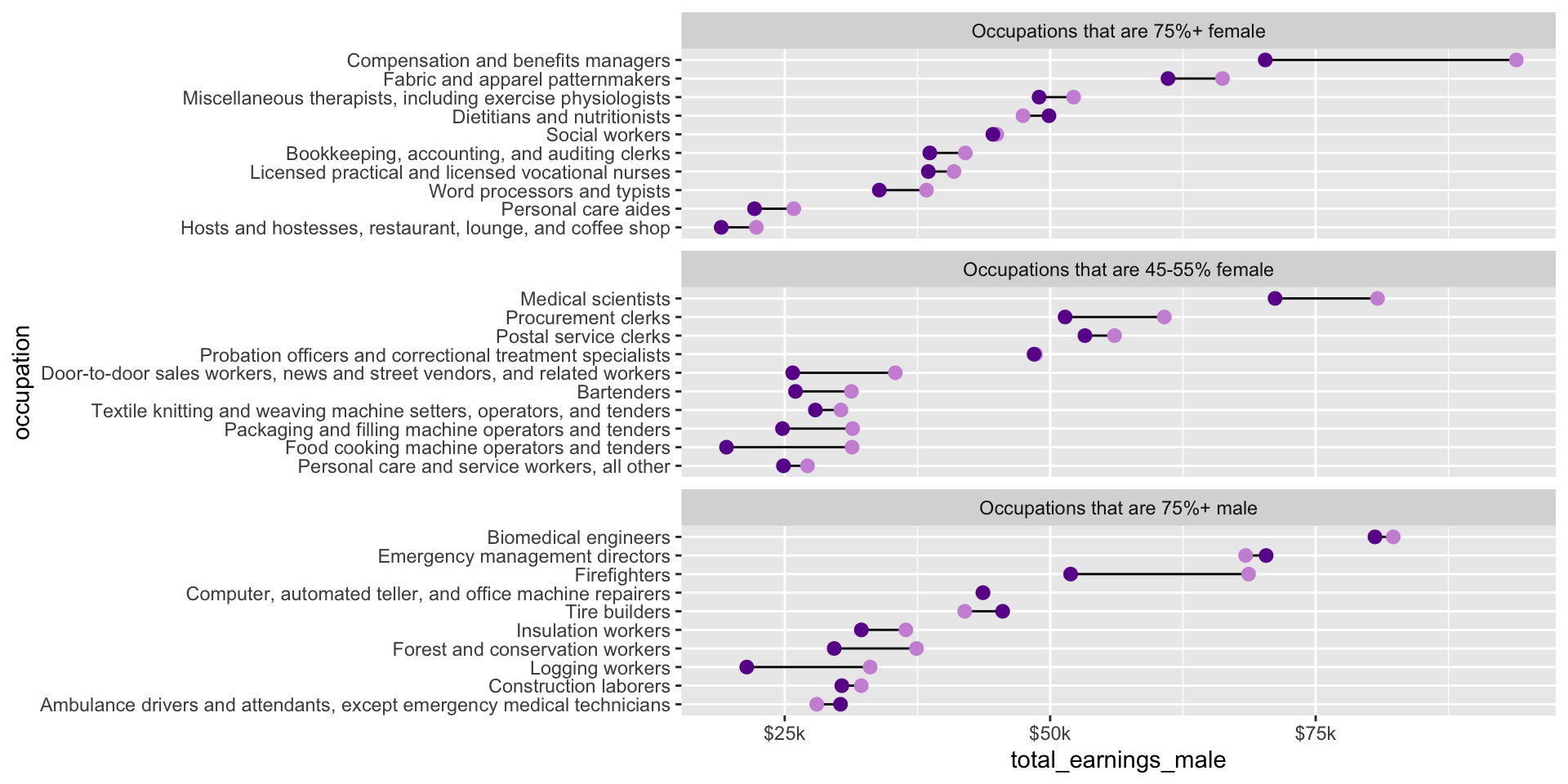
Dumbbell plots
highlights magnitude and direction of change (or difference) between two values within a category | shows exact values, but focus is on the difference between values | encode values using POSITION
Dumbbell plot for 1 categorical + 2 within-category numeric variables
Let’s say we want to explore the difference in median salaries between male and female workers, by occupation. We can use a dumbbell (aka Cleveland) plot to display median salaries (numeric) for female and male workers (categorical), by occupation (categorical):
Let’s use a subset of our data . . .
. . .to explore differences in male vs. female median salaries across occupations that are female dominated (75%+ female), male dominated (75%+ male), and those that are a relatively even split (45-55% female).
##~~~~~~~~~~~~~~~~~~~~~~~~~~~~~~~~~~~~~~~~~~~~~~~~~~~~~~~~~~~~~~~~~~~~~~~~~~~~~~## create subset df ----##~~~~~~~~~~~~~~~~~~~~~~~~~~~~~~~~~~~~~~~~~~~~~~~~~~~~~~~~~~~~~~~~~~~~~~~~~~~~~~#....guarantee the same random samples each time we run code.....set.seed(0)#.........get 10 random jobs that are 75%+ female (2016).........f75 <- jobs_clean |>filter(year ==2016, group_label =="Occupations that are 75%+ female") |>slice_sample(n =10)#..........get 10 random jobs that are 75%+ male (2016)..........m75 <- jobs_clean |>filter(year ==2016, group_label =="Occupations that are 75%+ male") |>slice_sample(n =10)#........get 10 random jobs that are 45-55%+ female (2016).......f50 <- jobs_clean |>filter(year ==2016, group_label =="Occupations that are 45-55% female") |>slice_sample(n =10)#.......combine dfs & relevel factors (for plotting order).......subset_jobs <-rbind(f75, m75, f50) |>mutate(group_label =fct_relevel(.f = group_label, "Occupations that are 75%+ female", "Occupations that are 45-55% female", "Occupations that are 75%+ male"),occupation =fct_reorder(.f = occupation, .x = total_earnings))
Create dumbbell plot
##~~~~~~~~~~~~~~~~~~~~~~~~~~~~~~~~~~~~~~~~~~~~~~~~~~~~~~~~~~~~~~~~~~~~~~~~~~~~~~## plot ----##~~~~~~~~~~~~~~~~~~~~~~~~~~~~~~~~~~~~~~~~~~~~~~~~~~~~~~~~~~~~~~~~~~~~~~~~~~~~~~# initialize plot (we'll map our aesthetics locally for each geom, below) ----ggplot(subset_jobs) +# create dumbbells ----geom_linerange(aes(y = occupation,xmin = total_earnings_female, xmax = total_earnings_male)) +geom_point(aes(x = total_earnings_male, y = occupation), color ="#CD93D8", size =2.5) +geom_point(aes(x = total_earnings_female, y = occupation), color ="#6A1E99", size =2.5) +# facet wrap by group ----facet_wrap(~group_label, nrow =3, scales ="free_y") +# "free_y" plots only the axis labels that exist in each group# axis breaks & $ labels ----scale_x_continuous(labels = scales::label_currency(scale =0.001, suffix ="k"),breaks =c(25000, 50000, 75000, 100000))