From a technical perspective, you have the tools in your tool kit to build data viz that tell stories.
02:00
EDS 240: Lecture 9.1
Data storytelling
Week 9 | March 3rdth, 2025
Good data visualization design considers:
Our job is to turn values and analyses into insights and narratives – doing so truthfully, effectively, and compellingly is all a part of data storytelling.
We won’t be covering anything new, per se
From a technical perspective, you have the tools in your tool kit to build data viz that tell stories.
We’ve seen many examples of data visualizations that are constructed around a narrative (whether or not we explicitly called attention to it).
You have all listened to, read, and told stories (in this class, in other classes, in life).
Why is storytelling important?
“…the very act of telling a story makes people trust you more… Data doesn’t change behavior, emotions do”
-Karen Eber in her TED talk, Why storytelling is more trustworthy than presenting data (2:45-7:07)
“Stories are inherent to us. We’ve been told stories since we were children. Stories are how we learn and how we make decisions.”
-Mike Bugembe in his TED talk, Lies, racism and sexism: The power of data stories (13:00-17:50)
I also recommend watching The Power in Effective Data Storytelling, by Malavica Sridhar and Why Data Storytelling Matters to All of Us, by Jia Hwei Ng
Telling a story involves . . .
adding context
makes it relevant / mean something to your audience
adding narrative
you want stories to be told in a way that everyone can understand
creating visuals
brings your narrative to life / makes it real
Let’s practice storytelling
Don’t advance the slides until I say so!
On the next few slides, we’ll see a series of data visualizations. First basic, then with additional layers added. These are data you’ve seen many times before.
For each version, consider the following questions:
Tell a story about this plot
02:00
Tell a story about this plot
02:00
Tell a story about this plot
02:00
Recreated based on Cédric Scherer’s visualization as showcased in his talk, ggplot Wizardry: My Favorite Tricks and Secrets for Beautiful Plots in R
Complete code (in case you’re interested)
#..........................load packages.........................
library(tidyverse)
library(palmerpenguins)
library(showtext)

#...........................load fonts...........................
font_add_google(name = "Montserrat", family = "montserrat")
showtext_auto()

#.................get and assemble penguin image.................
# only need to run these first two lines once to download image:
# url <- "https://raw.githubusercontent.com/allisonhorst/palmerpenguins/master/man/figures/culmen_depth.png"
# utils::download.file(url = url, destfile =  here::here("week8", "images", "penguin.png"))
my_img <- png::readPNG(here::here("week8", "images", "penguin.png"))
my_raster_img <- grid::rasterGrob(my_img)

#...........................build plot...........................
ggplot(penguins, aes(x = bill_length_mm, y = bill_depth_mm, color = body_mass_g)) +
  geom_point(alpha = 0.8, size = 2) +
  ggforce::geom_mark_ellipse(aes(group = species, label = species),
                    color = "black") +
  scale_color_gradientn(colors = c("#F3E5B1", "#6C7B1A", "#044148")) +
  guides(color = guide_colorbar(barwidth = 20, barheight = 0.5,
                                title.position = "top", title.hjust = 0.5,
                                ticks = FALSE)) +
  scale_x_continuous(breaks = seq(25, 65, 5),
                     limits = c(25, 65),
                     expand = c(0,0)) +
  scale_y_continuous(breaks = seq(12, 24, 2),
                     limits = c(12, 24),
                     expand = c(0,0)) +
  labs(x = "**Bill Length** (mm)",
       y = "**Bill Depth** (mm)",
       color = "Body Mass (g)",
       title = "**Bill Dimensions of Brush-Tailed Penguins (*Phygoscelis*)**",
       caption = "Data: Gorman, Williams, Fraser (2014) PLoS ONE | Illustration: Allison Horst") +
  theme_light() +
  theme(
    plot.title.position = "plot",
    legend.position = "top",
    text = element_text(family = "montserrat"),
    plot.title = ggtext::element_textbox_simple(size = 20,
                                                margin = margin(0.5, 0, 1, 0.25, "lines")),
    axis.title.x = ggtext::element_markdown(size = 15,
                                            margin = margin(1, 0, 0, 0, "lines")),
    axis.title.y = ggtext::element_markdown(size = 15,
                                            margin = margin(0, 1, 0, 0, "lines")),
    axis.text = element_text(size = 10),
    axis.ticks = element_blank(),
    legend.title = element_text(size = 14),
    legend.text = element_text(size = 10),
    plot.caption = element_text(face = "italic",
                                margin = margin(2, 0, 0, 0, "lines")),
    panel.grid.minor = element_blank()
  ) +
  coord_cartesian(clip = "off") +
  annotation_custom(my_raster_img,
                    xmin = 56.8, xmax = 65.8,
                    ymin = 22, ymax = 30)
Note: The positioning / size of text, penguin image, etc. was chosen based on how it looked as rendered in the slides. You may need to modify for viewing on your own device.
Scrollable data stories help to weave longer narratives
Take some time to explore these with your learning partners and be prepared to share out some thoughts.
08:00
We’ve shown that static viz can also tell stories
The next ten slides (14 - 23) each have a different static visualization. With your learning partner(s), discuss the following:
Note: You don’t need to get to every viz! There are lots of options so you can explore those that peak your interest most.
08:00
The Jan. 6 inquiry, by the numbers (New York Times)
China’s population continues to shrink as deaths outnumber births (New York Times)
Refugees resettled in the United States (Reuters)
How employed people spend their day (New York Times)
Anytime we present data, we have the opportunity to tell a story
oral talks
academic journal articles
blog posts
dashboards
infographics / static visualizations
A few last important reminders before you jump back into storytelling. . .
Identify your audience
To tell a clear story, you need to know your audience
Data viz can look wildly different depending on how you answer the above questions!
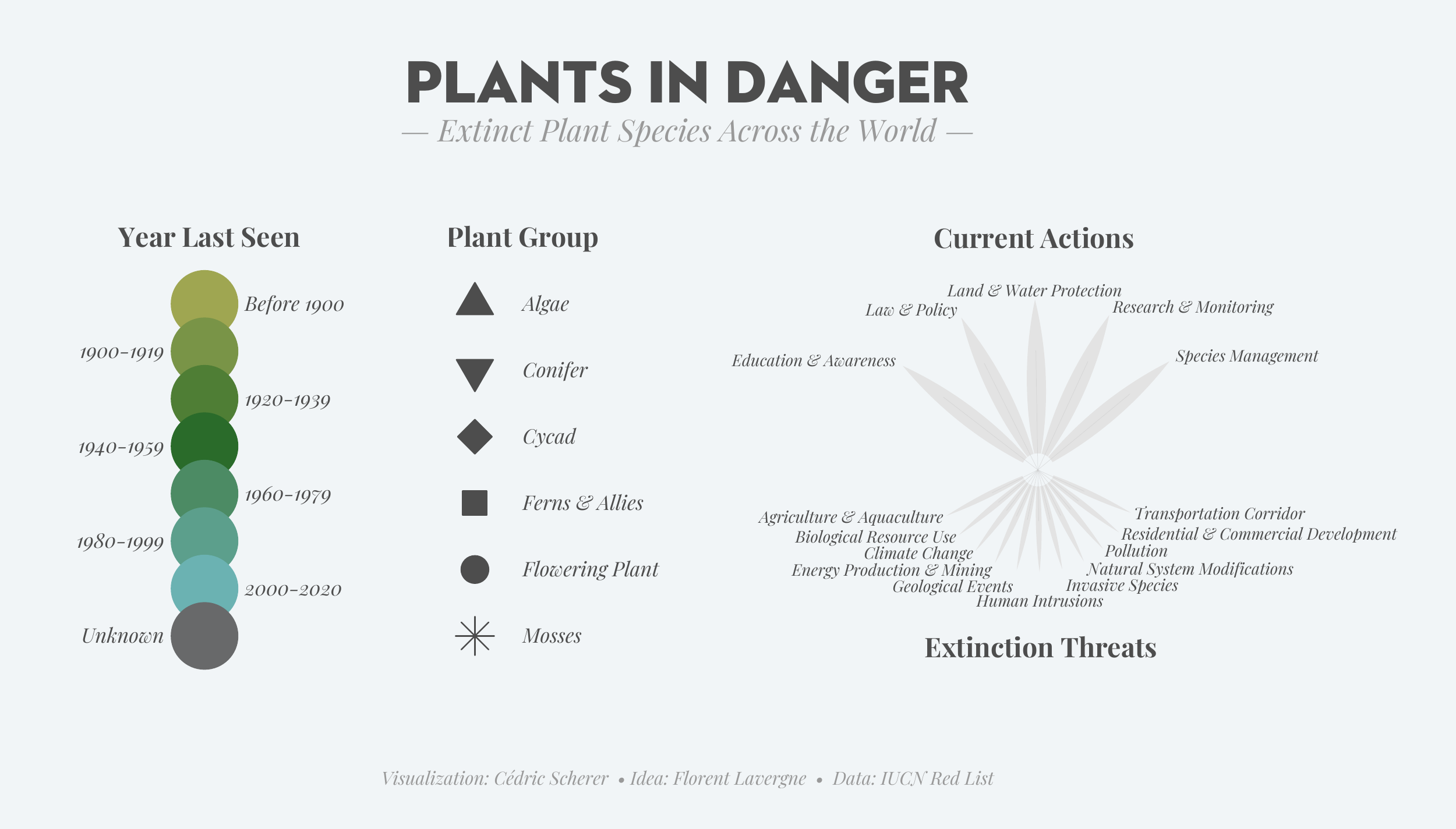
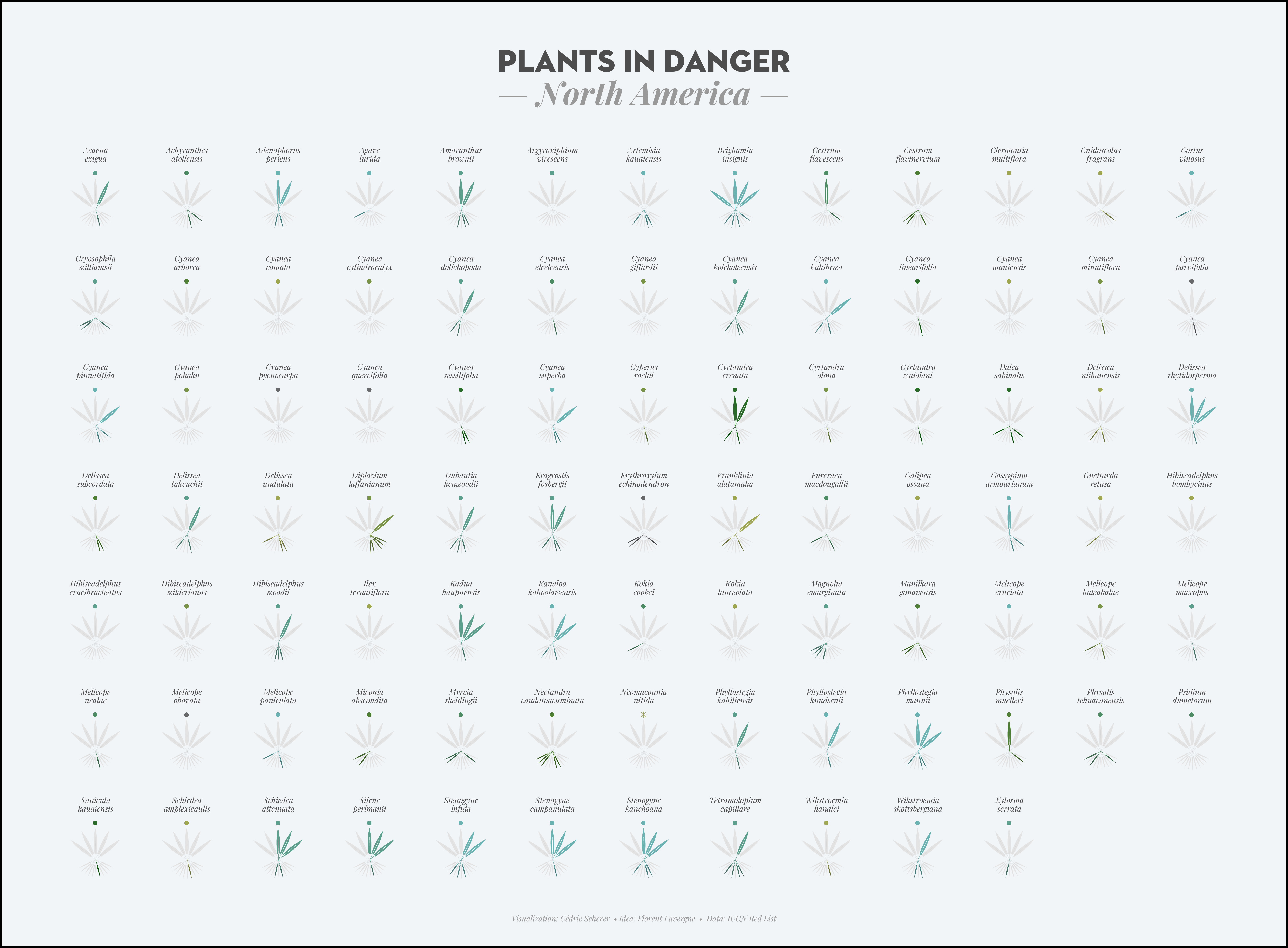
From Cédric Scherer’s talk, Effective Data Visualization and Graphic Design with ggplot2 workshop
Consider the audience


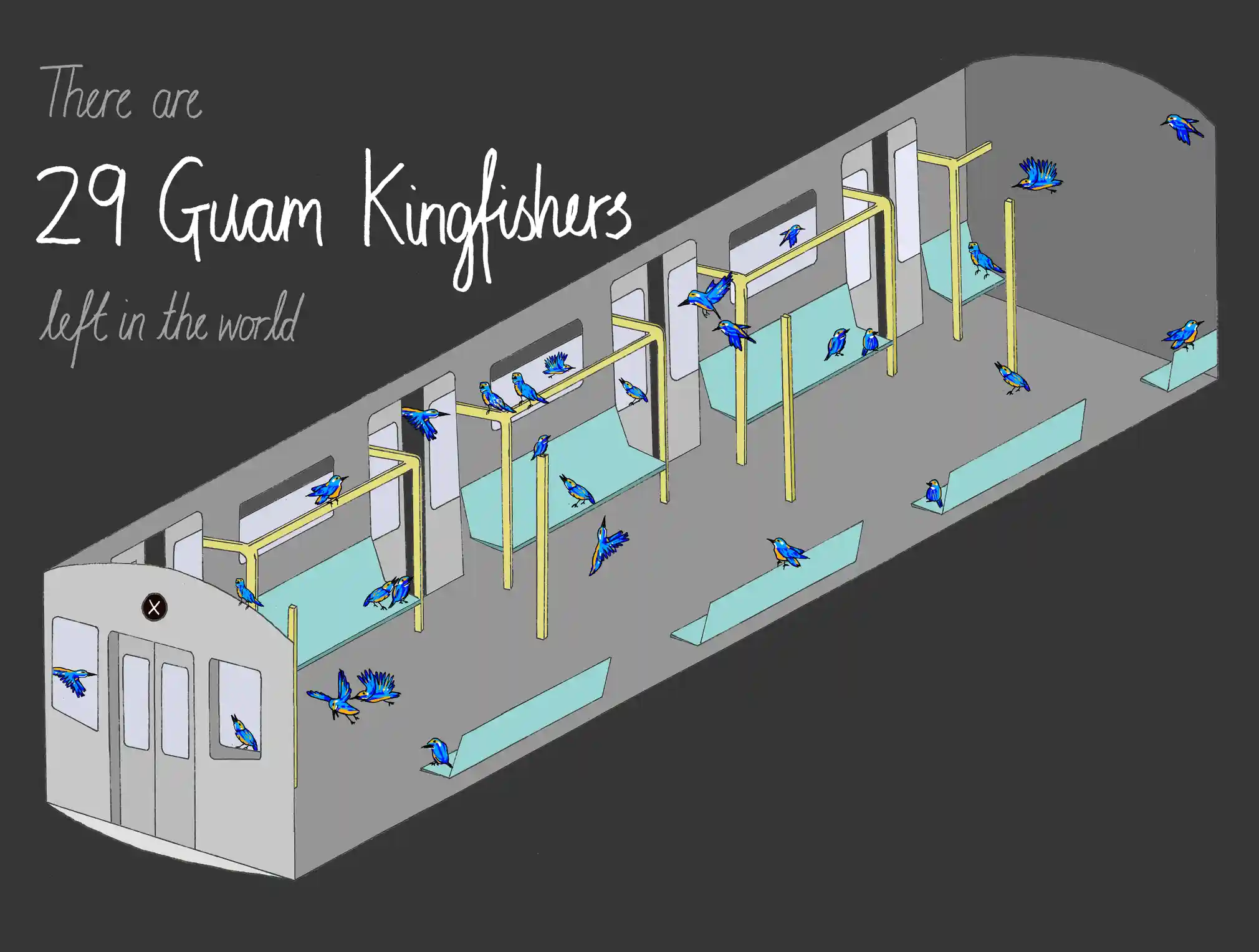
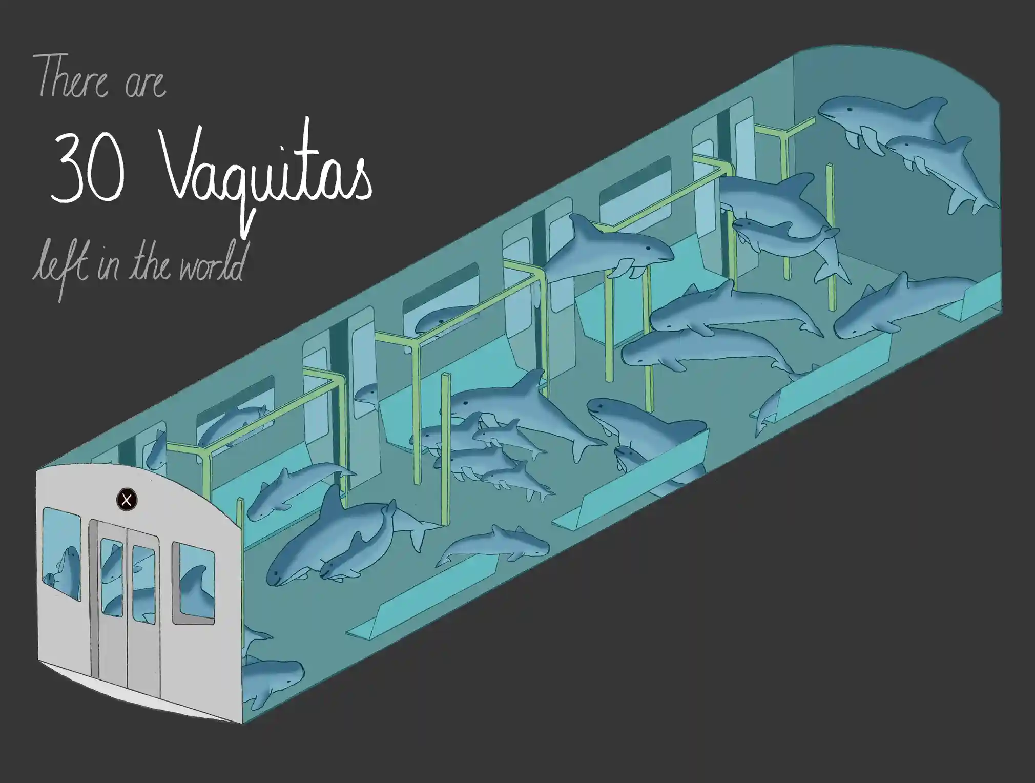
endangered species that could (almost) fit in a single train carriage, by Mona Chalabi (two of seven shown here)
02:00
Consider the audience
Fig. 3, by Ingeman et al. 2022: Glimmers of hope and critical cases. Find figure caption online.
02:00
Consider the audience


02:00
From Cédric Scherer’s talk, Effective Data Visualization and Graphic Design with ggplot2 workshop
Take a Break
~ This is the end of Lesson 1 (of 2) ~
05:00