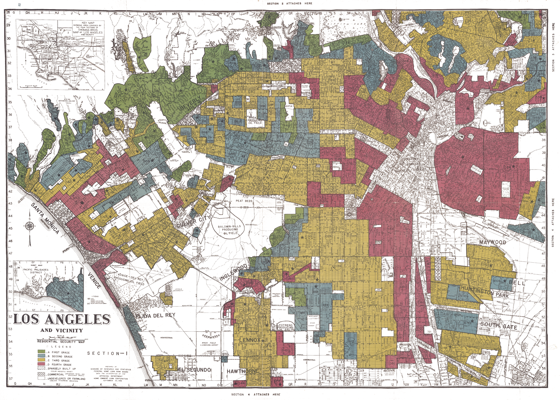
Source: Mapping Inequality: Redlining in New Deal America (v3)
EDS 240: Lecture 9.2
People as data
Week 9 | March 3rd, 2025
Good data visualization design considers:
What does this map depict?
Redlining Los Angeles, 1939
Our job as data scientists . . .
…is to actively incorporate equity awareness when working with data and generating data products (e.g. visualizations). Not all visuals are overtly racist or discriminatory, but we as data practitioners must recognize and work against misusing or misrepresenting data in ways that can harm communities and perpetuate systemic discrimination.
Urban Institute’s Do No Harm Guide, by Jonathan Schwabish and Alice Feng (2021)
guidelines on how to apply a DEI lens to not just words, colors, icons, etc., but also the process of crafting communication products
includes checklists & tool kits that focus on the often hidden / subtle ways that data analysts and communicators fail to incorporate equitable awareness in the data they use and they products they create
Our choices affect how viewers perceive and interpret information
Scheme by Andy Kirk from his book Data Visualisation: A Handbook for Data Driven Design, recreated by Cédric Scherer
Design choices influence viewers’ perception
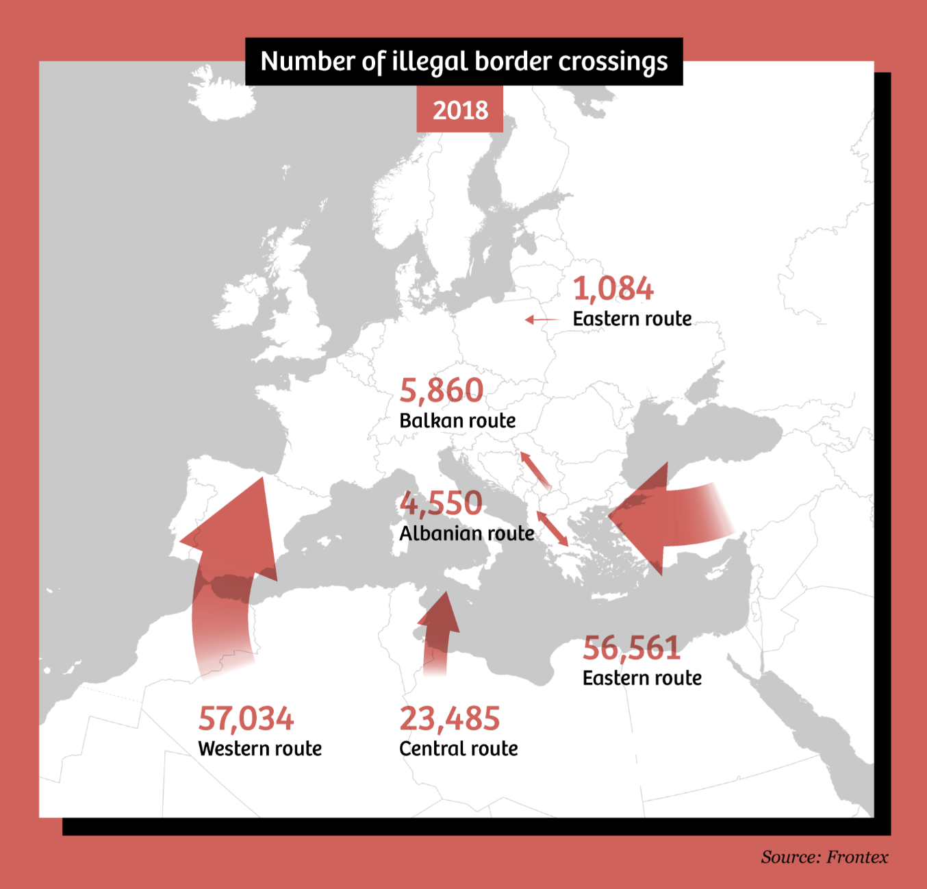
Discuss how you perceive, interpret, and comprehend this map with your learning partner(s). What thoughts or emotions does it invoke? Why do you think you feel those emotions?
The above map was recreated by folks at The Correspondent, based on migration maps commonly published by the European Border and Coast Guard Agency (Frontex).
04:00
Design choices influence viewers’ perception

How maps in the media make us more negative about migrants, by Maite Vermulen, Leon De Korte, and Henk Van Houtum
Design choices influence viewers’ perception

Discuss how you might redesign this map to make us feel less
“like we are being overrun by huge numbers of anonymous enemies, coming at us en masse from all corners of the globe to disrupt our orderly lives”
-Vermulen, De Korte, Van Houtum
How maps in the media make us more negative about migrants, by Maite Vermulen, Leon De Korte, and Henk Van Houtum
04:00
Use different colors

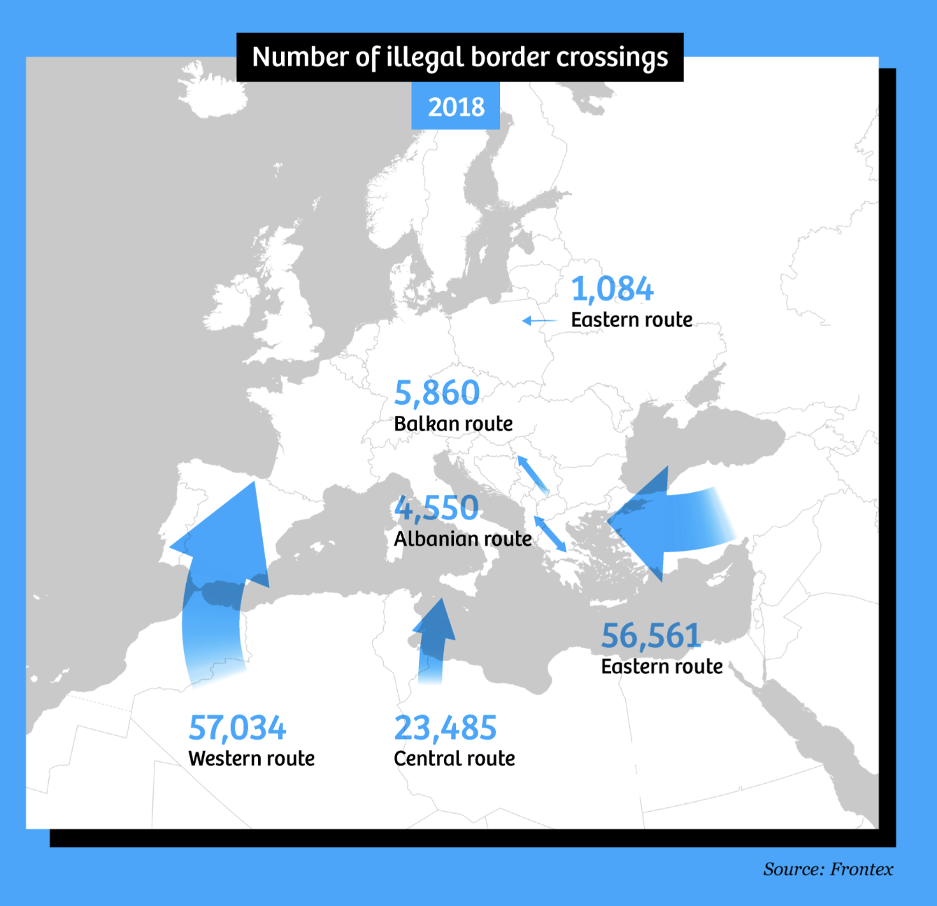
How maps in the media make us more negative about migrants, by Maite Vermulen, Leon De Korte, and Henk Van Houtum
Change the title

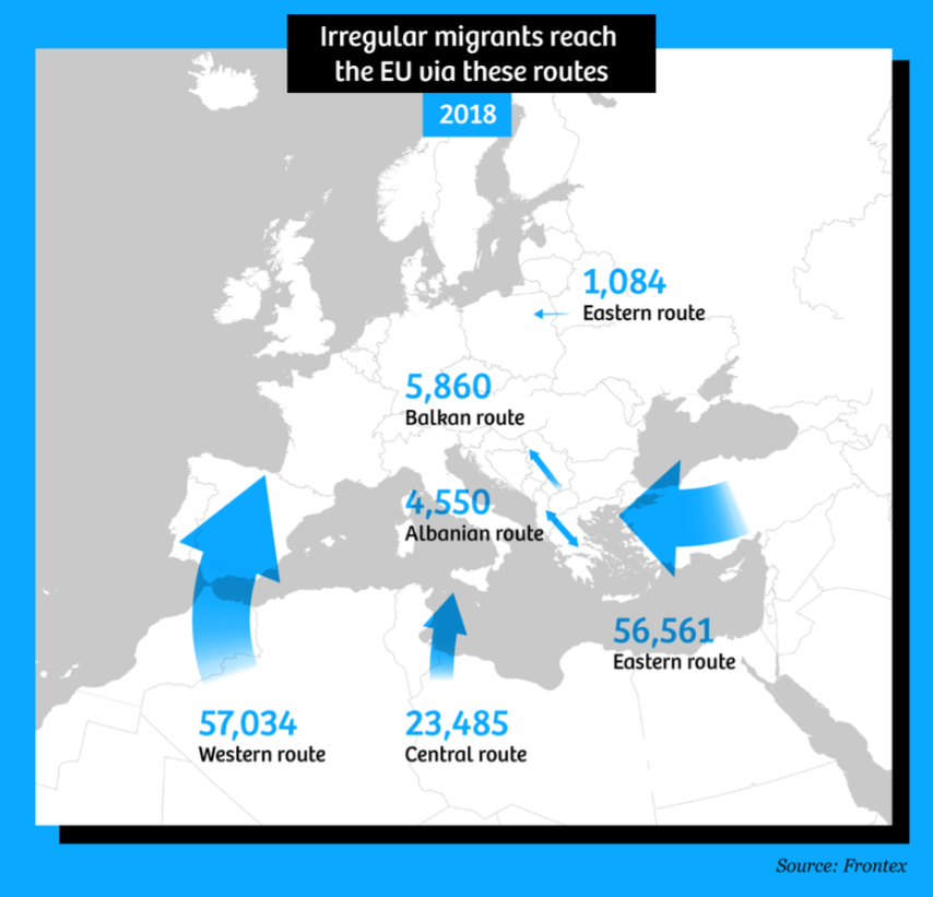
How maps in the media make us more negative about migrants, by Maite Vermulen, Leon De Korte, and Henk Van Houtum
Adjust the size of the arrows

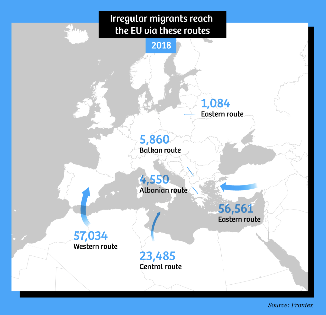
How maps in the media make us more negative about migrants, by Maite Vermulen, Leon De Korte, and Henk Van Houtum
Don’t use arrows altogether

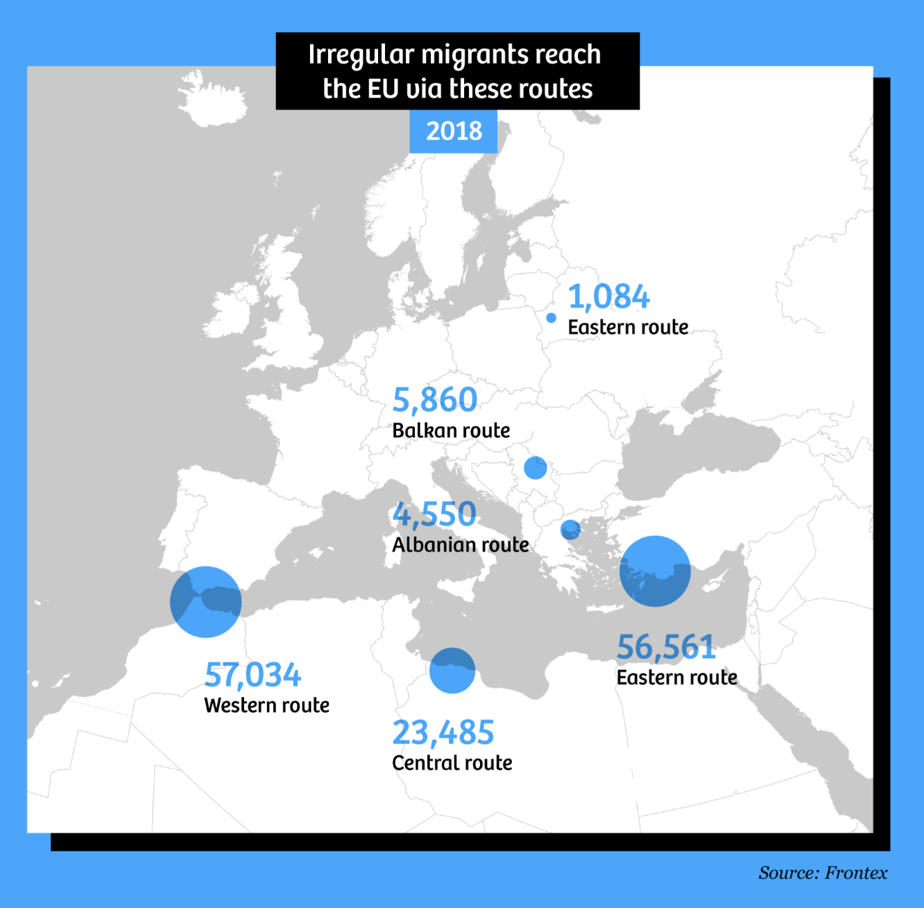
How maps in the media make us more negative about migrants, by Maite Vermulen, Leon De Korte, and Henk Van Houtum
Consider format and information

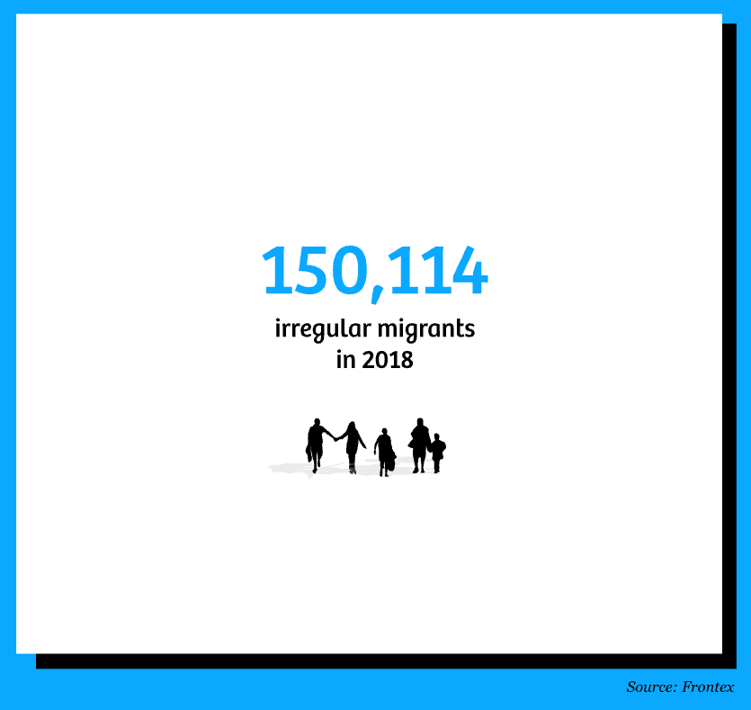
How maps in the media make us more negative about migrants, by Maite Vermulen, Leon De Korte, and Henk Van Houtum
Consider format and information

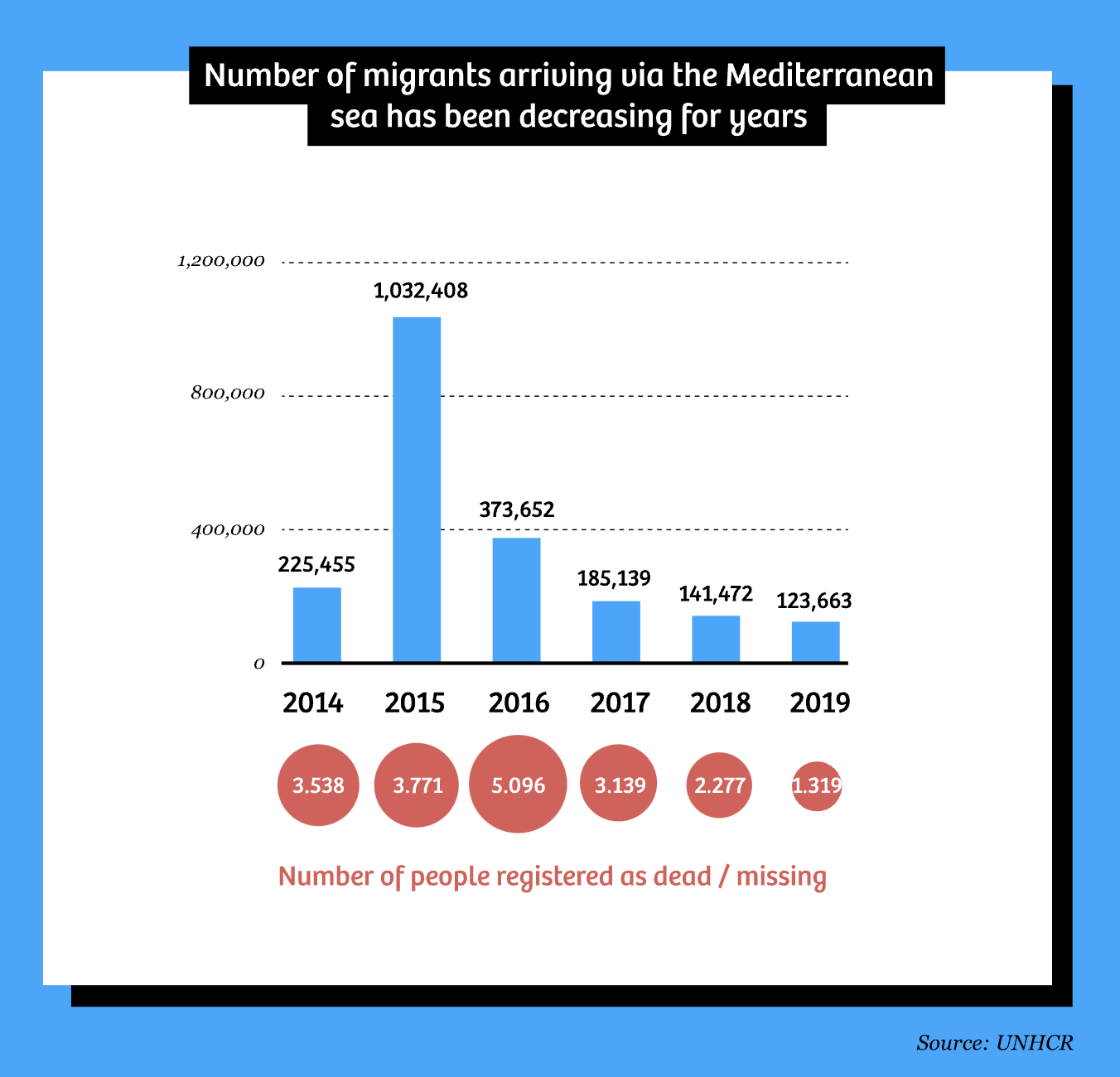
How maps in the media make us more negative about migrants, by Maite Vermulen, Leon De Korte, and Henk Van Houtum
Provide context

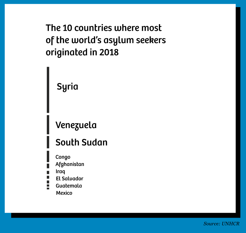
How maps in the media make us more negative about migrants, by Maite Vermulen, Leon De Korte, and Henk Van Houtum
Provide context

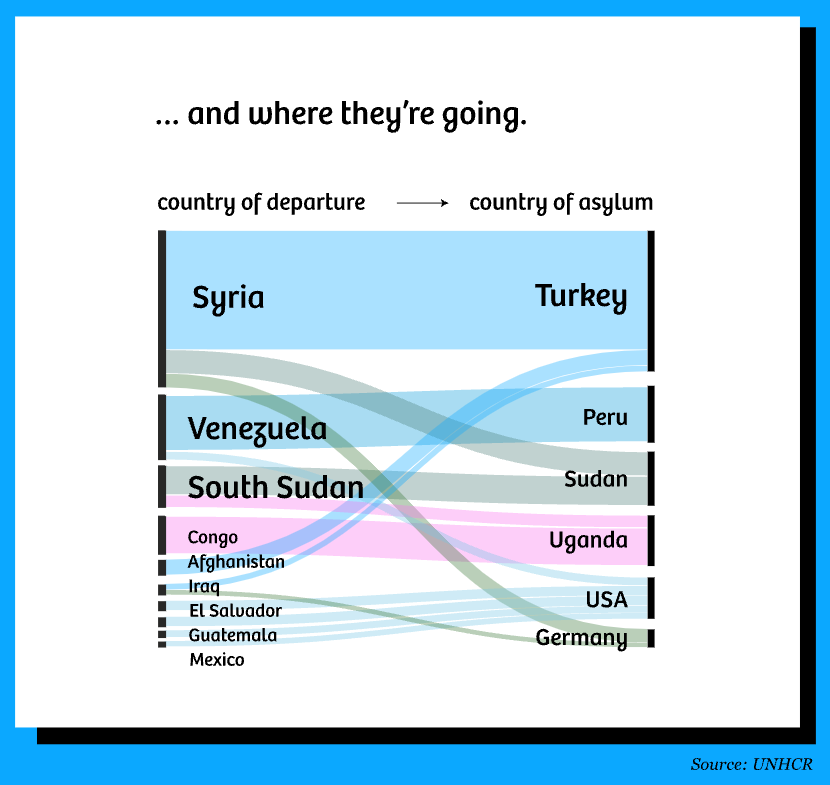
How maps in the media make us more negative about migrants, by Maite Vermulen, Leon De Korte, and Henk Van Houtum
Provide context

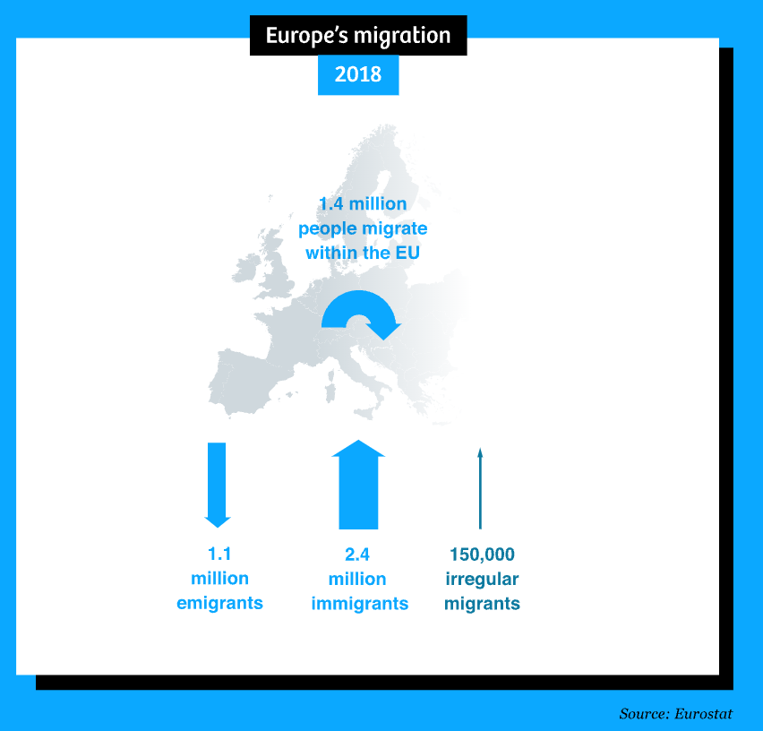
How maps in the media make us more negative about migrants, by Maite Vermulen, Leon De Korte, and Henk Van Houtum
Some important takeaways
Quotes from Vermulen, De Korte, and Van Houtum
“As journalists and illustrators, there is no way around simplifying the world for the sake of readability. Whether in maps or in text. But we can be much more aware of the consequences of those simplifications – and be honest about what’s happening.”
“… take a moment to contemplate who authored this visual story and what message the author wants to convey. And why.”
Connecting readers with content requires empathy – for both the communities whose data we are visualizing and the readers / target audiences of our work (Schwabish & Feng 2021)
Empathy is defined as:
“the action of understanding, being aware of, being sensitive to, and vicariously experiencing the feelings, thoughts, and experiences of another”
The Do No Harm Guide lists six themes for considering empathy as it applies to communicating data…
Connecting readers with content requires empathy
Put people first
“if your data [are] about people, make it extremely clear who they are or were”
-Jacob Harris in Connecting with the Dots

Each square represents US service member who died in Iraq or Afghanistan. Source: Faces of Death (New York Times); (Note: this is an archived page and a bit glitchy)
Connecting readers with content requires empathy
Put people first
Use personal connections to help readers and users connect with the material
Pair data-driven charts with personal stories, or help readers understand the “far vs. near” (i.e. overall metrics + smaller ranges / groups of data)
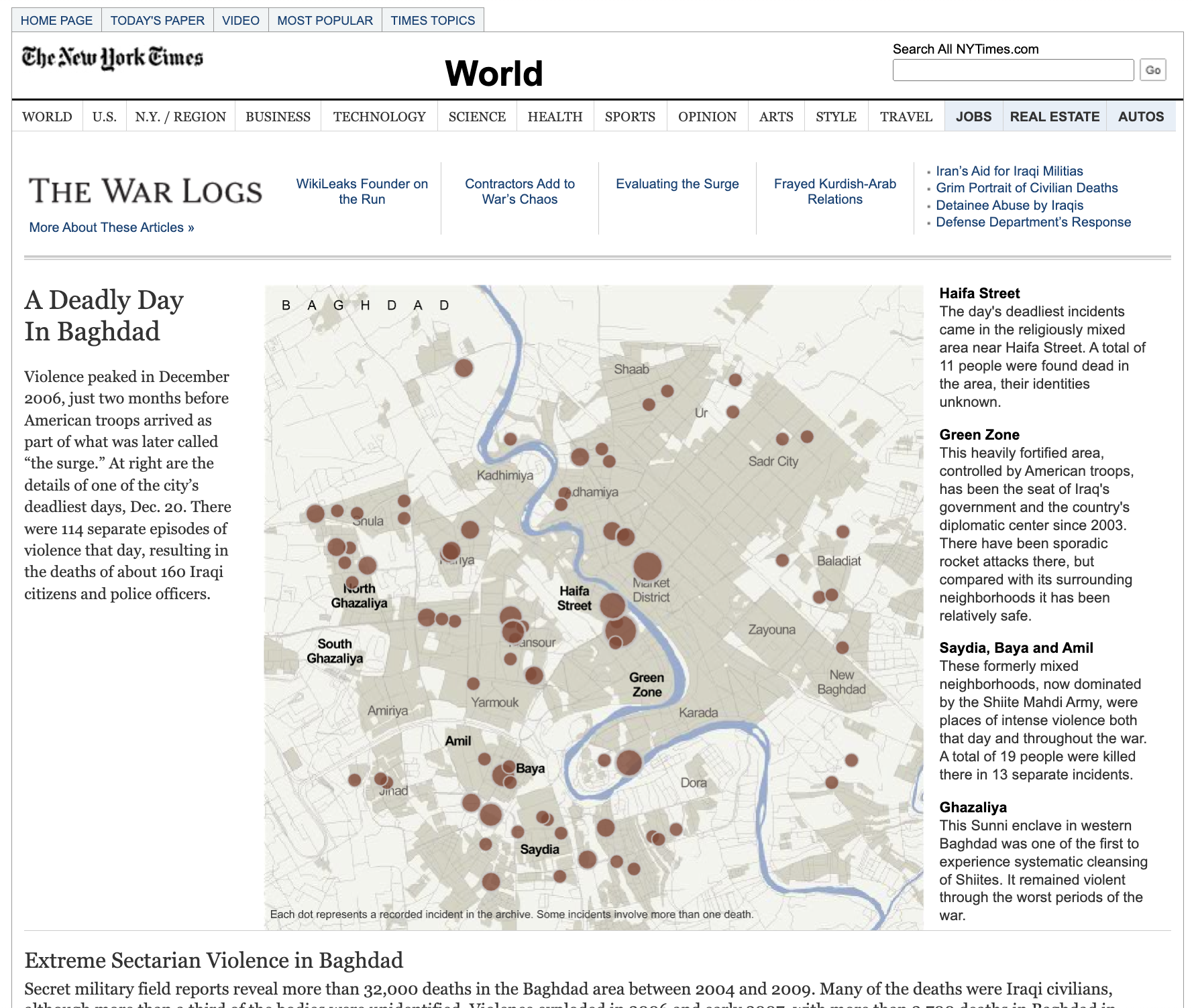
This map focuses on one of the deadliest days in Baghdad, with 114 separate episodes of violence resulting in the deaths of 160 Iraqi citizens and police officers | Source: A Deadly Day In Baghdad (New York Times)
Connecting readers with content requires empathy
Put people first
Use personal connections to help readers and users connect with the material
Use a mix of quantitative and qualitative approaches to tell a story
Focusing on just numbers without context can overlook important aspects of a story, such as the “why” and “how”
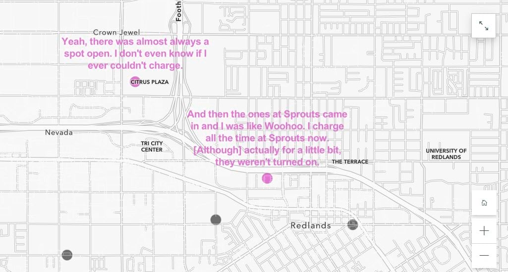
Mapping the theme of EV charging convenience, which was most tied to specific places. Above, transcript snippets around positive associations with convenience. | Source: Attitudes and Experiences with Electric Vehicles, by Diana Lavery
Check out Mapping Quotes, Stories, Sentiments, and Experiences, by Diana Lavery & Clinton Johnson, which explores the use of qualitative data to explore the complexities in peoples’ behaviors, attitudes, and concerns.
Connecting readers with content requires empathy
Put people first
Use personal connections to help readers and users connect with the material
Use a mix of quantitative and qualitative approaches to tell a story
Create a platform for engagement
Interactivity allows users to find themselves in the data or discover stories.
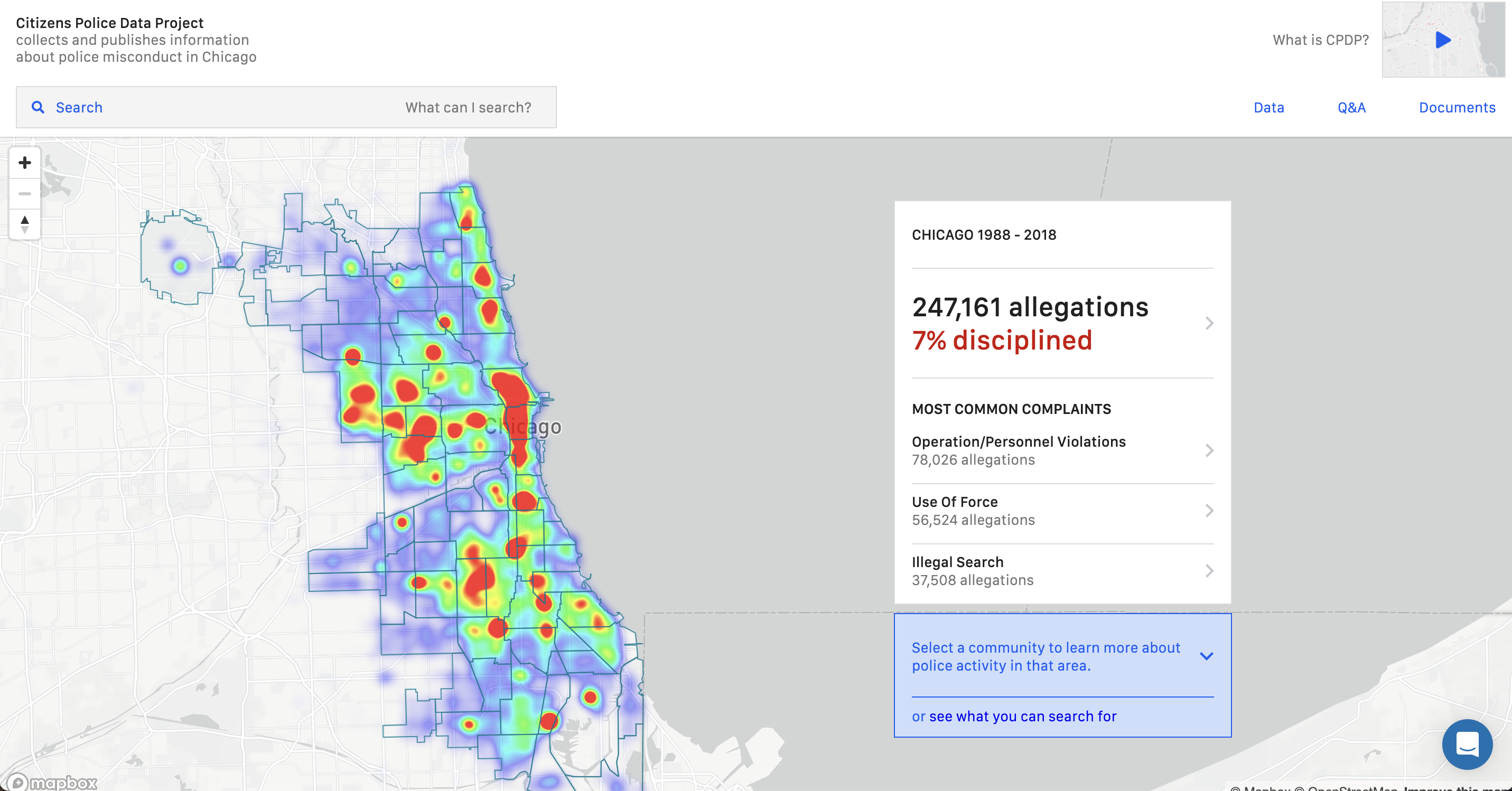
Explore reports by region and officer. | Source: Citizens Police Data Project, by Invisible Institute
The Citizens Police Data Project is an interactive online database and dashboard that empowers anyone to explore and analyze police misconduct data from Chicago. Trina Reynolds-Tyler, Data Director at Invisible Institute, spoke about this work at WiDS 2023 (begins ~1:05:00).
Connecting readers with content requires empathy
Put people first
Use personal connections to help readers and users connect with the material
Use a mix of quantitative and qualitative approaches to tell a story
Create a platform for engagement
Consider how your framing of an issue can create a biased emotional response
Crime maps are designed to show the frequency and location of crime incidents.
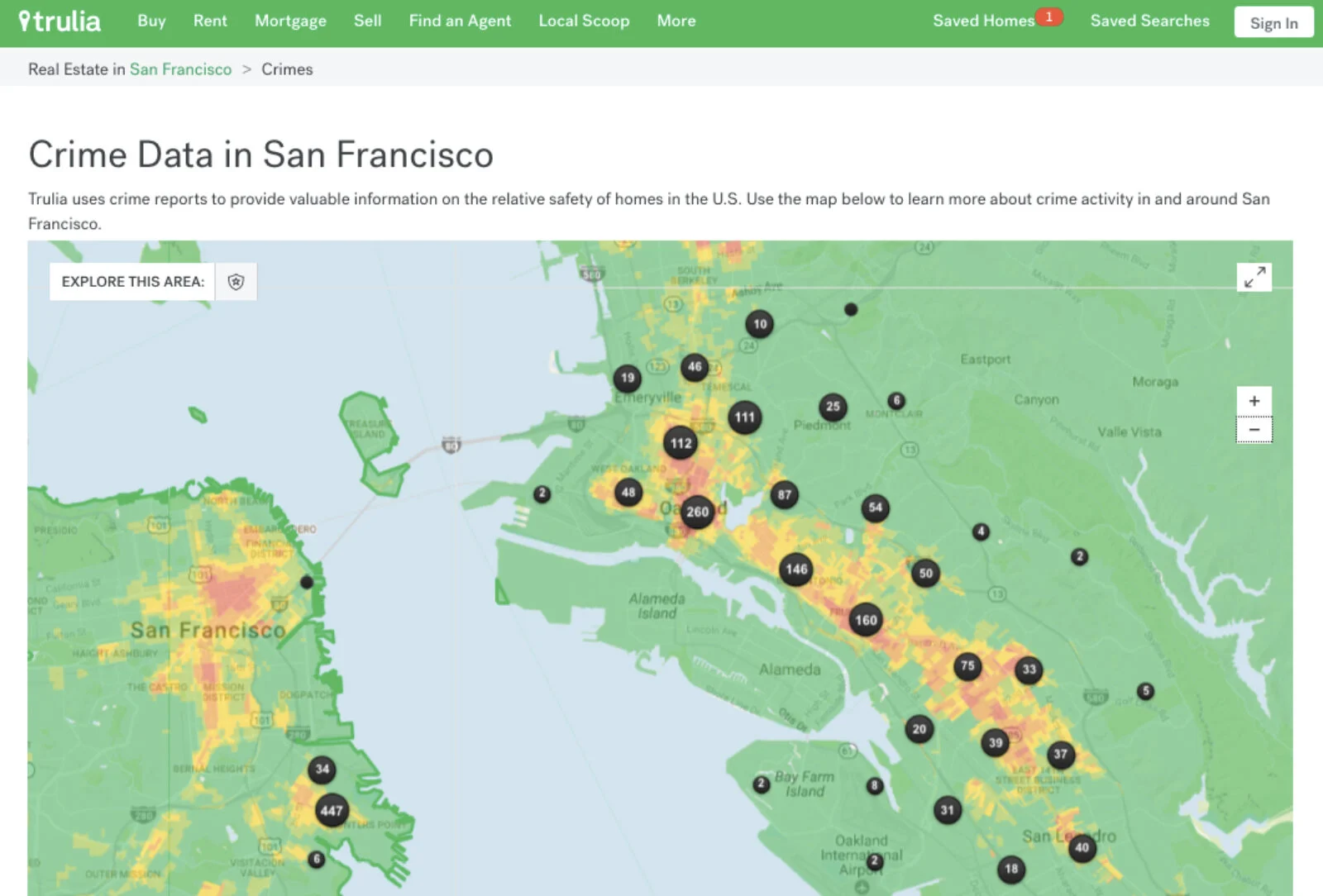
Trulia crime map (San Francisco) | Source: When the Designer Shows Up In the Design, by Lena V. Groeger (ProPublica)
Trulia removed it’s crime tab in 2022 after Redfin spoke out against the practice: “[G]iven the long history of redlining and racist housing covenants in the United States there’s too great a risk of this inaccuracy reinforcing racial bias. We believe that Redfin–and all real estate sites–should not show neighborhood crime data.” | Source: GeekWire | For more on biases in crime statistics, check out Buil-Gil et al. (2021)
Connecting readers with content requires empathy
Put people first
Use personal connections to help readers and users connect with the material
Use a mix of quantitative and qualitative approaches to tell a story
Create a platform for engagement
Consider how your framing of an issue can create a biased emotional response
“Rather than looking at where crimes are committed, we looked at where prisoners live, and the maps that resulted showed the urban costs of incarceration and suggested how those dollars might be better spent on investing in communities.”
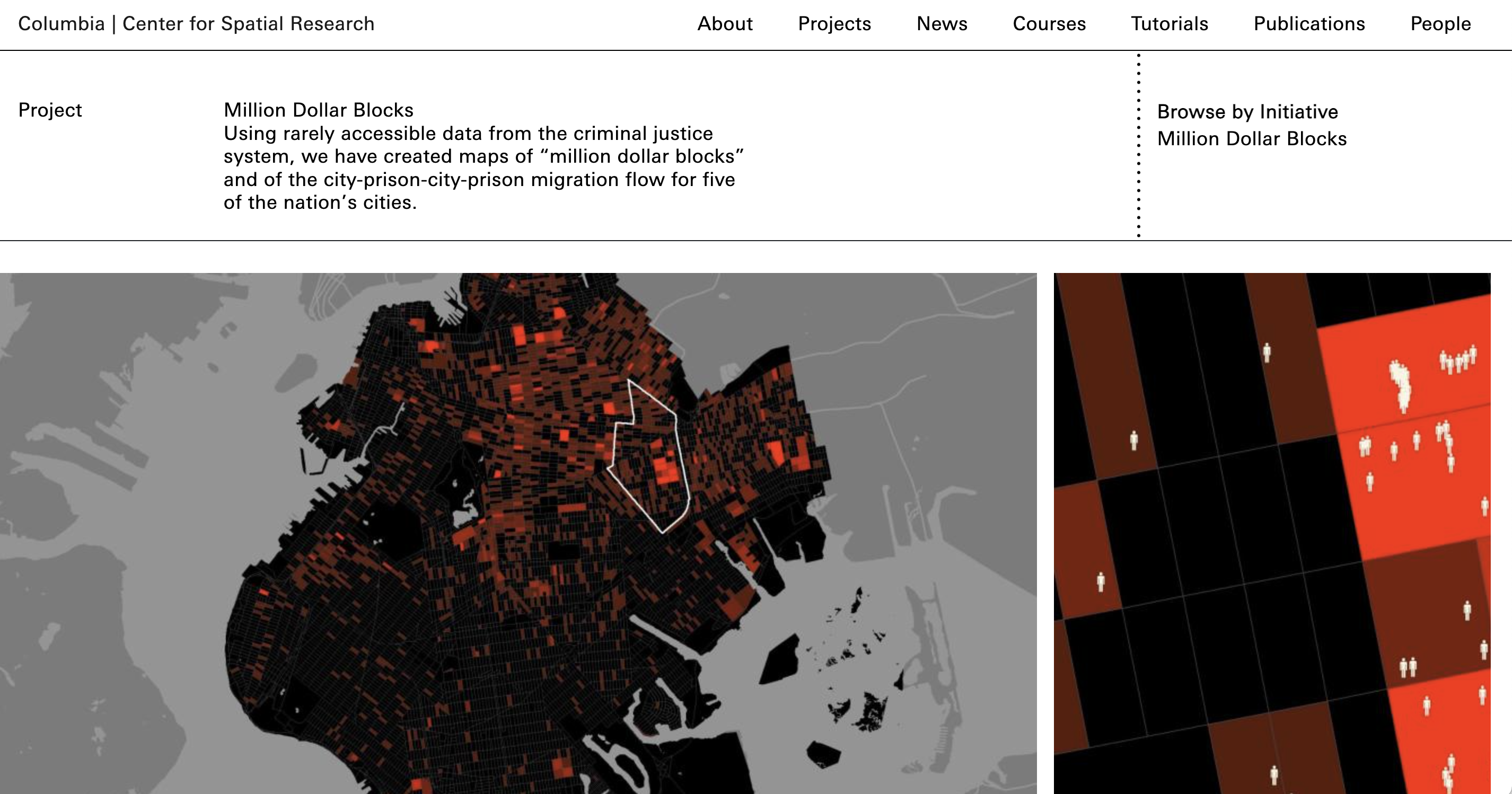
Source: Million Dollar Blocks, by Columbia’s Center for Spatial Research
Connecting readers with content requires empathy
Put people first
Use personal connections to help readers and users connect with the material
Use a mix of quantitative and qualitative approaches to tell a story
Create a platform for engagement
Consider how your framing of an issue can create a biased emotional response
Recognize the needs of your audience
Make sure visualizations are accessible so that folks with disabilities can view and use content online. Similarly, avoid overly technical or jargon-heavy language that make information inaccessible to a broad audience.
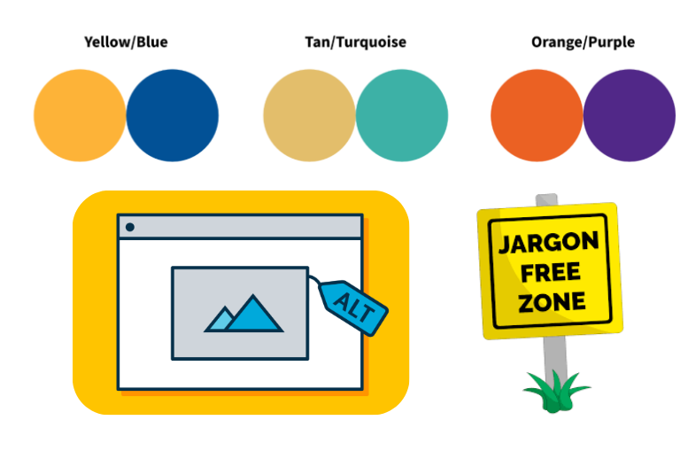
Image sources: NCEAS, Design102, call focus
Use icons to embed empathy into data design
Some chart types (e.g. bar, line, pie) abstract content by collapsing all people represented into one shape. Instead, try using individual points or even icons (i.e. anthropomorphize your data graphics).
But using icons doesn’t guarantee empathy . . .
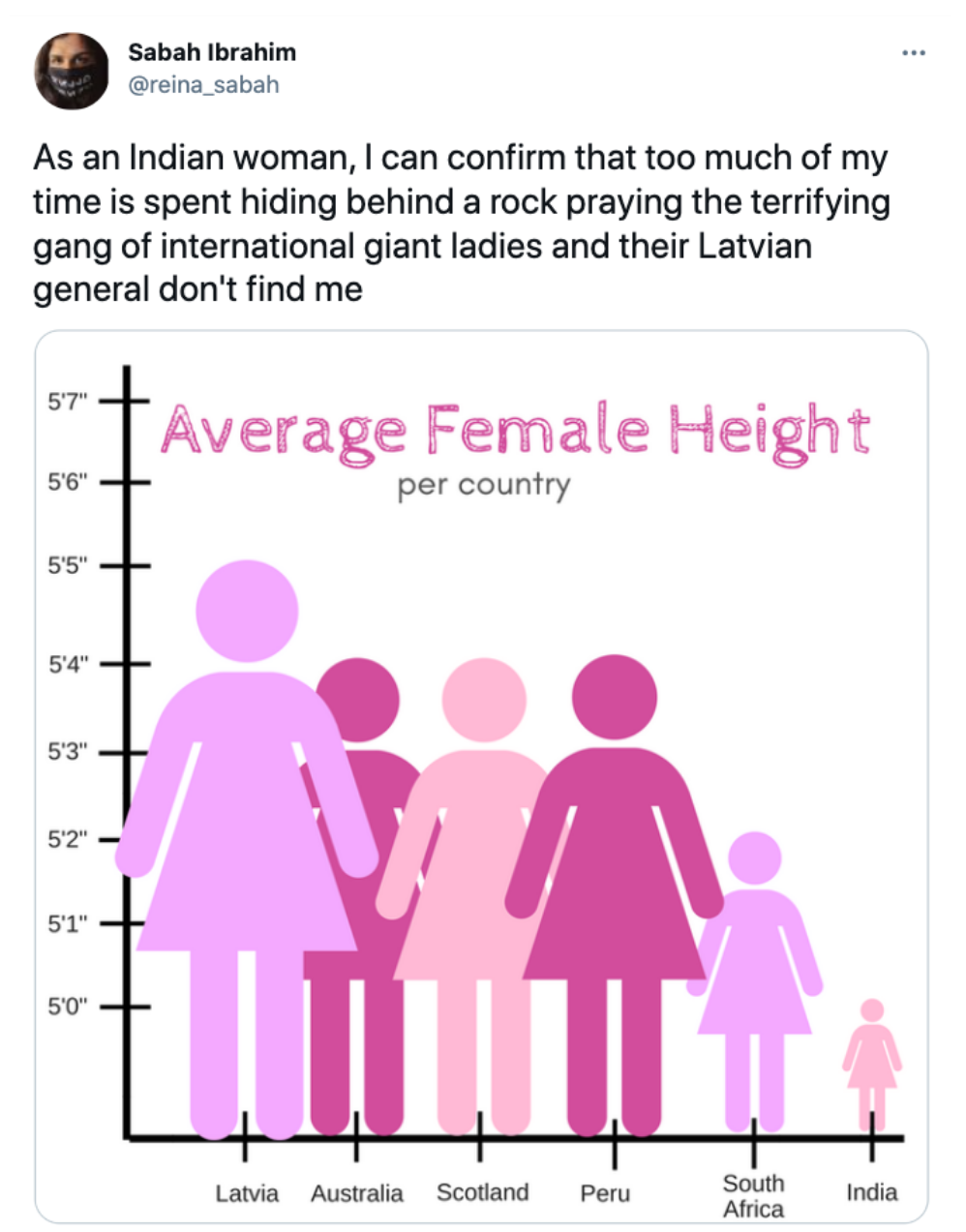
Source: Sabah Ibrahim (@reina_sabah), on X (formerly known as Twitter)
How you (dis)aggregate your data can tell drastically different and important stories
“Take AIM”
“Take AIM…Aggregate at intersections that matter”
-Clinton Johnson in his keynote talk, Toward an Equitable and Just Geography, at the 2024 NCEAS Environmental Data Science Summit
Decisions on how to aggregate data begin with the data collection stage, and continue through the analytical and communication stages.
Looking for more? Check out A primer on an intersectional approach to data, by Global Partnership for Sustainable Development Data.
Variation in unemployment data at different intersections
Screenshot from ProPublica’s graphic that allows you to visualize unemployment data aggregated at any three of the following intersections: race, gender, age class, education level, income level:
Source: What Coronavirus Job Losses Reveal About Racism in America, by Lena V. Groeger (ProPublica)
Variation in poverty rates across race categories
The US Census Bureau’s annual American Community Survey collects social, economic, housing, and demographic data which help to inform how trillions of dollars in federal funds are distributed each year.
While the official U.S. poverty rate in 2019 was 12.3%, the plot below, by Schwabish & Feng (2021) (figure 08) shows the large variation in estimated poverty rates for each of the 139 racial groups from the American Community Survey. The overall poverty rate for each major racial groupings are included as well.
Consider how to be inclusive of small groups
Aggregation is sometimes used to combine multiple (or many) groups when samples sizes are too small to display them individually. Consider adding a message / reference to small or missing groups to be inclusive:
Source: What Coronavirus Job Losses Reveal About Racism in America, by Lena V. Groeger (ProPublica)
Telling nuanced stories begins at data collection
Source: Do No Harm Guide, Figure 09 | I also encourage you to give @theannalytical a follow!!
Consider inclusive alternatives for “other”
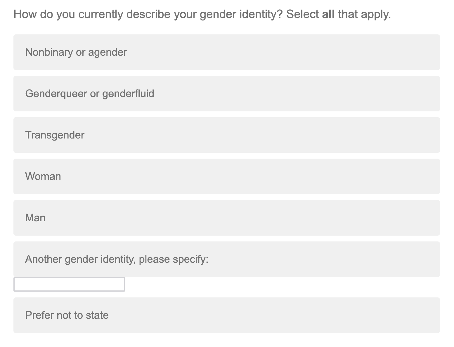
Source: Screenshot from a UCSB-administered survey (Feb 2024)
“Collecting inclusive data and building inclusive tools and visualizations can make the experience better for all users.”
Some alternatives:
Another race (or gender, etc.)
Additional groups
All other self-descriptions
People identifying as other or multiple races
Identity not listed
Identity not listed in this survey
Communicating data (in general, but particularly) about people is complicated. How can we translate numbers into concepts that people are drawn to and relate to?
04:00
Source: Data Humanism, The Revolution will be Visualized., by Giorgia Lupi | Also give her TED talk, How we can find ourselves in data a watch!
“reconnect numbers to what they really stand for”
“I started to work with data in 2010, 2011, and I saw that most of the approach to data at the time was very much based on a statistician’s background, and that’s fantastic. But I was also interested in using data myself as an anchoring point to tell stories. I thought that there’s just more that we could do to actually represent our reality if we include context, anecdotal details, if we embrace the imperfections that are inherent to how we collect data. And so, I started to just use these ideas in my practice, and I felt that I needed to just come up with an umbrella term for that. Data humanism was a good one, and data humanism is an approach to data that tries to reconnect numbers to what they really stand for by adding less factual and more anecdotal information.”
-Giorgia Lupi in her interview with Fast Company
“Visualization is not about simplifying reality; it’s about providing an access to complexity”
Image Source: 1374 Days - My Journey with Long Covid / NYT Visual OpED | Quote Source: Giorgia Lupi in her interview with Fast Company
Hopeful views of the world through data and drawings
https://happy-data.co/, A project by Pentagram: Giorgia Lupi, with Ting Fang Cheng, Talia Cotton, Phil Cox, and Sarah Kay Miller
“in some cases, a warmer depiction of data can make people relate”
Source: Happy Data, by Giorgia Lupi, with Ting Fang Cheng, Talia Cotton, Phil Cox, and Sarah Kay Miller | Quote Source: Giorgia Lupi in her interview with Fast Company
“if you get people to an emotional level, you might get them interested in learning more and spending more time”
Happy Data, by Giorgia Lupi, with Ting Fang Cheng, Talia Cotton, Phil Cox, and Sarah Kay Miller | Quote Source: Giorgia Lupi in her interview with Fast Company
“beauty is such an entry point for everything”
Happy Data, by Giorgia Lupi, with Ting Fang Cheng, Talia Cotton, Phil Cox, and Sarah Kay Miller | Quote Source: Giorgia Lupi in her interview with Fast Company
Consider the following examples of “people as data.” How do your perceive / interpret / comprehend the information across each version of the visualizations?
Destruction of Gaza, by Mona Chalabi
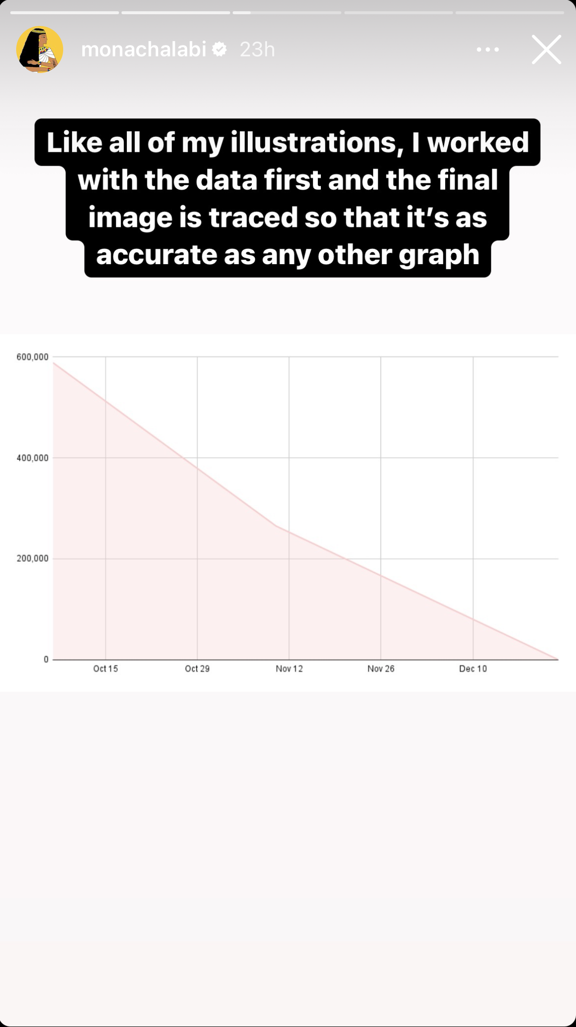
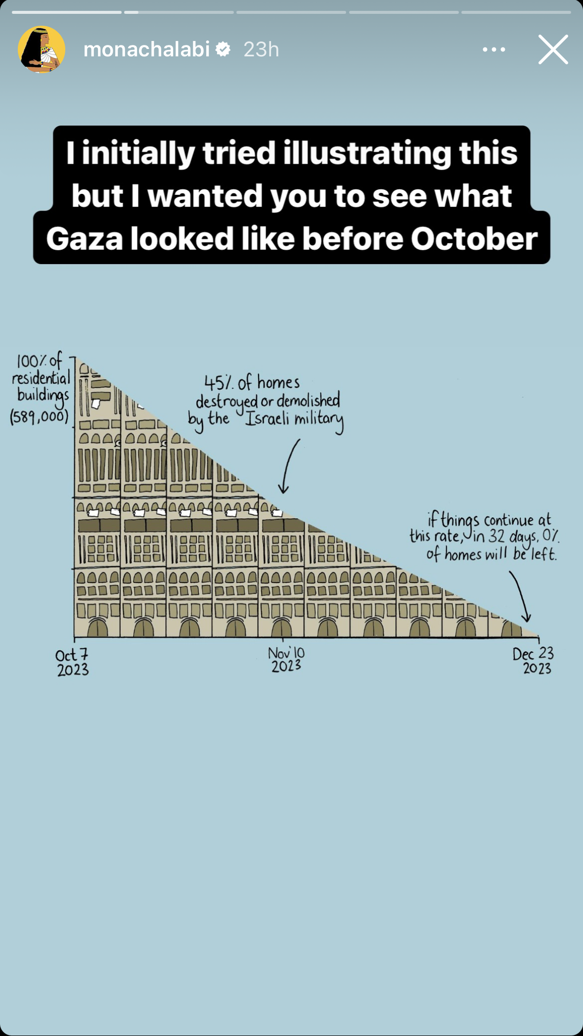
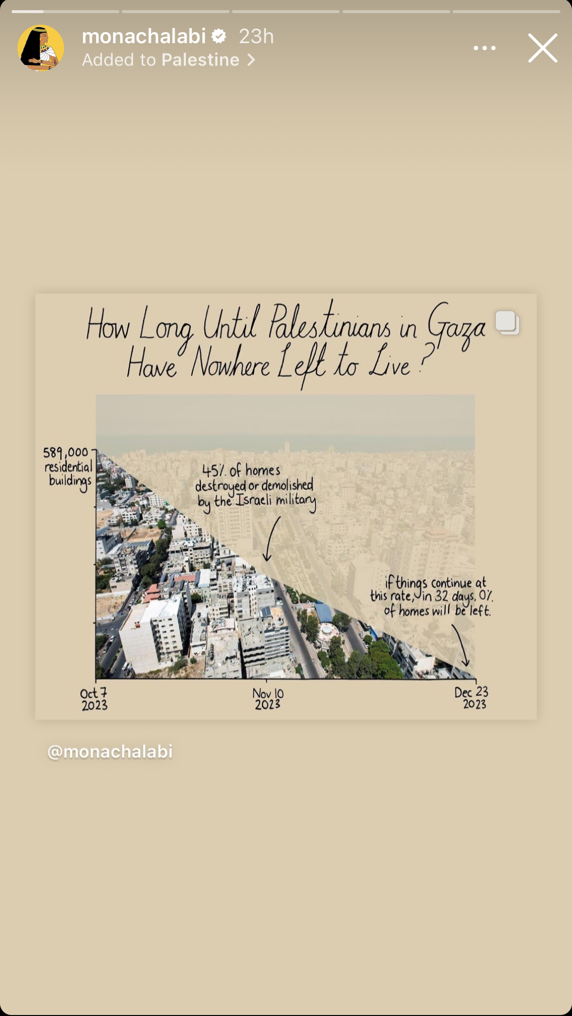
Screenshots taken on 2023-11-21 from @monachalabi, here in reverse order
03:00
Global temperatures, by the IPCC
Source: Figure SPM.1 from the Climate Change 2023 Synthesis Report, by the Intergovernmental Panel on Climate Change (IPCC) | Also see This visual shows how climate change will affect generations, by Kasha Patel (Washington Post)
03:00
Global temperatures, by the IPCC
Source: Figure SPM.1 from the Climate Change 2023 Synthesis Report, by the Intergovernmental Panel on Climate Change (IPCC) | Also see This visual shows how climate change will affect generations, by Kasha Patel (Washington Post)
03:00
See you next week!
~ This is the end of Lesson 2 (of 2) ~