-from Wikipedia
“…the practice of designing and creating easy-to-communicate and easy-to-understand graphic or visual representations of a large amount of complex quantitative and qualitative data and information with the help of static, dynamic or interactive visual items.”
-from Wikipedia
Note: this is by no means a comprehensive history of the visual representation of information!
Images from BBC News, Wikipedia (a, b, c, d), Smithsonian, The Marginalian, Scientific American & Twitter
Note: this is by no means a comprehensive history of the visual representation of information!
Images from BBC News, Wikipedia (a, b, c, d), Smithsonian, The Marginalian, Scientific American & Twitter
Note: this is by no means a comprehensive history of the visual representation of information!
Images from BBC News, Wikipedia (a, b, c, d), Smithsonian, The Marginalian, Scientific American & Twitter
Note: this is by no means a comprehensive history of the visual representation of information!
Images from BBC News, Wikipedia (a, b, c, d), Smithsonian, The Marginalian, Scientific American & Twitter
Note: this is by no means a comprehensive history of the visual representation of information!
Images from BBC News, Wikipedia (a, b, c, d), Smithsonian, The Marginalian, Scientific American & Twitter
Note: this is by no means a comprehensive history of the visual representation of information!
Images from BBC News, Wikipedia (a, b, c, d), Smithsonian, The Marginalian, Scientific American & Twitter
Note: this is by no means a comprehensive history of the visual representation of information!
Images from BBC News, Wikipedia (a, b, c, d), Smithsonian, The Marginalian, Scientific American & Twitter
Note: this is by no means a comprehensive history of the visual representation of information!
Images from BBC News, Wikipedia (a, b, c, d), Smithsonian, The Marginalian, Scientific American & Twitter
Note: this is by no means a comprehensive history of the visual representation of information!
Images from BBC News, Wikipedia (a, b, c, d), Smithsonian, The Marginalian, Scientific American & Twitter
Note: this is by no means a comprehensive history of the visual representation of information!
Images from BBC News, Wikipedia (a, b, c, d), Smithsonian, The Marginalian, Scientific American & Twitter
Note: this is by no means a comprehensive history of the visual representation of information!
Images from BBC News, Wikipedia (a, b, c, d), Smithsonian, The Marginalian, Scientific American & Twitter
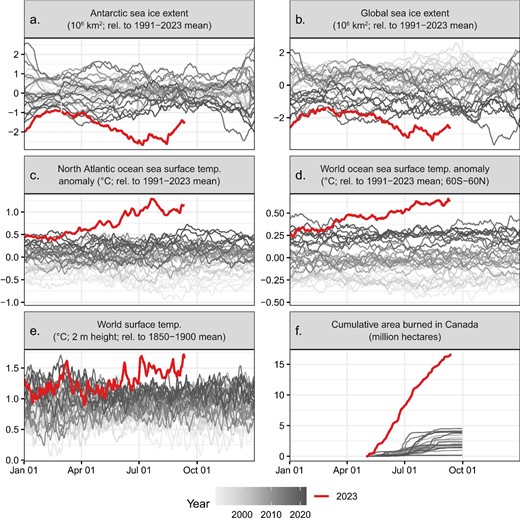
Fig Caption: Unusual climate anomalies in 2023 (the red line, which appears bold in print). Sea ice extent (a, b), temperatures (c–e), and area burned in Canada (f) are presently far outside their historical ranges. These anomalies may be due to both climate change and other factors. Sources and additional details about each variable are provided in supplemental file S1. Each line corresponds to a different year, with darker gray representing later years.
A nice Twitter thread on key takeaways from the above paper
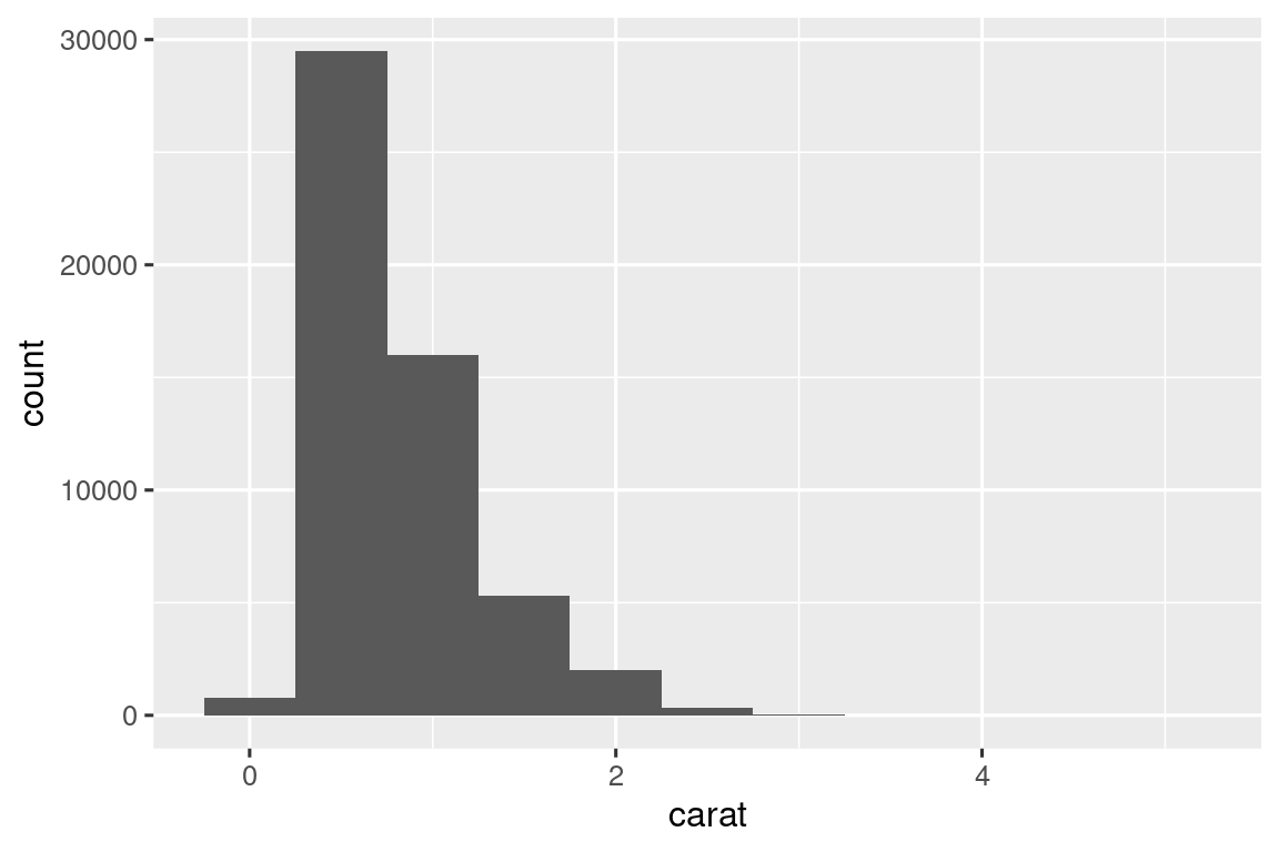
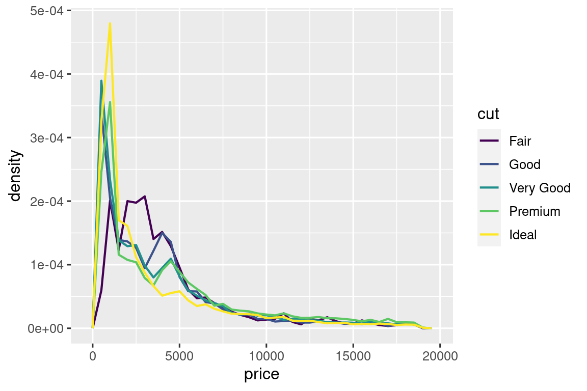
“Exploratory data analysis (EDA) is not a formal process with a strict set of rules. More than anything, EDS is a state of mind…you should feel free to investigate every idea that occurs to you. Some of these ideas will pan out, and some will be dead ends. As your exploration continues, you will hone in on a few particularly productive insights that you’ll eventually write-up and communicate to others.”
-Hadley Wickham, author of R for Data Science
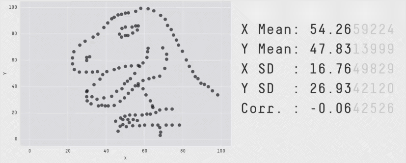
Same summary statistics, different distributions!
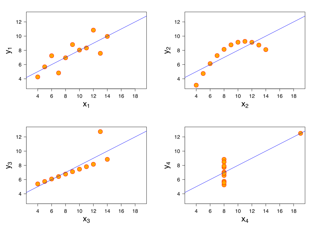
Anscombe’s Quartet
(Anscombe 1973)
Datasaurus Dozen
(Matejka & Fitzmaurice 2017, expanding upon Albert Cairo’s Datasaurus)
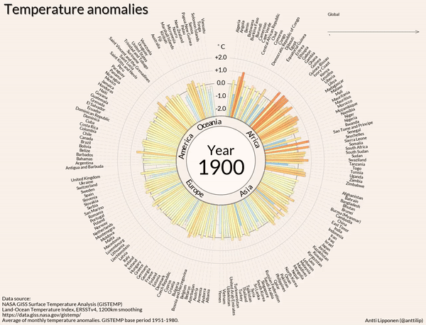
gif created from Antti Lipponen’s Temperature Anomolies.
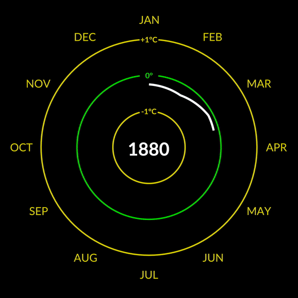
gif created from Mark SubbaRao’s Climate Spiral. For a similar visualization with accompanying {ggplot2} code, see Nicola Rennie’s TidyTuesday contribution!

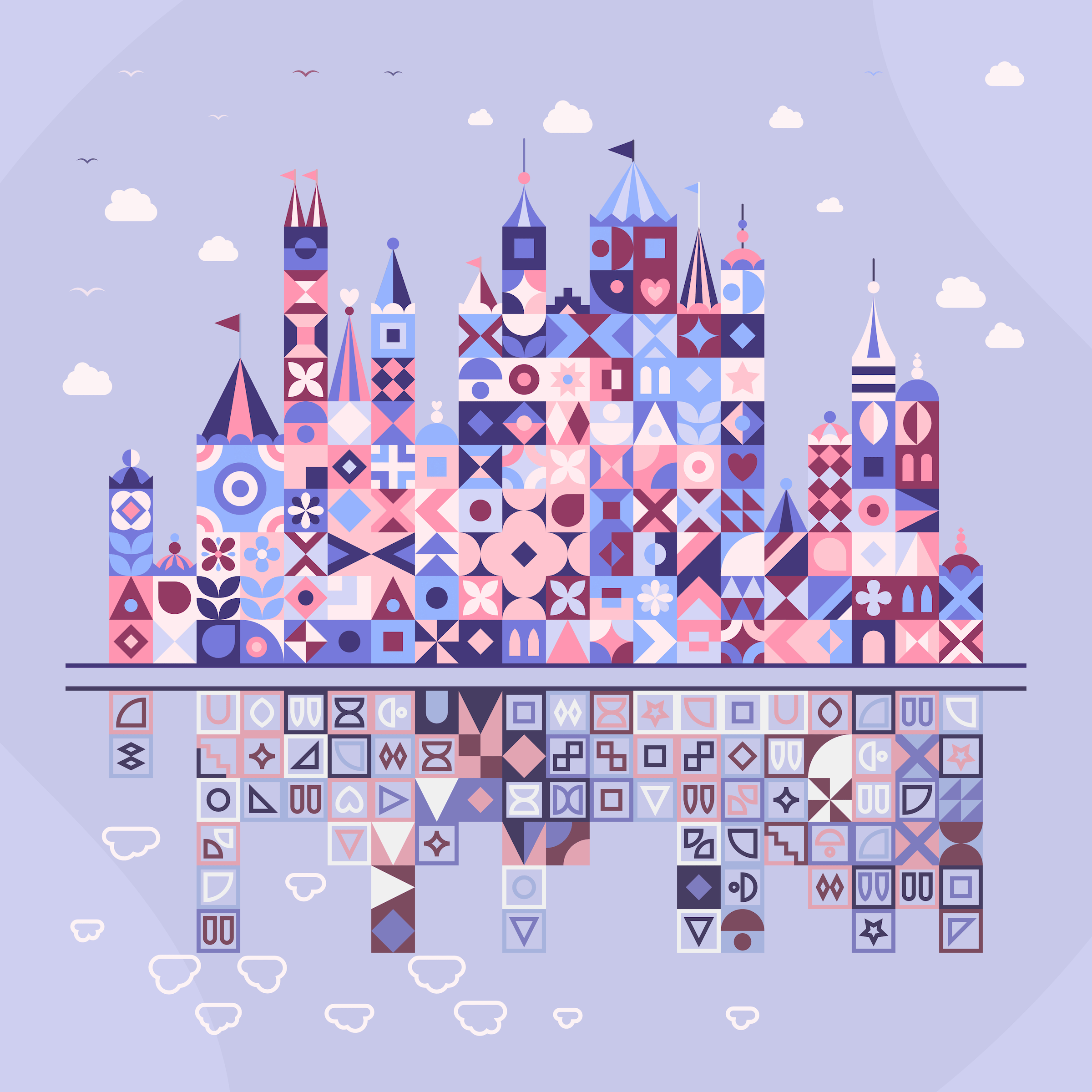

Patchwork Kingdoms, by Nadieh Bremer portraying the “digital divide” in schools across the world
To enlarge, Right click > Open Image in New Tab
{ggplot2} extensions)