Everyone should be prepared to share your thoughts with the class!
EDS 240: Discussion 5
Beyond fundamental chart types
Week 5 | February 4th, 2025
We’ve covered a number of “fundamental charts”
Distributions
Evolution
Rankings
Numeric relationships
Familiarity with these chart types and when it’s appropriate to use them is super important! They appear often in scientific literature, news / media outlets, reports, etc.
But they only scratch the surface of data viz possibilities.
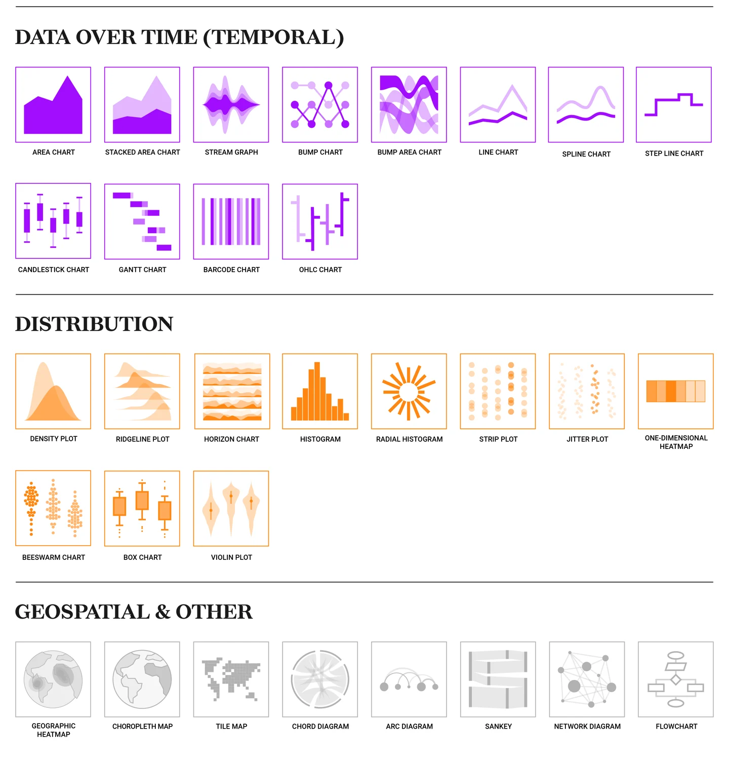
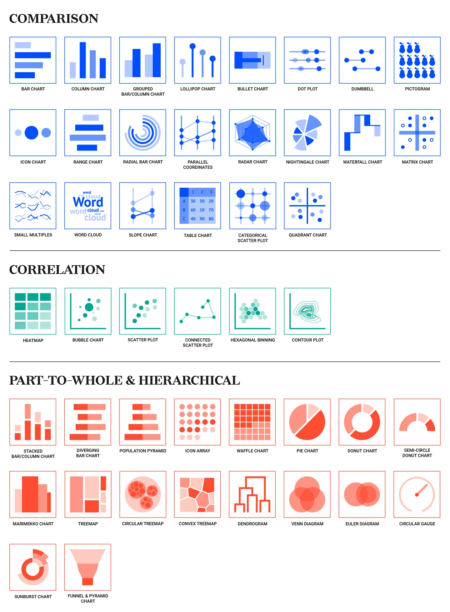
A non-exhaustive list of some familiar and some not-so-familiar chart types. Source: Datylon
Explore some cool new chart types!
The following slides showcase some examples of chart types that we haven’t explored yet in lecture, or are a sort of reimagination of the chart types we have discussed.
With a partner, explore and discuss some of the following data viz (or bring your own; check out the resources page if you’re looking for inspiration). Some question prompts to get you started:
Everyone should be prepared to share your thoughts with the class!
25:00
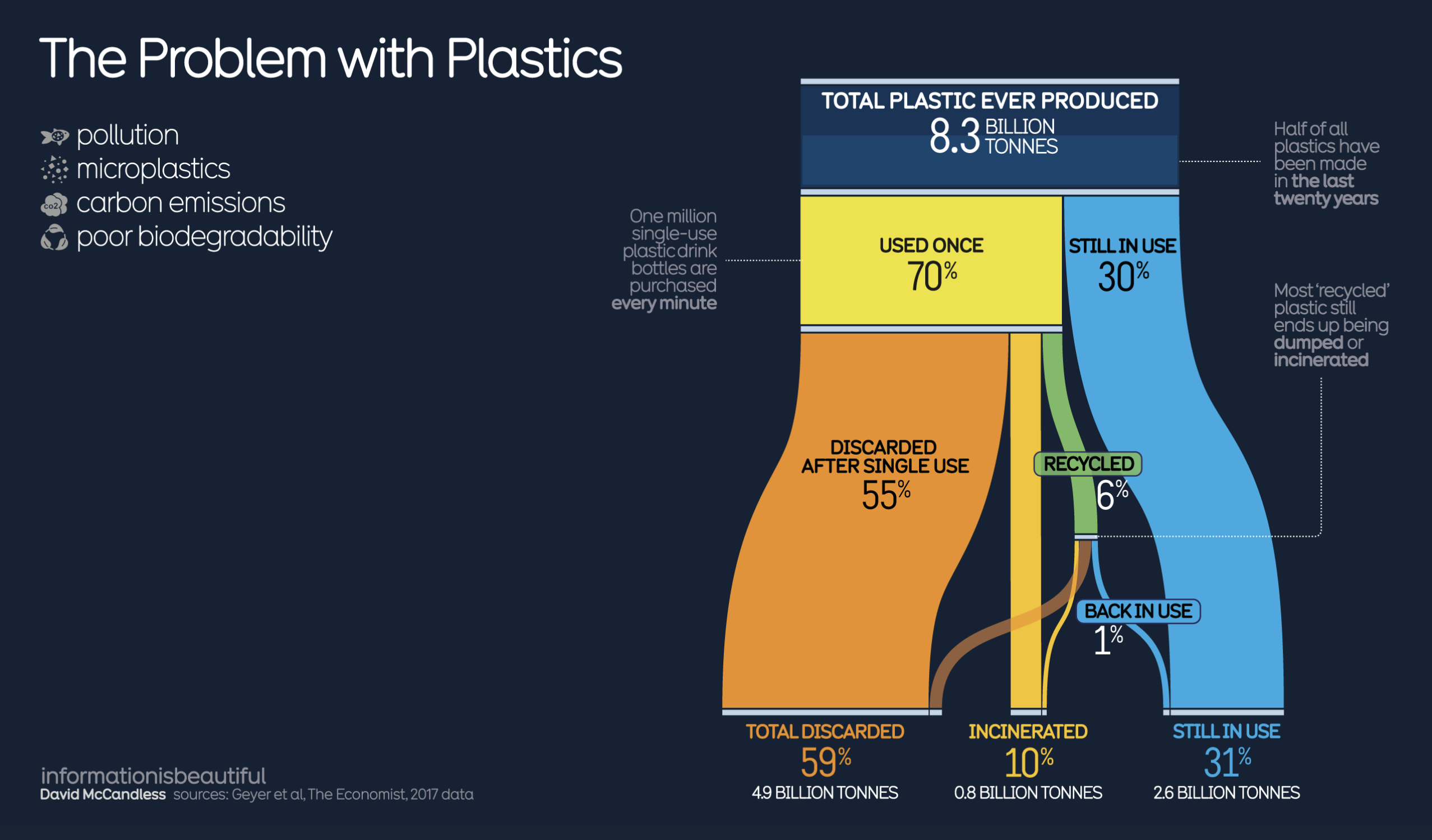
Sankey Diagram
Source: The Problem with Plastics, by David McCandless
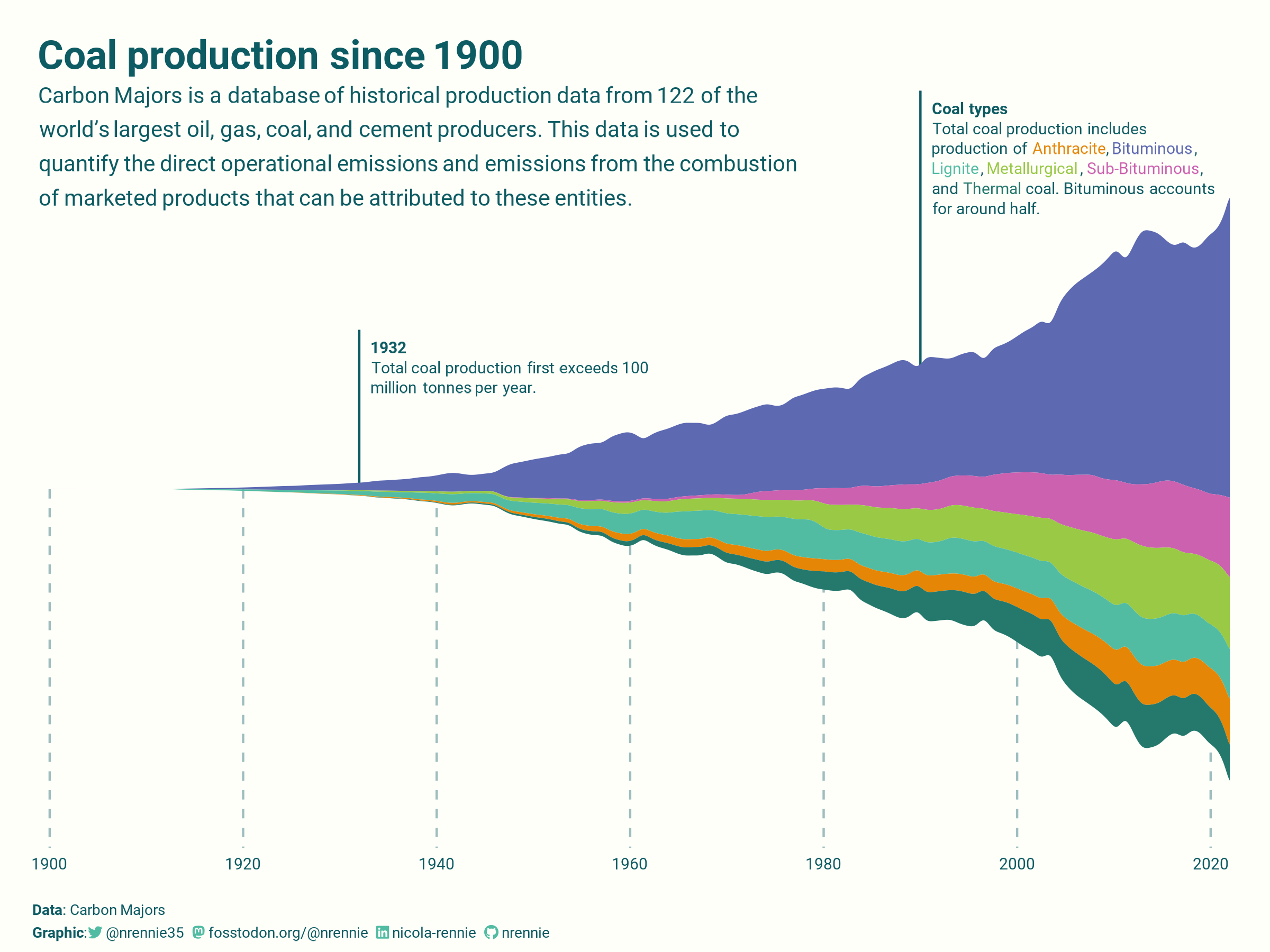
Stream graph
Source: Coal production since 1900, by Nicola Rennie (also check out this gif of her creative process!)
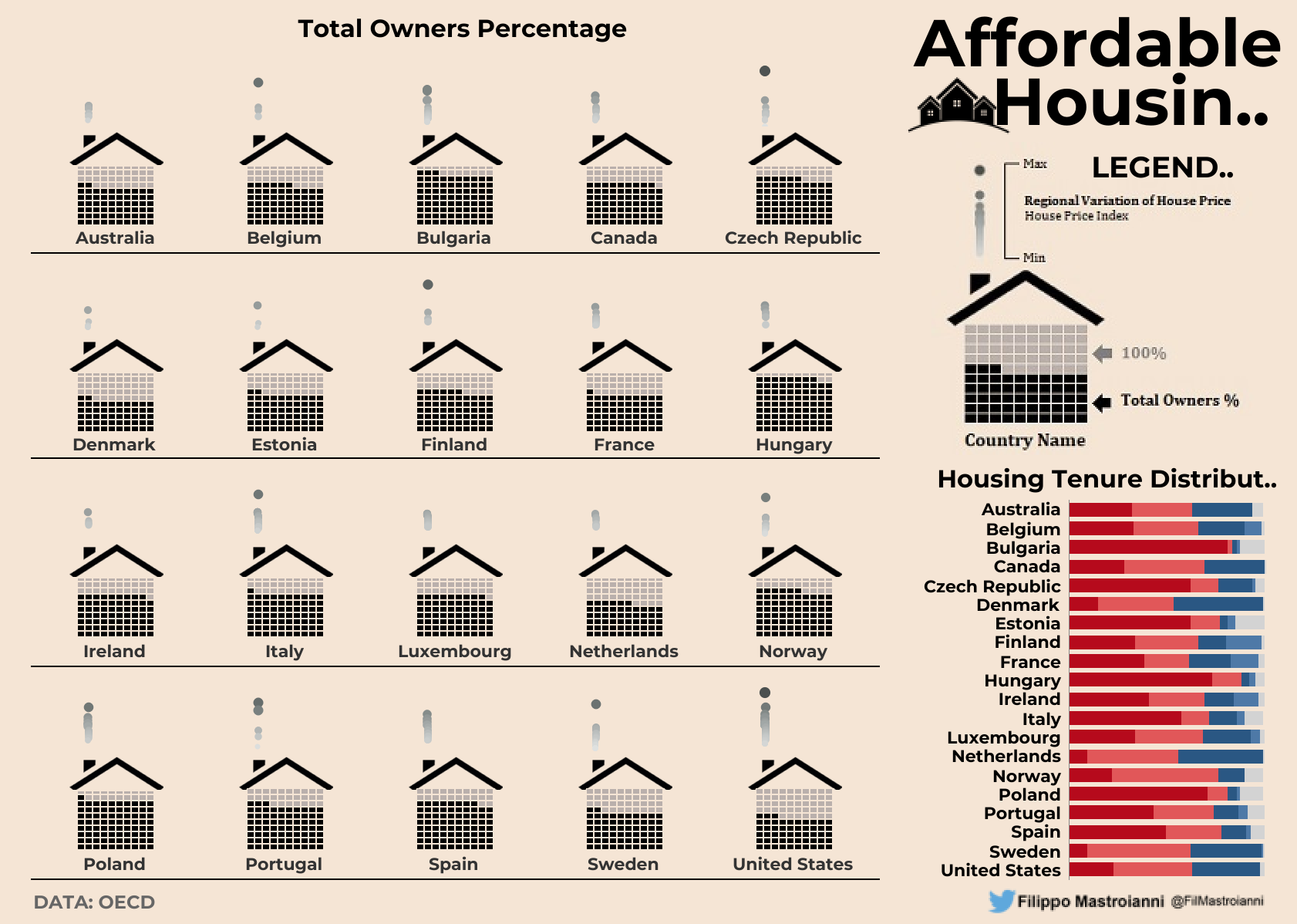
Waffle chart
Source: Affordable Housing, by Filippo Mastroianni
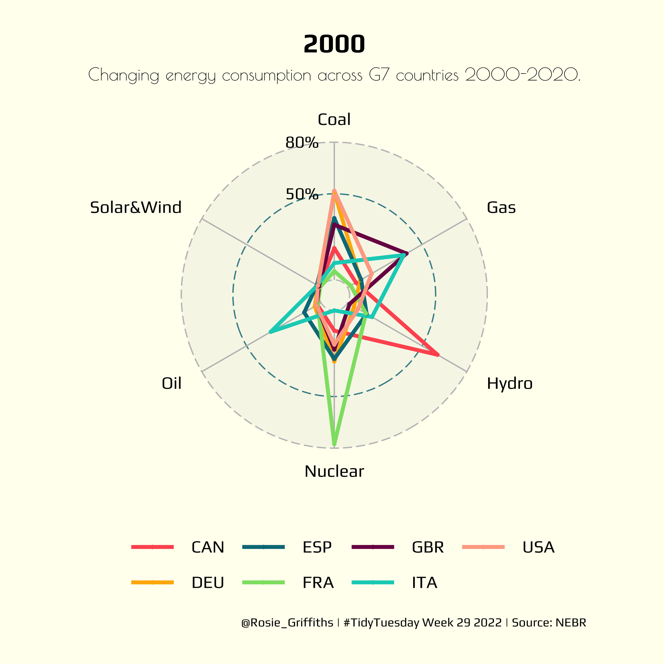
Radar / Spider Plot
Source: Changing energy consumption across G7 countries 2000-2020, by Rosie Griffiths
Pictogram / Icon Array
Source: Over 45,000 homes powered by trash, by Nicola Rennie
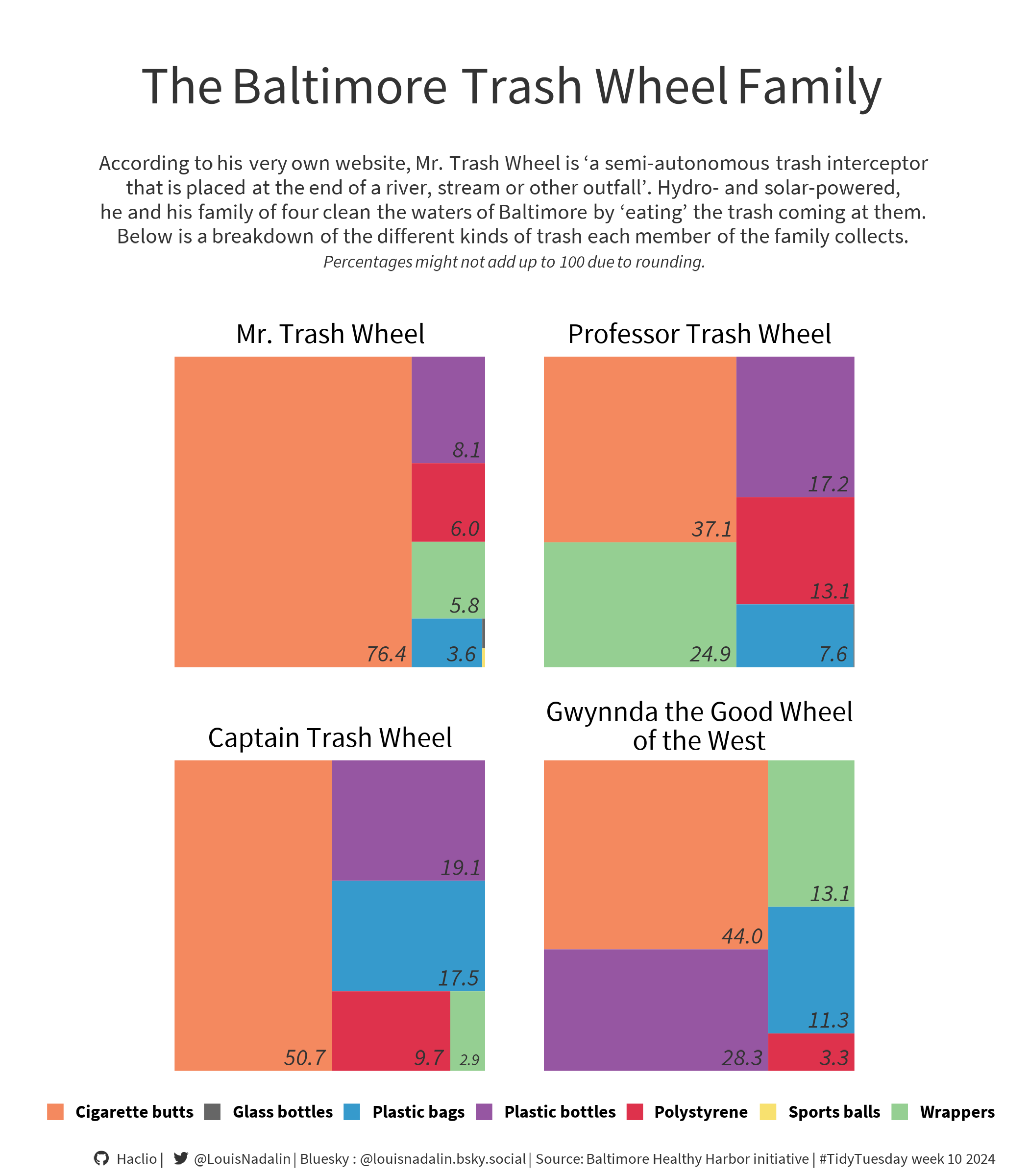
Treemap
(using the same #TidyTuesday data as previous viz!)
Source: The Baltimore Trash Wheel Family, by Louis Nadalin
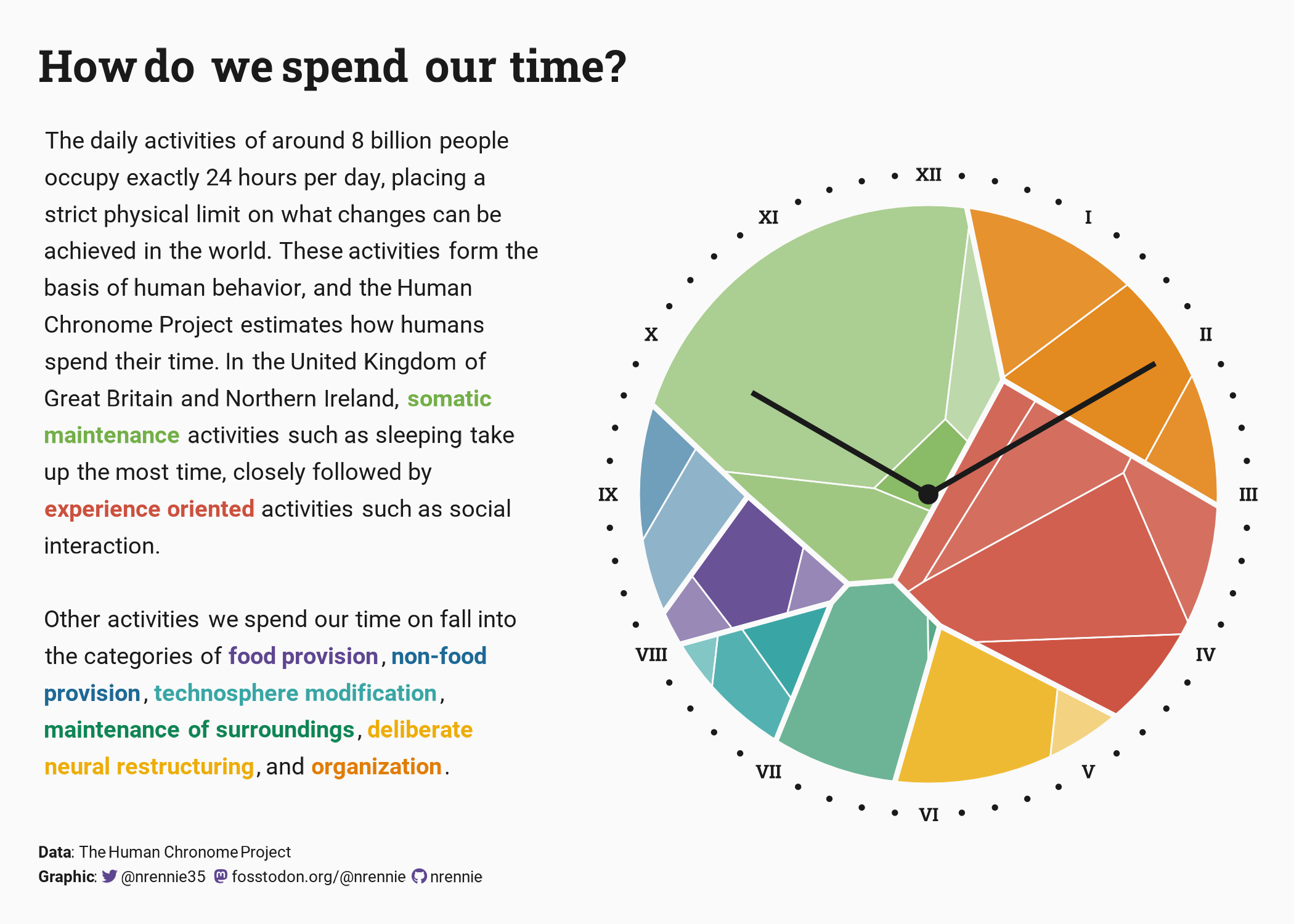
Voronoi Treemap
Source: How do we spend our time?, by Nicola Rennie
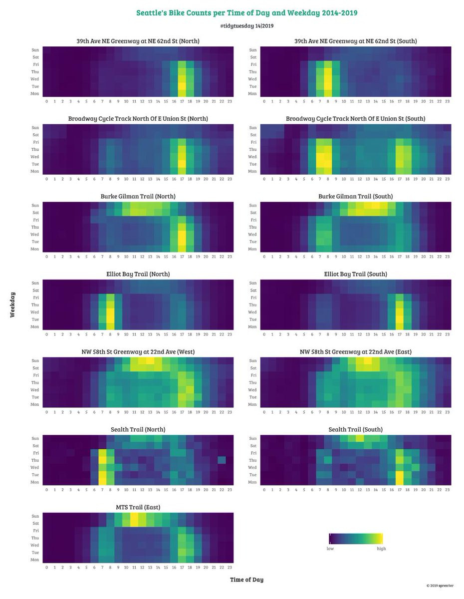
Heatmap
Source: Seattle’s Bike Counts per Time of Day and Weekday 2014-2019, by Torsten Sprenger
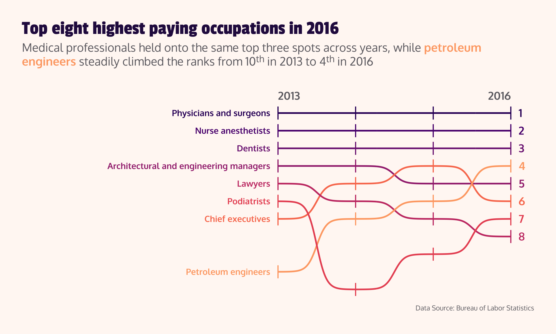
Bump Chart
(using the same TidyTuesday data as our dumbbell chart from weeks 4 & 6)
Source: Top eight highest paying occupations in 2016, by Sam Csik
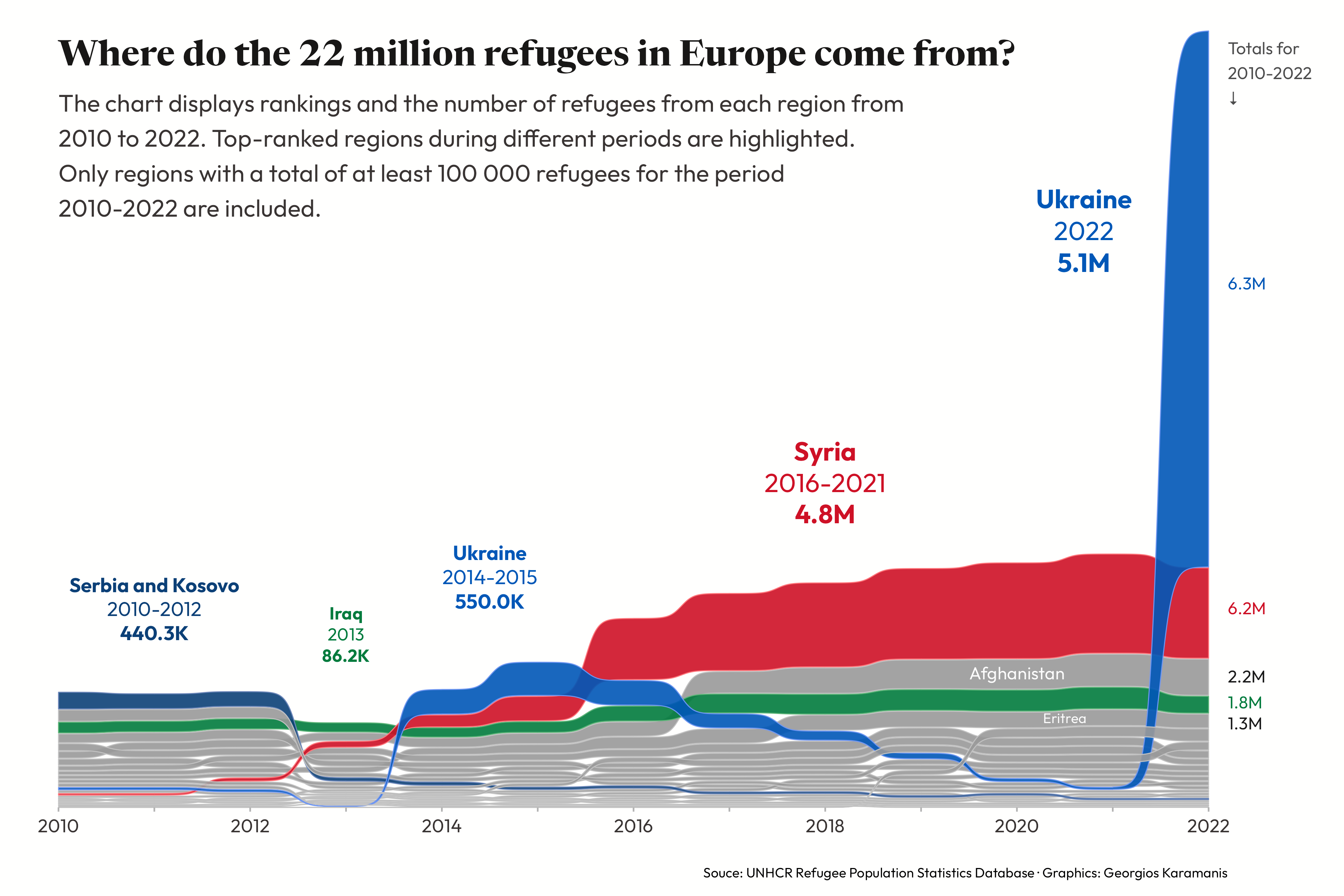
Area Bump Chart
Source: Where do the 22 millin refugees in Europe come from?, by Georgios Karamanis
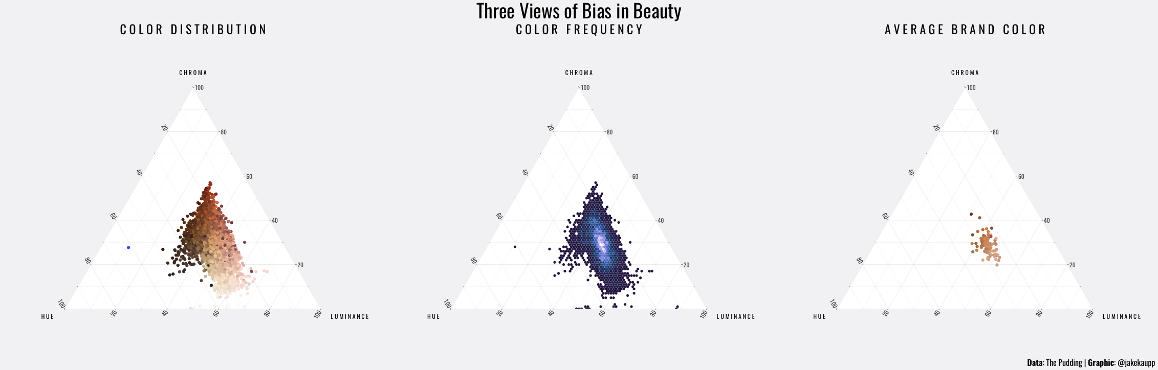
Ternary Plot
Source: Three Views of Bias in Beauty, by Jake Kaupp
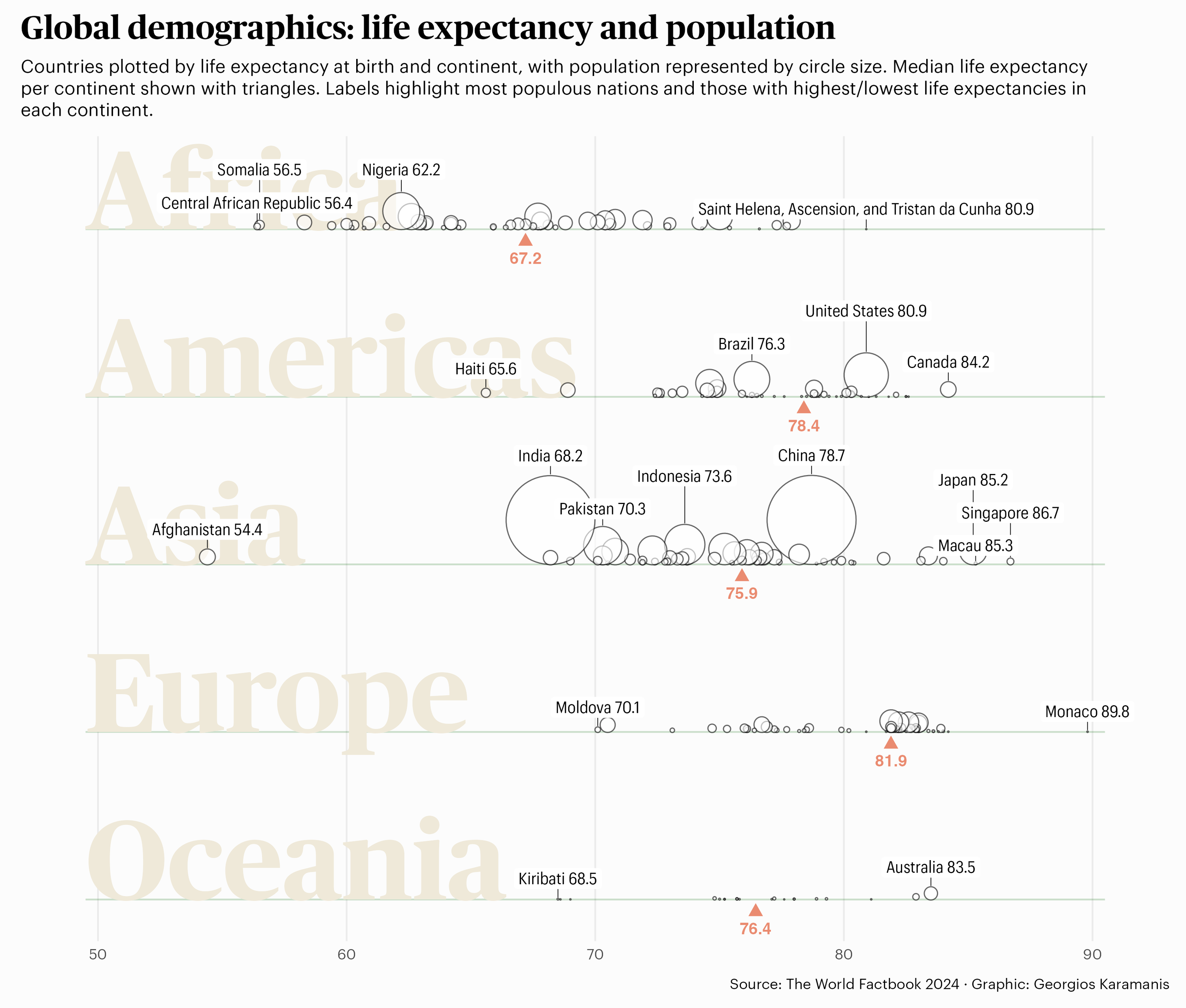
Strip Plot x Bubble Chart
Source: Global demographics: life expectency and population, by Georgios Karamanis
Petal Plot
Source: Dog Breeds, by Blake Robert Mills
Donut Chart
Source: The World’s Largest Fishing Fleet, by Ray Hunter (final infograhic for EDS 240, winter 2024). Also check out this article on pie vs. donut charts.
Circular Bar Chart
Source: Top 10 species present at vertically-oriented vinyard types (part of a larger infographic), by Melissa Widas
Pictogram
Source: Global Plastic Pollution, by Ijeamaka Anyene
Slope graph
Source: Consumption vs. CO2 Emissions, by Jake Kaupp
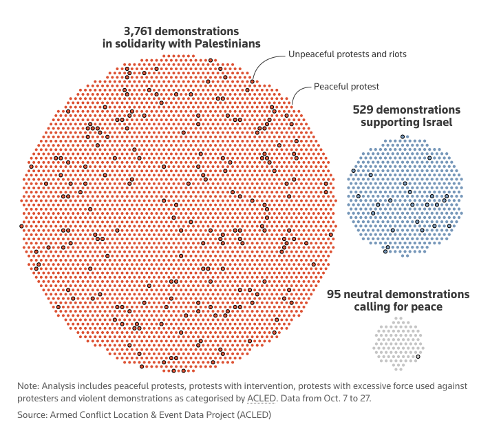
Chart type?
Source: Mapping the conflict in Israel and Gaza, by Mariano Zafra & John McClure
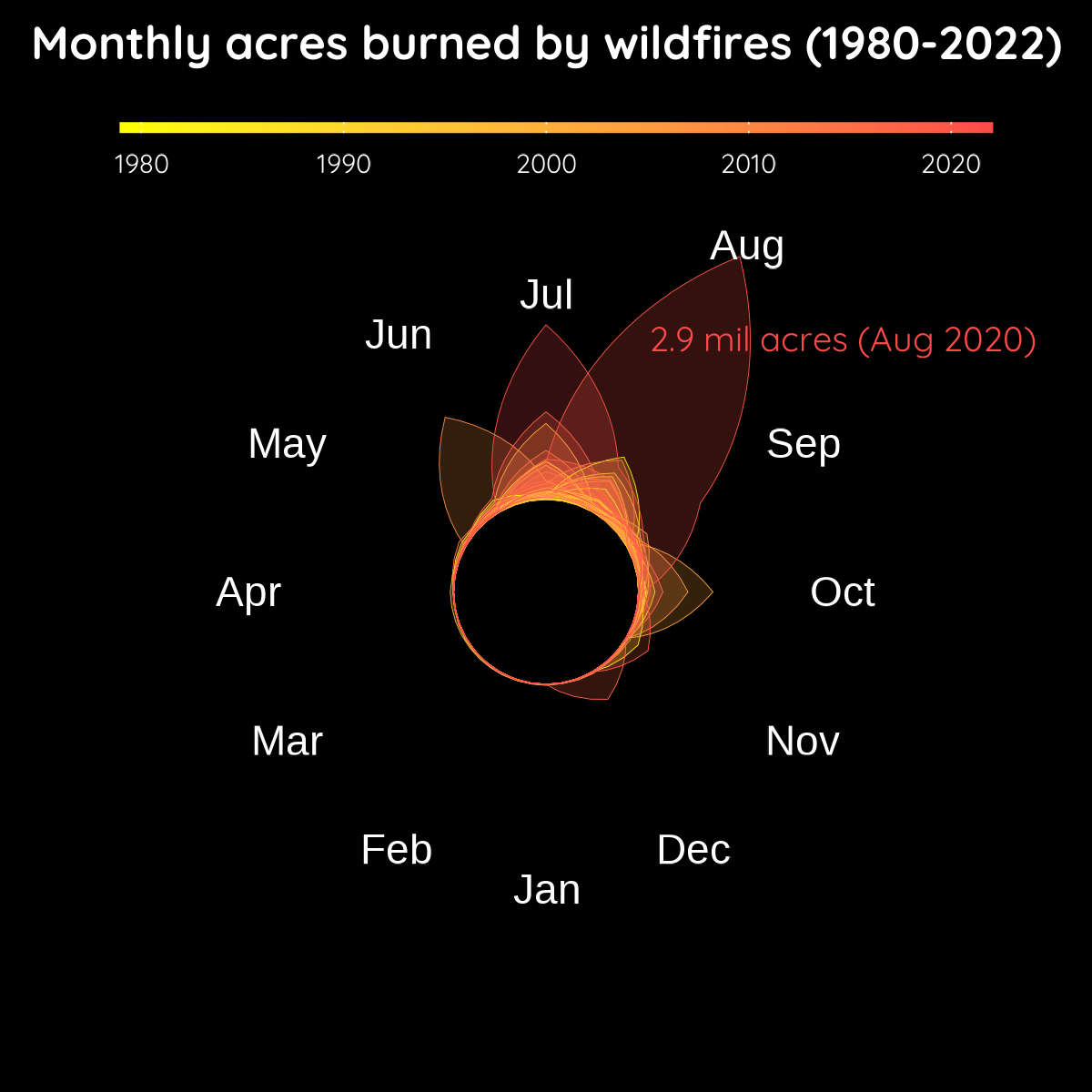
Chart type?
Source: Are California Wildfires Truly Getting Worse?, by Amanda Herbst
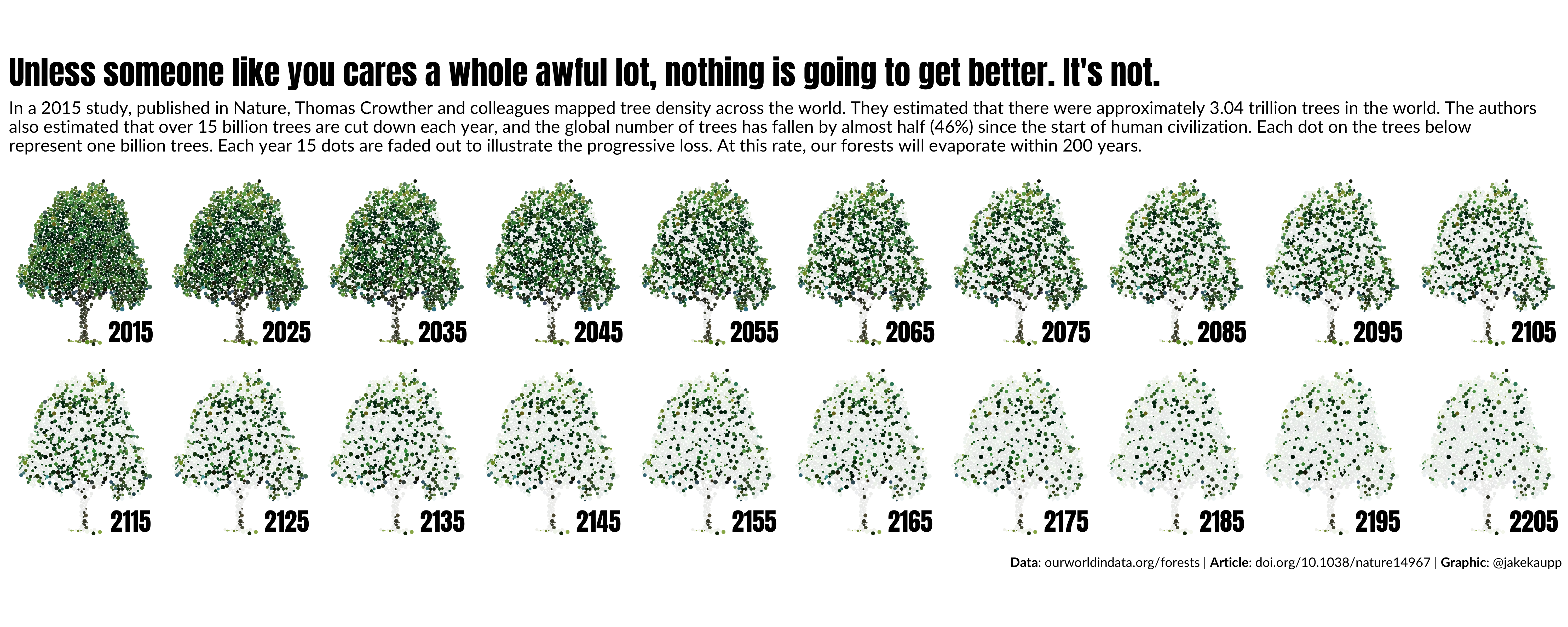
Chart type?
Source: Tree Loss, by Jake Kaupp