The Santa Barbara Coastal Long Term Ecolgical Research (SBC LTER) site was established in 2000 to understand the ecology of coastal kelp forest ecosystems. A number of coastal rocky reef sites are outfitted with instrumentation that collect long-term monitoring data.
We’ll be exploring bottom temperatures recorded at Mohawk Reef, a near-shore rocky reef and one of the Santa Barbara Coastal (SBC) LTER research sites.
##~~~~~~~~~~~~~~~~~~~~~~~~~~~~~~~~~~~~~~~~~~~~~~~~~~~~~~~~~~~~~~~~~~~~~~~~~~~~~~## setup ----##~~~~~~~~~~~~~~~~~~~~~~~~~~~~~~~~~~~~~~~~~~~~~~~~~~~~~~~~~~~~~~~~~~~~~~~~~~~~~~#..........................load packages.........................library(tidyverse)library(naniar)library(ggridges)library(gghighlight)library(ggbeeswarm)library(palmerpenguins) # for some minimal examples#..........................import data...........................mko <-read_csv(here::here("week2", "data", "mohawk_mooring_mko_20250117.csv"))##~~~~~~~~~~~~~~~~~~~~~~~~~~~~~~~~~~~~~~~~~~~~~~~~~~~~~~~~~~~~~~~~~~~~~~~~~~~~~~## wrangle data ----##~~~~~~~~~~~~~~~~~~~~~~~~~~~~~~~~~~~~~~~~~~~~~~~~~~~~~~~~~~~~~~~~~~~~~~~~~~~~~~mko_clean <- mko |># keep only necessary columns ----select(year, month, day, decimal_time, Temp_bot, Temp_top, Temp_mid) |># convert year, month, day & decimal_time cols to a date_time col ----# (not totally necessary for our plots, but helpful to know!)mutate(date_time =make_datetime(year, month, day, tz ="America/Los_Angeles") +# find tz identifiers: https://en.wikipedia.org/wiki/seconds(decimal_time *86400) # decimal_time is fraction of day; 86400 seconds in a day ) |># add month name by indexing the built-in `month.name` vector ----mutate(month_name = month.name[month]) |># replace 9999s with NAs ---- naniar::replace_with_na(replace =list(Temp_bot =9999, Temp_top =9999, Temp_mid =9999)) |># select/reorder desired columns ----select(date_time, year, month, day, month_name, Temp_bot, Temp_mid, Temp_top)##~~~~~~~~~~~~~~~~~~~~~~~~~~~~~~~~~~~~~~~~~~~~~~~~~~~~~~~~~~~~~~~~~~~~~~~~~~~~~~## explore missing data ----##~~~~~~~~~~~~~~~~~~~~~~~~~~~~~~~~~~~~~~~~~~~~~~~~~~~~~~~~~~~~~~~~~~~~~~~~~~~~~~# Missing data can have unexpected effects on your analyses# It's important to explore your data for missing values so that you can decide if and how to handle them# Data loggers can be prone to missingness (e.g. full memory, dead batteries, replacement logger)# We can use {naniar} to explore the frequency and patterns in missing data# Below is a short example of some {naniar} tools for doing so# Check out The Missing Book (https://tmb.njtierney.com/) by Nick Tierney and Allison Horst for some great guidance#..........counts & percentages of missing data by year..........see_NAs <- mko_clean |>group_by(year) |> naniar::miss_var_summary() |>filter(variable =="Temp_bot")#...................visualize missing Temp_bot...................bottom <- mko_clean |>select(Temp_bot)missing_temps <- naniar::vis_miss(bottom)
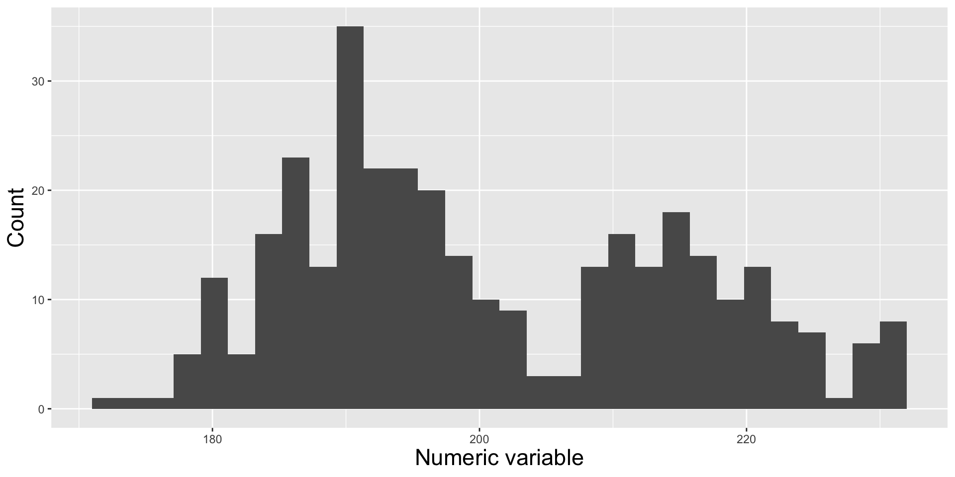
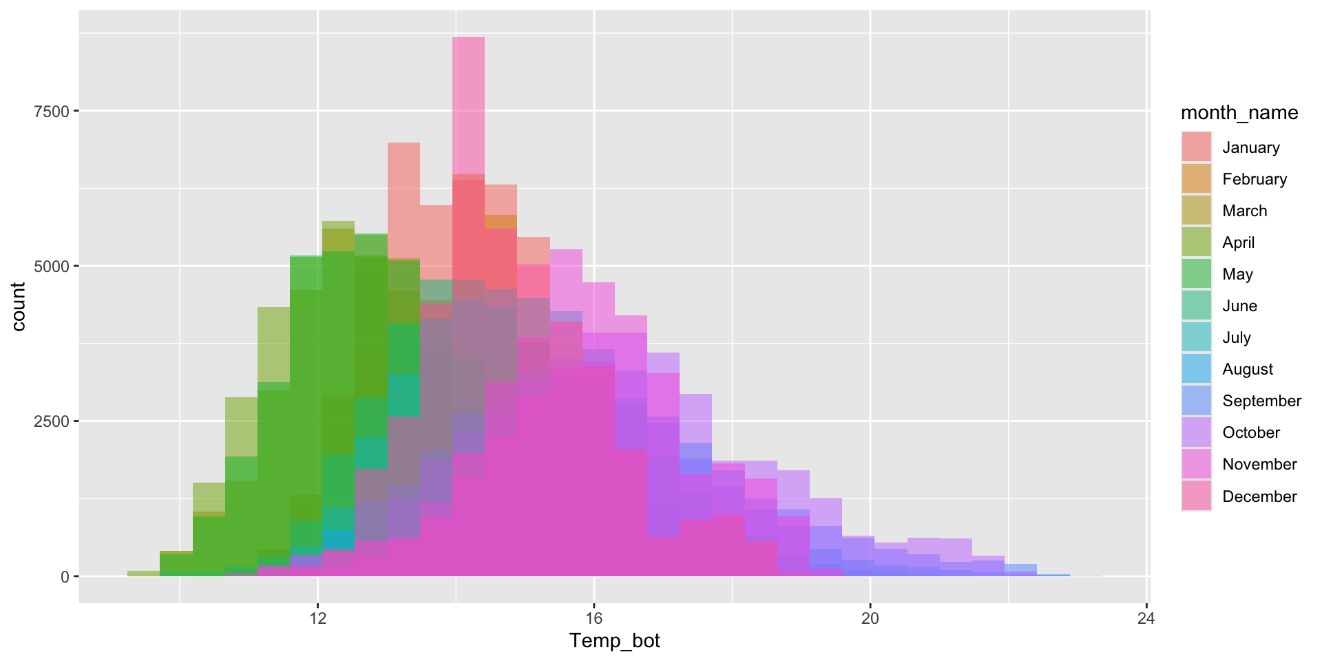
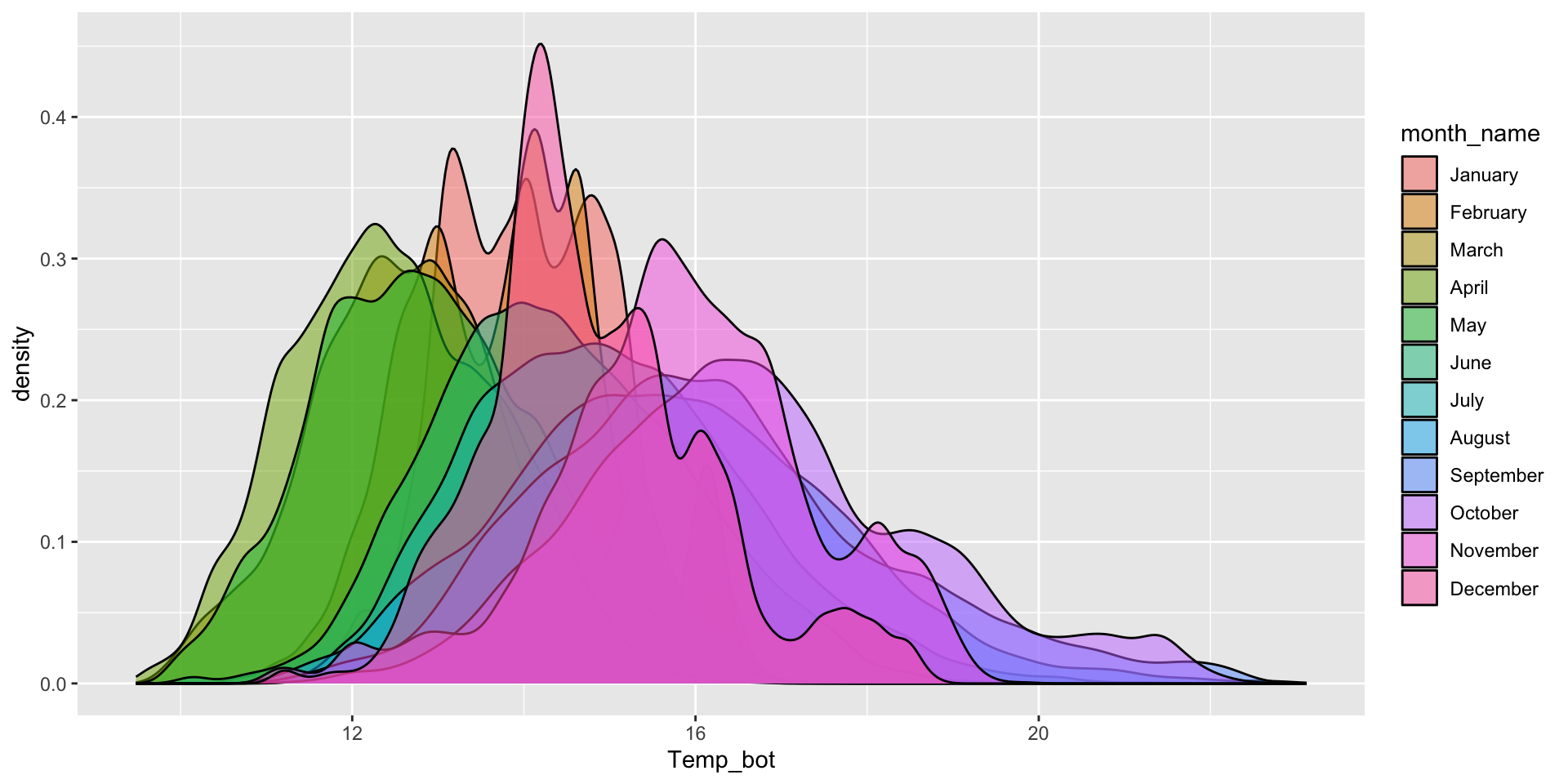
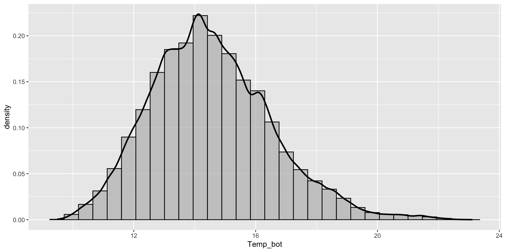
Histograms vs. Density Plots
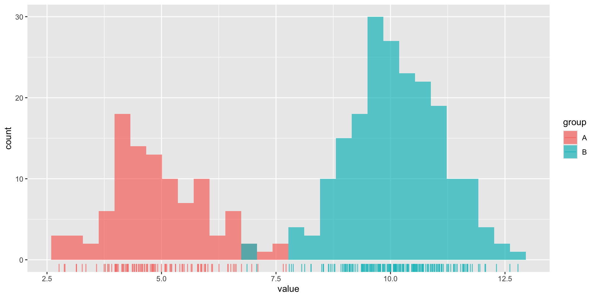
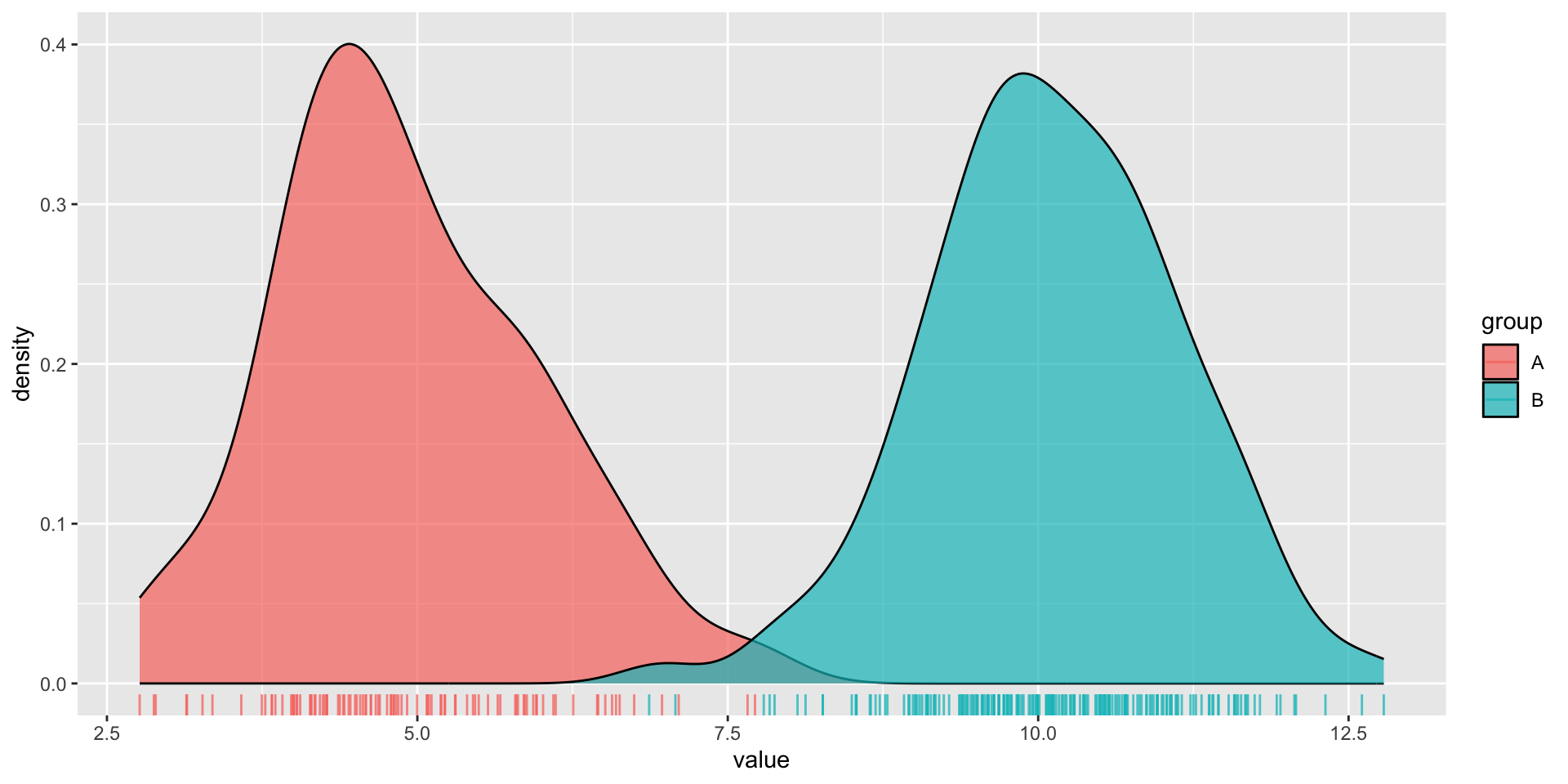
Histograms and density plots are often talked about as somewhat interchangeable. Below, they’re both used to show the distribution of a numeric variable (ocean bottom temperature in °C).
Histogram
Density plot
How would you interpret each of these?
02:00
Histograms vs. Density Plots
Histogram
Numeric variable is divided into several bins. The height of each bar represents the number of observations in that bin.
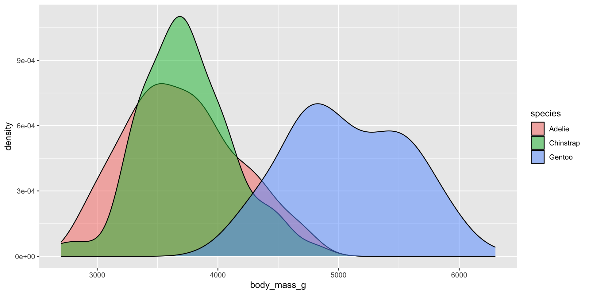
Density plot
Smoothed versions of a histogram, where the y-axis represents density (i.e. how concentrated your data is at each value). Taller parts of the curve indicate more common values, and shorter parts indicate rarer values. The area under the entire curve always equals 1, representing 100% of your data.
An important distinction
Histograms show the counts (frequency) of values in each range (bin), represented by the height of the bars.
Density plots show the relative proportion of values across the range of a variable. The total area under the curve equals 1, and peaks indicate values are more concentrated. Density plots do not show the absolute number of observations.
We’ll use some dummy data to demonstrate how this differs visually:
dummy_data <-data.frame(value =c(rnorm(n =100, mean =5),rnorm(n =200, mean =10)),group =rep(c("A", "B"),times =c(100, 200)))
Here, we have two groups (A, B) of values which are normally distributed, but with different means. Group A also has a smaller sample size (100) than group B (200).
An important distinction
We can see that group B has a larger sample size than group A when looking at our histogram. Additionally, we can get a good sense of our data distribution. But what happens when you reduce the number of bins (e.g. set bins = 4)?
We lose information about sample size in our density plot (note that both curves are ~the same height, despite group B having 2x as many observations). However, they’re great for visualizing the shape of our distributions since they are unaffected by the number of bins.
Use a histogram or density plot when you want to learn about the distribution of a numeric variable that has lots of values (observations) with meaningful differences between those values. It’s also important to keep the following considerations in mind:
set an appropriate bin width (30 bins by default) based on your scale of interest
too few bins (can hide important patterns, loss of distribution shape) / too many bins (adds noise and can make unimportant fluctuations appear meaningful)
useful when you want to visualize the shape of your data (not affected by bin number)
does not indicate sample size (and can be misleading with small data sets)
band width affects level of smoothing
Avoid plotting too many groups at once
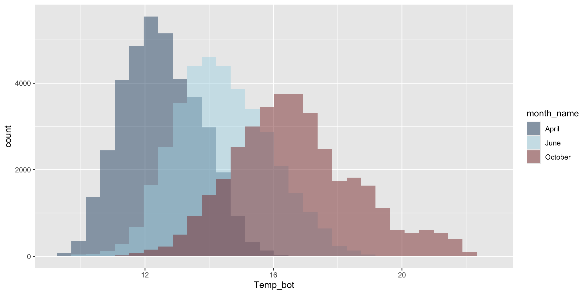
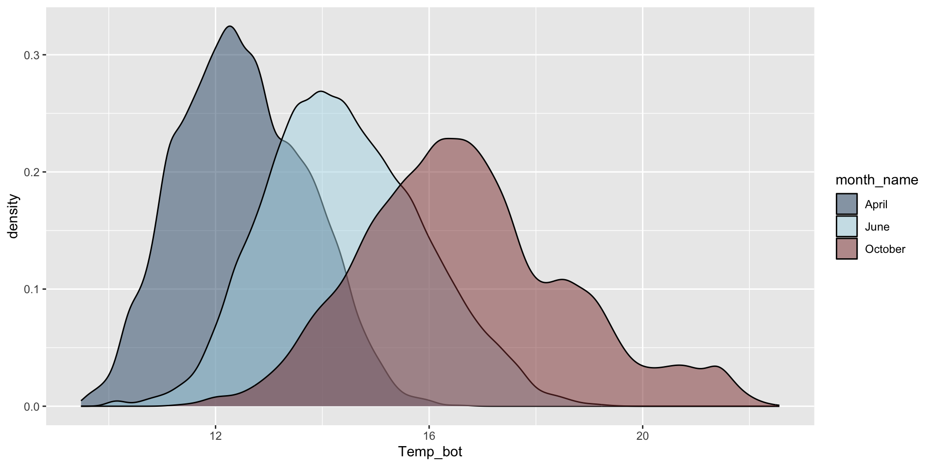
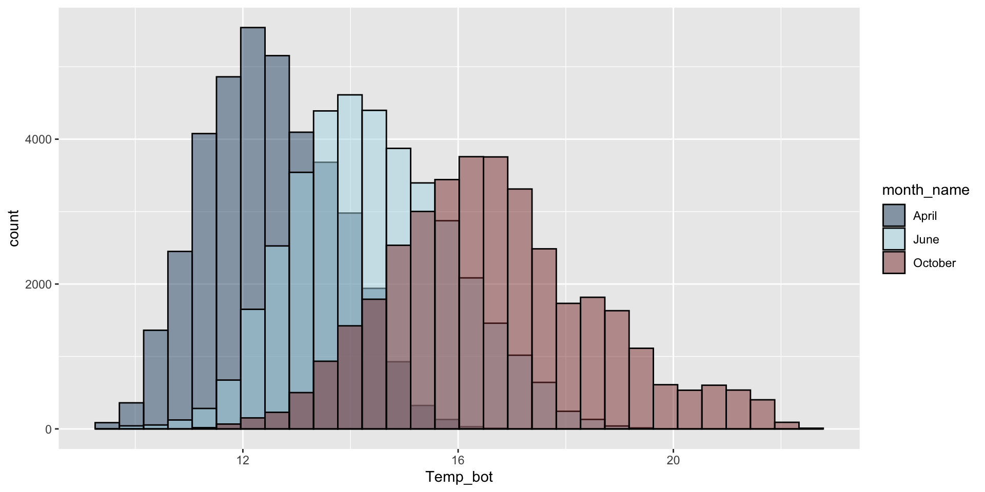
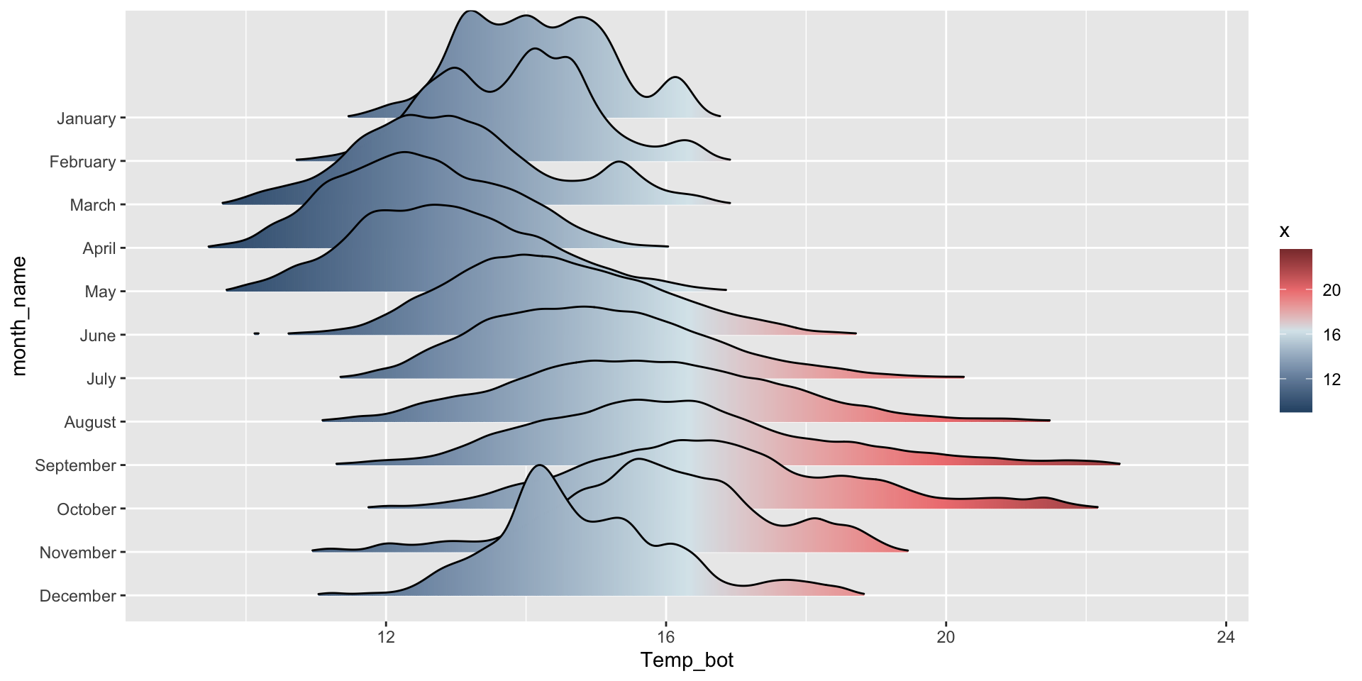
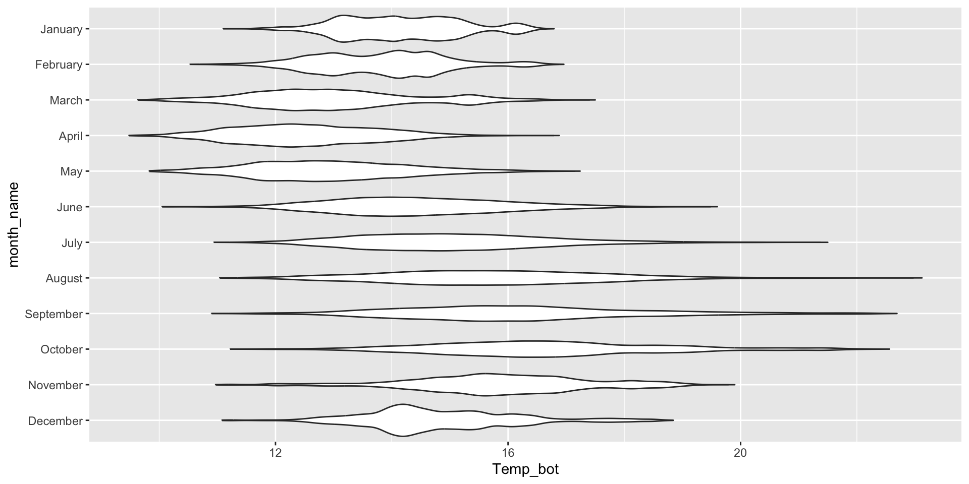
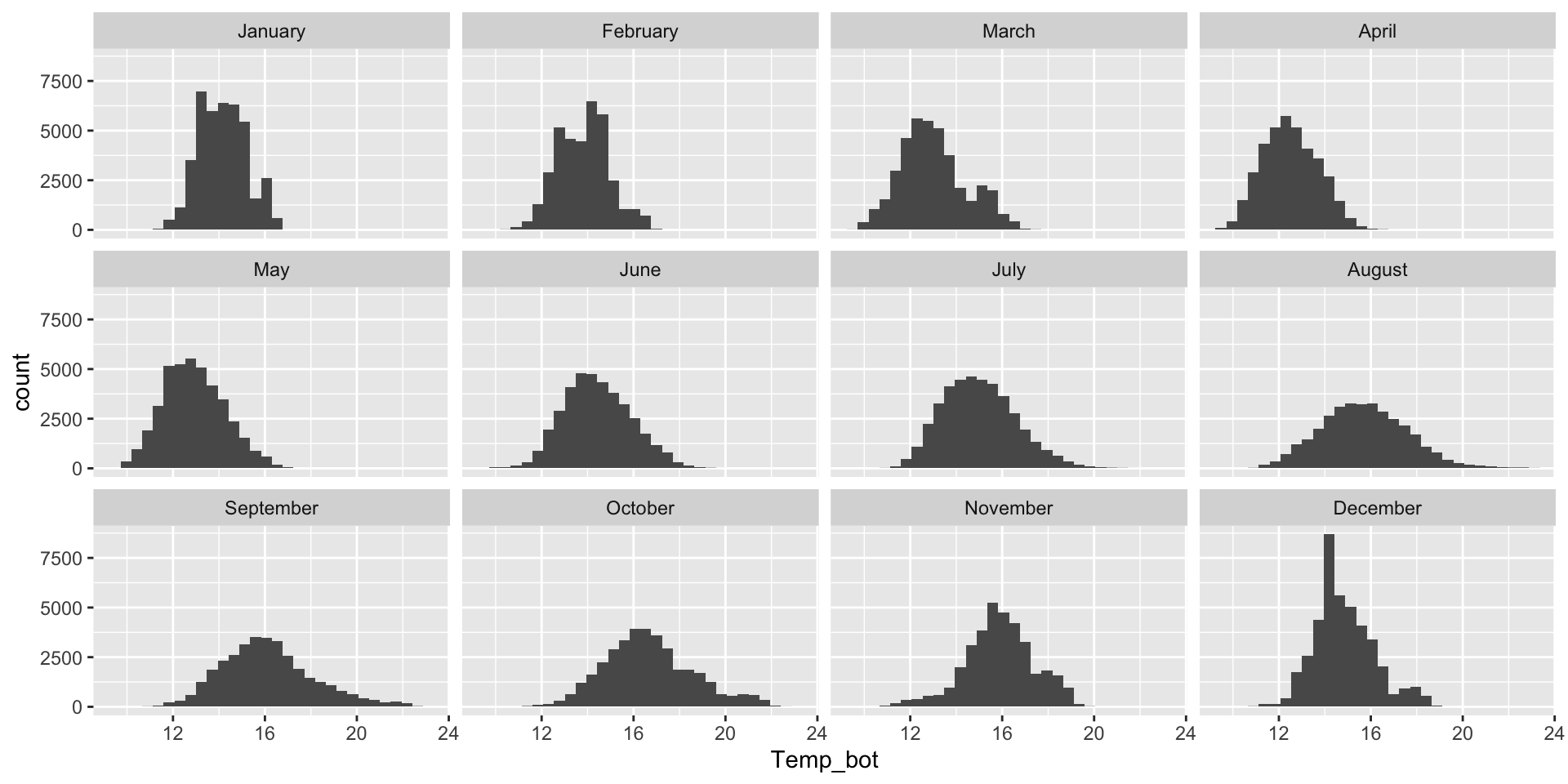
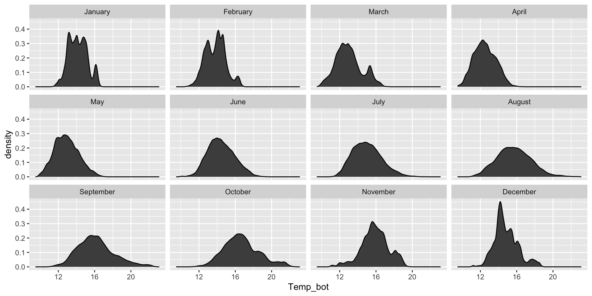
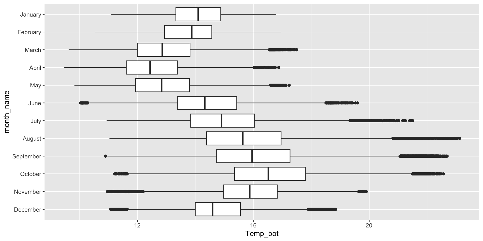
Histogram & density plots don’t work great when you have too many groups to plot at once. Twelve groups (month_name) is too many, especially when the range of temperature values for each of our groups largely overlap:
Do you need all (12) groups, or can you share the most relevant data using fewer groups? Let’s compare just three months: April (generally the coldest month), October (generally a hot month), and June (somewhere in between):
Why are the months still in chronological order, despite not reordering them using mutate(), as we do for our histogram?
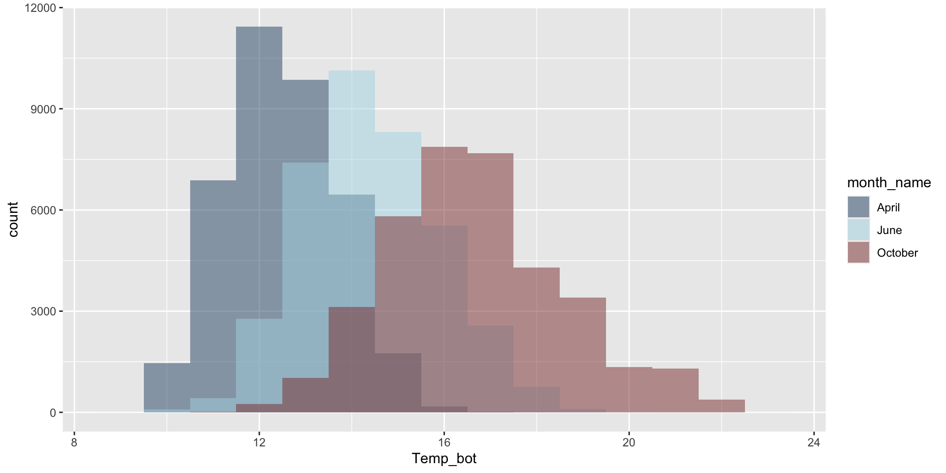
Modify bin / bandwidths
Modify binwidth (30 bins by default) – does a bin width of 1 (°C) actually make sense? Consider scale of interest. Also be mindful when using bins – too few will result in loss of distribution shape, too many adds noise.
Modify bandwidth by declaring a multiplier of the default bandwidth adjustment (default adjust = 1). A small bandwidth leads to undersmoothing, a large bandwidth leads to oversmoothing. Goal: accurately visualize the true underlying data distribution shape while reducing noise:
Overlay histogram & density plots as a sanity check
Overlay histogram and density plots to check that smoothing assumptions of the density curve align with the actual data distribution. This requires rescaling the histogram to match the density curve scale. Adding y = after_stat(density) within the aes() function rescales the histogram counts so that bar areas integrate to 1:
ggplot(mko_clean, aes(x = Temp_bot)) +geom_histogram(aes(y =after_stat(density)), # scale hist to match density curvefill ="gray", color ="black", alpha =0.75) +geom_density(linewidth =1)
What should you carefully consider when checking the smoothing asumptions of your density curve against a histogram?
If you have multiple to many groups, consider these alternatives:
Ridgeline plots, box plots, and violin plots are better suited for visualizing the distribution of a numeric variable with many (e.g. >3) groups.
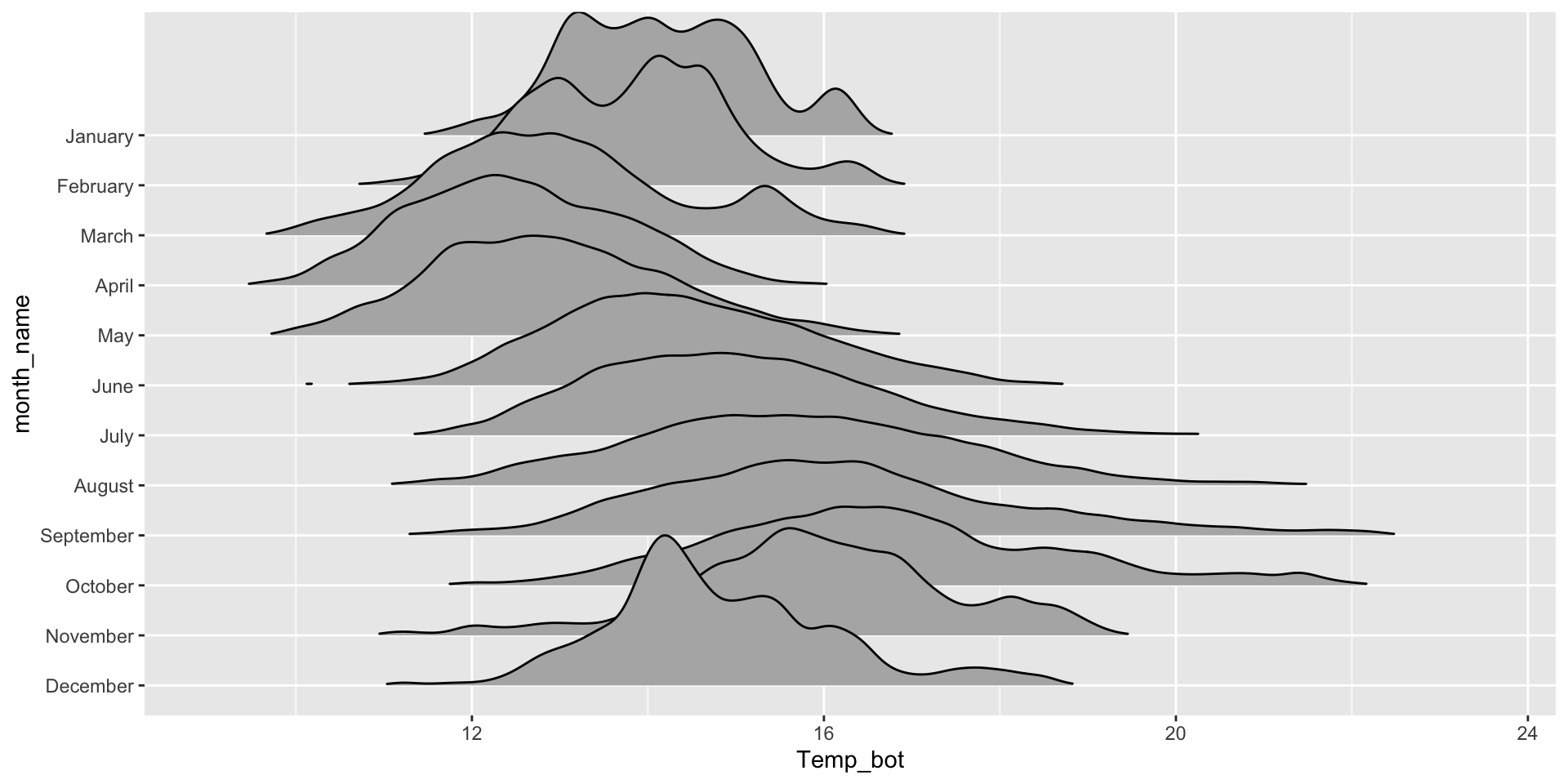
Ridgeline plot
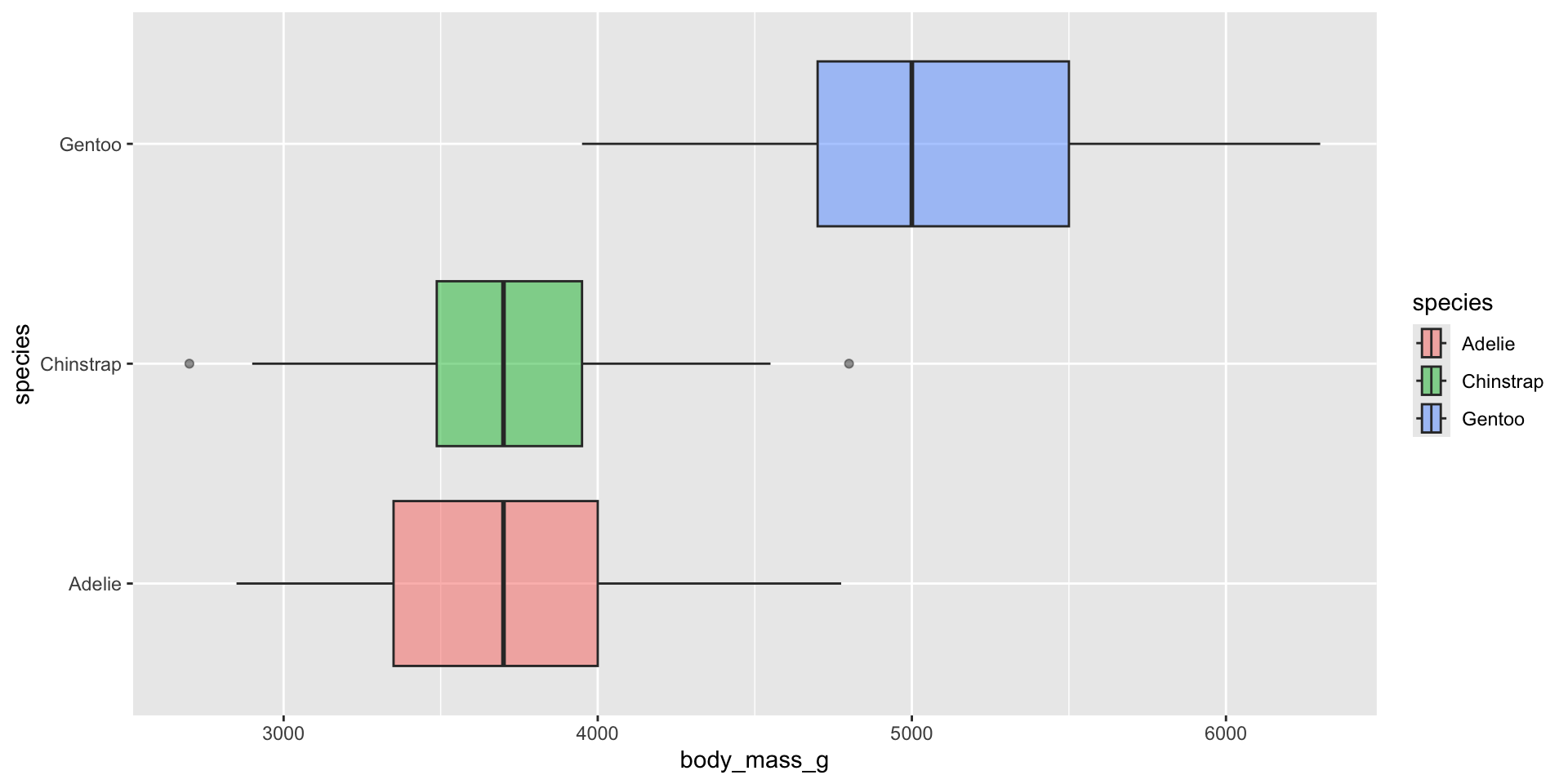
Box plot
Violin plot
Appropriately ordering groups is important for improving readability. If a natural order exists (e.g. months of the year), use it. If not, order groups by a meaningful summary statistic, such as the median (e.g. ordering penguin species by median body weight).
Let’s build them!
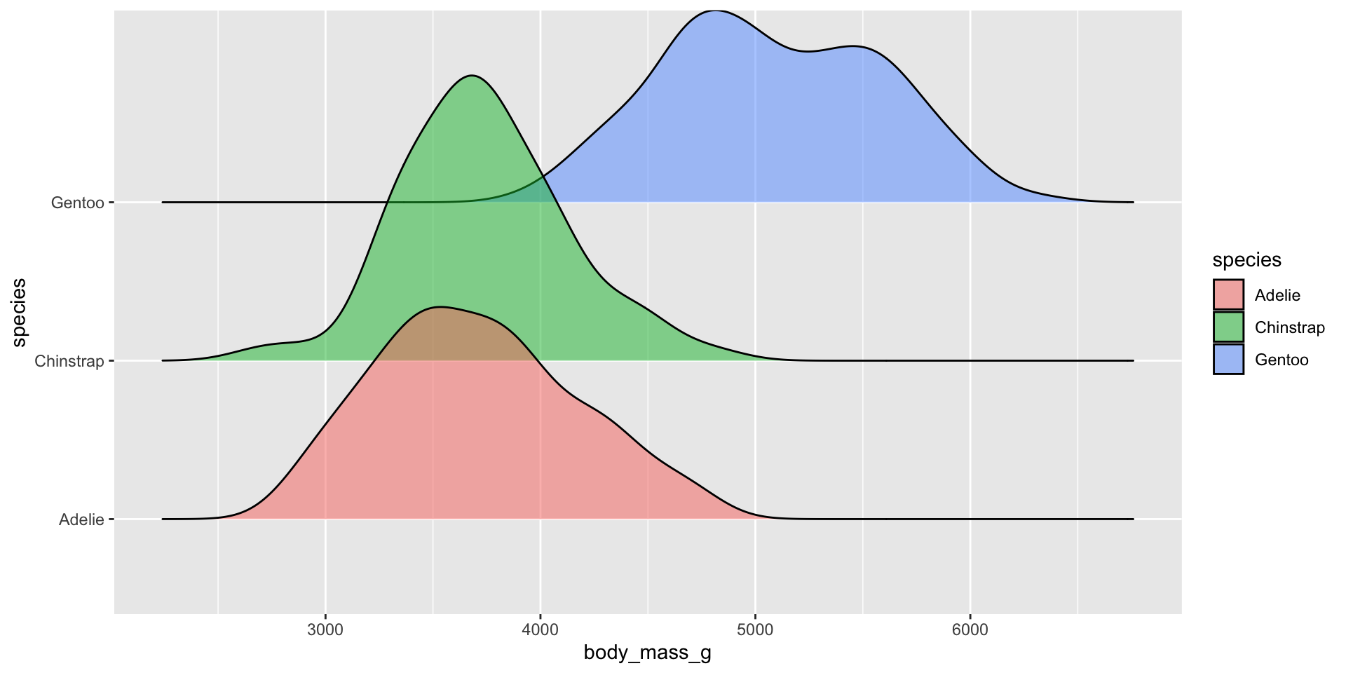
Ridegeline plots for comparing distribution shapes across many ordered groups
Ridgeline plots are most effective when groups have a meaningful order, such as an inherent ranking, or when you want to visualize how distributions change over time (e.g. months, years) or space (e.g. longitude, elevation). The {ggridges} package has various geoms for creating ridgeline plots, including:
geom_density_ridges():
mko_clean |>mutate(month_name =factor(month_name, levels =rev(month.name))) |># alt, within ggplot: `scale_y_discrete(limits = rev(month.name))`ggplot(aes(x = Temp_bot, y = month_name)) + ggridges::geom_density_ridges(rel_min_height =0.001, scale =3) # `rel_min_height` sets threshold for relative height of density curves (any values below threshold treated as 0); `scale` controls extent to which different densities overlap
geom_density_ridges_gradient():
mko_clean |>mutate(month_name =factor(month_name, levels =rev(month.name))) |>ggplot(aes(x = Temp_bot, y = month_name, fill =after_stat(x))) +# `after_stat(x)` tells ggplot: "Don't use the original data for coloring. Instead, wait until you've drawn the density curve, then color each part of that curve based on its x-axis position." ggridges::geom_density_ridges_gradient(rel_min_height =0.001, scale =3) +scale_fill_gradientn(colors =c("#2C5374","#849BB4", "#D9E7EC", "#EF8080", "#8B3A3A"))
Box plots for comparing distribution summaries across multiple groups
Box plots summarize data, meaning they don’t show the underlying shape of the distribution or sample size (though jittered points can be added, if appropriate). They provide a compact summary of a dataset’s center, spread and indications of skewness, and allow many groups to be compared side-by-side while remaining readable.
Box plots for comparing distribution summaries across groups
If your x-axis text is long, consider flipping your axes to make them less crunched:
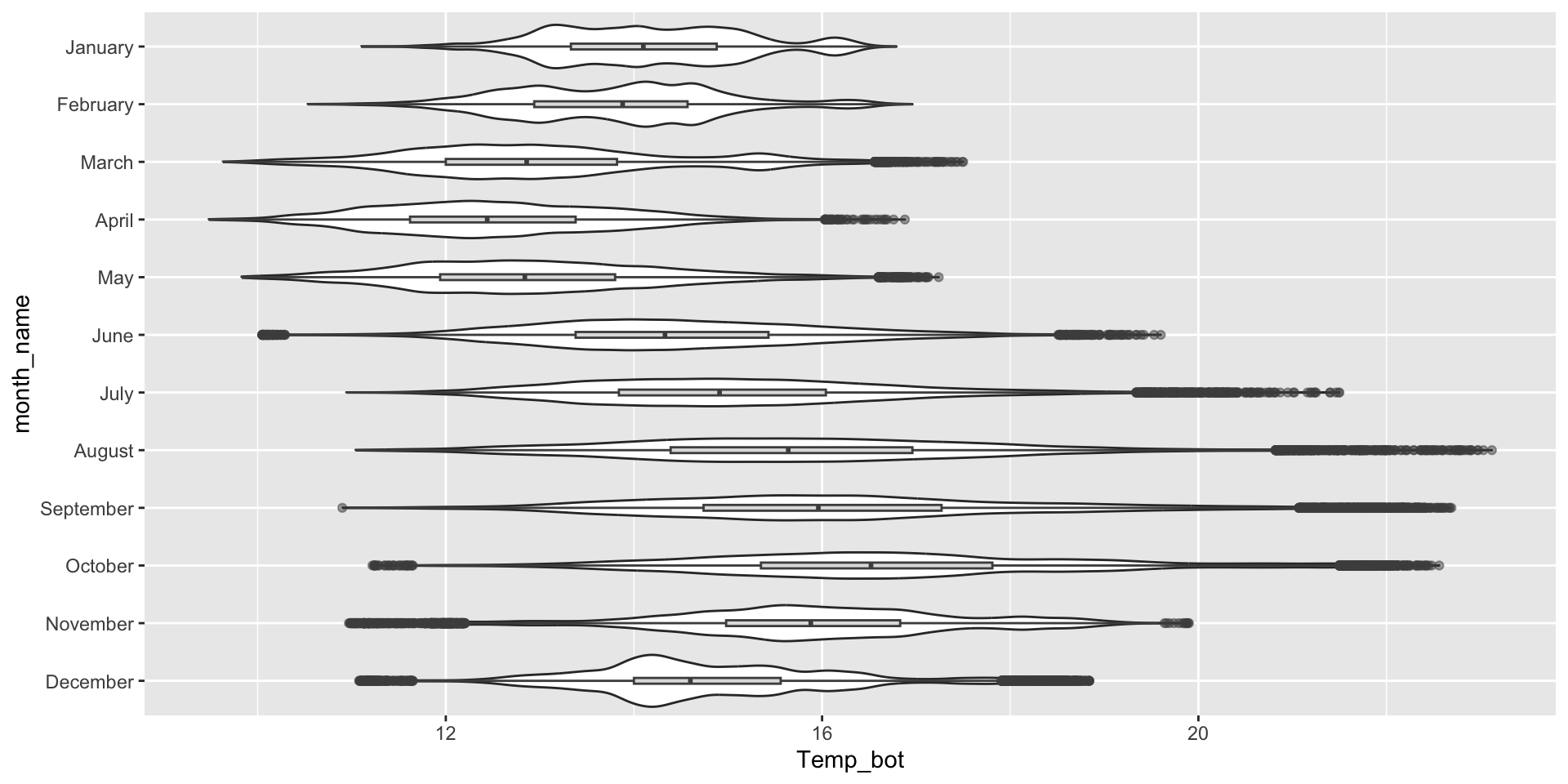
ggplot(mko_clean, aes(x = month_name, y = Temp_bot)) +geom_boxplot() +scale_x_discrete(limits =rev(month.name)) +# an alt way to reorder groups within ggplot, rather than during data wranglingcoord_flip()
What are the tradeoffs between reordering groups within a ggplot (as above) vs. during the data wrangling stage (e.g. as we did for our histogram and density and ridgeline plots)?
ggplot(mko_clean, aes(x = month_name, y = Temp_bot, fill = month_name)) +geom_boxplot() +scale_x_discrete(limits =rev(month.name)) + gghighlight::gghighlight(month_name =="October") +coord_flip() +theme(legend.position ="none")
Overlay jittered data, if appropriate
Since box plots hide sample size, consider overlaying raw data points using geom_jitter(). It’s important that you remove outliers, since overlaying raw data means those data points will be plotted a second time.
Overlaying raw data does not work when you have many observations:
ggplot(mko_clean, aes(x = month_name, y = Temp_bot)) +geom_boxplot(outlier.shape =NA) +# remember to remove outliers!geom_jitter(alpha =0.5, width =0.2) +scale_x_discrete(limits =rev(month.name)) +# an alt way to reorder groups within ggplot, rather than during data wranglingcoord_flip()
But it’s a great option for datasets with fewer observations:
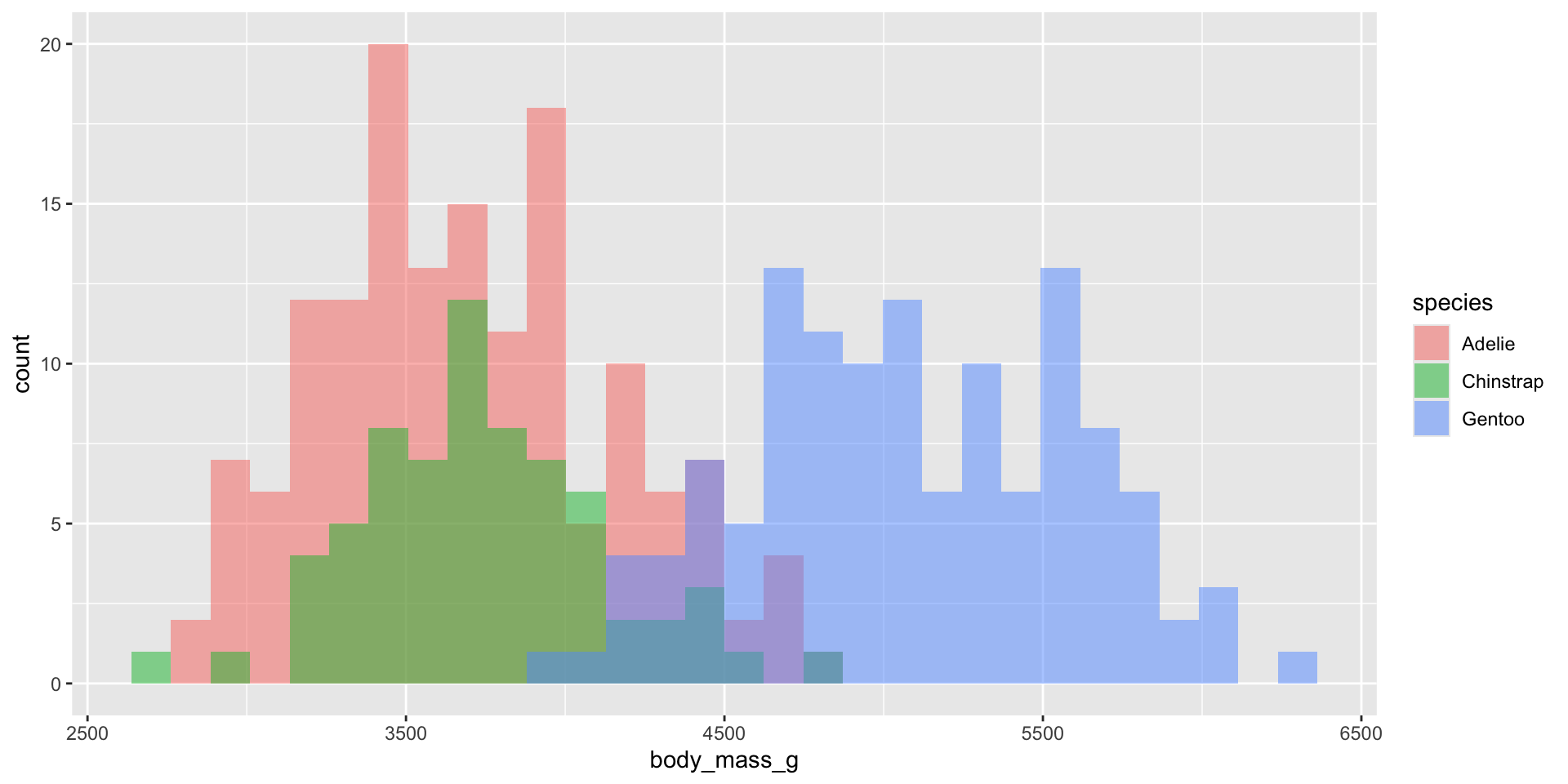
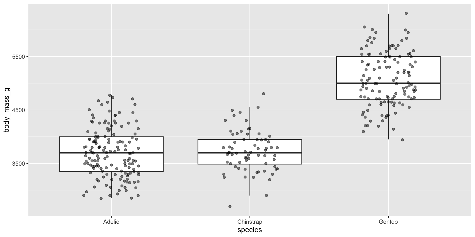
ggplot(penguins, aes(x = species, y = body_mass_g)) +geom_boxplot(outlier.shape =NA) +# remember to remove outliers!geom_jitter(alpha =0.5, width =0.2)
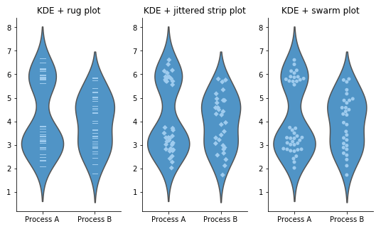
Beeswarm plots as an alternative
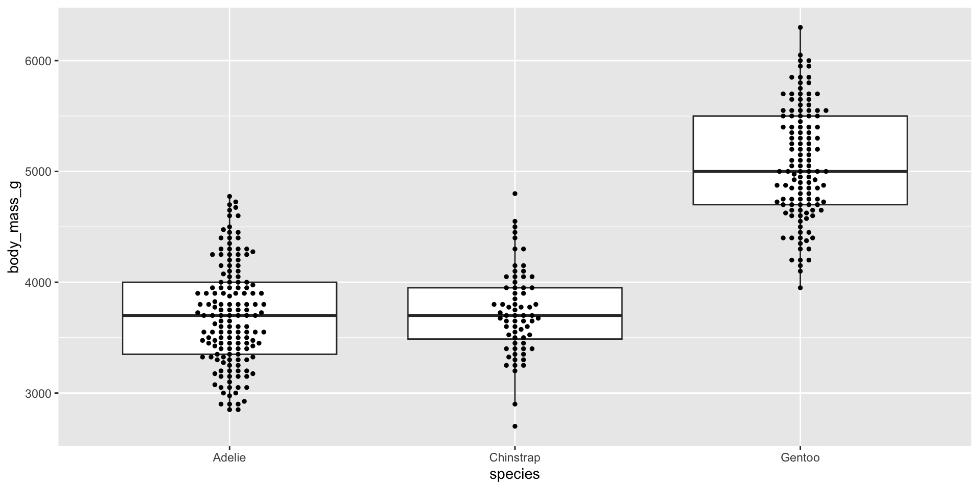
Similar to overlaying raw jittered data points, we can combine our box plot with a beeswarm plot using the {ggbeeswarm} package. Beeswarm plots visualize the density of data at each point, as well as arrange points that would normally overlap so that they fall next to one another instead. Consider using a standalone beeswarm plot here as well! We’ll again use the penguins data set to demo:
ggplot(penguins, aes(x = species, y = body_mass_g)) +geom_boxplot(outlier.shape =NA) +# remember to remove outliers! ggbeeswarm::geom_beeswarm(size =1)
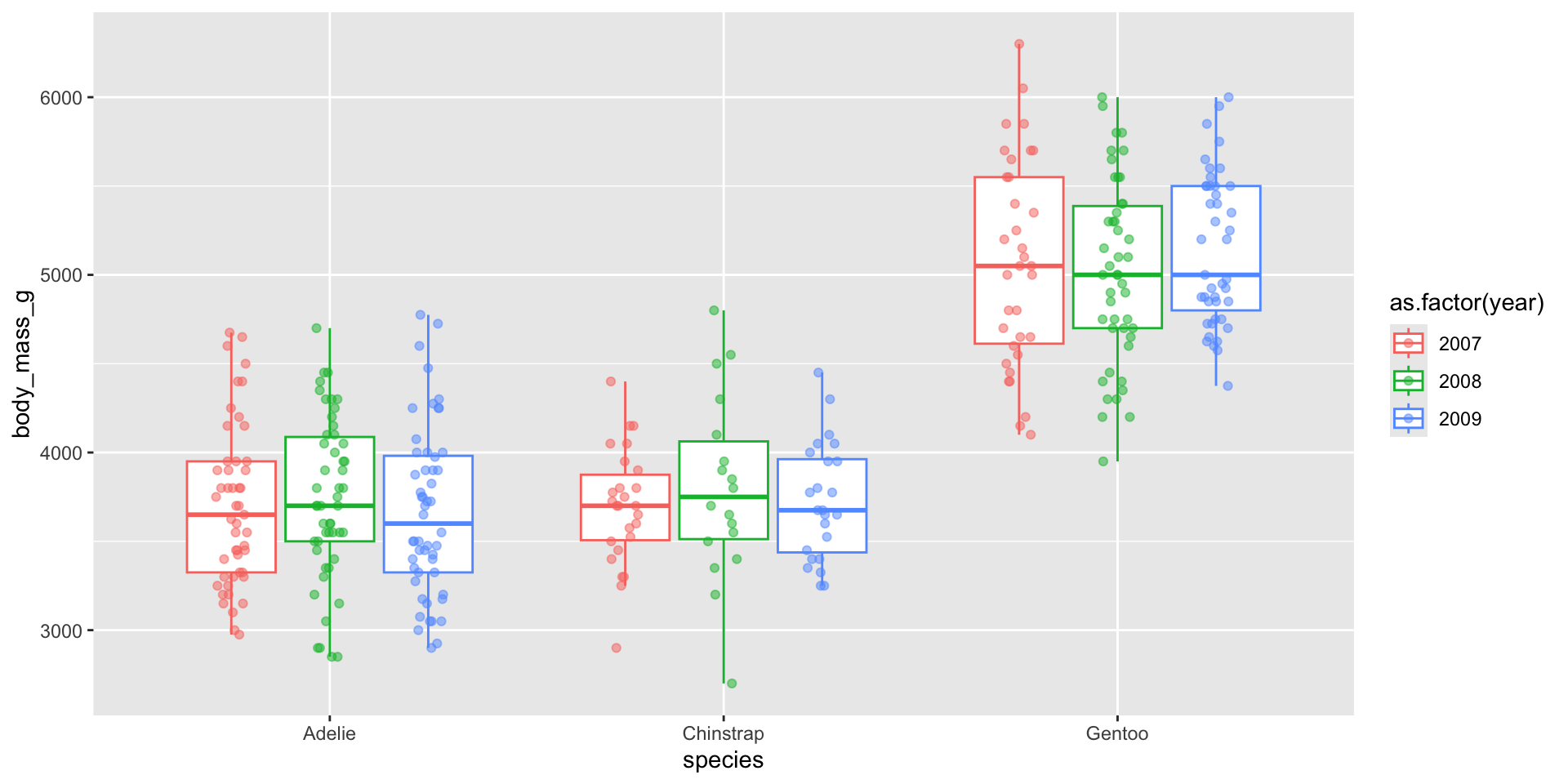
Dodge when you have an additional grouping variable
You may have data where you want to include an additional grouping variable – for example, let’s say we want to plot penguin body masses by species and year. We’ll need to at least dodge our overlaid points so that they sit on top of the correct box. Preferably, we both jitteranddodge our points:
ggplot(penguins, aes(x = species, y = body_mass_g, color =factor(year))) +geom_boxplot(outlier.shape =NA) +# remember to remove outliers!geom_point(alpha =0.5, position =position_jitterdodge(jitter.width =0.2))
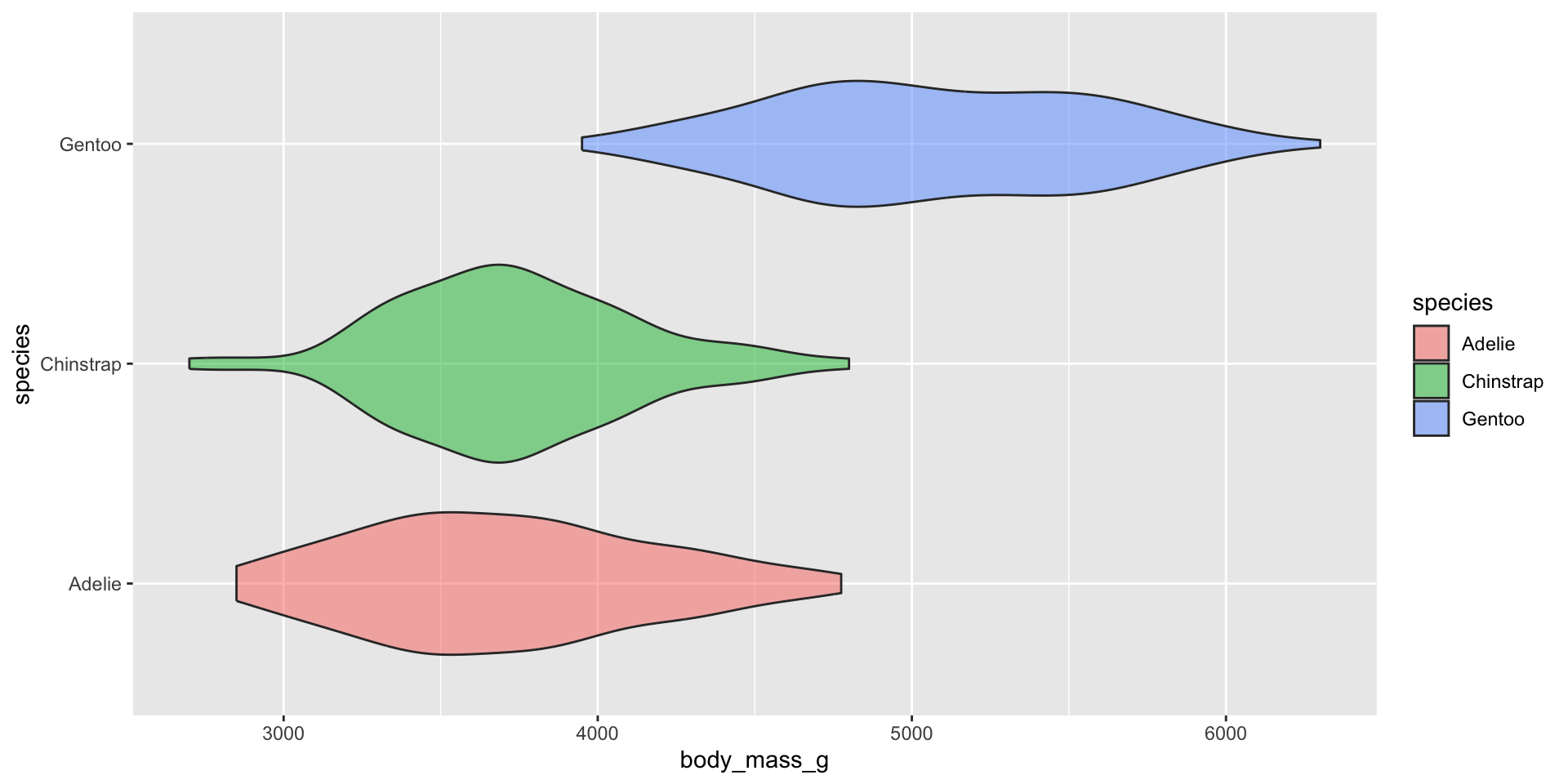
Violin plots for comparing distribution shapes across multiple groups
Violin plots show the shape of a distribution by visualizing the kernel density estimate (KDE) of a variable (i.e. ranges with more data points appear wider). They’re similar to density plots, but make it much easier to compare distribution shapes across multiple groups.
Overlay your violin plot with other geoms to add context
Be sure to order your groups appropriately (e.g. by natural order, or by median value) and consider overlaying another chart type (e.g. box plot for many data points, rug or beeswarm for low-medium number of data points) for additional context. Rotate your axes if your x-axis text is long:
ggplot(mko_clean, aes(x = month_name, y = Temp_bot)) +geom_violin() +geom_boxplot(width =0.1, fill ="gray", color ="gray30", alpha =0.5) +scale_x_discrete(limits =rev(month.name)) +coord_flip()
Take a Break
05:00
Extra time? Let’s practice.
TidyTuesday published a dataset on palm traits on March 18, 2025, sourced from the PalmTraits 1.0 Database. With your learning partners, explore these data and visualize the distribution of one or more palm traits of your choosing. Be intentional about how you group the data and whether those groupings are appropriate for the chart types you choose. Apply the visualization and design considerations discussed in lecture. Begin by importing the data directly from the tidytuesday repo: