For visualizing the relationship between (typically) two numeric variables.
EDS 240: Lecture 4.2
Visualizing numerical relationships
Week 4 | January 27th, 2025
Visualizing numerical relationships?
For visualizing the relationship between (typically) two numeric variables.
Line graphs (from week 2) are similar to scatter plots, except the x-axis variable is ordered chronologically and points are connected by lines to emphasize trends.
Roadmap
In this lesson, we’ll be exploring two main primary chart types:
1. scatter plots
2. 2d density plots
Roadmap
In this lesson, we’ll be exploring two main primary chart types:
1. scatter plots
2. 2d density plots
The data: Hubbard Brook Watershed stream chemistry
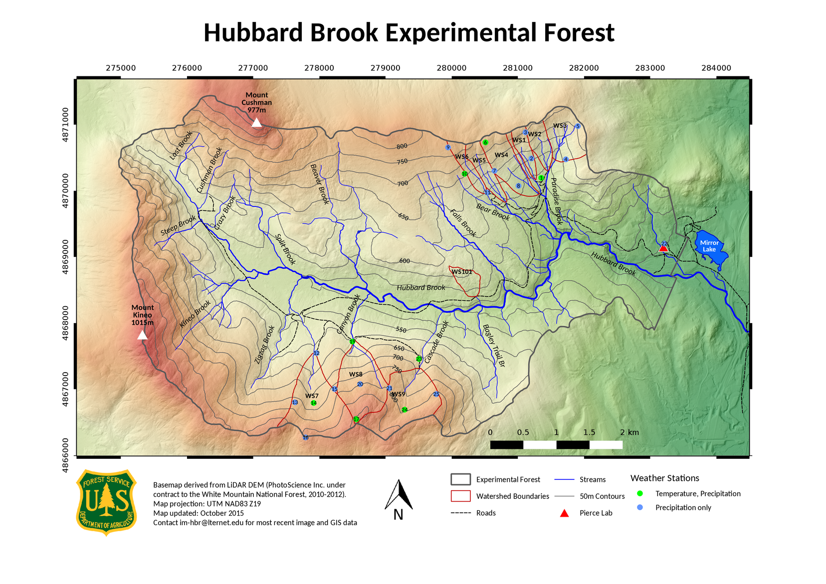
The Hubbard Brook Experimenatal Forest is a 8,700-acre hardwood research forest in the White Mountains of New Hampshire and home to a series of small watersheds occupying the valley’s north- and south-facing slopes.

Map of Hubbard Brook Experimental Forest, downloaded from the Hubbard Brook Ecosystem Study Photo Galleries
Since 1963, researchers have collected and analyzed weekly stream and precipitation data from the forest’s watersheds. Read about these long term data on DataOne.
These long-term data have contributed to important research, including the discovery of acid rain in North America.
In this lesson, we’ll explore the effects of various compounds on stream water pH (a lower pH = more acidic).
Data wrangling
Our data don’t require much wrangling, though we will practice using the {metajam} package for downloading and reading in data from repositories in the DataOne network.
#..........................load packages.........................
library(metajam)
library(tidyverse)
library(ggExtra)
library(ggdensity)

#...................download data from DataOne...................
# you only need to do this once (then I recommend commenting it out)!
metajam::download_d1_data("https://cn.dataone.org/cn/v2/resolve/https%3A%2F%2Fpasta.lternet.edu%2Fpackage%2Fdata%2Feml%2Fknb-lter-hbr%2F208%2F11%2F3b3cf7ea447cb875d7c7d68ebdfd24c7",
                 path = here::here("week4"))

#  ~ NOTE: You should rename the downloaded folder to 'data/' so that it's ignored by .gitignore! ~

#....................read in downloaded files....................
stream_chem_all <- metajam::read_d1_files(here::here("week4", "data"))

#........................get the data file.......................
# stream_chem_data <- stream_chem_all$data
stream_chem_data <- stream_chem_all$HubbardBrook_weekly_stream_chemistry.csv
See {metajam}’s README explains how to get a URL to use for downloading data using download_d1_data().
Basic scatter plot
The pH of surface water and topsoil may be lower in the presence of dissolved organic matter (e.g. see Erlandsson et al. 2010 & Zhou et al. 2019.). To start, let’s look at the effects of DOC on pH for just the most recent water year (2021):
Rug plots help to visualize the distribution of data
Rug plots add distribution marks (one narrow line for each data point) along the x and y axes of your plot:
Try marginal plots as an alternative to geom_rug()
The {ggExtra} package can be used to add marginal histograms / boxplots / density plots to ggplot scatter plots:
Explore a variety of other parameters to adjust the appearance of your marginal plots (e.g. col, fill, binwidth, etc.). You can add marginal plots on just a single axis (e.g. margins = "x" for just a marginal plot along the x-axis), or separately adjust the appearance of marginal plots (e.g. xparams = list(fill = "red"))
Marginal plots also work with groups
Here, we color points by site. It can be helpful to move the legend above or below the plot so that the marginal plot sit cleanly against the right-hand side of graph:
Adding trend lines – default behavior
You may consider adding a best fit line to help you readers more easily identify trends in your data. Let’s do that for a subset of our data (site W5, years 2011-2021).
If you have <1000 data points, geom_smooth() defaults to using a method called “LOESS” (locally estimated scatter plot smoothing), which draws a line that’s similar to a moving average. It will also include a confidence interval ribbon:
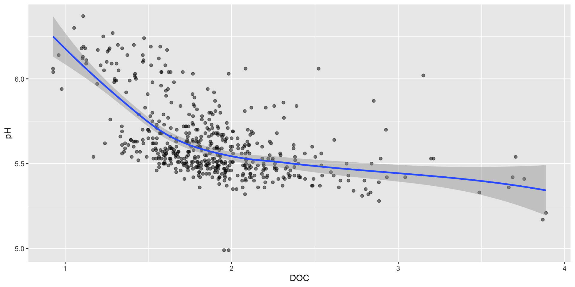
geom_smooth() can be a great tool for exploring general trends in your data, but you should be cautious when using it in a final visualization. It is often not appropriate when you have sparse data, or if no clear relationship between your variables exists.
Update method & remove CI
Oftentimes, you’ll want a line of best fit. Specify a linear model using the method argument.
It’s also best to remove the confidence interval band – it can make it a bit clearer to your audience that this is just a trend line and not a properly analyzed linear model (e.g. we haven’t checked for equal variances, normality of residuals).
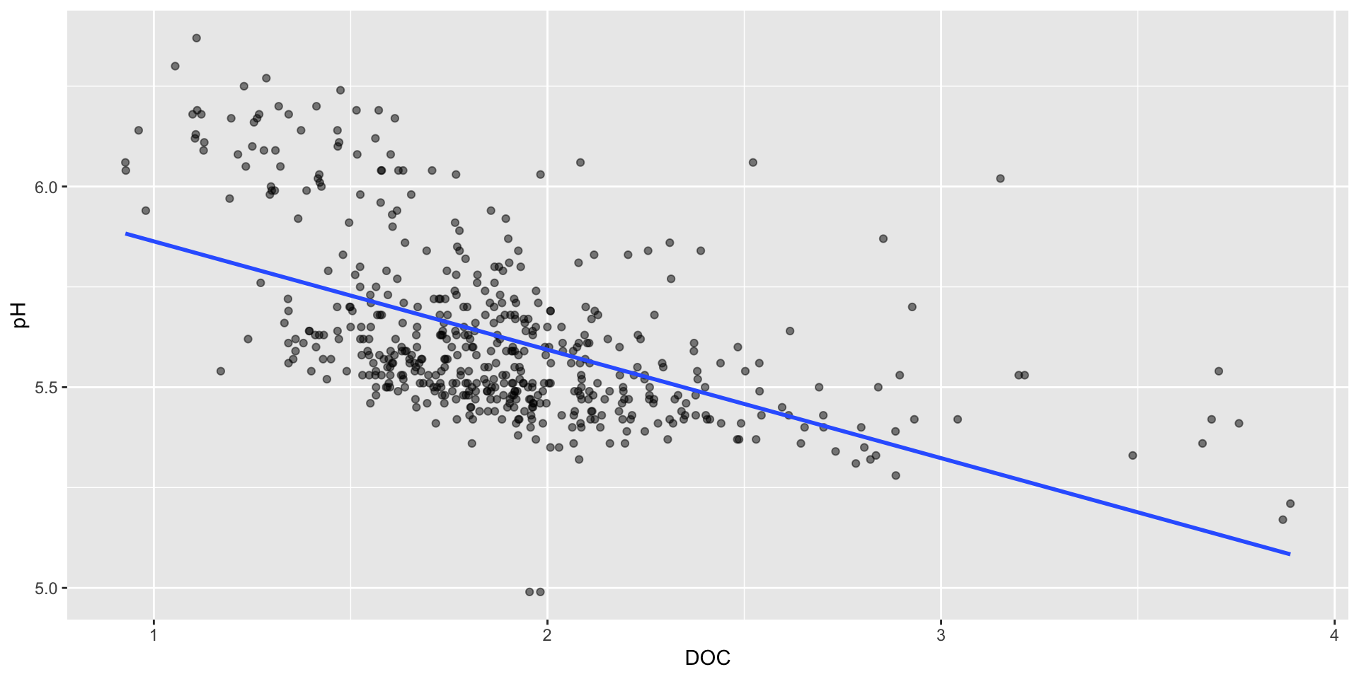
Check out chapter 5.2 & chapter 6.3 in An Introduction to R, by Alex Douglas, Deon Roos, Francesca Mancini, Ana Couto & David Lusseau, for a great (re)introduction to geom_smooth() and simple linear modeling.
Bubble charts for visualizing a third numeric variable
Low pH levels can increase the solubility of heavy metals, like aluminum (Al). High levels of Al can limit the growth and reproduction of aquatic species.
We can use a bubble chart to represent this third numeric variable (Al) through the size of our scatter plot points. Here, we also update our x-axis and legend titles:
Use size to represent a third numeric variable cautiously
Bubble charts encode values based on both position (within the Cartesian coordinate system) and size. Some challenges with this:
Adjust the size range of bubbles
Use scale_size() to adjust the area range of the bubbles:
If you have values of 0 in your data set, you may consider using scale_size_area(). This ensures that those 0s are mapped to a size of 0 (i.e. a tiny dot with no visible area).
Always scale bubble area by value
By default, ggplot scales bubble area by value, rather than radius or diameter. Scaling the radius or diameter by value can be deceiving – a point with 2x the value of another point would end up having 4x the area, making it’s value appear larger than warranted:
Scaling size by area using scale_size()
Visualizing a third numeric variable using color
Rather than coloring points by site, we can map color to them based on our third continuous numeric variable, Al_ICP. We’ll also apply the viridis color map:
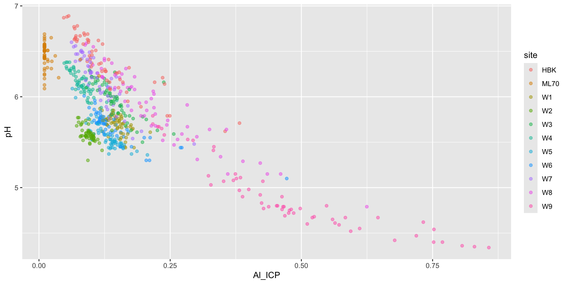
Alternatively, just use 2 separate scatter plots
Rather than mapping a third numeric variable to point size or color, consider if just creating two separate scatter plots may help to more effectively visualize the relationships:
Visualizing the effect of DOC on pH
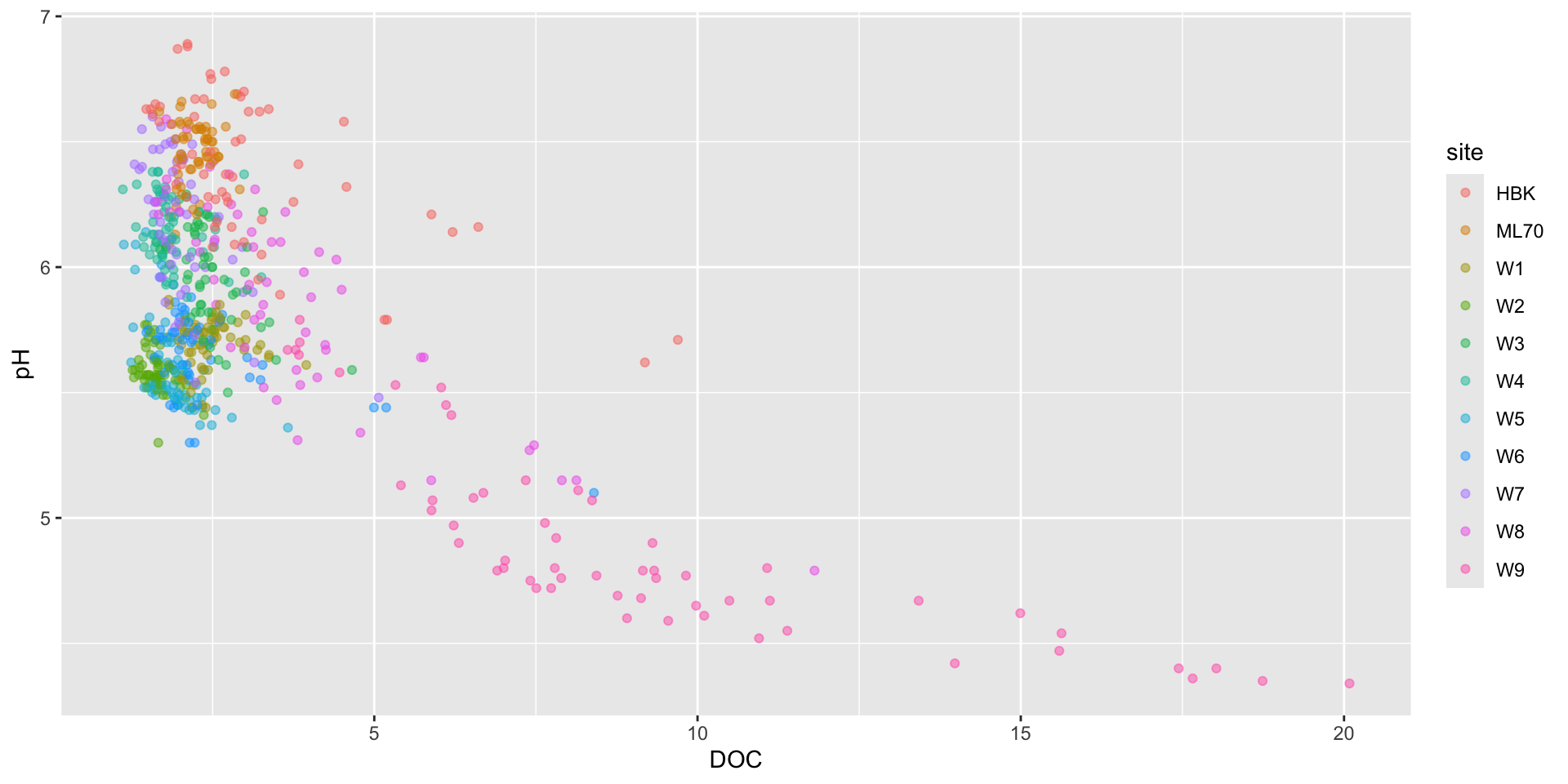
Visualizing the effect of Al_ICP on pH
Overplotting can disguise trends
Sometimes, we just have too many data points for a traditional scatter plot to be effective. For example, what if we want to plot all data (not just the 2021 water year subset)? Here, we plot sulfate concentration (SO4) against pH:
Some initial strategies
Depending on how many points you have and the message you want to convey, you may consider the following:
Smaller points and / or transparency
Add a rug plot
But with a really large number of points, these strategies may not make interpretation much easier…
Alternatively, try a heatmap
You might imagine that you’re looking down on a histogram, where lighter areas indicate a higher density of points.
heatmap of 2d bin counts
Similar to a histogram, you can update the number of bins or binwidth.
Adjust legend appearance using guides()
Check out the guides() function for tweaking the appearance of your legend (e.g. increasing the height can help readers more easily read the continuous color scale):
Another option: 2d density / contour plots
These are the 2d equivalents to creating a density plot using geom_density() (see week 3 materials).
contours of a 2d density estimate
These can be a bit confusing to read / interpret
What’s up with that legend?
The legend provides us with an estimate of the proportion of data points that fall within a colored region. The density of the distribution of points sums to 1.
In this example, 0-2% of of points fall within a 1x1 square in the darkest blue region, while 26-28% fall within a 1x1 square in the brightest yellow region.
Consider using the {ggdensity} equivalent geoms
The {ggdensity} package provides alternative functions, geom_hdr_lines() and geom_hdr(), as drop-in replacements for geom_density_2d() and geom_density_2d_filled() (respectively).
Interpreting {ggdensity} plots
These geoms similarly perform 2D density estimation, then compute and plot the resulting highest density regions (HDRs). These HDRs are computed to be the smallest such regions that bound that level of probability. By default, regions show the 50%, 80%, 95%, and 99% HDRs of the estimated density (though this can be updated using the probs argument).
See you next week!
~ This is the end of Lesson 2 (of 2) ~