Choosing the right graphic form is just the first step! It’s important to consider how you can enhance your visualization by:
EDS 240: Lecture 5.1
What makes a good data viz?
Week 5 | February 3rd, 2025
Looking forward . . .
Choosing the right graphic form is just the first step! It’s important to consider how you can enhance your visualization by:
applying pre-made and custom color palettes
updating fonts
adding annotations
fine-tuning themes
centering our primary message
We’ll start by familiarizing ourselves with a general set of rules and best practices for making “good” data viz.
Good data visualization design considers:
The above should always be considered in your design process, but may not always be necessary
Good data visualization design considers:
We’re going to talk about these first few points, to start.
Simplify plots to reduce eye movement & improve readability / interpretability
Data-Ink ratio: remove non-data ink
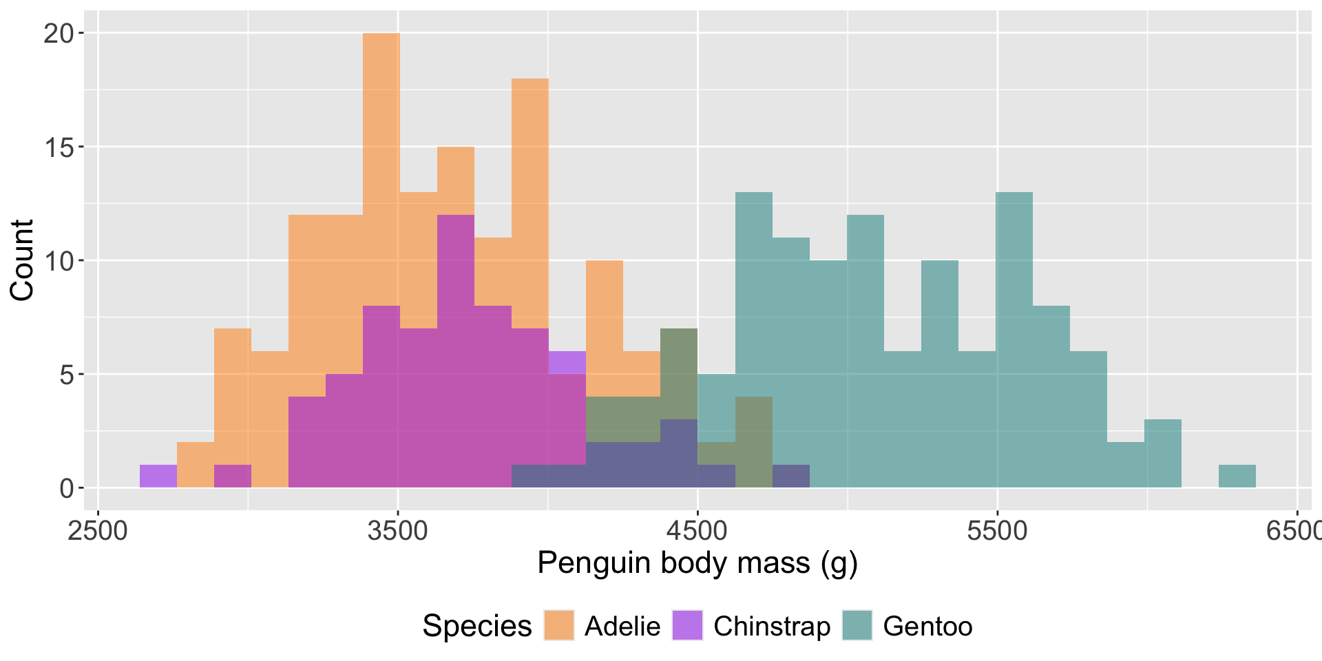
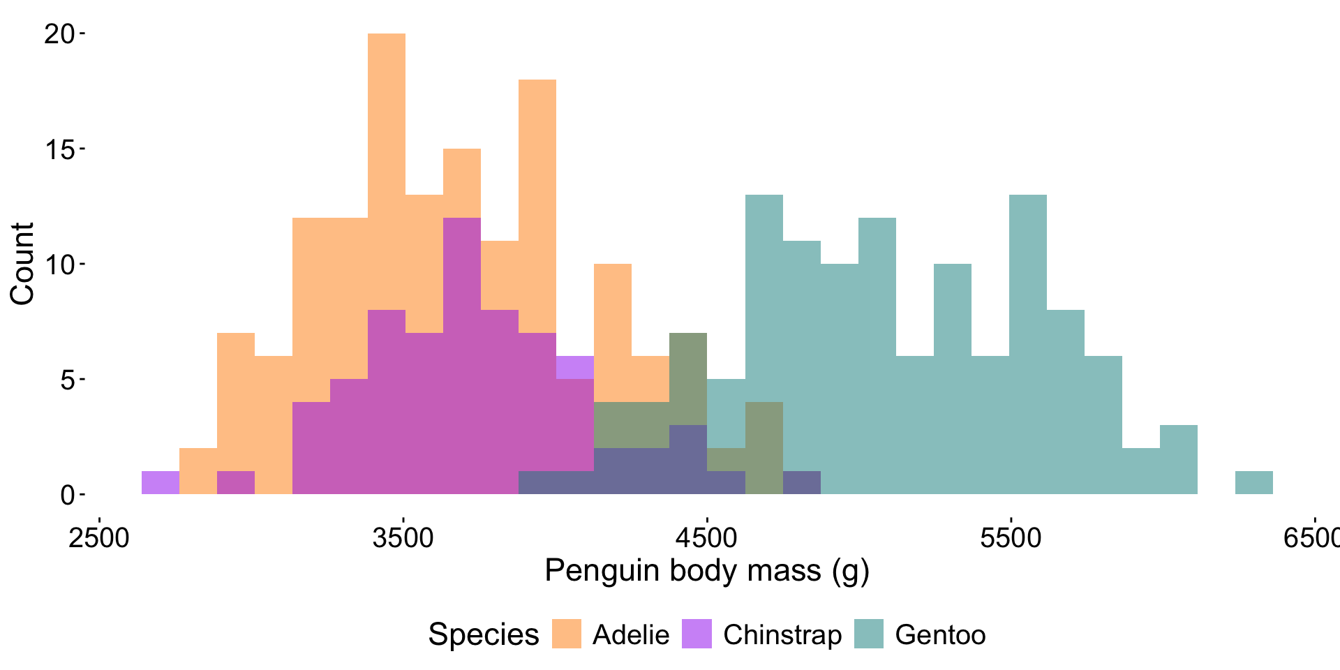
The Data-Ink ratio was introduced by Edward Tufte (1983) and argues that non-data-ink (i.e. ink used for for everything except the presentation of data itself) should be removed wherever possible.
\[ \text{Data-ink ratio} = \frac{\text{Data-ink}}{\text{Total ink used to print the graphic}} \]
Do so by starting with a complete theme (e.g. theme_classic(), theme_void()) and add / remove elements using theme().
Low Data-Ink ratio

High Data-Ink ratio
Maximizing the Data-Ink ratio isn’t always best
Eliminating lots of non-data ink may render visualizations difficult to read
A general rule of thumb: aim to maximize the data-ink ratio while not sacrificing overall readability, design, aesthetics.
Remove redundant legend information
Ask yourself, “Does this legend provide additional information that I can’t get elsewhere?”. If not, remove a legend using:
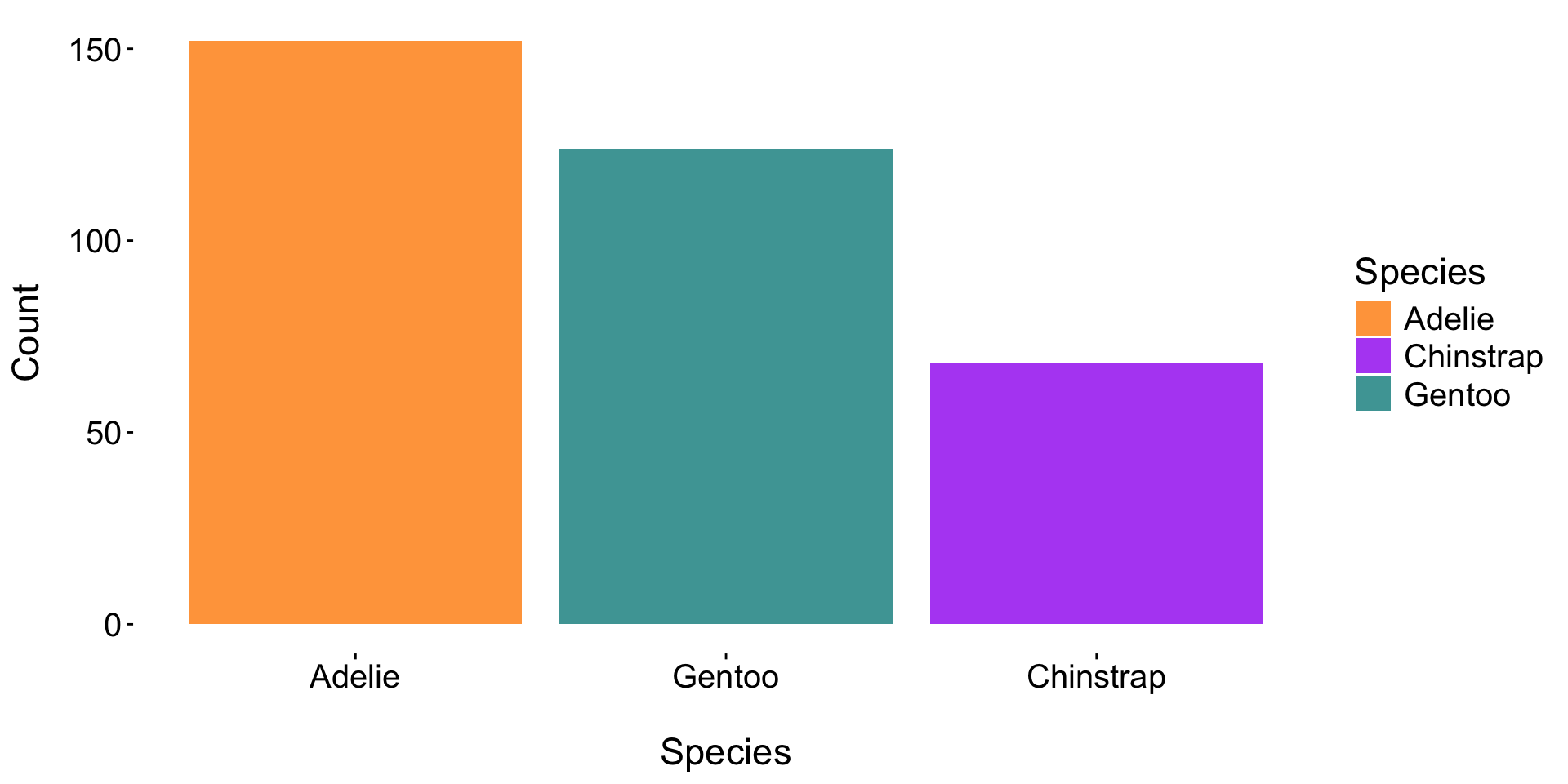
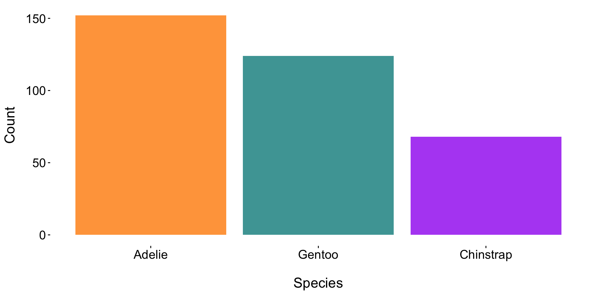
Doing so increases the data-ink ratio and reduces overall eye movement.
Add direct labels & minimize rotated text
We can use a combination of coord_flip() (or remap aesthetics), geom_text(), labs(), and theme() to further eliminate non-data ink and reduce overall eye movement.

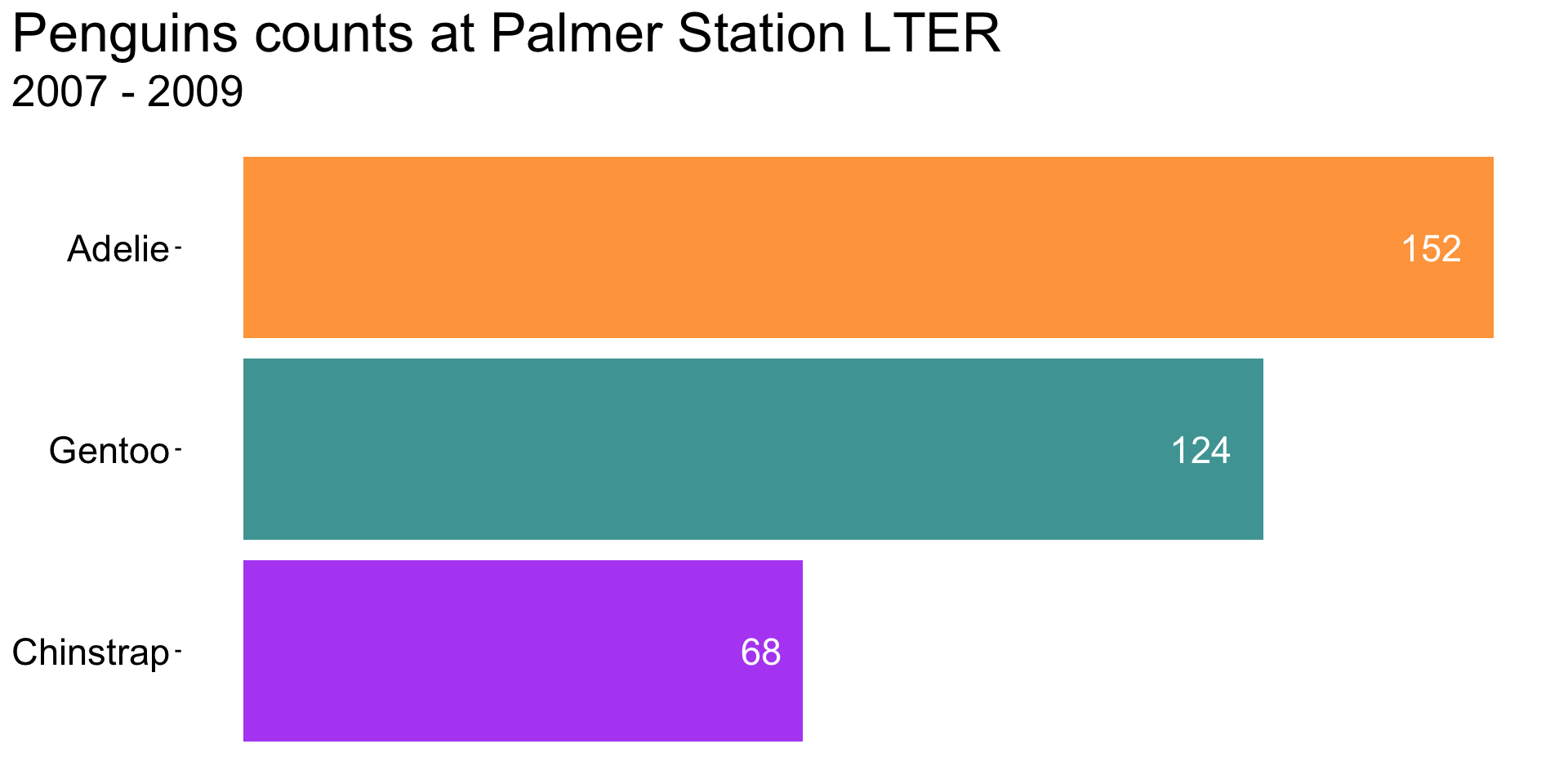
A visualization like this might not be appropriate for all audiences / contexts (e.g. scientific journal) – but the takeaways remain clear, despite the removal of axes / text / legend.
See the third visualization in this BBC article for an “in the wild” example.
Move the legend (positioning)
Reduce eye movement by updating the legend position (e.g. move it onto the plot panel):
Original plot:

Updated legend position:
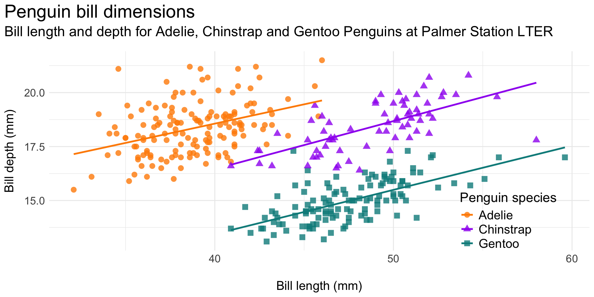
Also note the redundant species mapping (color and shape) – sometime redundancy is important for accessibility!
Move the legend (incorporate into title text)
Reduce eye movement and excess ink by including legend info in the plot (sub)title (here, using the {ggtext} package; minimal code example, below):
Original plot:
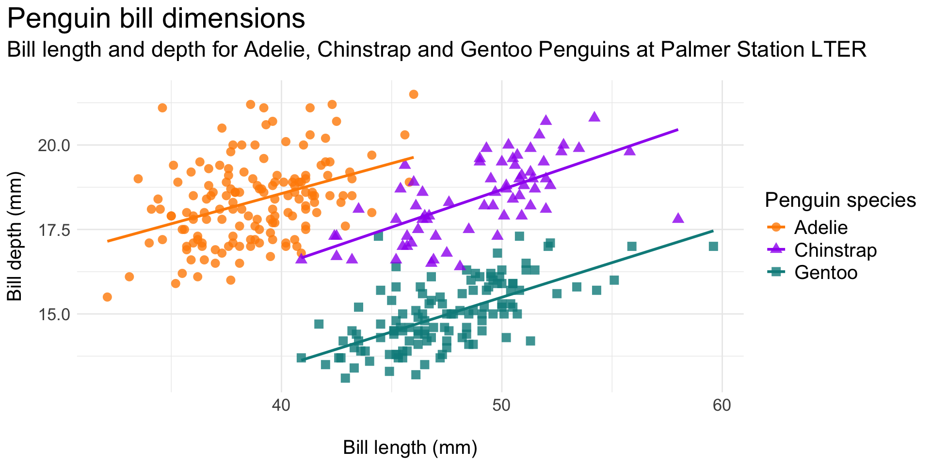
Legend as styled title text:
Move the legend (use direct labels)
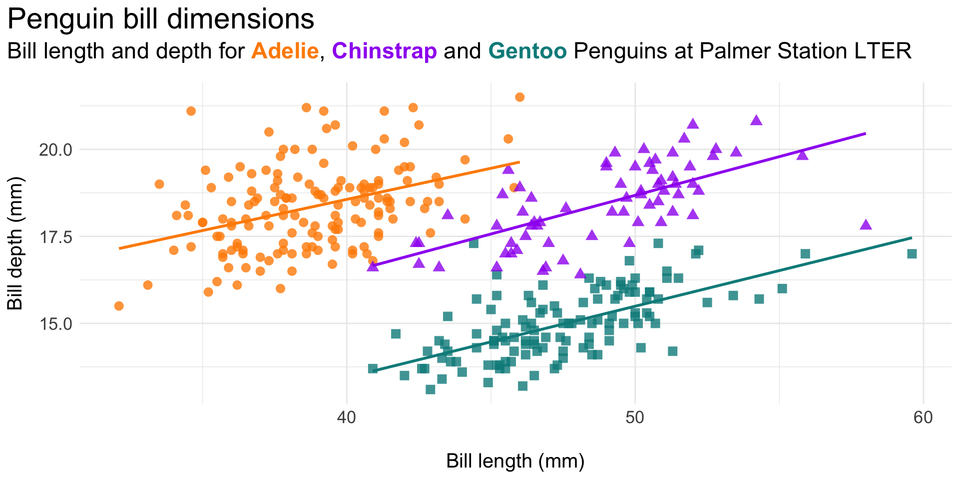
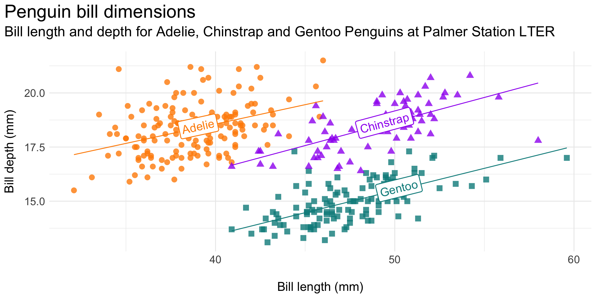
Reduce eye movement and excess ink by including legend info as direct labels on the plot (here, using the {geomtextpath} package; minimal code example, below):
Original plot:
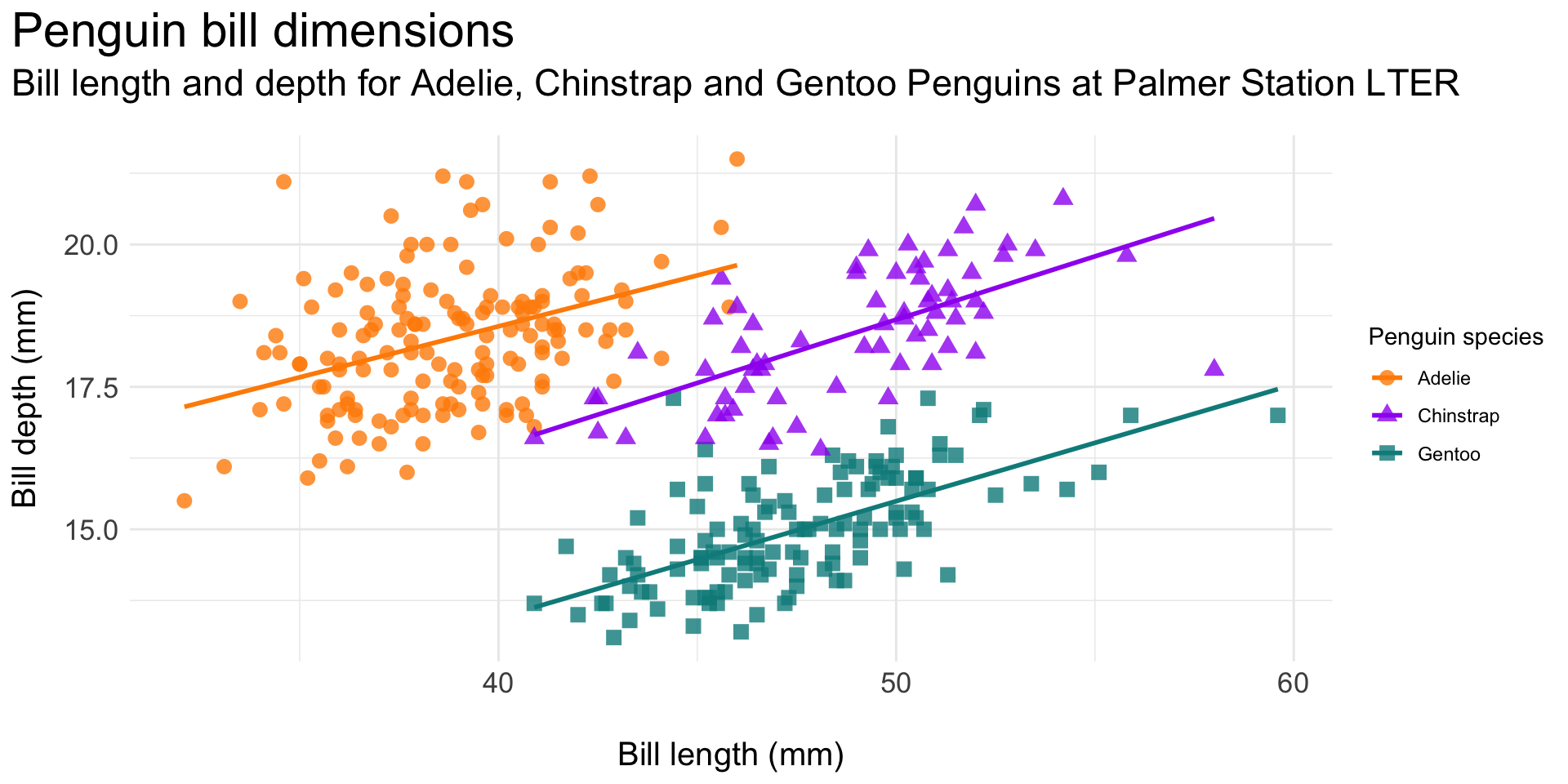
Legend as direct labels:
Use annotations to improve readability / interpretability
Is the y-axis necessary for this plot? What’s the author’s goal? How do annotations help achieve that goal?
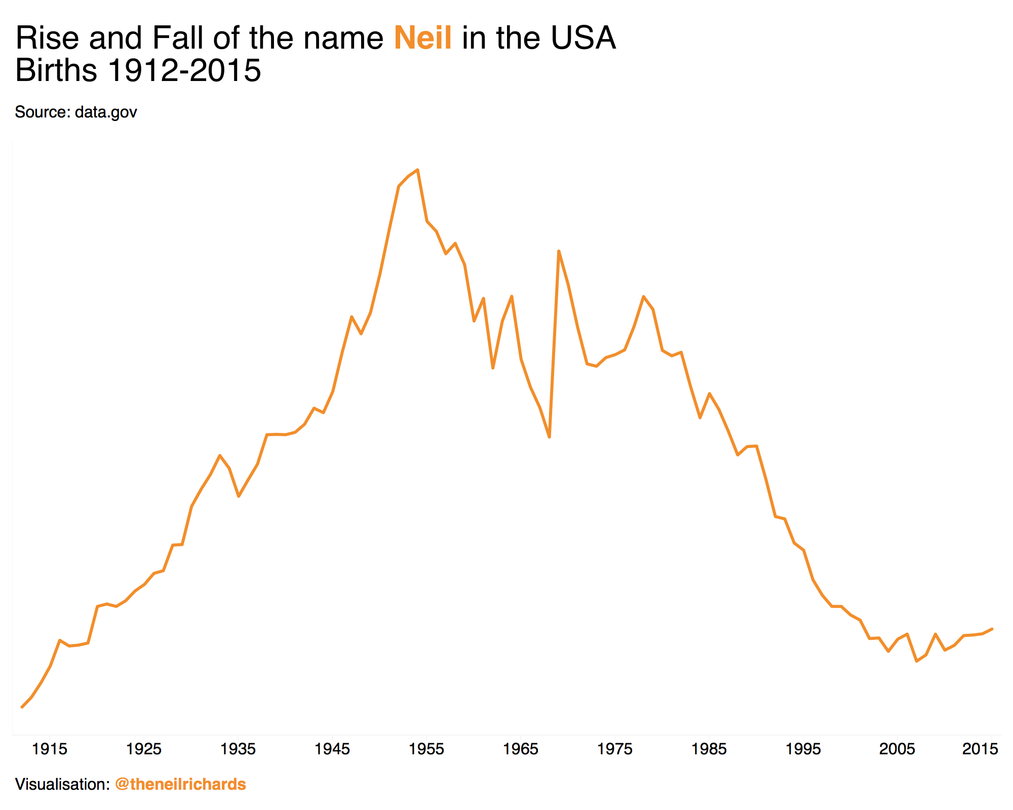
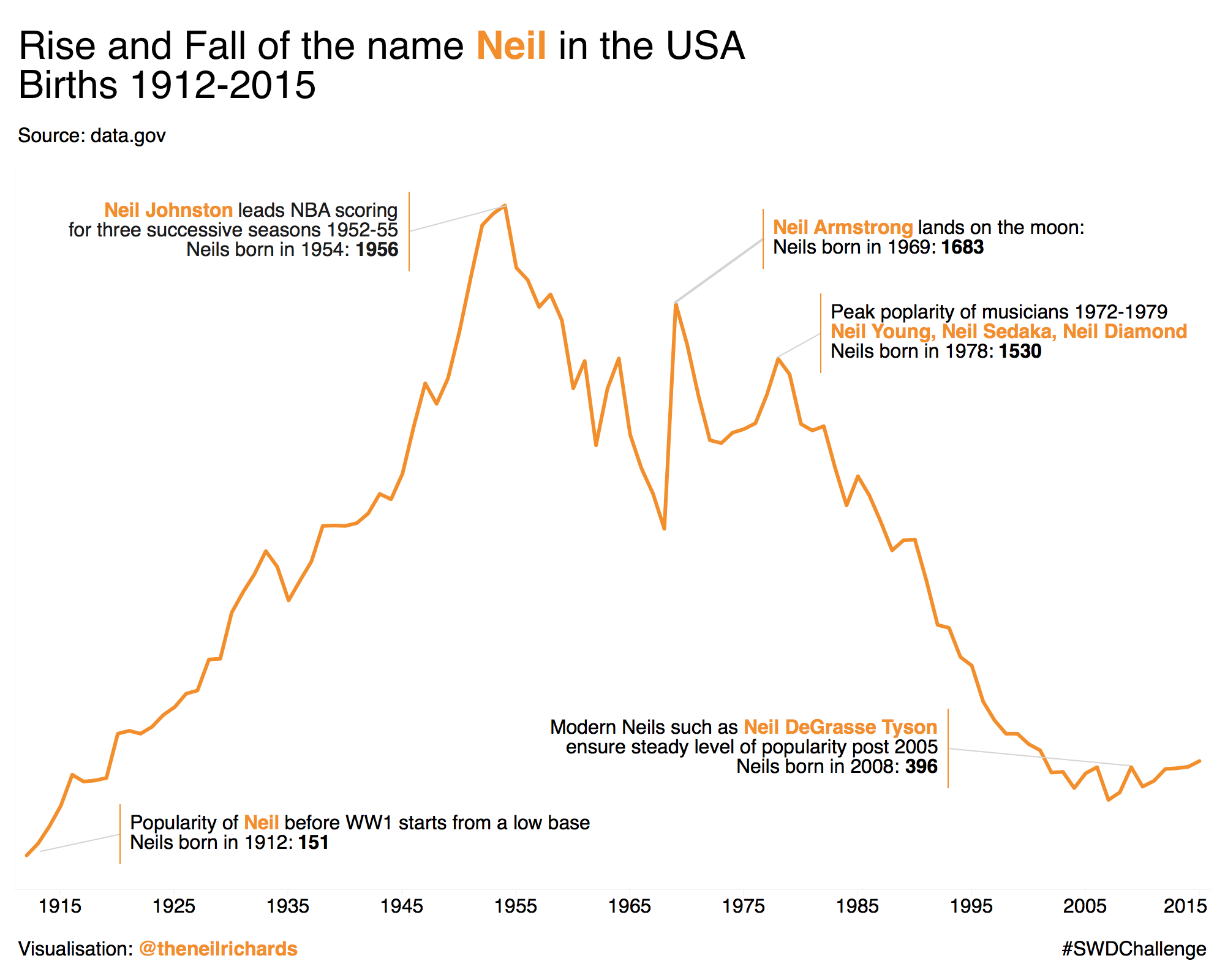
Is white space always your friend?, by Neil Richards
02:00
Use annotations to improve readability / interpretability
“The key thing we do is to add a title to the chart, as an entry point and to explain what is going on. Text and other annotations add enourmous value for non-chart people.”
-John Burn-Murdoch, Financial Times
Vaccines and Omicron mean Covid now less deadly than flu in England, by John Burn-Murdoch
Consider ways to provide additional context for your data
Plot groups against the whole when faceting
Facets (aka small multiples) allow us to more easily view individual groups. Here, the author plots individual groups (male vs. female passenger distributions on the Titanic) against the data set total (distribution of all passengers):
The area under each curve corresponds to the total number of male and female passengers with known age (468 (M) and 288 (F)).
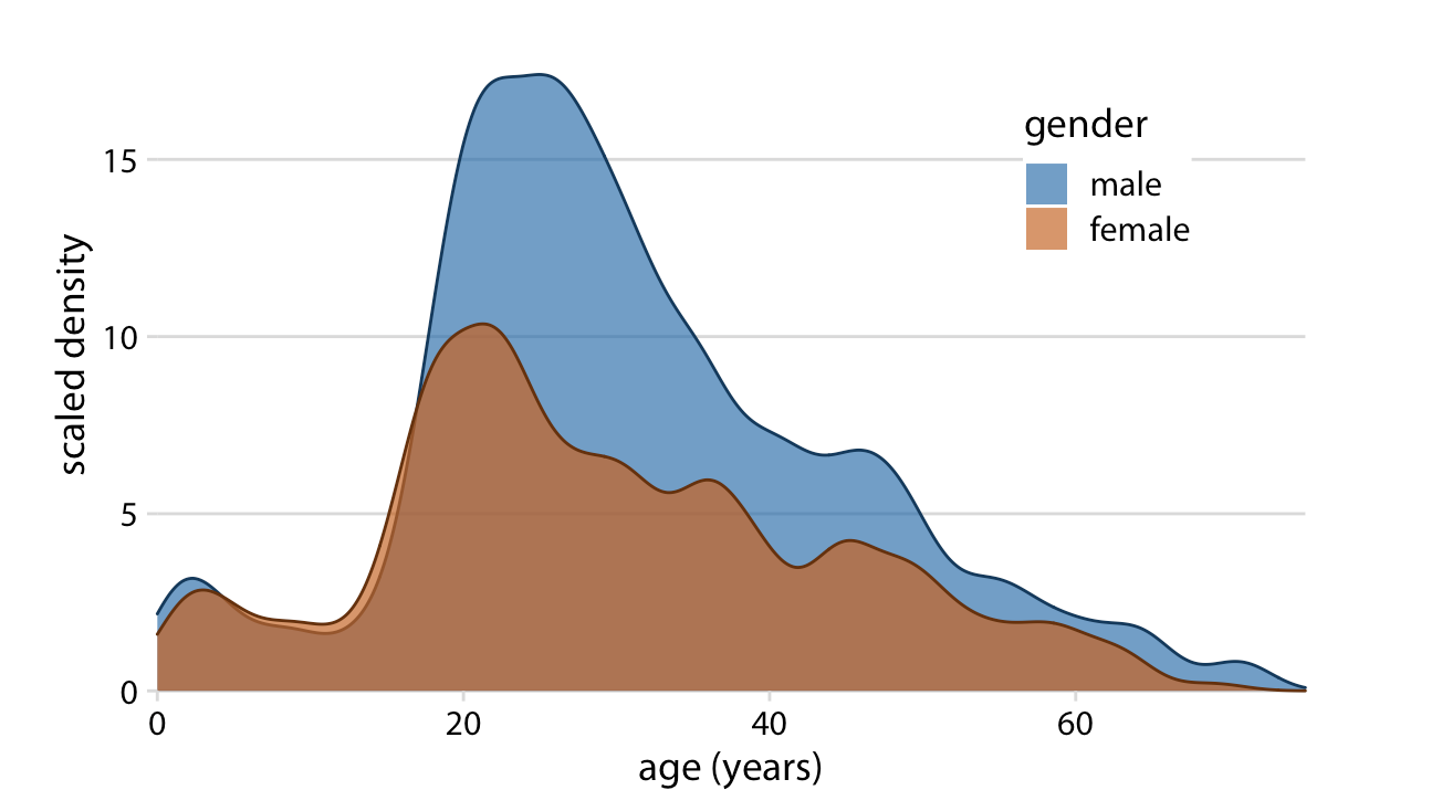
The colored areas show the density estimates of the ages of M and F passengers, and the gray areas show the overall passenger age distribution.
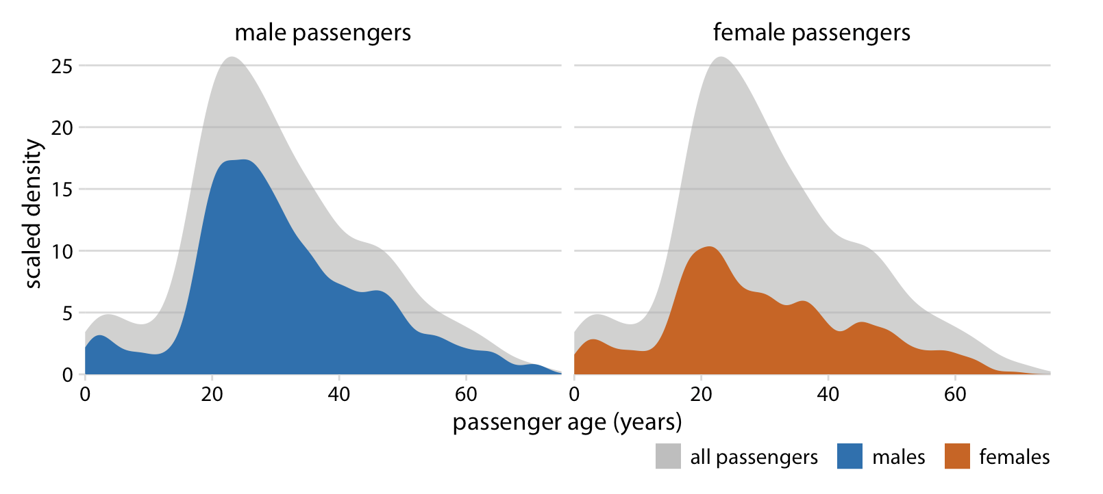
Example from Fundamentals of Data Visualization, by Claus Wilke. For an example with code, check out this slide from Lecture 2.2
Add benchmark values
Add vertical (geom_vline()) or horizontal (geom_hline()) lines at important values:
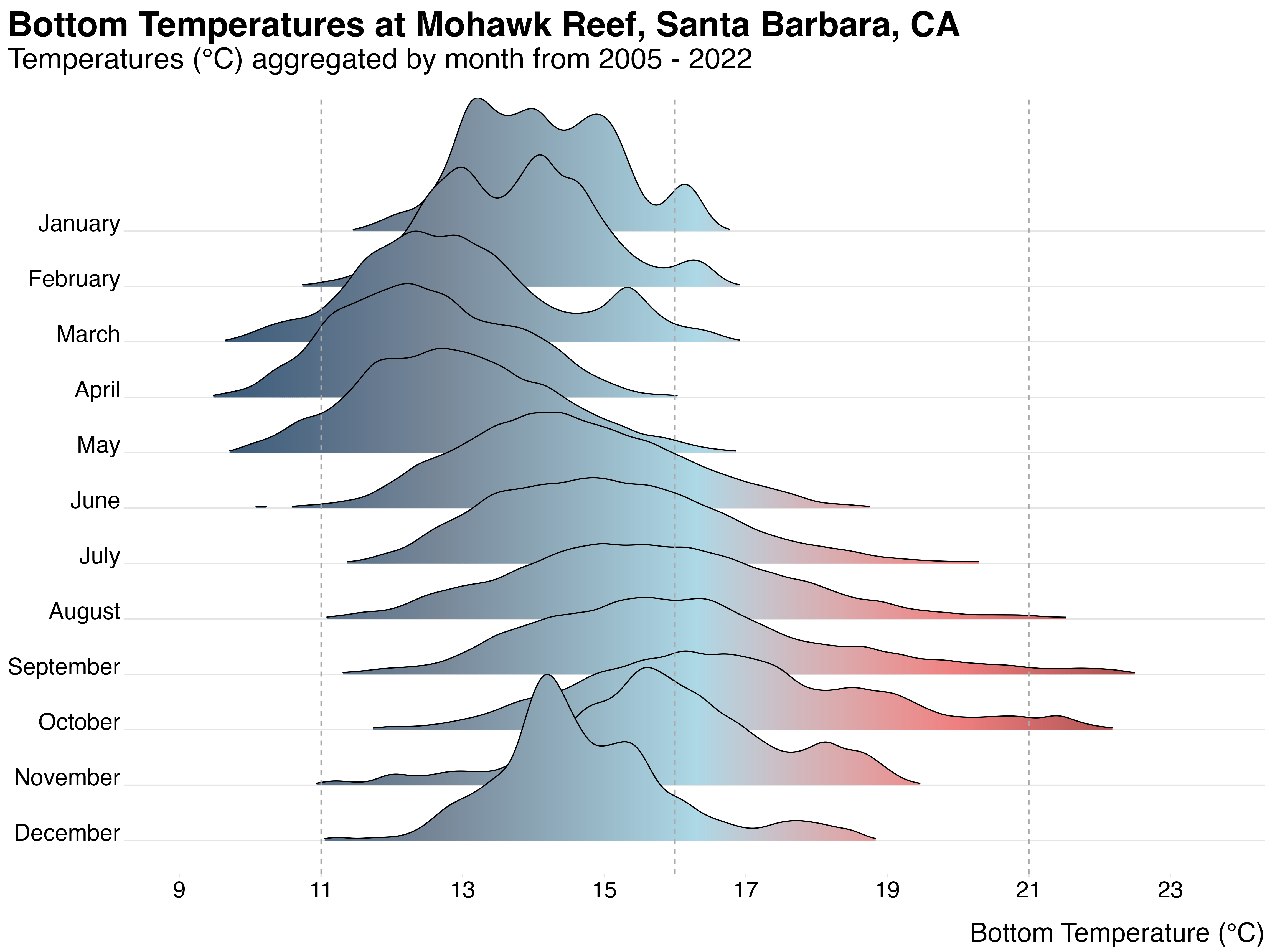
Fig cap: Temporal Variation in Bottom Temperature. Monthly bottom (4.5 m depth) temperatures at Mohawk Reef (34.396290, -119.731297) in Santa Barbara, CA compiled from 2005-2017. Vertical dashed lines represent three of four treatment temperatures (11, 16, 21°C). Data Source: Santa Barbara Coastal Long-Term Ecological Research group (adapted from Csik et al. 2023)
Add 1:1 line, if relevant
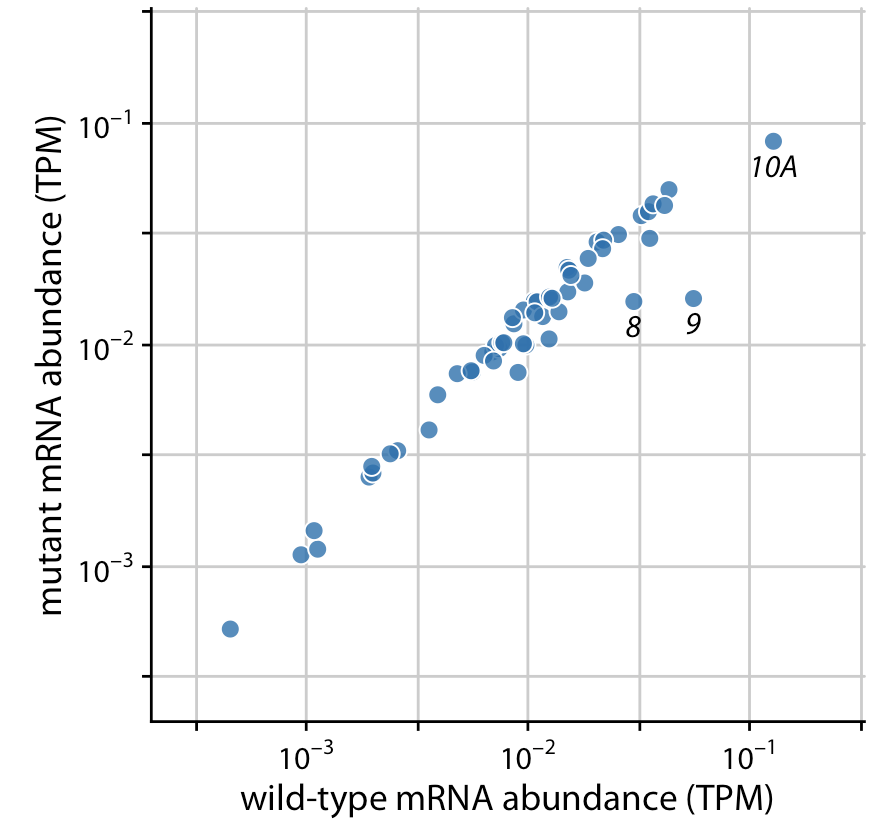
For data where the relevant comparison is the x = y line (e.g. scatter plots of paired data), plot the 1:1 line.
Below, the author compares gene expression levels in a mutant virus to the non-mutated (wild-type) variant. He presents three (increasingly better) versions of the same plot:
Bad
Better
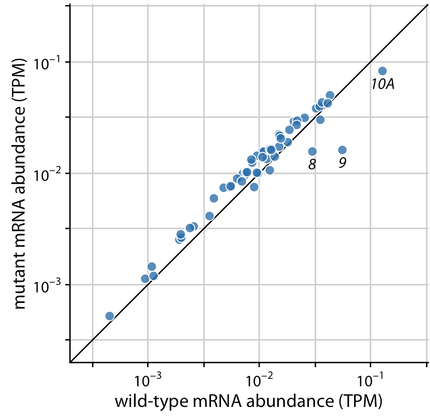
Best
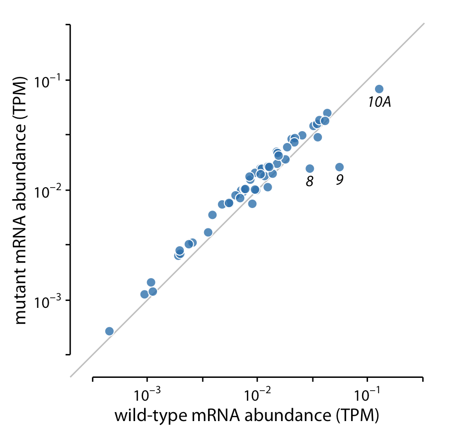
Example from Fundamentals of Data Visualization, by Claus Wilke
Watch this TED talk!
I highly recommend watching this awesome TED talk, The beauty of data visualization, by David McCandless. David does a fabulous job of showing the importance of providing context in your data visualizations.
Source: The Billion Dollar O Gram
Draw attention to important information / values
Use color to highlight groups / values
Highlight data by coloring groups of interest either manually or by using helpful packages, like {gghighlight} (we saw an example of this in lecture 2.3):
Use annotations to highlight groups / values
Or add annotations to your plots to call attention to data of interest (here, shown using the {ggforce} package; minimal code example, below):
What doesn’t work so well in data visualization?
Good data visualization design generally avoids…
Our job is to make it as easy as possible for our readers to understand our data without having to do mental gymnastics. The chart types described above (more often than not) ask too much of our readers in their quest to understand the information being presented.
There may be circumstances where the above are executed well…but more often than not, you’re safest avoiding them.
Information overload is no fun . . .
It can be nearly impossible to process many different variables, colors, shapes, etc. on the same visualization (and realistically, most people won’t want to take the time to even try):
Source: Stack Exchange
Information overload is no fun . . .
It can be nearly impossible to process many different variables, colors, shapes, etc. on the same visualization (and realistically, most people won’t want to take the time to even try):
Source: Unknown, but borrowed from EDS 221
Information overload is no fun . . .
It can be nearly impossible to process many different variables, colors, shapes, etc. on the same visualization (and realistically, most people won’t want to take the time to even try):
Source: Unknown, but borrowed from EDS 221
Reduce information overload whenever possible
Consider some of the approaches we’ve already discussed:
Or some that we haven’t covered:
{shiny}
Dual y-axes can deliberately mislead readers
The scales of dual axis charts are arbitrary and therefore can (deliberately) mislead readers about the relationship between the two data series. Let’s take this example using real Worldbank data for the German GDP and the global GDP between 2004 and 2016:
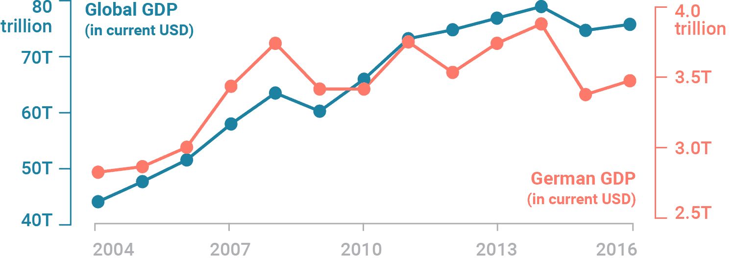
Example from Why not to use two axes, and what to use instead, by Lisa Charlotte Muth
Dual y-axes can deliberately mislead readers
The scales of dual axis charts are arbitrary and therefore can (deliberately) mislead readers about the relationship between the two data series. Let’s take this example using real Worldbank data for the German GDP and the global GDP between 2004 and 2016:

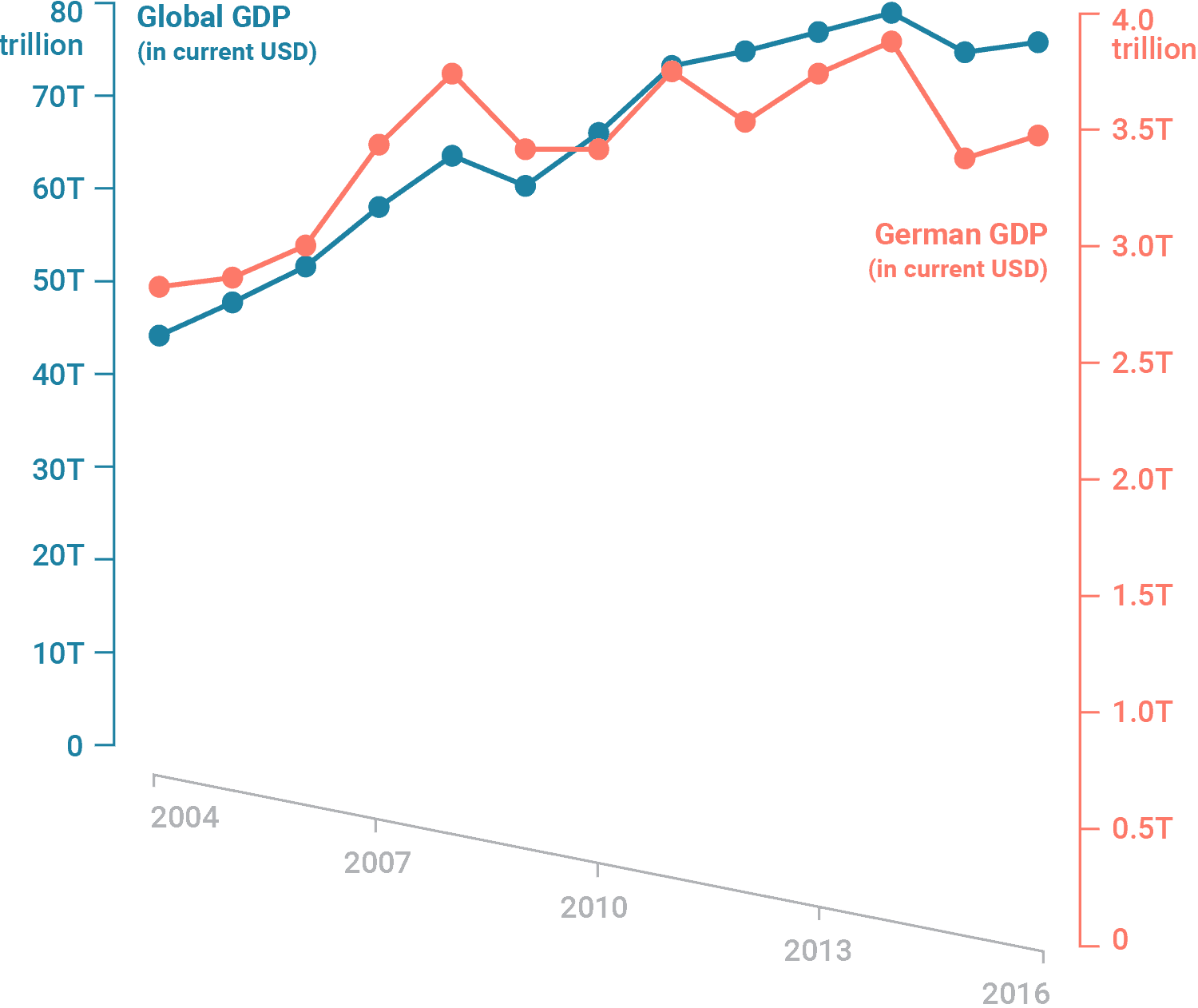
While both GDPs may appear to increase at the about same rate, they actually don’t – global GDP increased by 80% until 2014, while the German GDP increased by 40%.
Example from Why not to use two axes, and what to use instead, by Lisa Charlotte Muth
Alternatives to dual y-axes: side-by-side charts
Separate your data series into side-by-side charts – this allows us to create two different axes for two different charts.
Example from Why not to use two axes, and what to use instead, by Lisa Charlotte Muth
Alternatives to dual y-axes: indexed charts
Indexed charts show the relative change (percentage increase or decrease) of a data series over time. Consider adding labels or tooltips (e.g. using {plotly}) to include important absolute numbers.
Example from Why not to use two axes, and what to use instead, by Lisa Charlotte Muth
Alternatives to dual y-axes: prioritize & label
Consider prioritizing and plotting the more important of the two data series. Then use annotations to add information about the omitted variable. This option may not work well for all data sets, but can be effective for dual-axis charts that present both absolute and relative numbers of the same measure.
Example from Why not to use two axes, and what to use instead, by Lisa Charlotte Muth
Alternatives to dual y-axes: connected scatterplot
A connected scatterplot places one variable on the y-axis and the other on the x-axis (here, replacing time). Be mindful that these plots are generally less inutitive for a reader and may take more time to decipher patterns.
Example from Why not to use two axes, and what to use instead, by Lisa Charlotte Muth
The problem with pie charts . . .
. . . is actually a problem with humans – we’re not so great at comparing angles. We’re bad at comparing angles within a single pie chart if they’re all similar:
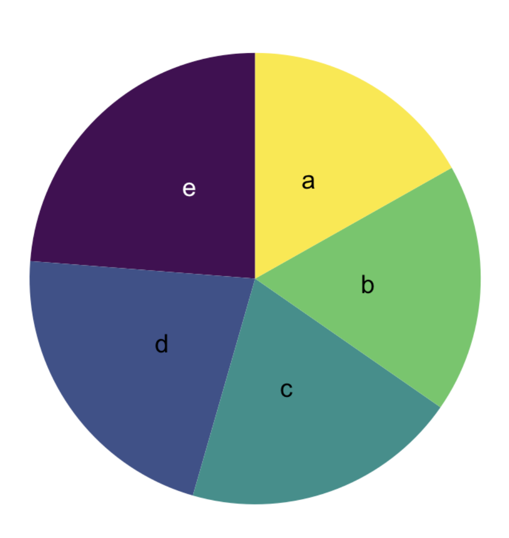
Examples from EDS 221, adapted from From Data to Viz
The problem with pie charts . . .
. . . is actually a problem with humans – we’re not so great at comparing angles. We’re bad at comparing angles within a single pie chart if they’re all similar:

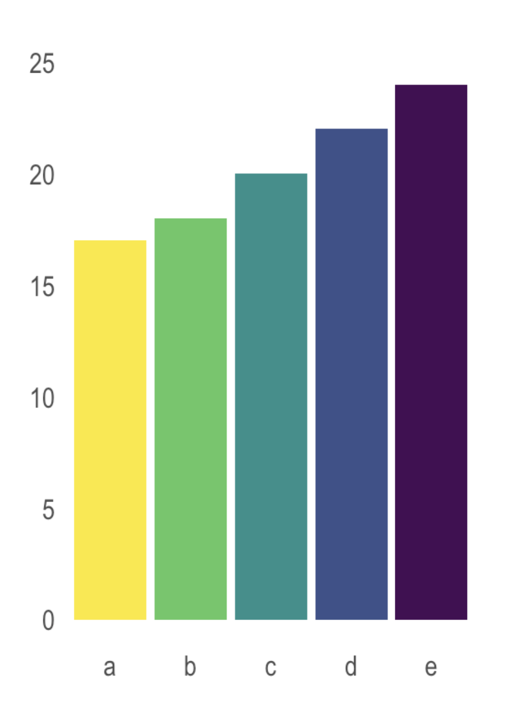
Examples from 221, adapted from From Data to Viz
The problem with pie charts . . .
. . . is actually a problem with humans – we’re not so great at comparing angles. And we’re even worse at comparing angles across multiple pie charts:
Examples from EDS 221, adapted from From Data to Viz
Sometimes, pie charts can be a good option

ABC Enterprise Sales. Source: How to Use Charts and Graphs Effectively, by MindTools
IF you decide a pie chart is the right option, consider:
Examples from EDS 221, adapted from From Data to Viz
Pie chart alternative: treemap
As an alternative to a pie chart, consider treemaps. Treemaps display hierarchical data as a set of nested rectangles – simpler versions can be used to display parts of a whole using rectangles (which are easier for us to estimate than angles).
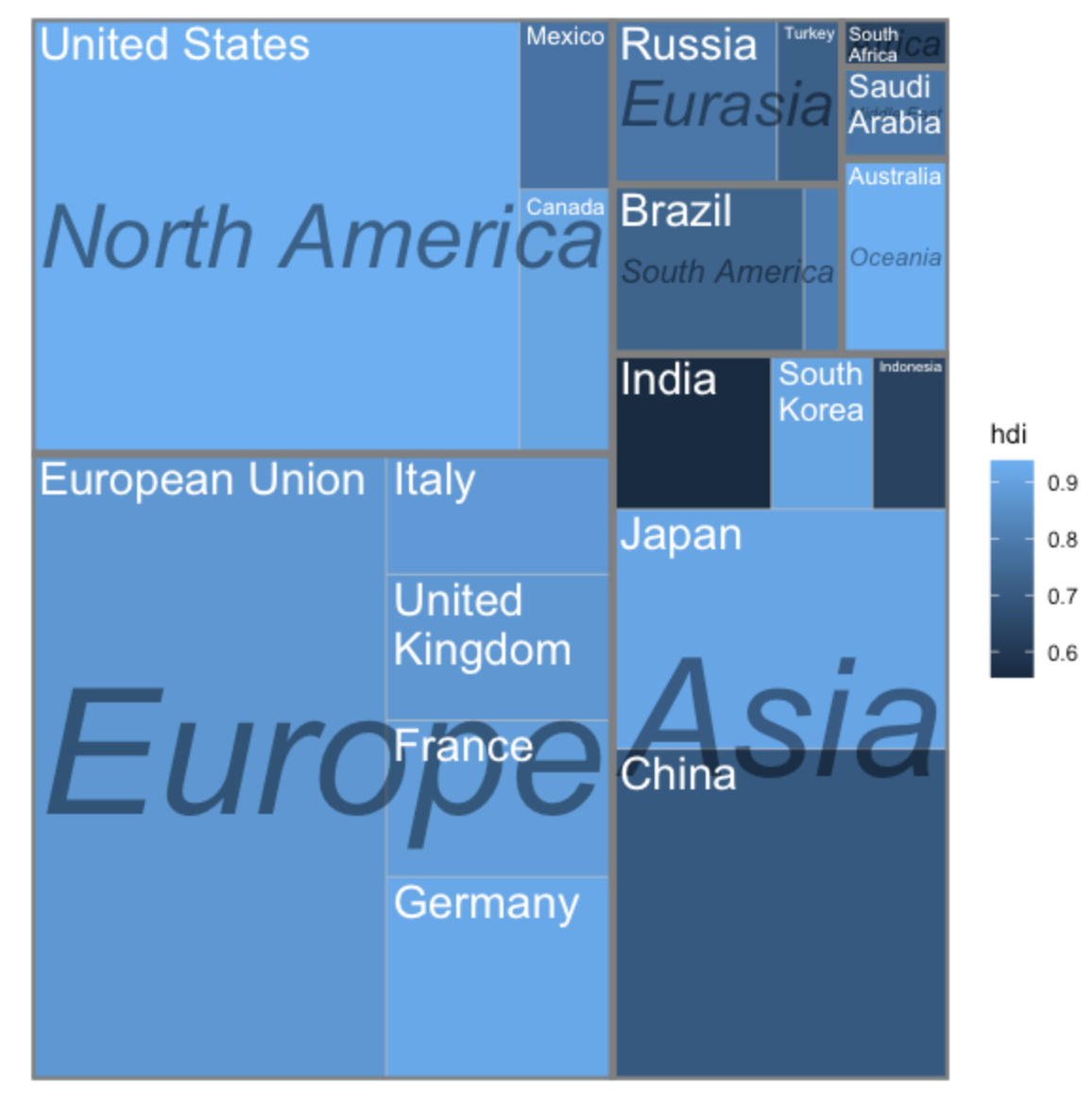
Source: {treemapify} pkgdown site
3D charts distort perspective
Occlusion: When we see one object occlude (aka obstruct) another on a 2D surface, our brain perceives the object being hidden as farther away:
3D charts distort perspective
Perspective distortion: When we view objects in 3D, the objects farther away appear smaller, but our brain perceives them to be of larger size than in the picture:
Avoid gratuitous 3D
Consider how gray and blue areas visually compare in the 3D version? What about gray and orange? Now how do your interpretations change when inspecting the 2D version?
The pie chart on the right is an example of using 3D purely for decorative purposes. Here, the third dimension doesn’t actually convey any additional data. Claus Wilke calls this gratuitous 3D, and you should always avoid it.
Avoid 3D position scales
A plot with three genuine position scales (x, y, and z) to represent mtcars data (viewed from four different perspectives:
Source: Fundamentals of Data Visualization, by Claus Wilke
Alternative (a) to 3D position scales
If we primarily care about fuel efficiency as the response variable, plot it twice (once against displacement and once against power):
Source: Fundamentals of Data Visualization, by Claus Wilke
Alternative (b) to 3D position scales
If we are more interested in how displacement and power relate to each other, with fuel efficiency as a secondary variable of interest, create a bubble chart (plot power vs. displacement and map fuel efficiency onto the size of the dots). Be mindful that three variables (even in a 2D space) are still challenging for readers to quickly comprehend.
Source: Fundamentals of Data Visualization, by Claus Wilke
Are there ever opportunties to bend / break the rules & guidelines for creating “good” data viz?
Breaking the rules is sometimes okay
Data visualization is both a science and an art. Following these rules / best practices can help us avoid common pitfalls and avoid creating objectively difficult-to-interpret data visualizations.
However, there are arguments for bending (or breaking) the rules every now and again. Consider the following posts:
Breaking the rules is sometimes okay
Award-winning data visualization by Simon Scarr (left), and a copy / remake of that visualization which follows the rules, created by Andy Cotgreave (right).
Image & caption source: Master the rules - then break them
Let’s consider some example data visualizations together
CO2 in conference rooms
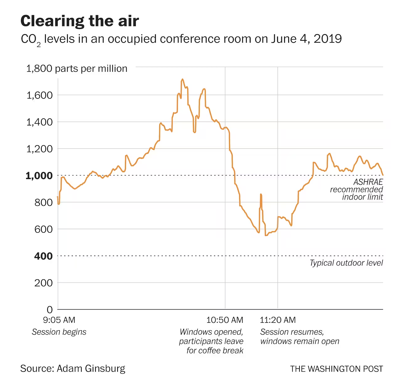
Clearing the Air, by Christopher Ingraham, writing for The Washington Post
Take some time to discuss the following:
02:00
Annotations adapted from @chezVoila
Palmer penguin classification
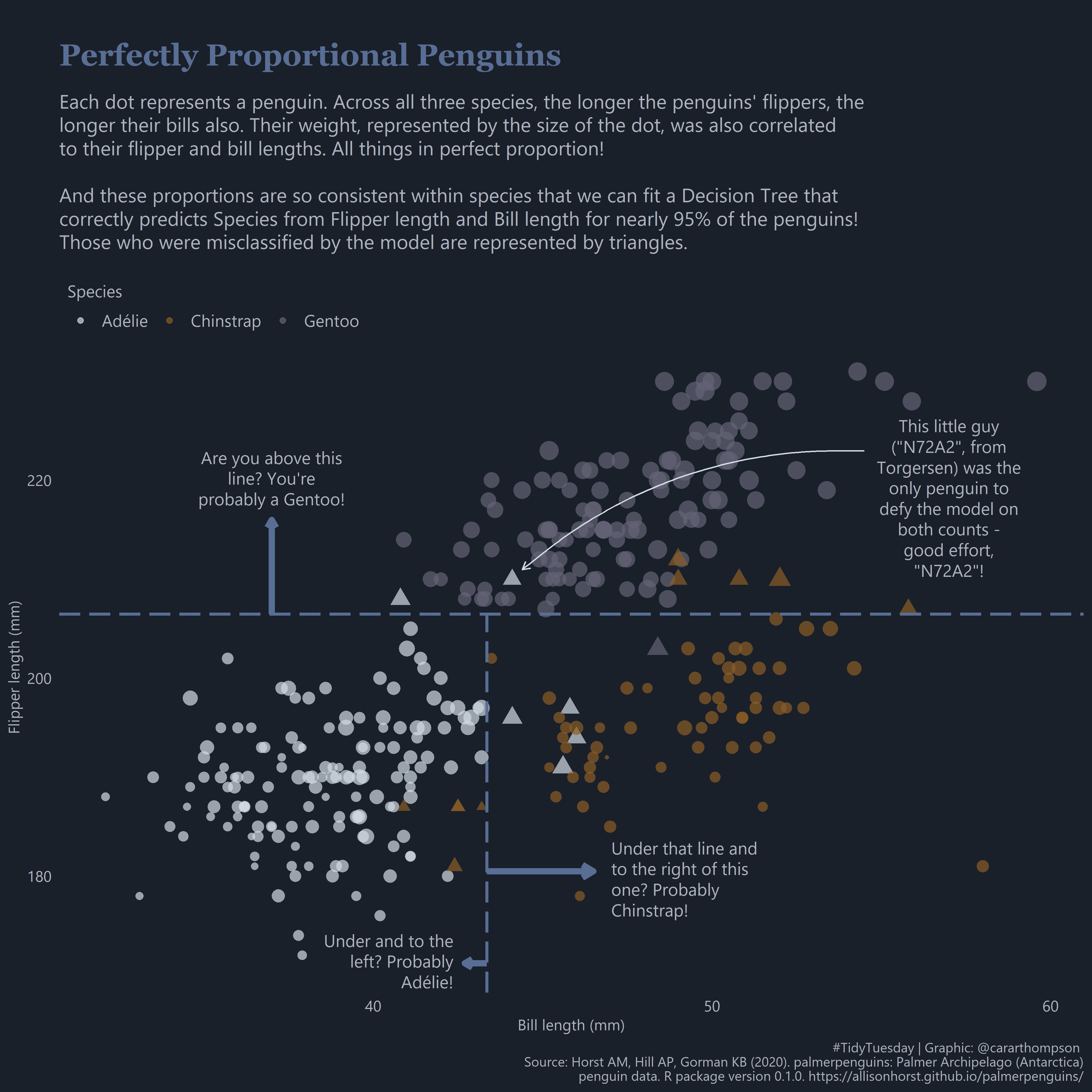
Perfectly Proportional Penguins, by Cara Thompson as part of TidyTuesday (code)
Take some time to discuss the following:
02:00
Glimmers of hope in large carnivore recovery
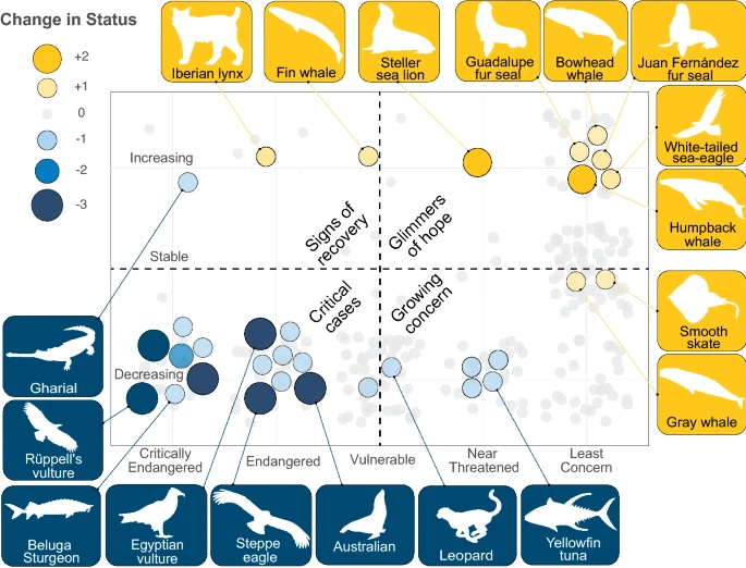
Fig. 3, by Ingeman et al. 2022: Glimmers of hope and critical cases. Distribution of large carnivore species across categories of current IUCN status (x-axis) and population trend (y-axis). Improvements in status are indicated by gold and declines by blue, with bubble size indicating the number of status category changes. The majority of species have not undergone any changes in status (shown in light gray). Note: No change in status may indicate lack of recent assessment, insufficient data, or, in the case of species designated Least Concern, effective conservation efforts.
Take some time to discuss the following:
02:00
Take a Break
~ This is the end of Lesson 1 (of 3) ~
05:00