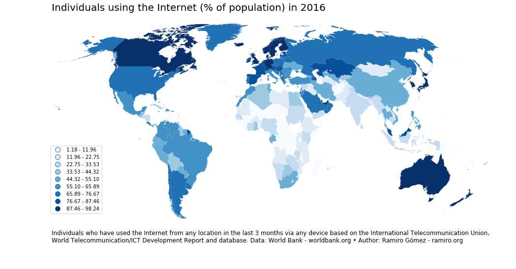
Choropleth by Ramiro Gómez using GeoPandas (blog post)
EDS 240: Lecture 5.3
Colors & Choropleths
Week 5 | February 7th, 2025
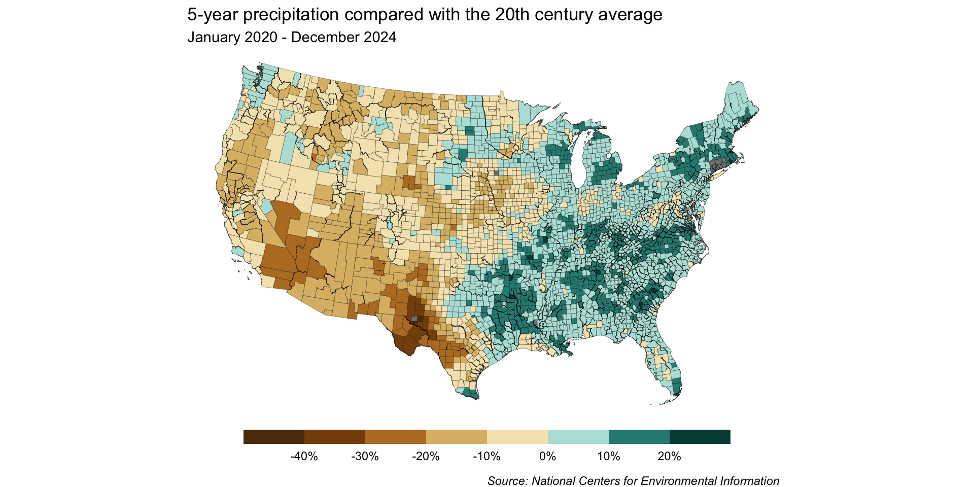
Let’s explore county-level precipitation data using a choropleth map. Importantly, we’ll decide on a color palette / scale type and make any necessary adjustments.
What’s a choropleth?
Choropleths are maps that display the spatial distribution of a variable across divided geographical areas / regions, where variable is encoded by color.

Choropleth by Ramiro Gómez using GeoPandas (blog post)
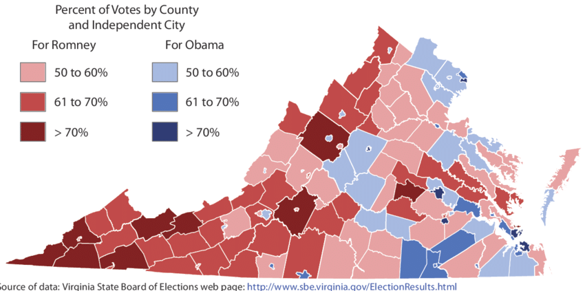
Choropleth by Hanna & Farnsworth (2013)
Choosing the right color palette and scale type are critically important. Oftentimes, you’ll need to adjust the default mapping of colors to accurately tell your story.
The Data
NOAA National Centers for Environmental Information (NCEI) is responsible for preserving, monitoring, assessing, and providing public access to the Nation’s geophysical data and information.


Find public access to a massive inventory of climate data on their Climate Monitoring page. Today’s lesson will use the Climate at a Glance collection. Specifically, we’ll be exploring how precipitation across the continental US over the past 5 years compares to the 20th century average. To do so, we’ll work with county-level precipitation data, accessed via the County Mapping portal.
Use {tigris} to download shapefiles
We can use the {tigris} package to download and use Census TIGER/Line shapefiles in R.

A shapefile is a vector data file format commonly used for geospatial analysis.
Shapefiles contain information for spatially describing features (e.g. points, lines, polygons), as well as any associated attribute information.
You can find / download shapefiles online (e.g. from the US Census Bureau), or depending on the tools available, access them via packages (like we’re doing today).
Check out Ch. 5 of Analyzing US Census Data: Methods, Mpas, and Models in R by Kyle E. Walker for a great intro to {tigris}
Simple features in R
Spatial data can take many forms – simple features is a standard that allows different types of software to specify spatial data in a common way.
Simple feature comprise:
1. a geometry object (e.g. a point, line, polygon) that describes where on Earth the feature is located
2. attribute data associated with the geometry object (e.g. the precipitation across a county during the last 5 years)
Because of how simple feature (sf) objects are represented in R (they look like data frames!), simple features can be maniupulated and plotted by other well-known packages like {dplyr} and {ggplot2}. Packages like {sf} provide additional tools for working with simple features (sf objects).
When we download our shapefile using {tigris}, it’ll be loaded as a simple features (sf) object with geometries that allow us to plot county lines. We’ll join our county-level precipitation data to our sf object so that we can color counties by precipitation.
Data Wrangling
Here, we’ll use the {tigris} package to import geometries for our US counties, then join it with our precipitation data:
##~~~~~~~~~~~~~~~~~~~~~~~~~~~~~~~~~~~~~~~~~~~~~~~~~~~~~~~~~~~~~~~~~~~~~~~~~~~~~~
##                                    setup                                 ----
##~~~~~~~~~~~~~~~~~~~~~~~~~~~~~~~~~~~~~~~~~~~~~~~~~~~~~~~~~~~~~~~~~~~~~~~~~~~~~~

#..........................load packages.........................
library(tidyverse)
library(tigris)
library(sf)
library(RColorBrewer)
library(scales)

#.........................get shape data.........................
county_geo <- tigris::counties(class = "sf", cb = TRUE) |> # cb = TRUE to use cartographic boundary files

  # transform CRS to USA Contiguous Albers Equal Area Conic ----
  # see https://gis.stackexchange.com/questions/141580/which-projection-is-best-for-mapping-the-contiguous-united-states
  sf::st_transform("ESRI:102003")

#....................import precipitation data...................
precip_data <- read_csv(here::here("week5", "data", "NCEI-county-jan20-dec24-precip.csv"),
                        skip = 4)

##~~~~~~~~~~~~~~~~~~~~~~~~~~~~~~~~~~~~~~~~~~~~~~~~~~~~~~~~~~~~~~~~~~~~~~~~~~~~~~
##                               data wrangling                             ----
##~~~~~~~~~~~~~~~~~~~~~~~~~~~~~~~~~~~~~~~~~~~~~~~~~~~~~~~~~~~~~~~~~~~~~~~~~~~~~~

##~~~~~~~~~~~~~~~~~~~~~~~~~~~~
##  ~ wrangle geometries  ----
##~~~~~~~~~~~~~~~~~~~~~~~~~~~~

county_geo_wrangled <- county_geo |>

  # clean up col names ----
  janitor::clean_names() |>

  # rename county & state cols ----
  rename(county = namelsad, state = state_name) |>

  # keep only 50 US states (minus AK & HI) ----
  filter(state %in% state.name) |> # `state.name` is a build-in vector of the 50 US States
  filter(!state %in% c("Alaska", "Hawaii")) |>

  # capitalize "city" in county names (so that it matches those in `precip_data`) ----
  mutate(county = str_replace(string = county, pattern = " city", replacement = " City"))

##~~~~~~~~~~~~~~~~~~~~~~~~~~~~~~~~~~~~
##  ~ wrangle precipitation data  ----
##~~~~~~~~~~~~~~~~~~~~~~~~~~~~~~~~~~~~

precip_wrangled <- precip_data |>

  # clean up col names ----
  janitor::clean_names() |>

  # rename county col ----
  rename(county = name) |>

  # keep only US states (this will filter out DC) ----
  filter(state %in% state.name) |>

  # update county name so that it matches the spelling in `county_geo` df ----
  mutate(county = str_replace(string = county, pattern = "Dona Ana County", replacement = "Doña Ana County")) |>

  # coerce precip & 20th centruy avg from chr to numeric ----
  mutate(value = as.numeric(value),
         x1901_2000_mean = as.numeric(x1901_2000_mean)) |>

  # calculate % change in precip from 20th century avg ----
  mutate(perc_change = ((value - x1901_2000_mean)/x1901_2000_mean)*100) |>

  # select, rename, reorder cols ----
  select(id, state, county, mean_1901_2000 = x1901_2000_mean, precip = value, perc_change, anomaly_1901_2000_base_period)

##~~~~~~~~~~~~~~~~~~
##  ~ join dfs  ----
##~~~~~~~~~~~~~~~~~~

# join dfs (be sure to join precip TO sf object, not the other way around; see https://github.com/tidyverse/ggplot2/issues/3936 & https://map-rfun.library.duke.edu/032_thematic_mapping_geom_sf.html)) -------
joined_precip_geom <- full_join(county_geo_wrangled, precip_wrangled)
Read more about cartographic boundary shapefiles (and the cb argument) in Analyzing US Census Data: Methods, Maps, and Models in R, by Kyle Walker.
Start by creating a base map
base_map <- ggplot(joined_precip_geom) +
  geom_sf(aes(fill = perc_change), linewidth = 0.1) +
  labs(title = "5-year precipitation compared with the 20th century average",
       subtitle = "January 2020 - December 2024",
       caption = "Source: National Centers for Environmental Information") +
  theme_void() +
  theme(
    legend.position = "bottom",
    legend.title = element_blank(),
    plot.caption = element_text(face = "italic",
                                margin = margin(t = 10, r = 5, b = 0, l = 0))
  )

base_map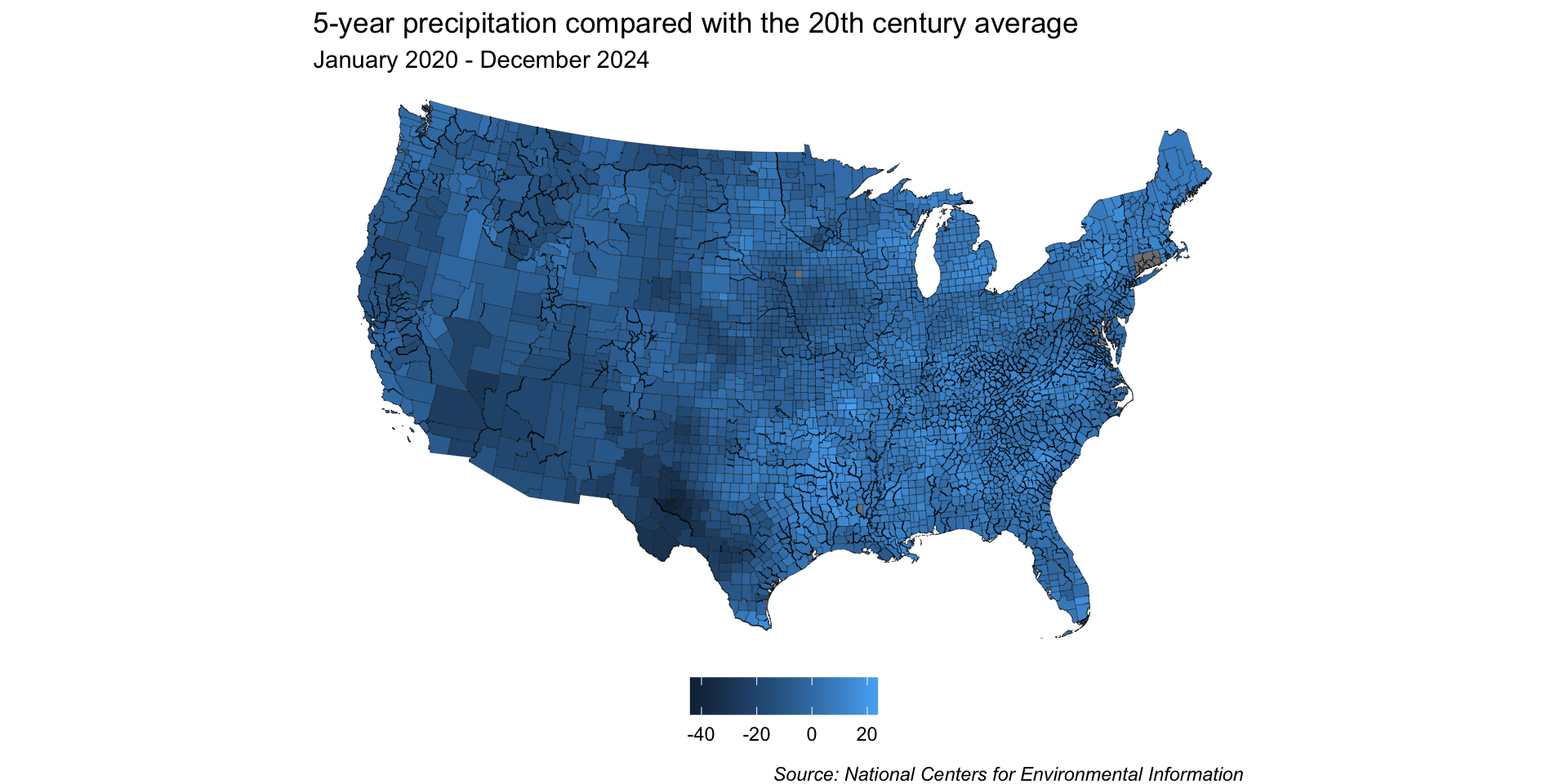
Because we want to map precipitation relative to the 20th century average (e.g. has precipitation for a given region over the last 5 years been above or below the average), a divering color palette makes a lot of sense.
You may notice that Connecticut is missing most of its data. After some digging, I learned that CT recently (2022) replaced its eight counties with nine planning regions as county-equivalents (read more in the UC Census Bureau Notice on 06/06/2022). I couldn’t quite make sense of how to match old county names to new planning regions, as there’s a decent amount of geographic overlap, soooo I gave up (for now) .
Classed or unclassed color scale?
We’ve landed on a diverging color palette, but should we use a classed (aka binned) or unclassed (aka continuous) palette?
Use a classed color scale if you want to communicate statistical brackets: 
Use an unclassed color scale if you want to show general patterns: 
Adapted from When to use classed and when to use unclassed color scales, by Lisa Charlotte Muth
For another great read on building color scales for choropleth maps, check out this article in Axis Map’s Cartography Guide.
Start with an unclassed scale
“The unclassed choropleth is the most exact representation of the data model possible,”
-Judith A. Tyner, in Priciples of Map Design
“No matter if you decide for a classed map at the end, you should start your process by looking at an unclassed map. This will help you see subtle differences between regions and make a conscious decision if and how you should simplify them.”
-Lisa Charlotte Muth, in When to use classed and when to use unclassed color scales
We’ll heed this advice and start with an unclassed map!
Pick a color palette!
Recall from earlier that precipitation data is often encoded using a brown / blue color scheme (with drier conditions falling on the brown side and wetter conditions falling on the blue side).
Lucky for us, RColorBrewer has this exact palette. Let’s use all 11 hues for our unclassed map:
Preview the palette using display.brewer.pal() with our desired number of hues:
Apply our palette & adjust colorbar
Here, we leverage the awesome {scales} package to add %s to the colorbar labels and set our breaks. We also use guides() + guide_colorbar() to update label positioning and colorbar size:
Inspect the color scale – anything off?
Our color mapping may be misleading
0% (i.e. no change between 5-year precipitation and 20th century average) is currently on the bluer side of our color scale, rather than on the off-white color that’s at the center of our palette.
As a result, our map is misleading – it would appear as if more counties received higher-than-average precipitation than in actuality.
Rescale the colorbar so that 0 is at the center
Our final unclassed map
Modify our palette for our classed map
We’ll be using the same color palette for our classed map, but this time, let’s keep 10 hues (this will drop the middle off-white hue):
Preview the palette using display.brewer.pal() with our desired number of hues:
By dropping the off-white hue, we can construct our scale so that 0% sits at the break point between brown and blue shades – any county that received more than the historical average will be a shade of blue, and any that received less will be a shade of brown.
By default, our resolution is pretty low
We only get 5 bins by default, which means we lose a lot of detail in our map:
More classes = more nuance
Breaks set to a width of 10 (note: 0 not at center)
Breaks set to a width of 5 & rescaled with 0 at center (note: {ggplot2} interpolates colors to create our scale)
But the more classes you have, the longer it will (likely) take a reader to interpret values.
Unclassed vs. classed maps
What stories to each of these maps tell? When might you choose one over the other? What additional modifications might you make?
Unclassed map:
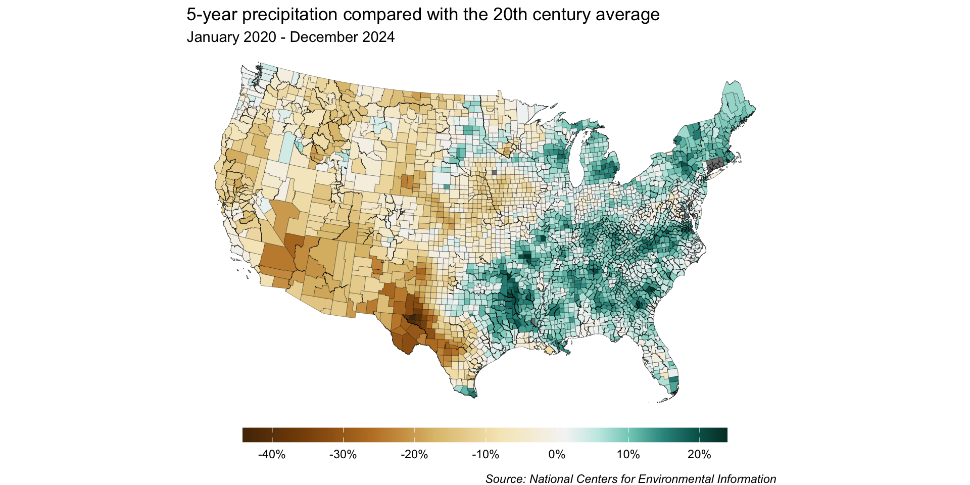
Classed map:
Choropleths are powerful in multiples
Several maps side-by-side can help you better spot important patterns and tell a more complete story.
What’s Going On in This Graph? | New Normal U.S. Precipitation (New York Times)
See you next week!
~ This is the end of Lesson 3 (of 3) ~