You’ll probably iterate on them as you sit with your visualization and of course, as you get feedback from others.
02:00
EDS 240: Lecture 5.2
Colors
Week 5 | February 3rd, 2025
Good data visualization design considers:
This lesson will focus on the use of colors in a good data visualization.
Why do we use color?
Spend a couple minutes discussing with your Learning Partners the following:
Why and / or when should we use color in data visualizations?
Find an example(s) of a data viz that uses color to convey information to share in #eds-240-data viz. Note some of your own observations about the color choices (i.e. why these colors? palette arrangement?).
02:00
Choosing colors is difficult and they should be purposefully chosen
You’ll probably iterate on them as you sit with your visualization and of course, as you get feedback from others.
Some places to start / things to consider:
What is color?
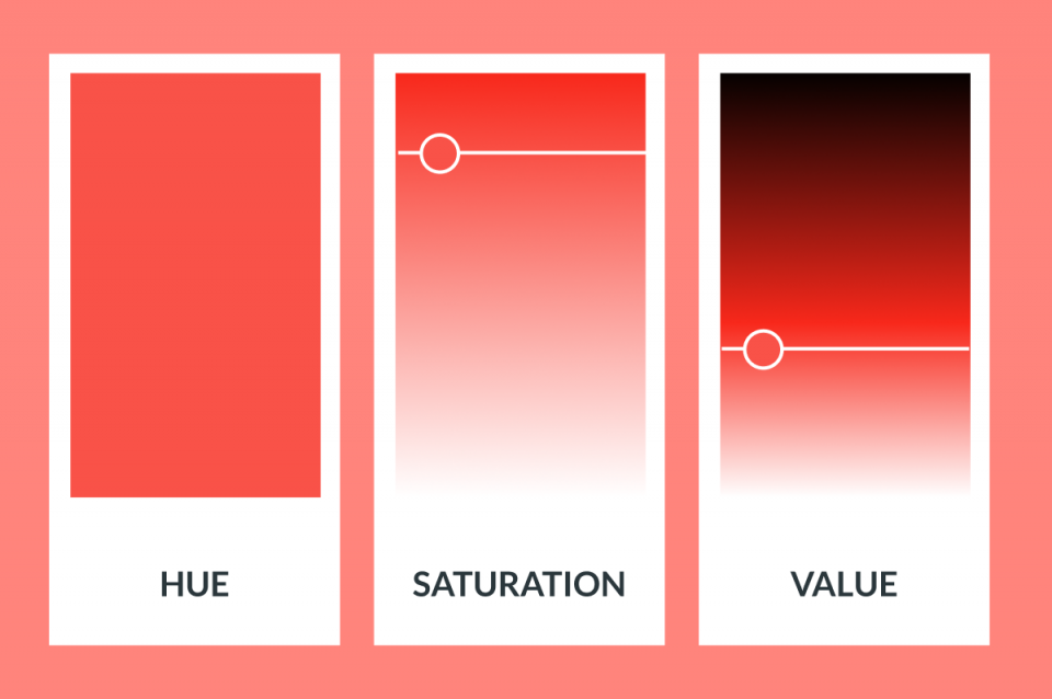
There are a number of different color spaces that are used to represent and define color. HSV and HSL are used commonly in color pickers (e.g. Google color picker). HCL underlies some default {ggplot2} parameters.
HSV
HCL
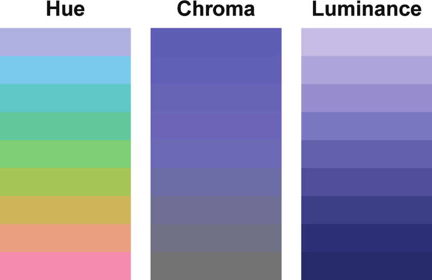
You don’t need to worry much about the underlying theory of color spaces, but know that changing any of the parameters (e.g. hue, saturation, etc.) can influence how we perceive information in a data visualization.
Image sources: medium.com (left), Stauffer et al. (2015) https://doi.org/10.1175/BAMS-D-13-00155.1 (right)
Different color scales for different data types
Image source: Which color scale to use when visualizing data, by Lisa Charlottte Muth.
This is the first article of a 4 part series (Part 2 / Part 3 / Part 4) – I highly recommend reading!
Categorical scales
Map source: Analyzing US Census Data, by Kyle Walker
Sequential scales
Map source: Analyzing US Census Data, by Kyle Walker
Diverging scales
Map source: 2020 U.S. Election Mapped: TrumpLand vs Biden Archipelago, by Vivid Maps
Base plots (for applying color scales to)
We’ll be testing out different palettes throughout this lesson. Instead of having to retype the code for our plots each time, let’s create and save two versions of a penguin scatter plot. We can then call either of these plot objects to modify with different color scales:
Requires a categorical color scale
Ensuring inclusive and accessible design through your color choices
What is colorblindness?
Color vision deficiency aka colorblindness is the decreased ability to see color or differences in color. It’s estimated that about 1 in 12 men (8%) and 1 in 200 women (0.5%) are affected (Wikipedia).
Color plate tests are used to help identify different forms of color blindness. Try using the Let’s get color blind Chrome extension to emulate different forms of colorblindness while looking at the above plates. Image source: American Optometric Association
The problem with rainbow color maps

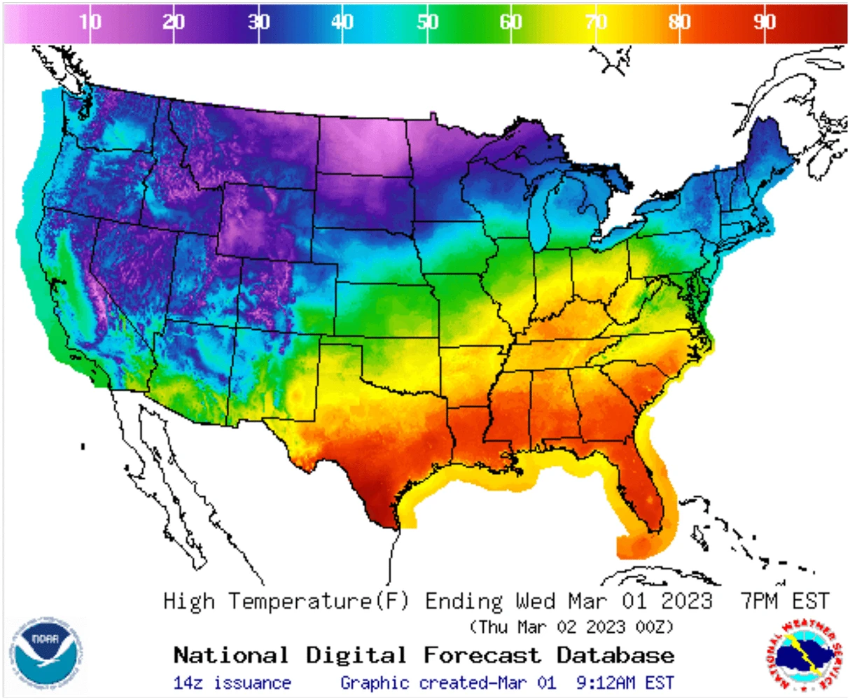
colors don’t follow any natural perceived ordering (no innate sense of higher or lower)
perceptual changes in rainbow colors are not uniform (e.g. colors appear to change faster in yellow region than green region)
insensitive to color vision deficiencies
Top image source: Why we use bad color maps and what you can do about it | Bottom left image source: Ware C, Stone M, Albers Szafir D (2023) Rainbow colormaps are not all bad. IEEE Computer Graphics and Applications 43:88-93 10.1109/MCG.2023.3246111 | For another example of poor use of rainbow color maps, see this world map with binned colors
If you’re going to use a rainbow colormap. . .
Try one of these improved versions (right), instead:
Problematic, perceptually nonuniform and unordered rainbow colormaps
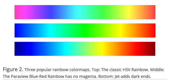
Improved, perceptual uniform and diverging rainbow colormaps
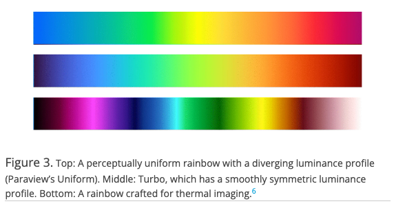
Image source: Ware C, Stone M, Albers Szafir D (2023) Rainbow colormaps are not all bad. IEEE Computer Graphics and Applications 43:88-93 10.1109/MCG.2023.3246111
Also check out Stoelzle & Stein (2021) (Figure 1 is particularly helpful!) and Crameri et al. (2020) for some really great supplemental reading
ALTERNATIVE: Viridis
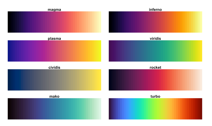
The viridis color scales are perceptually-uniform (even when printed in gray scale) and colorblindness-friendly:
Continuous viridis scales
Binned viridis scales
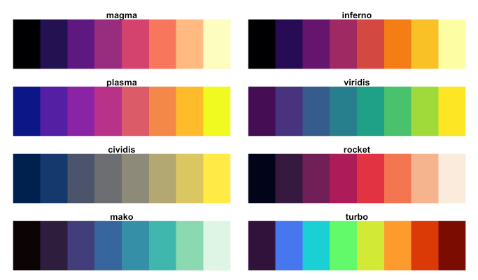
There are a number of different ways to apply viridis color scales, but I often opt for scale_*_viridis_*() functions, which come as part of {ggplot2}.
Using viridis color scales
Try out the palette options below, then check out the documentation and play around with some alternative options as well.
ALTERNATIVE: RColorBrewer
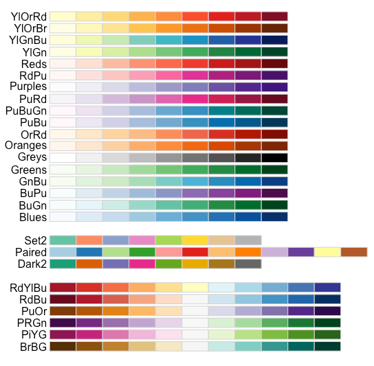
ColorBrewer offers a number of colorblind-friendly color schemes for maps and other graphics. Check them out using {RColorBrewer} or the web-based interface.
Colorblind-friendly palettes, viewed using display.brewer.all()
ColorBrewer’s web-based interface for exploring palettes
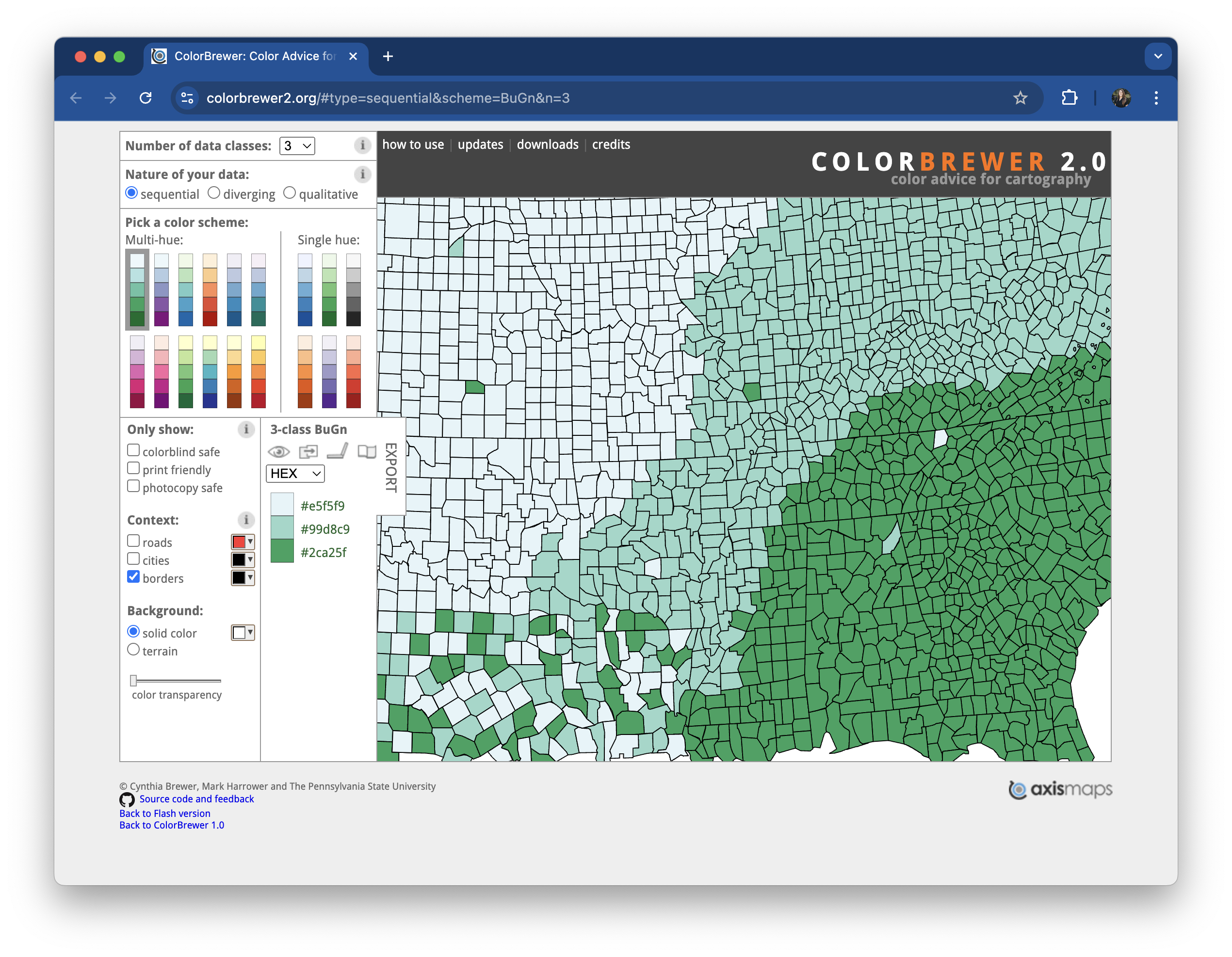
ALTERNATIVE: RColorBrewer
{RColorBrewer} comes with a couple useful functions for quickly viewing and assembling your palette’s HEX codes:
Using RColorBrewer color scales
Use the right function (all part of {ggplot2}) for the type of data / palette:
Use scale_color_brewer() to apply qualitative palettes
Use scale_color_distiller() for unclassed continuous color scales
Check out the documentation and play around with some alternative options.
Accessibility tip: outline points to make light colors more visible
Rather than color points by body_mass_g, we can fill points by body_mass_g. Then, we need to change the shape of our points to 21, which is the code for an outlined, fill-able point:
Trick comes courtesy of Albert Rapp and his How to Use Better Colors in ggplot (3 Easy Ways) video tutorial. Check out his YouTube channel for tons of great R content.
Accessibility tip: use redundant mapping whenever possible
Recall that colors are low on the hierarchy of elementary perceptual tasks. When possible, avoid conveying important information purely through color – consider how you might additionally use shapes, symbols, typography, or annotations.
Figure 2 from Apigo A and Oono R (2022) Plant abundance, but not plant evolutionary history, shapes patterns of host specificity in foliar fungal endophytes. Ecosphere. 13(1):e03879. https://doi.org/10.1002/ecs2.3879
There are so many other great pre-made color palettes to explore, many of which take into consideration color vision deficiencies (but always double check!)
Use paletteer to access TONS of pre-made palettes
The {paletteer} package provides a common interface for accessing a near-comprehensive list of palettes (over 2,500!!) across various packages.

Take a couple minutes to explore palettes
There are a number of ways to browse the extensive list of supported palette packages, including in the {paletter} documentation, on the r-color-palettes GitHub repo, on the R Color Palettes website, the R-Graph Gallery’s Color Palette Finder (built on {paletteer}; see below).
02:00
{paletteer} is useful in a number of ways – let’s consider two options next
TIP: Check out the palettes_c_names & palettes_d_names data frames, which contain information about supported palettes and packages.
1. Apply a palette using scale_*_paletteer_*()
where scale_* can be scale_color or scale_fill & and paletteer_* can be paletteer_d (discrete), paletteer_c (continuous), or paletteer_binned
Find eligible palettes in the following built-in data frames:
superbloom3 palette from {calecopal}
Also try using scale_color_paletteer_binned() to apply the batlow palette, above.
2a. Create vector of HEX codes using paletteer_*()
n), and optionally, the directionGrandBudapest1 palette from {wesanderson}
(discrete, with 3 colors)
We can now apply our palette to our plot using the appropriate ggplot2::scale_*() function.
See the next slide for some commonly used options.
Some common functions for scaling colors
For qualitative (categorical) data  :
:
scale_*_manual()For quantitative (numeric) data:
Unclassed palettes  :
:
scale_*_gradient(): creates a two color gradient (low-high)scale_*_gradient2(): creates a diverging color gradient (low-mid-high)scale_*_gradientn(): creates a n-color gradientClassed palettes  :
:
scale_*steps(): creates a two color binned gradient (low-high)scale_*_steps2(): creates a diverging binned color gradient (low-mid-high)scale_*_stepsn(): creates a n-color binned gradientUse the fill variant of the above functions for areas, bars, etc. and the color variant for points, lines, etc.
2b. Apply palette using ggplot2::scale_*()
Examples using our discrete color palette:
2b. Apply palette using ggplot2::scale_*()
Examples using our continuous color palette:
Climate and environmental science visualizations can (should) draw from community standards, when possible
Some widely-used climate science palettes
Figure 4. Appropriate diverging and sequential colour schemes for the following climate data (a), absolute temperature (b), absolute precipitation (c), temperature anomaly (d), precipitation or runoff anomaly (e and f) other climate variables with no symbolic association . Schemes in this figure are 7 class ones designed by Cynthia Brewer, (Brewer et al. 2003)
Citation: Kaye NR, Hartley A, Hemming D (2012) Mapping the climate: guidance on appropriate techniques to map climate variables and their uncertainty. Geoscientific Model Development. 5:245-256. www.geosci-model-dev.net/5/245/2012/ (PDF download)
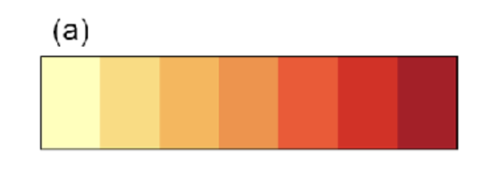

Source: Zittis, G., Lazoglou, G., Hadjinicolaou, P. et al. Emerging extreme heat conditions as part of the new climate normal. Theor Appl Climatol 155, 143–150 (2024). https://doi.org/10.1007/s00704-023-04605-y

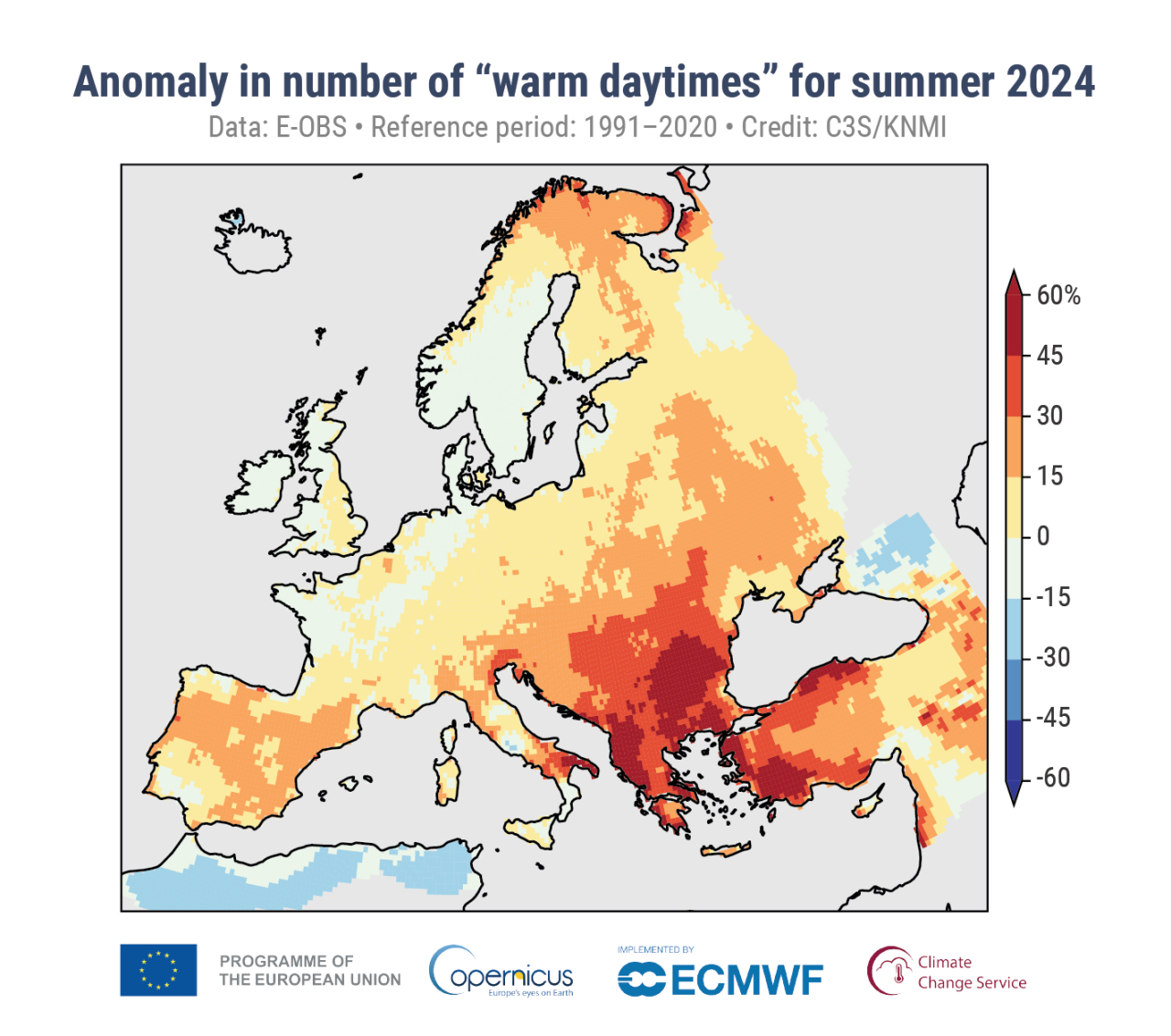
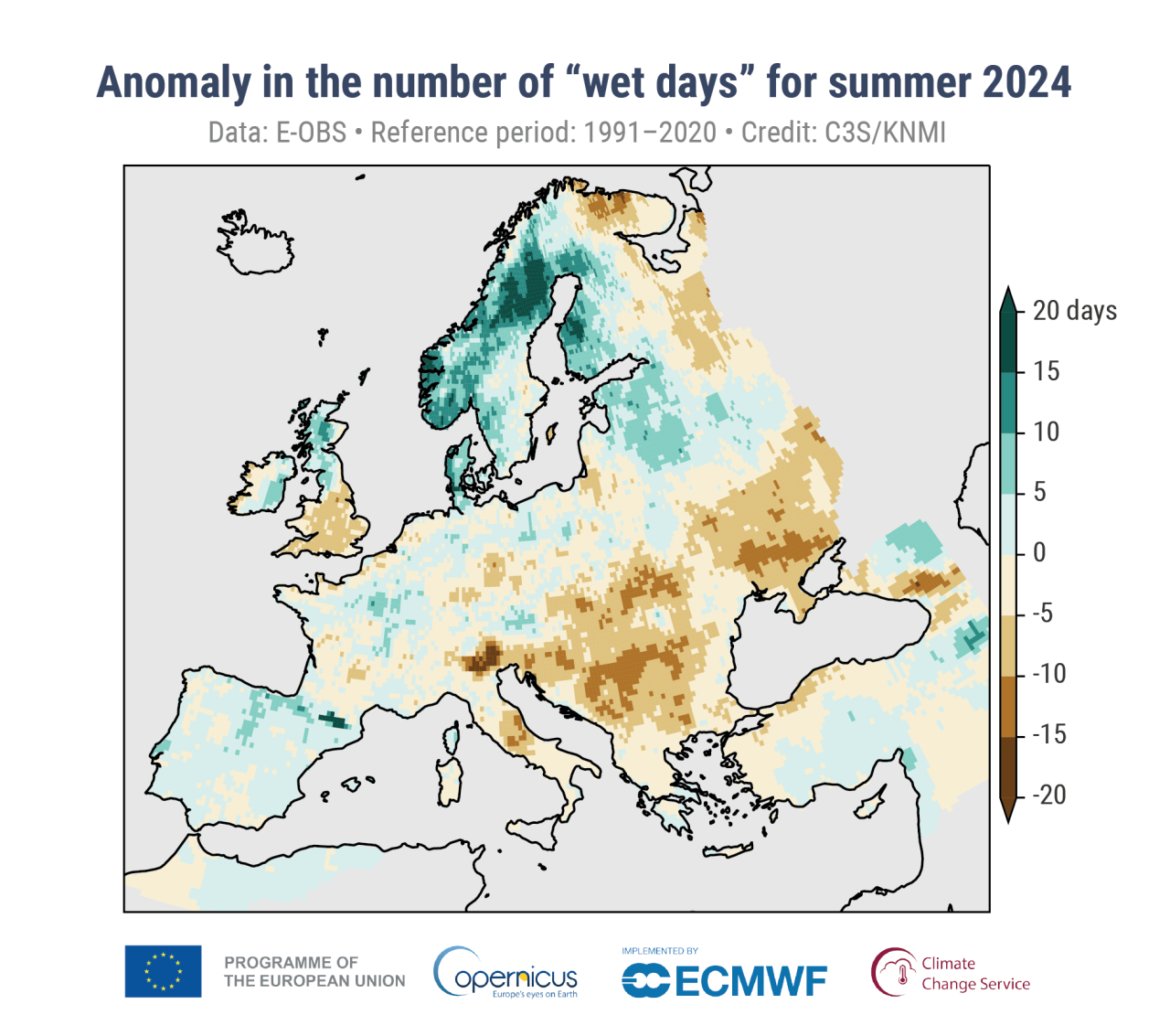
Source: C3S seasonal lookback: summer 2024, by Copernicus
Want to design your own palette? Here are some helpful guidelines and considerations…
Select hues using color wheels / pickers
There are lots of different variations of color wheels, but look for hues along the outer edge:
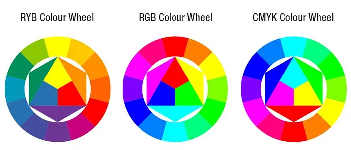
Common color models: RYB (used by painters), RGB (used in electonic displays), CMYK (used in modern printing). Image source: medium.com
When using a color picker, adjust the HEX code sliding scale to pick a hue and ensure that the selector is set to the top right edge of the box:
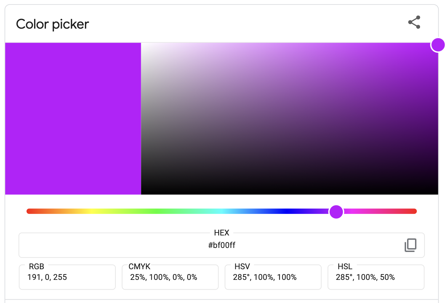
There are lots of great color pickers out there, though Google color picker is a quick one to navigate to. HTML color codes is my personal favorite.
Use color wheels identify color harmonies

Image source: htmlcolorcodes.com
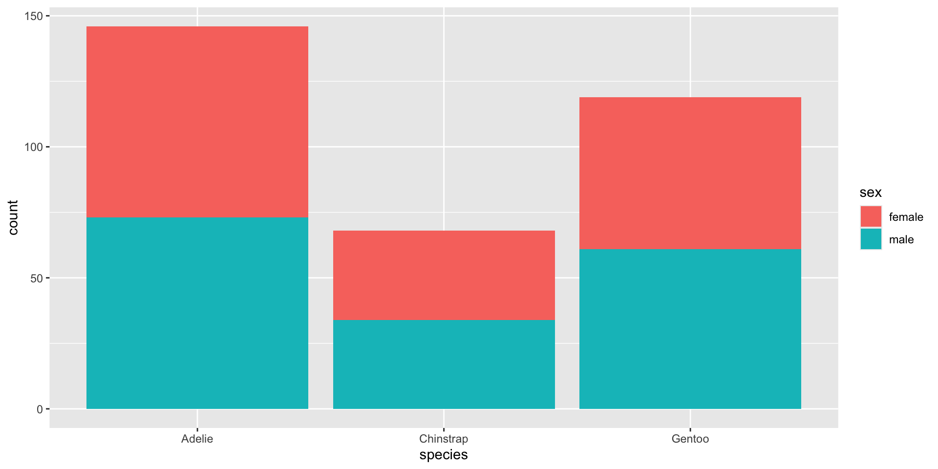
blue-green & red-orange are complementary and therefore offer the strongest possible contrast
Find descriptions of blue-green & red-orange on htmlcolorcodes.com
Hues have associated meaning
We associate meaning with different hues (e.g. cold / sad = blue, hot / angry = red), and importantly, these associations can differ among cultures.
Source: Information is Beautiful
Some associations span multiple cultures
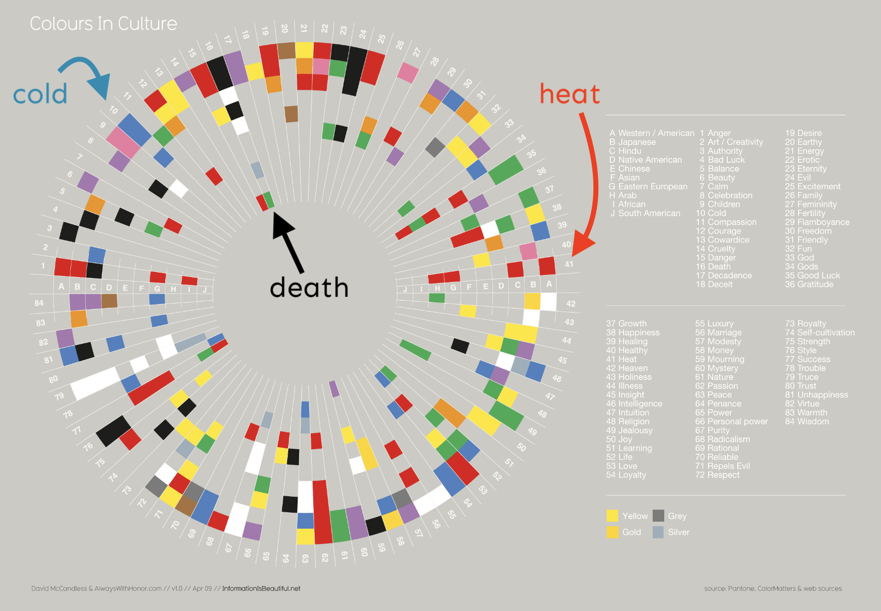
Source: Information is Beautiful
Colors elicit emotional responses
“lightness, brightness, and saturation can communicate the level of seriousness, intensity, and emotional weight in a visual work” -Cédric Scherer
Colors elicit emotional responses
“lightness, brightness, and saturation can communicate the level of seriousness, intensity, and emotional weight in a visual work” -Cédric Scherer
(Right) COVID-19 tracker by the Johns Hopkins University (screenshot from 2020-07-27, courtesy of Cédric Scherer). Red tends to elicit panic / fear. (Left) A map of confirmed COVID-19 cases by Datawrapper (screenshot from 2020-07-27, courtesy of Cédric Scherer). Blues and greens help to avoid such a strong fearful emotional response.
Colors elicit emotional responses
“We show the current or confirmed cases in another color than red. The coronavirus is not a death sentence. Most infected people will survive. If you’re infected, you want to find yourself on a map as a blue (or yellow, or beige, or purple…) dot, not as a “attention, danger, run!”-screaming red dot. Related, we show deaths in black, not red – it feels more respectful.”
-Lisa Charlotte Muth in 17 (or so) responsible live visualizations about the coronavirus, for you to use,
published March 3, 2020
Learn more about this award-winning visualization in an interview with Carrie Mifsud: Capturing One Million Deaths on a Page: A Chat with NYT’s Carrie Mifsud
Using pure hues can be overwhelming
Though it may be temping to use bright / bold colors to grab attention, it can lead to eye strain and make it more challenging for your readers to focus on your chart.
Use more subdued colors instead
Though it may be temping to use bright / bold colors to grab attention, it can lead to eye strain and make it more challenging for your readers to focus on your chart.
A few approaches for subduing a pure hue
1. adjust the saturation / chroma (i.e. the level of intensity of a color)
2. adjust luminance: tint (+ white), tone (+ gray), or shade (+ black)
3. increase transparency (e.g. using the alpha argument)
Green (132° on the color wheel) at 100% saturation
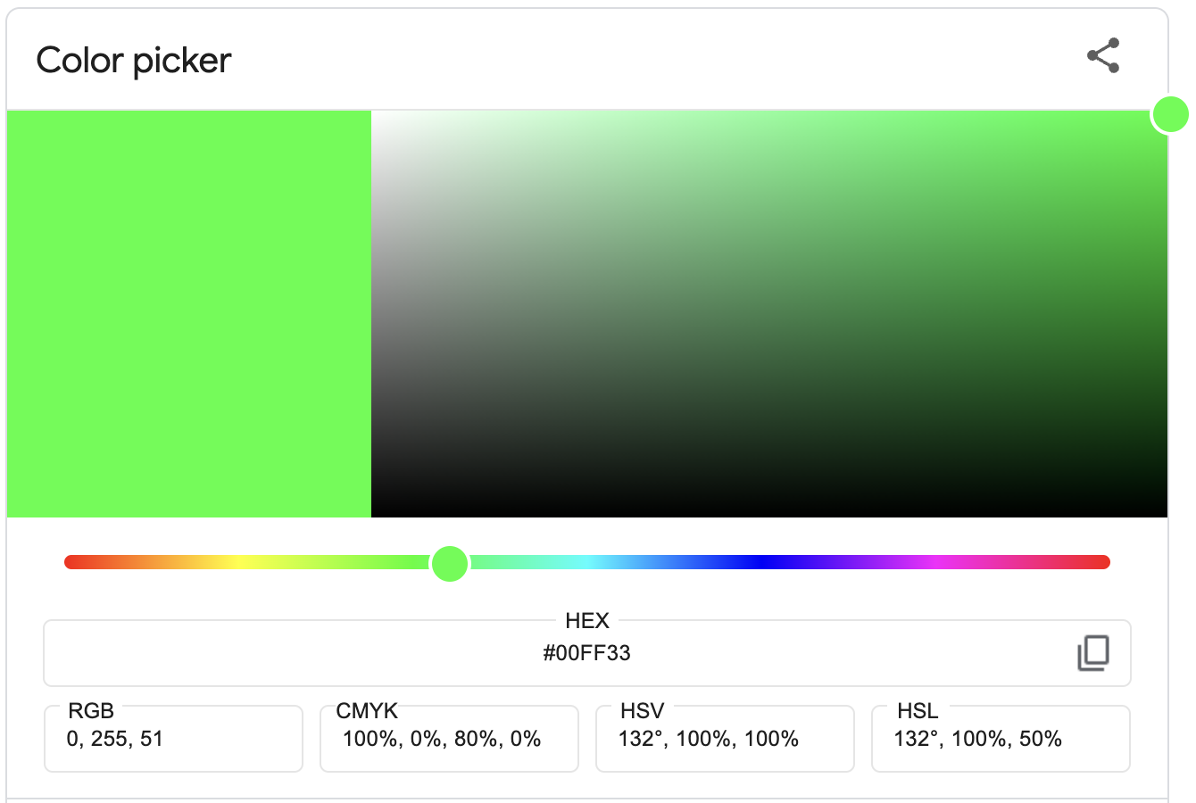
Green (132° on the color wheel) at 20% saturation (HSL)
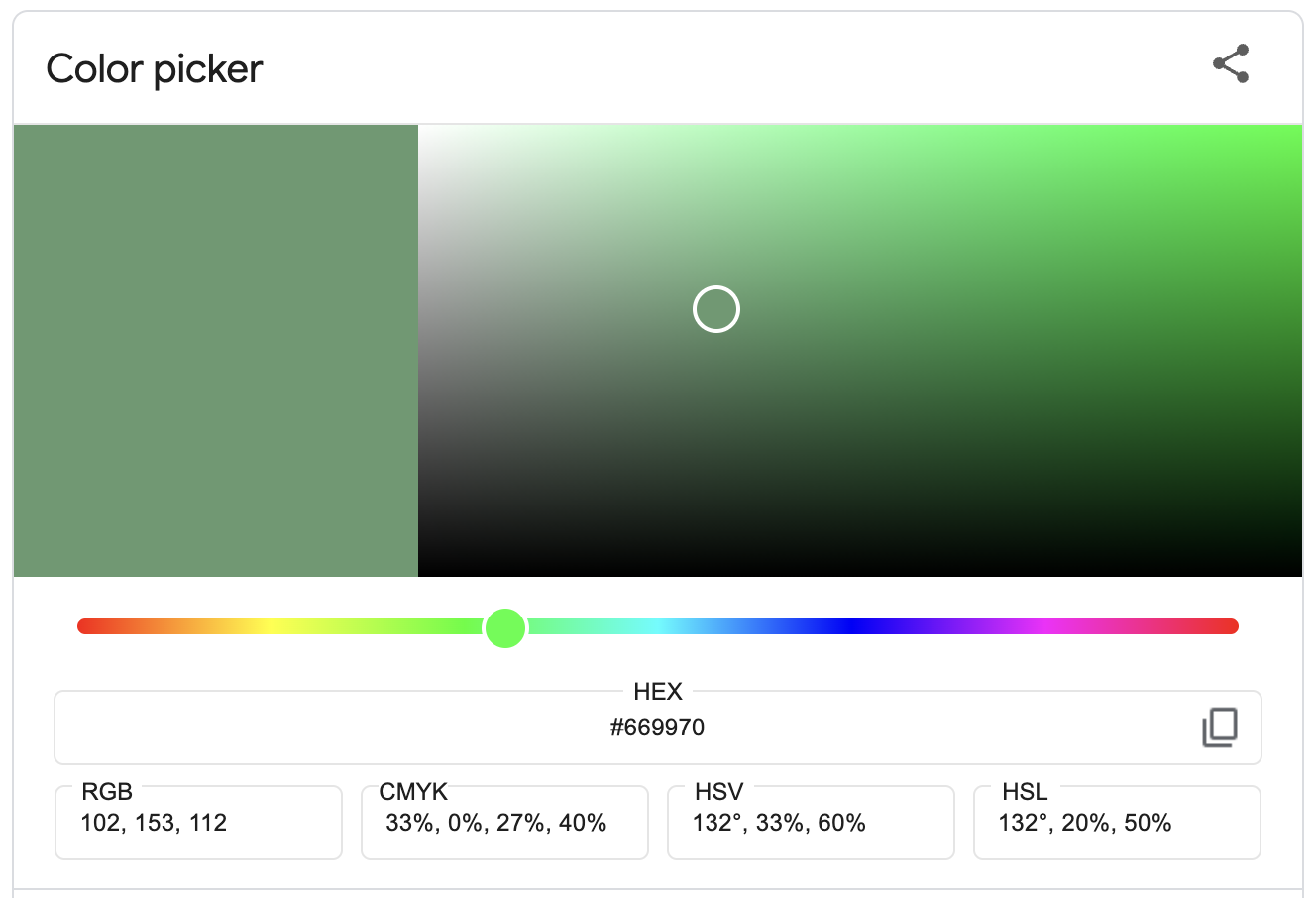
Saturation adjusted using the HSL (Hue, Saturation, Lightness) color model. Read about HSL vs HSV color models if you want a deeper dive.
A few approaches for subduing a pure hue
1. adjust the saturation / chroma (i.e. the level of intensity of a color)
2. adjust luminance: tint (+ white), tone (+ gray), or shade (+ black)
3. increase transparency (e.g. using the alpha argument)
The default chroma for ggplots is set to 100%
scale_*_hue() uses colors based on the HCL color model.
A few approaches for subduing a pure hue
1. adjust the saturation / chroma (i.e. the level of intensity of a color)
2. adjust luminance: tint (+ white), tone (+ gray), or shade (+ black)
3. increase transparency (e.g. using the alpha argument)
Green (132° on the color wheel) with luminance adjusted to 90% (more white)
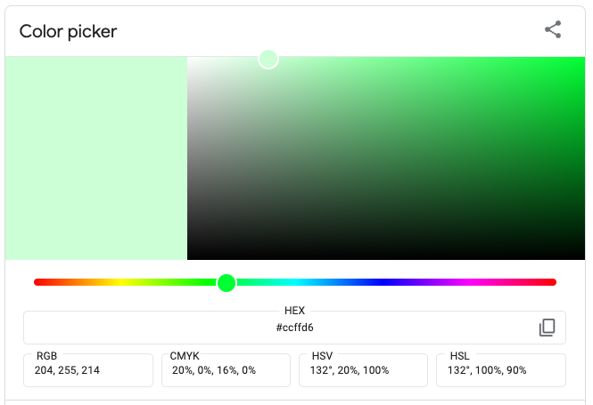
Green (132° on the color wheel) with luminance adjusted to 10% (more black)
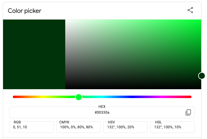
Lightness adjusted using the HSL (Hue, Saturation, Lightness) color model. Read about HSL vs HSV color models if you want a deeper dive.
A few approaches for subduing a pure hue
1. adjust the saturation / chroma (i.e. the level of intensity of a color)
2. adjust luminance: tint (+ white), tone (+ gray), or shade (+ black)
3. increase transparency (e.g. using the alpha argument)
The default luminance for ggplots is set to 65%
scale_*_hue() uses colors based on the HCL color space. The default luminance value of 65(%) is good for filled areas but may be a bit light for points and lines.
A few approaches for subduing a pure hue
1. adjust the saturation / chroma (i.e. the level of intensity of a color)
2. adjust luminance: tint (+ white), tone (+ gray), or shade (+ black)
3. increase transparency (e.g. using the alpha argument)
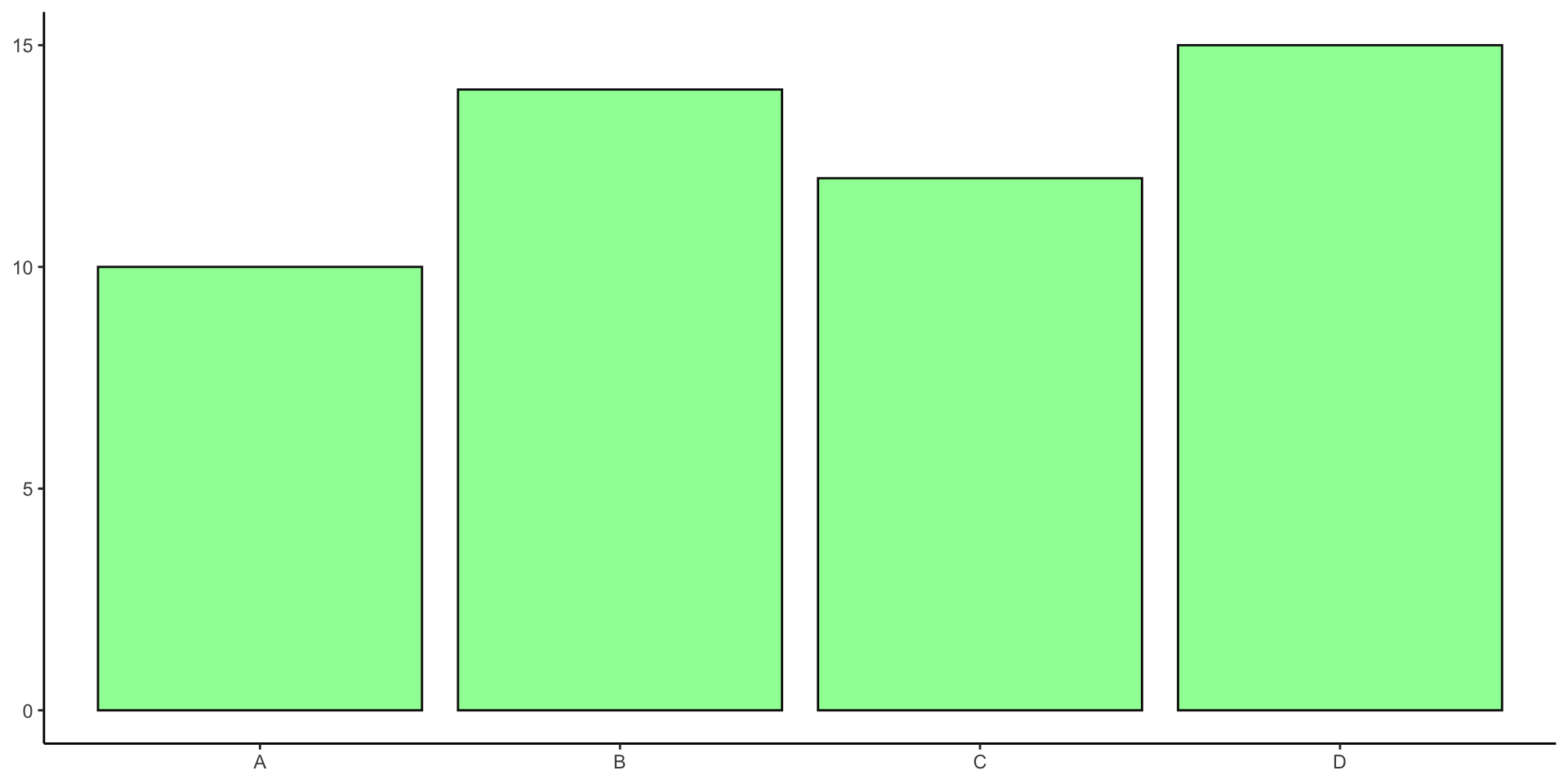
Green (132° on the color wheel) with default opacity (100%)
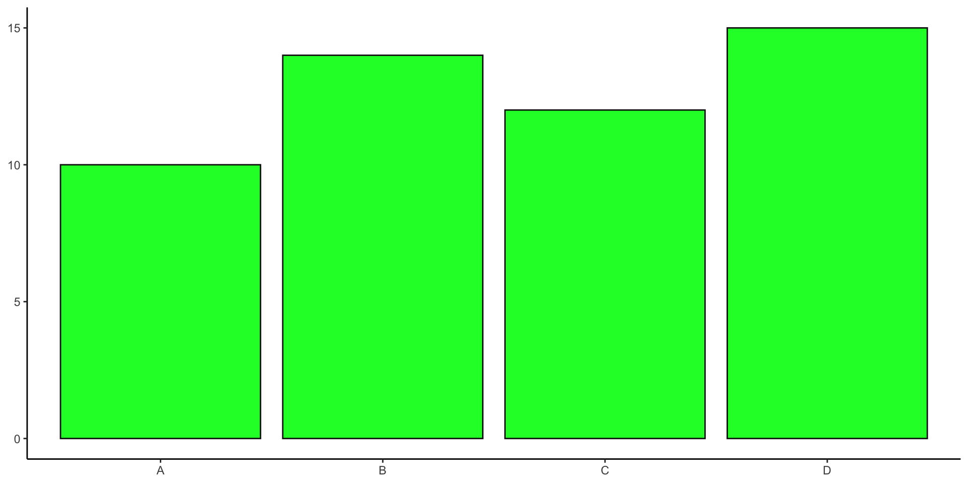
Green (132° on the color wheel) with opacity reduced to 50%
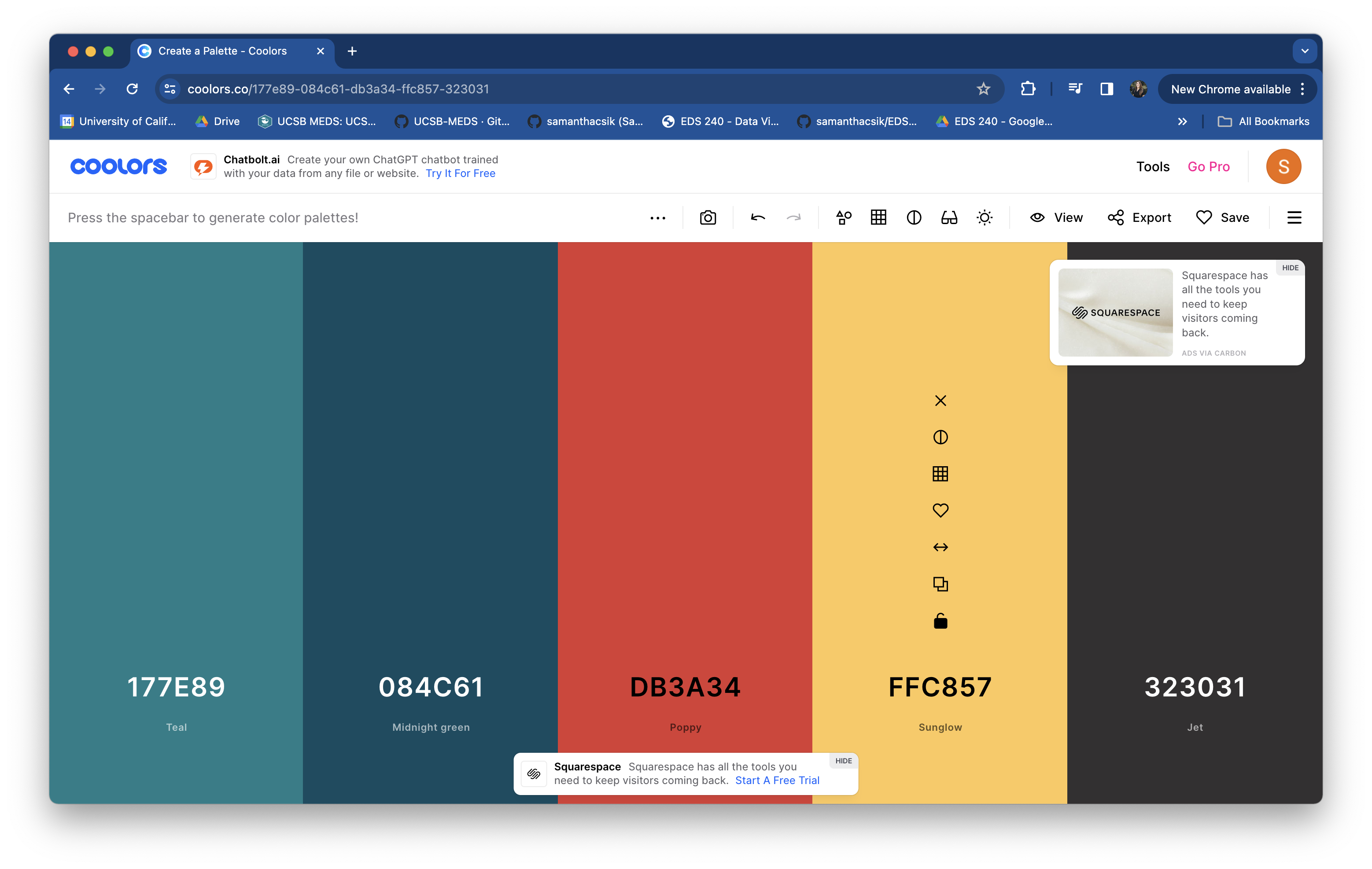
Building your own color palette
Be sure to consider what we’ve already discussed:
And also consider some other important sources of inspiration:
TIP: Save your palette outside of your ggplot
I recommend saving your palette to a named vector outside of your ggplot – this prevents lengthy palettes from creating cluttered ggplot code and allows you to reuse your palette across multiple plots:
Refer back to the common {ggplot2} scaling functions, to determine which is appropriate for your data / plot.
TIP: Set color names (1/2)
We should always be consistent with our colors. E.g. if Gentoo penguins are blue in one plot, they should be blue in all plots. Notice that our colors don’t “stick” with the species they represent, but rather they’re applied in the order that they appear in our palette:
Adelie, Chinstrap & Gentoo penguins
TIP: Set color names (2/2)
Setting the names of our vector elements (colors) ensures that they stick with those factor levels across all of our visualizations:
Adelie, Chinstrap & Gentoo penguins
Tip: modify df to apply colors to observations
The scale_*_identity() functions allows you to map aesthetic values from your data frame to individual points. They will not produce a legend unless specified using guide = "legend".
penguins |>
  mutate(
    my_color = case_when(
      bill_length_mm < 40 ~ "#D7263D",
      between(x = bill_length_mm, left = 40, right = 50) ~ "#E4BB97",
      bill_length_mm > 50 ~ "#386150"
    )
  ) |>
  ggplot(aes(x = bill_length_mm, y = bill_depth_mm, color = my_color)) +
  geom_point(size = 4, alpha = 0.8) +
  scale_color_identity()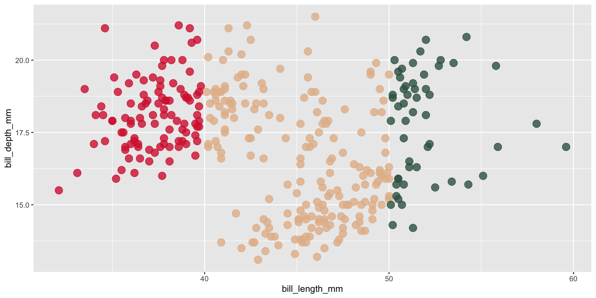
There are also some additional rules / guidelines that you should pretty much always abide by when selecting colors
High saturation = greater / more important values
It’s okay to use saturated / brighter colors in moderation.
We tend to associate more saturated colors with greater values.
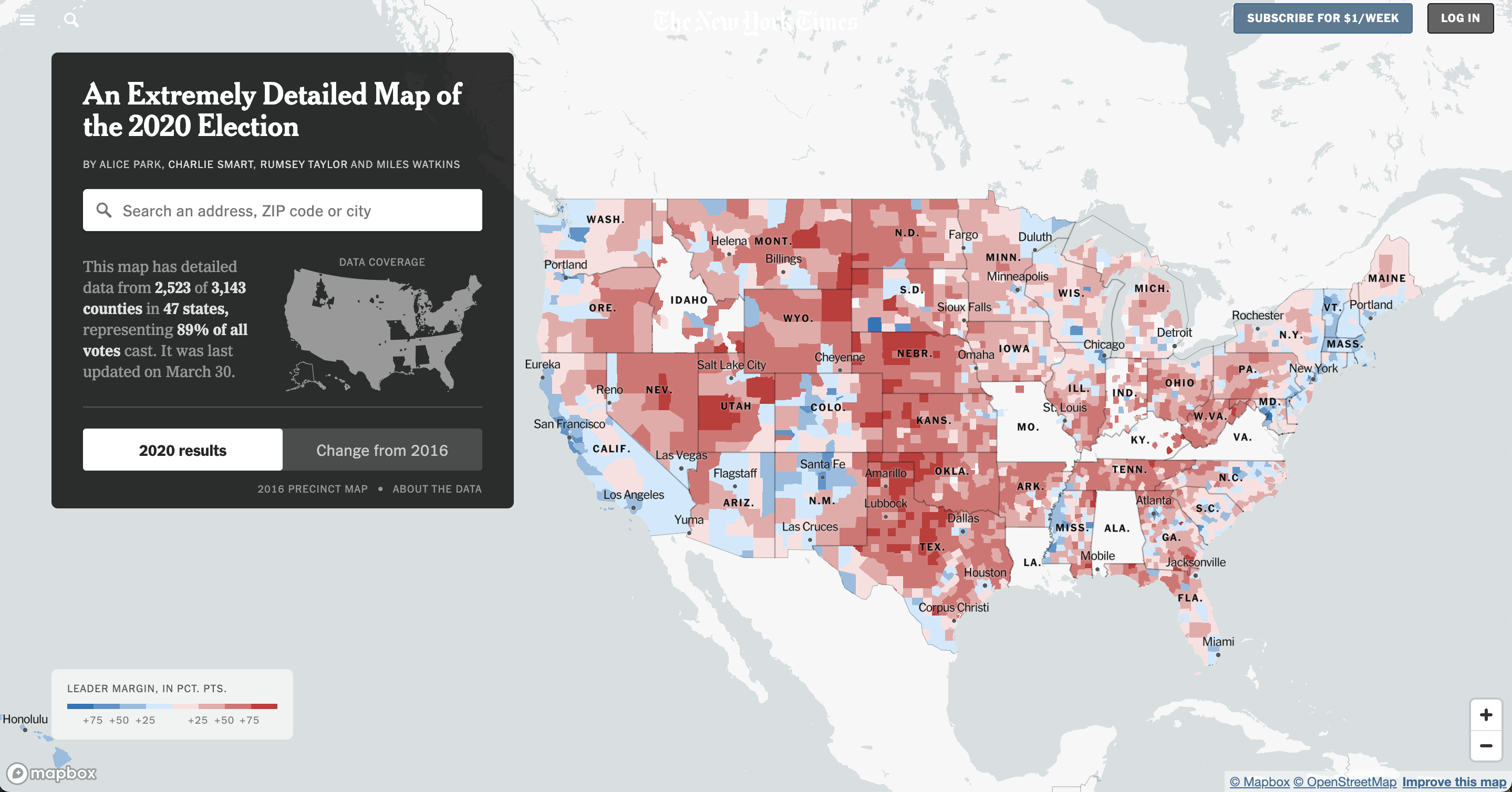
Image source: New York Times
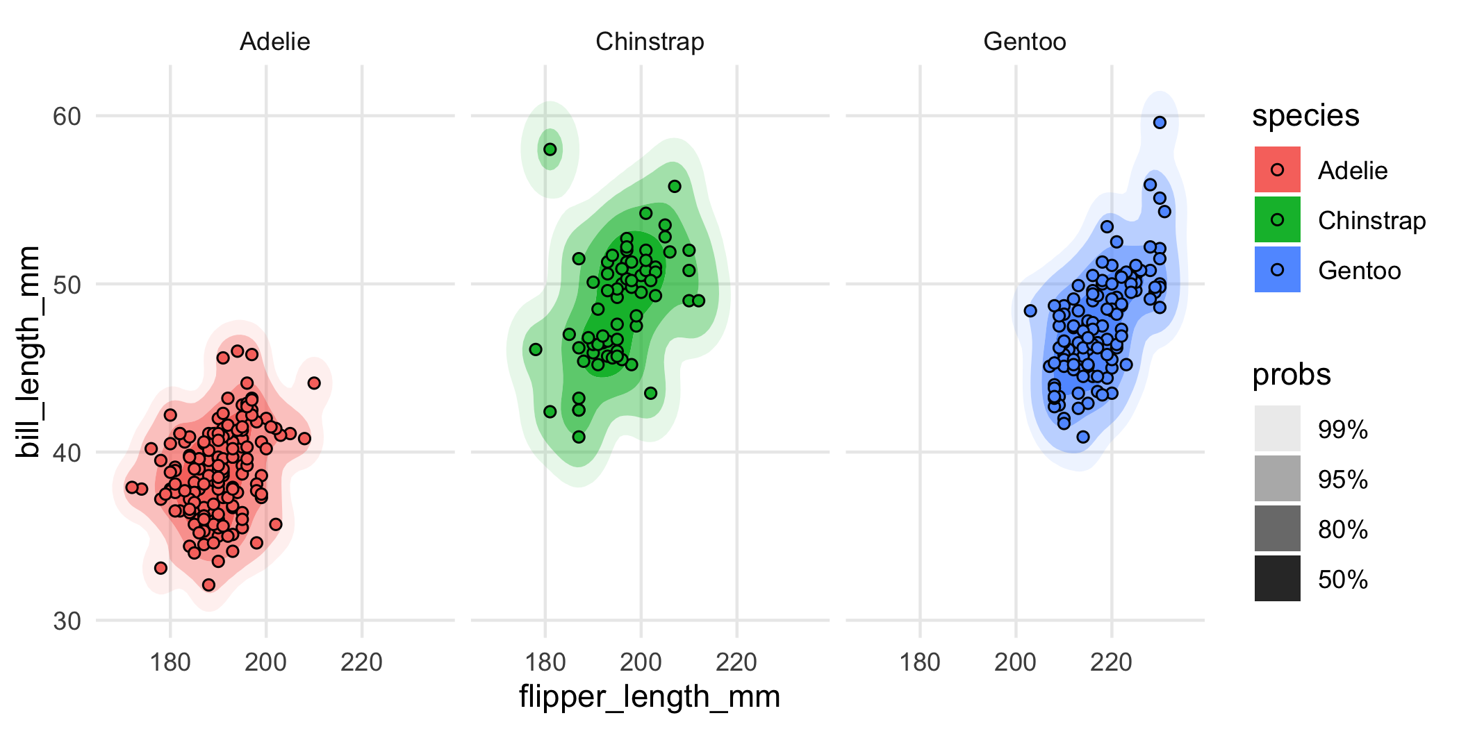
Image source: {ggdensity} pkgdown site.
No more than 7 colors
If you need more than seven colors, consider alternative chart types.
Example from What to consider when choosing colors for data visualization, by Lisa Charlotte Muth
Use colors consistently
Ensure consistent use of colors across multiple visualizations that display the same groups.
Example from What to consider when choosing colors for data visualization, by Lisa Charlotte Muth
Explain what your colors encode
Always include a color key, in the form of a traditional legend or otherwise.
Example from What to consider when choosing colors for data visualization, by Lisa Charlotte Muth
Highlight important values
Use gray for less important groups / values, annotations, contextual information, etc.
Example from What to consider when choosing colors for data visualization, by Lisa Charlotte Muth
Be predictable in your color choices
Use intuitive colors (e.g. green for forest, blue for water) but avoid stereotypes (e.g. pink for women, blue for men).
Try a cold color for men (e.g. blue or purple) and a warmer color for women (e.g. yellow, orange or a warm green; see this great blog post for more information).
Example from What to consider when choosing colors for data visualization, by Lisa Charlotte Muth
Bright = low, dark = high
In most cases, readers will associate bright colors with lower values and darker colors with higher values. Build gradients accordingly.
Example from What to consider when choosing colors for data visualization, by Lisa Charlotte Muth
Except in some cases. . .
“humans perceive bright colors on elevation maps to represent a high altitude, with darker colors representing naturally low-lying and shady areas like valley” (Cédric Scherer, Colors and Emotions in Data Visualization)
Gradient palettes for continuous data only
Most readers will associate dark colors with “high / important” and bright or light colors with “low / less”. Using a gradient palette with categorical data may imply a ranking of categories where there shouldn’t be.
Example from What to consider when choosing colors for data visualization, by Lisa Charlotte Muth
Use lightness, not just hue, to build gradients
Gradients should also work in black and white.
Example from What to consider when choosing colors for data visualization, by Lisa Charlotte Muth
Two hues are sometimes better than one
Readers are generally better able to distinguish colors on a gradient better if they are encoded through both lightness and two (sometimes three) carefully-selected hues.
Example from What to consider when choosing colors for data visualization, by Lisa Charlotte Muth
Take a Break
~ This is the end of Lesson 2 (of 3) ~
05:00