Metabolism effects on foraging across temperatures
02:00
EDS 240: Lecture 6.2
Annotations
Week 6 | February 10th, 2025
Good data visualization design considers:
This lesson will focus on the use of annotations in a good data visualization.
Source: Arctic Ice Reaches a Low Winter Maximum (New York Times).
Also check out this great commentary on the above visualization, Respect your readers’ time (DataWrapper).
Enjoy the y-axis units on this data viz? Be sure to check out The Measure of Things, a search engine for comparative measurements.
02:00
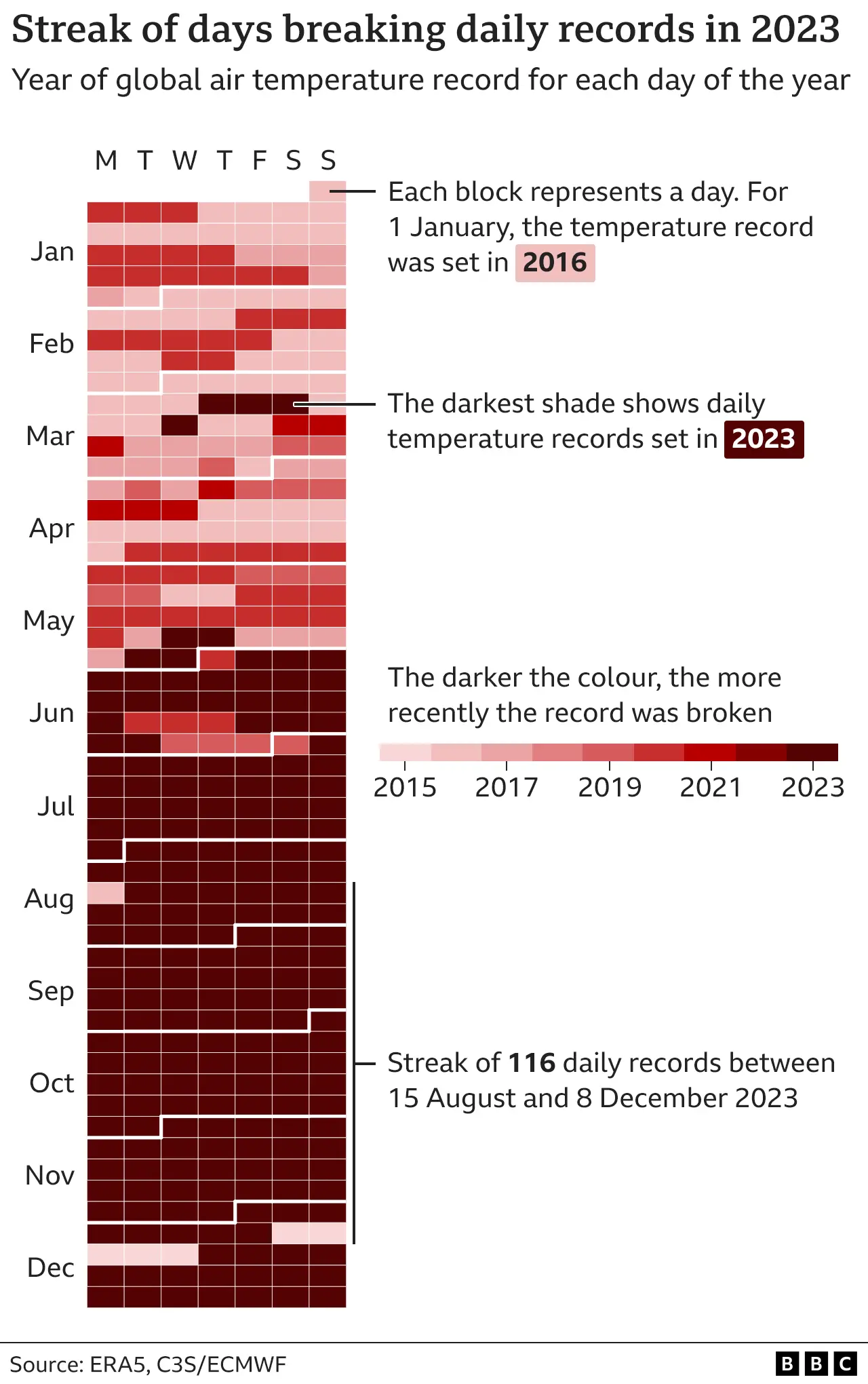
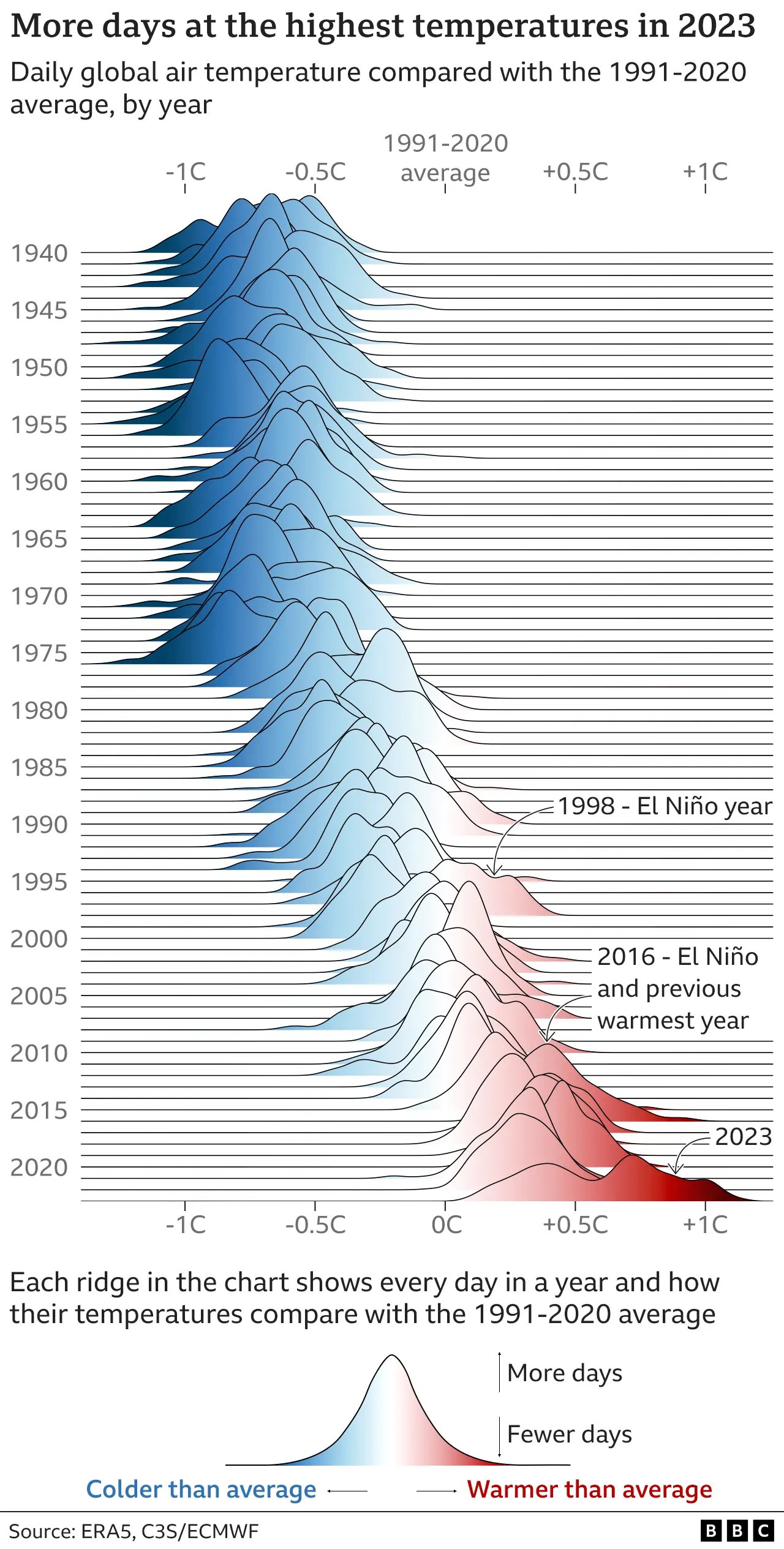
Source: 2023 confirmed as world’s hottest year on record (BBC)
02:00
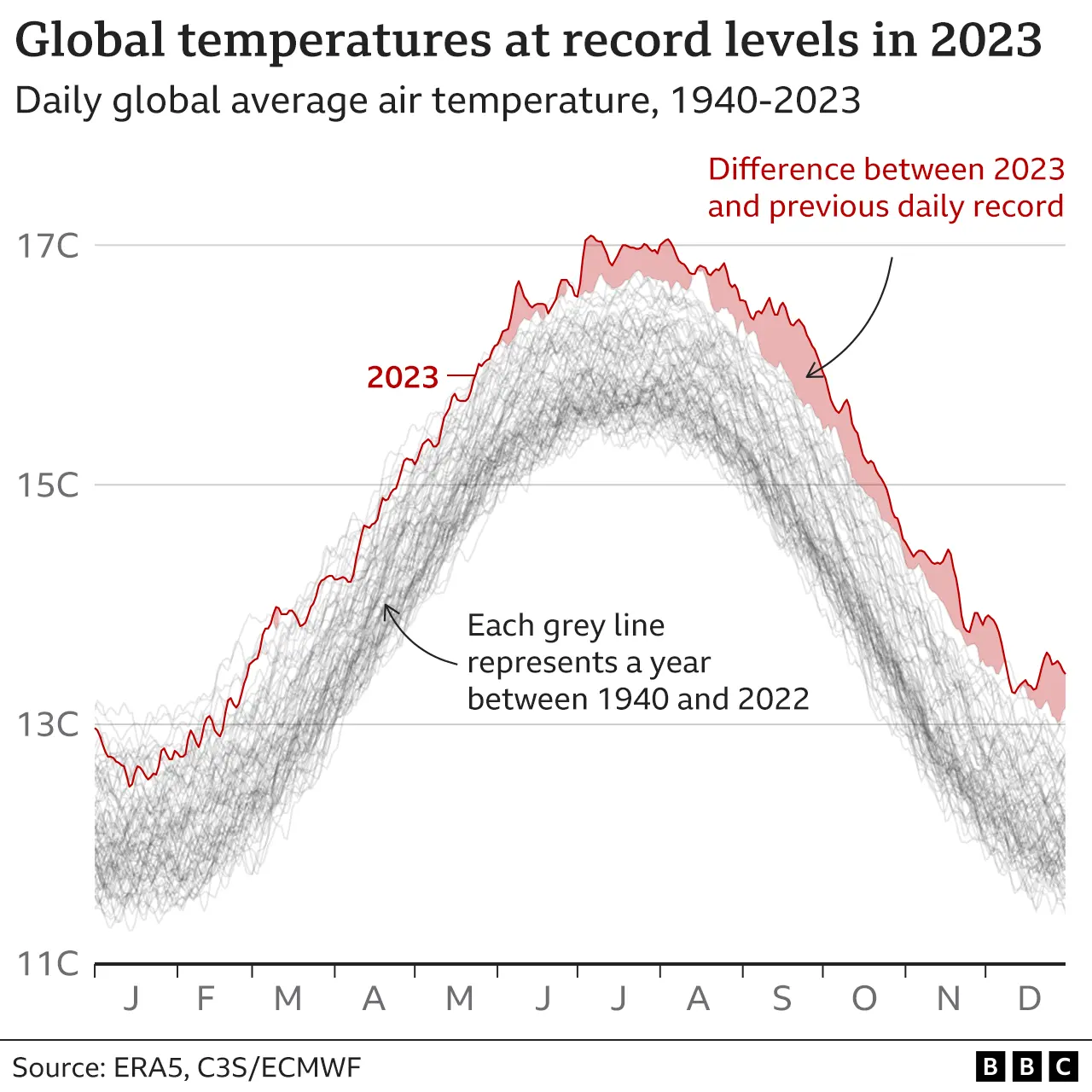
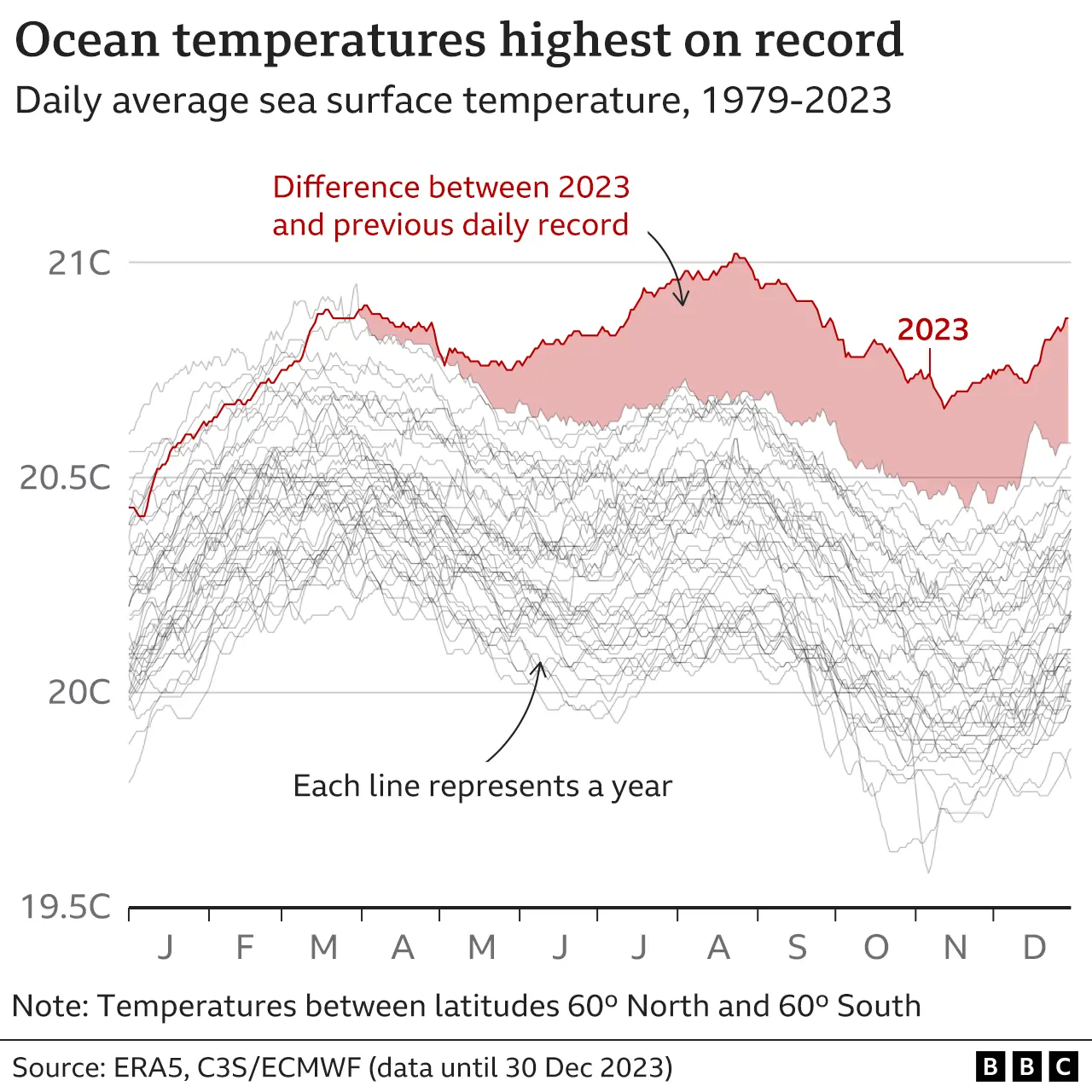
Source: 2023 confirmed as world’s hottest year on record (BBC)
02:00
Source: What is climate change? A really simple guide (BBC)
02:00
Why annotate?
The average attention span of an internet user is ~8 seconds (shorter than a goldfish!). It’s imperative that we respect our readers’ time.
Aim to:
The more time you spend making your visualization crystal clear, the more time you save your readers needing to decipher it.
Read these two great posts: What to consider when using text in data visualizations & Respect your readers’ time, both by Lisa Charlotte Muth
We’ll be annotating these plots
Mono Lake levels
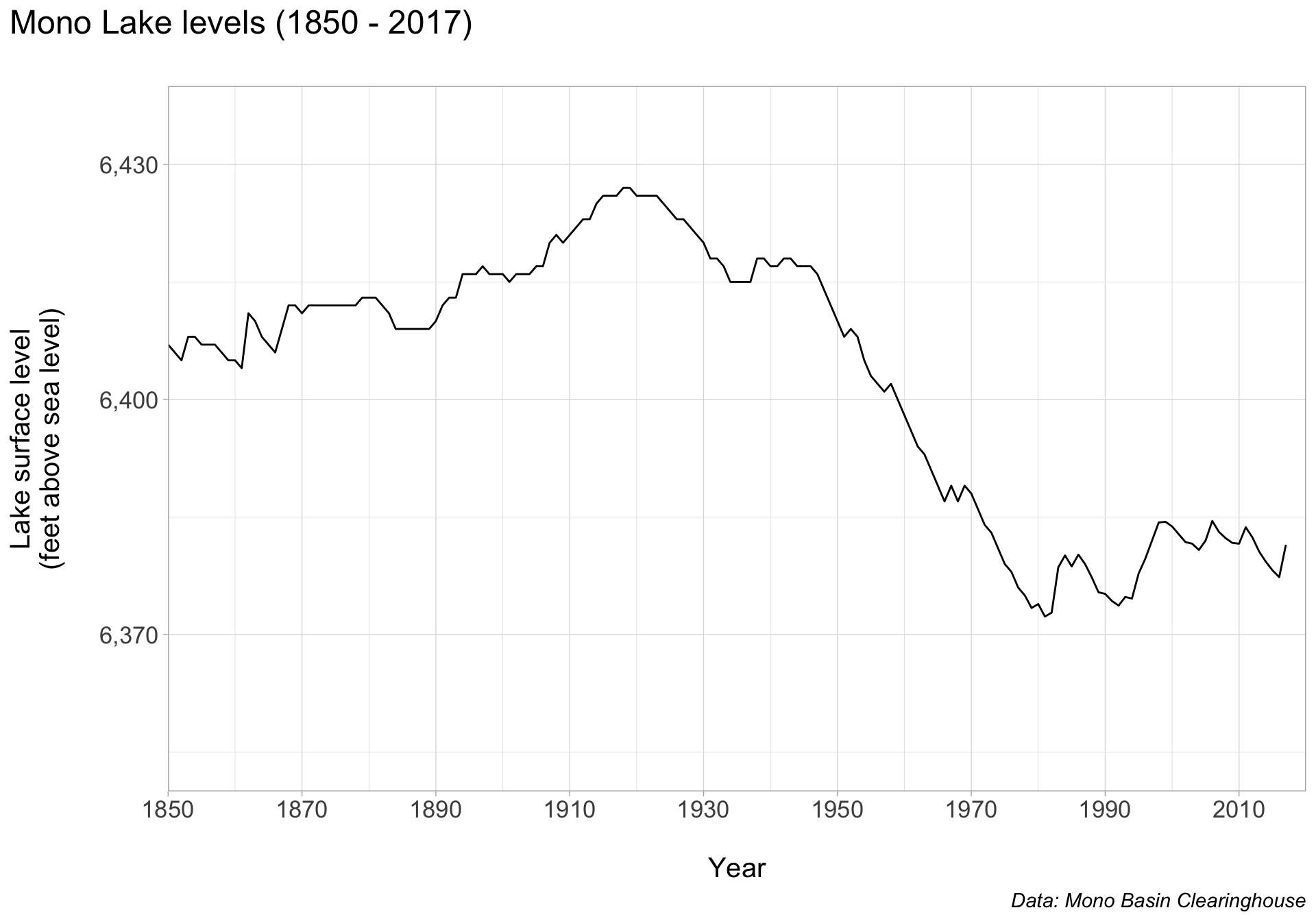
Borrowed from Allison Horst’s Customized Data Visualization in {ggplot2} materials.
These two plots (and likely many others that you’ll create moving forward) will benefit from some custom annotations.
Lobster plot starter code
Note that this starter code incorporates some of the strategies we’ve discussed in past lectures: creating a named color palette, building (axis) labels outside of the ggplot code, and using {ggtext} to apply markdown to plot text:
##~~~~~~~~~~~~~~~~~~~~~~~~~~~~~~~~~~~~~~~~~~~~~~~~~~~~~~~~~~~~~~~~~~~~~~~~~~~~~~
##                                    setup                                 ----
##~~~~~~~~~~~~~~~~~~~~~~~~~~~~~~~~~~~~~~~~~~~~~~~~~~~~~~~~~~~~~~~~~~~~~~~~~~~~~~

#.........................load libraries.........................
library(tidyverse)

#..........................read in data..........................

# read in Google Sheet ----
lobs <- googlesheets4::read_sheet("https://docs.google.com/spreadsheets/d/1DkDVcl_9rlaqznHfa_v1V1jtZqcuL75Q6wvAHpnCHuk/edit#gid=2143433533") |>
  mutate(temp = as.factor(temp))

# alternatively, read in downloaded files ----
# lobs <- read_csv(here::here("week6", "data", "metabolism-foraging-data.csv")) |>
  # mutate(temp = as.factor(temp))

##~~~~~~~~~~~~~~~~~~~~~~~~~~~~~~~~~~~~~~~~~~~~~~~~~~~~~~~~~~~~~~~~~~~~~~~~~~~~~~
##                            create lobster plot                           ----
##~~~~~~~~~~~~~~~~~~~~~~~~~~~~~~~~~~~~~~~~~~~~~~~~~~~~~~~~~~~~~~~~~~~~~~~~~~~~~~

#..........................create scales.........................
lob_palette <- c("11" = "#7B8698",
                 "16" = "#BAD7E5",
                 "21" = "#DC7E7C",
                 "26" = "#7D3E40")

lob_shapes <-  c("11" = 15,
                 "16" = 16,
                 "21" = 17,
                 "26" = 18)

lob_sizes <- c("11" = 6,
               "16" = 6,
               "21" = 6,
               "26" = 7)

#........................create plot text........................
x_axis_lab <- glue::glue("Resting Metabolic Rate<br>
                         (mg O<sub>2</sub> kg<sup>-1</sup> min<sup>-1</sup>)")

y_axis_lab <- glue::glue("Maximum Consumption Rate<br>
                         (prey consumed predator<sup>-1</sup> 24hr<sup>-1</sup>)")

#............................plot data...........................
lob_plot <- ggplot(lobs, aes(x = SMR, y = avg_eaten,
                             color = temp, shape = temp, size = temp)) +
  geom_point(alpha = 0.8) +
  scale_color_manual(values = lob_palette) +
  scale_shape_manual(values = lob_shapes) +
  scale_size_manual(values = lob_sizes) +
  scale_x_continuous(breaks = seq(0, 1.5, by = 0.2)) +
  scale_y_continuous(breaks = seq(0, 35, by = 5)) +
  labs(x = x_axis_lab,
       y = y_axis_lab,
       color = "Temp (ºC)",
       shape = "Temp (ºC)",
       size = "Temp (ºC)") +
  theme_light() +
    theme(
      axis.title.x = ggtext::element_markdown(size = 17,
                                              margin = margin(t = 15, r = 0, b = 0, l = 0),
                                              lineheight = 1.5),
      axis.title.y = ggtext::element_markdown(size = 17,
                                              margin = margin(t = 0, r = 15, b = 0, l = 0),
                                              lineheight = 1.5),
      axis.text = element_text(color = "black", size = 16),
      panel.border = element_rect(colour = "black", linewidth = 0.7),
      panel.grid = element_blank(),
      legend.position = "top",
      legend.title = element_text(size = 16),
      legend.text = element_text(size = 14)
    )

lob_plot
Building custom annotations
There are two primary ways to add custom text annotations:
geom_text() (for plain text) & geom_label() (adds a rectangle behind text), which take aesthetics mappings; these draw the geom once per each row of the data frameannotate(), which does not take aesthetics mappings and instead draws only the information provided to itLet’s try to add an annotation to our plot using both approaches to better understand the difference.
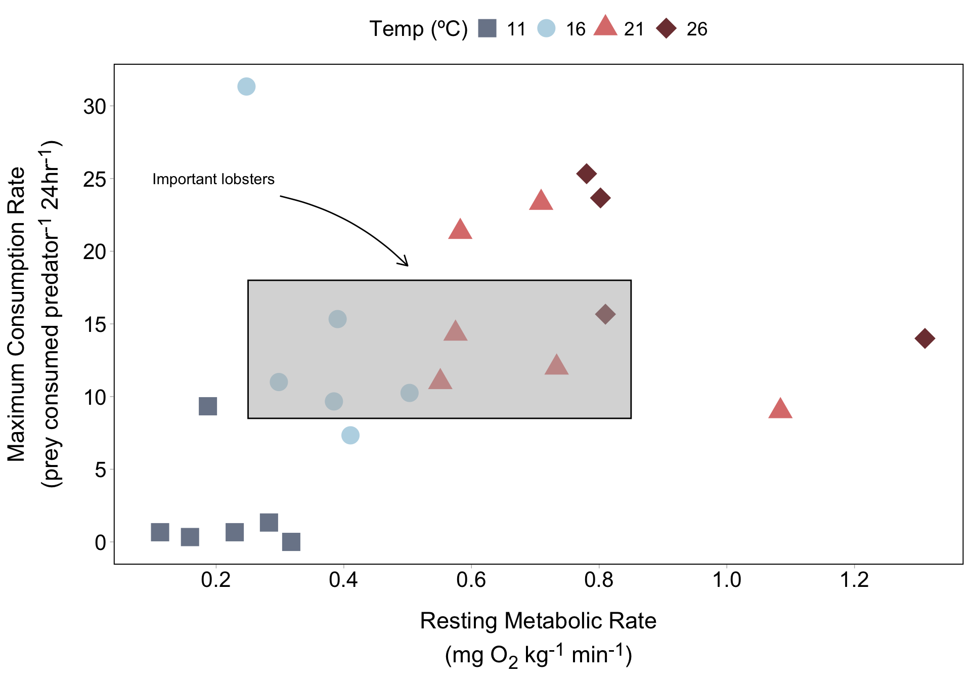
Our goal: add a rectangle that bounds / highlights a subset of points, add text nearby that reads Important lobsters, and draw an arrow from the text pointing to the box.
I’ve found the Annotation FAQ super helpful!
geom_text() + geom_rect() doesn’t look right . . .
Here, we use geom_text() + geom_rect() to add text and a rectangle to our plot. We need to supply coordinates to place each on our plot.
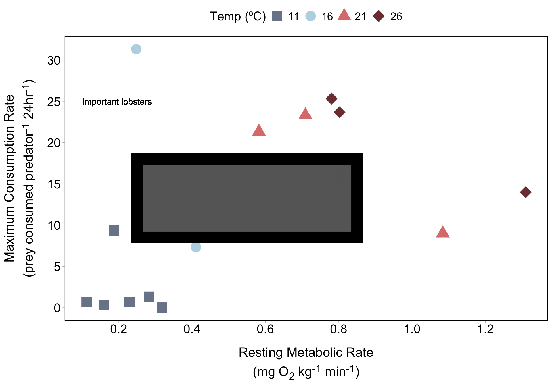
Notice that our text looks oddly blurry and bold, and our rectangle is opaque (despite adjusting alpha) and has a weird, thick border.
geom_text() inherits aesthetic mappings from ggplot()
Like all other geom_*() functions we’ve worked with, geom_text() (and related geoms) take aesthetic mappings. You can either define aes() within the geom, or it’ll inherit global mappings from ggplot() (as in our case).
Here, geom_text() is plotting our label (Important lobsters) and box 22 times each (once for each of the 22 observations in our data frame).
tibble [22 × 7] (S3: tbl_df/tbl/data.frame)
 $ lobster_id: chr [1:22] "N18" "L4" "N14" "L3" ...
 $ temp      : Factor w/ 4 levels "11","16","21",..: 3 3 3 3 3 3 1 1 1 1 ...
 $ SMR       : num [1:22] 0.709 0.551 0.582 1.084 0.575 ...
 $ MMR       : num [1:22] 4.5 3.75 5.64 4.66 4.85 ...
 $ AAS       : num [1:22] 3.79 3.2 5.06 3.58 4.28 ...
 $ FAS       : num [1:22] 6.35 6.81 9.69 4.3 8.44 ...
$ avg_eaten : num [1:22] 23.3 11 21.3 9 14.3 ...This is exactly the situation annotate() was made for
Alternatively, annotate() requires that we define a geom type (e.g. "text", "rect"). We’ll also omit the show.lengend argument, since annotate() doesn’t produce a legend.
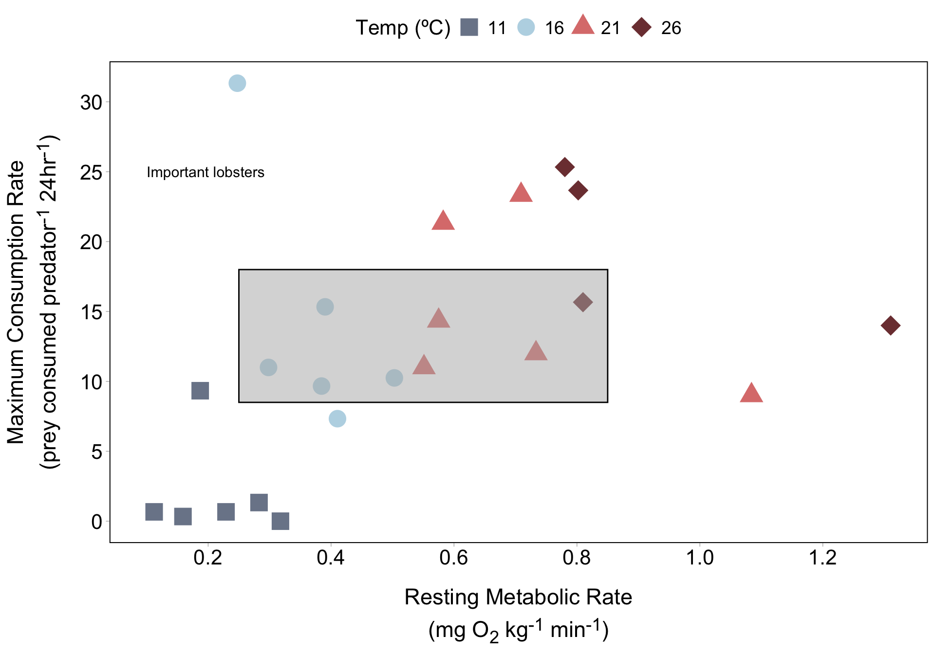
Note: Determining coordinates for any annotation requires a lot of trial and error. Pick values that you think are close and then tweak from there.
Draw an arrow between our label and rectangle
We can specify the "curve" geom type to draw a curved line. Use the arrow argument + arrow() function to add an arrow tip on the end:
lob_plot +
  annotate(
    geom = "text",
    x = 0.1,
    y = 25,
    label = "Important lobsters",
    size = 4,
    color = "black",
    hjust = "inward"
  ) +
  annotate(
    geom = "rect",
    xmin = 0.25, xmax = 0.85,
    ymin = 8.5, ymax = 18,
    alpha = 0.5,
    fill = "gray70", color = "black"
) +
annotate(
geom = "curve",
x = 0.3, xend = 0.5,
y = 23.8, yend = 19,
curvature = -0.15,
arrow = arrow(length = unit(0.3, "cm"))
)
Use geom_text/label() to annotate each point
geom_text() adds plain text
Annotations sit on top of data points, which may be undesirable…
Use {ggrepel} to repel annotations
geom_text() adds plain text
Manually label just a few important points
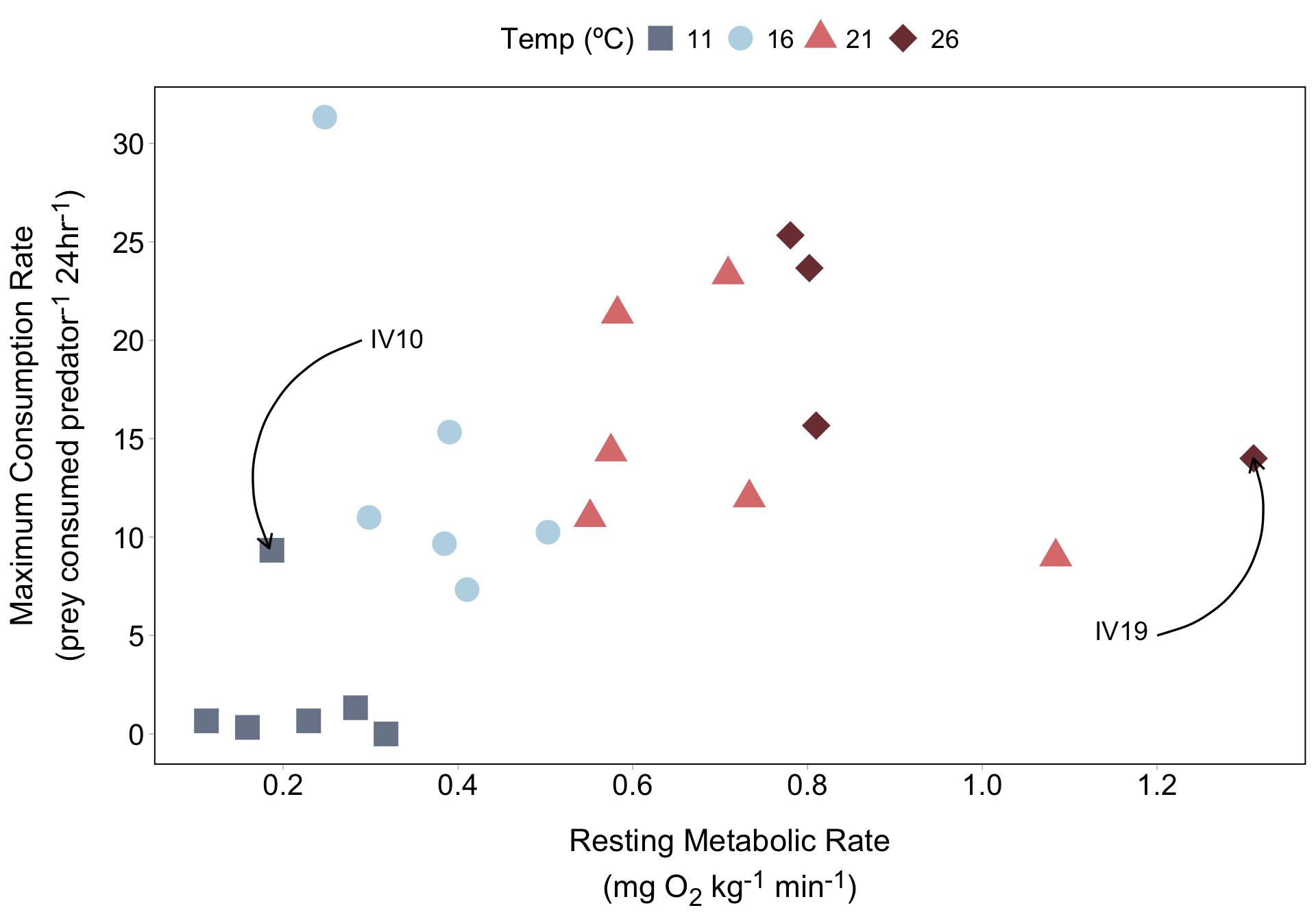
If we have just a few lobsters that we want to call attention to, we can use annotate() to label them. Let’s start with lobster IV10:
Manually label just a few important points
Your turn! Create another text label and arrow pointing to lobster IV19 (the farthest dark red diamond to the right). You don’t need to choose this exact location for your text and arrow:
05:00
Manually label just a few important points
A solution (you may have chosen a different placement for your text and arrow):
lob_plot +
  annotate(
    geom = "text",
    x = 0.3, y = 20.1,
    label = "IV10",
    hjust = "left",
    size = 5
    ) +
  annotate(
    geom = "curve",
    x = 0.29, xend = 0.184,
    y = 20, yend = 9.43,
    arrow = arrow(length = unit(0.3, "cm")),
    linewidth = 0.6
) +
annotate(
geom = "text",
x = 1.19,
y = 5.25,
label = "IV19",
hjust = "right",
size = 5
) +
annotate(
geom = "curve",
x = 1.2, xend = 1.31,
y = 5, yend = 14,
arrow = arrow(length = unit(0.3, "cm")),
linewidth = 0.6
)
Mono Lake plot starter code
##~~~~~~~~~~~~~~~~~~~~~~~~~~~~~~~~~~~~~~~~~~~~~~~~~~~~~~~~~~~~~~~~~~~~~~~~~~~~~~
##                                    setup                                 ----
##~~~~~~~~~~~~~~~~~~~~~~~~~~~~~~~~~~~~~~~~~~~~~~~~~~~~~~~~~~~~~~~~~~~~~~~~~~~~~~

#.........................load libraries.........................
library(tidyverse)

#..........................read in data..........................

# read in Google Sheet ----
mono <- googlesheets4::read_sheet("https://docs.google.com/spreadsheets/d/1o0-89RFp2rI2y8hMQWy-kquf_VIzidmhmVDXQ02JjCA/edit#gid=164128885")

# alternatively, read in csv ----
# mono <- read_csv(here::here("week6", "data", "mono.csv"))

##~~~~~~~~~~~~~~~~~~~~~~~~~~~~~~~~~~~~~~~~~~~~~~~~~~~~~~~~~~~~~~~~~~~~~~~~~~~~~~
##                            create Mono Lake plot                         ----
##~~~~~~~~~~~~~~~~~~~~~~~~~~~~~~~~~~~~~~~~~~~~~~~~~~~~~~~~~~~~~~~~~~~~~~~~~~~~~~

ggplot(data = mono, aes(x = year, y = lake_level)) +
  geom_line() +
  labs(x = "\nYear",
       y = "Lake surface level\n(feet above sea level)\n",
       title = "Mono Lake levels (1850 - 2017)\n",
       caption = "Data: Mono Basin Clearinghouse") +
  scale_x_continuous(limits = c(1850, 2020),
                     expand = c(0,0),
                     breaks = seq(1850, 2010, by = 20)) +
  scale_y_continuous(limits = c(6350, 6440),
                     breaks = c(6370, 6400, 6430),
                     expand = c(0,0),
                     labels = scales::label_comma()) +
  theme_light() +
  theme(
    plot.title.position = "plot",
    plot.title = element_text(size = 16),
    axis.title = element_text(size = 12),
    axis.text = element_text(size = 10),
    plot.caption = element_text(face = "italic")
    )
Highlight years of interest
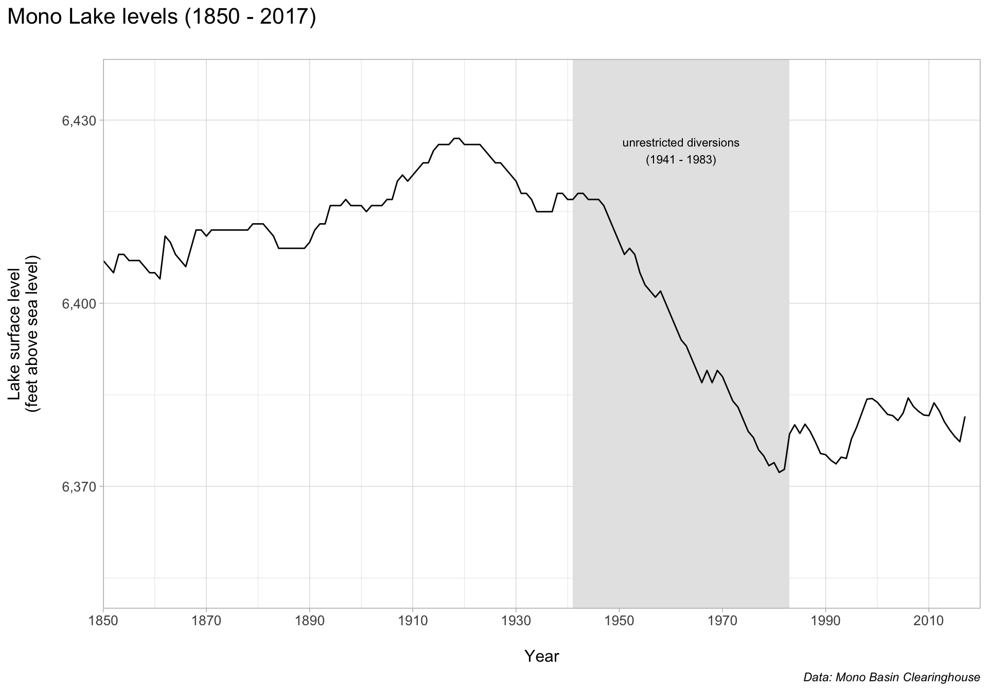
Let’s say we want to call particular attention to the sharp decline in lake surface level between 1941 - 1983 as a result of unrestricted water diversions. Let’s do so using annotate() (note the order of our annotation layers matters!).
ggplot(data = mono, aes(x = year, y = lake_level)) +
  annotate(
    geom = "rect",
    xmin = 1941, xmax = 1983,
    ymin = 6350, ymax = 6440,
    fill = "gray90"
  ) +
  annotate(
    geom = "text",
    x = 1962, y = 6425,
    label = "unrestricted diversions\n(1941 - 1983)",
    size = 3
  ) +
  geom_line() +
  labs(x = "\nYear",
       y = "Lake surface level\n(feet above sea level)\n",
       title = "Mono Lake levels (1850 - 2017)\n",
       caption = "Data: Mono Basin Clearinghouse") +
  scale_x_continuous(limits = c(1850, 2020),
                     expand = c(0,0),
                     breaks = seq(1850, 2010, by = 20)) +
  scale_y_continuous(limits = c(6350, 6440),
                     breaks = c(6370, 6400, 6430),
                     expand = c(0,0),
                     labels = scales::label_comma()) +
  theme_light() +
  theme(
    plot.title.position = "plot",
    plot.title = element_text(size = 16),
    axis.title = element_text(size = 12),
    axis.text = element_text(size = 10),
    plot.caption = element_text(face = "italic")
    )
Add other important context
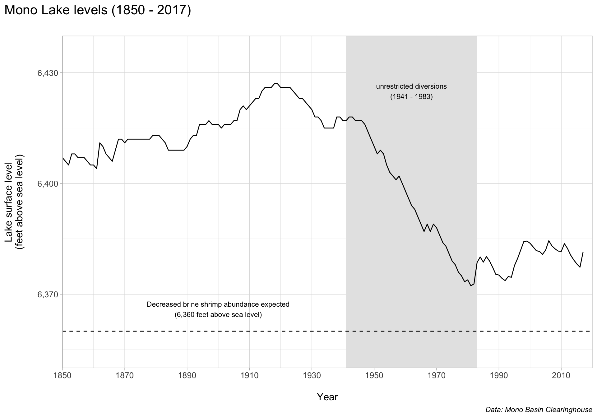
Mono Lake’s brine shrimp provide food for millions of migratory birds. Abundances are expected to decline if water levels drop below 6,360 feet above sea level. We can provide context by adding a benchmark line and text.
ggplot(data = mono, aes(x = year, y = lake_level)) +
  annotate(
    geom = "rect",
    xmin = 1941, xmax = 1983,
    ymin = 6350, ymax = 6440,
    fill = "gray90"
  ) +
  annotate(
    geom = "text",
    x = 1962, y = 6425,
    label = "unrestricted diversions\n(1941 - 1983)",
    size = 3
  ) +
  geom_line() +
  labs(x = "\nYear",
       y = "Lake surface level\n(feet above sea level)\n",
       title = "Mono Lake levels (1850 - 2017)\n",
       caption = "Data: Mono Basin Clearinghouse") +
  scale_x_continuous(limits = c(1850, 2020),
                     expand = c(0,0),
                     breaks = seq(1850, 2010, by = 20)) +
  scale_y_continuous(limits = c(6350, 6440),
                     breaks = c(6370, 6400, 6430),
                     expand = c(0,0),
                     labels = scales::label_comma()) +
  geom_hline(yintercept = 6360,
             linetype = "dashed") +
  annotate(
    geom = "text",
    x = 1900, y = 6366,
    label = "Decreased brine shrimp abundance expected\n(6,360 feet above sea level)",
    size = 3
    ) +
  theme_light() +
  theme(
    plot.title.position = "plot",
    plot.title = element_text(size = 16),
    axis.title = element_text(size = 12),
    axis.text = element_text(size = 10),
    plot.caption = element_text(face = "italic")
    )
Keep these additional tips, tools & tutorials in mind!
Tools & packages:
use clip = "off" inside a coord_*() function to allow drawing outside the plot panel (see this tweet for one example)
the {ggfittext} package is a ggplot2 extension for fitting text into boxes
the {ggtext} package includes two geoms for annotating plots, geom_richtext() & geom_textbox() – both permit Markdown styling
the {ggforce} package has so many awesome functions, including a series of annotation functions (e.g. check out geom_mark_ellipse(), demoed in lecture 5.1), and facet_zoom(), for zooming into a subset of data; Tuo Wang also has some great examples in this blog post
Tutorials:
Level Up Your Labels: Tips and Tricks for Annotating Plots, by Cara Thompson
Recreating the Storytelling with Data look with ggplot, by Albert Rapp
4 Ways to use colors in ggplot more efficiently, by Albert Rapp (includes some great annotation examples)
See you next week!
~ This is the end of Lesson 2 (of 2) ~