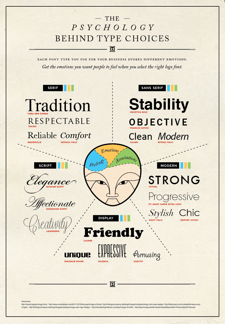
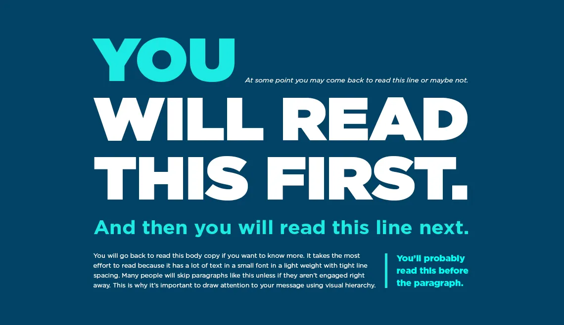
Typefaces and fonts communicate beyond more than just the written text – they can evoke emotions and can be used to better connect your audience with your work.
What typography choices did the author(s) of this visualization make? With you learning partner(s), consider all the various pieces of text on this visualization:
02:00
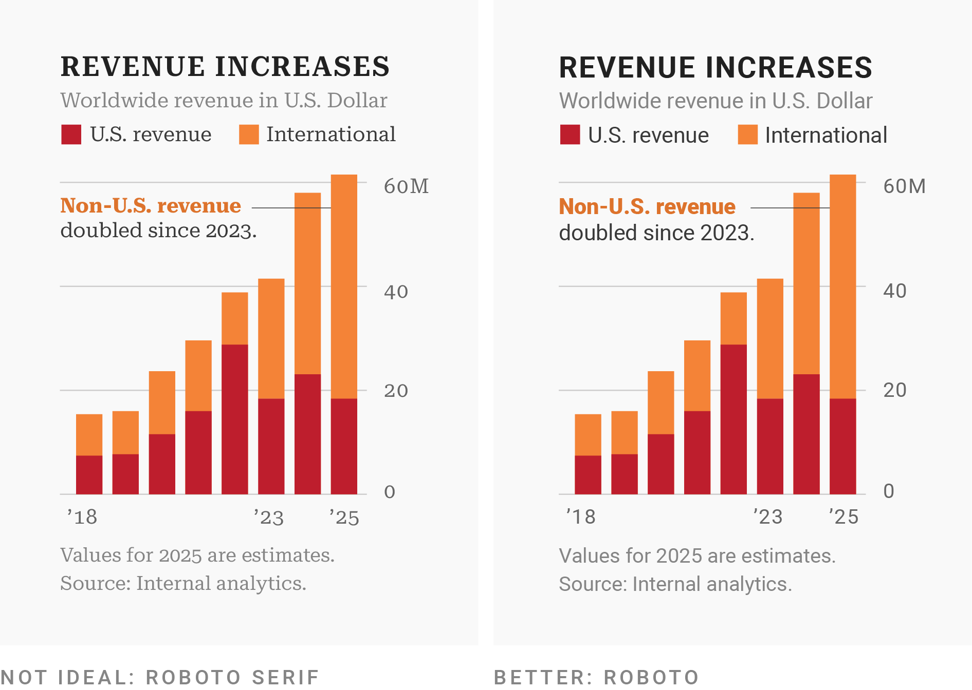
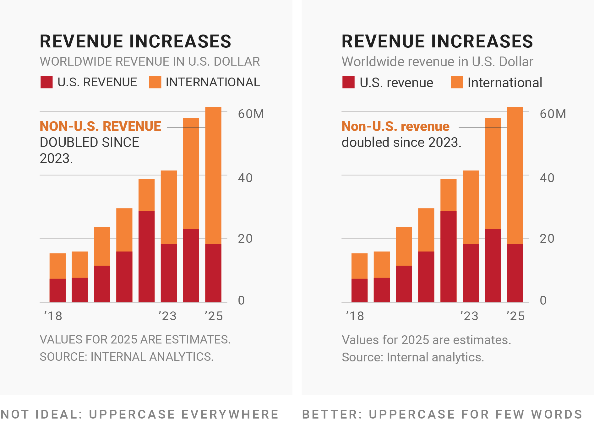
When in doubt, use sans-serif fonts
Serif fonts have small decorative lines (aka “tails” or “feet”) that extend off characters while sans serif fonts don’t.
Serif fonts = classy / traditional / professional / serious tone; typically only used for visualization headlines
If your organization uses a serif font, consider using it in your visualization’s headline
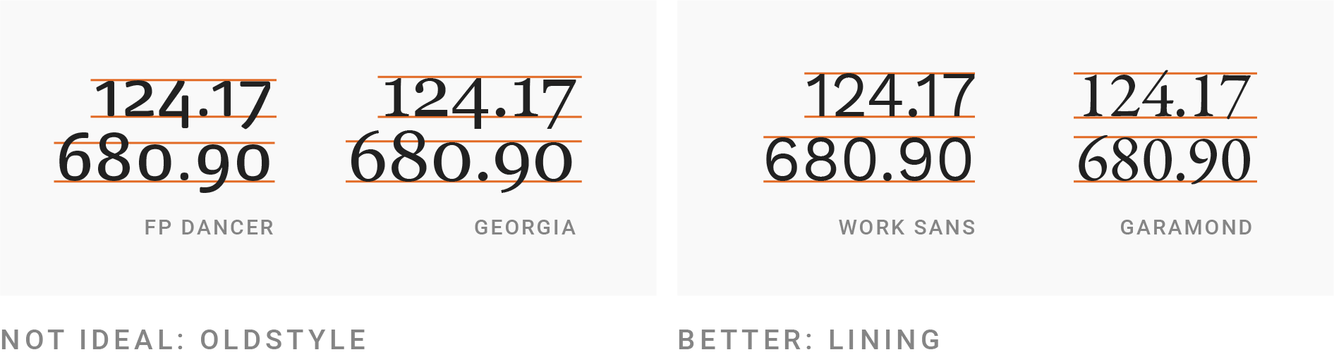
Use a typeface with lining figures for numerals
Different typefaces display numbers differently. Serif fonts tend to have “oldstyle figures”, which extend above and below the “line” – these can be difficult to read in a visualization.
Instead, look for options with lining figures, where numbers “line up”, i.e. they’re all the same height.
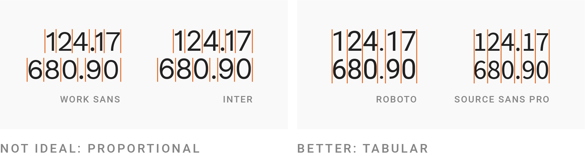
Use a monospaced typeface for numerals
Typefaces with tabular figures print every character with equal width – you may see these referred to as monospaced typefaces. These work well in tables, visualizations, or any scenario where figures should line up vertically (see how you can quickly identify how many figures a number has in the table on the right, below).
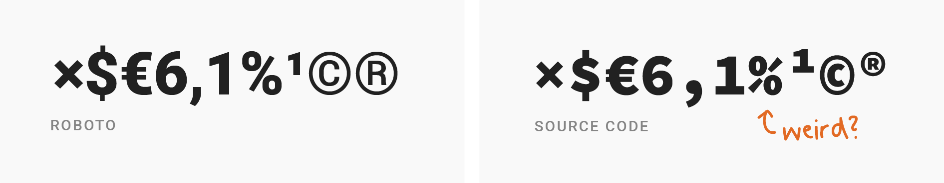
Use a typeface with all the symbols you need
Confirm that all symbols (aka glyphs) that you need exist and that they look good for your chosen typeface.
Consider special characters for different languages, currency symbols, math symbols, reference marks, sub / superscript numbers, etc.
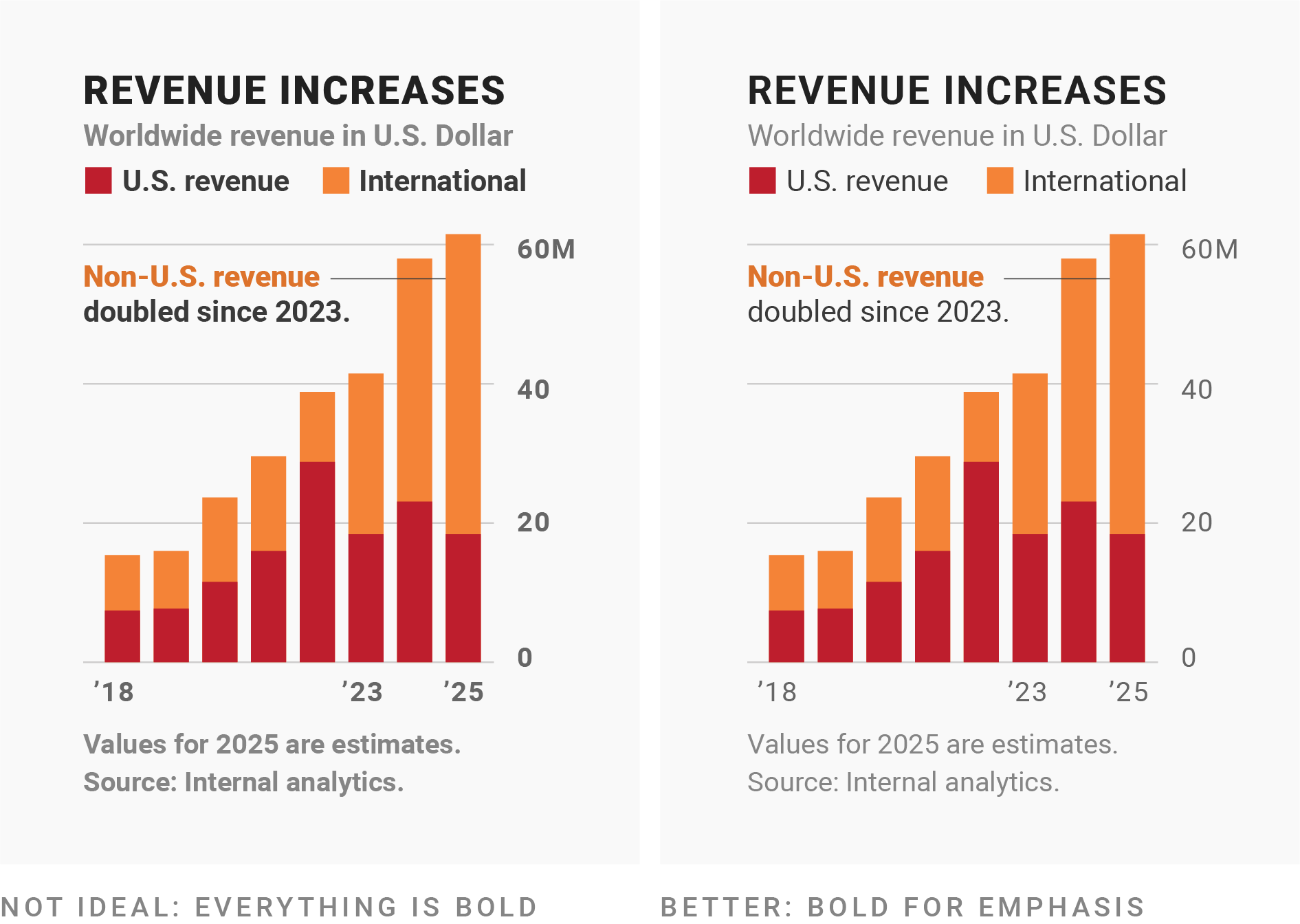
Use bold fonts for emphasis only
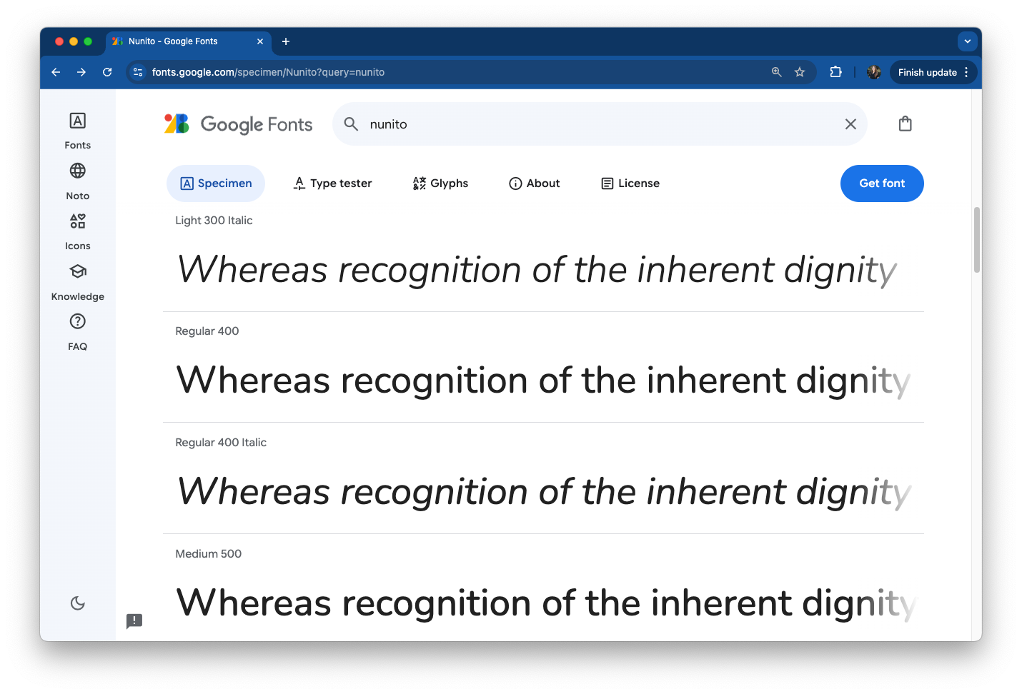
Most typefaces come with fonts for different weights (Google Fonts uses numbers for font weights – extra light (200), light (300), regular (400, default), medium (500), semi bold (600), bold (700), extra bold (800)).
Use bold text for titles or to emphasize a few words in annotations. Regular or medium weights are often easiest for longer text (descriptions, annotations, notes).
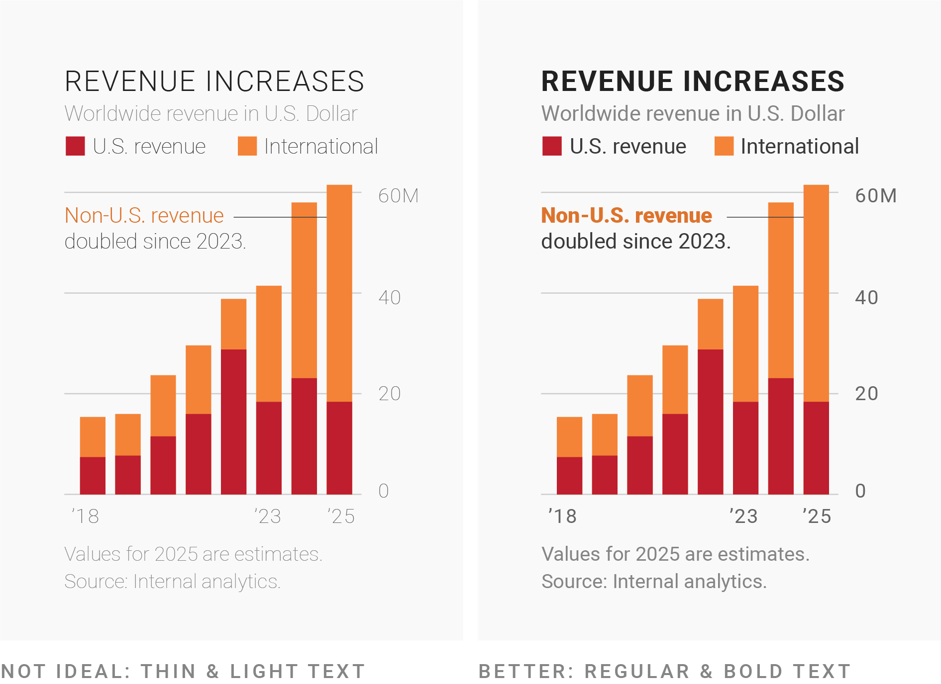
Avoid really thin fonts
Thin (light-weight fonts) fonts are hard to read. Only use them in a high-contrast color and in large sizes (e.g. for titles).
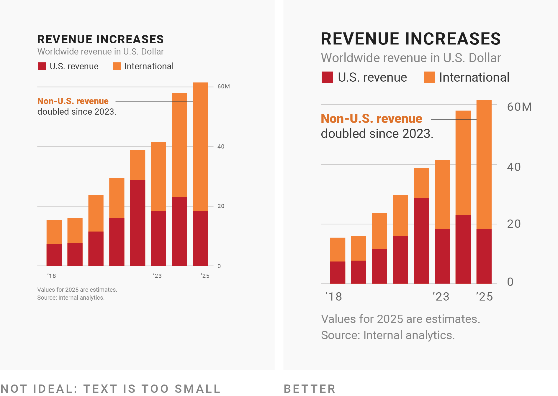
Ensure your font size is large enough
Make sure your font size is large enough, especially when presenting visualizations in a slide-based presentation (this oftentimes means increasing it larger than you would have it in print). In ggplot, adjust font sizes using theme().
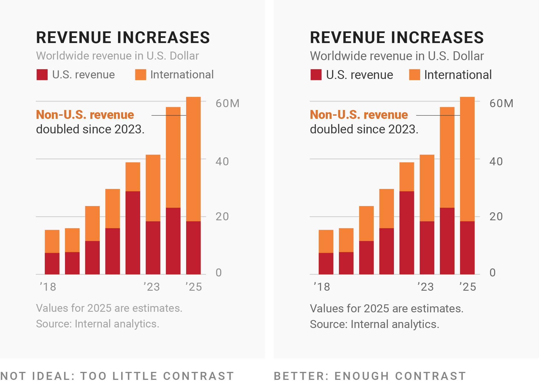
No one wants to read a wall of text. You can use font size, style, color, spacing, and typeface (or combinations of these) to create a hierarchy that guide your readers.
Let’s learn how to use different fonts in our ggplots!
The problem with system fonts
A system font is one that’s already assumed to be on the vast majority of users’ devices, with no need for a web font to be downloaded.
There are only three system fonts that are guaranteed to work everywhere: sans (the default), serif, or mono. Use the family argument to specify which font family you’d like to use for a particular text element, and use the face argument to specify font face (bold, italic, plain (default)):
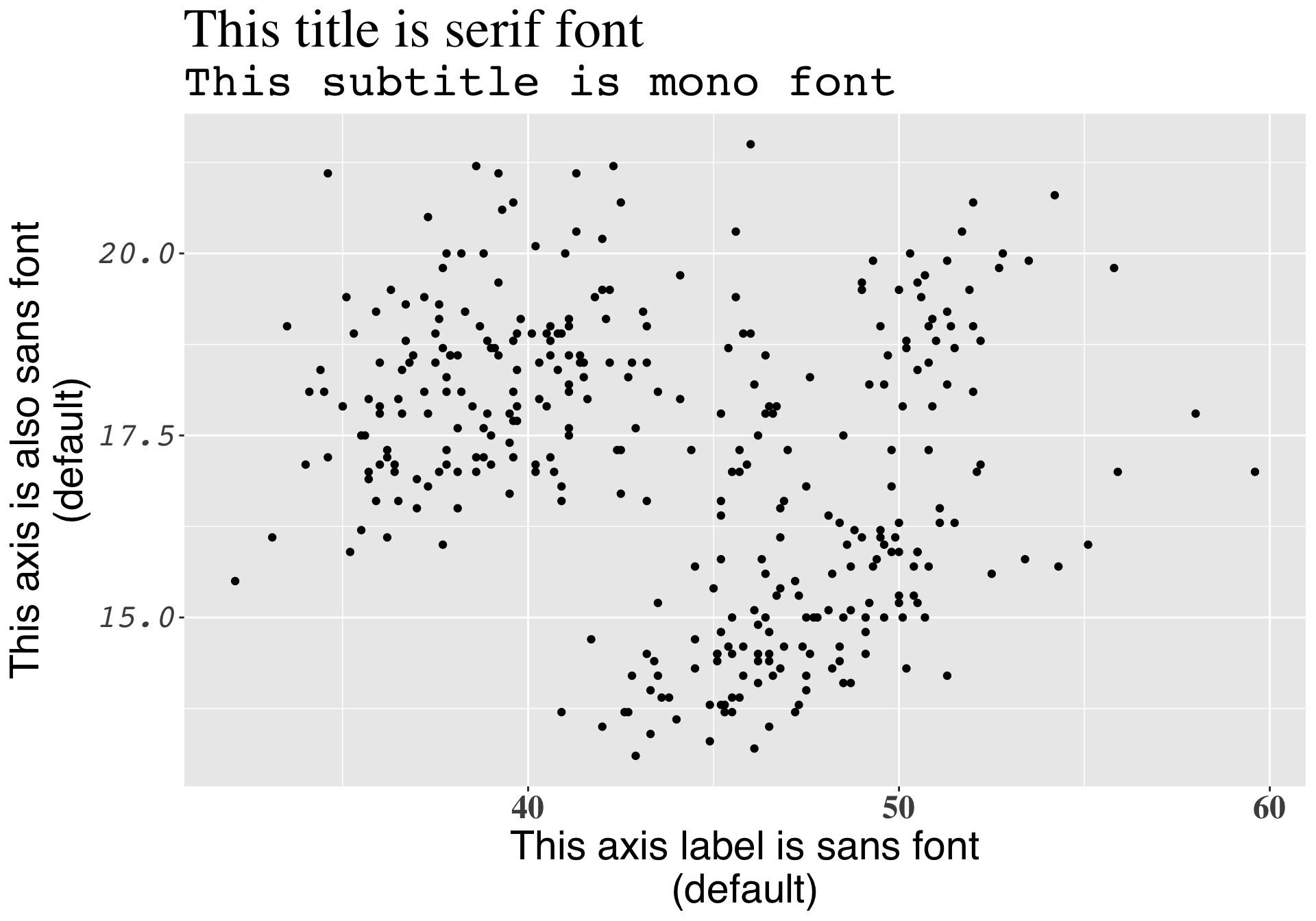
library(palmerpenguins)library(tidyverse)ggplot(penguins, aes(x = bill_length_mm, y = bill_depth_mm)) +geom_point() +labs(title ="This title is serif font",subtitle ="This subtitle is mono font",x ="This axis label is sans font\n(default)",y ="This axis is also sans font\n(default)") +theme(plot.title =element_text(family ="serif", size =30),plot.subtitle =element_text(family ="mono", size =25),axis.title =element_text(family ="sans", size =22),axis.text.x =element_text(family ="serif", face ="bold", size =18),axis.text.y =element_text(family ="mono", face ="italic", size =18) )
The problem with system fonts
A graphics device (GD) is something used to make a plot appear – every time you create a plot in R, it needs to be sent to a specific GD to be rendered. There are two main device types:
screen devices: the most common place for your plot to be “sent” – whenever our plot appears in a window on our computer screen, it’s being sent to a screen device; different operating systems (e.g. Mac, Windows, Linux) have different screen devices
file devices: if we want to write (i.e. save) our plot to a file, we can send our plot to a particular file device (e.g. pdf, png, jpeg)
Unfortunately, text drawing is handled differently by each graphics device, which means that if we want a font to work everywhere, we need to configure all these different devices in different ways.
R packages to the rescue!
Fortunately, there are a couple super handy packages that make working with fonts a little bit easier:
We’ll be using {showtext} for a couple reasons: it supports more file formats and more graphics devices, and it also avoids using external software ({extrafont} requires that you install some additional software and packages first). {showtext} makes is easy to import and use Google Fonts.
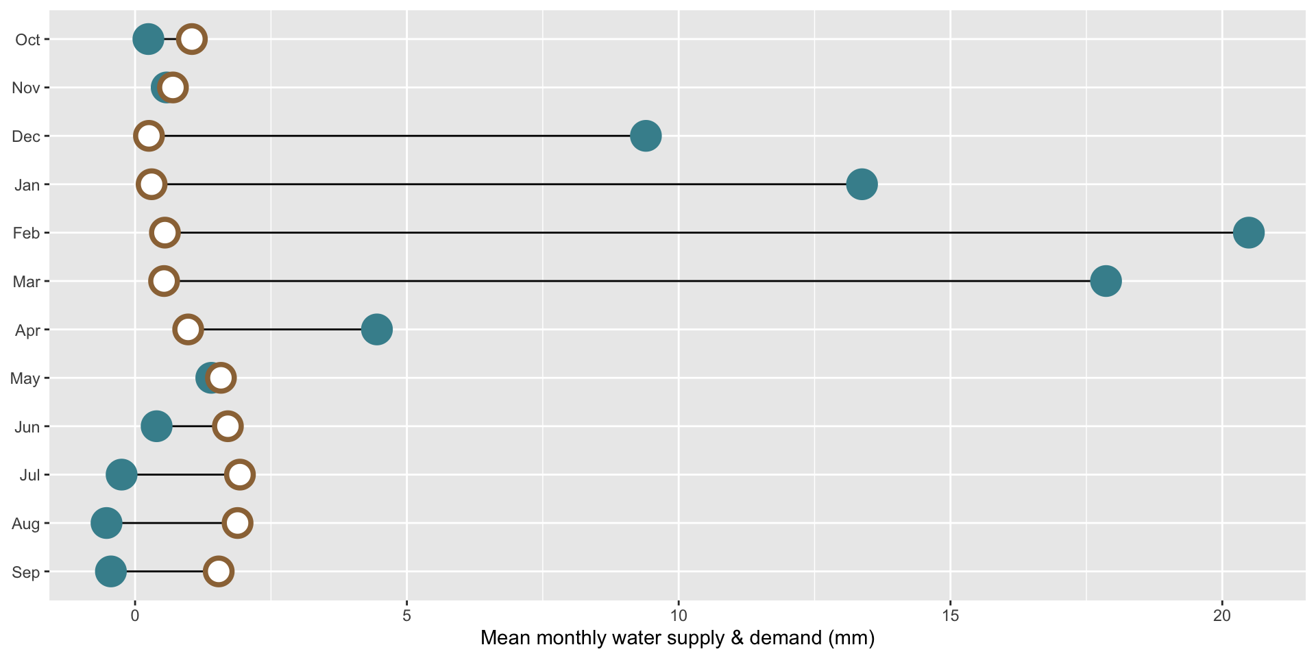
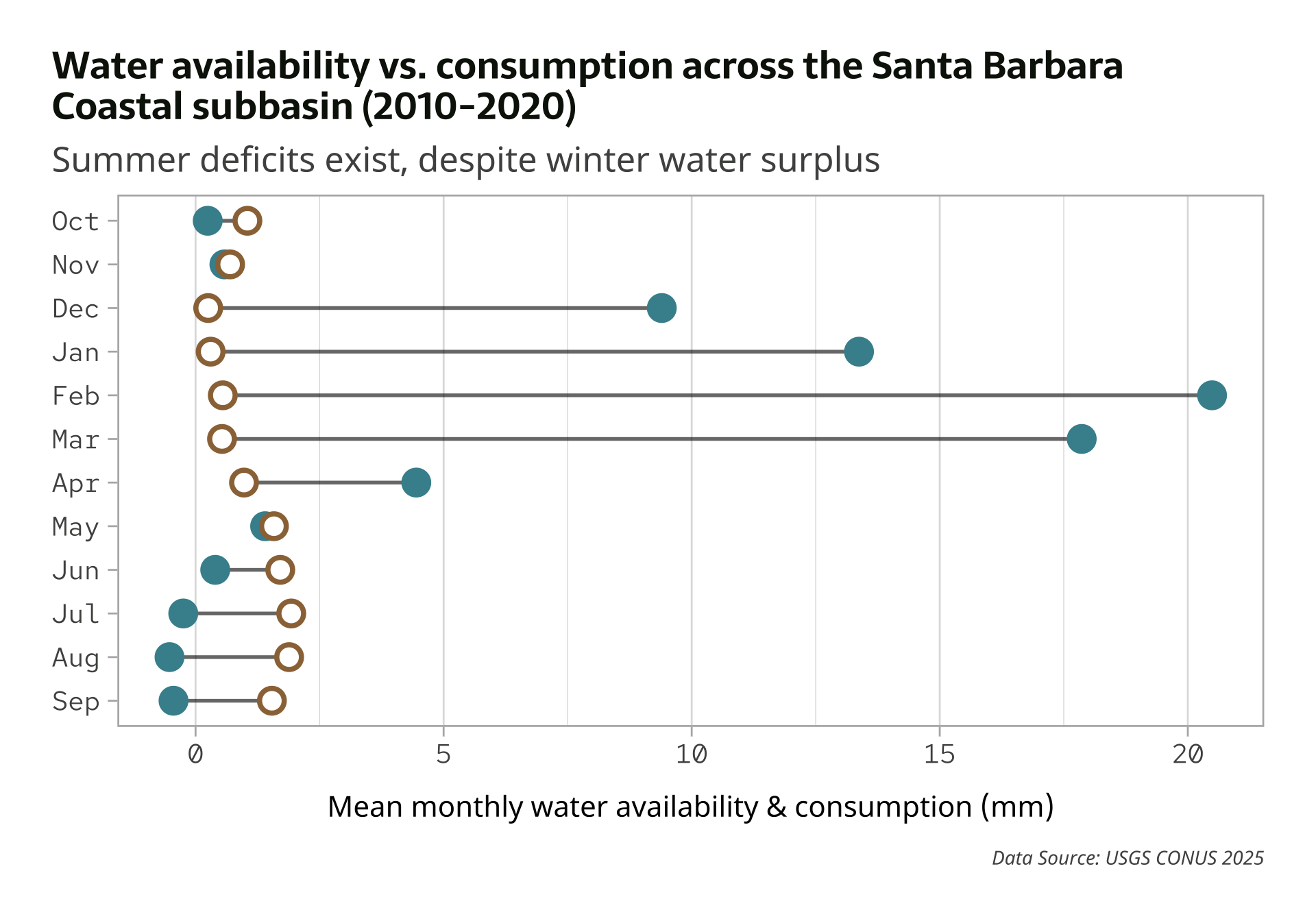
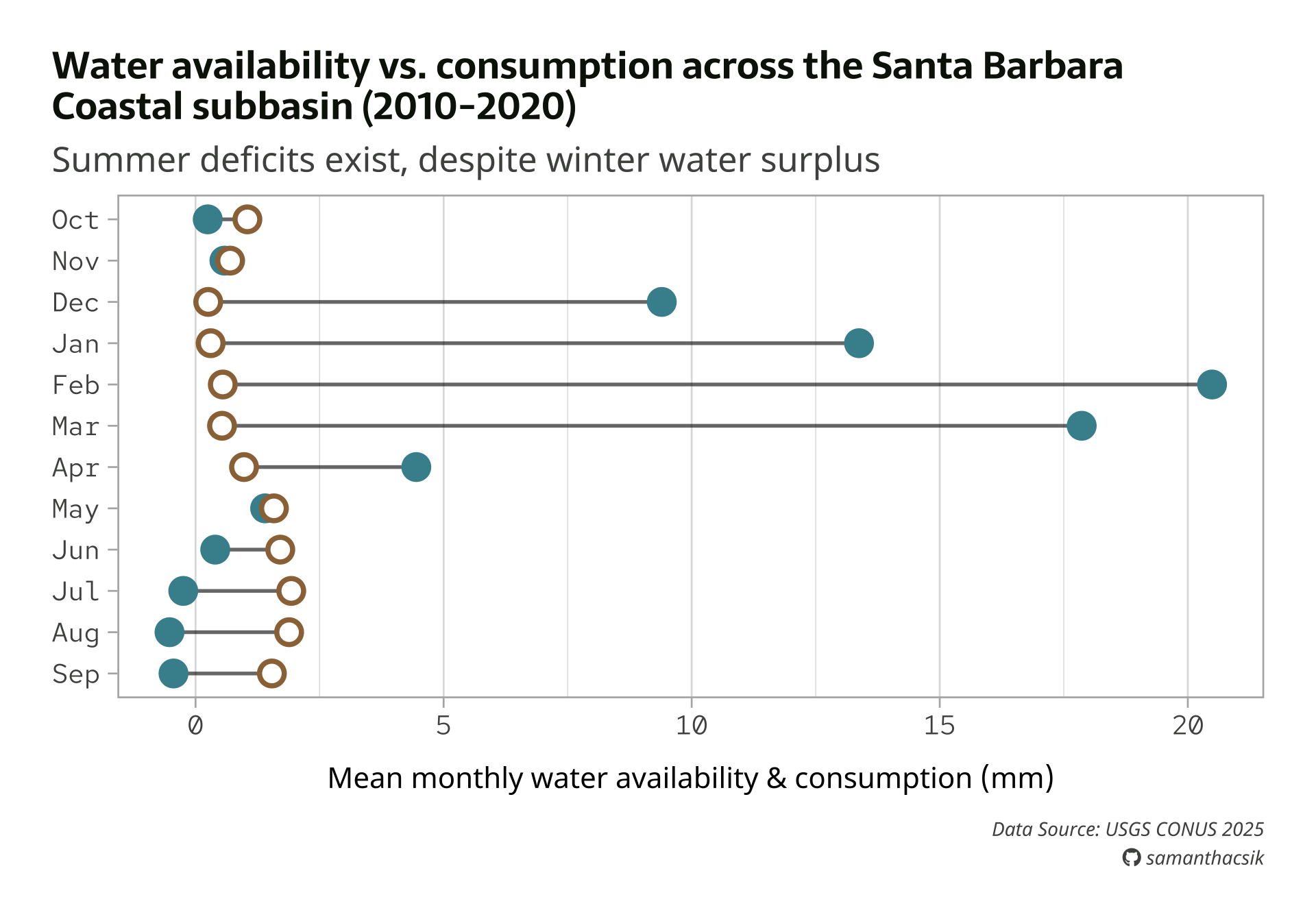
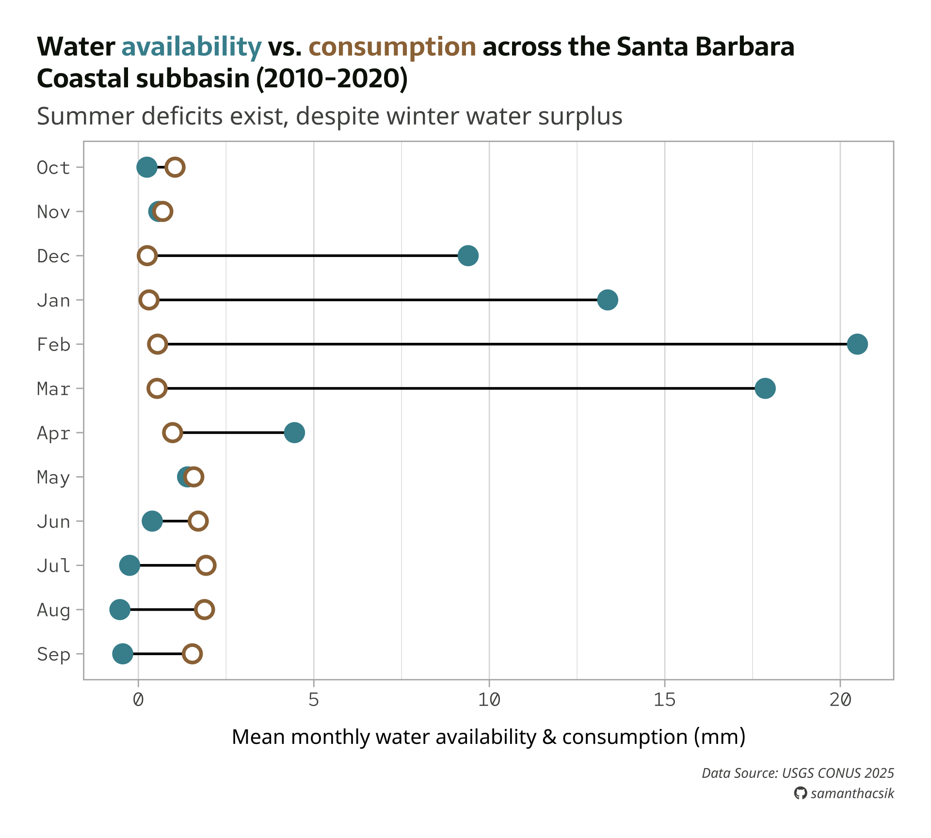
Recall our dumbbell plot from the amounts / rankings lecture
Let’s improve this plot by adding text, modifying the theme, and using some new fonts!
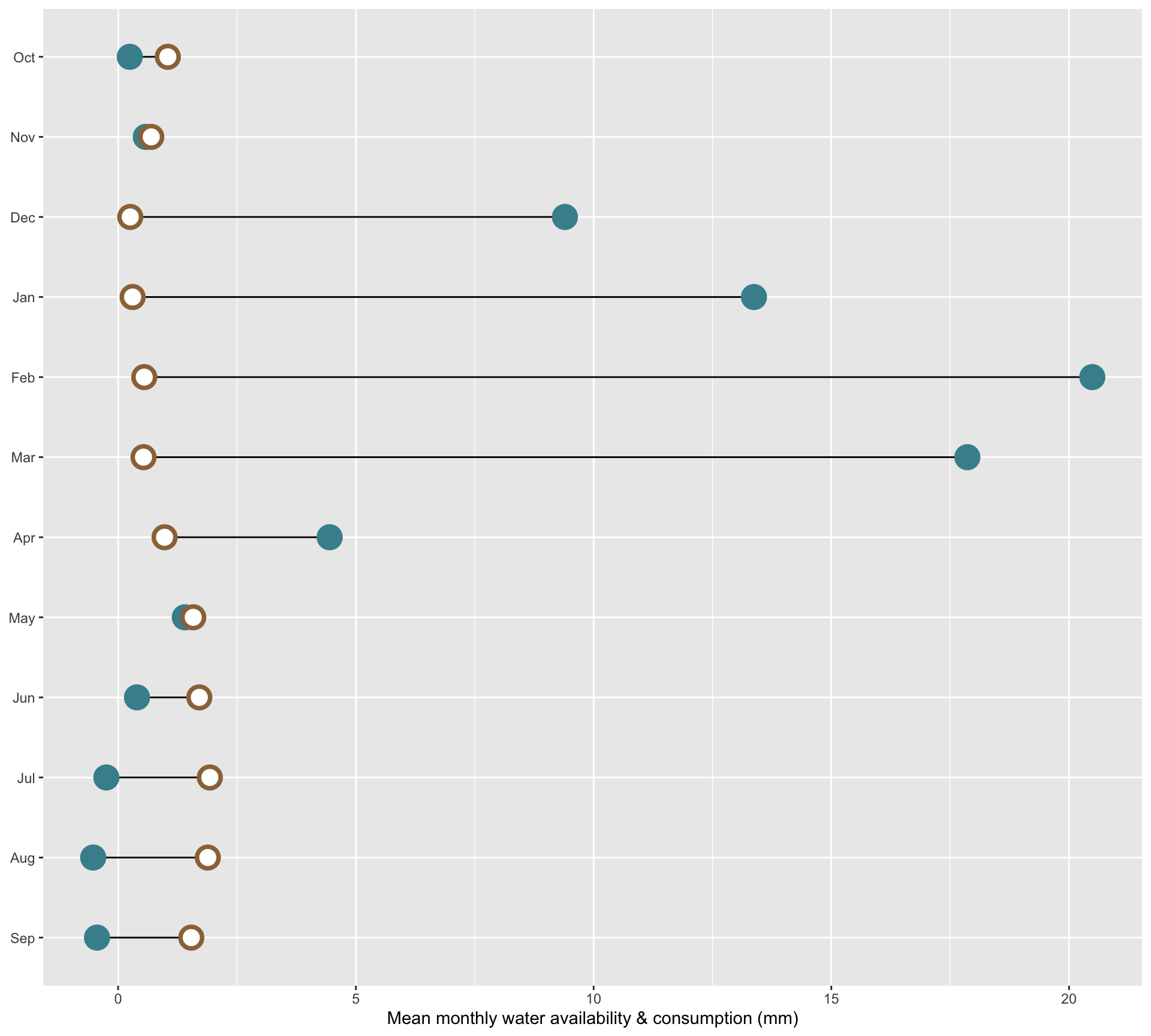
##~~~~~~~~~~~~~~~~~~~~~~~~~~~~~~~~~~~~~~~~~~~~~~~~~~~~~~~~~~~~~~~~~~~~~~~~~~~~~~## setup ----##~~~~~~~~~~~~~~~~~~~~~~~~~~~~~~~~~~~~~~~~~~~~~~~~~~~~~~~~~~~~~~~~~~~~~~~~~~~~~~#..........................load packages.........................library(tidyverse)library(janitor)#..........................import data...........................iwa_data <-read_csv(here::here("week3", "data", "combined_iwa-assessment-outputs-conus-2025_CONUS_200910-202009_long.csv"))#..................create df of subregions names.................# data only contain HUC codes; must manually join names if we want to include those in our viz (which we do! we'll mainly be looking at CA subregions)# subregions (& others) identified in: https://water.usgs.gov/GIS/wbd_huc8.pdf# there may be a downloadable dataset containing HUCs & names out there...but I couldn't find itsubregion_names <-tribble(~subregion_HUC, ~subregion_name,"1801", "Klamath-Northern California Coastal","1802", "Sacramento","1803", "Tulare-Buena Vista Lakes","1804", "San Joaquin","1805", "San Francisco Bay","1806", "Central California Coastal","1807", "Southern California Coastal","1808", "North Lahontan", "1809", "Northern Mojave-Mono Lake","1810", "Southern Mojave-Salton Sea",)##~~~~~~~~~~~~~~~~~~~~~~~~~~~~~~~~~~~~~~~~~~~~~~~~~~~~~~~~~~~~~~~~~~~~~~~~~~~~~~## wrangle data ----##~~~~~~~~~~~~~~~~~~~~~~~~~~~~~~~~~~~~~~~~~~~~~~~~~~~~~~~~~~~~~~~~~~~~~~~~~~~~~~#......create df with just CA water resource region (HUC 18).....ca_region <- iwa_data |>clean_names() |>mutate(region_HUC =str_sub(string = huc12_id, start =1, end =2),subregion_HUC =str_sub(string = huc12_id, start =1, end =4)) |>filter(region_HUC =="18") |>separate_wider_delim(cols = year_month,delim ="-",names =c("year", "month")) |>mutate(year =as.numeric(year),month =as.numeric(month)) |>left_join(subregion_names) |>select(year, month, huc12_id, region_HUC, subregion_HUC, subregion_name, availab_mm_mo, consum_mm_mo, sui_frac)#.................create df of just SBC subbasin.................sbc_subbasin_monthly <- ca_region |>mutate(subbasin_HUC =str_sub(string = huc12_id, start =1, end =8)) |>filter(subbasin_HUC =="18060013") |>#group_by(month) |>summarize(mean_avail =mean(availab_mm_mo, na.rm =TRUE),mean_consum =mean(consum_mm_mo, na.rm =TRUE)) |>mutate(month = month.abb[month],month =factor(month, levels =rev(c(month.abb[10:12], month.abb[1:9]))))
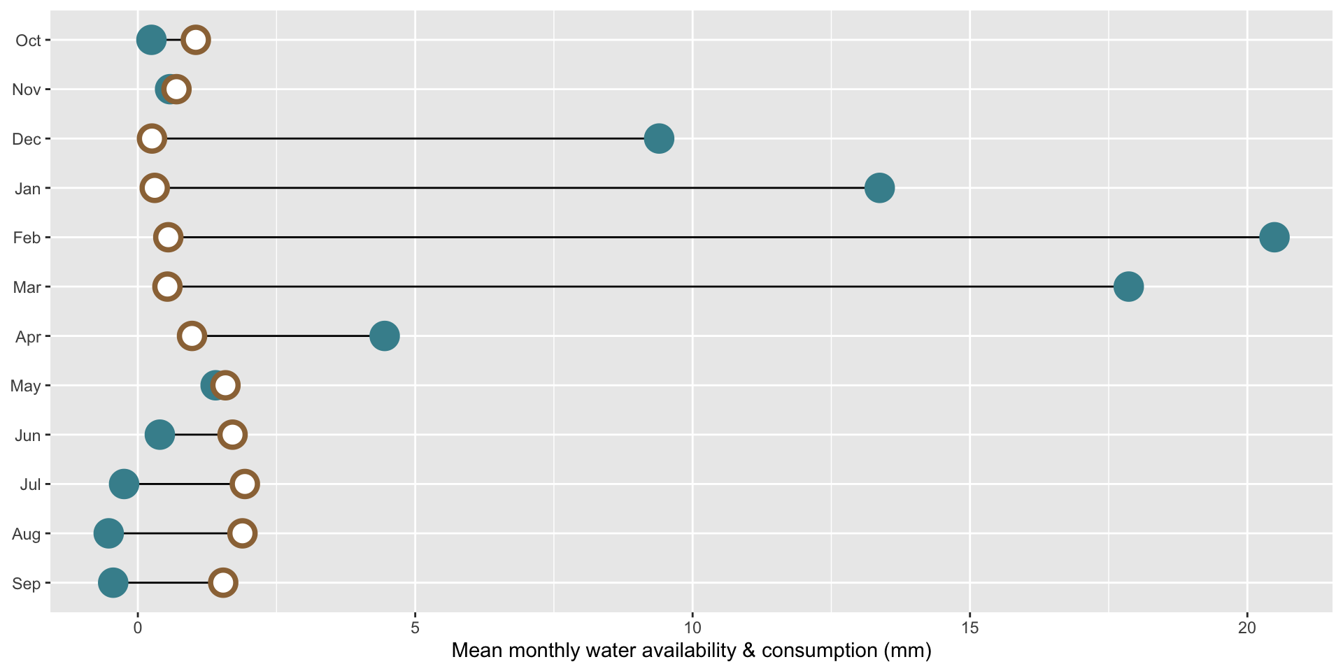
##~~~~~~~~~~~~~~~~~~~~~~~~~~~~~~~~~~~~~~~~~~~~~~~~~~~~~~~~~~~~~~~~~~~~~~~~~~~~~~## plot ----##~~~~~~~~~~~~~~~~~~~~~~~~~~~~~~~~~~~~~~~~~~~~~~~~~~~~~~~~~~~~~~~~~~~~~~~~~~~~~~ggplot(sbc_subbasin_monthly) +geom_linerange(aes(y = month,xmin = mean_consum, xmax = mean_avail)) +geom_point(aes(x = mean_avail, y = month), color ="#448F9C", size =5,stroke =2) +geom_point(aes(x = mean_consum, y = month), color ="#9C7344", fill ="white",shape =21,size =5,stroke =2) +labs(x ="Mean monthly water availability & consumption (mm)") +theme(axis.title.y =element_blank())
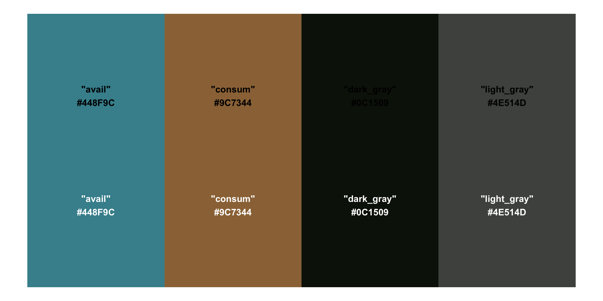
Create a named palette
Let’s create a named vector of colors to call from. In addition to our point colors, we’ll also include colors for our plot’s text:
pal <-c("avail"="#448F9C","consum"="#9C7344","dark_gray"="#0C1509","light_gray"="#4E514D")
The primary purpose of the {monochromeR} package is for creating monochrome color palettes, however, it also includes a helpful function for viewing our palette:
monochromeR::view_palette(pal)
Apply new colors by name
ggplot(sbc_subbasin_monthly) +geom_linerange(aes(y = month,xmin = mean_consum, xmax = mean_avail)) +geom_point(aes(x = mean_avail, y = month), color = pal["avail"], size =5,stroke =2) +geom_point(aes(x = mean_consum, y = month), color = pal["consum"], fill ="white",shape =21,size =5,stroke =2) +labs(x ="Mean monthly water availability & consumption (mm)") +theme(axis.title.y =element_blank())
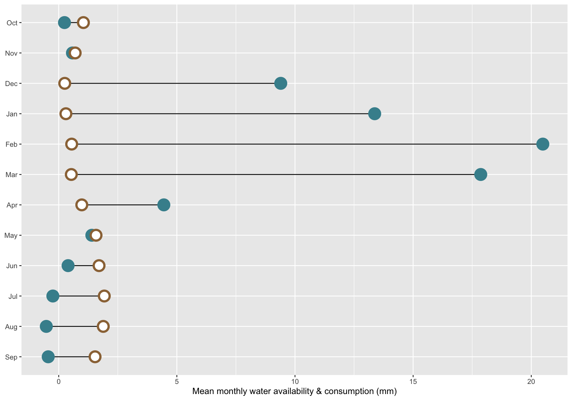
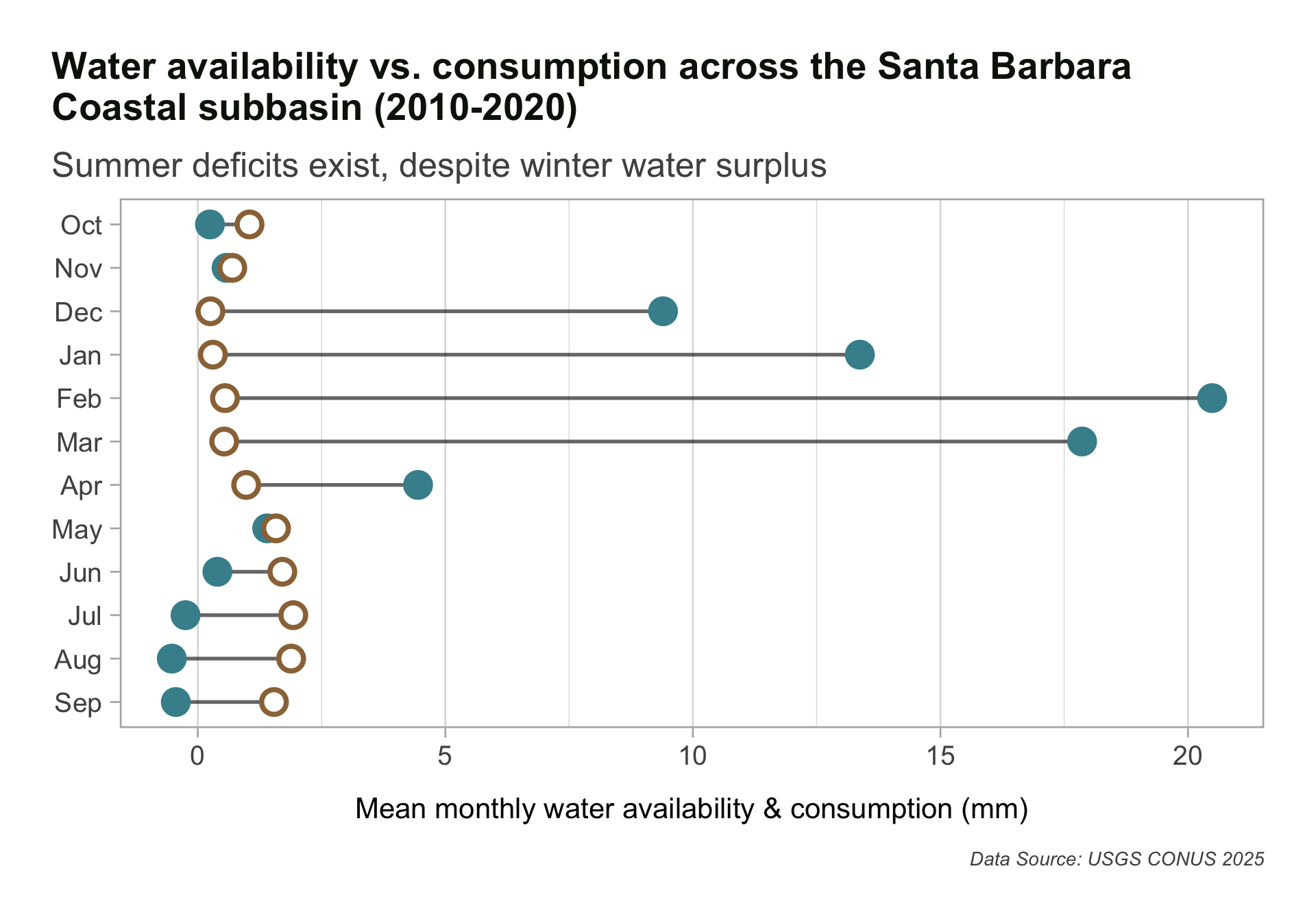
Add titles / caption & modify theme
Use relative font sizes within your theme! If you need to make your plot larger for a presentation, for example, you’ll just need to increase your base_size and all text scales proportionally. Resulting plot is rendered on next slide.
ggplot(sbc_subbasin_monthly) +geom_linerange(aes(y = month,xmin = mean_consum, xmax = mean_avail),alpha =0.6) +geom_point(aes(x = mean_avail, y = month), color = pal["avail"], size =5,stroke =2) +geom_point(aes(x = mean_consum, y = month), color = pal["consum"], fill ="white",shape =21,size =5,stroke =2) +labs(title ="Water availability vs. consumption across the Santa Barbara\nCoastal subbasin (2010-2020)",subtitle ="Summer deficits exist, despite winter water surplus",caption ="Data Source: USGS CONUS 2025",x ="Mean monthly water availability & consumption (mm)") +theme_light(base_size =17) +# set relative text sizes based on your defined `base_size`theme(plot.title.position ="plot",plot.title =element_text(face ="bold",size =rel(0.98),color = pal["dark_gray"]),plot.subtitle =element_text(size =rel(0.9),color = pal["light_gray"],margin =margin(b =8)), # you don't need to include arg names, so long as you list margin sizes in order (counterclockwise from top, e.g. `margin(0, 0, 8, 0)`)axis.text =element_text(size =rel(0.7),color = pal["light_gray"]),axis.title.x =element_text(size =rel(0.75),margin =margin(t =15)),axis.title.y =element_blank(),plot.caption =element_text(face ="italic",size =rel(0.5),color = pal["light_gray"],margin =margin(t =15)),panel.grid.major.y =element_blank(),plot.margin =margin(t =1, r =1, b =1, l =1, "cm") )
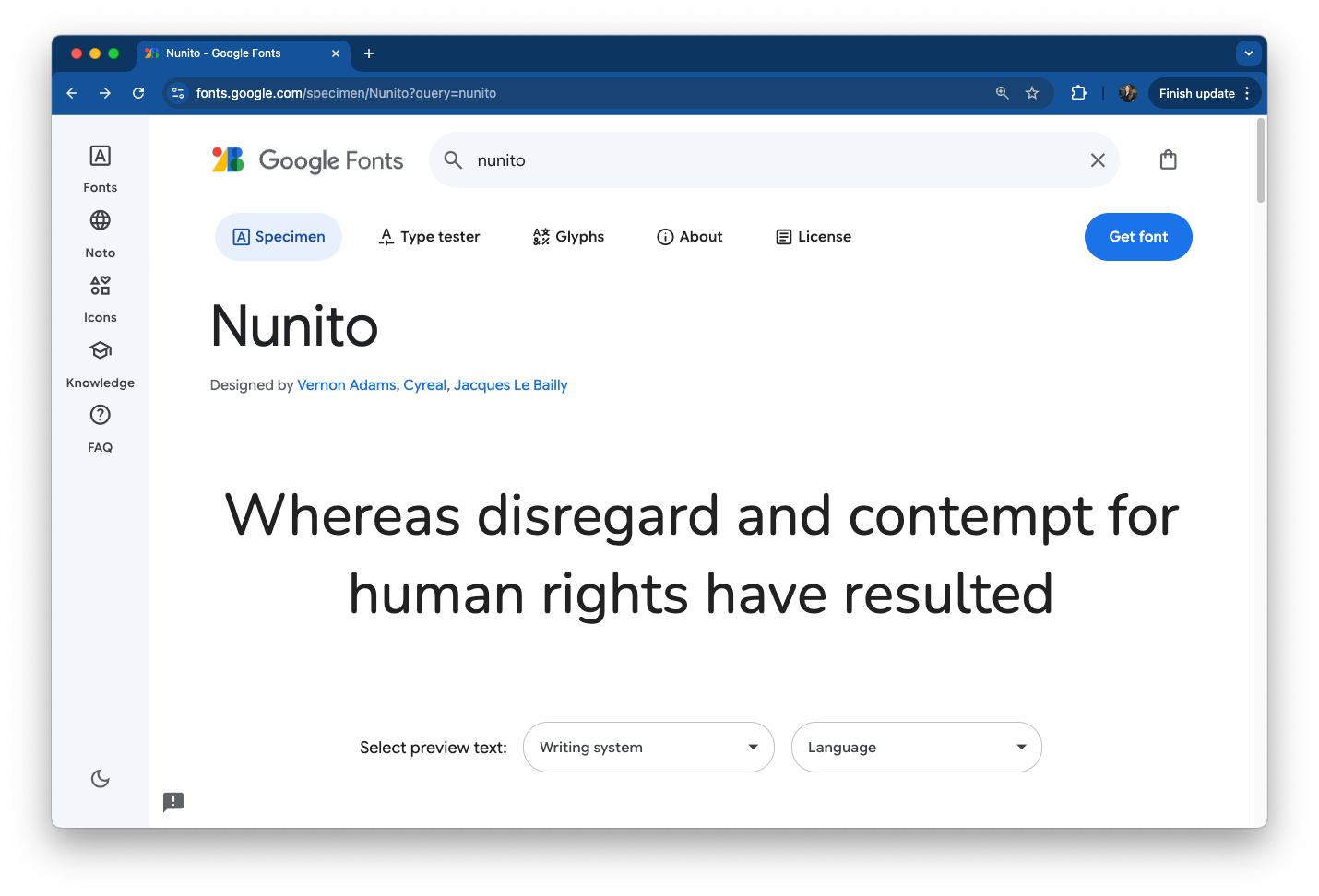
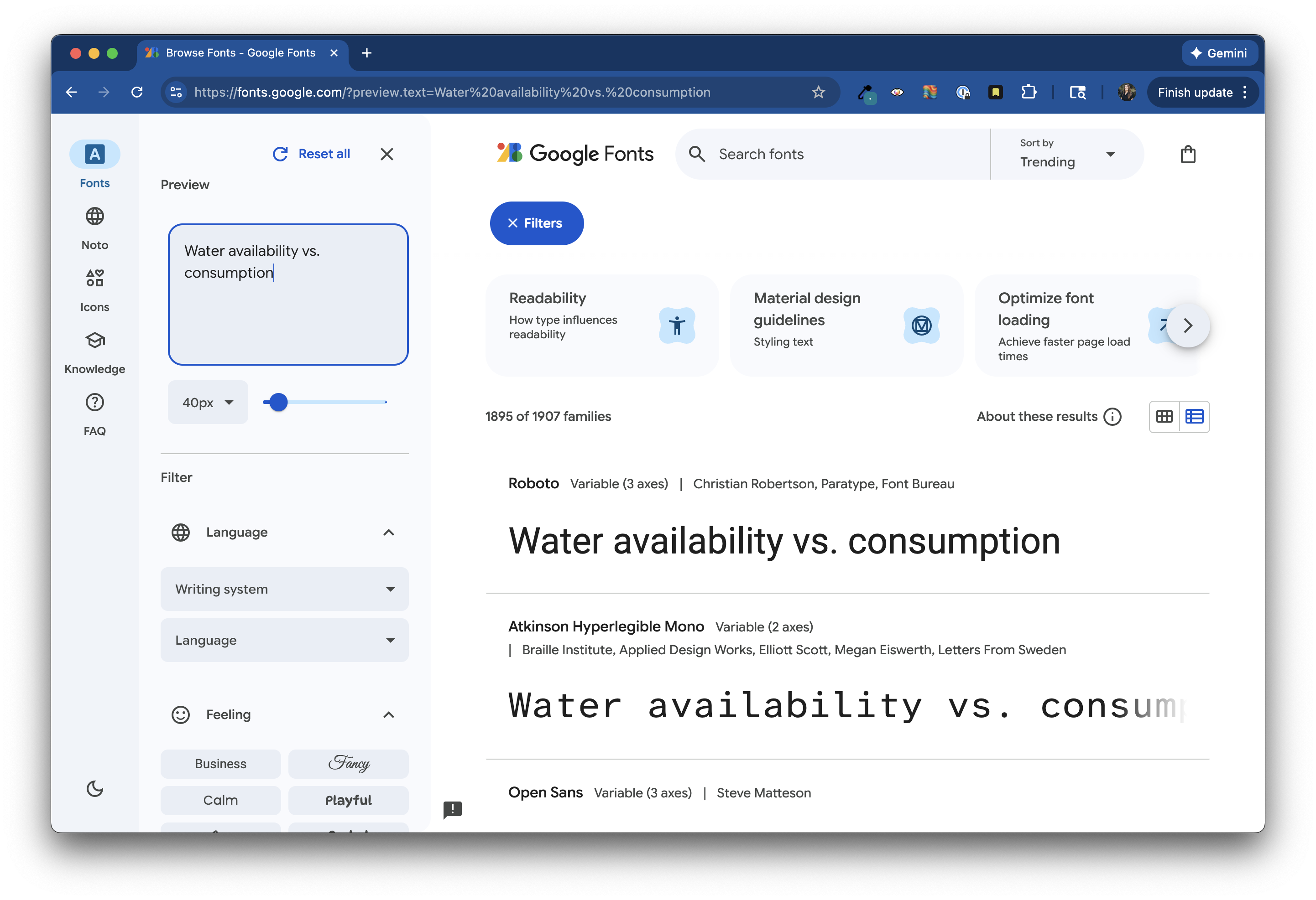
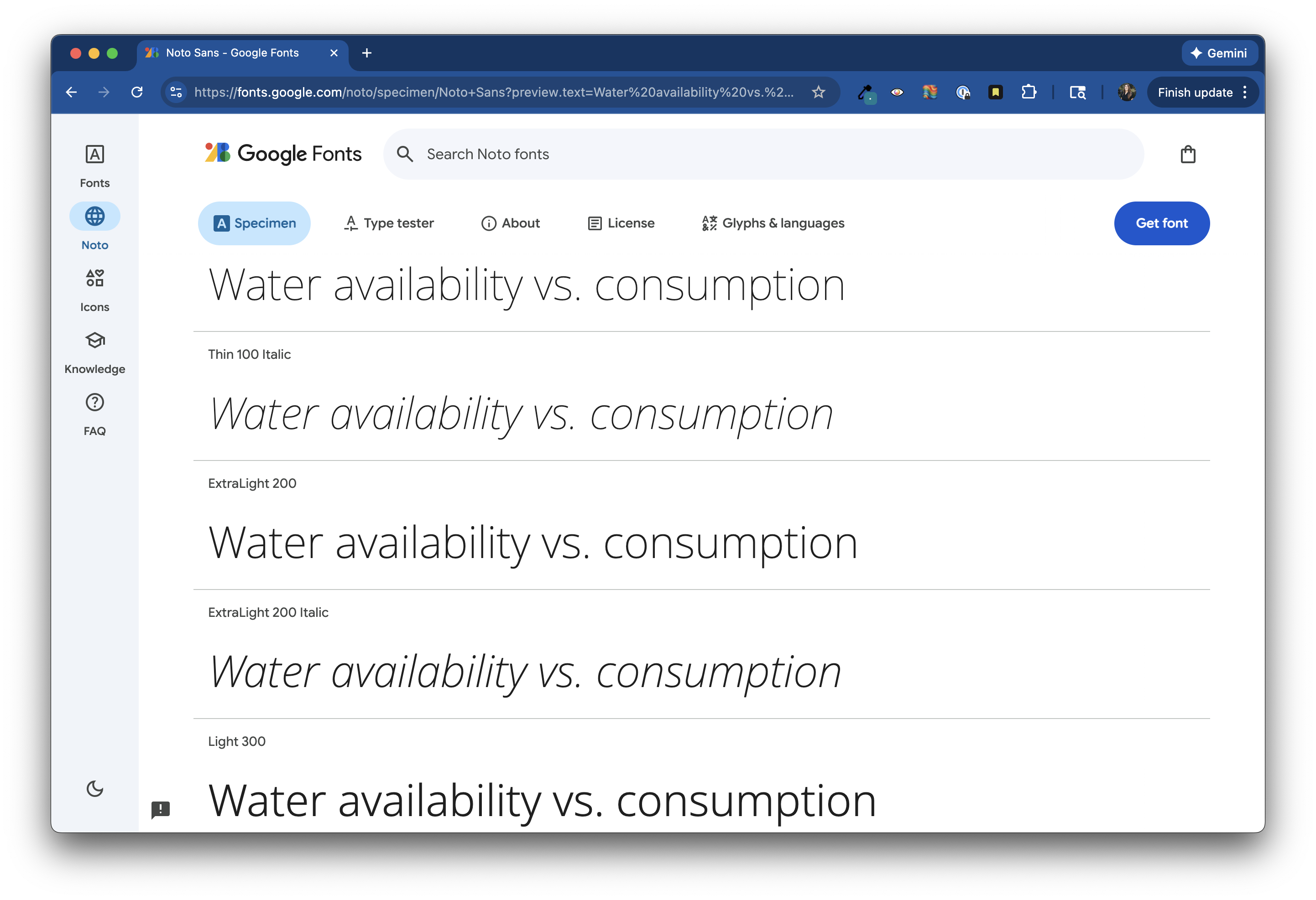
Pick a typeface(s) from Google Fonts
Browse typefaces and fonts at https://fonts.google.com/. It can be helpful to type your desired text into the Preview field (you may need to expand the sidebar by clicking the Filters button on the top left of the page) to get a better sense of how your font choice will look. You can also search typefaces by name.
Import {showtext} at the top of your script, then use font_add_google() to specify the font family(ies) you want to import.
##~~~~~~~~~~~~~~~~~~~~~~~~~~~~~~~~~~~~~~~~~~~~~~~~~~~~~~~~~~~~~~~~~~~~~~~~~~~~~~## setup ----##~~~~~~~~~~~~~~~~~~~~~~~~~~~~~~~~~~~~~~~~~~~~~~~~~~~~~~~~~~~~~~~~~~~~~~~~~~~~~~#..........................load packages.........................library(tidyverse)library(janitor)library(showtext)#......................import Google fonts.......................# `name` is the name of the font as it appears in Google Fonts# `family` is the user-specified id that you'll use to apply a font in your ggpplotfont_add_google(name ="Sarala", family ="sarala")font_add_google(name ="Noto Sans", family ="noto-sans")font_add_google(name ="Red Hat Mono", family ="red")# ~ additional setup code omitted for brevity ~
Enable {showtext} & apply Google Fonts
You’ll need to “turn on” {showtext} rendering ahead of running your plot code. I like to turn it off immediately after as well.
#..............enable {showtext} for newly opened GD.............showtext_auto(enable =TRUE)#...........................build plot...........................ggplot(sbc_subbasin_monthly) +geom_linerange(aes(y = month,xmin = mean_consum, xmax = mean_avail),alpha =0.6) +geom_point(aes(x = mean_avail, y = month), color = pal["avail"], size =5,stroke =2) +geom_point(aes(x = mean_consum, y = month), color = pal["consum"], fill ="white",shape =21,size =5,stroke =2) +labs(title ="Water availability vs. consumption across the Santa Barbara\nCoastal subbasin (2010-2020)",subtitle ="Summer deficits exist, despite winter water surplus",caption ="Data Source: USGS CONUS 2025",x ="Mean monthly water availability & consumption (mm)") +theme_light(base_size =17) +# set relative text sizes based on your defined `base_size`theme(plot.title.position ="plot",plot.title =element_text(family ="sarala",face ="bold",size =rel(0.98),color = pal["dark_gray"]),plot.subtitle =element_text(family ="noto-sans",size =rel(0.9),color = pal["light_gray"],margin =margin(b =8)), # you don't need to include arg names, so long as you list margin sizes in order (counterclockwise from top, e.g. `margin(0, 0, 8, 0)`)axis.text =element_text(family ="red",size =rel(0.7),color = pal["light_gray"]),axis.title.x =element_text(family ="noto-sans",size =rel(0.75),margin =margin(t =15)),axis.title.y =element_blank(),plot.caption =element_text(family ="noto-sans",face ="italic",size =rel(0.5)color = pal["light_gray"],margin =margin(t =15)),panel.grid.major.y =element_blank(),plot.margin =margin(t =1, r =1, b =1, l =1, "cm") )#...............turn off {showtext} text rendering...............showtext_auto(enable =FALSE)
Import Font Awesome fonts
Font Awesome is a library of icons, which can be imported and used similar to Google Fonts. You’ll need to download the font files first (see today’s pre-class prep instructions). We can then use font_add() to make them available for use in our ggplots:
##~~~~~~~~~~~~~~~~~~~~~~~~~~~~~~~~~~~~~~~~~~~~~~~~~~~~~~~~~~~~~~~~~~~~~~~~~~~~~~## setup ----##~~~~~~~~~~~~~~~~~~~~~~~~~~~~~~~~~~~~~~~~~~~~~~~~~~~~~~~~~~~~~~~~~~~~~~~~~~~~~~#..........................load packages.........................library(tidyverse)library(janitor)library(showtext)#......................import Google Fonts.......................# `name` is the name of the font as it appears in Google Fonts# `family` is the user-specified id that you'll use to apply a font in your ggplotfont_add_google(name ="Sarala", family ="sarala")font_add_google(name ="Noto Sans", family ="noto-sans")font_add_google(name ="Red Hat Mono", family ="red")#....................import Font Awesome fonts...................# we'll only be using an icon from the brands collection today; you'll need to import the other .otf files if you also plan to use icons from those collectionsfont_add(family ="fa-brands",regular = here::here("fonts", "Font Awesome 7 Brands-Regular-400.otf")) # ~ additional setup code omitted for brevity ~
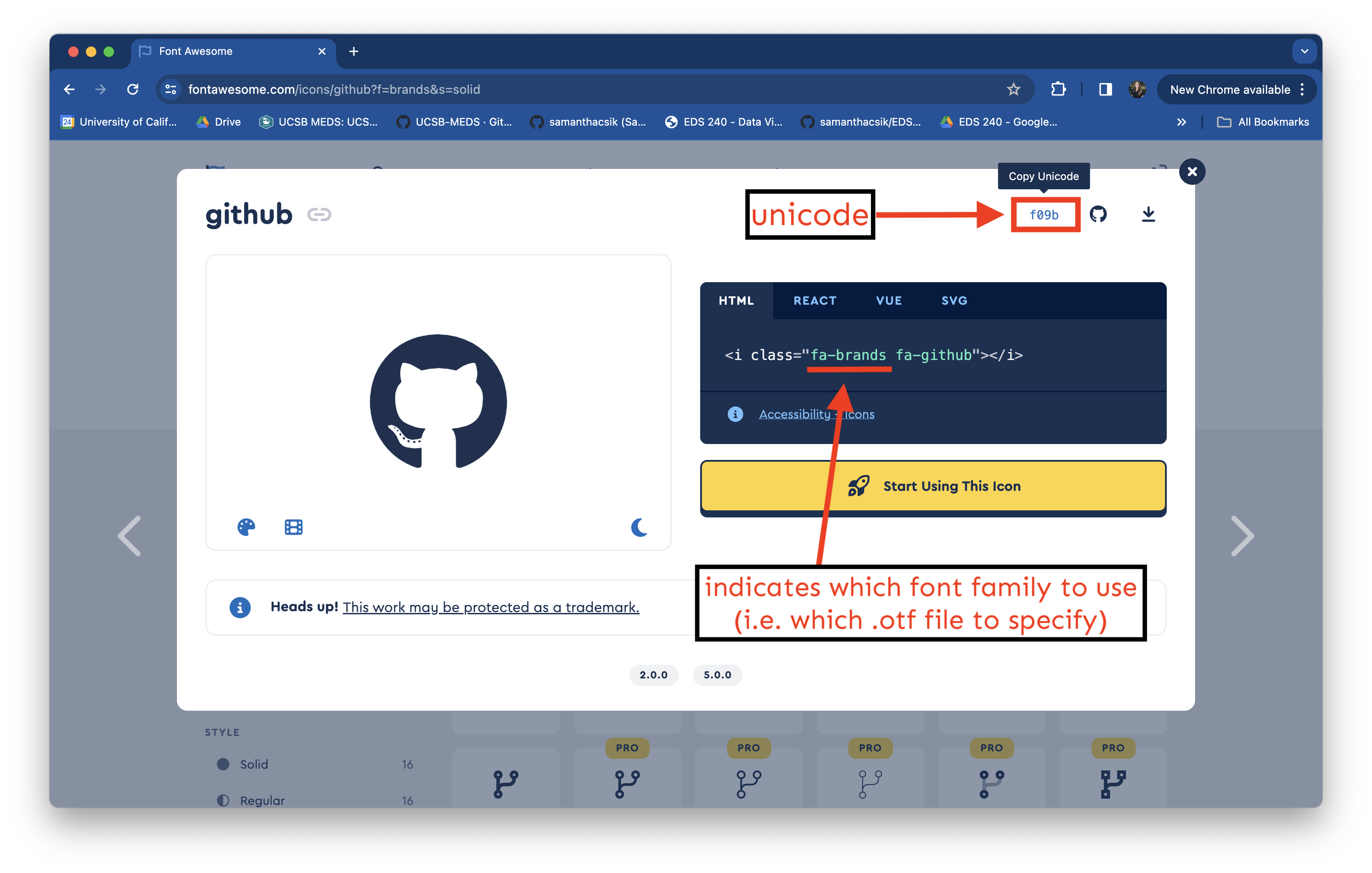
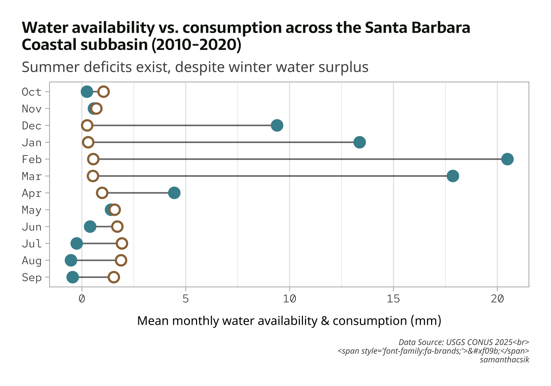
Reference icons by their Unicode
Let’s say I want to include my GitHub username along with the GitHub icon in the caption of my plot. Start by searching the Free icons on Font Awesome and click on the one you want to use (here, the github icon). Find the icon’s Unicode in the top right corner of the popup box:
Add an icon to our caption
To use this unicode in HTML, we need to stick a &#x ahead of it. We can make our code a bit easier to read by saving the unicode (as well as our username text) to variable names. We’ll then use the glue::glue() function to construct our full caption. Importantly, glue() will evaluate expressions enclosed by braces as R code.
Note that we (1) wrap our object names in {} to use the values that are saved to them, and (2), we use the HTML <span> tag to apply styles to text – here, we use the font-family property and supply it the value, fa-brands (which is the id (i.e. family) we created when loading the Font Awesome 7 Brands-Regular-400.otf file at the top of our script).
Apply our new caption
Resulting plot is rendered on the next slide.
#..............enable {showtext} for newly opened GD.............showtext_auto(enable =TRUE)#...........................build plot...........................ggplot(sbc_subbasin_monthly) +geom_linerange(aes(y = month,xmin = mean_consum, xmax = mean_avail),alpha =0.6) +geom_point(aes(x = mean_avail, y = month), color = pal["avail"], size =5,stroke =2) +geom_point(aes(x = mean_consum, y = month), color = pal["consum"], fill ="white",shape =21,size =5,stroke =2) +labs(title ="Water availability vs. consumption across the Santa Barbara\nCoastal subbasin (2010-2020)",subtitle ="Summer deficits exist, despite winter water surplus",caption = caption,x ="Mean monthly water availability & consumption (mm)") +theme_light(base_size =17) +# set relative text sizes based on your defined `base_size`theme(plot.title.position ="plot",plot.title =element_text(family ="sarala",face ="bold",size =rel(0.98),color = pal["dark_gray"]),plot.subtitle =element_text(family ="noto-sans",size =rel(0.9),color = pal["light_gray"],margin =margin(b =8)), # you don't need to include arg names, so long as you list margin sizes in order (counterclockwise from top, e.g. `margin(0, 0, 8, 0))axis.text =element_text(family ="red",size =rel(0.7),color = pal["light_gray"]),axis.title.x =element_text(family ="noto-sans",size =rel(0.75),margin =margin(t =15)), axis.title.y =element_blank(),plot.caption =element_text(family ="noto-sans",face ="italic",size =rel(0.5),color = pal["light_gray"],margin =margin(t =15)),panel.grid.major.y =element_blank(),plot.margin =margin(t =1, r =1, b =1, l =1, "cm") )#...............turn off {showtext} text rendering...............showtext_auto(enable =FALSE)
ggplot doesn’t (natively) know how to parse HTML
. . . but the {ggtext} package does! If we want to render ggplot text using HTML or Markdown syntax, we also need to use one of {ggtext}’s theme() elements, which will parse and render the applied styles.
There are a few options, all which replace {ggplot2}’s element_text() – be sure to check out the documentation as you’re deciding which to use. We’ll use element_markdown().
Update theme() element to render styling
#..............enable {showtext} for newly opened GD.............showtext_auto(enable =TRUE)#...........................build plot...........................ggplot(sbc_subbasin_monthly) +geom_linerange(aes(y = month,xmin = mean_consum, xmax = mean_avail),alpha =0.6) +geom_point(aes(x = mean_avail, y = month), color = pal["avail"], size =5,stroke =2) +geom_point(aes(x = mean_consum, y = month), color = pal["consum"], fill ="white",shape =21,size =5,stroke =2) +labs(title ="Water availability vs. consumption across the Santa Barbara\nCoastal subbasin (2010-2020)",subtitle ="Summer deficits exist, despite winter water surplus",caption = caption,x ="Mean monthly water availability & consumption (mm)") +theme_light(base_size =17) +# set relative text sizes based on your defined `base_size`theme(plot.title.position ="plot",plot.title =element_text(family ="sarala",face ="bold",size =rel(0.98),color = pal["dark_gray"]),plot.subtitle =element_text(family ="noto-sans",size =rel(0.9),color = pal["light_gray"],margin =margin(b =8)), # you don't need to include arg names, so long as you list margin sizes in order (counterclockwise from top, e.g. `margin(0, 0, 8, 0))axis.text =element_text(family ="red",size =rel(0.7),color = pal["light_gray"]),axis.title.x =element_text(family ="noto-sans",size =rel(0.75),margin =margin(t =15)),axis.title.y =element_blank(),plot.caption = ggtext::element_markdown(family ="noto-sans",face ="italic",size =rel(0.5),color = pal["light_gray"],halign =1, lineheight =1.5,margin =margin(t =15)),panel.grid.major.y =element_blank(),plot.margin =margin(t =1, r =1, b =1, l =1, "cm") )#...............turn off {showtext} text rendering...............showtext_auto(enable =FALSE)
Note: Text rendered with {ggtext} doesn’t typically appear correctly in the plots pane (or when using the Zoom window; see this separate, but potentially related GitHub issue). For now, you’ll want to render your template .qmd file to see your plot instead.
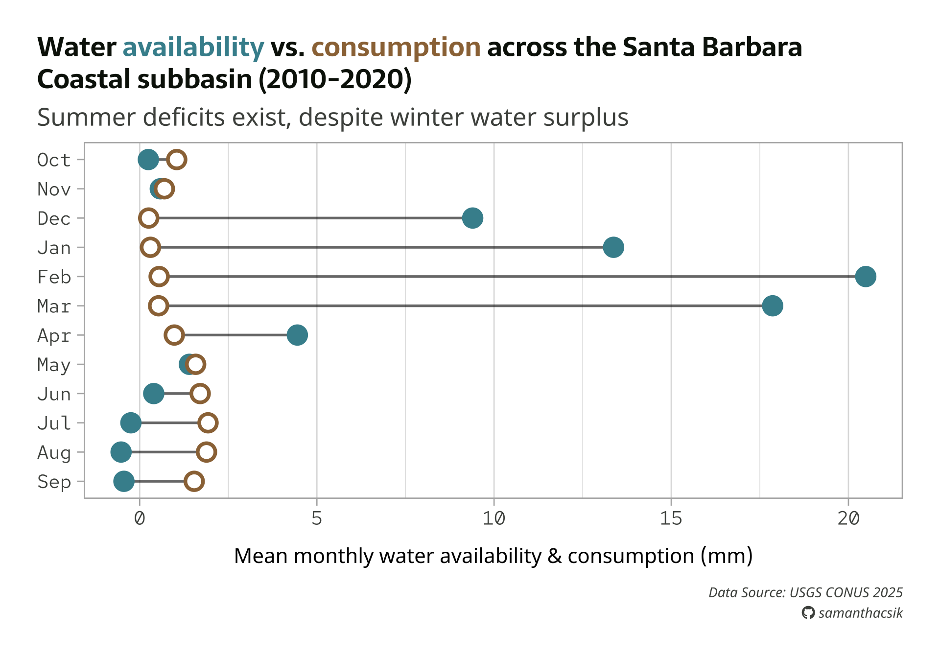
We also need to tell readers what our colors mean!
Rather than a traditional legend, let’s color-code our title text (i.e. availability & consumption) to match the points in our plot. We can again use the {ggtext} package to apply simple Markdown and HTML rendering to our ggplot text.
We’ll need to both format our title using some HTML, andupdate theme() so that this text element is rendered using ggtext::element_markdown() (like our caption). Let’s construct our title using glue::glue():
title <- glue::glue("Water
                    <span style='color:#448F9C;'>availability</span>
                    vs.
                    <span style='color:#9C7344;'>consumption</span>
                    across the Santa Barbara<br>
                    Coastal subbasin (2010-2020)")
Then update to element_markdown() and increase the lineheight to give the two lines a bit of breathing room: