EDS 240: Lecture 10.1

Misc. charts: waffle & bump charts


Week 10 | March 10th, 2025

Waffle charts offer an alternative way to show parts-to-whole relationships


Image source: How to visualise your data: parts-to-whole charts, by Tom McKenzie

Waffle chart (seasonal Bigfoot sightings in CA)


Anyone may report a Bigfoot sighting to the Bigfoot Field Researchers Organization (BFRO). TidyTuesday featured these compiled BFRO reports on 2022-09-13.


Waffle chart (seasonal Bigfoot sightings in CA)


##~~~~~~~~~~~~~~~~~~~~~~~~~~~~~~~~~~~~~~~~~~~~~~~~~~~~~~~~~~~~~~~~~~~~~~~~~~~~~~
##                                    setup                                 ----
##~~~~~~~~~~~~~~~~~~~~~~~~~~~~~~~~~~~~~~~~~~~~~~~~~~~~~~~~~~~~~~~~~~~~~~~~~~~~~~

#..........................load packages.........................
library(tidyverse)
library(waffle)
library(showtext)

#..........................import data...........................
bigfoot <- readr::read_csv('https://raw.githubusercontent.com/rfordatascience/tidytuesday/master/data/2022/2022-09-13/bigfoot.csv')

#..........................import fonts..........................
font_add_google(name = "Ultra", family = "ultra")
font_add_google(name = "Josefin Sans", family = "josefin")

#................enable {showtext} for rendering.................
showtext_auto()

##~~~~~~~~~~~~~~~~~~~~~~~~~~~~~~~~~~~~~~~~~~~~~~~~~~~~~~~~~~~~~~~~~~~~~~~~~~~~~~
##                                wrangle data                              ----
##~~~~~~~~~~~~~~~~~~~~~~~~~~~~~~~~~~~~~~~~~~~~~~~~~~~~~~~~~~~~~~~~~~~~~~~~~~~~~~

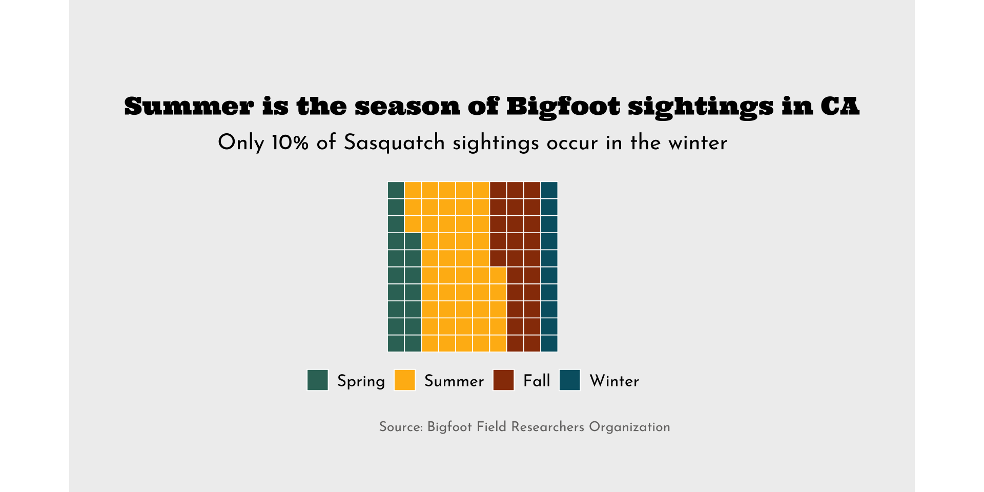
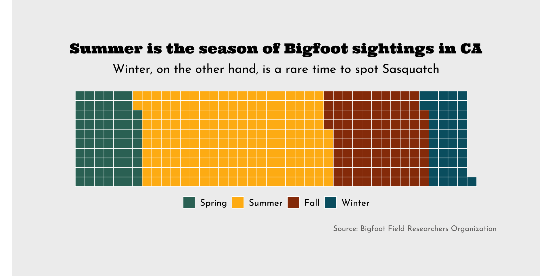
ca_season_counts <- bigfoot |> 
  filter(state == "California") |> 
  group_by(season) |> 
  count(season) |> 
  ungroup() |> 
  filter(season != "Unknown") |> 
  mutate(season = fct_relevel(season, "Spring", "Summer", "Fall", "Winter")) |> # set factor levels for legend
  arrange(season, c("Spring", "Summer", "Fall", "Winter")) # order df rows; {waffle} fills color based on the order that values appear in df

##~~~~~~~~~~~~~~~~~~~~~~~~~~~~~~~~~~~~~~~~~~~~~~~~~~~~~~~~~~~~~~~~~~~~~~~~~~~~~~
##                                waffle chart                              ----
##~~~~~~~~~~~~~~~~~~~~~~~~~~~~~~~~~~~~~~~~~~~~~~~~~~~~~~~~~~~~~~~~~~~~~~~~~~~~~~

#........................create palettes.........................
season_palette <- c("Spring" = "#357266", 
                    "Summer" = "#FFB813", 
                    "Fall" = "#983A06", 
                    "Winter" = "#005F71")

plot_palette <- c(gray = "#757473",
                  beige = "#EFEFEF")

#.......................create plot labels.......................
title <- "Summer is the season of Bigfoot sightings in CA"
subtitle <- "Winter, on the other hand, is a rare time to spot Sasquatch"
caption <- "Source: Bigfoot Field Researchers Organization"

#......................create waffle chart.......................
ggplot(ca_season_counts, aes(fill = season, values = n)) +
  geom_waffle(color = "white", size = 0.3, 
              n_rows = 10, make_proportional = FALSE) +
  coord_fixed() +
  scale_fill_manual(values = season_palette) +
  labs(title = title,
       subtitle = subtitle,
       caption = caption) +
  theme_void() +
  theme(
    plot.title = element_text(family = "ultra", 
                              size = 18, 
                              hjust = 0.5,
                              margin = margin(t = 0, r = 0, b = 0.3, l = 0, "cm")),
    plot.subtitle = element_text(family = "josefin",
                                 size = 16,
                                 hjust = 0.5,
                                 margin = margin(t = 0, r = 0, b = 0.5, l = 0, "cm")),
    plot.caption = element_text(family = "josefin",
                                size = 10,
                                color = plot_palette["gray"], 
                                margin = margin(t = 0.75, r = 0, b = 0, l = 0, "cm")),
    legend.position = "bottom",
    legend.title = element_blank(),
    legend.text = element_text(family = "josefin",
                               size = 12),
    plot.background = element_rect(fill = plot_palette["beige"], 
                                   color = plot_palette["beige"]),
    plot.margin = margin(t = 2, r = 2, b = 2, l = 2, "cm")
  )

#........................turn off showtext.......................
showtext_auto(FALSE)

Proportional waffle chart (seasonal Bigfoot sightings in CA)


Proportional waffle chart (seasonal Bigfoot sightings in CA)


##~~~~~~~~~~~~~~~~~~~~~~~~~~~~~~~~~~~~~~~~~~~~~~~~~~~~~~~~~~~~~~~~~~~~~~~~~~~~~~
##                          proportional waffle chart                       ----
##~~~~~~~~~~~~~~~~~~~~~~~~~~~~~~~~~~~~~~~~~~~~~~~~~~~~~~~~~~~~~~~~~~~~~~~~~~~~~~

#........................create palettes.........................
season_palette <- c("Spring" = "#357266", 
                    "Summer" = "#FFB813", 
                    "Fall" = "#983A06", 
                    "Winter" = "#005F71")

plot_palette <- c(gray = "#757473",
                  beige = "#EFEFEF")

#.......................create plot labels.......................
title <- "Summer is the season of Bigfoot sightings in CA"
subtitle <- "Only 10% of Sasquatch sightings occur in the winter"
caption <- "Source: Bigfoot Field Researchers Organization"

#......................create waffle chart.......................
ggplot(ca_season_counts, aes(fill = season, values = n)) +
  geom_waffle(color = "white", size = 0.3, n_rows = 10, 
              make_proportional = TRUE) +
  coord_fixed() +
  scale_fill_manual(values = season_palette) +
  labs(title = title,
       subtitle = subtitle,
       caption = caption) +
  theme_void() +
  theme(
    plot.title = element_text(family = "ultra", 
                              size = 18, 
                              hjust = 0.5,
                              margin = margin(t = 1, r = 0, b = 0.3, l = 1, "cm")),
    plot.subtitle = element_text(family = "josefin",
                                 size = 16,
                                 hjust = 0.5,
                                 margin = margin(t = 0, r = 0, b = 0.5, l = 0, "cm")),
    plot.caption = element_text(family = "josefin",
                                size = 10,
                                color = plot_palette["gray"], 
                                hjust = 0,
                                margin = margin(t = 0.75, r = 0, b = 0, l = 0, "cm")),
    legend.position = "bottom",
    legend.title = element_blank(),
    legend.text = element_text(family = "josefin",
                               size = 12),
    plot.background = element_rect(fill = plot_palette["beige"], 
                                   color = plot_palette["beige"]),
    plot.margin = margin(t = 1.5, r = 9, b = 1.5, l = 8, "cm")
  )

#........................turn off showtext.......................
showtext_auto(FALSE)

Bump charts offer a way to visualize changes in rank over time


They do not, however, provide information about the actual or relative magnitudes of difference between rankings. If that’s important to show, consider an alternative chart type (or something like the ribbon bump chart to the right!).

Bump chart (highest paying occupations)


The US Bureau of Labor Statistics provides data on occupations and earnings. TidyTuesday featured these compiled data on 2019-03-05 (these are the same data we used to create our dumbbell plot during lectures 4.1 and 6.1).


Bump chart (highest paying occupations)


##~~~~~~~~~~~~~~~~~~~~~~~~~~~~~~~~~~~~~~~~~~~~~~~~~~~~~~~~~~~~~~~~~~~~~~~~~~~~~~
##                                    setup                                 ----
##~~~~~~~~~~~~~~~~~~~~~~~~~~~~~~~~~~~~~~~~~~~~~~~~~~~~~~~~~~~~~~~~~~~~~~~~~~~~~~

#..........................load packages.........................
library(tidyverse)
library(ggbump)
library(ggtext)
library(showtext)

#..........................import data...........................
jobs <- read_csv("https://raw.githubusercontent.com/rfordatascience/tidytuesday/master/data/2019/2019-03-05/jobs_gender.csv")

#..........................import fonts..........................
font_add_google(name = "Passion One", family = "passion")
font_add_google(name = "Oxygen", family = "oxygen")

#................enable {showtext} for rendering.................
showtext_auto()

##~~~~~~~~~~~~~~~~~~~~~~~~~~~~~~~~~~~~~~~~~~~~~~~~~~~~~~~~~~~~~~~~~~~~~~~~~~~~~~
##                                wrangle data                              ----
##~~~~~~~~~~~~~~~~~~~~~~~~~~~~~~~~~~~~~~~~~~~~~~~~~~~~~~~~~~~~~~~~~~~~~~~~~~~~~~

#...................rank occupations by salary...................
salary_rank_by_year <- jobs |> 
  select(year, occupation, total_earnings) |> 
  group_by(year) |> 
  mutate(
    rank = row_number(desc(total_earnings))
  ) |> 
  ungroup() |> 
  arrange(rank, year)

#........get top 8 occupation names for final year (2016)........
top2016 <- salary_rank_by_year |>  
  filter(year == 2016, rank <= 8) |>  
  pull(occupation) 

##~~~~~~~~~~~~~~~~~~~~~~~~~~~~~~~~~~~~~~~~~~~~~~~~~~~~~~~~~~~~~~~~~~~~~~~~~~~~~~
##                                 bump chart                               ----
##~~~~~~~~~~~~~~~~~~~~~~~~~~~~~~~~~~~~~~~~~~~~~~~~~~~~~~~~~~~~~~~~~~~~~~~~~~~~~~

# grab magma palette ----
magma_pal <- viridisLite::magma(12)

# view magma colors ----
# monochromeR::view_palette(magma_pal)

# assign magma colors to top 8 occupations ----
occupation_colors <- c(
  "Physicians and surgeons" = magma_pal[3],
  "Nurse anesthetists" = magma_pal[4],
  "Dentists" = magma_pal[5],
  "Architectural and engineering managers" = magma_pal[6],
  "Lawyers" = magma_pal[7], 
  "Podiatrists" = magma_pal[8],
  "Chief executives" = magma_pal[9],
  "Petroleum engineers" = magma_pal[10]
)

# create palette for additional plot theming ----
plot_palette <- c(dark_purple = "#2A114E", 
                  dark_gray = "#6D6B71",
                  light_pink = "#FFF8F4")

#.......................create plot labels.......................
title <- "Top eight highest paying occupations in 2016"
subtitle <- "Medical professionals held onto the same top three spots across years, while <span style='color:#FEA873FF;'>**petroleum engineers**</span> steadily climbed the ranks from 10^th^ in 2013 to 4^th^ in 2016"
caption <- "Data Source: Bureau of Labor Statistics"

#........................create bump chart.......................
salary_rank_by_year |>  
  filter(occupation %in% top2016) |>  
  ggplot(aes(x = year, y = rank, color = occupation)) + 
  geom_point(shape = "|", size = 6) + 
  geom_bump(linewidth = 1) +
  geom_text(
    data = salary_rank_by_year |> filter(year == 2013, occupation %in% top2016),
    aes(label = occupation),
    hjust = 1,
    nudge_x = -0.1,
    family = "oxygen",
    fontface = "bold"
  ) +
  geom_text(
    data = salary_rank_by_year |> filter(year == 2016, occupation %in% top2016),
    aes(label = rank),
    hjust = 0,
    nudge_x = 0.1,
    size = 5,
    family = "oxygen",
    fontface = "bold"
  ) +
  annotate(
    geom = "text",
    x = c(2013, 2016),
    y = c(-0.2, -0.2),
    label = c("2013", "2016"),
    hjust = c(0, 1),
    vjust = 1,
    size = 5,
    family = "oxygen",
    fontface = "bold",
    color = plot_palette["dark_gray"],
  ) +
  scale_y_reverse() +
  scale_color_manual(values = occupation_colors) +
  coord_cartesian(xlim = c(2010, 2016), 
                  ylim = c(11, 0.25), 
                  clip = "off") +
  labs(title = title,
       subtitle = subtitle,
       caption = caption) +
  theme_void() +
  theme(
    legend.position = "none",
    plot.title = element_text(family = "passion",
                              size = 25,
                              color = plot_palette["dark_purple"],
                              margin = margin(t = 0, r = 0, b = 0.3, l = 0, "cm")),
    plot.subtitle = element_textbox_simple(family = "oxygen",
                                           size = 15,
                                           color = plot_palette["dark_gray"],
                                           margin = margin(t = 0, r = 0, b = 1, l = 0, "cm")),
    plot.caption = element_text(family = "oxygen",
                                color = plot_palette["dark_gray"],
                                margin = margin(t = 0.3, r = 0, b = 0, l = 0, "cm")),
    plot.background = element_rect(fill = plot_palette["light_pink"],
                                   color = plot_palette["light_pink"]),
    plot.margin = margin(t = 1, r = 1, b = 1, l = 1, "cm")
  )

#........................turn off showtext.......................
showtext_auto(FALSE)

Take a Break

~ This is the end of Lesson 1 (of 2) ~

05:00