EDS 240: Lecture 6.1
Typography
Week 6 | February 10th, 2025
Good data visualization design considers:
- data-ink ratio (less is more, within reason)
- how to reduce eye movement and improve readability / interpretability (e.g. through alternative legend positions, direct annotations)
- putting things in context
- how to draw the main attention to the most important info
- consistent use of colors, spacing, typefaces, weights
- typeface / font choices and how they affect both readability and emotions and perceptions
- using visual hierarchy to guide the reader
- color choices (incl. palette types, emotions, readability)
- how to tell an interesting story
- how to center the people and communities represented in your data
- accessibility through colorblind-friendly palettes & alt text
This lesson will focus on the use of typefaces and fonts in a good data visualization.
Type and font choice influences audience perception and readability
Typeface vs. font
Typeface (aka font family): underlying visual design (e.g. Times New Roman, Helvetica, Roboto)
Font: an implementation of a typeface; they can come in different weights and styles (e.g. bold, italic)
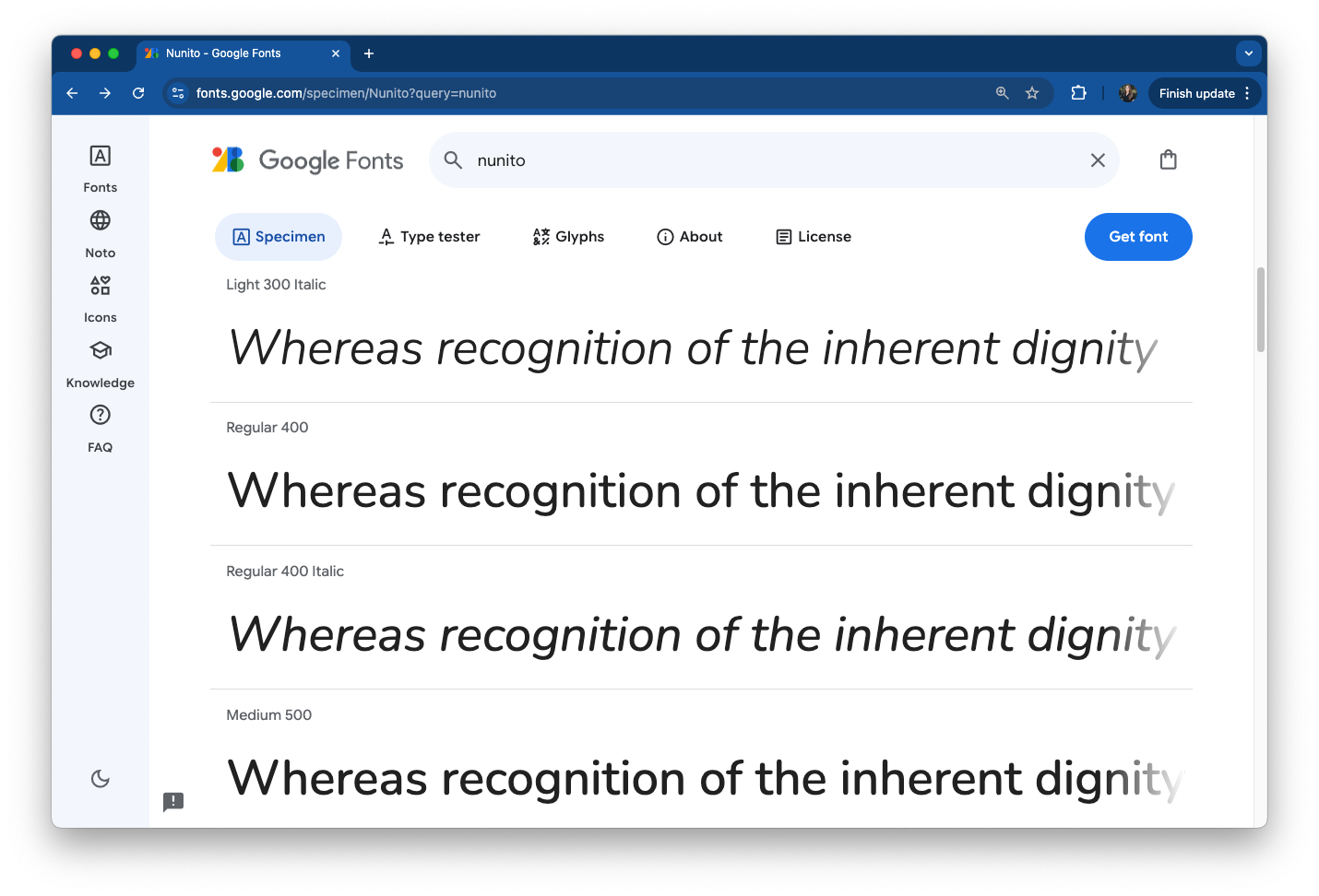
You choose a typeface (e.g. Nunito)
You use a font (e.g. regular, italic, bold)
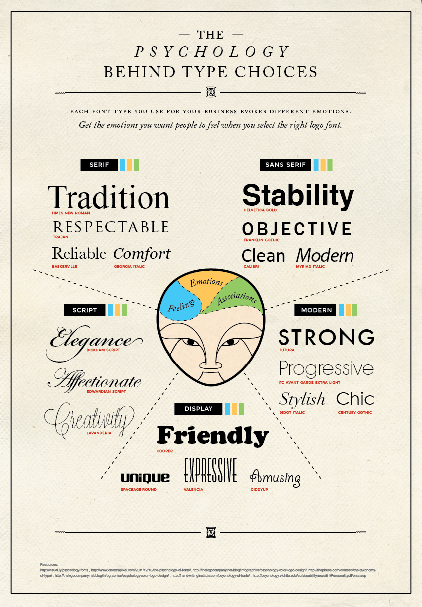
Typeface choices affect emotions and perceptions
“Typography is the art and technique of arranging type to make written language legible, readable and appealing when displayed.”
Similar to colors, typefaces / fonts influence the how viewers perceive information (check out this short TEDx talk).
Source: The Daily Egg
Want to dive deeper into the world of typography? Start with this quick read, Why care about typography? and explore other great articles by Google Fonts.
Context matters - choose typeface accordingly
Typefaces and fonts communicate beyond more than just the written text – they can evoke emotions and can be used to better connect your audience with your work.

Source: Typography for a better user experience, by Suvo Ray
Interested in font psychology? Check out this short video and this article to learn a bit more.
When in doubt, use sans-serif fonts
Serif fonts have small decorative lines (aka “tails” or “feet”) that extend off characters while sans serif fonts don’t.
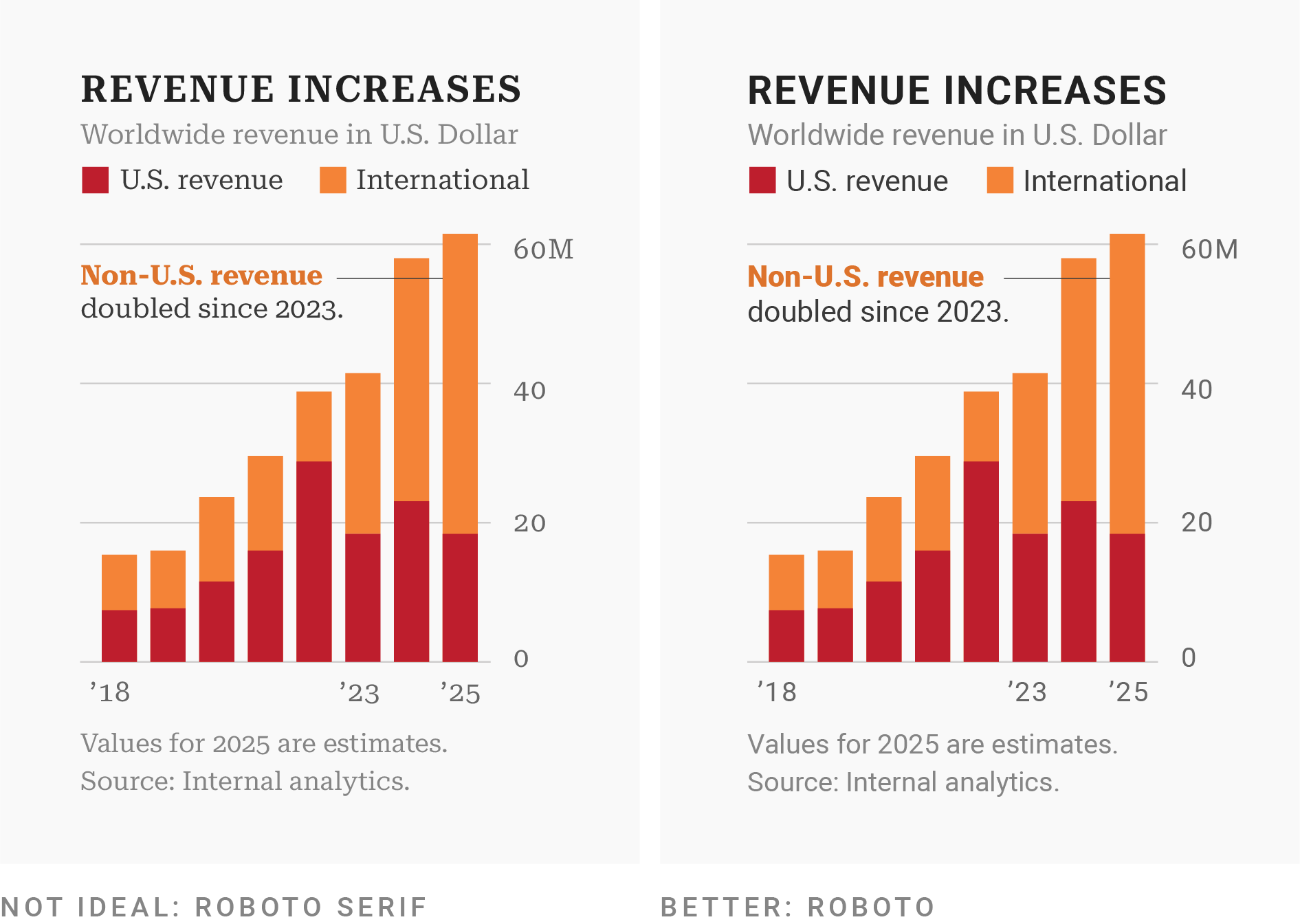
Example from Which fonts to use for your charts and tables, by Lisa Charlotte Muth
Use a typeface with lining figures for numerals
Different typefaces display numbers differently. Serif fonts tend to have “oldstyle figures”, which extend above and below the “line” – these can be difficult to read in a visualization.
Instead, look for options with lining figures, where numbers “line up”, i.e. they’re all the same height.

Example from Which fonts to use for your charts and tables, by Lisa Charlotte Muth
Use a monospaced typeface for numerals
Typefaces with tabular figures print every character with equal width – you may see these referred to as monospaced typefaces. These work well in tables, visualizations, or any scenario where figures should line up vertically (see how you can quickly identify how many figures a number has in the table on the right, below).

Examples from Which fonts to use for your charts and tables, by Lisa Charlotte Muth & Understanding numerals article by Google Fonts
Use a typeface with all the symbols you need
Confirm that all symbols (aka glyphs) that you need exist and that they look good for your chosen typeface.

Consider special characters for different languages, currency symbols, math symbols, reference marks, sub / superscript numbers, etc.
Example from Which fonts to use for your charts and tables, by Lisa Charlotte Muth
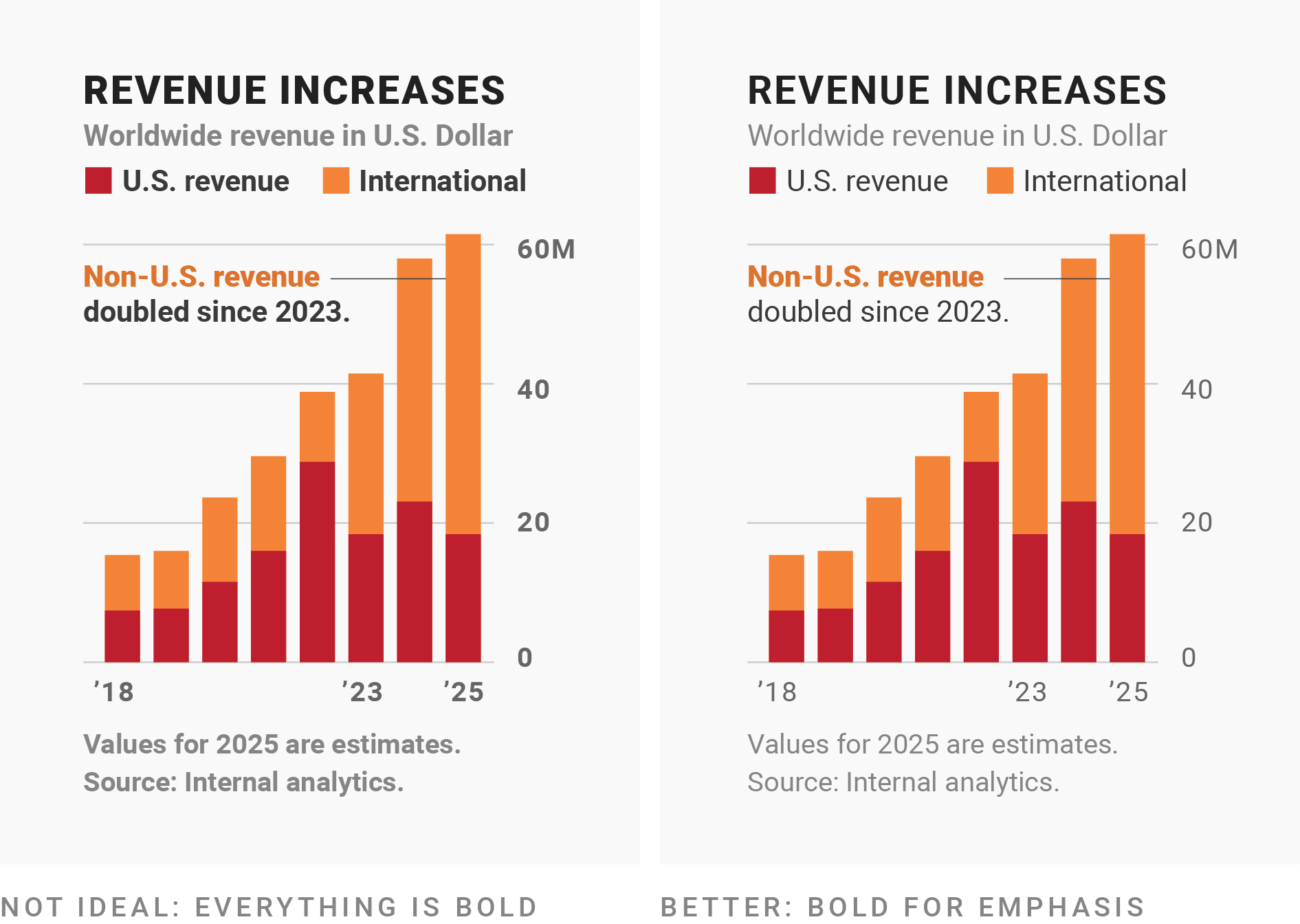
Use bold fonts for emphasis only
Most typefaces come with fonts for different weights (Google Fonts uses numbers for font weights – extra light (200), light (300), regular (400, default), medium (500), semi bold (600), bold (700), extra bold (800)).
Use bold text for titles or to emphasize a few words in annotations. Regular or medium weights are often easiest for longer text (descriptions, annotations, notes).
Example from Which fonts to use for your charts and tables, by Lisa Charlotte Muth
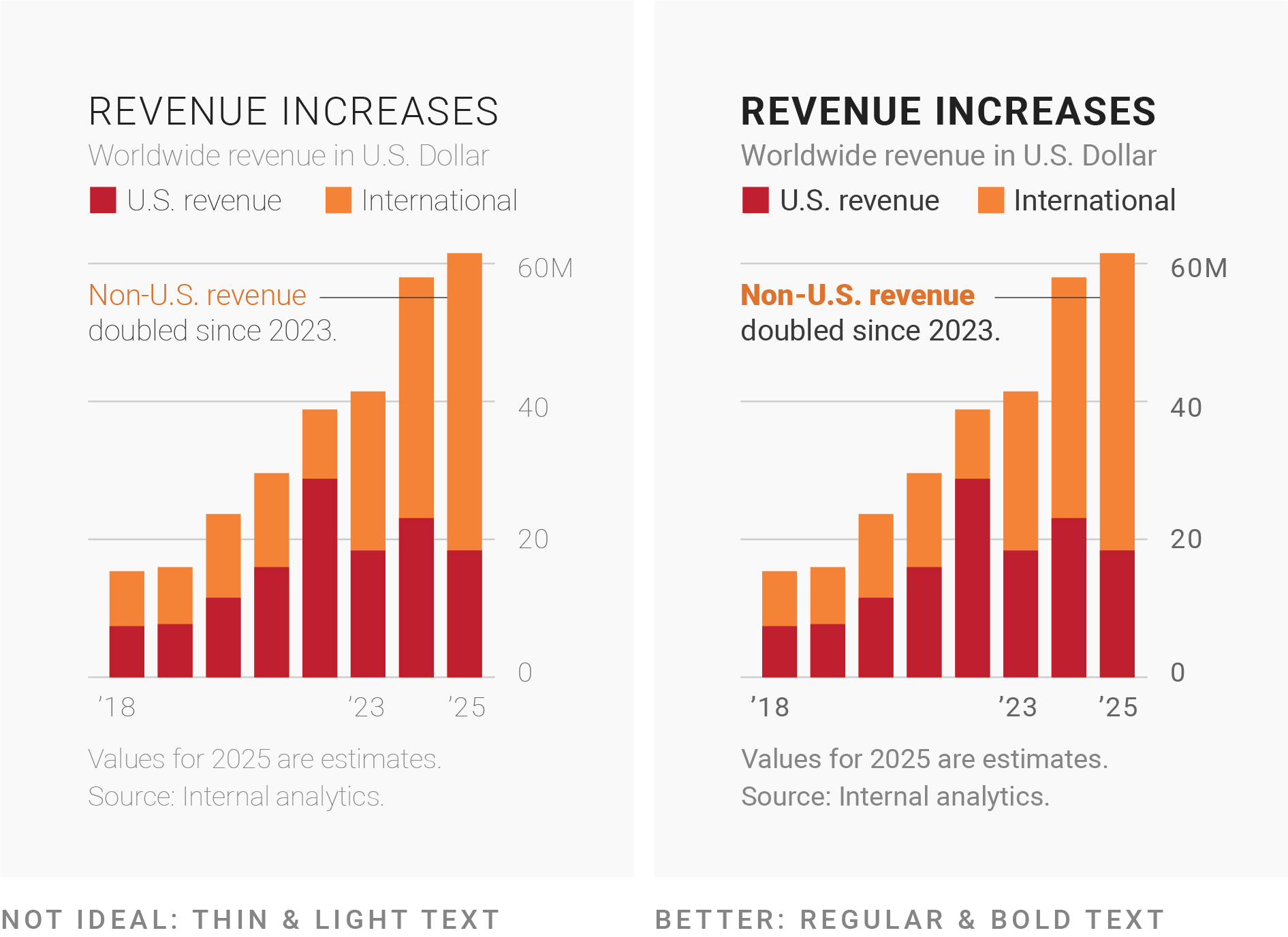
Avoid really thin fonts
Thin (light-weight fonts) fonts are hard to read. Only use them in a high-contrast color and in large sizes (e.g. for titles).
Example from Which fonts to use for your charts and tables, by Lisa Charlotte Muth
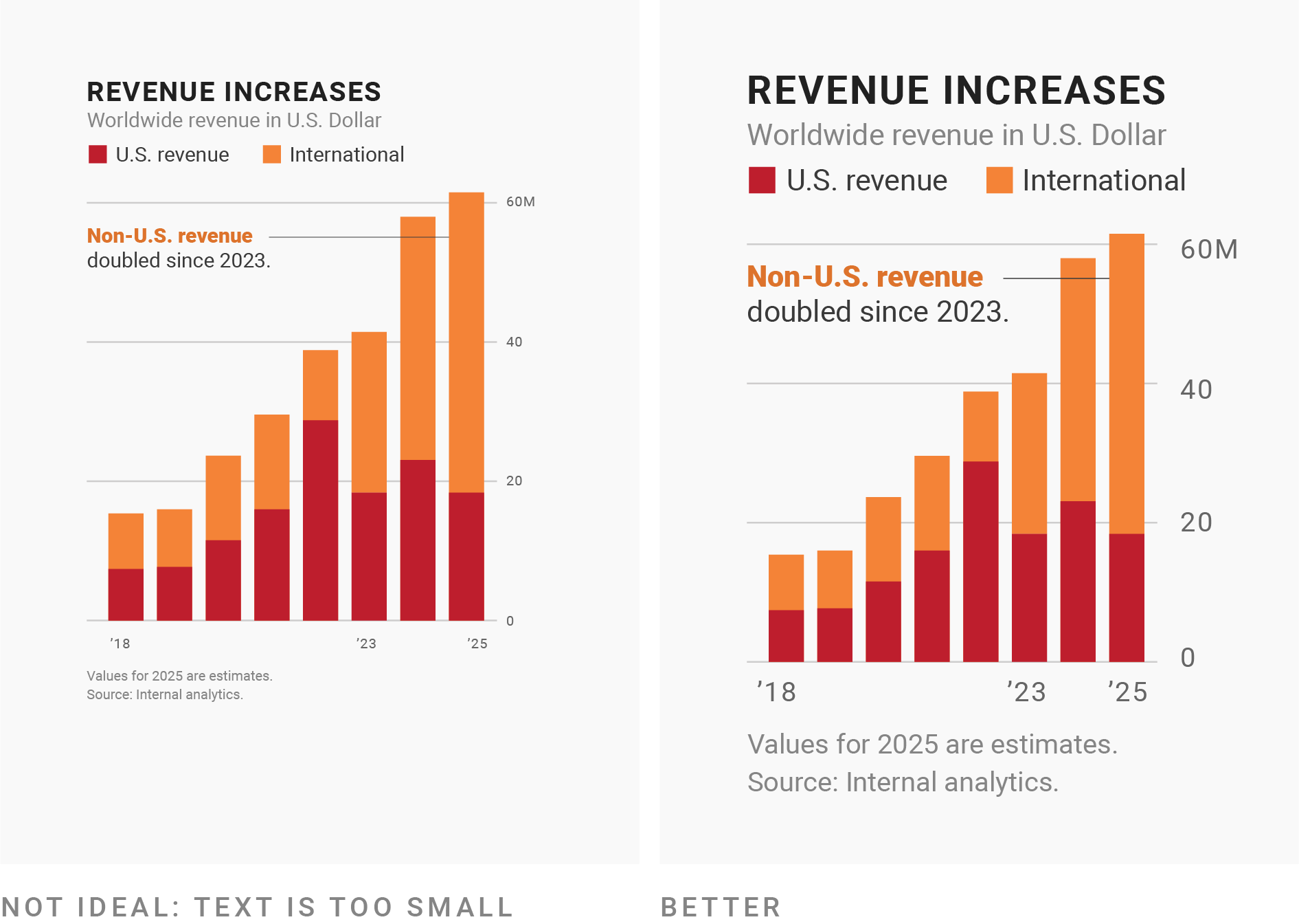
Ensure your font size is large enough
Make sure your font size is large enough, especially when presenting visualizations in a slide-based presentation (this oftentimes means increasing it larger than you would have it in print). In ggplot, adjust font sizes using theme().
Example from Which fonts to use for your charts and tables, by Lisa Charlotte Muth
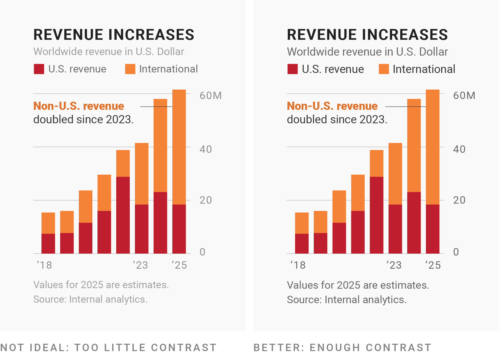
Use high-contrast color for most text
Web Content Accessibility Guidelines (WCAG) recommends a minimum contrast ratio of 4.5:1 – use a color contrast checker to check your ratio. The Coolers color contrast checker will enhance poor color combinations to meet WCAG guidelines. For example, here is a color combo with a bad contrast ratio, and here is the updated color combo with an improved contrast ratio.
Example from Which fonts to use for your charts and tables, by Lisa Charlotte Muth
Use UPPERCASE text sparingly
Uppercase text is more difficult to read compared to sentence case – limit use to headlines or labels. Region labels on maps are commonly uppercase (e.g. see maps in these New York Times pieces, How to Think About Ukraine, in Maps and Charts and Closing the Back Door to Europe).
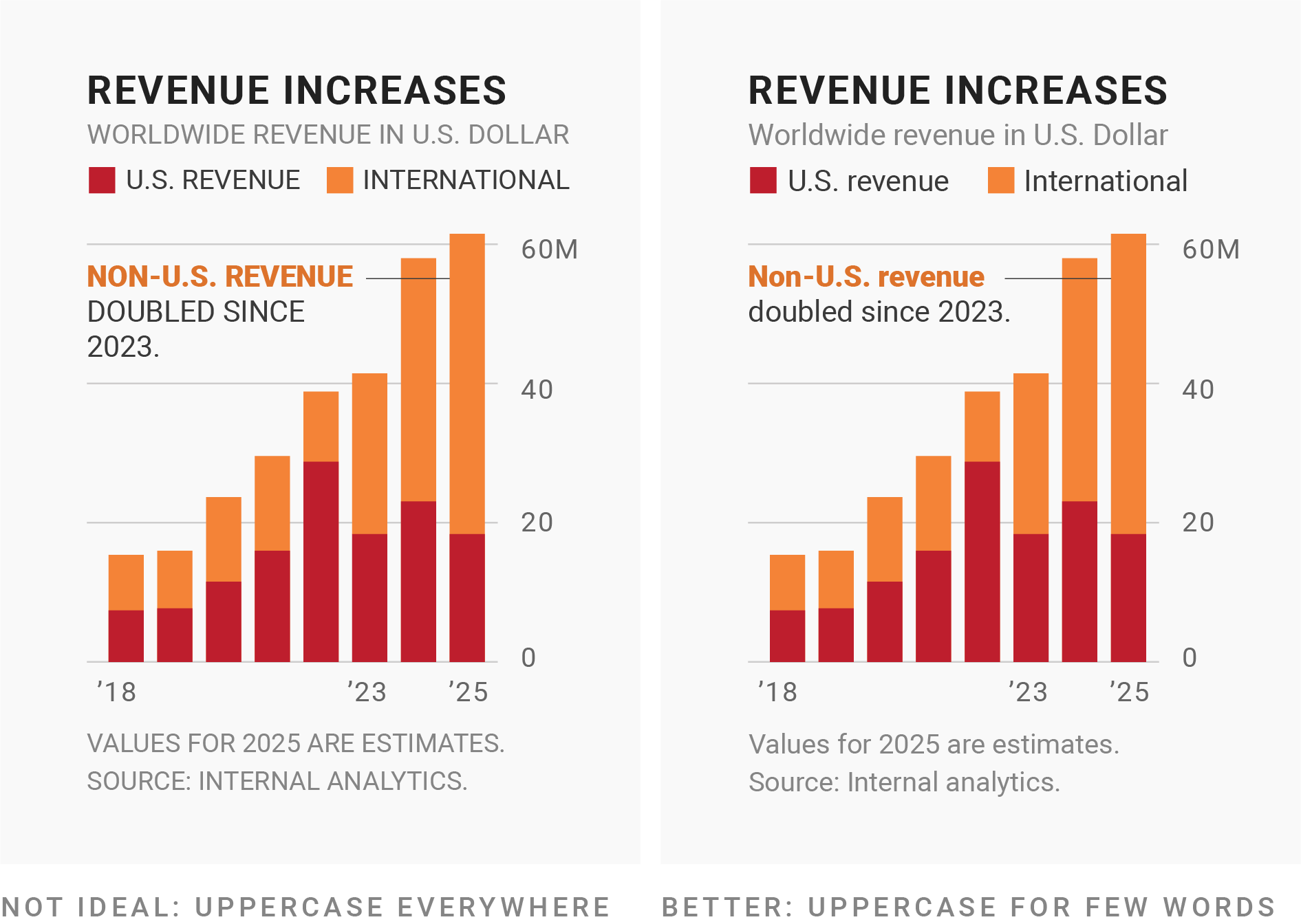
Example from Which fonts to use for your charts and tables, by Lisa Charlotte Muth
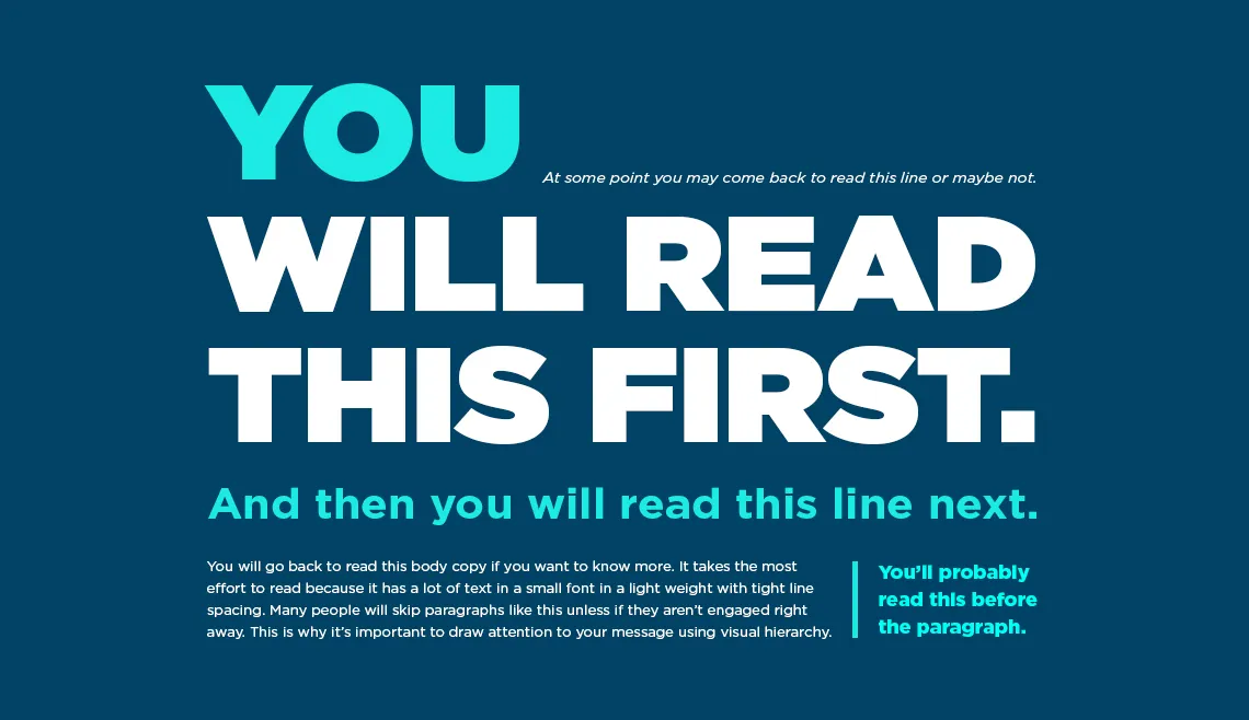
Typographic hierarchy
No one wants to read a wall of text. You can use font size, style, color, spacing, and typeface (or combinations of these) to create a hierarchy that guide your readers.
Recap: choosing the right typeface(s) & font(s)
- context matters – the type(s) should fit the topic and audience
- when in doubt, use a sans-serif style
- choose a monospaced typeface with lining figures for numbers
- ensure that your chosen typeface has all the symbols you need and that they look okay
- use bold fonts for emphasis and avoid thin fonts
- make font sizes large enough to easily read
- use high-contrast font colors
- strategically use types & fonts to create hierarchy
- avoid (extensively) using ALL CAPS
Avoid using too many typefaces (stick to just 1-3)
Check out fontpair.co to explore aesthetically-pleasing font pairings!
There are lots of excellent resources out there for choosing the right typeface / font – check out the resources page on the course website for some recommendations.
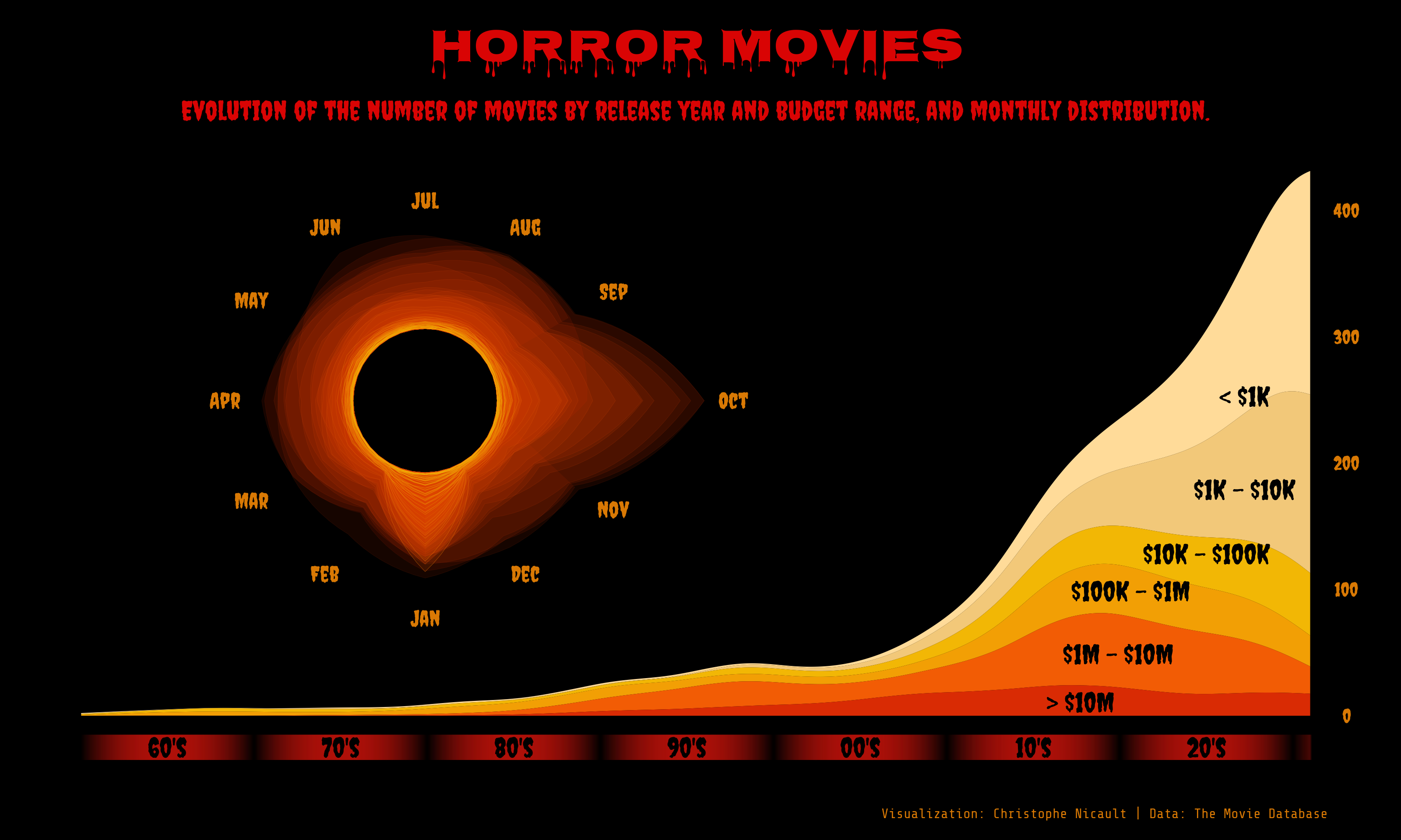
Horror Movies, by Cristophe Nicault (source code)
01:00
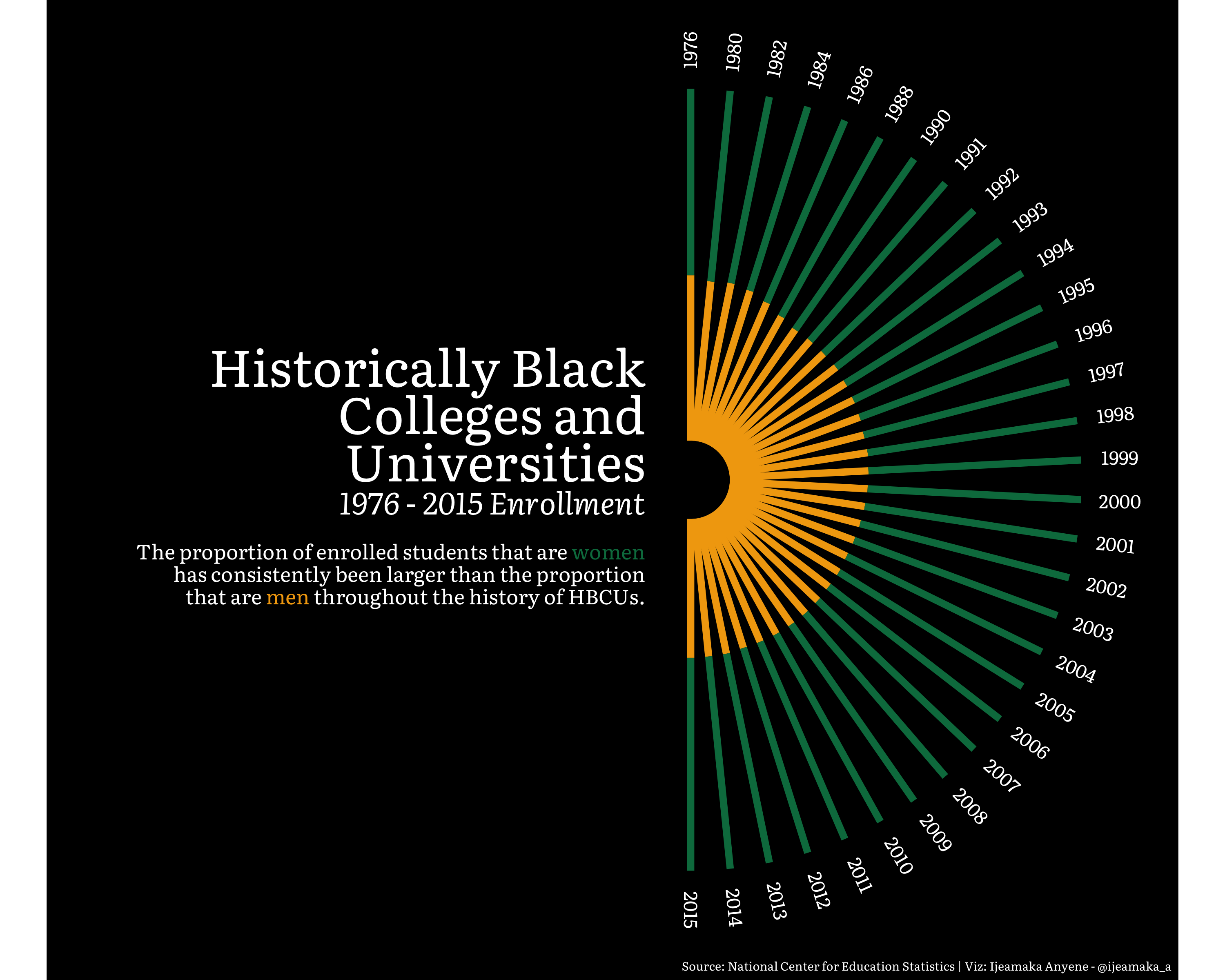
HBCUs, by Ijeamaka Anyene (source code)
01:00
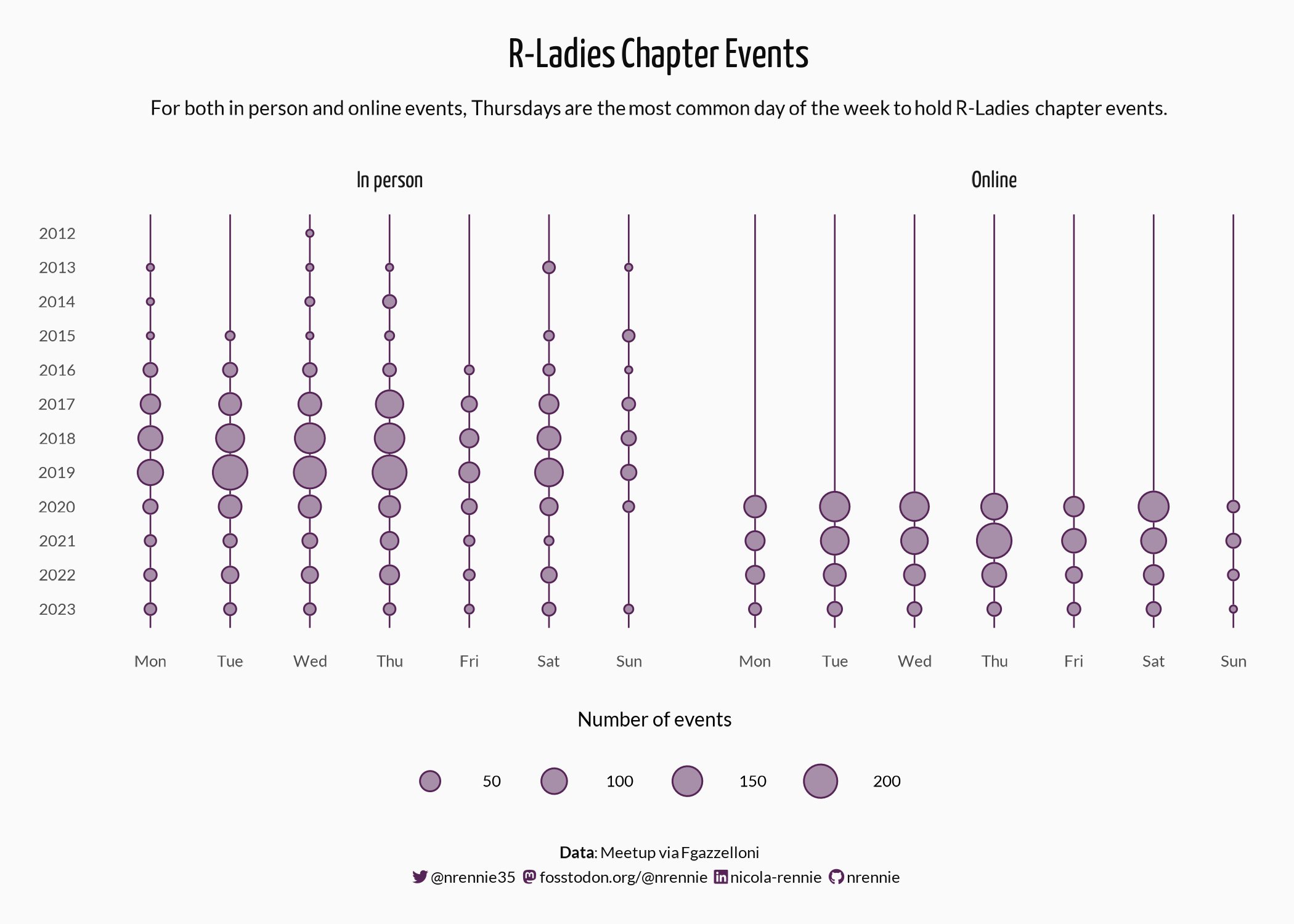
R-Ladies Chapter Events, by Nicola Rennie (source code) | Font inspired by R-Ladies Global
01:00
Let’s learn how to use different fonts in our ggplots!
The problem with system fonts
A system font is one that’s already assumed to be on the vast majority of users’ devices, with no need for a web font to be downloaded.
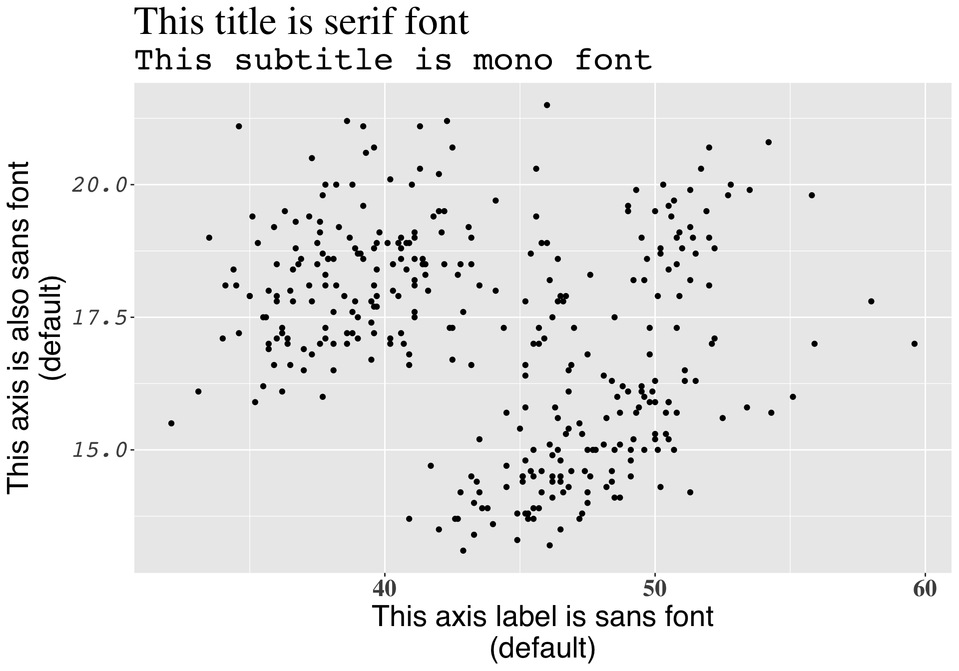
There are only three system fonts that are guaranteed to work everywhere: sans (the default), serif, or mono. Use the family argument to specify which font family you’d like to use for a particular text element, and use the face argument to specify font face (bold, italic, plain (default)):
library(palmerpenguins)
library(tidyverse)

ggplot(penguins, aes(x = bill_length_mm, y = bill_depth_mm)) +
  geom_point() +
  labs(title = "This title is serif font",
       subtitle = "This subtitle is mono font",
       x = "This axis label is sans font\n(default)",
       y = "This axis is also sans font\n(default)") +
  theme(
    plot.title = element_text(family = "serif", size = 30),
    plot.subtitle = element_text(family = "mono", size = 25),
    axis.title = element_text(family = "sans", size = 22),
    axis.text.x = element_text(family = "serif", face = "bold", size = 18),
    axis.text.y = element_text(family = "mono", face = "italic", size = 18)
    )
The problem with system fonts
A graphics device (GD) is something used to make a plot appear – every time you create a plot in R, it needs to be sent to a specific GD to be rendered. There are two main device types:
- screen devices: the most common place for your plot to be “sent” – whenever our plot appears in a window on our computer screen, it’s being sent to a screen device; different operating systems (e.g. Mac, Windows, Linux) have different screen devices
- file devices: if we want to write (i.e. save) our plot to a file, we can send our plot to a particular file device (e.g. pdf, png, jpeg)
Unfortunately, text drawing is handled differently by each graphics device, which means that if we want a font to work everywhere, we need to configure all these different devices in different ways.
Run ?Devices in your console to see which devices are supported by your installation of R.
Read a bit more about graphics devices in Chapter 8 of Exploratory Data Analysis with R, by Roger Peng
R packages to the rescue!
Fortunately, there are a couple super handy packages that make working with fonts a little bit easier:

We’ll be using {showtext} for a couple reasons: it supports more file formats and more graphics devices, and it also avoids using external software ({extrafont} requires that you install some additional software and packages first). {showtext} makes is easy to import and use Google Fonts.
Albert Rapp and Nicola Rennie both have written great blog posts on using {showtext}. These materials draw from both their work!
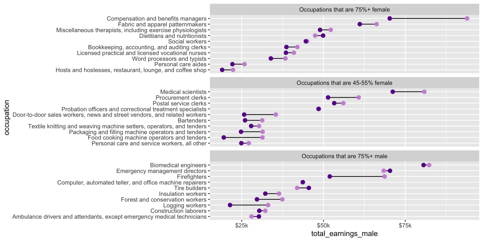
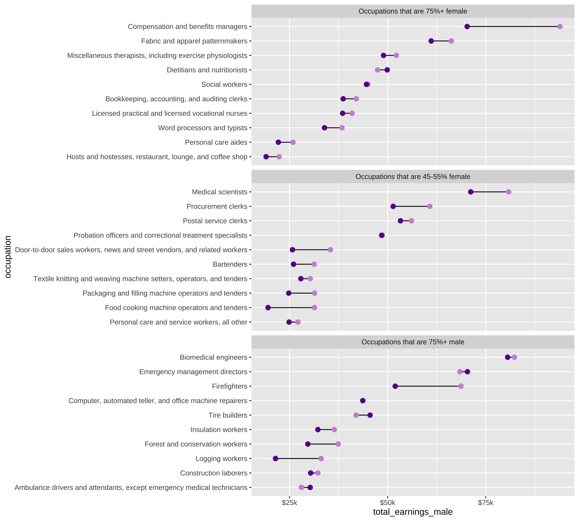
Recall our dumbbell plot from week 4
Let’s improve this plot by updating the colors, modifying the theme, and using some new fonts!
Wrangle data
This code should look familiar (copied from Lecture 4.1):
##~~~~~~~~~~~~~~~~~~~~~~~~~~~~~~~~~~~~~~~~~~~~~~~~~~~~~~~~~~~~~~~~~~~~~~~~~~~~~~
##                                    setup                                 ----
##~~~~~~~~~~~~~~~~~~~~~~~~~~~~~~~~~~~~~~~~~~~~~~~~~~~~~~~~~~~~~~~~~~~~~~~~~~~~~~

#..........................load packages.........................
library(tidyverse)
library(scales)

#..........................import data...........................
jobs <- read_csv("https://raw.githubusercontent.com/rfordatascience/tidytuesday/master/data/2019/2019-03-05/jobs_gender.csv")

##~~~~~~~~~~~~~~~~~~~~~~~~~~~~~~~~~~~~~~~~~~~~~~~~~~~~~~~~~~~~~~~~~~~~~~~~~~~~~~
##                                wrangle data                              ----
##~~~~~~~~~~~~~~~~~~~~~~~~~~~~~~~~~~~~~~~~~~~~~~~~~~~~~~~~~~~~~~~~~~~~~~~~~~~~~~

jobs_clean <- jobs |>

  # add col with % men in a given occupation (% females in a given occupation is already included) ----
  mutate(percent_male = 100 - percent_female) |>

  # rearrange columns ----
  relocate(year, major_category, minor_category, occupation,
          total_workers, workers_male, workers_female,
          percent_male, percent_female,
          total_earnings, total_earnings_male, total_earnings_female,
          wage_percent_of_male) |>

  # drop rows with missing earnings data ----
  drop_na(total_earnings_male, total_earnings_female) |>

  # make occupation a factor (for reordering groups in our plot) ----
  mutate(occupation = as.factor(occupation)) |>

  # classify jobs by percentage male or female (these will become facet labels in our dumbbell plot) ----
  mutate(group_label = case_when(
    percent_female >= 75 ~ "Occupations that are 75%+ female",
    percent_female >= 45 & percent_female <= 55 ~ "Occupations that are 45-55% female",
    percent_male >= 75 ~ "Occupations that are 75%+ male"
  ))

##~~~~~~~~~~~~~~~~~~~~~~~~~~~~~~~~~~~~~~~~~~~~~~~~~~~~~~~~~~~~~~~~~~~~~~~~~~~~~~
##                              create subset df                            ----
##~~~~~~~~~~~~~~~~~~~~~~~~~~~~~~~~~~~~~~~~~~~~~~~~~~~~~~~~~~~~~~~~~~~~~~~~~~~~~~

#....guarantee the same random samples each time we run code.....
set.seed(0)

#.........get 10 random jobs that are 75%+ female (2016).........
f75 <- jobs_clean |>
  filter(year == 2016, group_label == "Occupations that are 75%+ female") |>
  slice_sample(n = 10)

#..........get 10 random jobs that are 75%+ male (2016)..........
m75 <- jobs_clean |>
  filter(year == 2016, group_label == "Occupations that are 75%+ male") |>
  slice_sample(n = 10)

#........get 10 random jobs that are 45-55%+ female (2016).......
f50 <- jobs_clean |>
  filter(year == 2016, group_label == "Occupations that are 45-55% female") |>
  slice_sample(n = 10)

#.......combine dfs & relevel factors (for plotting order).......
subset_jobs <- rbind(f75, m75, f50) |>
  mutate(group_label = fct_relevel(group_label,
                                   "Occupations that are 75%+ female",
                                   "Occupations that are 45-55% female",
                                   "Occupations that are 75%+ male"),
         occupation = fct_reorder(.f = occupation, .x = total_earnings))
Code for our original plot
This code was copied from Lecture 4.1. Resulting plot is rendered on the next slide!
##~~~~~~~~~~~~~~~~~~~~~~~~~~~~~~~~~~~~~~~~~~~~~~~~~~~~~~~~~~~~~~~~~~~~~~~~~~~~~~
##                                    plot                                  ----
##~~~~~~~~~~~~~~~~~~~~~~~~~~~~~~~~~~~~~~~~~~~~~~~~~~~~~~~~~~~~~~~~~~~~~~~~~~~~~~

# initialize plot (we'll map our aesthetics locally for each geom, below) ----
ggplot(subset_jobs) +

  # create dumbbells ----
  geom_linerange(aes(y = occupation,
                     xmin = total_earnings_female, xmax = total_earnings_male)) +
  geom_point(aes(x = total_earnings_male, y = occupation),
             color = "#CD93D8",
             size = 2.5) +
  geom_point(aes(x = total_earnings_female, y = occupation),
             color = "#6A1E99",
             size = 2.5) +

  # facet wrap by group ----
  facet_wrap(~group_label, nrow = 3, scales = "free_y") + # "free_y" plots only the axis labels that exist in each group

  # axis breaks & $ labels ----
  scale_x_continuous(labels = scales::label_currency(scale = 0.001, suffix = "k"),
                     breaks = c(25000, 50000, 75000, 100000, 125000))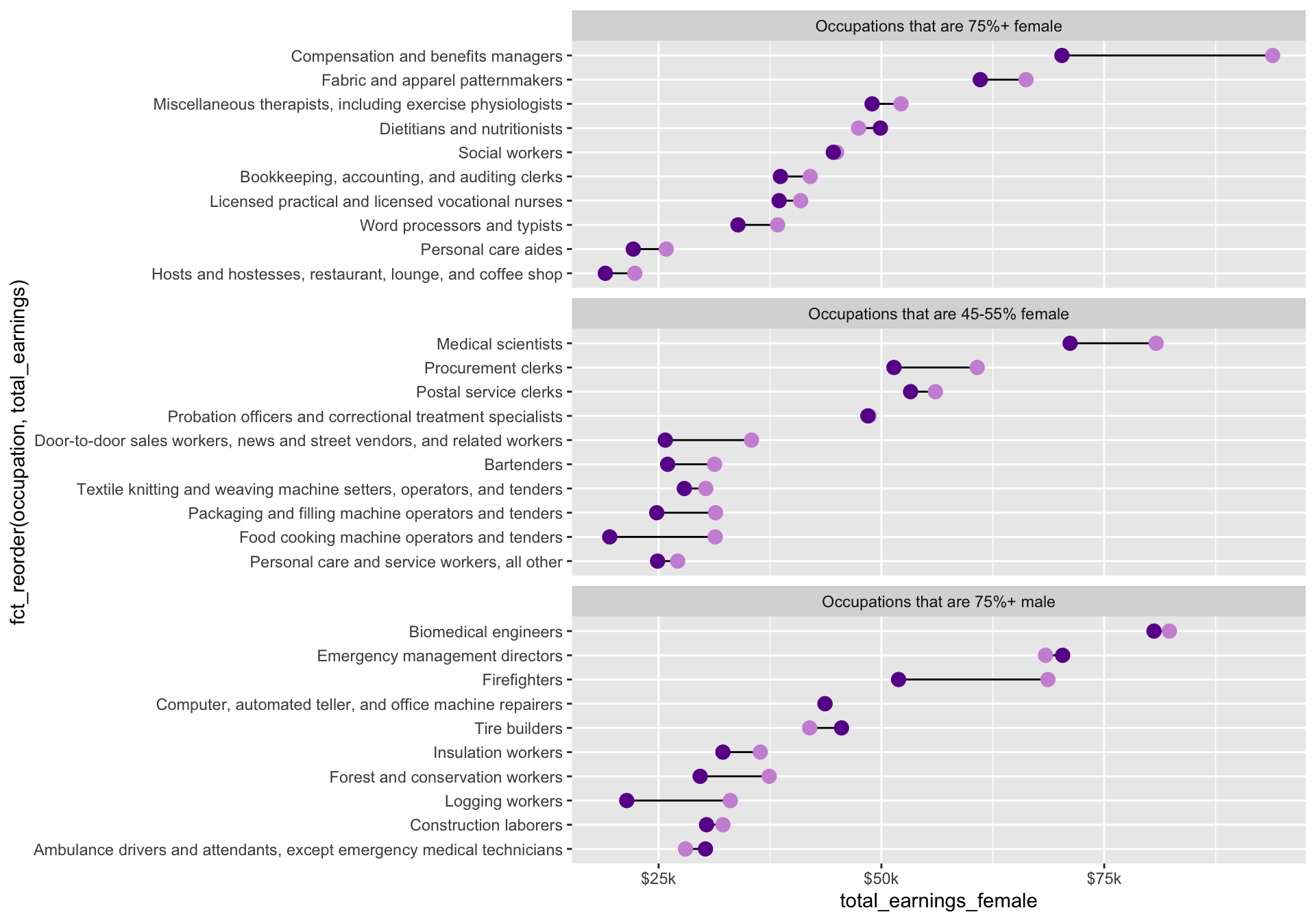
Create a better (named) palette
In lecture 5.2 (colors), we learned to be predictable in our color choices, but to avoid stereotypes (Muth 2018). It can be helpful for readers to choose a cool color for men (e.g. blues / purples) and warmer color for women (e.g. yellows, oranges, warm greens).
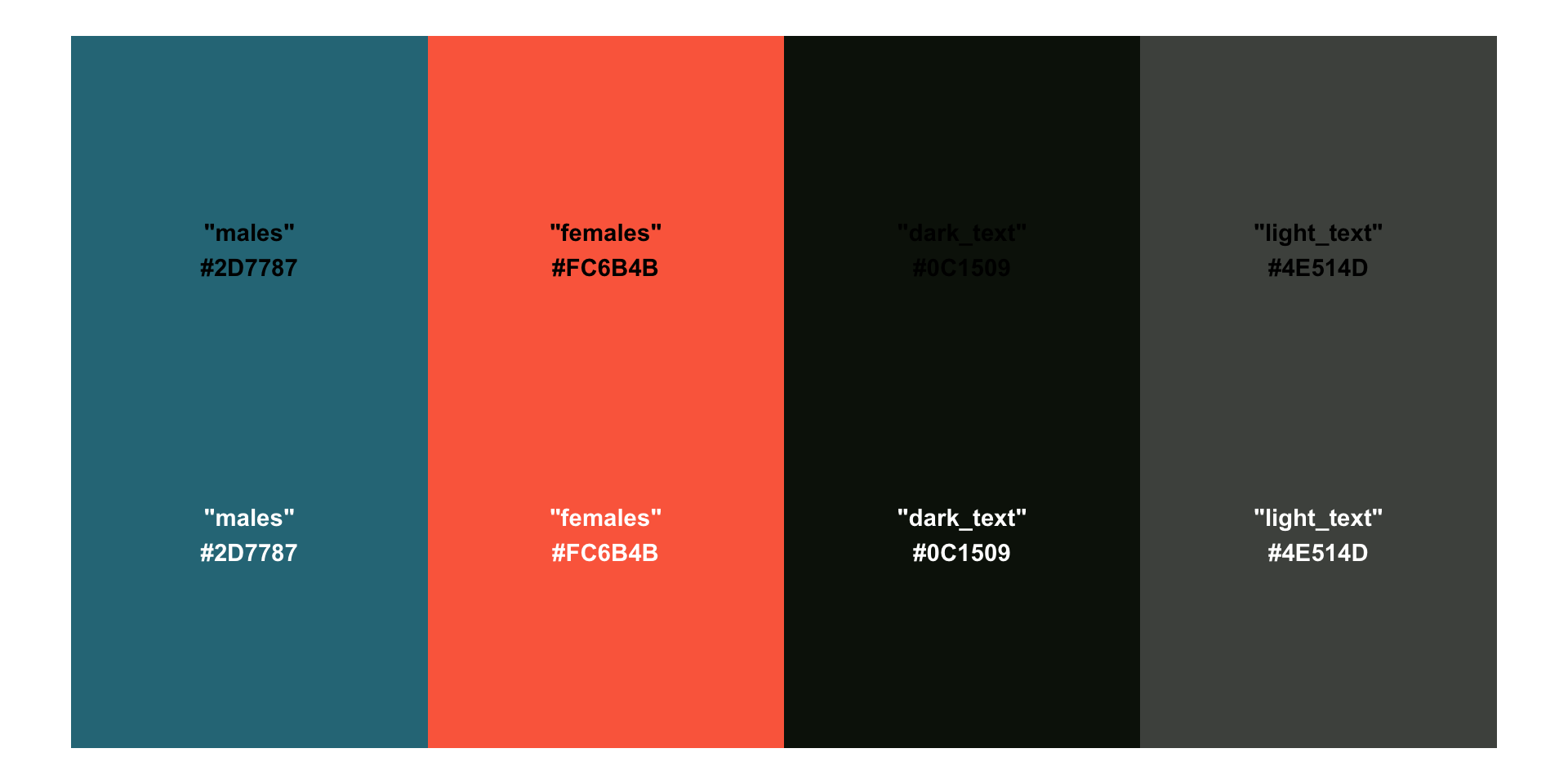
We’ll do that here, but this time, let’s create a named vector of colors to call from. In addition to our point colors, we’ll also include colors for our plot’s text:
The primary purpose of the {monochromeR} package is for creating monochrome color palettes, however, it also includes a helpful function for viewing our palette:
Apply new colors by name
ggplot(subset_jobs) +
  geom_linerange(aes(y = occupation,
                     xmin = total_earnings_female, xmax = total_earnings_male)) +
  geom_point(aes(x = total_earnings_male, y = occupation),
             color = earnings_pal["males"],
             size = 2.5) +
  geom_point(aes(x = total_earnings_female, y = occupation),
             color = earnings_pal["females"],
             size = 2.5) +
  facet_wrap(~group_label, nrow = 3, scales = "free_y") +
  scale_x_continuous(labels = scales::label_currency(scale = 0.001, suffix = "k"),
                     breaks = c(25000, 50000, 75000, 100000, 125000))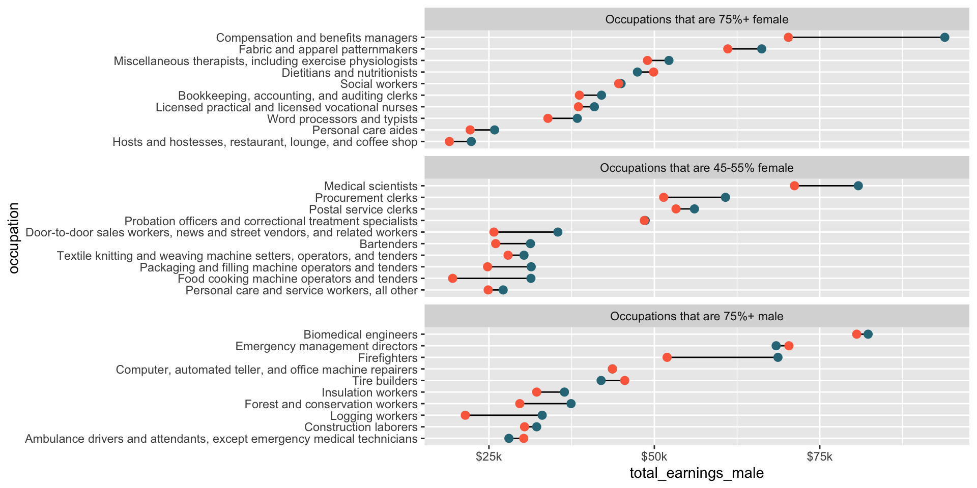
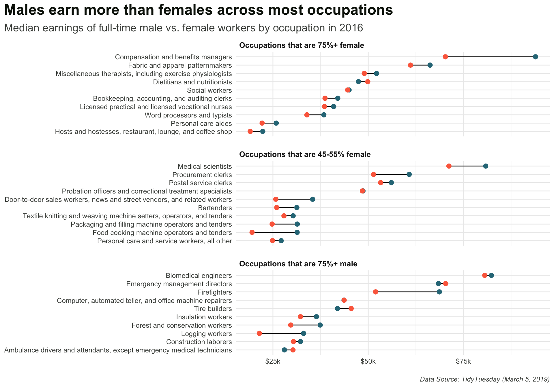
Add titles / caption & modify theme
Resulting plot is rendered on the next slide!
ggplot(subset_jobs) +
  geom_linerange(aes(y = occupation,
                     xmin = total_earnings_female, xmax = total_earnings_male)) +
  geom_point(aes(x = total_earnings_male, y = occupation),
             color = earnings_pal["males"],
             size = 2.5) +
  geom_point(aes(x = total_earnings_female, y = occupation),
             color = earnings_pal["females"],
             size = 2.5) +
  facet_wrap(~group_label, nrow = 3, scales = "free_y") +
  scale_x_continuous(labels = scales::label_currency(scale = 0.001, suffix = "k"),
                     breaks = c(25000, 50000, 75000, 100000, 125000)) +
  labs(title = "Males earn more than females across most occupations",
       subtitle = "Median earnings of full-time male vs. female workers by occupation in 2016",
       caption = "Data Source: TidyTuesday (March 5, 2019)") +
  theme_minimal() +
  theme(
    plot.title.position = "plot",
    plot.title = element_text(face = "bold",
                              size = 18,
                              color = earnings_pal["dark_text"]),
    plot.subtitle = element_text(size = 11.5,
                                 color = earnings_pal["light_text"],
                                 margin = margin(t = 2, r = 0, b = 6, l = 0)),
    plot.caption = element_text(face = "italic",
                                color = earnings_pal["light_text"],
                                margin = margin(t = 15, r = 0, b = 0, l = 0)),
    strip.text = element_text(face = "bold",
                              size = 10,
                              hjust = 0),
    panel.spacing.y = unit(x = 0.5, "cm"),
    axis.text = element_text(size = 9,
                             color = earnings_pal["light_text"]),
    axis.title = element_blank()
  )
Note: We can apply our font colors in the same way we applied our point colors, calling named values from our earnings_pal
Pick a typeface(s) from Google Fonts
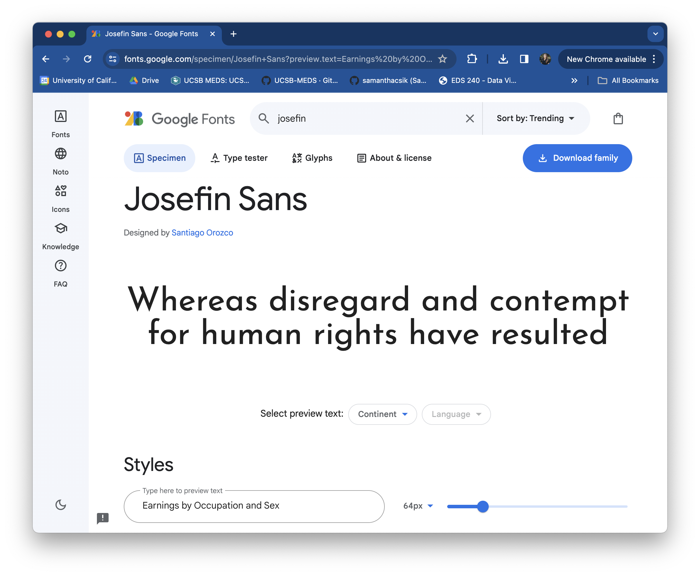
Browse typefaces and fonts at https://fonts.google.com/. It can be helpful to type your desired text into the Preview field (you may need to expand the sidebar by clicking the Filters button on the top left of the page) to get a better sense of how your font choice will look. You can also search typefaces by name:
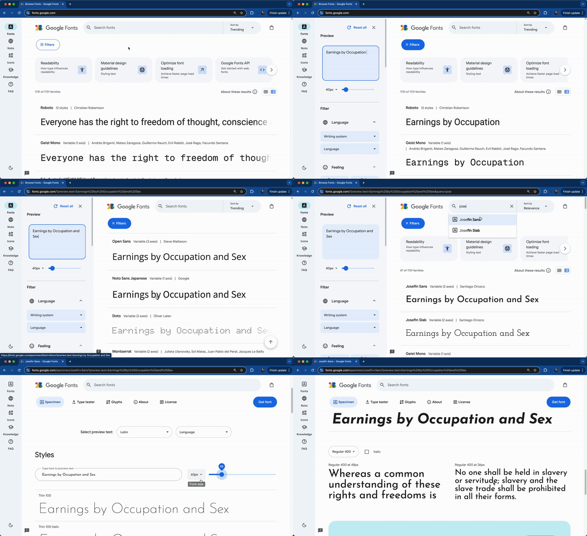
We’ll use these two typefaces:
Important: Pick typefaces that have all the font styles (e.g. bold, italic) that you want to use. Sen does not come in an italic style, meaning we won’t be able to render any text in the typeface Sen and the font style italic (demonstrated in the next slides).
Import Google Fonts
Import {showtext} at the top of your script, then use font_add_google() to specify the font family(ies) you want to import. Importantly, you’ll also need to “turn on” showtext using showtext_auto() – this enables showtext font rendering for any newly opened graphics devices.
##~~~~~~~~~~~~~~~~~~~~~~~~~~~~~~~~~~~~~~~~~~~~~~~~~~~~~~~~~~~~~~~~~~~~~~~~~~~~~~
##                                    setup                                 ----
##~~~~~~~~~~~~~~~~~~~~~~~~~~~~~~~~~~~~~~~~~~~~~~~~~~~~~~~~~~~~~~~~~~~~~~~~~~~~~~

#..........................load packages.........................
library(tidyverse)
library(showtext)

#......................import Google fonts.......................
# `name` is the name of the font as it appears in Google Fonts
# `family` is the user-specified id that you'll use to apply a font in your ggpplot
font_add_google(name = "Josefin Sans", family = "josefin")
font_add_google(name = "Sen", family = "sen")

#................enable {showtext} for rendering.................
showtext_auto()

# ~ additional setup code omitted for brevity ~
Apply Google Fonts (code)
Resulting plot is rendered on the next slide!
ggplot(subset_jobs) +
  geom_linerange(aes(y = occupation,
                     xmin = total_earnings_female, xmax = total_earnings_male)) +
  geom_point(aes(x = total_earnings_male, y = occupation),
             color = earnings_pal["males"],
             size = 2.5) +
  geom_point(aes(x = total_earnings_female, y = occupation),
             color = earnings_pal["females"],
             size = 2.5) +
  facet_wrap(~group_label, nrow = 3, scales = "free_y") +
  scale_x_continuous(labels = scales::label_currency(scale = 0.001, suffix = "k"),
                     breaks = c(25000, 50000, 75000, 100000, 125000)) +
  labs(title = "Males earn more than females across most occupations",
       subtitle = "Median earnings of full-time male vs. female workers by occupation in 2016",
       caption = "Data Source: TidyTuesday (March 5, 2019)") +
  theme_minimal() +
  theme(
    plot.title.position = "plot",
    plot.title = element_text(family = "josefin",
                              face = "bold",
                              size = 18,
                              color = earnings_pal["dark_text"]),
    plot.subtitle = element_text(family = "sen",
                                 size = 11.5,
                                 color = earnings_pal["light_text"],
                                 margin = margin(t = 2, r = 0, b = 6, l = 0)),
    plot.caption = element_text(family = "sen",
                                face = "italic",
                                color = earnings_pal["light_text"],
                                margin = margin(t = 15, r = 0, b = 0, l = 0)),
    strip.text = element_text(family = "josefin",
                              face = "bold",
                              size = 10,
                              hjust = 0),
    panel.spacing.y = unit(x = 0.5, "cm"),
    axis.text = element_text(family = "sen",
                             size = 9,
                             color = earnings_pal["light_text"]),
    axis.title = element_blank()
  )
Note: Our previously italicized caption is no longer, since Sen does not come in an italicized font style. You can choose to leave line 17 (it just won’t work) or remove it altogether.
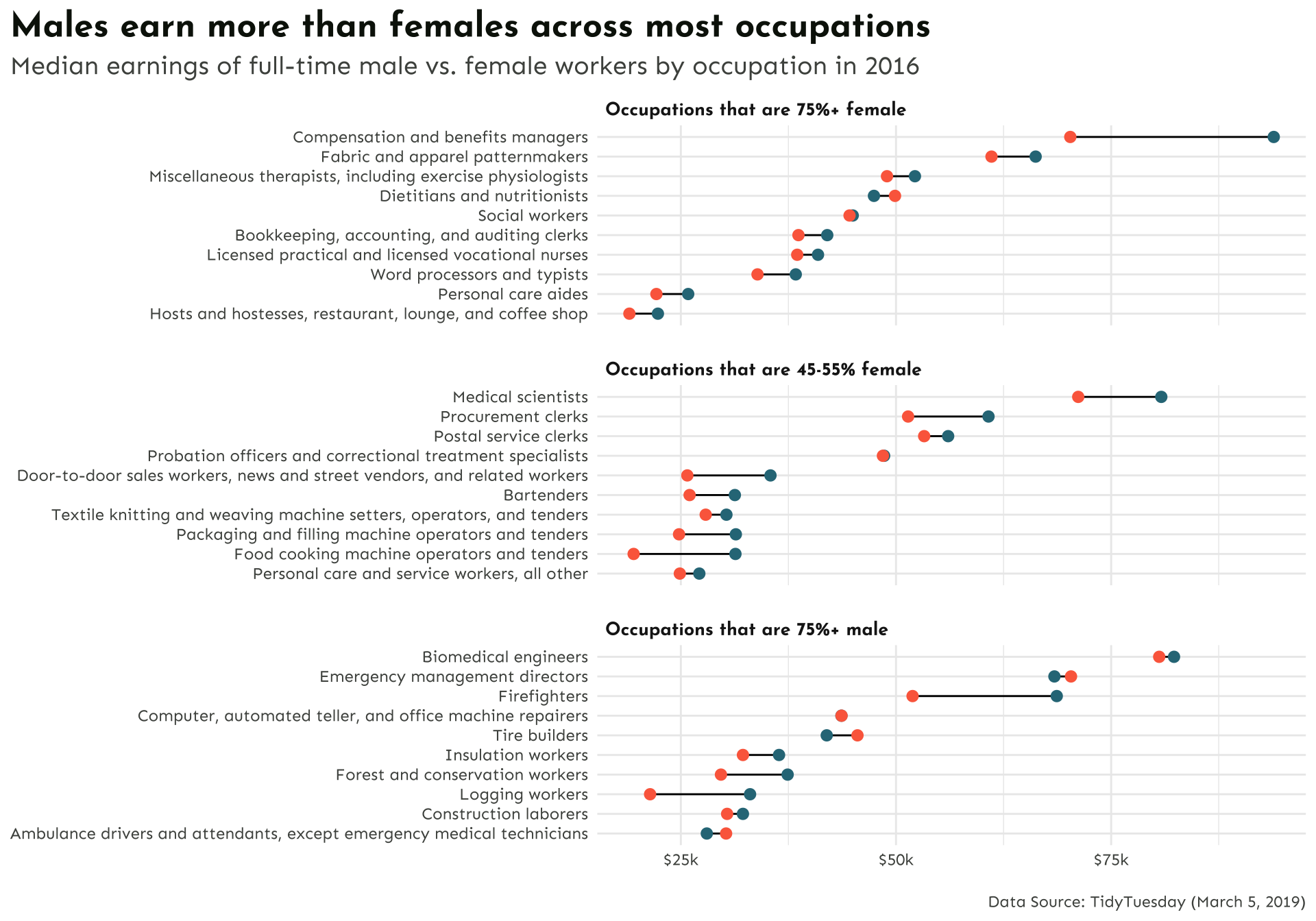
Import Font Awesome fonts
Font Awesome is a library of icons, which can be imported and used similar to Google Fonts. You’ll need to download the font files first (see today’s pre-class prep instructions). We can then use showtext::font_add() to make them available for use in our ggplots:
##~~~~~~~~~~~~~~~~~~~~~~~~~~~~~~~~~~~~~~~~~~~~~~~~~~~~~~~~~~~~~~~~~~~~~~~~~~~~~~
##                                    setup                                 ----
##~~~~~~~~~~~~~~~~~~~~~~~~~~~~~~~~~~~~~~~~~~~~~~~~~~~~~~~~~~~~~~~~~~~~~~~~~~~~~~

#..........................load packages.........................
library(tidyverse)
library(showtext)

#......................import Google Fonts.......................
# `name` is the name of the font as it appears in Google Fonts
# `family` is the user-specified id that you'll use to apply a font in your ggpplot
font_add_google(name = "Josefin Sans", family = "josefin")
font_add_google(name = "Sen", family = "sen")

#....................import Font Awesome fonts...................
font_add(family = "fa-brands",
         regular = here::here("fonts", "Font Awesome 6 Brands-Regular-400.otf"))
font_add(family = "fa-regular",
         regular = here::here("fonts", "Font Awesome 6 Free-Regular-400.otf"))
font_add(family = "fa-solid",
         regular = here::here("fonts", "Font Awesome 6 Free-Solid-900.otf"))

#......enable {showtext} rendering for all newly opened GDs......
showtext_auto()

# ~ additional setup code omitted for brevity ~
Reference icons by their Unicode
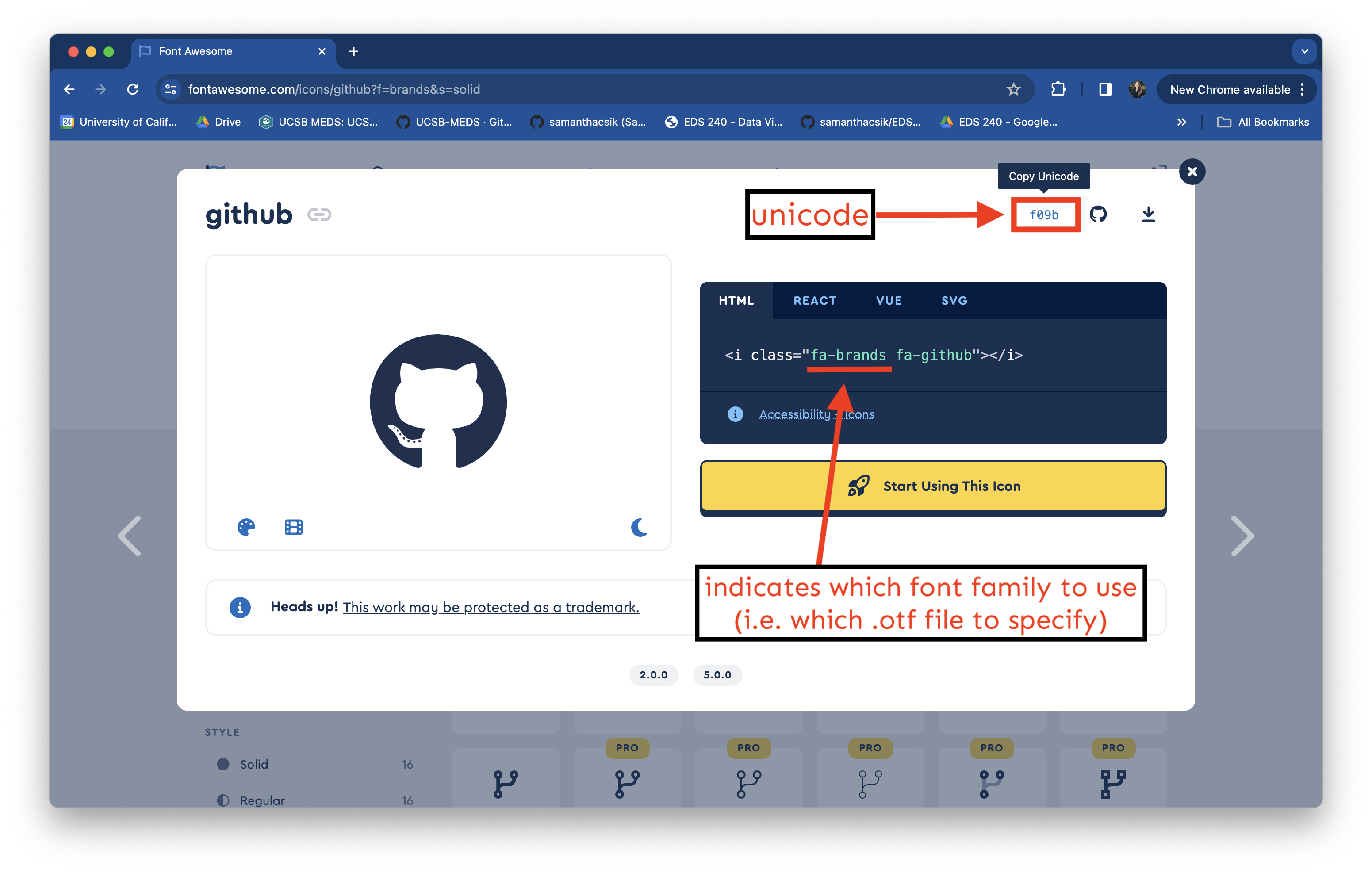
Let’s say I want to include my GitHub username along with the GitHub icon in the caption of my plot. Start by searching the Free icons on Font Awesome and click on the one you want to use (here, the github icon). Find the icon’s Unicode in the top right corner of the popup box:
Add an icon to our caption
To use this unicode in HTML, we need to stick a &#x ahead of it. We can make our lives a bit easier by saving our unicode (as well as our username text) to variable names. We’ll then use the glue::glue() function to construct our full caption. Importantly, glue() will evaluate expressions enclosed by braces as R code.
Note that we (1) wrap our object names in {} to use the values that are saved to them, and (2), we use the HTML <span> tag to apply styles to text – here, we use the font-family property and supply it the value, fa-brands (which is the id (i.e. family) we created when loading the Font Awesome 6 Brands-Regular-400.otf file at the top of our script).
Let’s also add an icon to our subtitle
We can do this the same way that we constructed our caption – note that this money icon is from the fa-regular family (though you could choose to use the solid version as well):
Apply our new caption & subtitle
Resulting plot is rendered on the next slide!
ggplot(subset_jobs) +
  geom_linerange(aes(y = occupation,
                     xmin = total_earnings_female, xmax = total_earnings_male)) +
  geom_point(aes(x = total_earnings_male, y = occupation),
             color = earnings_pal["males"],
             size = 2.5) +
  geom_point(aes(x = total_earnings_female, y = occupation),
             color = earnings_pal["females"],
             size = 2.5) +
  facet_wrap(~group_label, nrow = 3, scales = "free_y") +
  scale_x_continuous(labels = scales::label_currency(scale = 0.001, suffix = "k"),
                     breaks = c(25000, 50000, 75000, 100000, 125000)) +
  labs(title = "Males earn more than females across most occupations",
       subtitle = subtitle,
       caption = caption) +
  theme_minimal() +
  theme(
    plot.title.position = "plot",
    plot.title = element_text(family = "josefin",
                              face = "bold",
                              size = 18,
                              color = earnings_pal["dark_text"]),
    plot.subtitle = element_text(family = "sen",
                                 size = 11.5,
                                 color = earnings_pal["light_text"],
                                 margin = margin(t = 2, r = 0, b = 6, l = 0)),
    plot.caption = element_text(family = "sen",
                                face = "italic",
                                color = earnings_pal["light_text"],
                                margin = margin(t = 15, r = 0, b = 0, l = 0)),
    strip.text = element_text(family = "josefin",
                              face = "bold",
                              size = 10,
                              hjust = 0),
    panel.spacing.y = unit(x = 0.5, "cm"),
    axis.text = element_text(family = "sen",
                             size = 9,
                             color = earnings_pal["light_text"]),
    axis.title = element_blank()
  )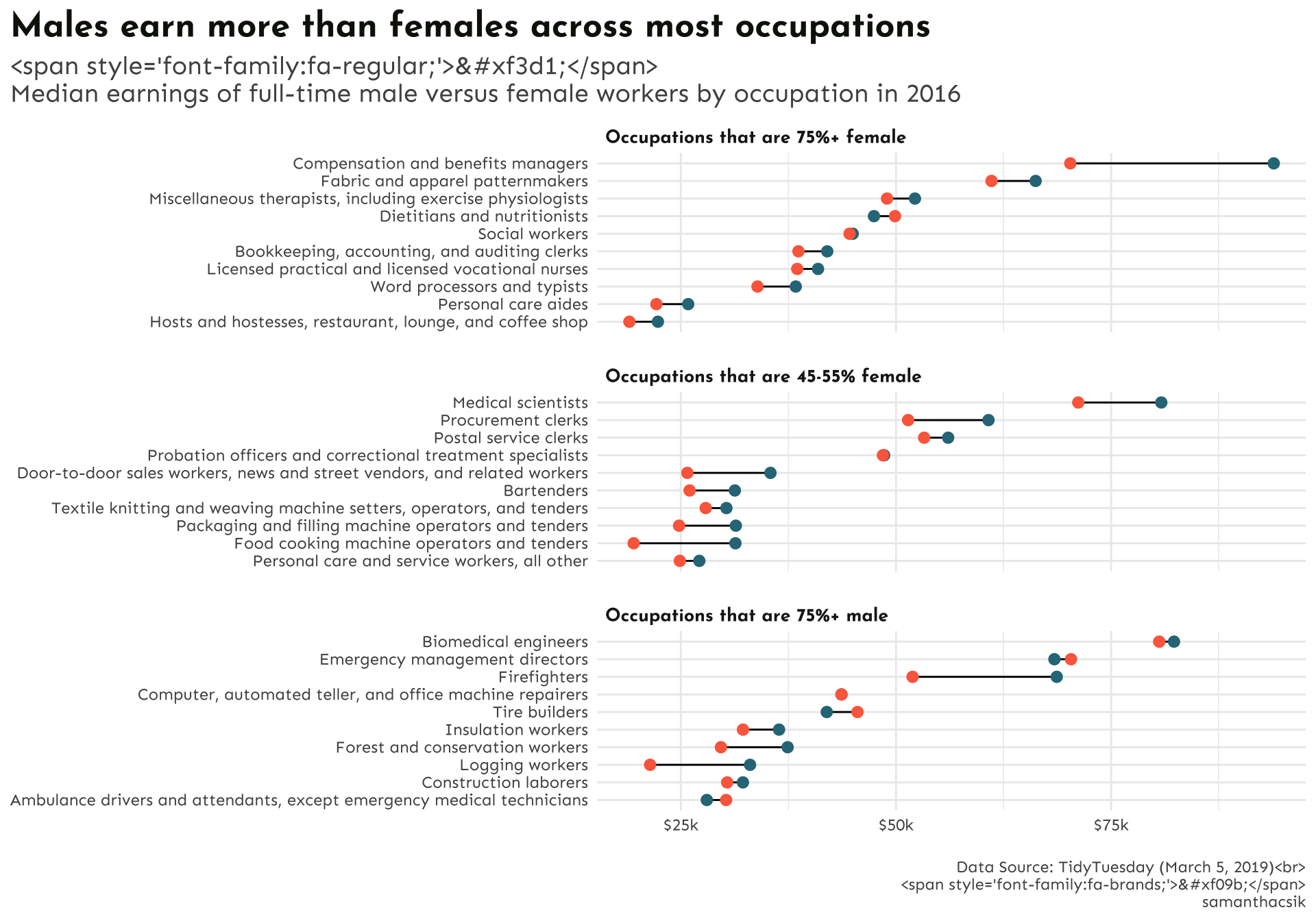
ggplot doesn’t (natively) know how to parse HTML
. . . but the {ggtext} package does! If we want to render ggplot text using HTML or Markdown syntax, we also need to use one of {ggtext}’s theme() elements, which will parse and render the applied styles.
There are a few options, all which replace {ggplot2}’s element_text() – be sure to check out the documentation as you’re deciding which to use:
element_markdown()element_textbox()element_textbox_simple()
Update theme() elements to render styling
ggplot(subset_jobs) +
  geom_linerange(aes(y = occupation,
                     xmin = total_earnings_female, xmax = total_earnings_male)) +
  geom_point(aes(x = total_earnings_male, y = occupation),
             color = earnings_pal["males"],
             size = 2.5) +
  geom_point(aes(x = total_earnings_female, y = occupation),
             color = earnings_pal["females"],
             size = 2.5) +
  facet_wrap(~group_label, nrow = 3, scales = "free_y") +
  scale_x_continuous(labels = scales::label_currency(scale = 0.001, suffix = "k"),
                     breaks = c(25000, 50000, 75000, 100000, 125000)) +
  labs(title = "Males earn more than females across most occupations",
       subtitle = subtitle,
       caption = caption) +
  theme_minimal() +
  theme(
    plot.title.position = "plot",
    plot.title = element_text(family = "josefin",
                              face = "bold",
                              size = 18,
                              color = earnings_pal["dark_text"]),
    plot.subtitle = ggtext::element_textbox(family = "sen",
                                            size = 11.5,
                                            color = earnings_pal["light_text"],
                                            margin = margin(t = 2, r = 0, b = 6, l = 0)),
    plot.caption = ggtext::element_textbox(family = "sen",
                                           face = "italic",
                                           color = earnings_pal["light_text"],
                                           halign = 1,
                                           lineheight = 1.5,
                                           margin = margin(t = 15, r = 0, b = 0, l = 0)),
    strip.text = element_text(family = "josefin",
                              face = "bold",
                              size = 10,
                              hjust = 0),
    panel.spacing.y = unit(x = 0.5, "cm"),
    axis.text = element_text(family = "sen",
                             size = 9,
                             color = earnings_pal["light_text"]),
    axis.title = element_blank()
  )
Note: Text rendered with {ggtext} doesn’t appear correctly in the RStudio plots pane (or when using the Zoom window) – see this separate, but potentially related GitHub issue.
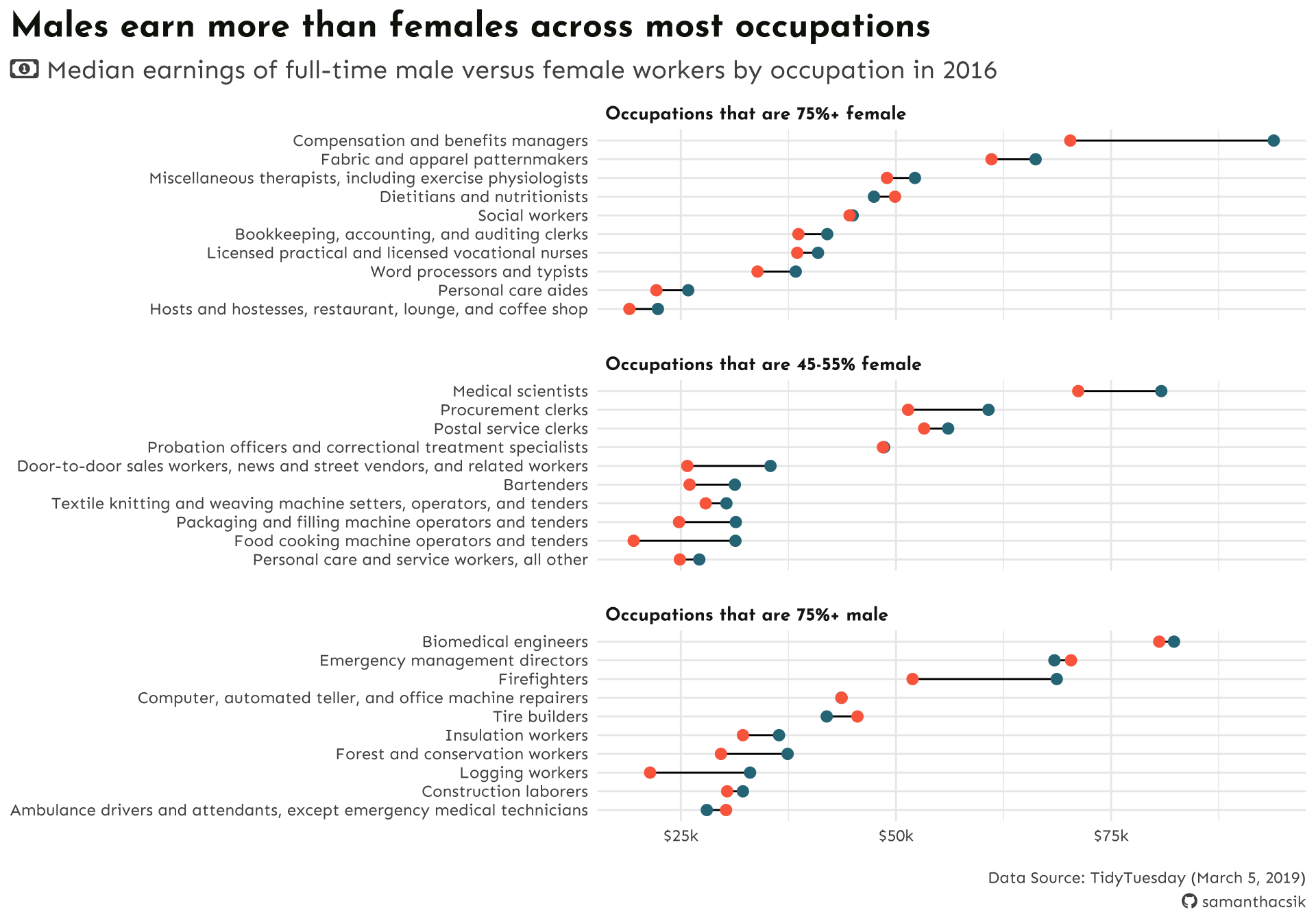
We also need to tell readers what our colors mean!
Rather than a traditional legend, let’s color-code our subtitle text (i.e. male & female) to match the points in our plot. We can again use the {ggtext} package to apply simple Markdown and HTML rendering to our ggplot text.
We already have the correct theme() elements added to our plot, but we do need to update our subtitle text with Markdown and HTML styling. Let’s bold and color the words “male” and “female”:
#........................create subtitle.........................
money_icon <- ""
subtitle <- glue::glue("<span style='font-family:fa-regular;'>{money_icon};</span>
Median earnings of full-time
<span style='color:#2D7787;'>**male**</span>
versus
<span style='color:#FC6B4B;'>**female**</span>
workers by occupation in 2016")Note: We combine both Markdown syntax (e.g. ** to bold text) and HTML syntax to apply in-line CSS styling (e.g. <span style=...>)):
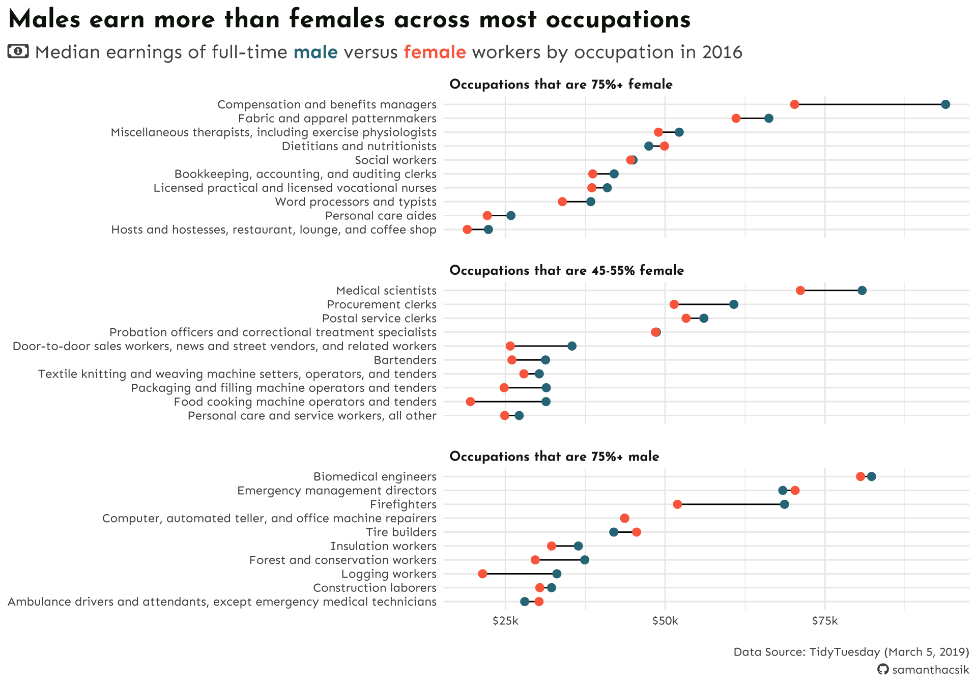
Before & after
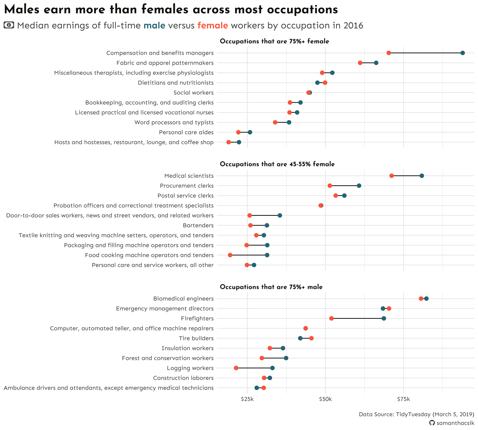
We can use ggsave() to save our plot as a PNG file
ggsave() creates a new graphical device to write the output file – here we specify a PNG device:
We can also turn off showtext rendering for future devices:
Uh oh . . . ?
Text elements can cause some annoyances when writing plots to file….
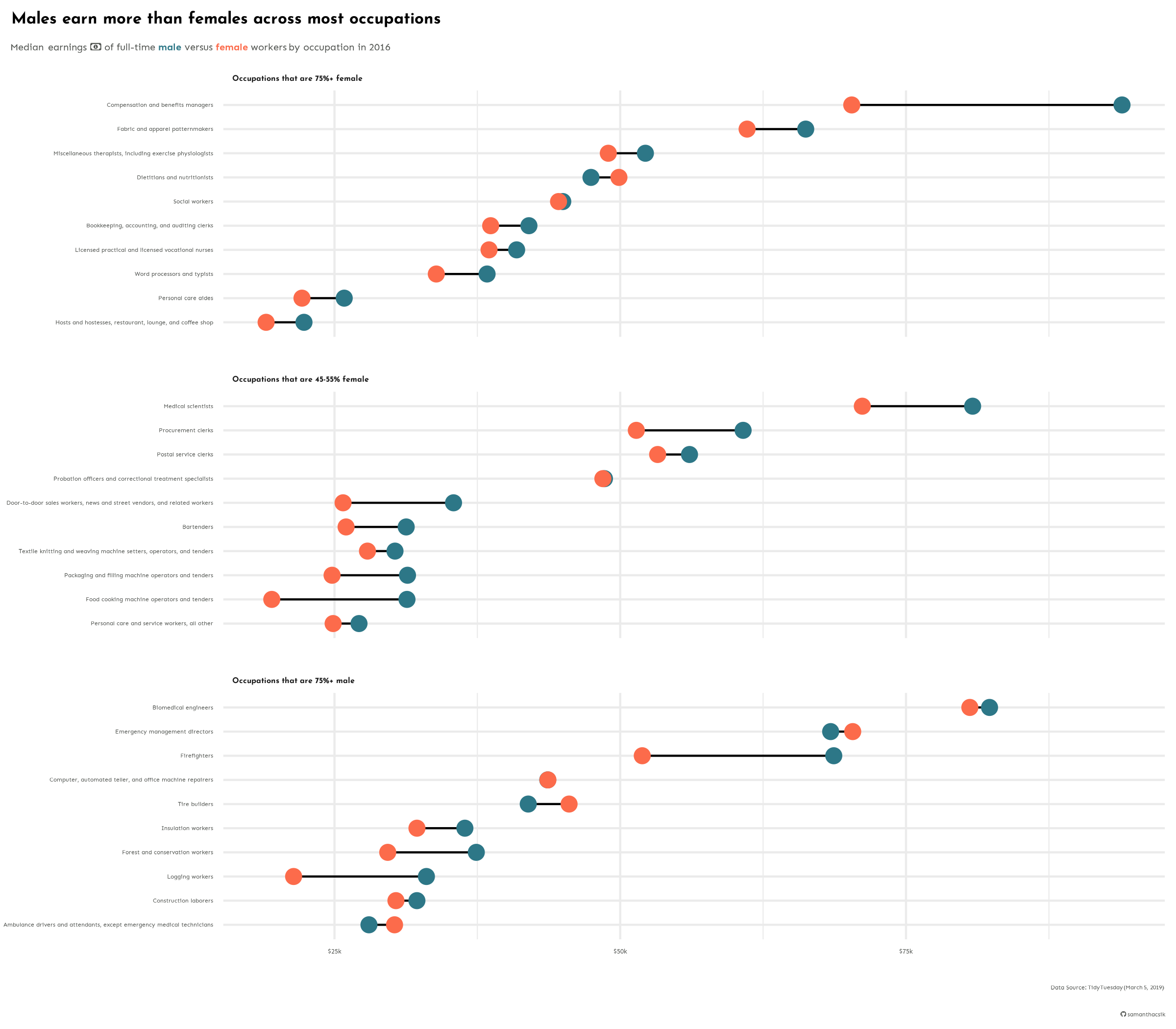
You’ll learn strategies for fixing this in discussion section!
Take a Break
~ This is the end of Lesson 1 (of 2) ~
05:00
