##~~~~~~~~~~~~~~~~~~~~~~~~~~~~~~~~~~~~~~~~~~~~~~~~~~~~~~~~~~~~~~~~~~~~~~~~~~~~~~
##                                    setup                                 ----
##~~~~~~~~~~~~~~~~~~~~~~~~~~~~~~~~~~~~~~~~~~~~~~~~~~~~~~~~~~~~~~~~~~~~~~~~~~~~~~

#..........................load packages.........................
library(tidyverse)

#..........................import data...........................
drought <- readr::read_csv('https://raw.githubusercontent.com/rfordatascience/tidytuesday/main/data/2021/2021-07-20/drought.csv')

##~~~~~~~~~~~~~~~~~~~~~~~~~~~~~~~~~~~~~~~~~~~~~~~~~~~~~~~~~~~~~~~~~~~~~~~~~~~~~~
##                            wrangle drought data                          ----
##~~~~~~~~~~~~~~~~~~~~~~~~~~~~~~~~~~~~~~~~~~~~~~~~~~~~~~~~~~~~~~~~~~~~~~~~~~~~~~

drought_clean <- drought |>

  # select cols of interest & update names for clarity (as needed) ----
  select(date = valid_start, state_abb, drought_lvl, area_pct) |>

  # add year, month & day cols using {lubridate} fxns ----
  # NOTE: this step isn't necessary for our plot, but I'm including as examples of how to extract different date elements from a object of class `Date` using {lubridate} ----
  mutate(year = year(date),
         month = month(date, label = TRUE, abbr = TRUE),
         day = day(date)) |>

  # add drought level conditions names ----
  mutate(drought_lvl_long = factor(drought_lvl,
                            levels = c("D4", "D3", "D2", "D1","D0", "None"),
                            labels = c("(D4) Exceptional", "(D3) Extreme",
                                       "(D2) Severe", "(D1) Moderate",
                                       "(D0) Abnormally Dry",
                                       "No Drought"))) |>

  # reorder cols ----
  relocate(date, year, month, day, state_abb, drought_lvl, drought_lvl_long, area_pct)
Note
It’s up to you to organize your own week2-discussion.qmd file (i.e. there is no template). You may (should) discuss and work through today’s exercise with a partner (or two!).
- Begin by copying the following setup and data wrangling code into your
week2-discussion.qmdfile. Run through and review the code, and explore the resultingdrought_cleandata frame.
- We still need to filter for just California data and remove any observations where
drought_lvlis"None". It makes some sense to perform these filters separate from our data wrangling code (in case we ever want to usedrought_cleanto make a similar plot for a different state(s)). Let’s filterdrought_clean, then pipe directly into our gpplot:
##~~~~~~~~~~~~~~~~~~~~~~~~~~~~~~~~~~~~~~~~~~~~~~~~~~~~~~~~~~~~~~~~~~~~~~~~~~~~~~
##       create stacked area plot of CA drought conditions through time     ----
##~~~~~~~~~~~~~~~~~~~~~~~~~~~~~~~~~~~~~~~~~~~~~~~~~~~~~~~~~~~~~~~~~~~~~~~~~~~~~~

drought_clean |>

  # remove drought_lvl "None" & filter for just CA ----
  filter(drought_lvl != "None",
         state_abb == "CA") |>
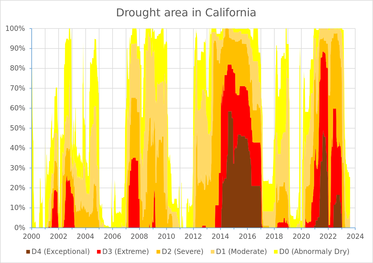
# pipe into ggplot here!- Build that ggplot! Here’s the original plot that we want to create (we’re only focusing on the data layer, geometric layer, and scales today):
It can be helpful to tackle one small(ish) thing at a time. Consider the following “stages”:
- Create a stacked area chart (take a look back at lecture 2.3 slides for examples)
- Figure out how to order the drought level groups in the same way as the USDM version (i.e. level
D4on the bottom, closet to the x-axis, and levelD0at the top) – Hint: explore thepositionargument - Update the colors so that they match the USDM version (use Colorpick Eyedropper to grab HEX codes from the original visualization) – Hint: use
scale_fill_manual()to set your new colors - Adjust your x-axis “breaks” (i.e. the tick mark values that represent years) – Hint: check out
scale_x_date()andscales::breaks_pretty() - Adjust your y-axis “breaks” (i.e. the tick mark value that represent percentage of affected area) – Hint: check out
scale_y_continous()andscales::label_percent() - Remove the “padding” (i.e. space) between your area chart and the x- and y-axes – Hint: check out the
expandargument inscale_x_date()andscale_y_continuous() - update the plot title