##~~~~~~~~~~~~~~~~~~~~~~~~~~~~~~~~~~~~~~~~~~~~~~~~~~~~~~~~~~~~~~~~~~~~~~~~~~~~~~
##                                    setup                                 ----
##~~~~~~~~~~~~~~~~~~~~~~~~~~~~~~~~~~~~~~~~~~~~~~~~~~~~~~~~~~~~~~~~~~~~~~~~~~~~~~

#..........................load packages.........................
library(metajam)
library(tidyverse)
library(ggExtra)
library(ggdensity)

#...................download data from DataOne...................
# you only need to do this once (then I recommend commenting it out)!
metajam::download_d1_data("https://cn.dataone.org/cn/v2/resolve/https%3A%2F%2Fpasta.lternet.edu%2Fpackage%2Fdata%2Feml%2Fknb-lter-hbr%2F208%2F14%2F024b6acc5cb2e03a14fff5558bbffc0c",
                 path = here::here("week4"))

#  ~ NOTE: You should rename the downloaded folder to 'data/' so that it's automatically ignored by your repo's .gitignore! ~

#....................read in downloaded files....................
stream_chem_all <- metajam::read_d1_files(here::here("week4", "data"))

#........................get the data file.......................
#stream_chem_data <- stream_chem_all$data
stream_chem_data <- stream_chem_all$HubbardBrook_weekly_stream_chemistry.csv
Note
This template follows the relationships slides. Please be sure to cross-reference the slides, which contain important information and additional context!
Setup
Data are downloaded from DataOne (find instructions for getting the download link on the {metajam} package README).
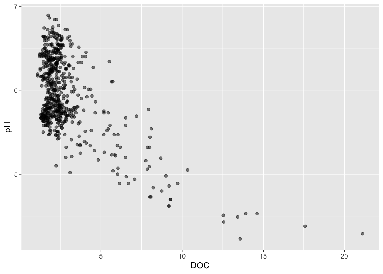
Scatter plots
Basic scatter plot
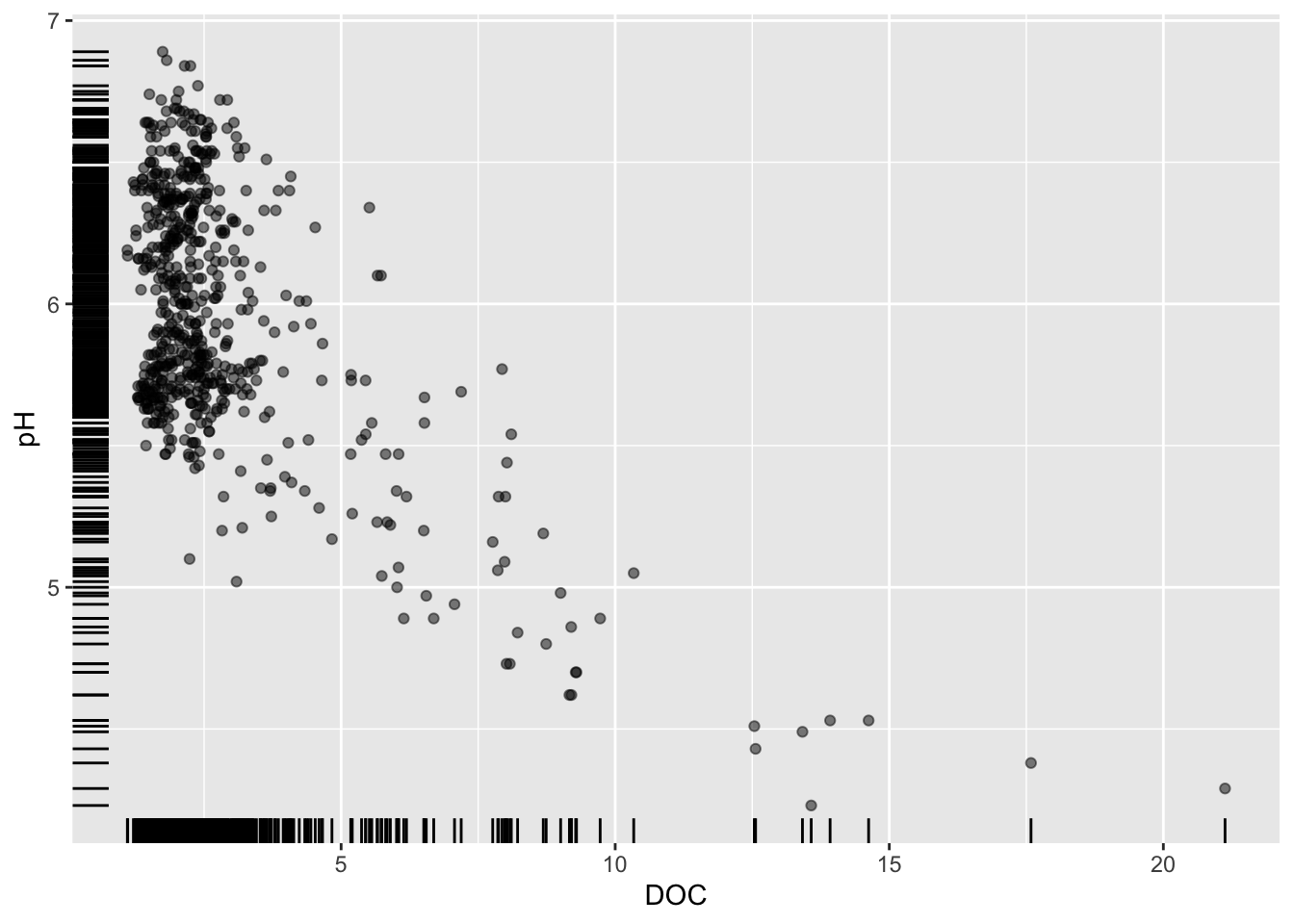
Alt 1: add a rug plot
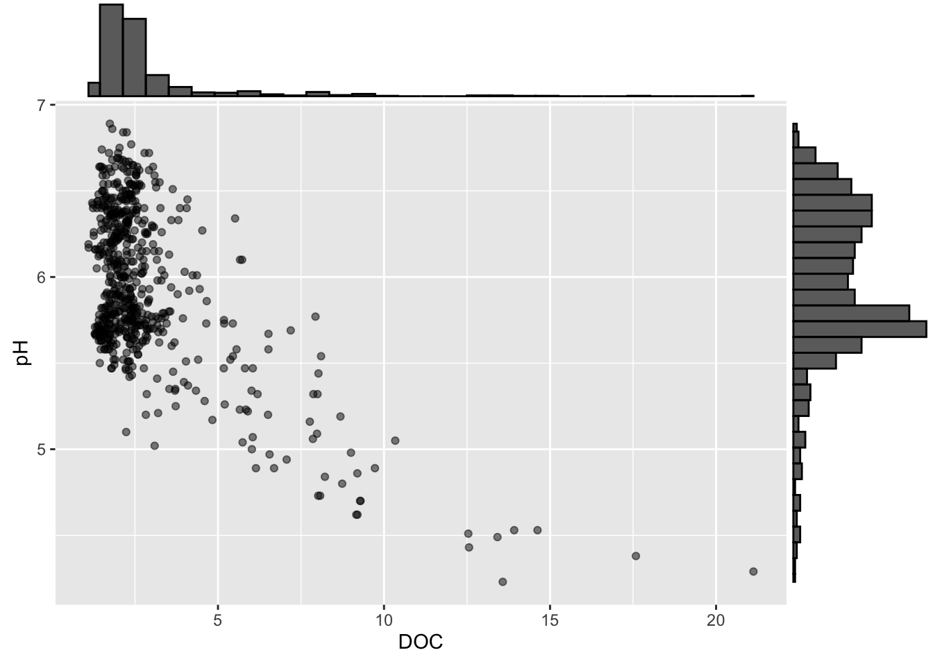
Alt 2: marginal plot alternatives using {ggExtra}
Alt 3: scatter + marginal plot with 2+ groups
#............scatter plot with points colored by site............
p2 <- stream_chem_data |>
  dplyr::filter(waterYr == 2024) |>
  ggplot(aes(x = DOC, y = pH, color = site)) +
  geom_point(alpha = 0.5) +
  theme(legend.position = "bottom")

#..................with marginal density plot....................
ggExtra::ggMarginal(p2, type = "density", groupFill = TRUE, groupColour = TRUE)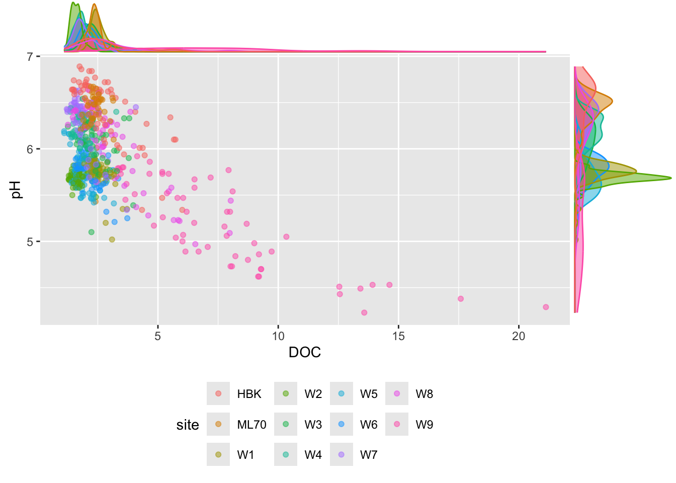
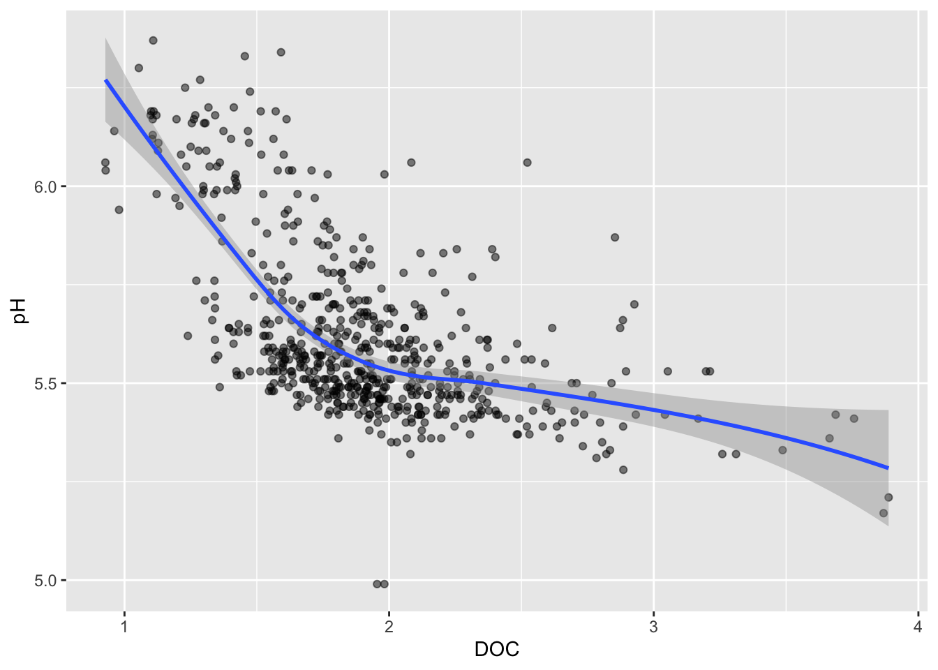
Trend lines
Default (<1000 data points): LOESS method
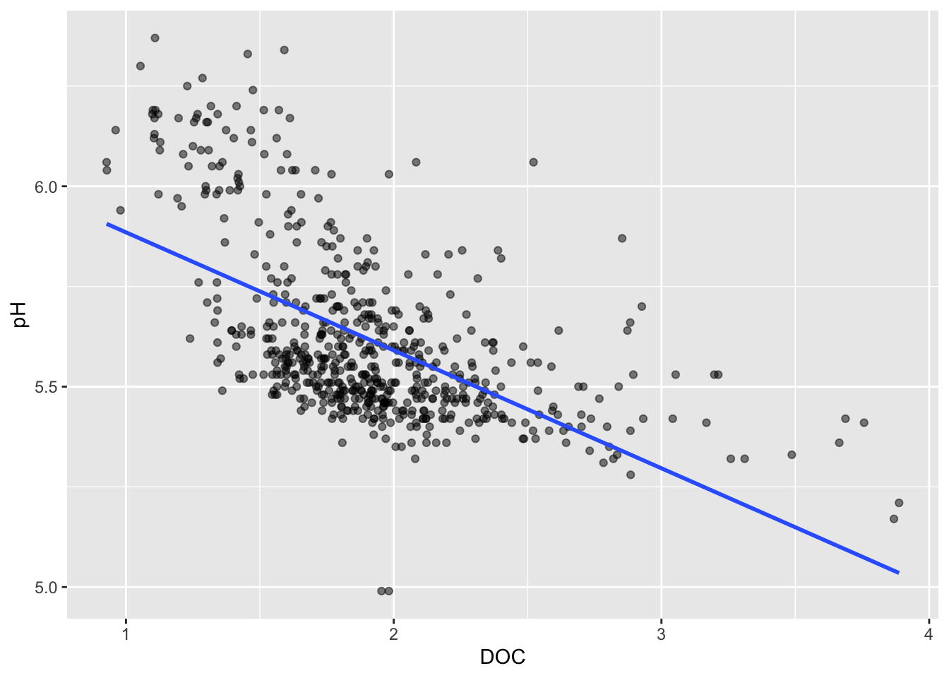
Line of best fit
Visualizing a third numeric variable
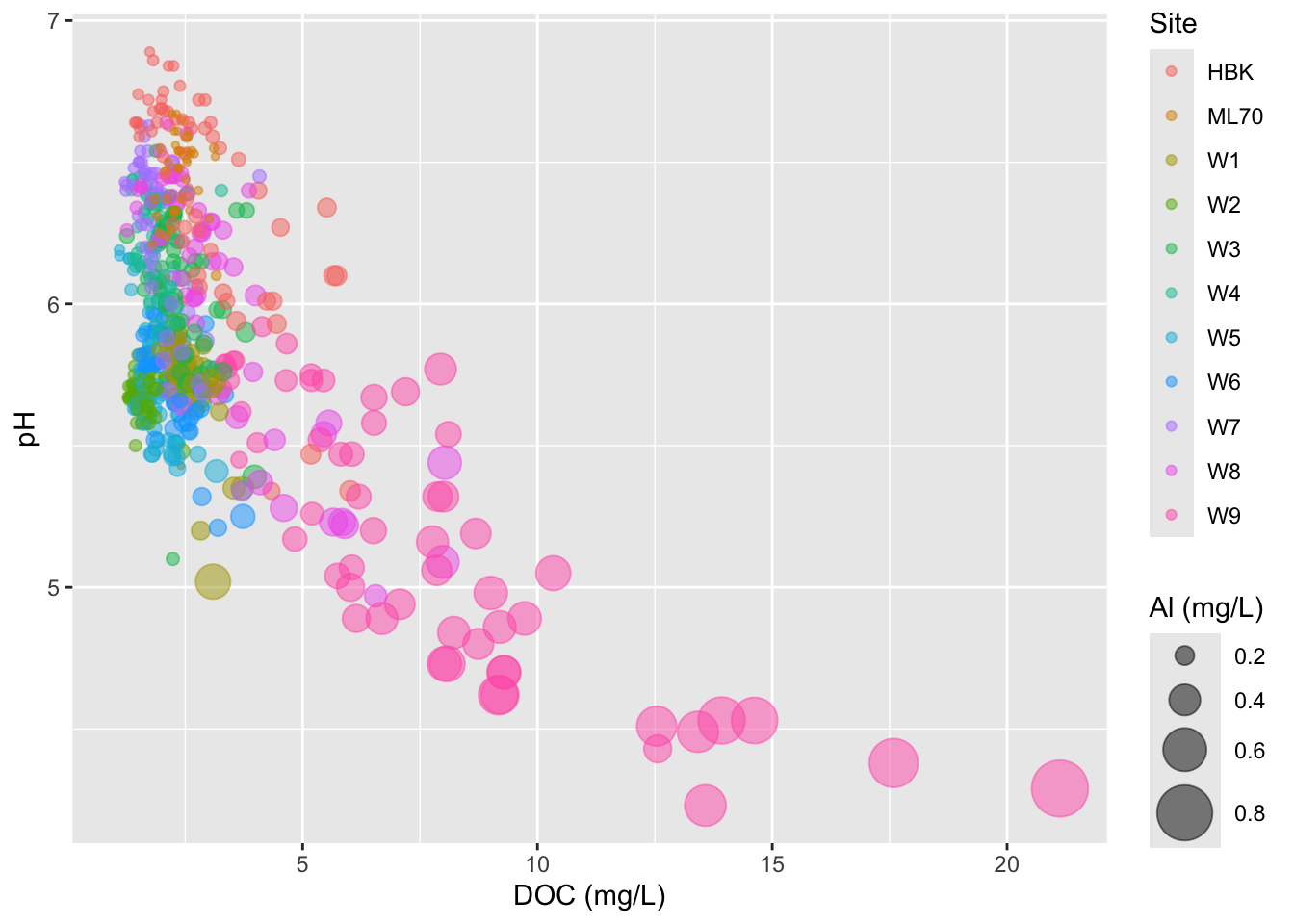
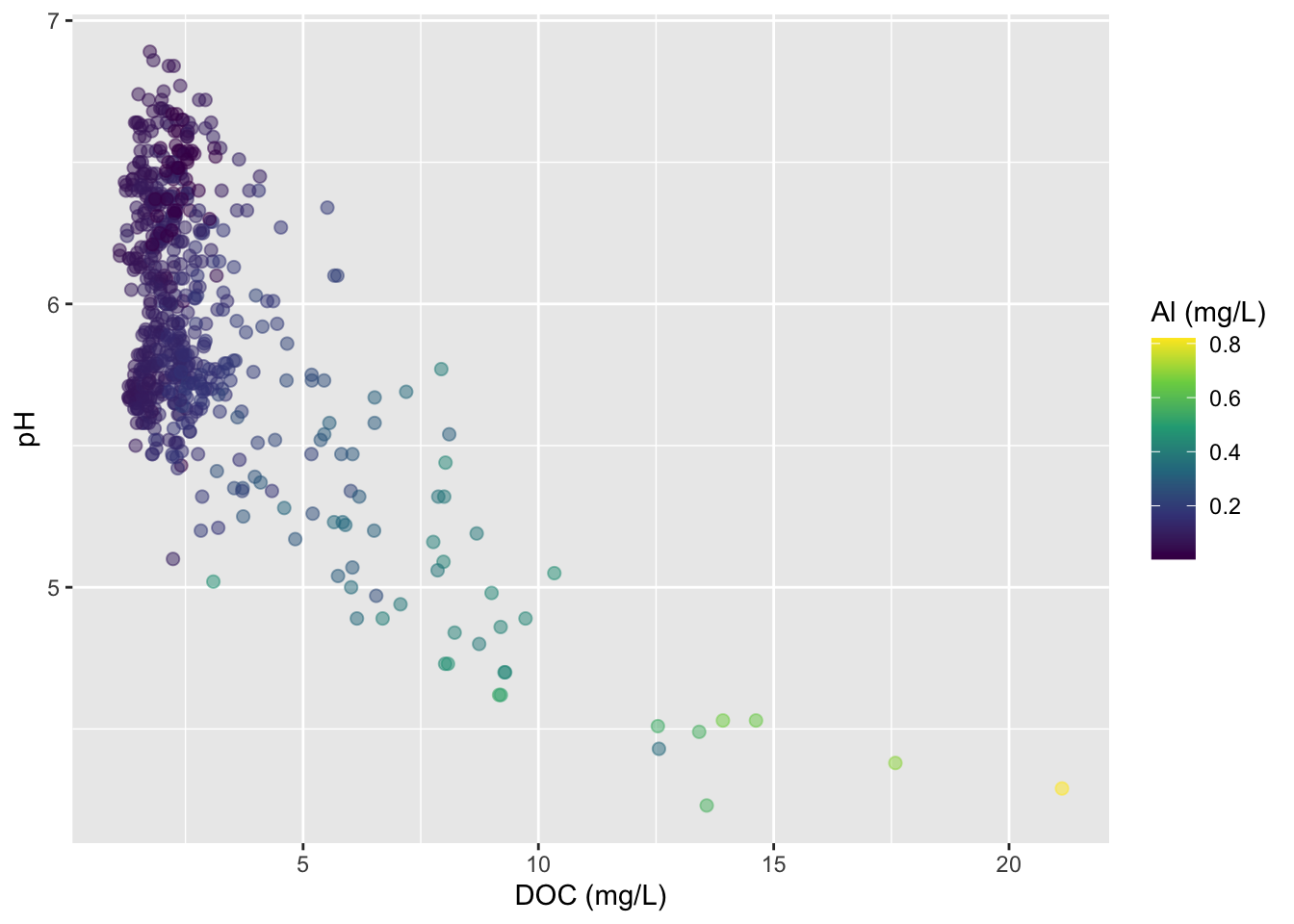
Bubble charts
- variation of a scatter plot for visualizing a third numeric variable
- be mindful: it’s challenging to interpret 3 numeric variables
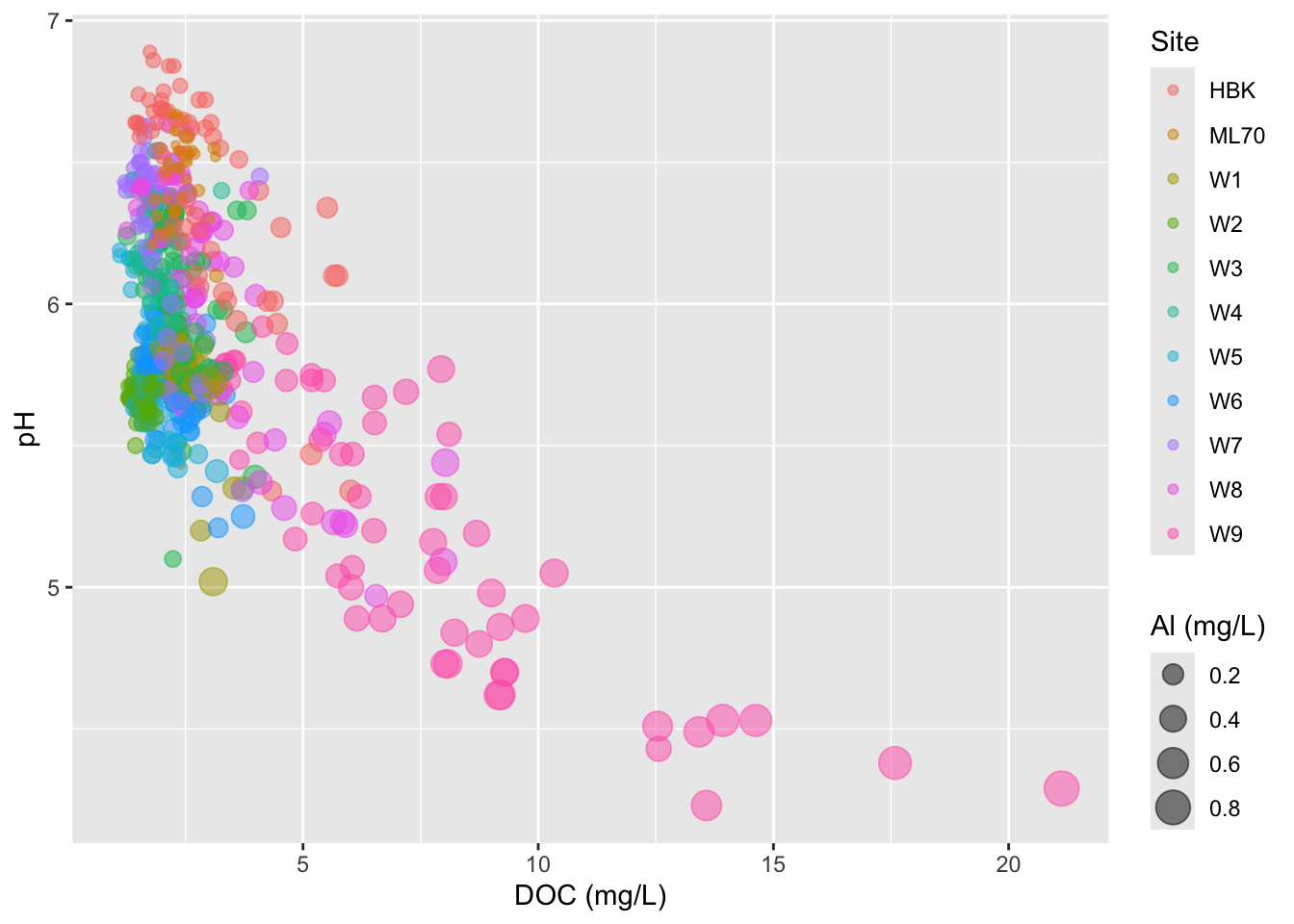
- adjust size range of bubbles
- IMPORTANT: don’t scale size by radius (can be deceptive)
#.......................scale size by area.......................
stream_chem_data |>
  dplyr::filter(waterYr == 2024) |>
  ggplot(aes(x = DOC, y = pH, color = site, size = Al_ICP)) +
  geom_point(alpha = 0.5) +
  scale_size(range = c(1, 10)) +
  labs(x = "DOC (mg/L)", size = "Al (mg/L)", color = "Site")
#...................DON'T scale size by radius...................
stream_chem_data |>
  dplyr::filter(waterYr == 2024) |>
  ggplot(aes(x = DOC, y = pH, color = site, size = Al_ICP)) +
  geom_point(alpha = 0.5) +
  scale_radius(range = c(1, 10)) +
  labs(x = "DOC (mg/L)", size = "Al (mg/L)", color = "Site")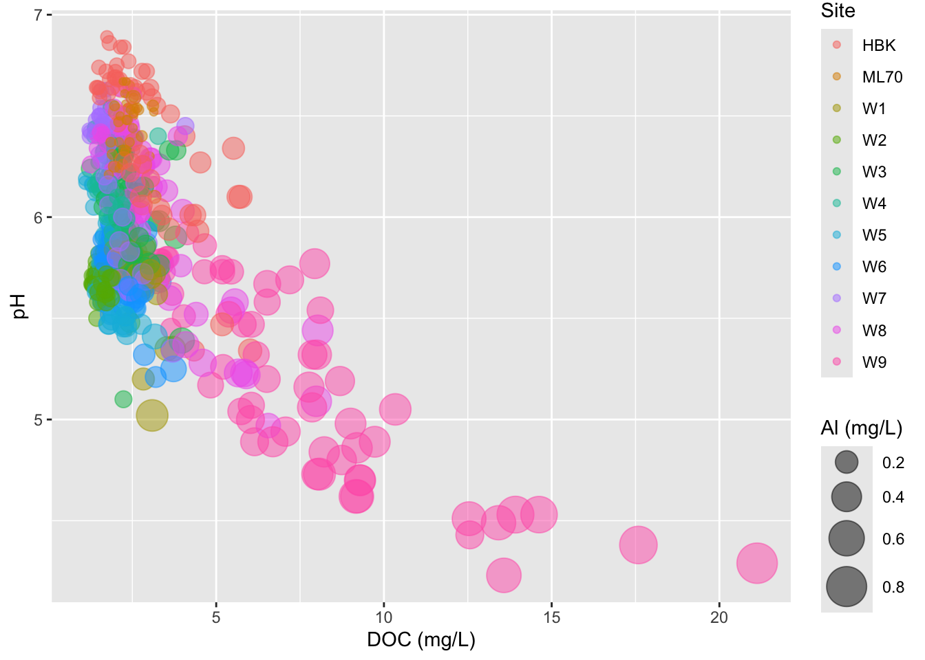
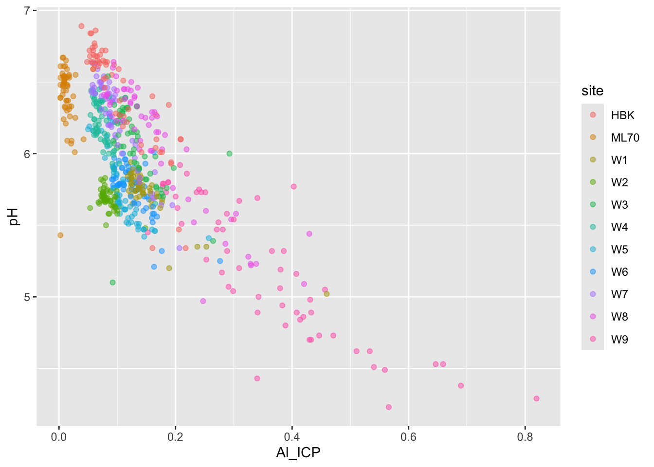
Use color for third variable
But oftentimes best to just create two different plots
#......................effect of DOC on pH.......................
stream_chem_data |>
  dplyr::filter(waterYr == 2024) |>
  ggplot(aes(x = DOC, y = pH, color = site)) +
  geom_point(alpha = 0.5)
#....................effect of DOC on Al_ICP.....................
stream_chem_data |>
  dplyr::filter(waterYr == 2024) |>
  ggplot(aes(x = Al_ICP, y = pH, color = site)) +
  geom_point(alpha = 0.5)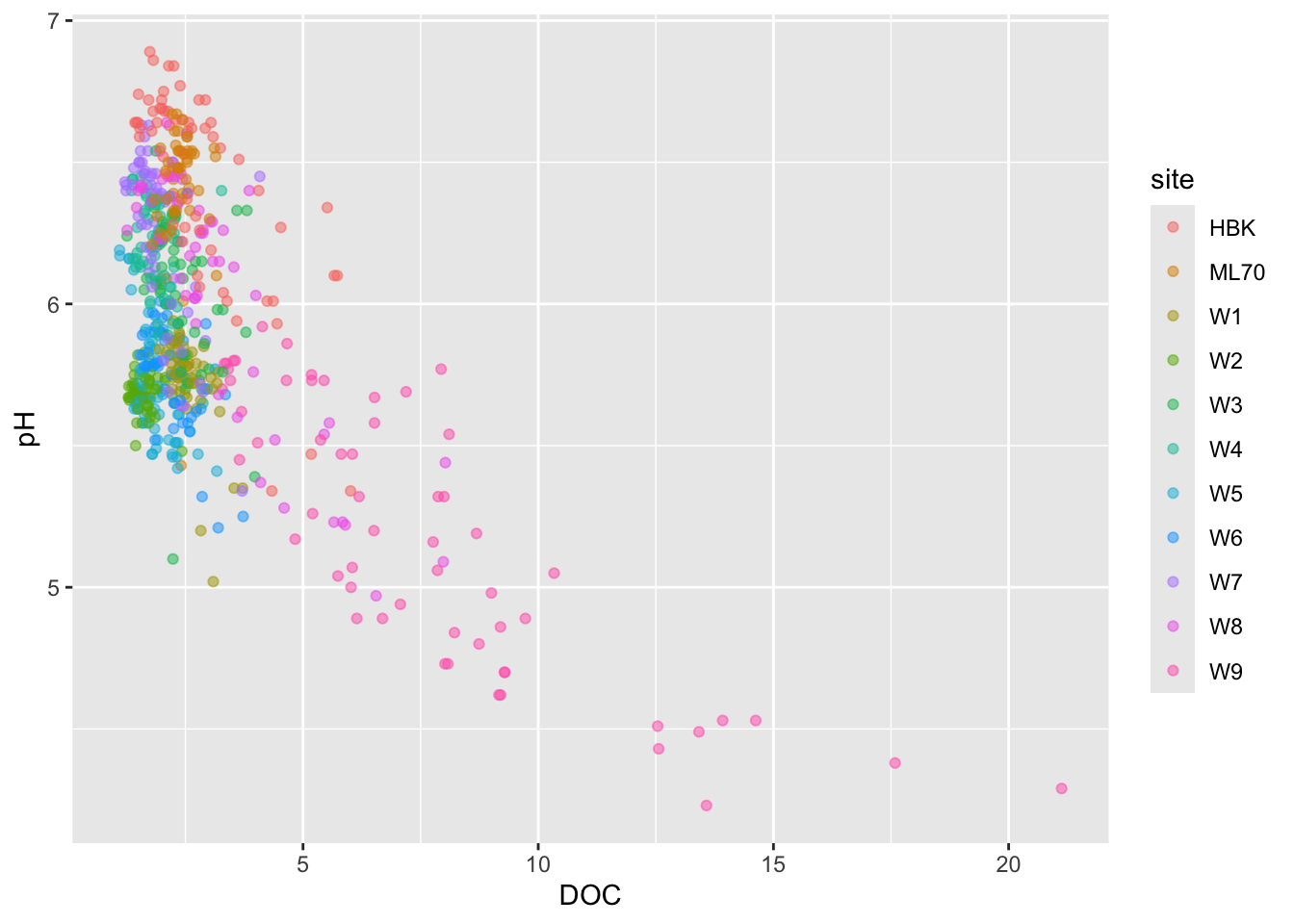
Overplotting
- if you have too many points, scatter plots can be ineffective
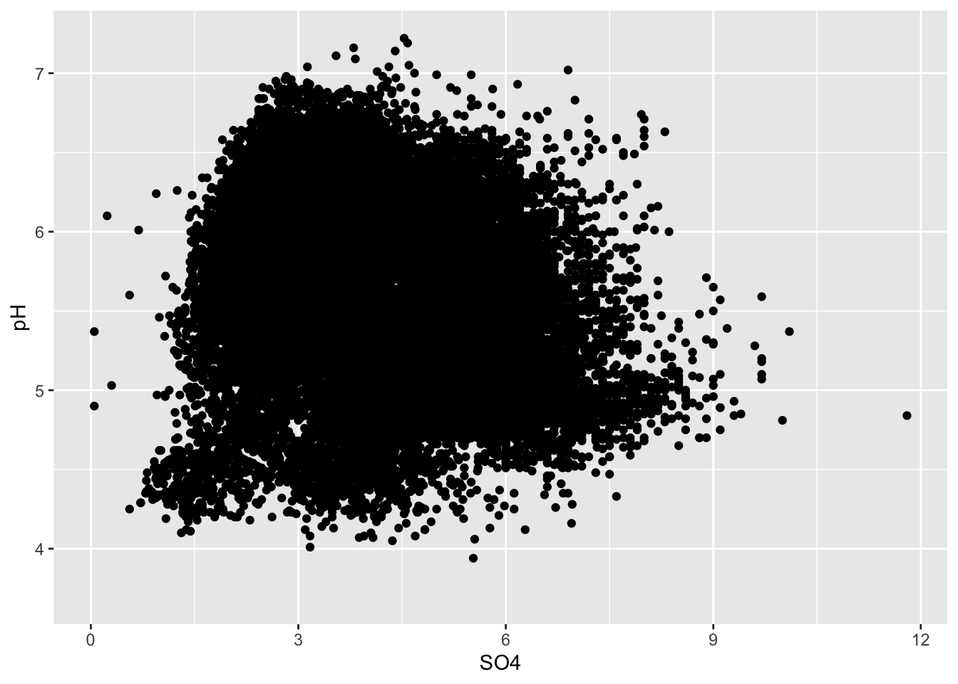
Initial strategies
#................smaller more transparent points.................
ggplot(stream_chem_data, aes(x = SO4, y = pH)) +
geom_point(size = 0.5, alpha = 0.3)
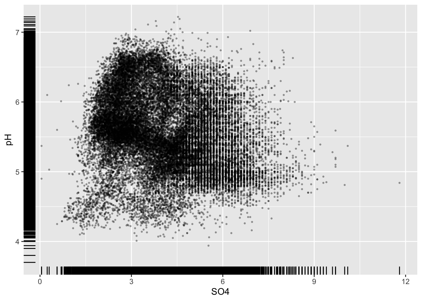
#..........................add rug plot..........................
ggplot(stream_chem_data, aes(x = SO4, y = pH)) +
geom_point(size = 0.5, alpha = 0.3) +
geom_rug()
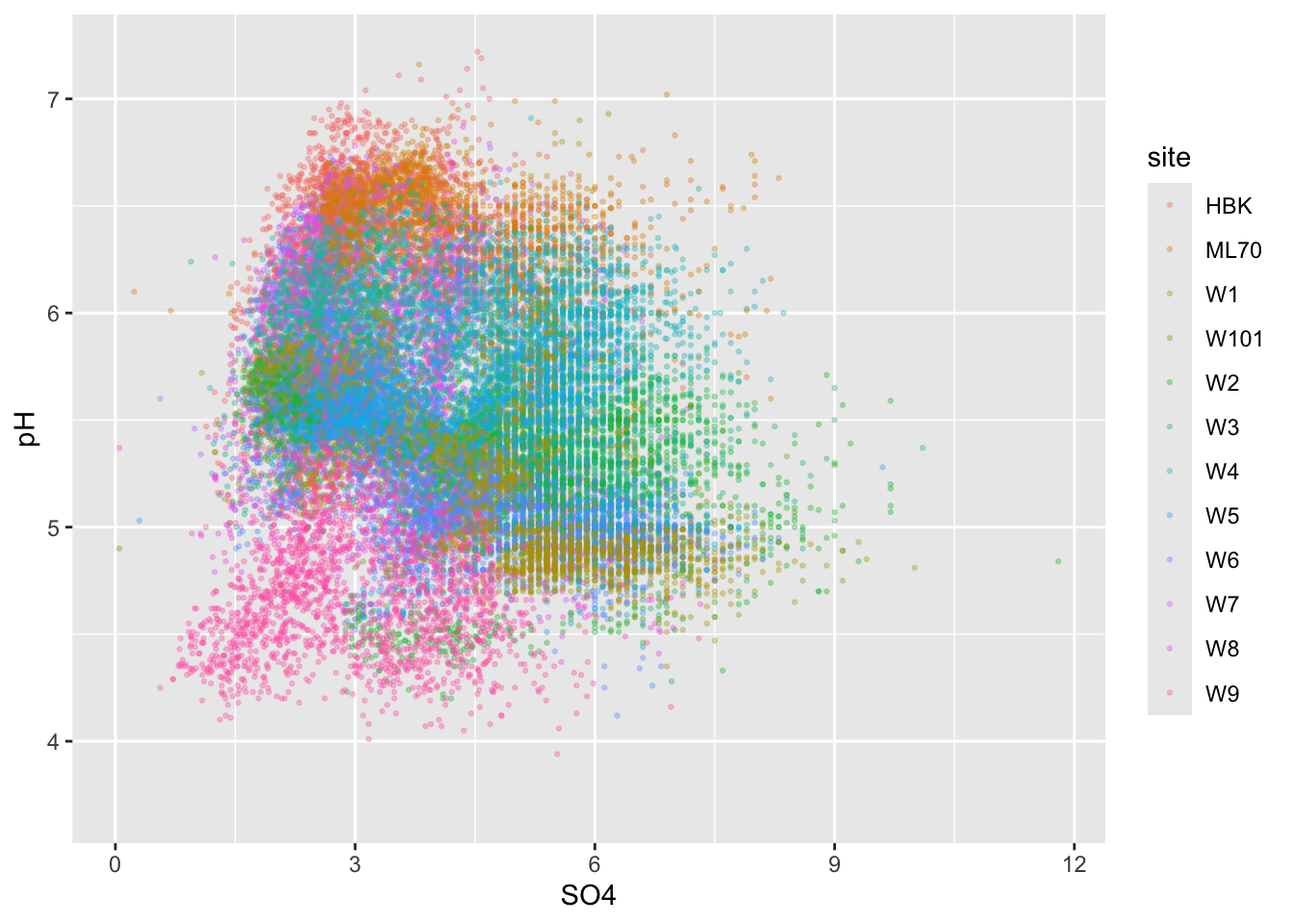
#.........................color by group.........................
ggplot(stream_chem_data, aes(x = SO4, y = pH, color = site)) +
geom_point(size = 0.5, alpha = 0.3) 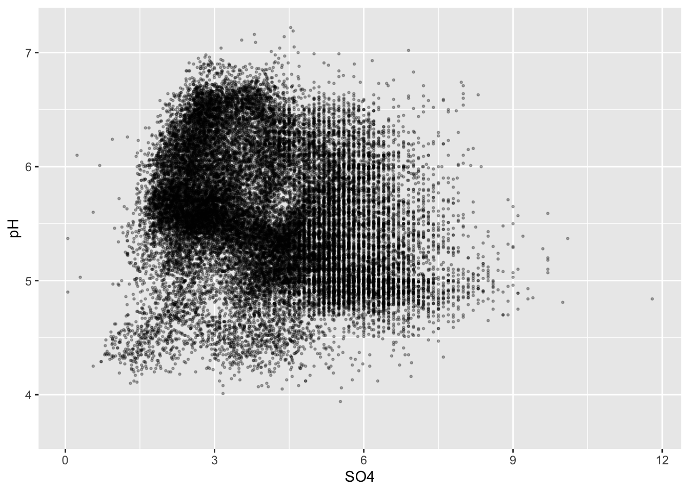
Alt 1: 2d heatmaps
- e.g. like you’re looking down on a histogram
#....................heatmap of 2d bin counts....................
ggplot(stream_chem_data, aes(x = SO4, y = pH)) +
geom_bin2d() +
scale_fill_viridis_c()
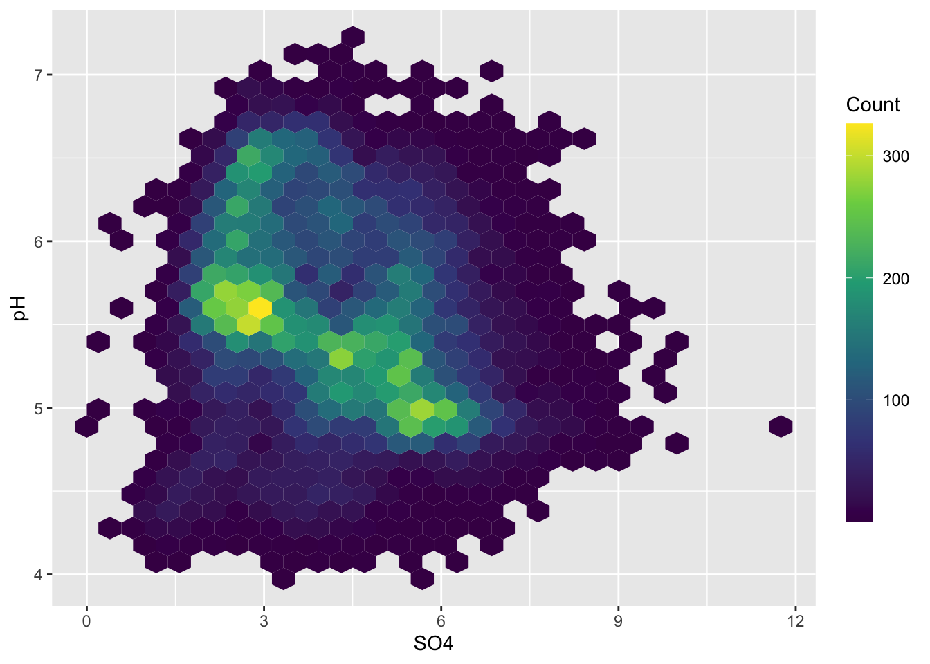
#..................heatmap with hexagonal bins...................
ggplot(stream_chem_data, aes(x = SO4, y = pH)) +
geom_hex() +
scale_fill_viridis_c() +
guides(fill = guide_colorbar(title = "Count",
barwidth = 1, barheight = 15))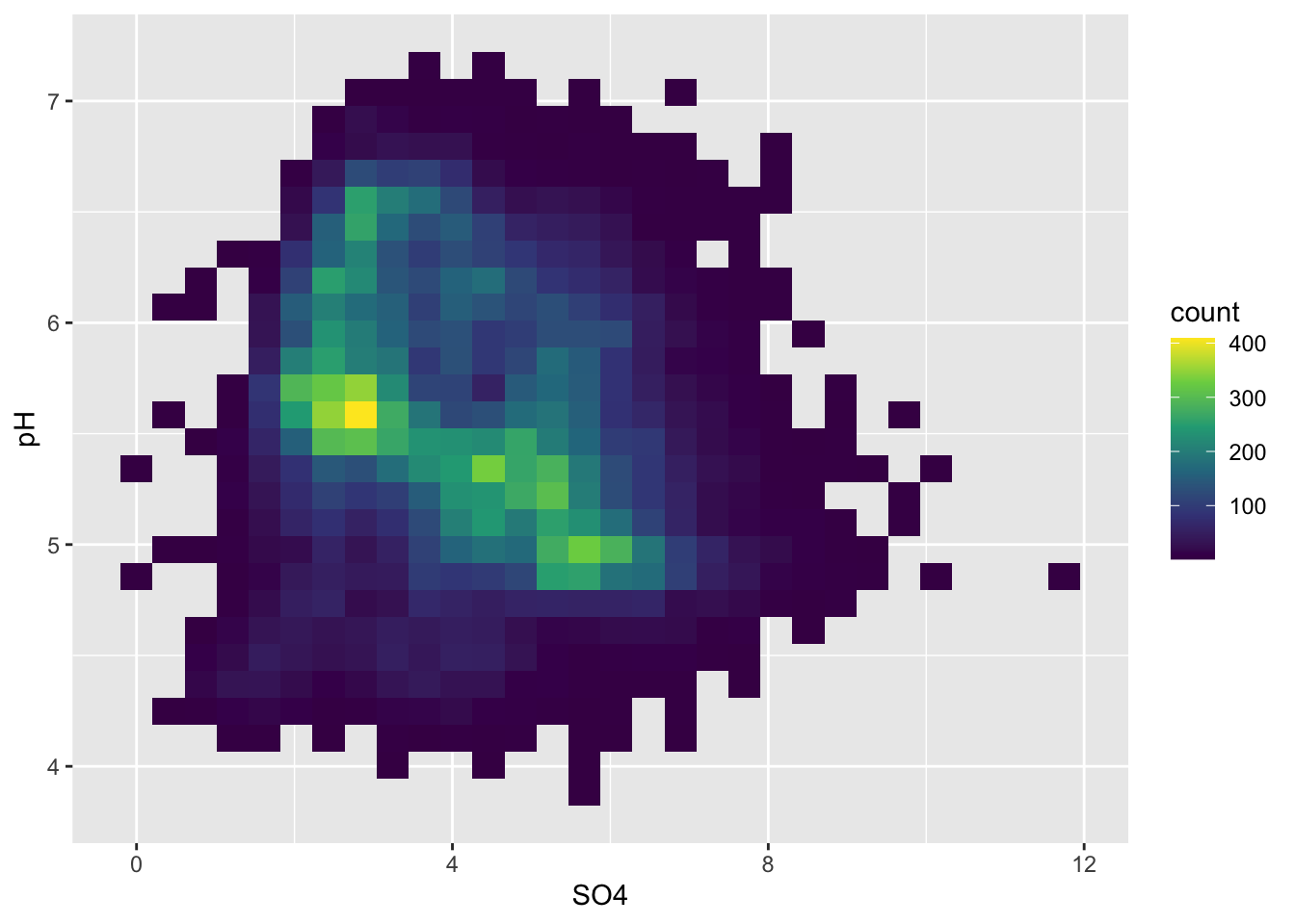
Alt 2: 2d density / contour plots
- e.g. like you’re looking down on a density plot
- legend provides an estimate of the proportion of data points fall within a colored region (density of distribution of points sums to 1)
- interpreting legend: 0-2% of of points fall within a 1x1 square in the darkest blue region, while 24-26% fall within a 1x1 square in the brightest yellow region
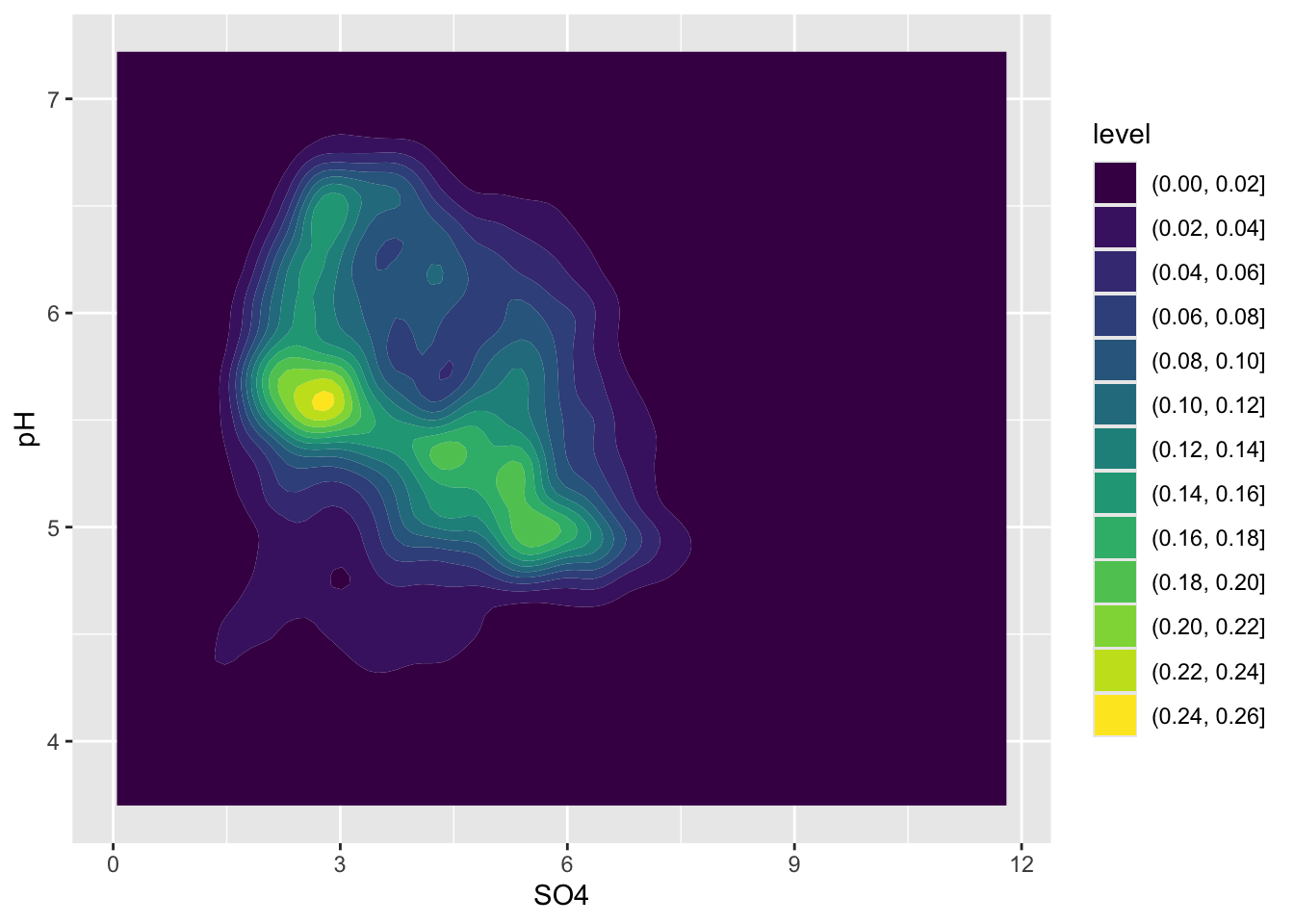
Alt 3: 2d density plots using {ggdensity}
- can be easier to interpret
- compute and plot the resulting highest density regions (HDRs)
- HDRs are computed to be the smallest such regions that bound that level of probability
