library(ggplot2)
library(tidyverse)
library(palmerpenguins)

ggplot(data = penguins, aes(x = body_mass_g, fill = species)) +
  geom_histogram(alpha = 0.5,
                 position = "identity") +
  scale_fill_manual(values = c("darkorange","purple","cyan4")) +
  labs(x = "Body mass (g)",
       y = "Frequency",
       title = "Penguin body masses")
Note
It’s up to you to organize your own week3-lab.qmd file (i.e. there is no template).
Today you’ll be practicing writing alt text with a partner by following the steps below:
Setup:
- Find a partner and decide who will be Partner 1 and Partner 2
- If you are Partner #1, copy the Partner #1 code chunk below into your qmd. If you are Partner #2, copy the Partner #2 code chunk below into your qmd.
Keep your screen private from your partner throughout the activity!
Create Alt Text:
- Individually, run your code chunk and view the plot it produces
- On your piece of paper, write alt text that describes your plot
- Once you’re finished, close your laptop
Test the Alt Text:
- Exchange papers with your partner
- Read your partner’s alt text and draw the data visualization they described based solely on their written description
Reflect and Revise:
- Open your laptops and compare the drawings to the original plots
- Discuss with your partner:
- How similar is the drawing to the actual plot?
- What key information was missing or unclear in the alt text?
- What details were most helpful for recreating the visualization?
Based on this feedback, revise your alt text to make it more complete and accurate.
Adding alt text to the plot.
Now that you have revised your alt text, it is time to embed it in your plot!
- Add alt text using the
fig-alt:code chunk option - Render your qmd file to html
- “Inspect” your plot (right click > Inspect) to verify that the
altattribute and text is added to the HTML
Partner 1
Partner 2
#install.packages("lterdatasampler")
library(lterdatasampler)
library(tidyr)
library(ggplot2)

pie_crab %>%

  ggplot(aes(y=latitude, x = size, group = latitude)) +

  geom_boxplot() +

  scale_x_continuous(breaks = seq(from = 7, to = 23, by = 2), limits = c(6.5,24))+

  scale_y_continuous(breaks = seq(from = 29, to = 43, by = 2), limits = c(29, 43.5)) +

  labs(title = "Crab carapace size (mm) by latitude")
More alt text Examples
Example 1 (from The New York Times):
- Download this viz (right click > Save Image As… > save to your class repo)
- Embed the viz in
week3-lab.qmdusing Markdown syntax and add alt text:
{fig-alt="Alt text goes here"}- “Inspect” your image (right click > Inspect) to verify that the
altattribute and text is added to the HTML
Note
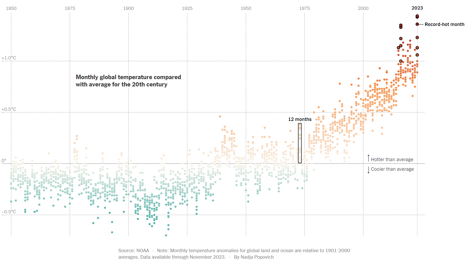
This graphic form is called a dot plot.
Dot plots are particularly useful for visualizing variability within a single measured numerical variable – here, that’s how much temperature deviates from the 20th-century average for each month in a given year. Year is treated as a categorical variable.
It’s easy to confuse dot plots with scatter plots, which alternatively are used to visualize a relationship between two (or sometimes three) numeric variables.
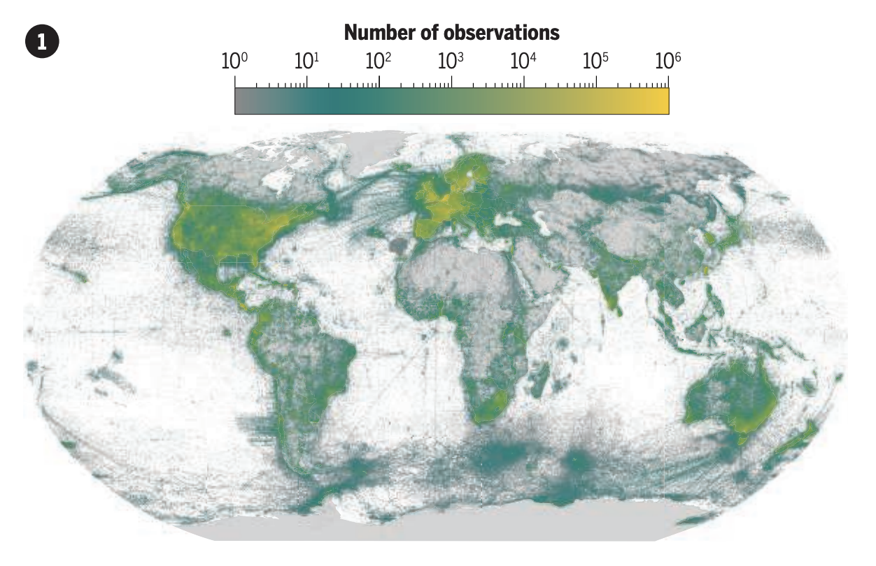
Example 2 (Fig 1A from Chapman et al. 2024):
- Download this viz (right click > Save Image As… > save to your class repo)
- Embed the viz in
week3-lab.qmdusing HTML syntax and add alt text (you’ll also need to include thewidthattribute to make the image a bit smaller):
<img src="file/path/to/image" alt="Alt text goes here" width="700px">- “Inspect” your image (right click > Inspect) to verify that the
altattribute and text is added to the HTML
Note
The associated figure caption for this figure:
The >2.6 billion species observations in the Global Biodiversity Information Facility (GBIF) database are disproportionately from high-income countries.