Let’s walk through how to create your own scrollytelling story with closeread!
quarto add qmd-lab/closereadScrollytelling
Triggers can also be plots! Scroll to see.
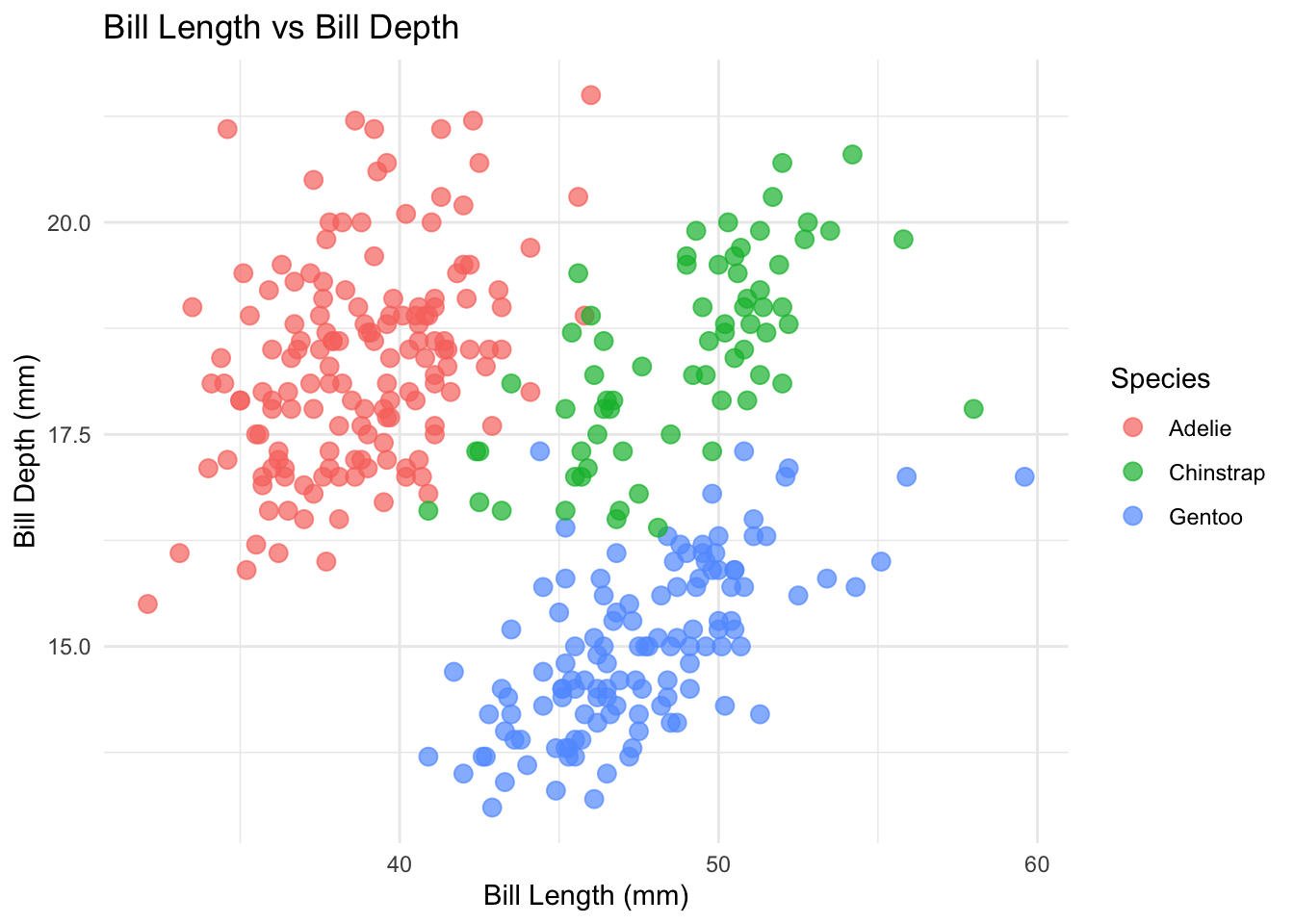
Scroll back up if sticky or trigger aren’t clicking yet. Otherwise,keep scrolling to learn how to code them!
Default view — no transform. The full plot is visible in the sticky.
scale-by="1.5" — zoomed in 50%. The species clusters are easier to compare. Values above 1 zoom in.
scale-by="2.5" — zoomed in 150%. Great for dense plots or small labels.
scale-by="0.7" — zoomed out. Values below 1 shrink the sticky.
Back to default. Each trigger sets its own zoom level independently — they don’t stack.
Here’s the code that produced this section:

scale-by goes on your focus-on trigger:
/* Default — no transform */
:::{focus-on="cr-scale-demo"}
No transform.
:::
/* Zoom in 50% */
:::{focus-on="cr-scale-demo" scale-by="1.5"}
Zoomed in!
:::
/* Zoom in 150% */
:::{focus-on="cr-scale-demo" scale-by="2.5"}
Even closer!
:::
/* Zoom out */
:::{focus-on="cr-scale-demo" scale-by="0.7"}
Zoomed out.
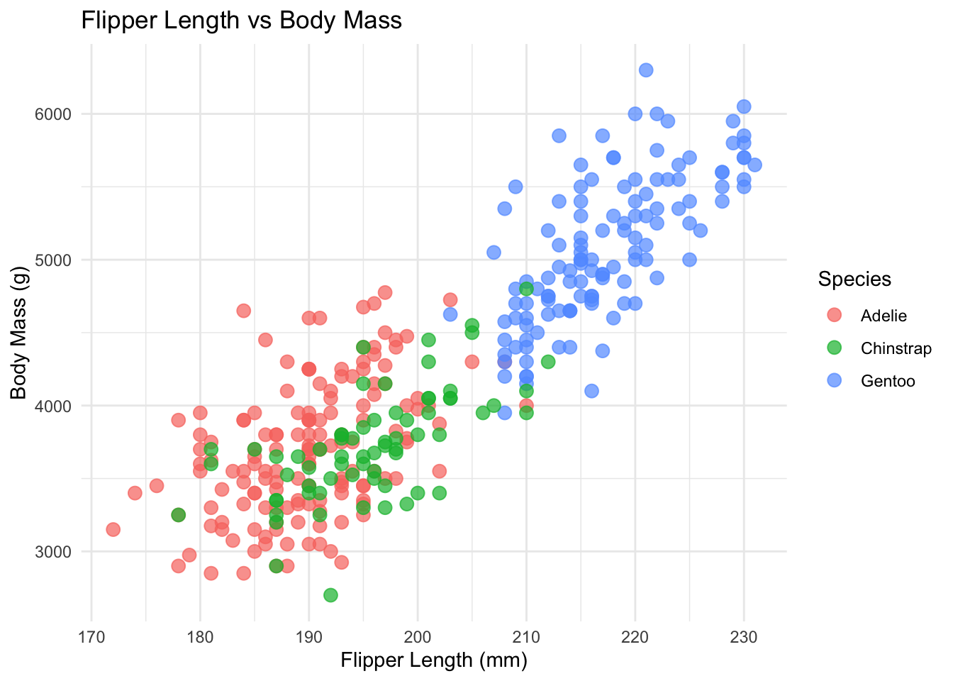
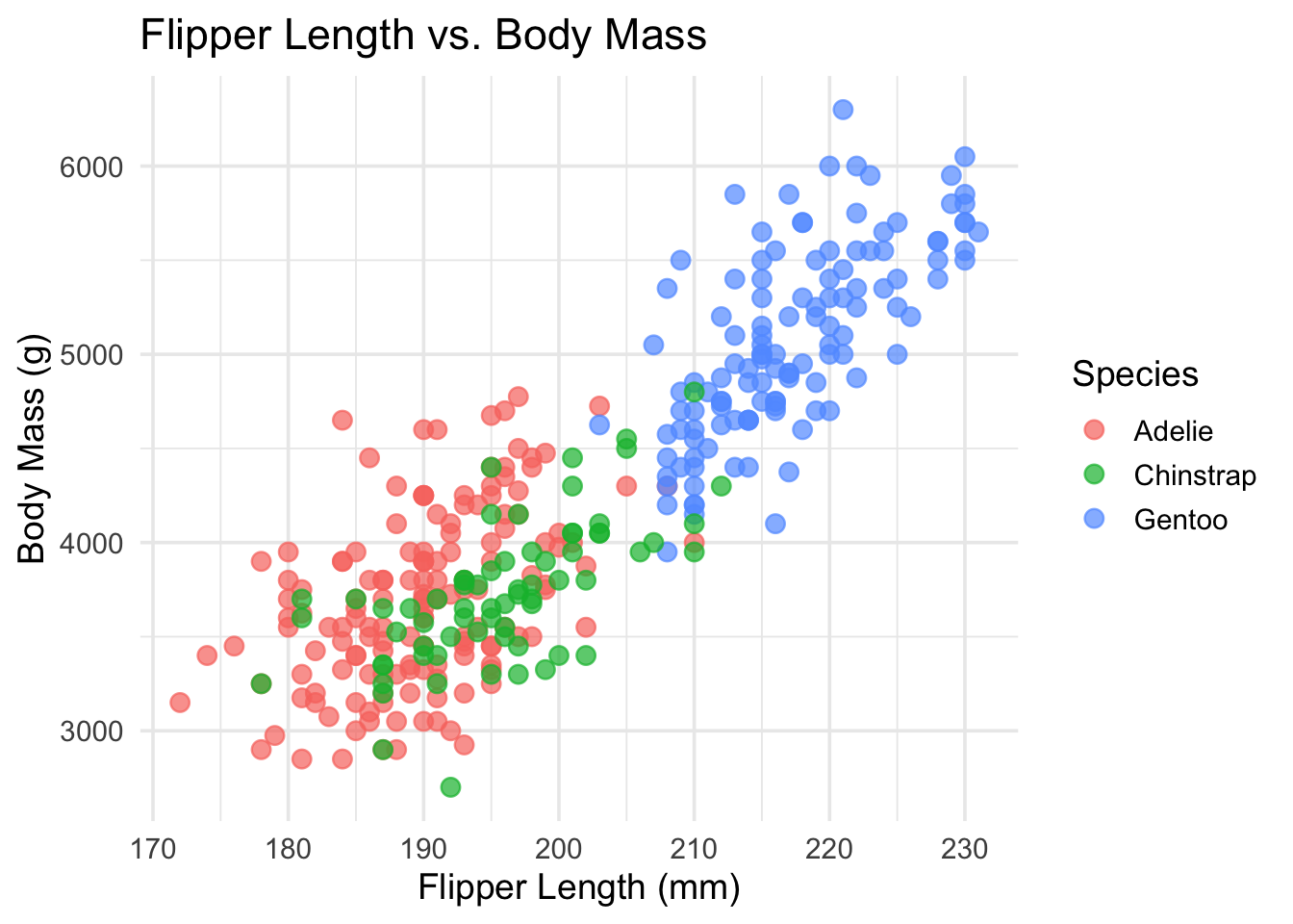
:::pan-to lets you slide the viewer’s focus across a sticky — perfect for large images, wide plots, or directing attention to a specific region. Scroll to watch the plot shift!
pan-to="25%,0%" — panned 25% of its width to the right. Positive percentages shift right (x) and down (y).
pan-to="-25%,0%" — panned 25% to the left. Negative values shift left (x) and up (y).
pan-to="0%,30%" — panned 30% downward. This is great for focusing on axis labels or legends at the bottom of a chart.
pan-to="25%,-20%" scale-by="1.8" — pan and scale combined! Pan shifts the view while scale-by zooms in. Together, they let you spotlight a specific region of any sticky.
Back to the default view. Like all focus effects, a trigger with no attributes resets the sticky.
Here’s the code for the combined pan + scale trigger:
pan-to syntax:
/* pan-to takes x,y values in % or px */

/* Pan right */
:::{focus-on="cr-YOUR-STICKY" pan-to="25%,0%"}
Narrative text.
:::

/* Pan left and up */
:::{focus-on="cr-YOUR-STICKY" pan-to="-25%,-20%"}
Narrative text.
:::

/* Combine with scale-by for a spotlight effect */
:::{focus-on="cr-YOUR-STICKY" pan-to="25%,-20%" scale-by="1.8"}
Zoomed in and shifted!
:::

/* Using pixel values instead of percentages */
:::{focus-on="cr-YOUR-STICKY" pan-to="100px,-50px"}
Shifted by exact pixels.
:::
Tip: pan-to works especially well with images and large plots where you want to guide the reader’s eye to a specific area.