##~~~~~~~~~~~~~~~~~~~~~~~~~~~~~~~~~~~~~~~~~~~~~~~~~~~~~~~~~~~~~~~~~~~~~~~~~~~~~~
##                                    setup                                 ----
##~~~~~~~~~~~~~~~~~~~~~~~~~~~~~~~~~~~~~~~~~~~~~~~~~~~~~~~~~~~~~~~~~~~~~~~~~~~~~~

#..........................load packages.........................
library(tidyverse)

#..........................import data...........................
drought <- read_csv(here::here("week3", "data", "drought.csv"))

##~~~~~~~~~~~~~~~~~~~~~~~~~~~~~~~~~~~~~~~~~~~~~~~~~~~~~~~~~~~~~~~~~~~~~~~~~~~~~~
##                            wrangle drought data                          ----
##~~~~~~~~~~~~~~~~~~~~~~~~~~~~~~~~~~~~~~~~~~~~~~~~~~~~~~~~~~~~~~~~~~~~~~~~~~~~~~

drought_clean <- drought |>

  # Pivot table to be in tidy form
  pivot_longer(cols = None:D4, names_to = "drought_lvl",    values_to = "area_pct") |>

  janitor::clean_names() |>

  # Rename state abbreviation column
   rename(state_abb = state_abbreviation) |>

  # select cols of interest & update names for clarity (as needed) ----
  select(date = valid_start, state_abb, drought_lvl, area_pct) |>

  # add year, month & day cols using {lubridate} fxns ----
  # NOTE: this step isn't necessary for our plot, but I'm including as examples of how to extract different date elements from a object of class `Date` using {lubridate} ----
  mutate(year = year(date),
         month = month(date, label = TRUE, abbr = TRUE),
         day = day(date)) |>

  # add drought level conditions names ----
  mutate(drought_lvl_long = factor(drought_lvl,
                            levels = c("D4", "D3", "D2", "D1","D0", "None"),
                            labels = c("(D4) Exceptional", "(D3) Extreme",
                                       "(D2) Severe", "(D1) Moderate",
                                       "(D0) Abnormally Dry",
                                       "No Drought"))) |>

  # reorder cols ----
  relocate(date, year, month, day, state_abb, drought_lvl, drought_lvl_long, area_pct)
Note
It’s up to you to organize your own week3-lab.qmd file (i.e. there is no template). You may (should) discuss and work through today’s exercise with a partner (or two!).
- Begin by copying the following setup and data wrangling code into your
week3-lab.qmdfile. Run through and review the code, and explore the resultingdrought_cleandata frame.
- We still need to filter for just California data and remove any observations where
drought_lvlis"None". It makes some sense to perform these filters separate from our data wrangling code (in case we ever want to usedrought_cleanto make a similar plot for a different state(s)). Let’s filterdrought_clean, then pipe directly into our gpplot:
##~~~~~~~~~~~~~~~~~~~~~~~~~~~~~~~~~~~~~~~~~~~~~~~~~~~~~~~~~~~~~~~~~~~~~~~~~~~~~~
##       create stacked area plot of CA drought conditions through time     ----
##~~~~~~~~~~~~~~~~~~~~~~~~~~~~~~~~~~~~~~~~~~~~~~~~~~~~~~~~~~~~~~~~~~~~~~~~~~~~~~

drought_clean |>

  # remove drought_lvl "None" & filter for just CA ----
  filter(drought_lvl != "None",
         state_abb == "CA") |>
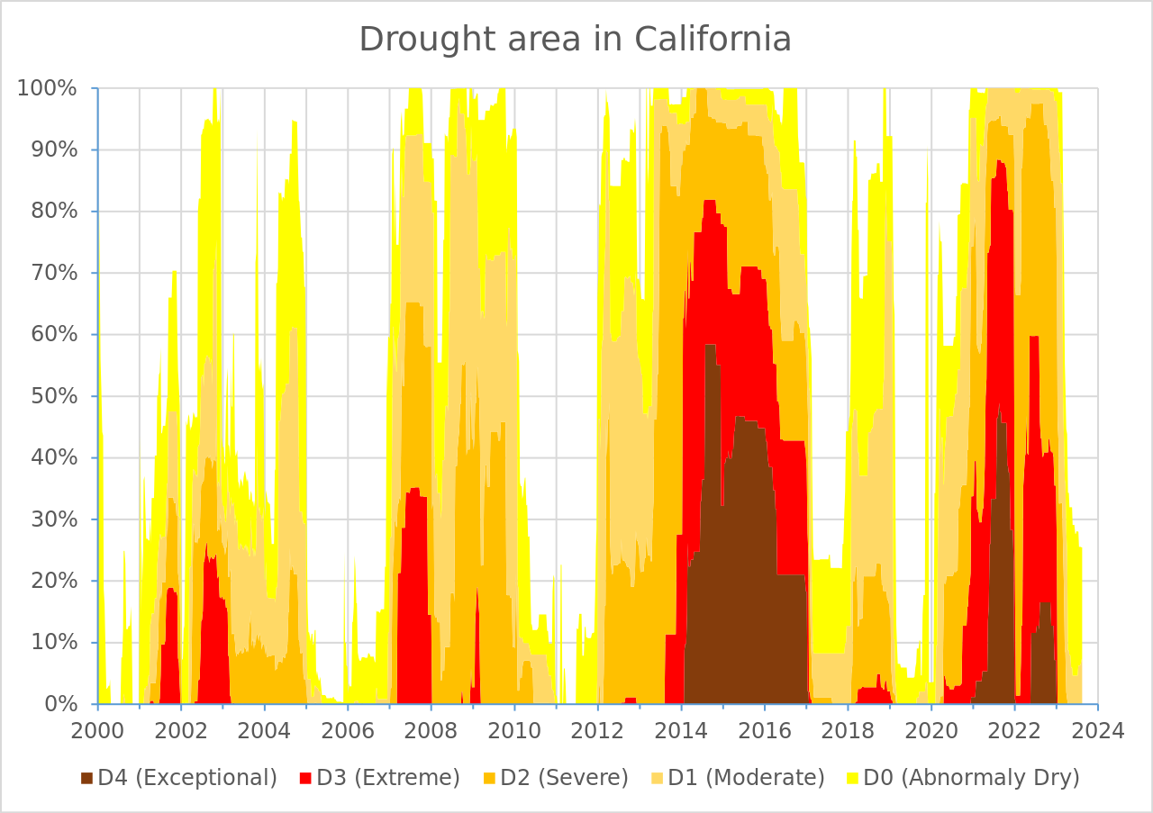
# pipe into ggplot here!- Build that ggplot! Here’s the original plot that we want to create (we’re only focusing on the data layer, geometric layer, and scales here):
It can be helpful to tackle one small(ish) thing at a time. Consider the following “stages”:
- Create a stacked area chart (take a look back at lecture 2.3 slides for examples)
- Figure out how to order the drought level groups in the same way as the USDM version (i.e. level
D4on the bottom, closet to the x-axis, and levelD0at the top) – Hint: explore thepositionargument - Update the colors so that they match the USDM version (use Colorpick Eyedropper to grab HEX codes from the original visualization) – Hint: use
scale_fill_manual()to set your new colors - Adjust your x-axis “breaks” (i.e. the tick mark values that represent years) – Hint: check out
scale_x_date()andscales::breaks_pretty() - Adjust your y-axis “breaks” (i.e. the tick mark value that represent percentage of affected area) – Hint: check out
scale_y_continous()andscales::label_percent() - Remove the “padding” (i.e. space) between your area chart and the x- and y-axes – Hint: check out the
expandargument inscale_x_date()andscale_y_continuous() - update the plot title
- Iterate on this ggplot until it closely resembles the original USDM plot. Tip: begin with a complete theme, then use
theme()to tweak plot elements from there.
ImportantUse the Zoom button to check out your plot as you iterate
Your plot will appear slightly different in the RStudio plot window vs. a zoom window vs. rendered in a Quarto doc – I recommend checking it out in the zoom window while you iterate.
Importantly, how you theme a data visualization depends on how you plan to package / present it. For example, your plot margin sizes may differ when you prepare a standalone plot vs. one that you plan to embed in a rendered Quarto doc. We’ll explore this idea more during week 4 discussion!