NoteYour answers might look a bit different! Discuss with your own answers with one another.
While you should generally follow the alt text formula, your final answers may look a bit different than those listed here.
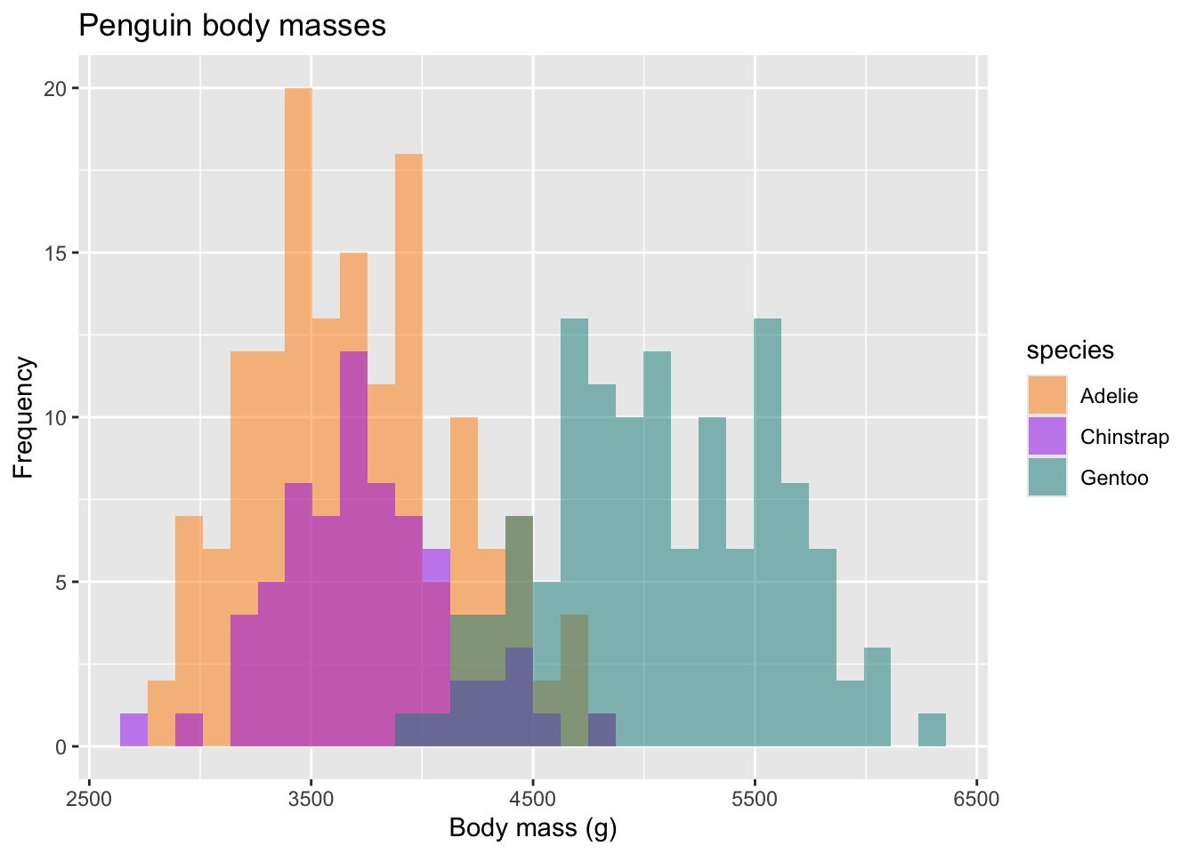
Example 1: {palmerpenguins} ggplot
Alt text: A histogram of penguin body masses where Gentoo penguins have body masses that are about 37% larger than Adelie and Chinstrap penguins.
Example 2: {lterdatasampler} ggplot
Alt text: Horizontal boxplots of crab carapace size at different latitudes where crabs tend to be larger at higher latitudes, with median sizes ranging from approximately 11 mm at 30° latitude to 18/19 mm at latitudes 41°- 43°.
#install.packages("lterdatasampler")
library(lterdatasampler)
library(tidyr)
library(ggplot2)
pie_crab %>%
ggplot(aes(y=latitude, x = size, group = latitude)) +
geom_boxplot() +
scale_x_continuous(breaks = seq(from = 7, to = 23, by = 2), limits = c(6.5,24))+
scale_y_continuous(breaks = seq(from = 29, to = 43, by = 2), limits = c(29, 43.5)) +
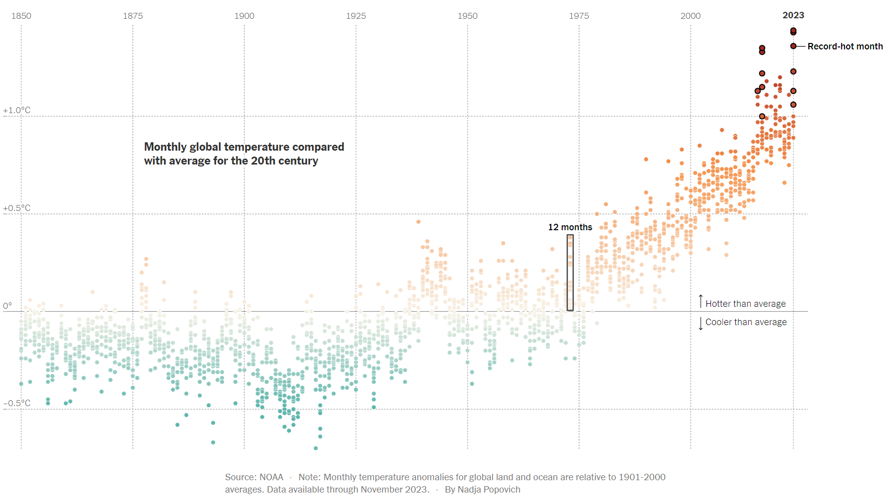
labs(title = "Crab carapace size (mm) by latitude")Example 3 (from The New York Times):
Alt text: A dot plot of monthly global temperatures compared to the 20th-century average, where monthly global temperatures are increasing over time. Nearly every month since the mid-1970s is warmer than the 20th-century average, with 12 record-breaking hot months occurring between 2015-2023.
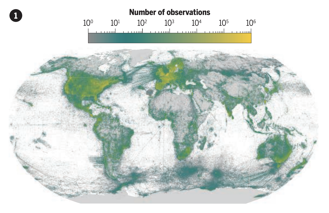
Example 4 (Fig 1A from Chapman et al. 2024):
Alt text: A heatmap of global species observations where the highest concentration of observations occur in high-income countries, particularly in the USA and European nations.