##~~~~~~~~~~~~~~~~~~~~~~~~~~~~~~~~~~~~~~~~~~~~~~~~~~~~~~~~~~~~~~~~~~~~~~~~~~~~~~
## setup ----
##~~~~~~~~~~~~~~~~~~~~~~~~~~~~~~~~~~~~~~~~~~~~~~~~~~~~~~~~~~~~~~~~~~~~~~~~~~~~~~
#..........................load packages.........................
library(tidyverse)
library(janitor)
#......................import colony and stressor data......................
stressor <- read_csv(here::here("week1", "data", "stressor.csv"))
##~~~~~~~~~~~~~~~~~~~~~~~~~~~~~~~~~~~~~~~~~~~~~~~~~~~~~~~~~~~~~~~~~~~~~~~~~~~~~~
## basic data exploration ----
##~~~~~~~~~~~~~~~~~~~~~~~~~~~~~~~~~~~~~~~~~~~~~~~~~~~~~~~~~~~~~~~~~~~~~~~~~~~~~~
# names(stressor)
# dim(stressor)
# str(stressor)
# summary(stressor)
# View(stressor)
##~~~~~~~~~~~~~~~~~~~~~~~~~~~~~~~~~~~~~~~~~~~~~~~~~~~~~~~~~~~~~~~~~~~~~~~~~~~~~~
## clean/wrangle bee data ----
##~~~~~~~~~~~~~~~~~~~~~~~~~~~~~~~~~~~~~~~~~~~~~~~~~~~~~~~~~~~~~~~~~~~~~~~~~~~~~~
stressor_clean <- stressor |>
# Clean character strings
mutate(state = str_replace_all(state, "[^A-Za-z ]", ""),
stressor = str_replace_all(stressor, "[^A-Za-z ]", "")) |>
janitor:: clean_names() |>
# Convert year variable from string to numeric--
mutate(year = as.numeric(year)) |>
# Pivot table to make tidy--
pivot_longer(
cols = c("january_march", "april_june", "july_september", "october_december"),
names_to = "months",
values_to = "stress_pct"
) |>
# Convert months to quarter number--
mutate(quarter = case_when(
months == "january_march" ~ 1,
months == "april_june" ~ 2,
months == "july_september" ~ 3,
months == "october_december" ~ 4
)) |>
# Remove "United States" and "Other States" observations
filter(state != "United States", state != "Other States") |>
# Select a specific stressor
filter(stressor == "Pesticides") |>
# Select a specific state
filter(state == "California") |>
# Calculate quarterly average for each year --
group_by(year, quarter) |>
summarise(avg_stress_pct = mean(stress_pct, na.rm = TRUE))
##~~~~~~~~~~~~~~~~~~~~~~~~~~~~~~~~~~~~~~~~~~~~~~~~~~~~~~~~~~~~~~~~~~~~~~~~~~~~~~
## some exploratory data viz + a few plot mods for practice ----
##~~~~~~~~~~~~~~~~~~~~~~~~~~~~~~~~~~~~~~~~~~~~~~~~~~~~~~~~~~~~~~~~~~~~~~~~~~~~~~
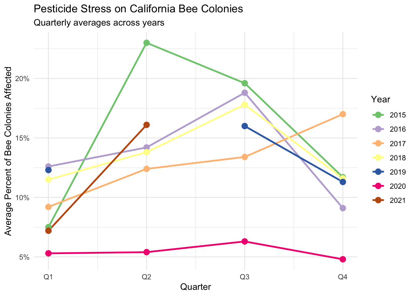
stressor_clean |>
ggplot(aes(x = quarter, y = avg_stress_pct, color = factor(year))) +
geom_line(linewidth = 1) +
geom_point(size = 3) +
scale_color_brewer(palette = "Accent")+
scale_x_continuous(breaks = 1:4, labels = c("Q1", "Q2", "Q3", "Q4")) +
scale_y_continuous(labels = scales::label_number(suffix = "%")) +
labs(
title = "Pesticide Stress on California Bee Colonies",
subtitle = "Quarterly averages across years",
x = "Quarter",
y = "Average Percent of Bee Colonies Affected",
color = "Year"
) +
theme_minimal()
NoteThere’s almost always more than one correct solution!
Remember, there is rarely (if ever) one single solution to solving a data science problem. If you took different approaches / use different functions / etc. but arrived at the same output, that’s great! Chat with your partner(s) about how your approaches differ from the one below, and why it still got you to the same output.