Note
FPM #3 is the the third step in working towards your final project, which is meant to combine nearly all of the course learning outcomes. You’ll begin drafting the visualizations that will become part of your final infographic.
Description
I. Review the final project instructions
Begin by rereading the final project description in full to remind yourself of the goals and requirements.
II. Create drafting-viz.qmd
Create an file named, drafting-viz.qmd within your lastName-eds240-infographic repo and add appropriate YAML fields. You’ll completing all sections of this assigment (Parts III-VI) here.
III. Some pre-planning
Before you start drafing your viz, answer the following questions:
ImportantImportant – be specific here!
For example, let’s say I’m interested in how Lyme disease incidence is changing over time for states X, Y and Z. An appropriate explanation of variables might look something like this:
“I have two data sets, one containing population estimates by state from the
{tidycensus}package, and another from the CDC containing lyme disease case counts by county and year. After wrangling / joining these data sets, I was able to calculate disease incidence as cases per 100k people at the state level. Doing so provides me with three variables to visualize: time (years), disease incidence (cases per 100k people), and state.”
TipTip: Remember to check out the Resources page for lots of great inspiration!!
It lists tons of really wonderful websites, tutorials, and links to the repos / websites of some seriously incredible data viz creators. This is an excellent place to start when looking for inspiration.
TipTip: Embedding images into a
.qmd file
There are a number of ways to render an image in .qmd file. Two ways I find easiest are:
- Using
knitr::include_graphics()in a code chunk (if you’re using R). Here are the chunk options I often specify:
- Using Markdown syntax:
{fig-alt="Alt text goes here"}
IV. Hand-draw your anticipated visualizations
Before you begin coding, it’s a super useful practice to sketch out your anticipated visualizations by hand. This Medium article does a great job summarizing why this step matters.
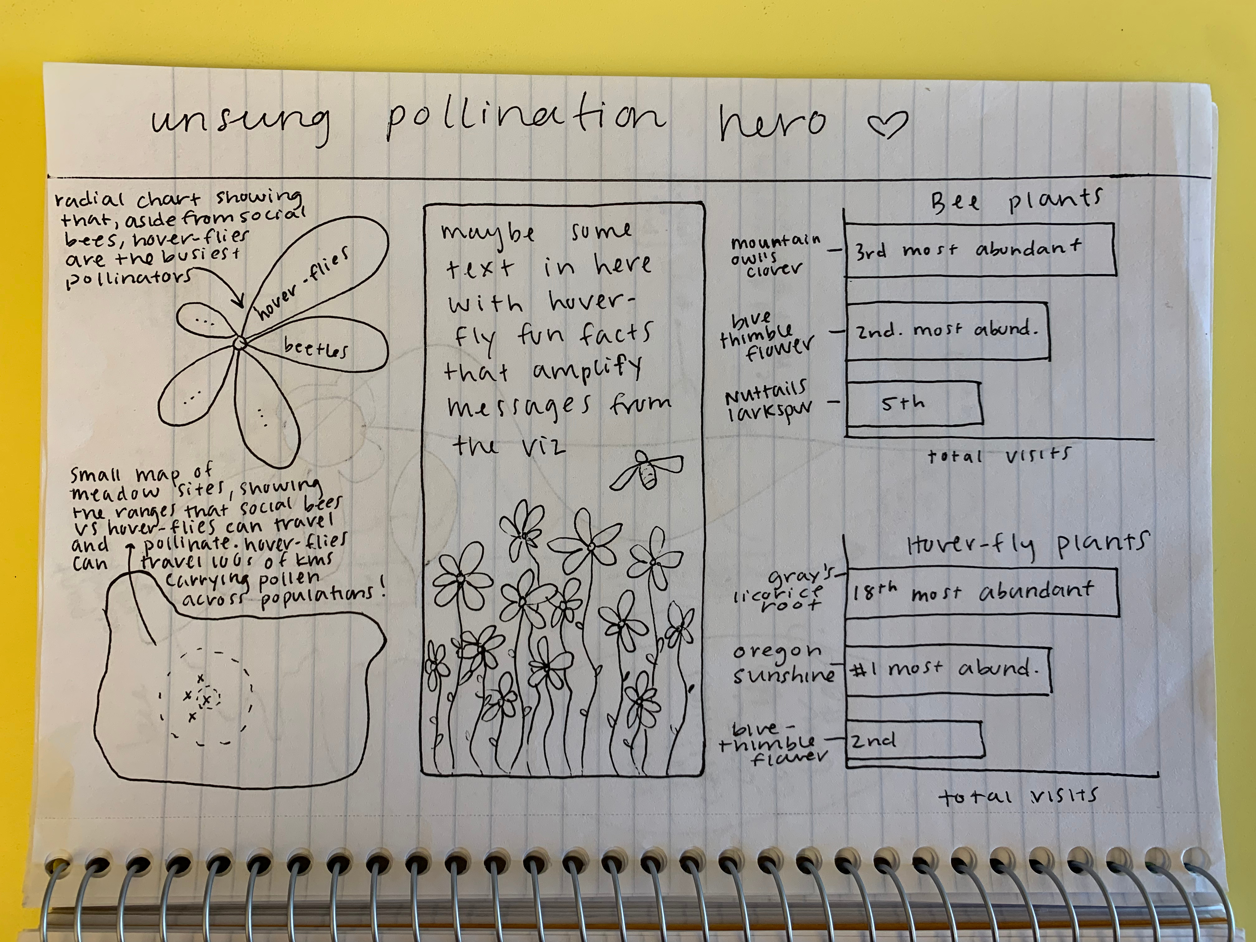
NoteOpen me for an example!
Here’s a great example of some hand-sketched visualizations, by Marine Kochuten (MEDS 2025). Marina also chose to sketch a potential layout of her final infographic:
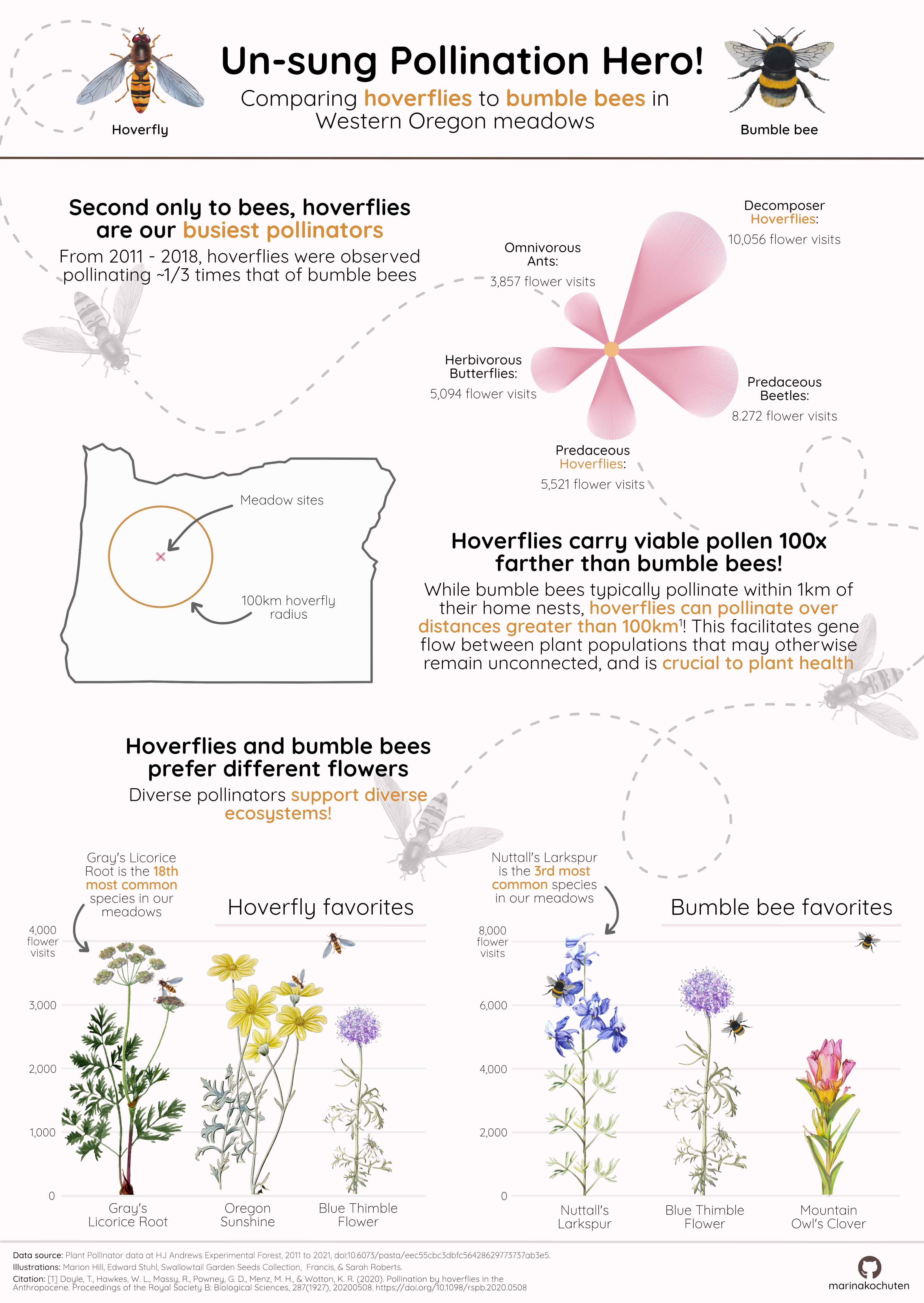
And if you’re curious how the final infographic turned out:
V. Recreate your hand-drawn visualizations using code
Mock up all of your hand drawn visualizations using code. We understand that you will continue to iterate on these into FPM #4 (particularly after receiving feedback), but by the end of FPM #3, you should:
VI. Answer a few last questions about your work and progress
Rubric (specifications)
To receive a “Satisfactory” mark for FPM #3: