Screenshot of the Resilience Analysis and Planning Tool (RAPT) with the National Risk Index Counties data layer.
{ggplot2} + ggplot2 extension packagesIn class, we’ve been discussing strategies and considerations for choosing the right graphic form to represent your data and convey your intended message. Here, you’ll apply what we’re learning to natural hazards and demographics data, courtesy of the FEMA Resilience Analysis and Planning Tool (RAPT) and the US Census Bureau’s American Community Survey (ACS).
Refamiliarize yourself with the FEMA’s NRI and learn more about the ACS. (unfold the following note, which is collapsed to save space):
FEMA (Federal Emergency Management Agency) is a government agency with a mission of helping people before, during, and after disasters. In 2021, FEMA launched the National Risk Index (NRI), a dataset that “provides information for communities most at risk to 18 different natural hazards. It offers a baseline risk measurement for expected annual loss, social vulnerability and community resilience at the Census tract or county level. The data helps to validate, measure and better understand your community’s natural hazard risk.” Risk is defined as the potential for negative impacts resulting from natural hazards. It’s calculated using the following equation:
\[Risk\:Index = Expected\:Annual\:Loss \times \frac{Social\:Vulnerability}{Community\:Resilience}\]
NRI provides hazard type-specific scores, as well as a composite score, which adds together the risk from all 18 hazard types. A community’s risk score is represented by its percentile ranking among all other communities at the same level for Risk, Expected Annual Loss, Social Vulnerability and Community Resilience – for example, if a given county’s Risk Index percentile for a hazard type is 84.32 then its Risk Index value is greater than 84.32% of all US counties. Each community is also assigned a risk rating, which is a qualitative rating that describes the community in comparison to all other communities at the same level, ranging from “Very Low” to “Very High.” You can learn more in the National Risk Index Data Technical Documentation.
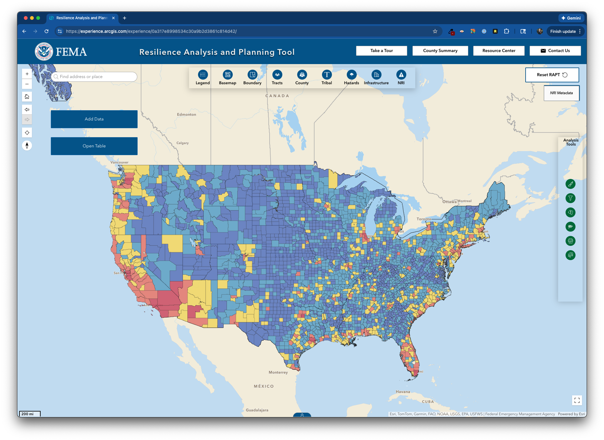
In December 2025, FEMA integrated NRI data into the Resilience Analysis and Planning Tool (RAPT):
Screenshot of the Resilience Analysis and Planning Tool (RAPT) with the National Risk Index Counties data layer.
The American Community Survey (ACS) is a nationwide, continuous survey designed to provide communities with reliable and timely social, economic, housing, and demographic data every year. Unlike the Decennial Census (which counts every person in the US every 10 years for the purpose of congressional appointment), the ACS collects detailed information from a small subset of the population (~3.5 million households) at 1- and 5-year intervals. Learn more about the differences between these 1- and 5-year estimates.
eds240-nri-acs-viz GitHub repoMake the following modifications to your eds240-nri-acs-vizrepository:
Let’s download the necessary data using the US Census Bureau’s API via the {tidycensus} package and write a copy to file. We’ll then read that saved copy of our data back in for use.
The following three steps describe the code you see in the following chunk. You may copy this code into the top of your HW3.qmd file, where you’d normally read in your data (remember to load any necessary packages first, though, and clean up the code comments as necessary).
Import ACS data using tidycensus::get_acs(): You’ll need your API key to use {tidycensus} functions (revisit week 3 pre-class prep instructions, if necessary).
Write your data to .csv: It’s always a good idea to write your data (i.e. the race_ethnicity data frame, from above) to file, in case the Census Bureau’s API goes down. If you write your csv file to your data/ folder, it will automatically be ignored by .gitignore.
Read in your saved .csv file.
#....Step 1a: see all available ACS variables + descriptions.....
acs_vars <- tidycensus::load_variables(year = 2023,
                                       dataset = "acs1")

#..............Step 1b: import race & ethnicity data.............
race_ethnicity <- tidycensus::get_acs(
  geography = "county",
  survey = "acs1",
  # NOTE: you may not end up using all these variables
  variables = c("B01003_001", "B02001_002", "B02001_003",
                "B02001_004", "B02001_005", "B02001_006",
                "B02001_007", "B02001_008", "B03002_012",
                "B03002_002"),
  state = "CA",
  year = 2023) |>
  # join variable descriptions (so we know what's what!)
  dplyr::left_join(acs_vars, by = dplyr::join_by(variable == name))

#.................Step 2: write ACS data to file.................
readr::write_csv(race_ethnicity, here::here("data", "ACS-1yr-2023-county-race-ethnicity.csv"))

#..................Step 3: read in your CSV file.................
race_ethnicity <- readr::read_csv(here::here("data", "ACS-1yr-2023-county-race-ethnicity.csv"))HW3.qmd. Comment these lines out, rather that delete them altogether, so that anyone checking out your work understands how you initially retrieved the data. If you have difficulties downloading the data via the API, you can find a copy on Google Drive.Create a data viz that helps to answer the question, How does climate hazard risk exposure vary across racial / ethnic groups in California? This will require some data wrangling first (including joining the NRI and ACS data).
Your final visualization should:
.qmd file? Adjust the aspect ratio!
You can adjust the aspect ratio of your plot (i.e. its width to height ratio) so that your data / groups are easy to read. Add the fig-asp option to your code chunk YAML, which makes adjusting aspect ratios for rendered outputs quite easy. Values > 1 make your plot taller and values < 1 make your plot wider.
To recieve a “Satisfactory” on HW #3: