##~~~~~~~~~~~~~~~~~~~~~~~~~~~~~~~~~~~~~~~~~~~~~~~~~~~~~~~~~~~~~~~~~~~~~~~~~~~~~~
## setup ----
##~~~~~~~~~~~~~~~~~~~~~~~~~~~~~~~~~~~~~~~~~~~~~~~~~~~~~~~~~~~~~~~~~~~~~~~~~~~~~~
#..........................load packages.........................
library(tidyverse)
library(ggbump)
library(ggtext)
library(showtext)
#..........................import data...........................
jobs <- read_csv("https://raw.githubusercontent.com/rfordatascience/tidytuesday/master/data/2019/2019-03-05/jobs_gender.csv")
#..........................import fonts..........................
font_add_google(name = "Passion One", family = "passion")
font_add_google(name = "Oxygen", family = "oxygen")
##~~~~~~~~~~~~~~~~~~~~~~~~~~~~~~~~~~~~~~~~~~~~~~~~~~~~~~~~~~~~~~~~~~~~~~~~~~~~~~
## wrangle data ----
##~~~~~~~~~~~~~~~~~~~~~~~~~~~~~~~~~~~~~~~~~~~~~~~~~~~~~~~~~~~~~~~~~~~~~~~~~~~~~~
#...................rank occupations by salary...................
salary_rank_by_year <- jobs |>
select(year, occupation, total_earnings) |>
group_by(year) |>
mutate(
rank = row_number(desc(total_earnings))
) |>
ungroup() |>
arrange(rank, year)
#........get top 8 occupation names for final year (2016)........
top2016 <- salary_rank_by_year |>
filter(year == 2016, rank <= 8) |>
pull(occupation)
##~~~~~~~~~~~~~~~~~~~~~~~~~~~~~~~~~~~~~~~~~~~~~~~~~~~~~~~~~~~~~~~~~~~~~~~~~~~~~~
## bump chart ----
##~~~~~~~~~~~~~~~~~~~~~~~~~~~~~~~~~~~~~~~~~~~~~~~~~~~~~~~~~~~~~~~~~~~~~~~~~~~~~~
# grab magma palette ----
magma_pal <- viridisLite::magma(12)
# view magma colors ----
# monochromeR::view_palette(magma_pal)
# assign magma colors to top 8 occupations ----
occupation_colors <- c(
"Physicians and surgeons" = magma_pal[3],
"Nurse anesthetists" = magma_pal[4],
"Dentists" = magma_pal[5],
"Architectural and engineering managers" = magma_pal[6],
"Lawyers" = magma_pal[7],
"Podiatrists" = magma_pal[8],
"Chief executives" = magma_pal[9],
"Petroleum engineers" = magma_pal[10]
)
# create palette for additional plot theming ----
plot_palette <- c(dark_purple = "#2A114E",
dark_gray = "#6D6B71",
light_pink = "#FFF8F4")
#.......................create plot labels.......................
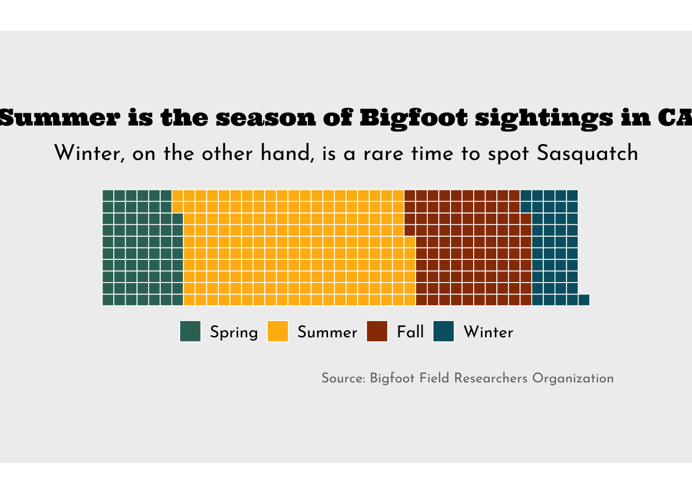
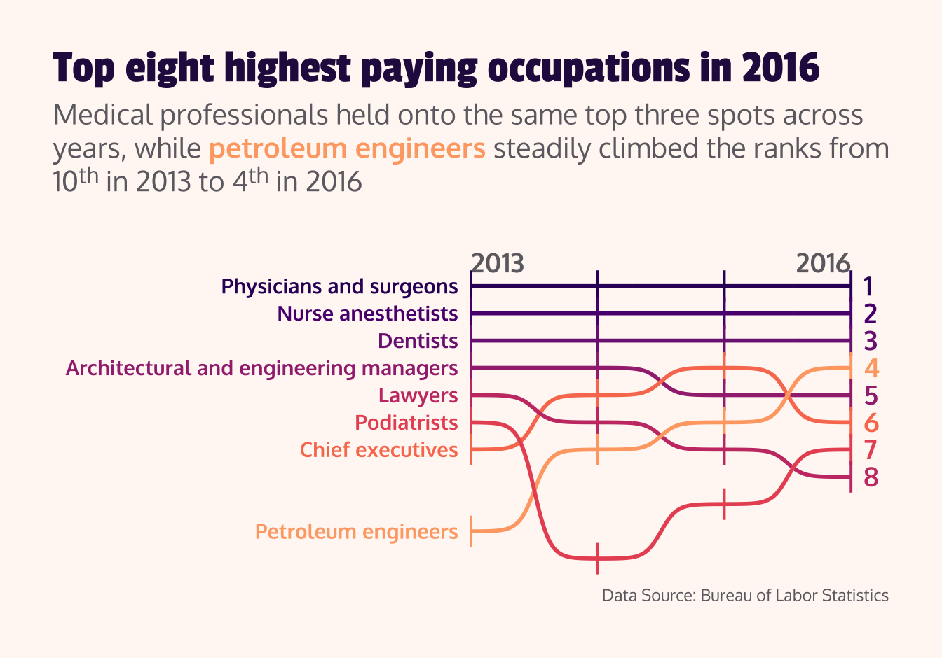
title <- "Top eight highest paying occupations in 2016"
subtitle <- "Medical professionals held onto the same top three spots across years, while <span style='color:#FEA873FF;'>**petroleum engineers**</span> steadily climbed the ranks from 10^th^ in 2013 to 4^th^ in 2016"
caption <- "Data Source: Bureau of Labor Statistics"
#........................create bump chart.......................
salary_rank <- salary_rank_by_year |>
filter(occupation %in% top2016) |>
ggplot(aes(x = year, y = rank, color = occupation)) +
geom_point(shape = "|", size = 6) +
geom_bump(linewidth = 1) +
geom_text(
data = salary_rank_by_year |> filter(year == 2013, occupation %in% top2016),
aes(label = occupation),
hjust = 1,
nudge_x = -0.1,
family = "oxygen",
fontface = "bold"
) +
geom_text(
data = salary_rank_by_year |> filter(year == 2016, occupation %in% top2016),
aes(label = rank),
hjust = 0,
nudge_x = 0.1,
size = 5,
family = "oxygen",
fontface = "bold"
) +
annotate(
geom = "text",
x = c(2013, 2016),
y = c(-0.2, -0.2),
label = c("2013", "2016"),
hjust = c(0, 1),
vjust = 1,
size = 5,
family = "oxygen",
fontface = "bold",
color = plot_palette["dark_gray"],
) +
scale_y_reverse() +
scale_color_manual(values = occupation_colors) +
coord_cartesian(xlim = c(2010, 2016),
ylim = c(11, 0.25),
clip = "off") +
labs(title = title,
subtitle = subtitle,
caption = caption) +
theme_void() +
theme(
legend.position = "none",
plot.title = element_text(family = "passion",
size = 25,
color = plot_palette["dark_purple"],
margin = margin(t = 0, r = 0, b = 0.3, l = 0, "cm")),
plot.subtitle = element_textbox_simple(family = "oxygen",
size = 15,
color = plot_palette["dark_gray"],
margin = margin(t = 0, r = 0, b = 1, l = 0, "cm")),
plot.caption = element_text(family = "oxygen",
color = plot_palette["dark_gray"],
margin = margin(t = 0.3, r = 0, b = 0, l = 0, "cm")),
plot.background = element_rect(fill = plot_palette["light_pink"],
color = plot_palette["light_pink"]),
plot.margin = margin(t = 1, r = 1, b = 1, l = 1, "cm")
)
#................enable {showtext} for rendering.................
showtext_auto(enable = TRUE)
#...........................print plot...........................
salary_rank