##~~~~~~~~~~~~~~~~~~~~~~~~~~~~~~~~~~~~~~~~~~~~~~~~~~~~~~~~~~~~~~~~~~~~~~~~~~~~~~
##                                    setup                                 ----
##~~~~~~~~~~~~~~~~~~~~~~~~~~~~~~~~~~~~~~~~~~~~~~~~~~~~~~~~~~~~~~~~~~~~~~~~~~~~~~

#..........................load packages.........................
library(tidyverse)
library(janitor)
library(scales)

#..........................import data...........................
iwa_data <- read_csv(here::here("week3", "data", "combined_iwa-assessment-outputs-conus-2025_CONUS_200910-202009_long.csv"))

#..................create df of subregions names.................
# data only contain HUC codes; must manually join names if we want to include those in our viz (which we do! we'll mainly be looking at CA subregions)
# subregions (& others) identified in: https://water.usgs.gov/GIS/wbd_huc8.pdf
# there may be a downloadable dataset containing HUCs & names out there...but I couldn't find it
subregion_names <- tribble(
  ~subregion_HUC, ~subregion_name,
  "1801", "Klamath-Northern California Coastal",
  "1802", "Sacramento",
  "1803", "Tulare-Buena Vista Lakes",
  "1804", "San Joaquin",
  "1805", "San Francisco Bay",
  "1806", "Central California Coastal",
  "1807", "Southern California Coastal",
  "1808", "North Lahontan",
  "1809", "Northern Mojave-Mono Lake",
  "1810", "Southern Mojave-Salton Sea",
)

##~~~~~~~~~~~~~~~~~~~~~~~~~~~~~~~~~~~~~~~~~~~~~~~~~~~~~~~~~~~~~~~~~~~~~~~~~~~~~~
##                                wrangle data                              ----
##~~~~~~~~~~~~~~~~~~~~~~~~~~~~~~~~~~~~~~~~~~~~~~~~~~~~~~~~~~~~~~~~~~~~~~~~~~~~~~

#......create df with just CA water resource region (HUC 18).....
ca_region <- iwa_data |>

  # make nicer column names ----
  clean_names() |>

  # create columns for 2-unit (region-level) & 4-unit (subregion-level) HUC using full 12-unit HUC ----
  mutate(region_HUC = str_sub(string = huc12_id, start = 1, end = 2),
         subregion_HUC = str_sub(string = huc12_id, start = 1, end = 4)) |>

  # filter for just CA region (HUC 18) ----
  filter(region_HUC == "18") |>

  # separate year and month into two columns ----
  separate_wider_delim(cols = year_month,
                       delim = "-",
                       names = c("year", "month")) |>

  # convert year and month from chr to num ---
  mutate(year = as.numeric(year),
         month = as.numeric(month)) |>

  # join subregion names ----
  left_join(subregion_names) |>

  # keep necessary columns & reorder in more logical way -----
  select(year, month, huc12_id, region_HUC, subregion_HUC, subregion_name, availab_mm_mo, consum_mm_mo, sui_frac)
Note
This key follows the visualizing amounts / rankings slides. Please be sure to cross-reference the slides, which contain important information and additional context!
Setup
Bar & Lollipop Plots
- bar & lollipop plots are interchangeable
- the focus is on the highest & lowest values (as well as overall rank / hierarchy)
- best for visualizing amounts across a single categorical variable
- encode values by LENGTH from 0
After building some basic plots, we’ll practice:
- making space for overlapping labels
- reordering groups
- adding direct labels
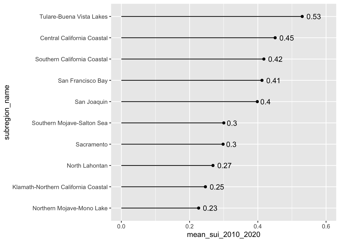
Our goal: create bar & lollipop that shows long-term mean Surface Water-Supply and Use Index (SUI) across the ten HUC 18 subregions
#............................bar plot............................
ca_region |>
  group_by(subregion_name) |>
  summarise(mean_sui_2010_2020 = mean(sui_frac, na.rm = TRUE)) |>
  mutate(subregion_name = fct_reorder(.f = subregion_name, .x = mean_sui_2010_2020)) |>
  ggplot(aes(x = mean_sui_2010_2020, y = subregion_name)) +
  geom_col() +
  geom_text(aes(label = round(mean_sui_2010_2020, 2)), hjust = 1.2, color = "white")
#..........................lollipop plot.........................
ca_region |>
  group_by(subregion_name) |>
  summarise(mean_sui_2010_2020 = mean(sui_frac, na.rm = TRUE)) |>
  mutate(subregion_name = fct_reorder(.f = subregion_name, .x = mean_sui_2010_2020)) |>
  ggplot(aes(x = mean_sui_2010_2020, y = subregion_name)) +
  geom_point() +
  geom_linerange(aes(xmin = 0, xmax = mean_sui_2010_2020)) +
  geom_text(aes(label = round(mean_sui_2010_2020, 2)), hjust = -0.3) +
  scale_x_continuous(limits = c(0, 0.6))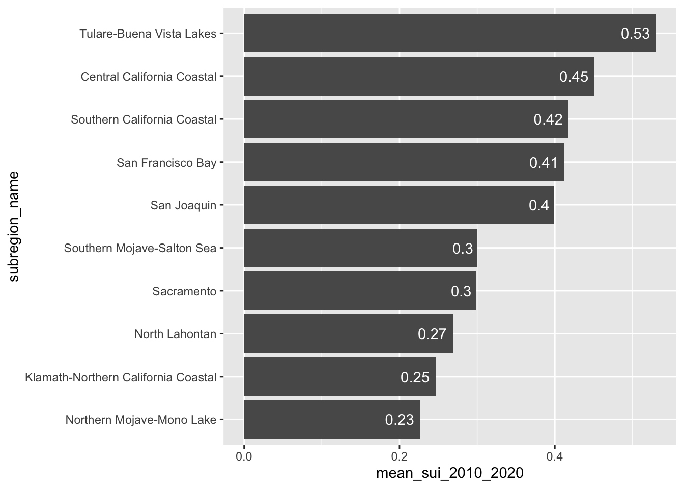
Note 1: geom_col() vs. geom_bar()
- Use
geom_col()when you want the heights of your bars to represent values in your data - Use
geom_bar()if you want the heights of your bars to be proportional to the number of cases in each group
#......................`geom_col()` example......................
# How does mean SUI compare across subregions?
ca_region |>
group_by(subregion_name) |>
summarise(mean_sui_2010_2020 = mean(sui_frac, na.rm = TRUE)) |>
ggplot(aes(x = mean_sui_2010_2020, y = subregion_name)) +
geom_col()
#......................`geom_bar()` example......................
# How many observations (rows) exist for each subregion?
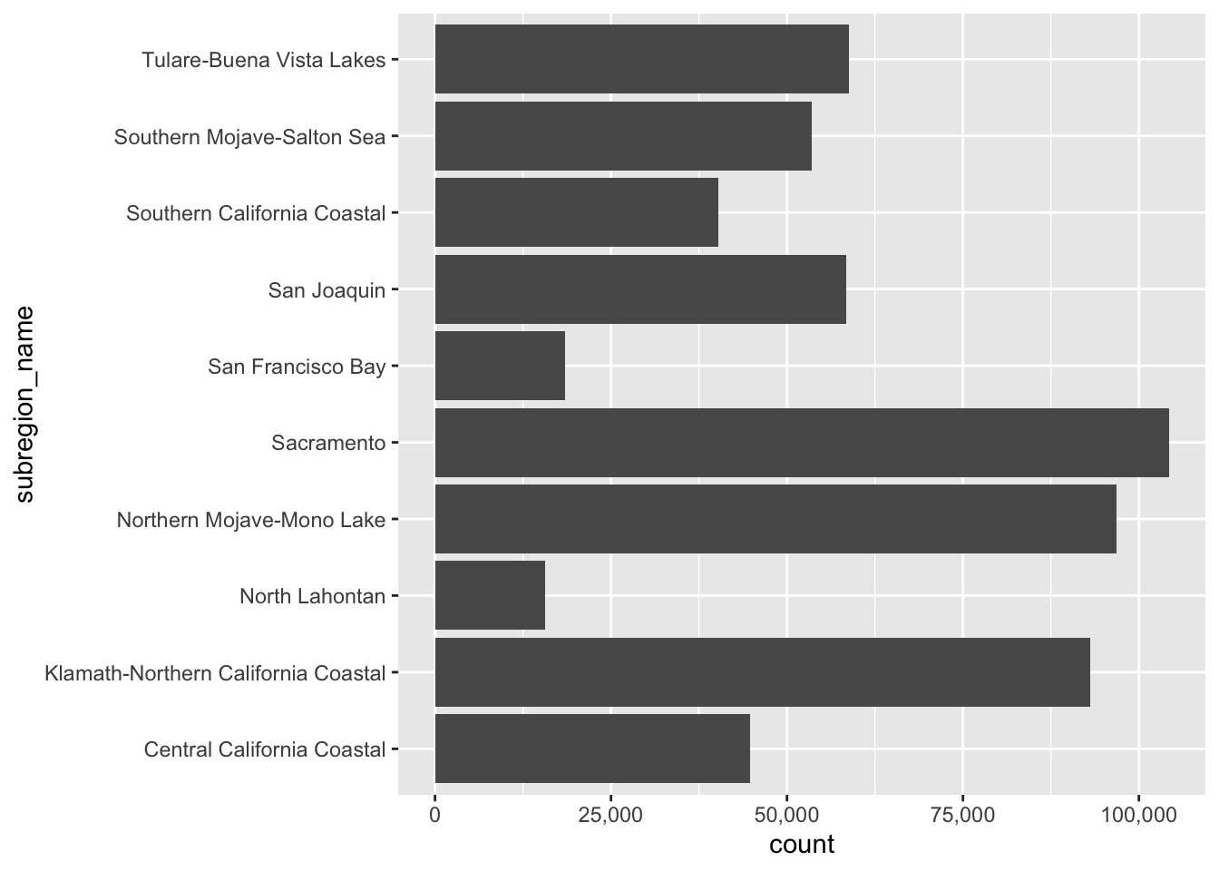
ggplot(ca_region, aes(x = subregion_name)) +
geom_bar() +
coord_flip() +
scale_y_continuous(label = scales::label_comma()) 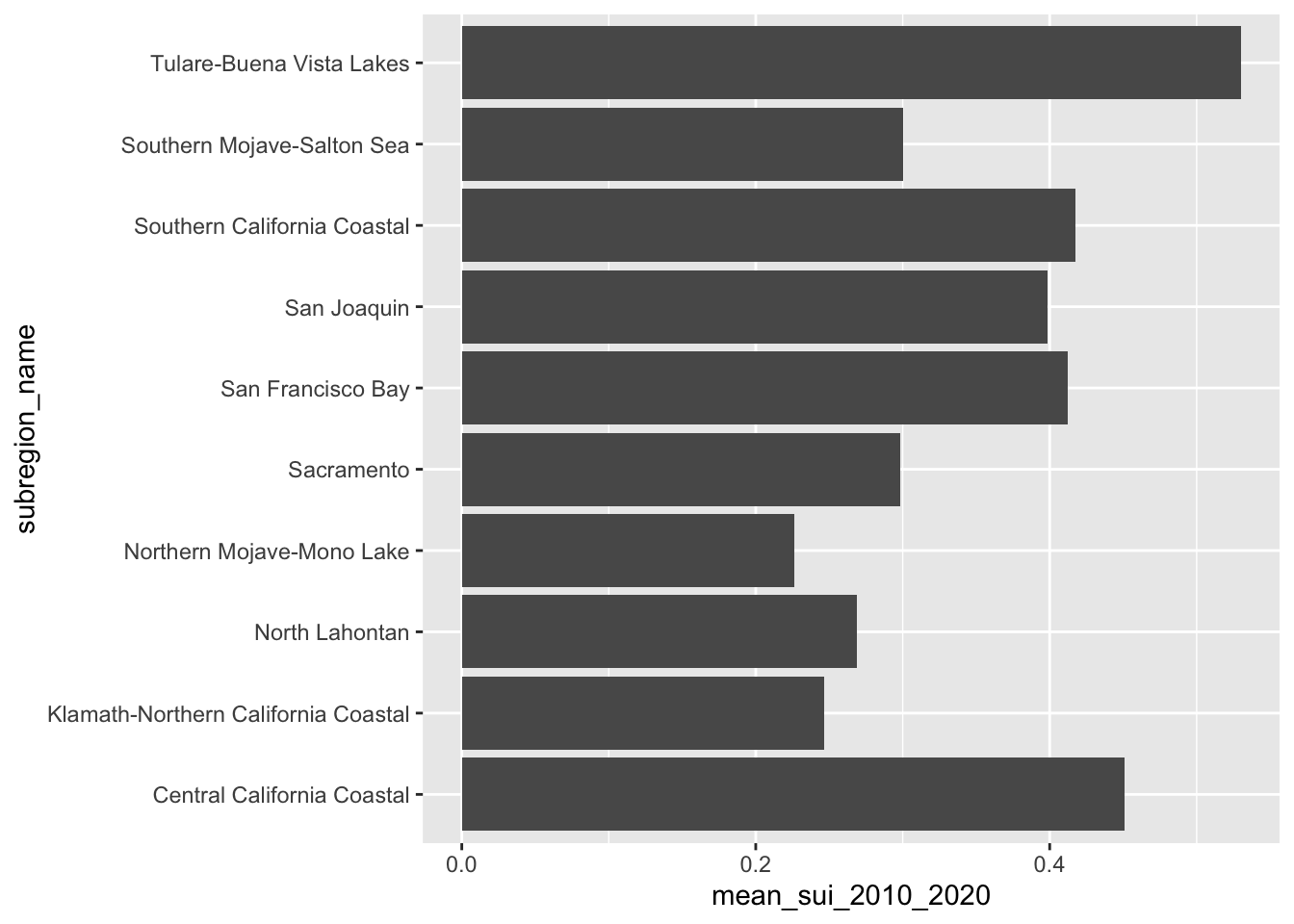
Stacked Bar Plots
- great for part-to-whole comparisons
- use a percentage stacked bar chart when you want the focus to be on relative proportions
- encode values by LENGTH
Our goal: create a stacked bar chart that shows how CA subwatersheds (HUC 12s) are distributed across SUI categories
First we need to do a bit of wrangling:
#................create df classifying SUI values................
sui_severity <- ca_region |>
  mutate(
    sui_category = case_when(
      sui_frac < 0.2 ~ "Very low",
      sui_frac >= 0.2 & sui_frac < 0.4 ~ "Low",
      sui_frac >= 0.4 & sui_frac < 0.6 ~ "Moderate",
      sui_frac >= 0.6 & sui_frac < 0.8 ~ "High",
      sui_frac >= 0.8 & sui_frac <= 1 ~ "Severe",
      TRUE ~ NA
    )) |>
  group_by(month, sui_category) |>
  summarize(tot_num_sui = n()) |>
  drop_na(sui_category) |>
  mutate(month = month.abb[month],
         month = factor(month, levels = c(month.abb[10:12], month.abb[1:9]))) |>
  mutate(sui_category = factor(sui_category,
                               levels = c("Very low", "Low",
                                          "Moderate", "High", "Severe")))
Then create a stacked bar plot:
#......................create color palettes.....................
# pulled hex codes from USGS map using ColorZilla Chrome extension
sui_colors <- c("Severe" = "#720C0F",
                "High" = "#F68939",
                "Moderate" = "#FBF7BF",
                "Low" = "#AAD9EA",
                "Very low" = "#217AB5")

#......................% stacked bar chart.......................
ggplot(sui_severity, aes(x = month, y = tot_num_sui, fill = sui_category)) +
  geom_col(position = "fill") +
  scale_fill_manual(values = sui_colors) +
scale_y_continuous(labels = scales::label_percent(scale = 100)) 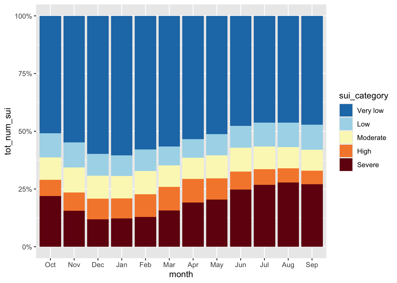
Heatmaps
- great for visualizing matrices of data (e.g. 2 categorical + 1 numeric)
- focus is on patterns rather than precise amounts
- consider audience familiarity (may require more explanation than a basic bar plot)
- encodes values using COLOR
Our goal: create a heatmap that shows how water stress (represented by SUI) changes through time for each of the ten HUC 18 subregions
First, we need to do a bit of wrangling:
#............df of annual mean SUI by subregion & year...........
heatmap_data <- ca_region |>
  group_by(subregion_name, year) |>
  summarize(annual_mean_sui = mean(sui_frac, na.rm = TRUE)) |>
  ungroup()

#.determine order of subregions based on highest avg SUI in 2015.
order_2015 <- heatmap_data |>
  filter(year == 2015) |>
  arrange(annual_mean_sui) |>
  mutate(order = row_number()) |>
  select(subregion_name, order)

#........join order with rest of data to set factor levels.......
heatmap_order <- heatmap_data |>
  left_join(order_2015) |>
  mutate(subregion_name = fct_reorder(.f = subregion_name, .x = order))
Then, create heatmap:
#.........................create heatmap.........................
ggplot(heatmap_order, aes(x = year, y = subregion_name, fill = annual_mean_sui)) +
  geom_tile() +
  labs(fill = "Annual Mean Surface Water-Supply and\nUse Index (SUI)") +
  scale_fill_viridis_c() +
  scale_x_continuous(breaks = seq(2010, 2020, by = 2)) +
  guides(fill = guide_colorbar(barwidth = 15, barheight = 0.75, title.position = "top")) +
  theme_minimal() +
  theme(
    legend.position = "top",
    axis.title = element_blank(),
    panel.grid = element_blank()
  )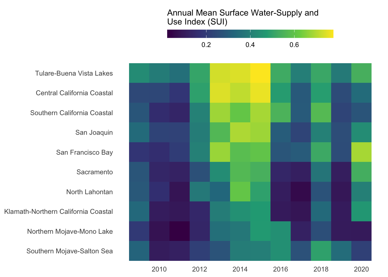
NoteQuestion:
How else might you consider ordering these groups?
Dumbbell Plots
- highlight magnitude and direction of change (or difference) between two values within a category
- shows exact values, but focus is on the difference between values
- encode values using POSITION
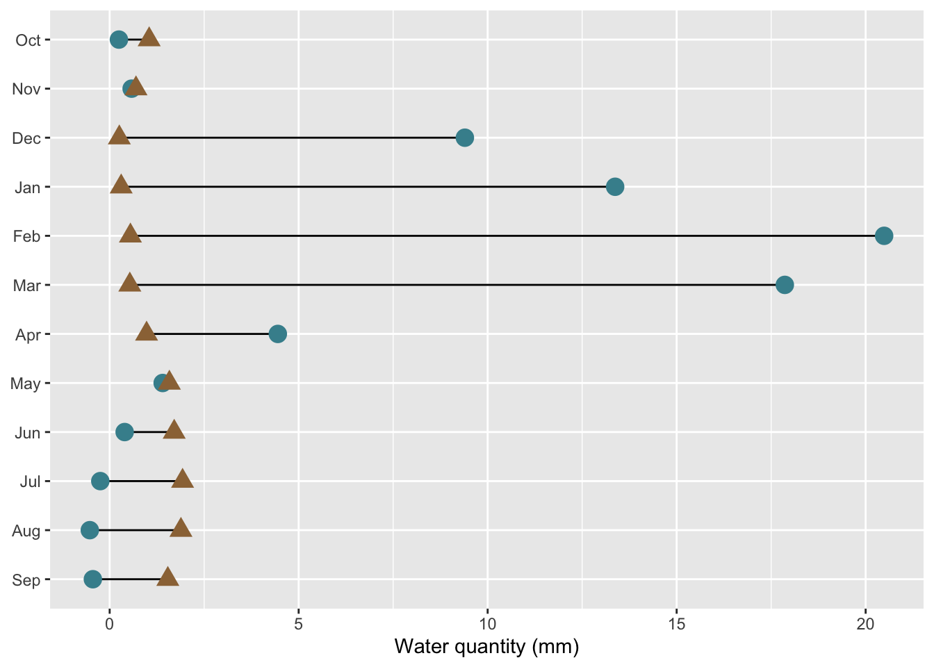
Our goal: create a dumbbell chart to compare mean monthly water availability and consumption in the Santa Barbara Coastal subbasin (HUC8: 18060013) across the years 2010-2020.
First, we need to do a bit of wrangling:
#.........df mean water avail vs. consum in HUC 18060013.........
sbc_subbasin_monthly <- ca_region |>
  mutate(subbasin_HUC = str_sub(string = huc12_id, start = 1, end = 8)) |>
  filter(subbasin_HUC == "18060013") |>
  group_by(month) |>
  summarize(mean_avail = mean(availab_mm_mo, na.rm = TRUE),
            mean_consum = mean(consum_mm_mo, na.rm = TRUE)) |>
  mutate(month = month.abb[month],
          month = factor(month, levels = rev(c(month.abb[10:12], month.abb[1:9]))))
Then, create dumbbell plot:
#......................create dumbbell plot......................
ggplot(sbc_subbasin_monthly) +
  geom_linerange(aes(y = month,
                     xmin = mean_consum, xmax = mean_avail)) +
  geom_point(aes(x = mean_avail, y = month),
             color = "#448F9C",
             size = 4) +
  geom_point(aes(x = mean_consum, y = month),
             color = "#9C7344",
             shape = 17,
             size = 4) +
  labs(x = "Water quantity (mm)") +
  theme(axis.title.y = element_blank())