This template follows lecture 1.3 slides. Please be sure to cross-reference the slides, which contain important information and additional context!
Setup
Tidy Data Review
Example untidy / wide data:
# create some untidy temperature data ----
temp_data_wide <- tribble(
  ~date, ~station1, ~station2,  ~station3,
  "2023-10-01", 30.1, 29.8,  31.2,
  "2023-11-01", 28.6, 29.1,  33.4,
  "2023-12-01", 29.9, 28.5,  32.3
)

# print it out ----
print(temp_data_wide)
# A tibble: 3 × 4
date station1 station2 station3
<chr> <dbl> <dbl> <dbl>
1 2023-10-01 30.1 29.8 31.2
2 2023-11-01 28.6 29.1 33.4
3 2023-12-01 29.9 28.5 32.3Using pivot_longer() to “lengthen” / tidy our data:
# convert data from wide > long ----
temp_data_long <- temp_data_wide |>
  pivot_longer(cols = starts_with("station"),
               names_to = "station_id",
               values_to = "temp_c")

# print it out ----
print(temp_data_long)
# A tibble: 9 × 3
date station_id temp_c
<chr> <chr> <dbl>
1 2023-10-01 station1 30.1
2 2023-10-01 station2 29.8
3 2023-10-01 station3 31.2
4 2023-11-01 station1 28.6
5 2023-11-01 station2 29.1
6 2023-11-01 station3 33.4
7 2023-12-01 station1 29.9
8 2023-12-01 station2 28.5
9 2023-12-01 station3 32.3Plot #1
Explore the relationship between penguin bill length and bill depth. Our goals are to review:
- initializing a plot object and adding a geometry layer to represent our data
- when to define data & map variables globally (e.g. within
ggplot()) vs. locally (e.g. within ageom_*()) - updating how aesthetic mappings manifest visually, aka scaling
- piping into a ggplot
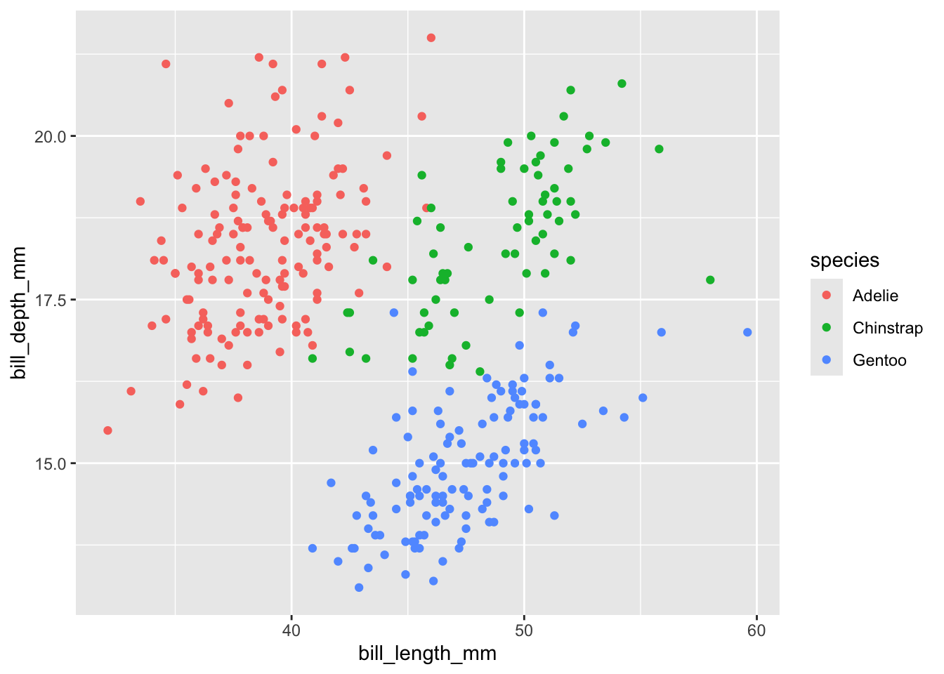
Example 1 (the basics)
- initialize a plot object
- define data & map aesthetics (also, omitting argument names)
- add a geometry layer
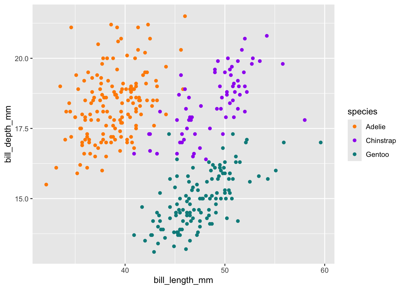
- update how aesthetic mappings manifest visually (i.e. scaling)
- map custom colors
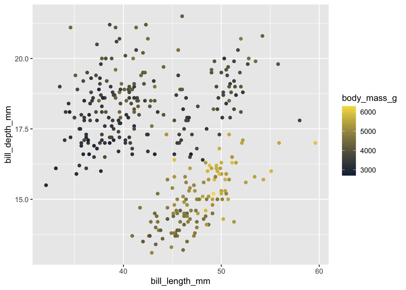
Example 2 (mapping color to continuous variable)
Example 3 (updating color for all points)
Example 4 (local vs. global data & variable mappings)
- define data and mappings within
geom_*()(locally) rather than inggplot()(globally) – helpful if you plan to include multiple geoms with different mappings (e.g. you’re plotting data from multiple data frames):
# create a separate penguins_summary df ----
penguins_summary <- penguins |>
  drop_na() |>
  group_by(species) |>
  summarize(
    mean_bill_length_mm = mean(bill_length_mm),
    mean_bill_depth_mm = mean(bill_depth_mm)
  )

# create ggplot with layers from different dfs ----
ggplot() +
  geom_point(data = penguins,
             mapping = aes(x = bill_length_mm, y = bill_depth_mm, color = species),
             alpha = 0.5) +
  geom_point(data = penguins_summary,
             mapping = aes(x = mean_bill_length_mm, y = mean_bill_depth_mm, fill = species),
             size = 5, shape = 24)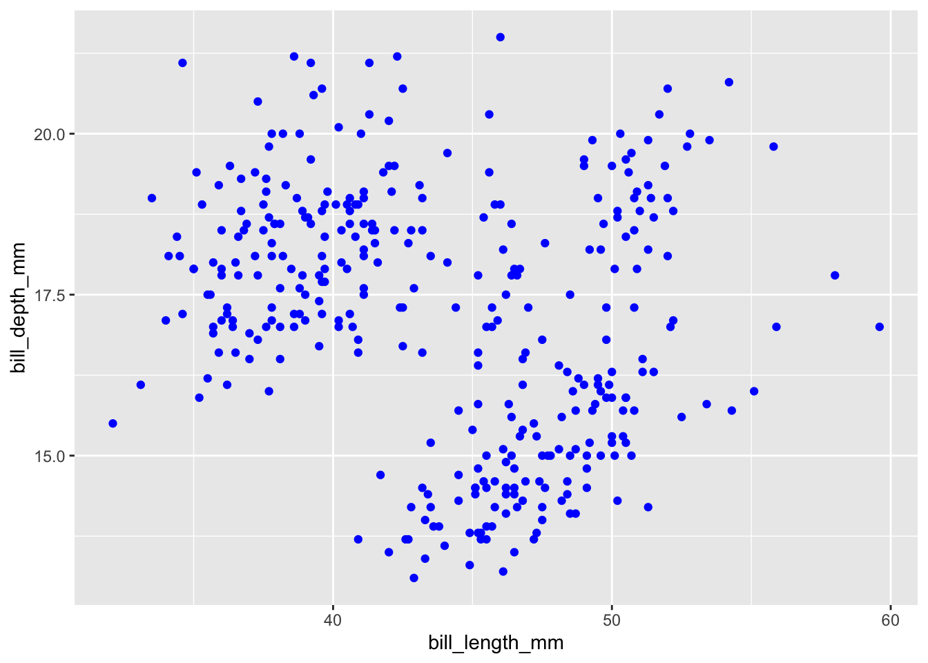
Example 5 & 6 (mapping variables globally vs. locally)
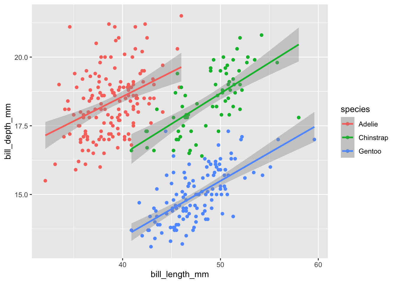
- global mappings are passed down to all subsequent layers:
# scatterplot with lms fitted to species ----
ggplot(penguins, aes(x = bill_length_mm, y = bill_depth_mm, color = species)) +
  geom_point() +
  geom_smooth(method = "lm")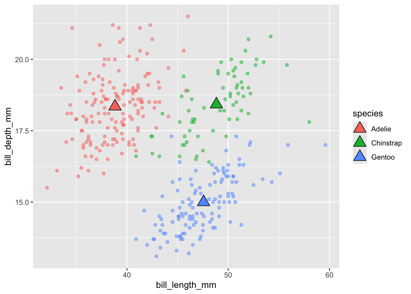
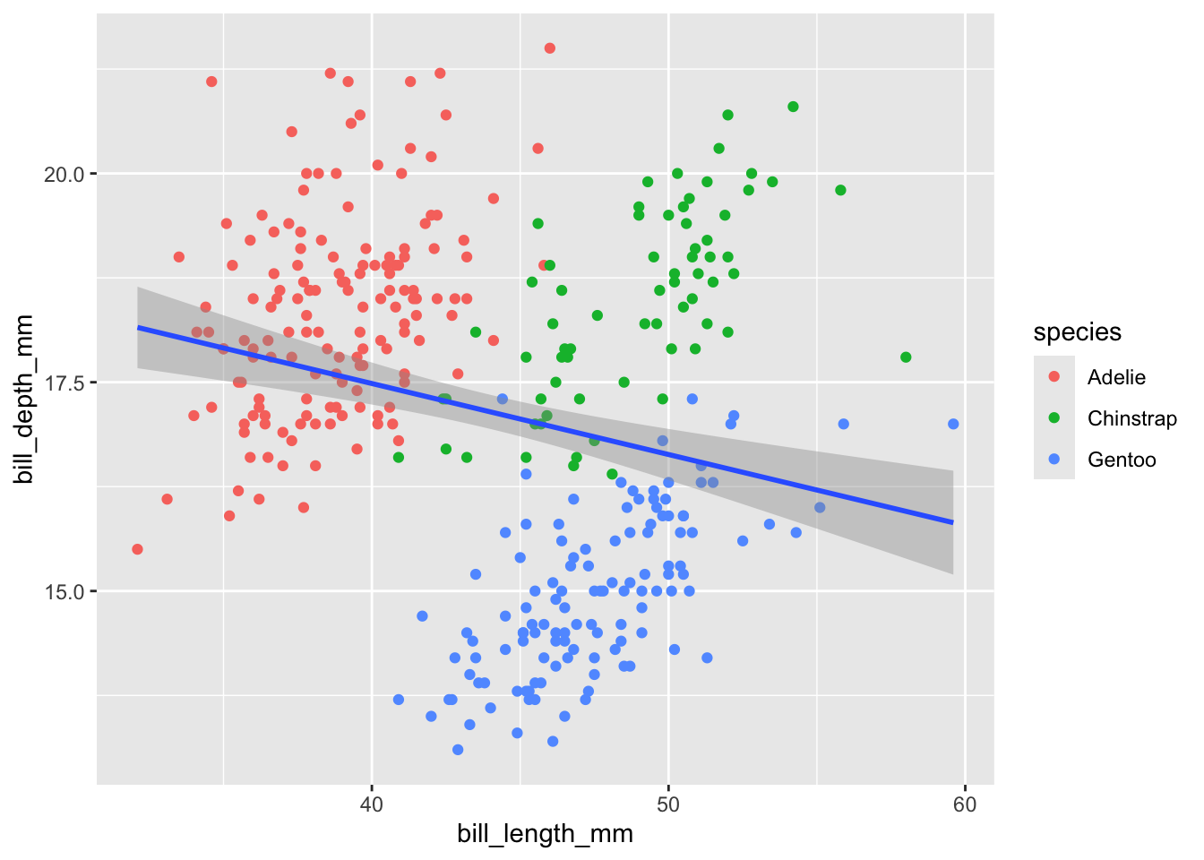
- local mappings only apply to that particular layer:
Example 7 (piping data into a ggplot)
- useful if you need to do a small bit of wrangling first, but don’t want to create a whole new df
Plot #2
Explore penguin species counts. Our goals are to review:
- statistical transformations – what are they, how to identify the default, and how to update them
- position adjustments – what are they, how to identify the default, and how to update them
- coordinate systems – what are they, how to identify the default, and how to update them
- updating non-data elements using pre-built themes and the
theme()function
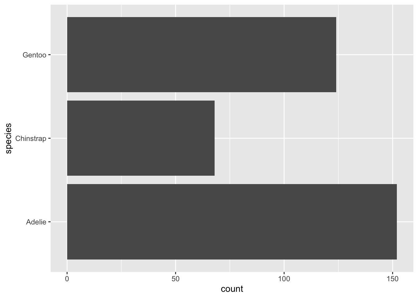
Example 1 (the basics + default stat)
- initialize a plot object
- map aesthetics
- add a geometry layer
- explore default statistical transformations (reading documentation is important here!)
Example 2 (override default stat)
- let’s say we have a df that already contains calculated species count values, and we want the height of the bars to be based on those count values:
# new summarized df ----
penguin_summary <- penguins |>
  count(species)

# generate bar heights based on "identity" of values in `n` column ----
ggplot(penguin_summary, aes(x = species, y = n)) +
  geom_bar(stat = "identity")
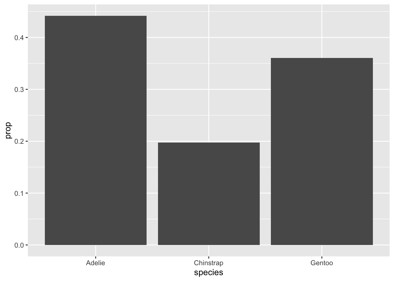
Note: See the slides for an example of overriding the default stat mapping (e.g. displaying these y-axis values as proportions, rather than counts)
Example 3 (default position adjustment)
- position adjustments tweak position of elements to resolve overlapping geoms
- all geoms have a default position (e.g. barplots have
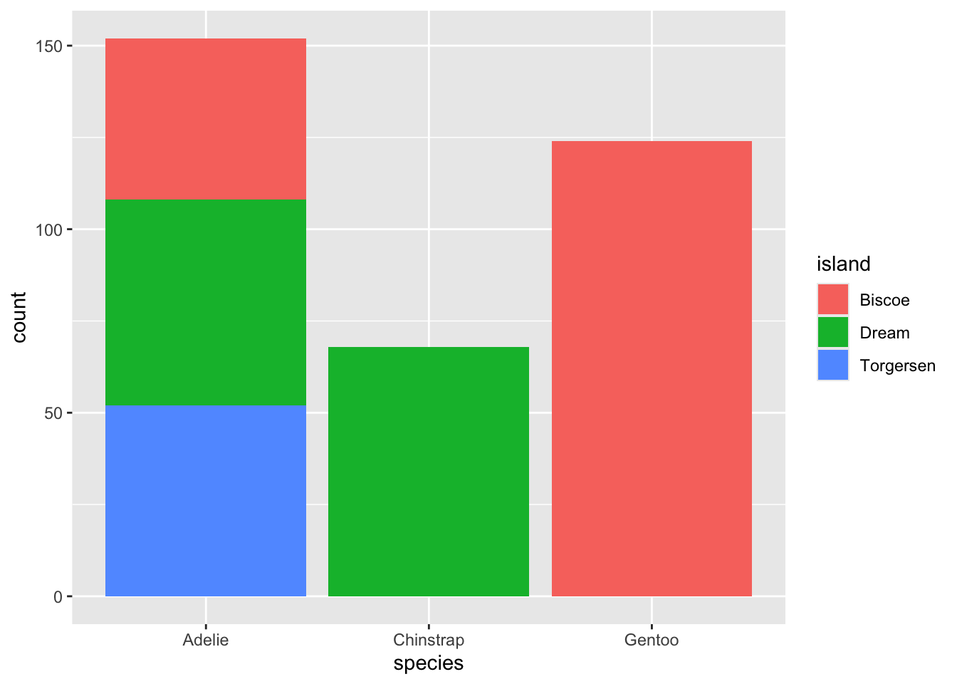
position = "stack") – see documentation - let’s say we now want to visualize penguin counts by species (bar height) and by island (color):
Example 4 & 5 (override default position adjustments)
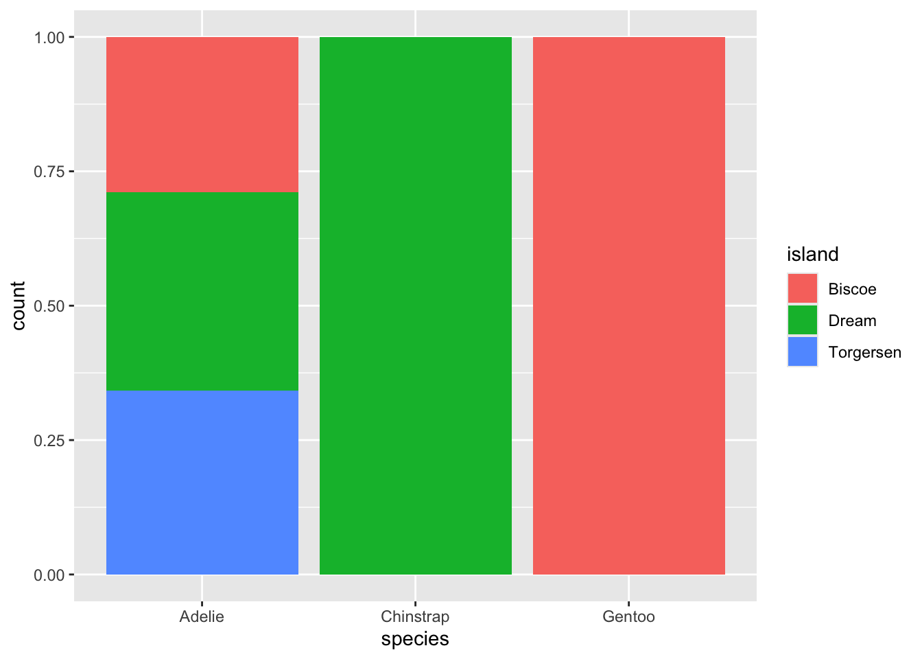
position = "fill"creates stacked bars of the same height (easier to compare proportions):
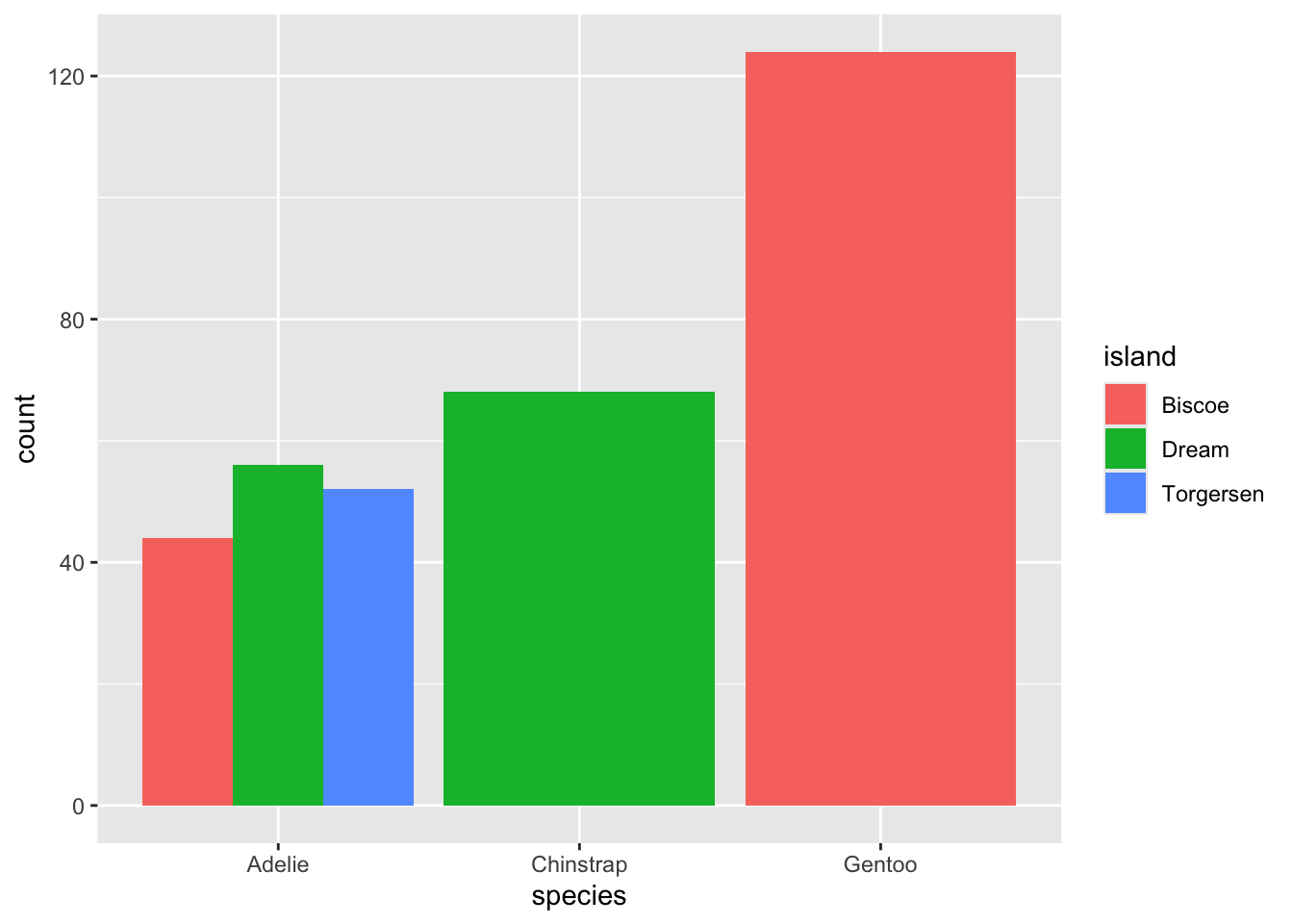
position = "dodge"places overlapping bars directly beside one another (easier to compare individual values):
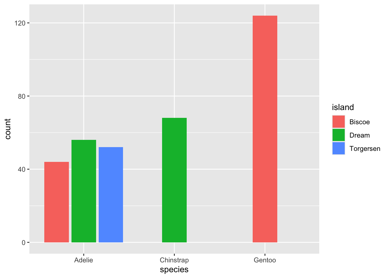
Example 6 (alternatively, use position_*())
Example 7 (default coordinate system)
Example 8 & 9 (alternative coordinate systems)
- flip x & y axes:
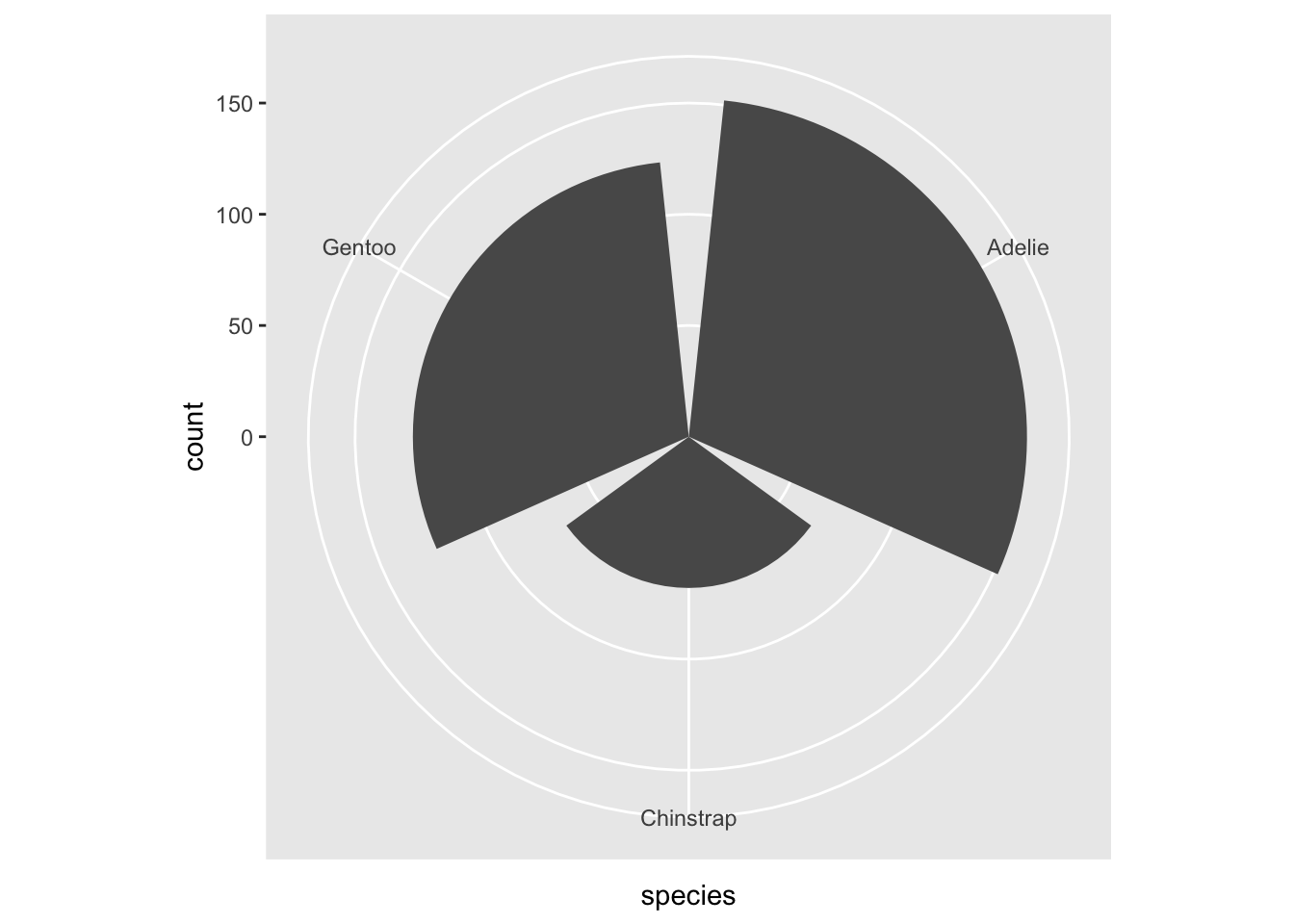
- polar coordinates:
Example 10 (pre-made themes + futher customization with theme())
Plot #3
Explore penguin flipper lengths. Our goals are to review:
- more position adjustments and scales
- updating plot labels
- faceting
Example 1 (all in one go!)
- initialize a plot object
- map aesthetics
- add a geometry layer
- map color to species
- update position adjustment
- update labels
- facet by species
ggplot(penguins, aes(x = flipper_length_mm, fill = species)) +
  geom_histogram(position = "identity", alpha = 0.5) +
  scale_fill_manual(values = c("darkorange", "purple", "cyan4")) +
  labs(x = "Flipper Length (mm)",
       y = "Frequency",
       fill = "Species",
       title = "Penguin Flipper Lengths") +
  facet_wrap(~species, ncol = 1)