Course materials are currently undergoing revision! EDS 240 will begin again in January 2026. In the meantime, things here might get a little messy
Lecture 10.1 KEY
Misc. chart types
Author
Your Name
Published
March 10, 2025
Note
This template follows lecture 10.1 slides. Please be sure to cross-reference the slides, which contain important information and additional context!
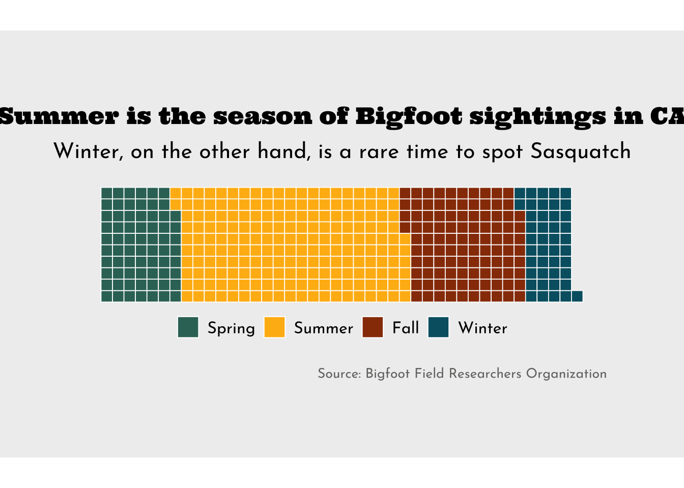
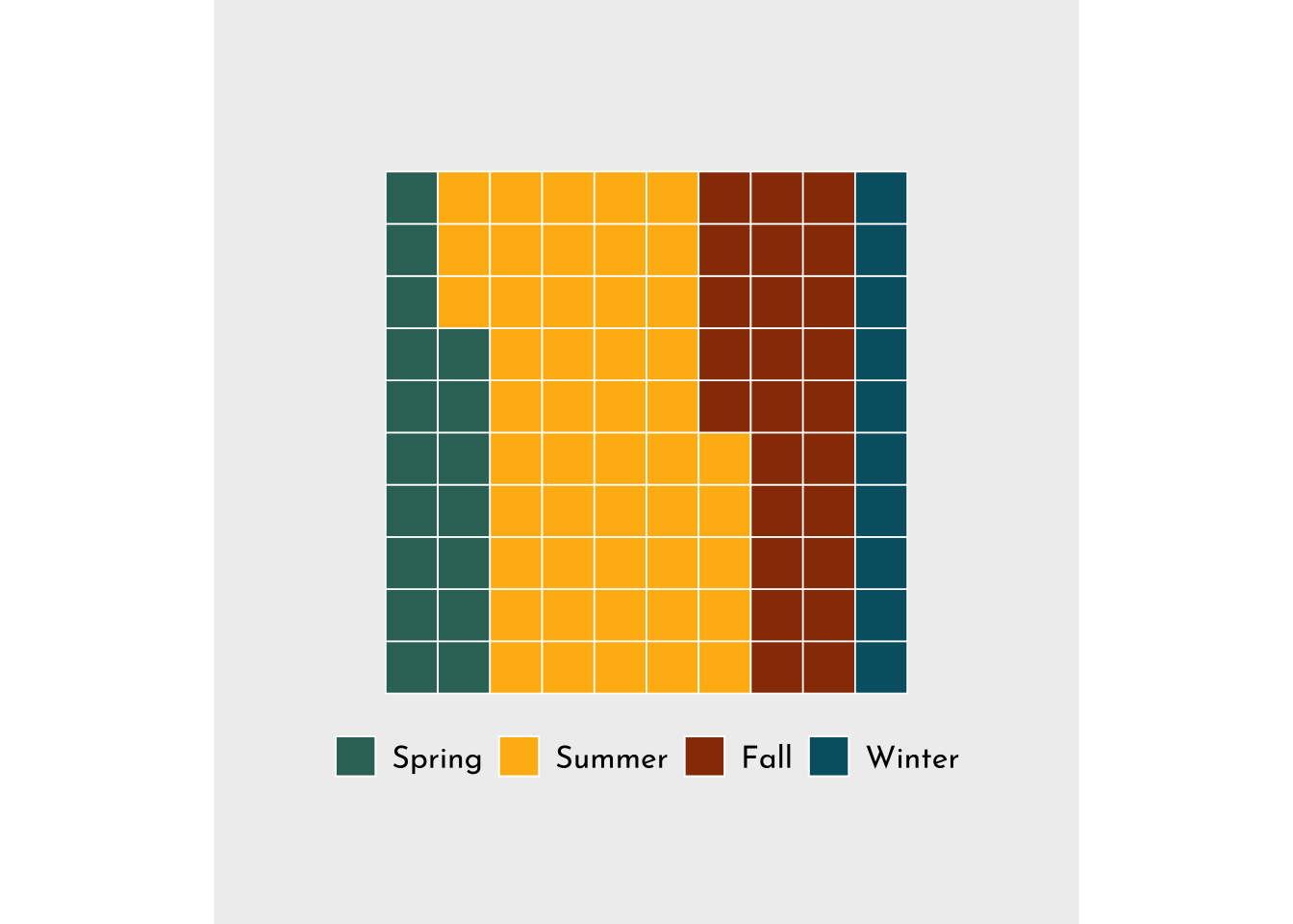
Waffle chart
##~~~~~~~~~~~~~~~~~~~~~~~~~~~~~~~~~~~~~~~~~~~~~~~~~~~~~~~~~~~~~~~~~~~~~~~~~~~~~~## setup ----##~~~~~~~~~~~~~~~~~~~~~~~~~~~~~~~~~~~~~~~~~~~~~~~~~~~~~~~~~~~~~~~~~~~~~~~~~~~~~~#..........................load packages.........................library(tidyverse)library(waffle)library(showtext)#..........................import data...........................bigfoot <- readr::read_csv('https://raw.githubusercontent.com/rfordatascience/tidytuesday/master/data/2022/2022-09-13/bigfoot.csv')#..........................import fonts..........................font_add_google(name ="Ultra", family ="ultra")font_add_google(name ="Josefin Sans", family ="josefin")#................enable {showtext} for rendering.................showtext_auto()##~~~~~~~~~~~~~~~~~~~~~~~~~~~~~~~~~~~~~~~~~~~~~~~~~~~~~~~~~~~~~~~~~~~~~~~~~~~~~~## wrangle data ----##~~~~~~~~~~~~~~~~~~~~~~~~~~~~~~~~~~~~~~~~~~~~~~~~~~~~~~~~~~~~~~~~~~~~~~~~~~~~~~ca_season_counts <- bigfoot |>filter(state =="California") |>group_by(season) |>count(season) |>ungroup() |>filter(season !="Unknown") |>mutate(season =fct_relevel(season, "Spring", "Summer", "Fall", "Winter")) |># set factor levels for legendarrange(season, c("Spring", "Summer", "Fall", "Winter")) # order df rows; {waffle} fills color based on the order that values appear in df##~~~~~~~~~~~~~~~~~~~~~~~~~~~~~~~~~~~~~~~~~~~~~~~~~~~~~~~~~~~~~~~~~~~~~~~~~~~~~~## waffle chart ----##~~~~~~~~~~~~~~~~~~~~~~~~~~~~~~~~~~~~~~~~~~~~~~~~~~~~~~~~~~~~~~~~~~~~~~~~~~~~~~#........................create palettes.........................season_palette <-c("Spring"="#357266", "Summer"="#FFB813", "Fall"="#983A06", "Winter"="#005F71")plot_palette <-c(gray ="#757473",beige ="#EFEFEF")#.......................create plot labels.......................title <-"Summer is the season of Bigfoot sightings in CA"subtitle <-"Winter, on the other hand, is a rare time to spot Sasquatch"caption <-"Source: Bigfoot Field Researchers Organization"#......................create waffle chart.......................ggplot(ca_season_counts, aes(fill = season, values = n)) +geom_waffle(color ="white", size =0.3, n_rows =10) +coord_fixed() +scale_fill_manual(values = season_palette) +labs(title = title,subtitle = subtitle,caption = caption) +theme_void() +theme(plot.title =element_text(family ="ultra", size =17, hjust =0.5,margin =margin(t =0, r =0, b =0.3, l =0, "cm")),plot.subtitle =element_text(family ="josefin",size =16,hjust =0.5,margin =margin(t =0, r =0, b =0.5, l =0, "cm")),plot.caption =element_text(family ="josefin",size =10,color = plot_palette["gray"], margin =margin(t =0.75, r =0, b =0, l =0, "cm")),legend.position ="bottom",legend.title =element_blank(),legend.text =element_text(family ="josefin",size =12),plot.background =element_rect(fill = plot_palette["beige"], color = plot_palette["beige"]),plot.margin =margin(t =2, r =2, b =2, l =2, "cm") )
#................create proportional waffle chart................ggplot(ca_season_counts, aes(fill = season, values = n)) +geom_waffle(color ="white", size =0.3, n_rows =10,1make_proportional =TRUE) +coord_fixed() +scale_fill_manual(values = season_palette) +theme_void() +theme(plot.title =element_text(family ="ultra", size =18, hjust =0.5,margin =margin(t =1, r =0, b =0.3, l =1, "cm")),plot.subtitle =element_text(family ="josefin",size =16,hjust =0.5,margin =margin(t =0, r =0, b =0.5, l =0, "cm")),plot.caption =element_text(family ="josefin",size =10,color = plot_palette["gray"], hjust =0,margin =margin(t =0.75, r =0, b =0, l =0, "cm")),legend.position ="bottom",legend.title =element_blank(),legend.text =element_text(family ="josefin",size =12),plot.background =element_rect(fill = plot_palette["beige"], color = plot_palette["beige"]),plot.margin =margin(t =2, r =2, b =2, l =2, "cm") )
1
Set make_proportional = TRUE (FALSE by default)
#........................turn off showtext.......................showtext_auto(FALSE)
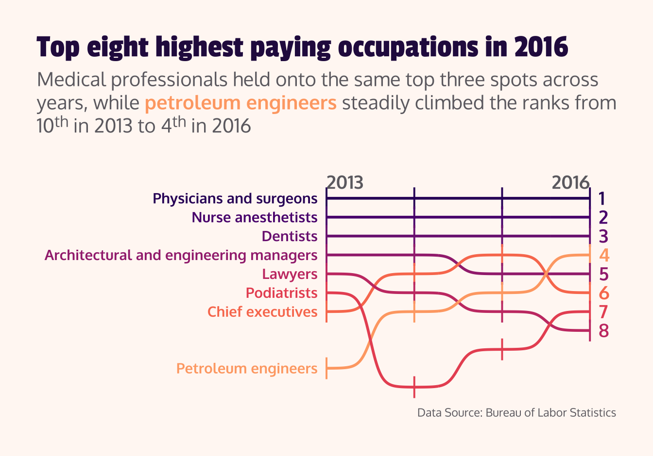
Bump chart
##~~~~~~~~~~~~~~~~~~~~~~~~~~~~~~~~~~~~~~~~~~~~~~~~~~~~~~~~~~~~~~~~~~~~~~~~~~~~~~## setup ----##~~~~~~~~~~~~~~~~~~~~~~~~~~~~~~~~~~~~~~~~~~~~~~~~~~~~~~~~~~~~~~~~~~~~~~~~~~~~~~#..........................load packages.........................library(tidyverse)library(ggbump)library(ggtext)library(showtext)#..........................import data...........................jobs <-read_csv("https://raw.githubusercontent.com/rfordatascience/tidytuesday/master/data/2019/2019-03-05/jobs_gender.csv")#..........................import fonts..........................font_add_google(name ="Passion One", family ="passion")font_add_google(name ="Oxygen", family ="oxygen")#................enable {showtext} for rendering.................showtext_auto()##~~~~~~~~~~~~~~~~~~~~~~~~~~~~~~~~~~~~~~~~~~~~~~~~~~~~~~~~~~~~~~~~~~~~~~~~~~~~~~## wrangle data ----##~~~~~~~~~~~~~~~~~~~~~~~~~~~~~~~~~~~~~~~~~~~~~~~~~~~~~~~~~~~~~~~~~~~~~~~~~~~~~~#...................rank occupations by salary...................salary_rank_by_year <- jobs |>select(year, occupation, total_earnings) |>group_by(year) |>mutate(rank =row_number(desc(total_earnings)) ) |>ungroup() |>arrange(rank, year)#........get top 8 occupation names for final year (2016)........top2016 <- salary_rank_by_year |>filter(year ==2016, rank <=8) |>pull(occupation) ##~~~~~~~~~~~~~~~~~~~~~~~~~~~~~~~~~~~~~~~~~~~~~~~~~~~~~~~~~~~~~~~~~~~~~~~~~~~~~~## bump chart ----##~~~~~~~~~~~~~~~~~~~~~~~~~~~~~~~~~~~~~~~~~~~~~~~~~~~~~~~~~~~~~~~~~~~~~~~~~~~~~~# grab magma palette ----magma_pal <- viridisLite::magma(12)# view magma colors ----# monochromeR::view_palette(magma_pal)# assign magma colors to top 8 occupations ----occupation_colors <-c("Physicians and surgeons"= magma_pal[3],"Nurse anesthetists"= magma_pal[4],"Dentists"= magma_pal[5],"Architectural and engineering managers"= magma_pal[6],"Lawyers"= magma_pal[7], "Podiatrists"= magma_pal[8],"Chief executives"= magma_pal[9],"Petroleum engineers"= magma_pal[10])# create palette for additional plot theming ----plot_palette <-c(dark_purple ="#2A114E", dark_gray ="#6D6B71",light_pink ="#FFF8F4")#.......................create plot labels.......................title <-"Top eight highest paying occupations in 2016"subtitle <-"Medical professionals held onto the same top three spots across years, while <span style='color:#FEA873FF;'>**petroleum engineers**</span> steadily climbed the ranks from 10^th^ in 2013 to 4^th^ in 2016"caption <-"Data Source: Bureau of Labor Statistics"#........................create bump chart.......................salary_rank_by_year |>filter(occupation %in% top2016) |>ggplot(aes(x = year, y = rank, color = occupation)) +geom_point(shape ="|", size =6) +geom_bump(linewidth =1) +geom_text(data = salary_rank_by_year |>filter(year ==2013, occupation %in% top2016),aes(label = occupation),hjust =1,nudge_x =-0.1,family ="oxygen",fontface ="bold" ) +geom_text(data = salary_rank_by_year |>filter(year ==2016, occupation %in% top2016),aes(label = rank),hjust =0,nudge_x =0.1,size =5,family ="oxygen",fontface ="bold" ) +annotate(geom ="text",x =c(2013, 2016),y =c(-0.2, -0.2),label =c("2013", "2016"),hjust =c(0, 1),vjust =1,size =5,family ="oxygen",fontface ="bold",color = plot_palette["dark_gray"], ) +scale_y_reverse() +scale_color_manual(values = occupation_colors) +coord_cartesian(xlim =c(2010, 2016), ylim =c(11, 0.25), clip ="off") +labs(title = title,subtitle = subtitle,caption = caption) +theme_void() +theme(legend.position ="none",plot.title =element_text(family ="passion",size =25,color = plot_palette["dark_purple"],margin =margin(t =0, r =0, b =0.3, l =0, "cm")),plot.subtitle =element_textbox_simple(family ="oxygen",size =15,color = plot_palette["dark_gray"],margin =margin(t =0, r =0, b =1, l =0, "cm")),plot.caption =element_text(family ="oxygen",color = plot_palette["dark_gray"],margin =margin(t =0.3, r =0, b =0, l =0, "cm")),plot.background =element_rect(fill = plot_palette["light_pink"],color = plot_palette["light_pink"]),plot.margin =margin(t =1, r =1, b =1, l =1, "cm") )
#........................turn off showtext.......................showtext_auto(FALSE)