##~~~~~~~~~~~~~~~~~~~~~~~~~~~~~~~~~~~~~~~~~~~~~~~~~~~~~~~~~~~~~~~~~~~~~~~~~~~~~~
##                                    setup                                 ----
##~~~~~~~~~~~~~~~~~~~~~~~~~~~~~~~~~~~~~~~~~~~~~~~~~~~~~~~~~~~~~~~~~~~~~~~~~~~~~~

#..........................load packages.........................
library(tidyverse)
library(chron)
library(naniar)
library(ggridges)
library(gghighlight)
library(ggbeeswarm)
library(see)
library(palmerpenguins) # for some minimal examples

#..........................import data...........................
# mko <- readr::read_csv("https://portal.edirepository.org/nis/dataviewer?packageid=knb-lter-sbc.2007.17&entityid=02629ecc08a536972dec021f662428aa")
mko <- read_csv(here::here("course-materials", "lecture-slides", "data", "mohawk_mooring_mko_20250117.csv"))

##~~~~~~~~~~~~~~~~~~~~~~~~~~~~~~~~~~~~~~~~~~~~~~~~~~~~~~~~~~~~~~~~~~~~~~~~~~~~~~
##                                wrangle data                              ----
##~~~~~~~~~~~~~~~~~~~~~~~~~~~~~~~~~~~~~~~~~~~~~~~~~~~~~~~~~~~~~~~~~~~~~~~~~~~~~~

mko_clean <- mko |>

  # keep only necessary columns ----
  select(year, month, day, decimal_time, Temp_bot, Temp_top, Temp_mid) |>

  # create datetime column (not totally necessary for our plots, but it can be helpful to know how to do this!) ----
  unite(date, year, month, day, sep = "-", remove = FALSE) |>
  mutate(time = chron::times(decimal_time)) |>
  unite(date_time, date, time, sep = " ") |>

  # coerce data types ----
  mutate(date_time = as_datetime(date_time, "%Y-%m-%d %H:%M:%S", tz = "GMT"),
         year = as.factor(year),
         month = as.factor(month),
         day = as.numeric(day)) |>

  # add month name by indexing the built-in `month.name` vector ----
  mutate(month_name = month.name[month]) |>

  # replace 9999s with NAs ----
  naniar::replace_with_na(replace = list(Temp_bot = 9999,
                                         Temp_top = 9999,
                                         Temp_mid = 9999)) |>

  # select/reorder desired columns ----
  select(date_time, year, month, day, month_name, Temp_bot, Temp_mid, Temp_top)

##~~~~~~~~~~~~~~~~~~~~~~~~~~~~~~~~~~~~~~~~~~~~~~~~~~~~~~~~~~~~~~~~~~~~~~~~~~~~~~
##                            explore missing data                          ----
##~~~~~~~~~~~~~~~~~~~~~~~~~~~~~~~~~~~~~~~~~~~~~~~~~~~~~~~~~~~~~~~~~~~~~~~~~~~~~~

#..........counts & percentages of missing data by year..........
see_NAs <- mko_clean |>
  group_by(year) |>
  naniar::miss_var_summary() |>
  filter(variable == "Temp_bot")

#...................visualize missing Temp_bot...................
bottom <- mko_clean |> select(Temp_bot)
missing_temps <- naniar::vis_miss(bottom)
Note
This template follows lecture 2.2 slides. Please be sure to cross-reference the slides, which contain important information and additional context!
Setup
[UPDATE reading data in from EDI not working; fix later]
- Find data & metadata on the EDI Data Portal.
- Get data download link by right-clicking on the Download button > Copy Link Address > then paste into
read_csv()
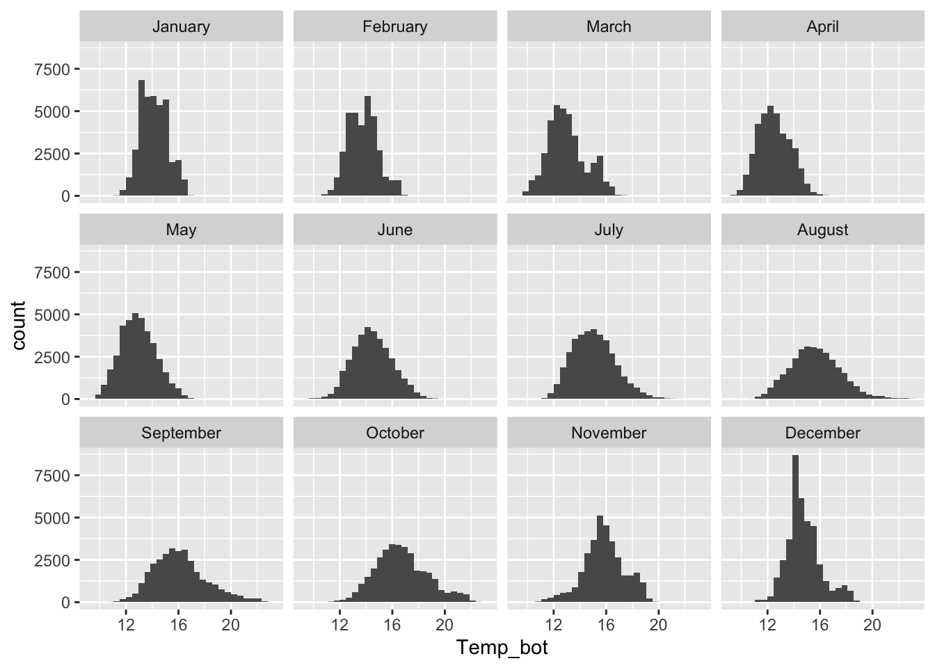
Histograms
- represent distribution of a numeric variable(s), which is cut into several bins – height of bar represents # of observations in that bin
Too many groups
Note the message, to remind us to consider adjusting our binwidth
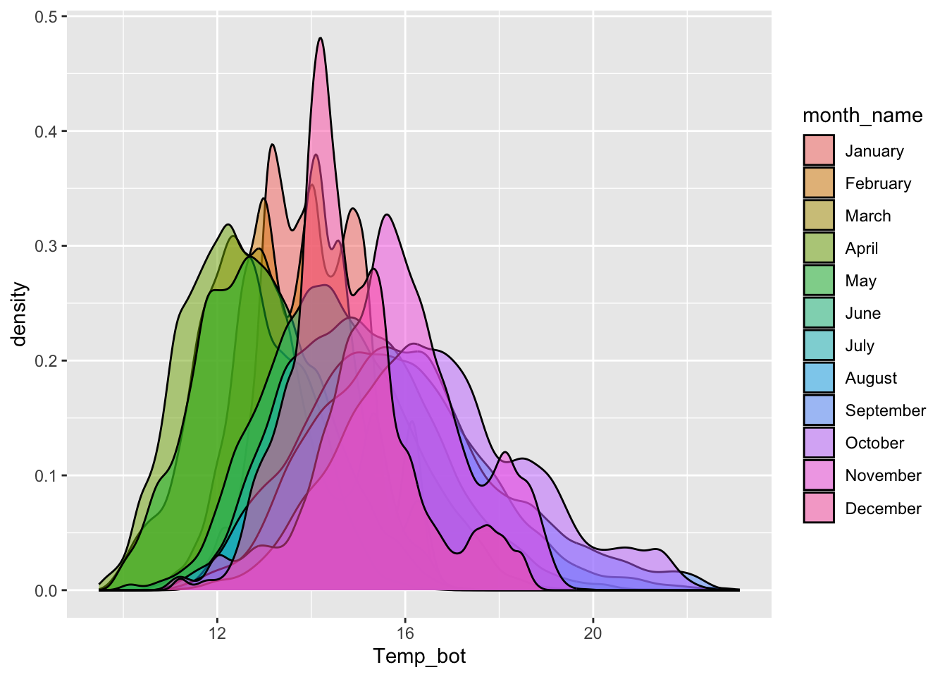
# histogram with all 12 months ----
mko_clean |>
  mutate(month_name = factor(month_name, levels = month.name)) |>
  ggplot(aes(x = Temp_bot, fill = month_name)) +
  geom_histogram(position = "identity", alpha = 0.5)
`stat_bin()` using `bins = 30`. Pick better value `binwidth`.Warning: Removed 69427 rows containing non-finite outside the scale range
(`stat_bin()`).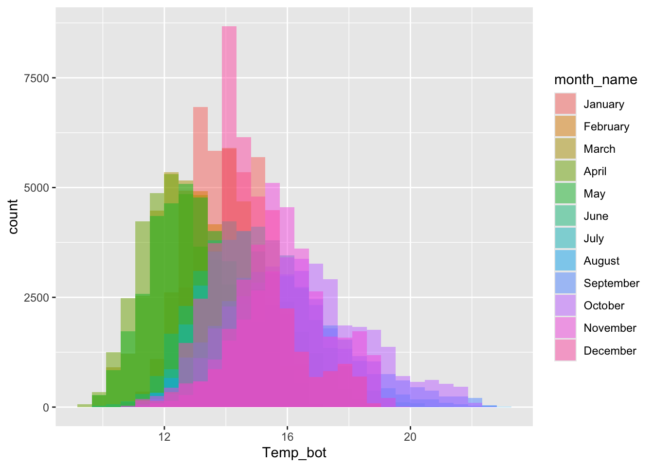
Alt 1: small multiples
Alt 2: fewer groups + update colors + modify bin widths
# histogram with fewer months ----
mko_clean |>
  mutate(month_name = factor(month_name, levels = month.name)) |>
  filter(month_name %in% c("April", "June", "October")) |>
  ggplot(aes(x = Temp_bot, fill = month_name)) +
  geom_histogram(position = "identity", alpha = 0.5, color = "black", binwidth = 1) +
  scale_fill_manual(values = c("#2C5374", "#ADD8E6", "#8B3A3A"))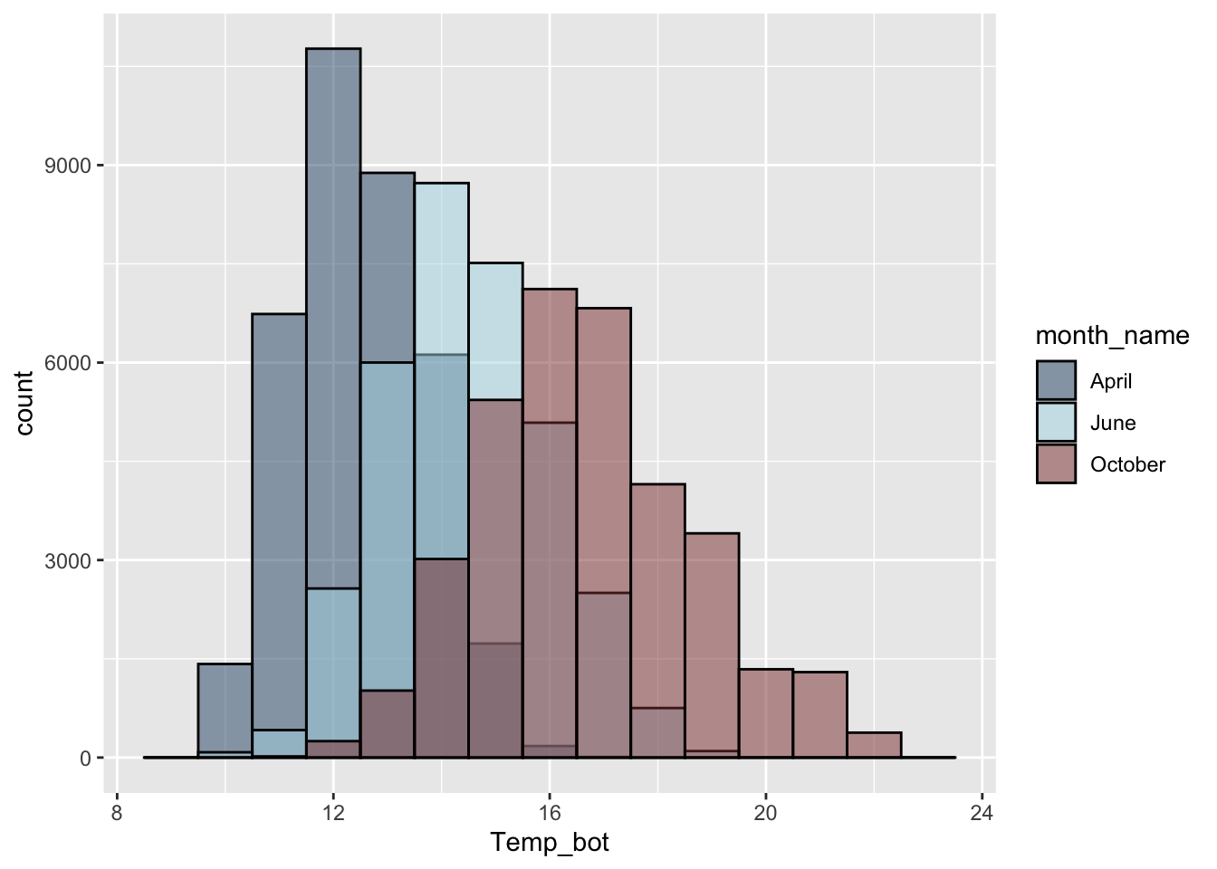
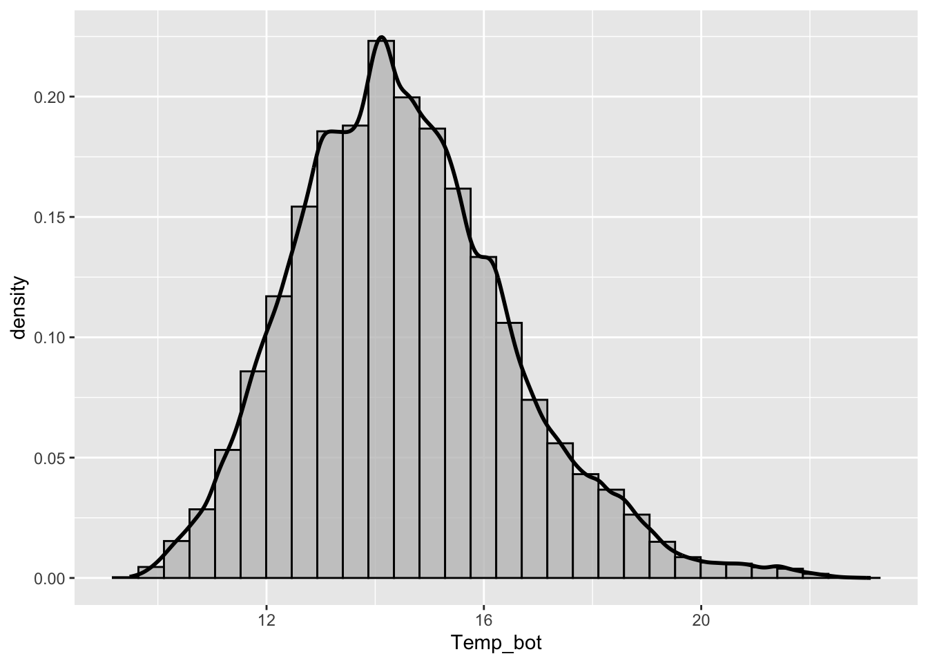
Density plots
- represent data distribution of a numeric variable(s); uses KDE to show probability density function of the variable, the y-axis represents the estimated density, i.e. the relative likelihood of a value occurring, and the area under each curve is equal to 1
Too many groups
Alt 1: small multiples
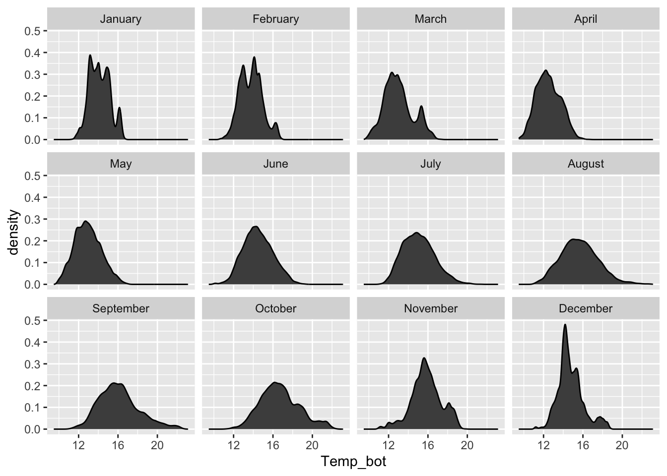
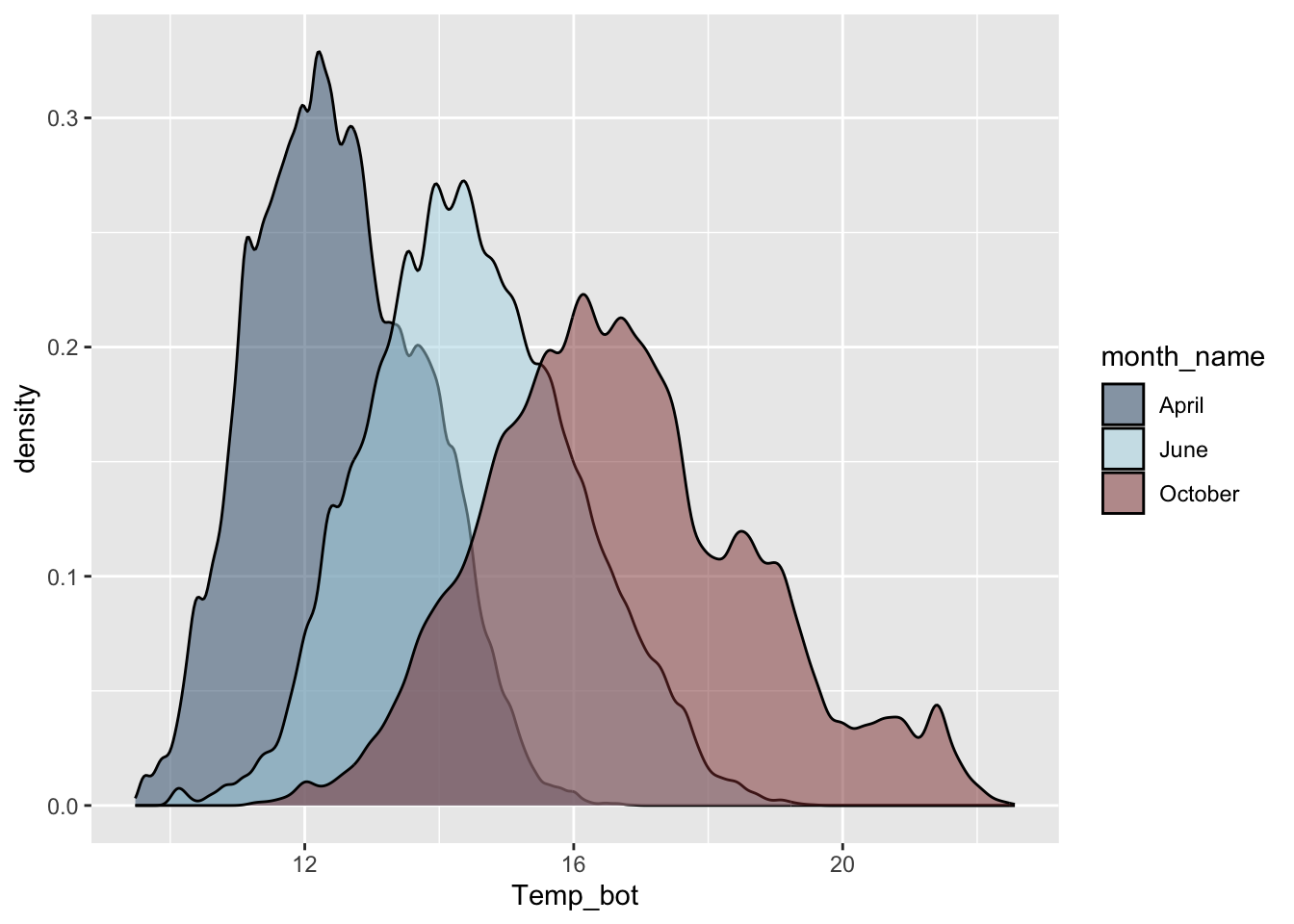
Alt 2: fewer groups + update colors + modify band widths
A few more histograms & density plots
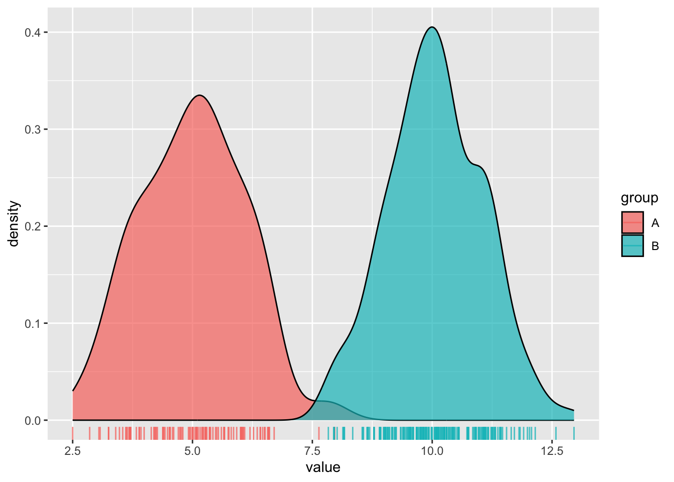
Distinction: histograms vs. density plots
# create some dummy data ----
dummy_data <- data.frame(value = c(rnorm(n = 100, mean = 5),
                                   rnorm(n = 200, mean = 10)),
                         group = rep(c("A", "B"),
                                     times = c(100, 200)))

# histogram ----
ggplot(dummy_data, aes(x = value, fill = group)) +
  geom_histogram(position = "identity", alpha = 0.7) +
  geom_rug(aes(color = group), alpha = 0.75)
# density plot ----
ggplot(dummy_data, aes(x = value, fill = group)) +
  geom_density(alpha = 0.7) +
  geom_rug(aes(color = group), alpha = 0.75)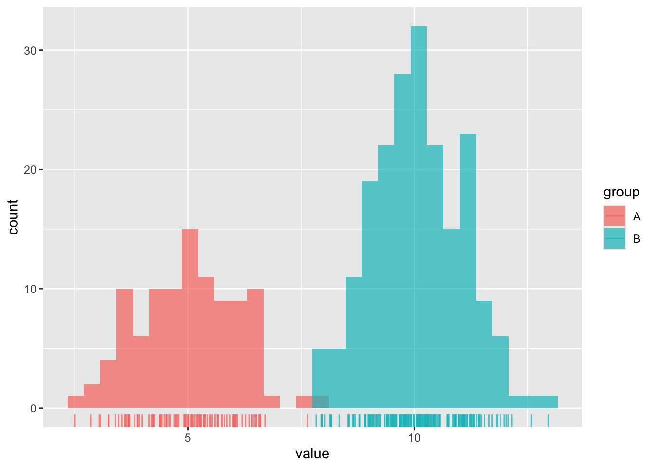
Combining geoms
Compare groups to a whole
# use `after_stat(count)` to plot density of observations ----
ggplot(penguins, aes(x = body_mass_g, y = after_stat(count))) +

  # plot full distribution curve with label "all penguins"; remove 'species' col so that this doesn't get faceted later on ----
  geom_density(data = select(penguins, -species),
               aes(fill = "all penguins"), color = "transparent") +

  # plot second curve with label "species" ----
  geom_density(aes(fill = "species"), color = "transparent") +

  # facet wrap by species ----
  facet_wrap(~species, nrow = 1) +

  # update colors, x-axis label, legend position ----
  scale_fill_manual(values = c("grey","green4"), name = NULL) +
  labs(x = "Body Mass (g)") +
  theme(legend.position = "top")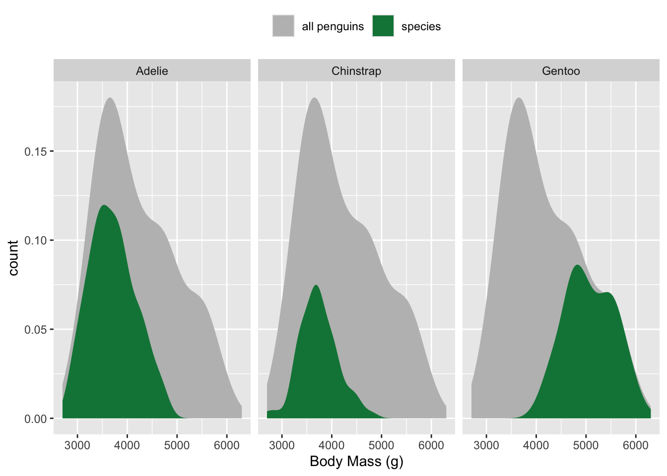
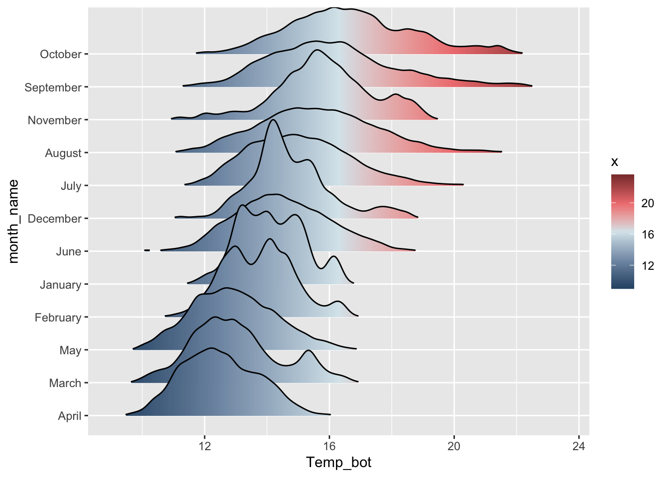
Ridgeline plots
- show distribution of a numeric variable for multiple groups
# basic ridgeline plot ----
ggplot(mko_clean, aes(x = Temp_bot, y = month_name)) +
ggridges::geom_density_ridges()
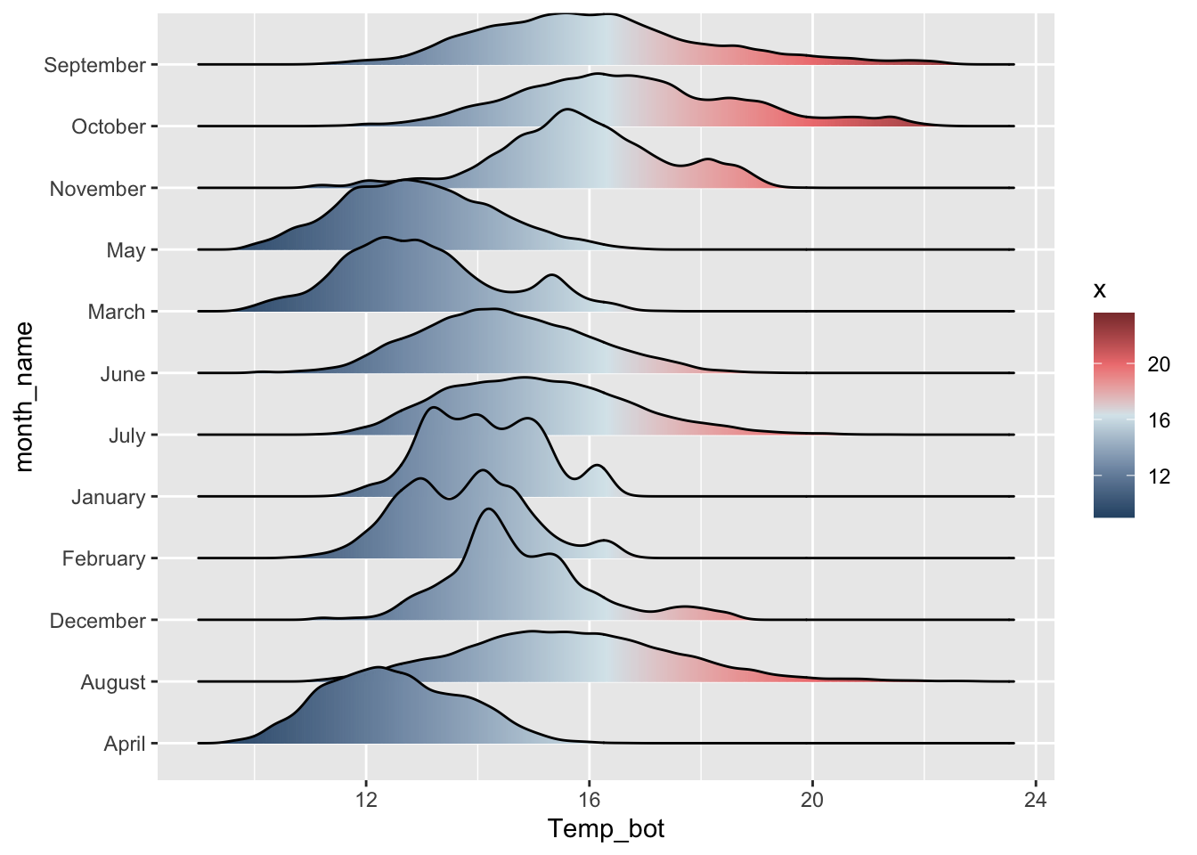
# fill with color gradient ----
ggplot(mko_clean, aes(x = Temp_bot, y = month_name, fill = after_stat(x))) +
ggridges::geom_density_ridges_gradient() +
scale_fill_gradientn(colors = c("#2C5374","#849BB4", "#D9E7EC", "#EF8080", "#8B3A3A"))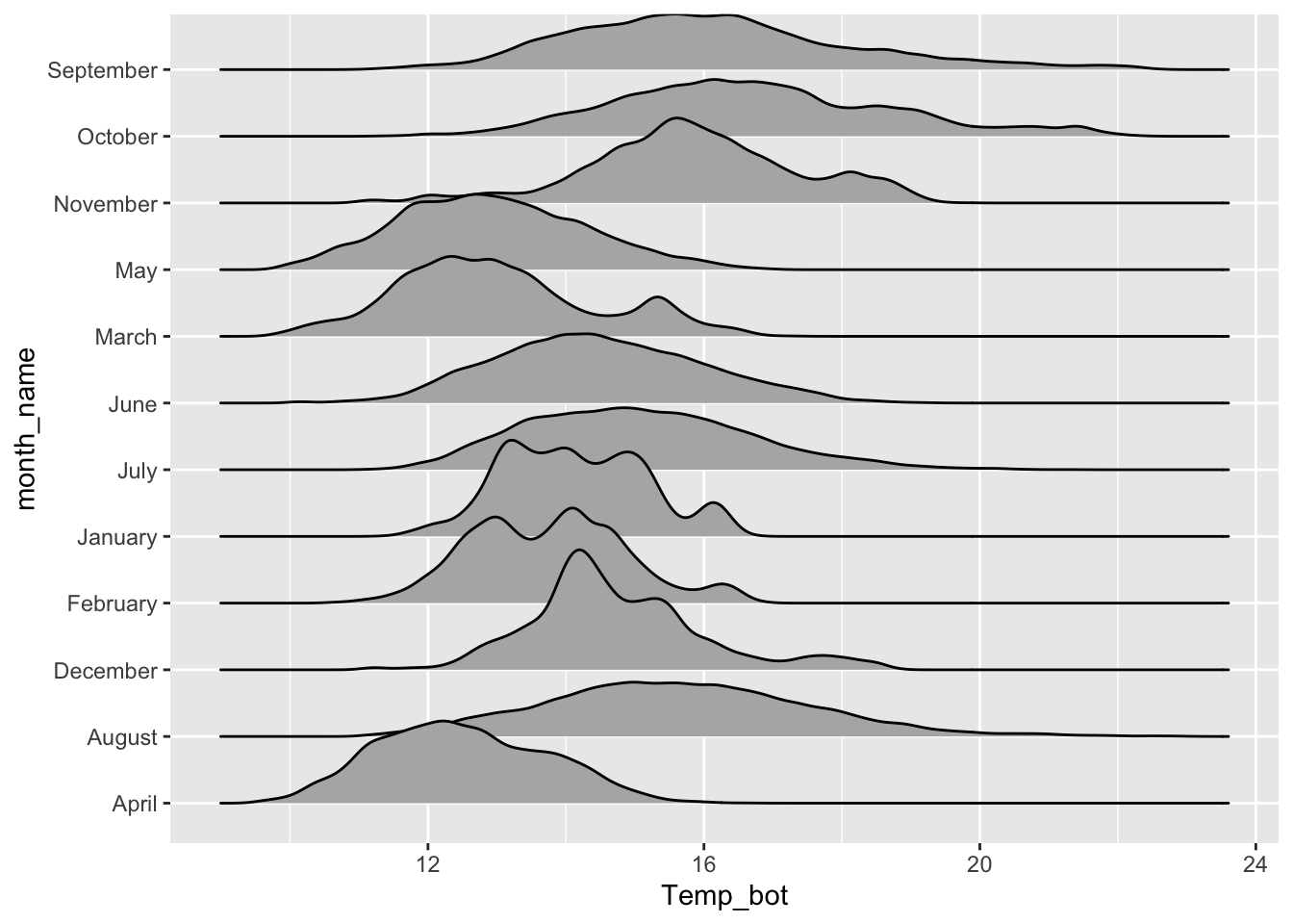
Alt 1: reorder groups + adjust overlap & tails
# ridgeline plot with reordered months ----
ggplot(mko_clean, aes(x = Temp_bot, y = month_name, fill = after_stat(x))) +
  ggridges::geom_density_ridges_gradient(rel_min_height = 0.01, scale = 3) +
  scale_y_discrete(limits = rev(month.name)) +
  scale_fill_gradientn(colors = c("#2C5374","#849BB4", "#D9E7EC", "#EF8080", "#8B3A3A"))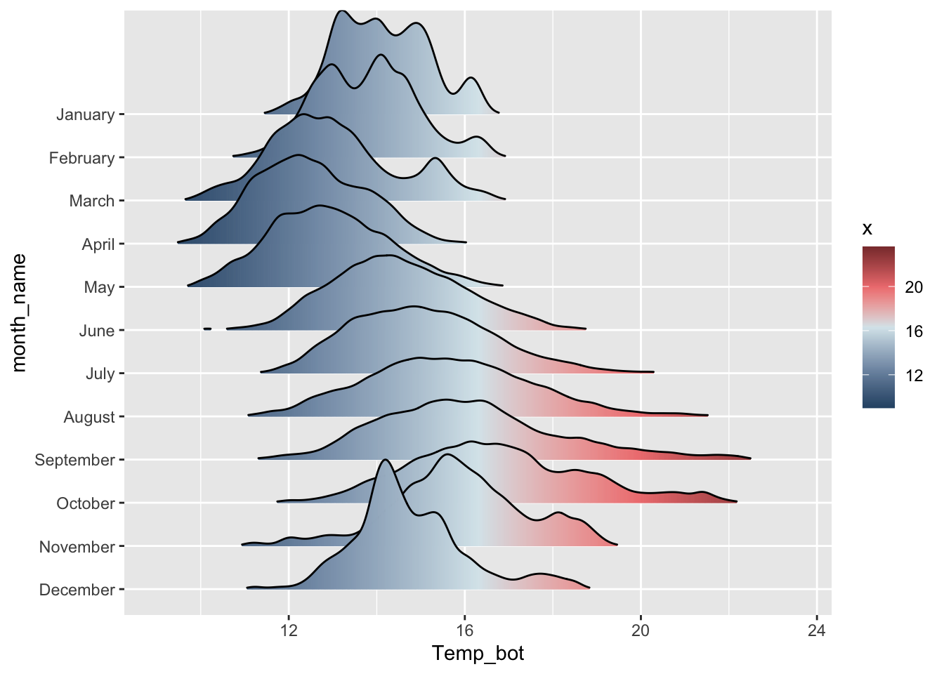
Remember, you can also reorder factor levels during the data wrangling stage:
# e.g. by month: ----
mko_clean |>
  mutate(month_name = factor(month_name, levels = rev(month.name))) |>
  ggplot(aes(x = Temp_bot, y = month_name, fill = after_stat(x))) +
  ggridges::geom_density_ridges_gradient(rel_min_height = 0.01, scale = 3) +
  scale_fill_gradientn(colors = c("#2C5374","#849BB4", "#D9E7EC", "#EF8080", "#8B3A3A"))
# e.g. by median temp ---
mko_clean |>
  mutate(month_name = fct_reorder(month_name, Temp_bot, .fun = median)) |>
  ggplot(aes(x = Temp_bot, y = month_name, fill = after_stat(x))) +
  ggridges::geom_density_ridges_gradient(rel_min_height = 0.01, scale = 3) +
  scale_fill_gradientn(colors = c("#2C5374","#849BB4", "#D9E7EC", "#EF8080", "#8B3A3A"))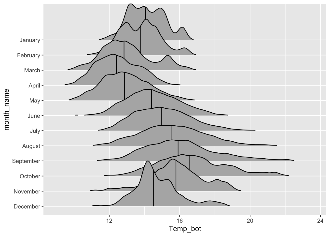
Alt 2: add quantiles
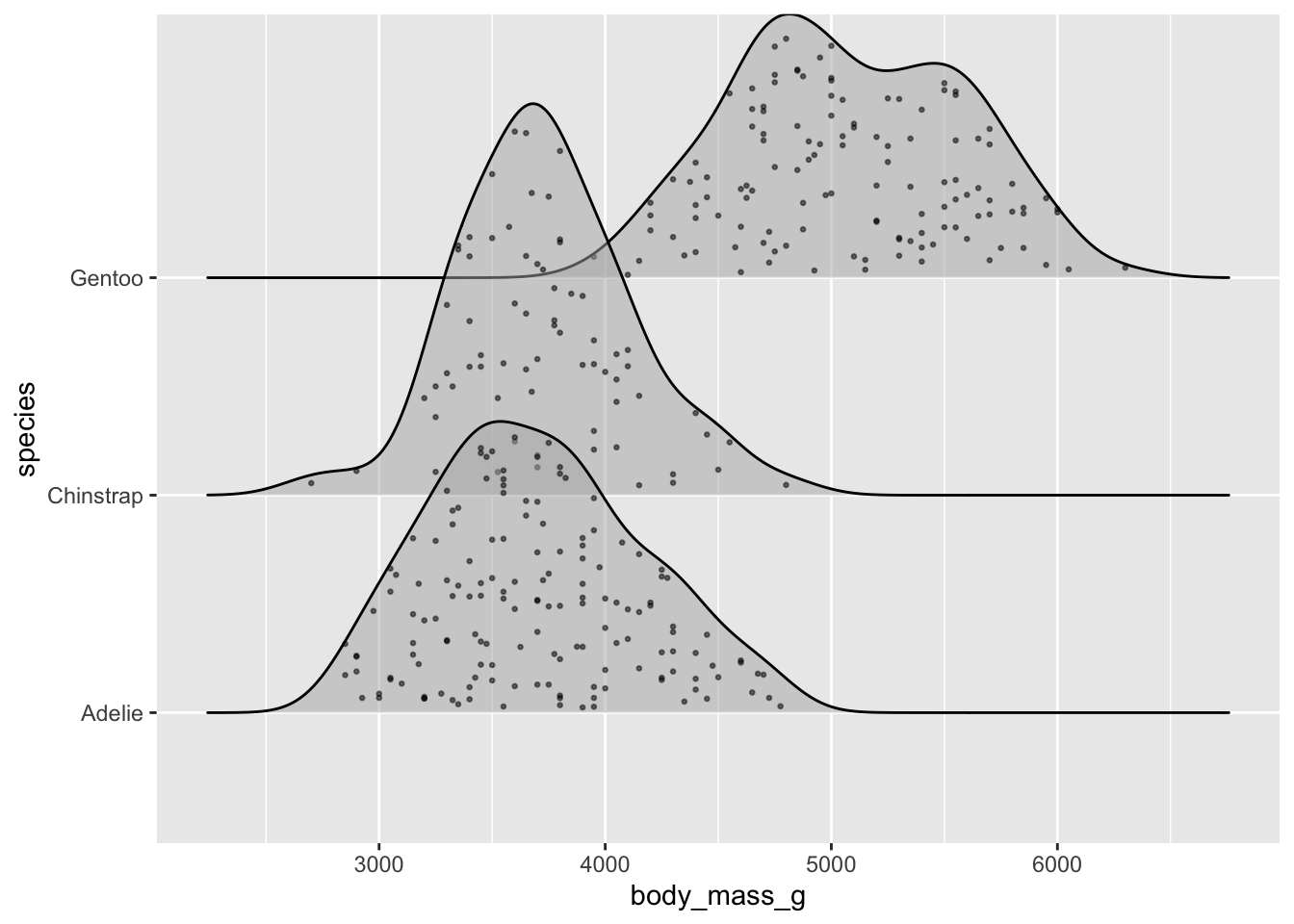
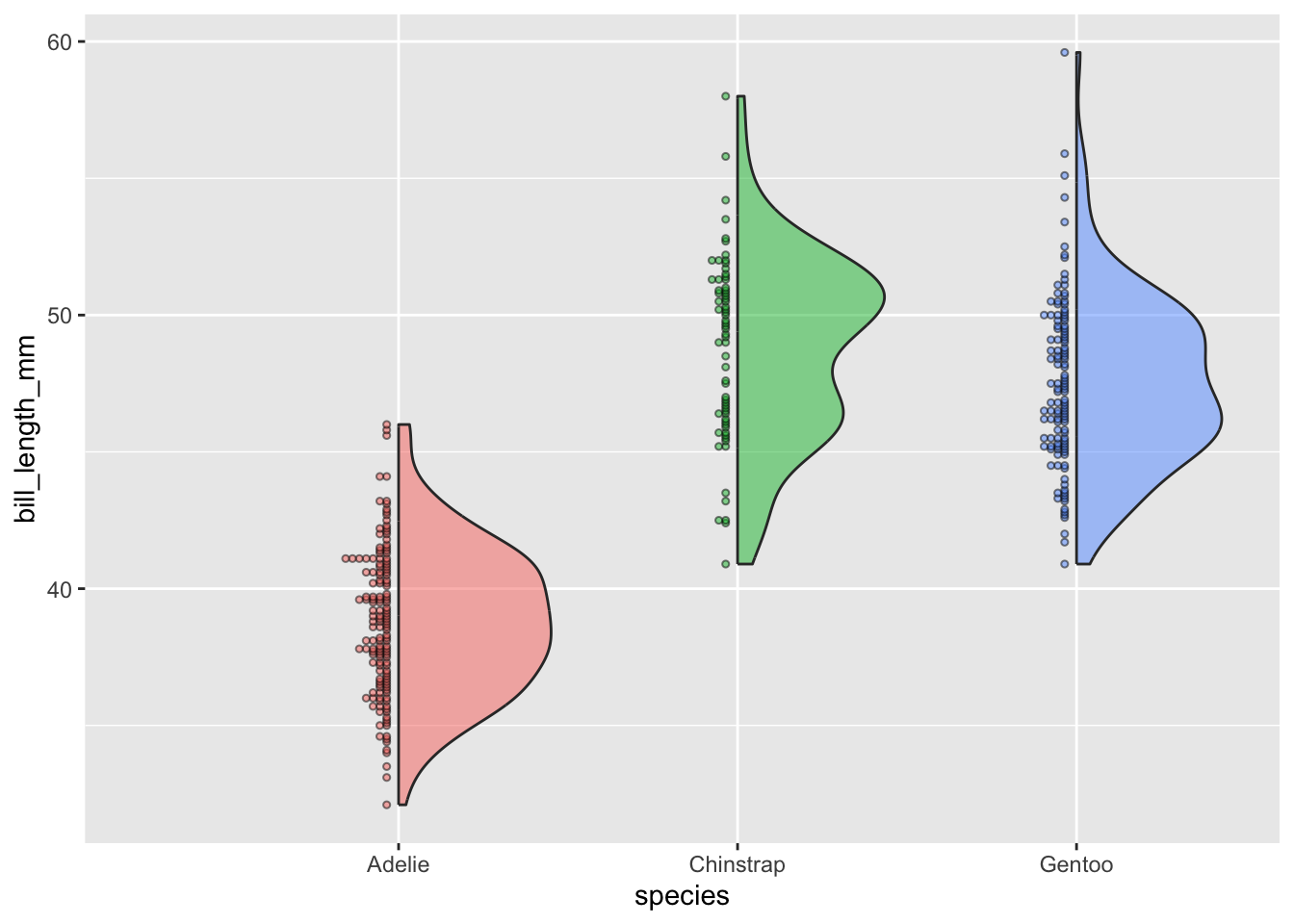
Alt 3: jitter raw data
# jittered points ----
ggplot(penguins, aes(x = body_mass_g, y = species)) +
  ggridges::geom_density_ridges(jittered_points = TRUE,
                                alpha = 0.5, point_size = 0.5)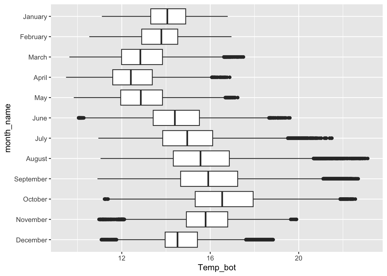
# raincloud ----
ggplot(penguins, aes(x = body_mass_g, y = species)) +
  ggridges::geom_density_ridges(jittered_points = TRUE,
                                alpha = 0.5, point_size = 0.5, scale = 0.6,
                                position = "raincloud")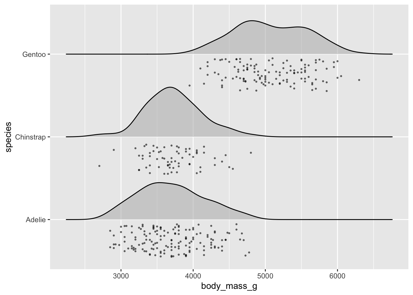
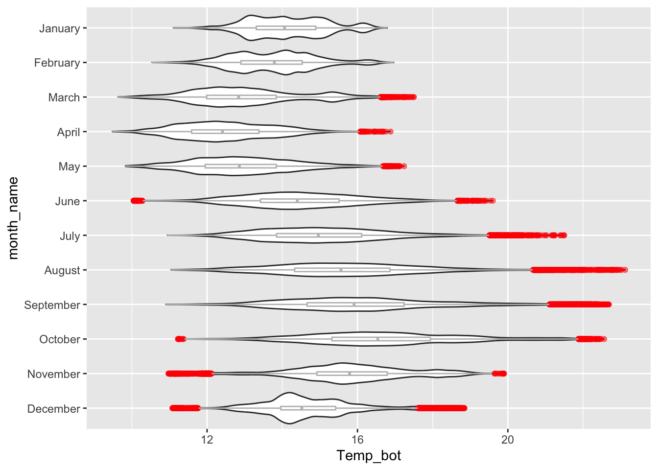
Boxplots
- summarize the distribution of a numeric variable for one or several groups
# boxplot with all 12 months ----
ggplot(mko_clean, aes(x = month_name, y = Temp_bot)) +
  geom_boxplot() +
  scale_x_discrete(limits = rev(month.name)) +
  coord_flip()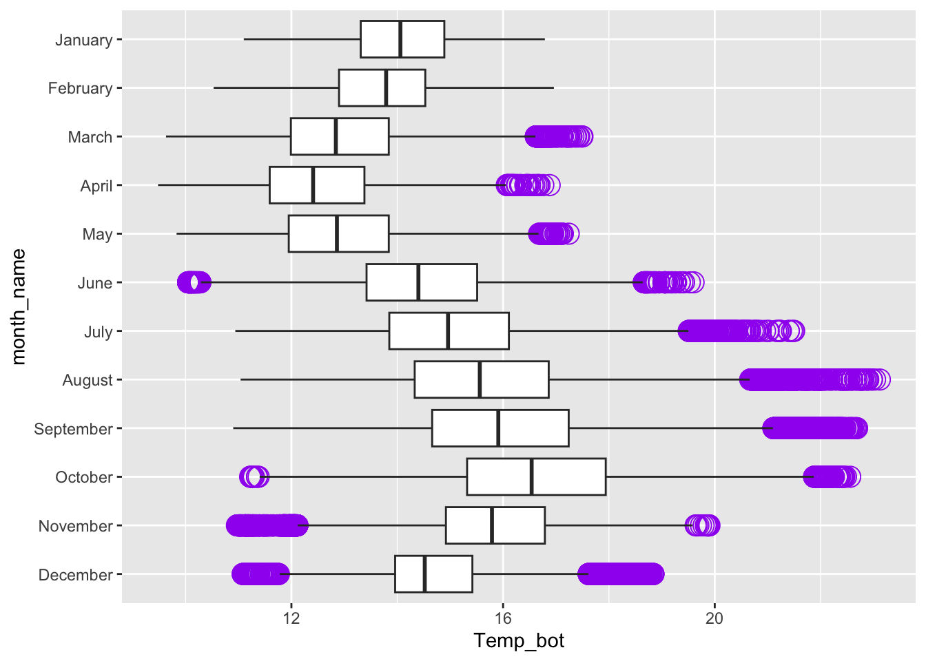
Alt 1: modify outliers
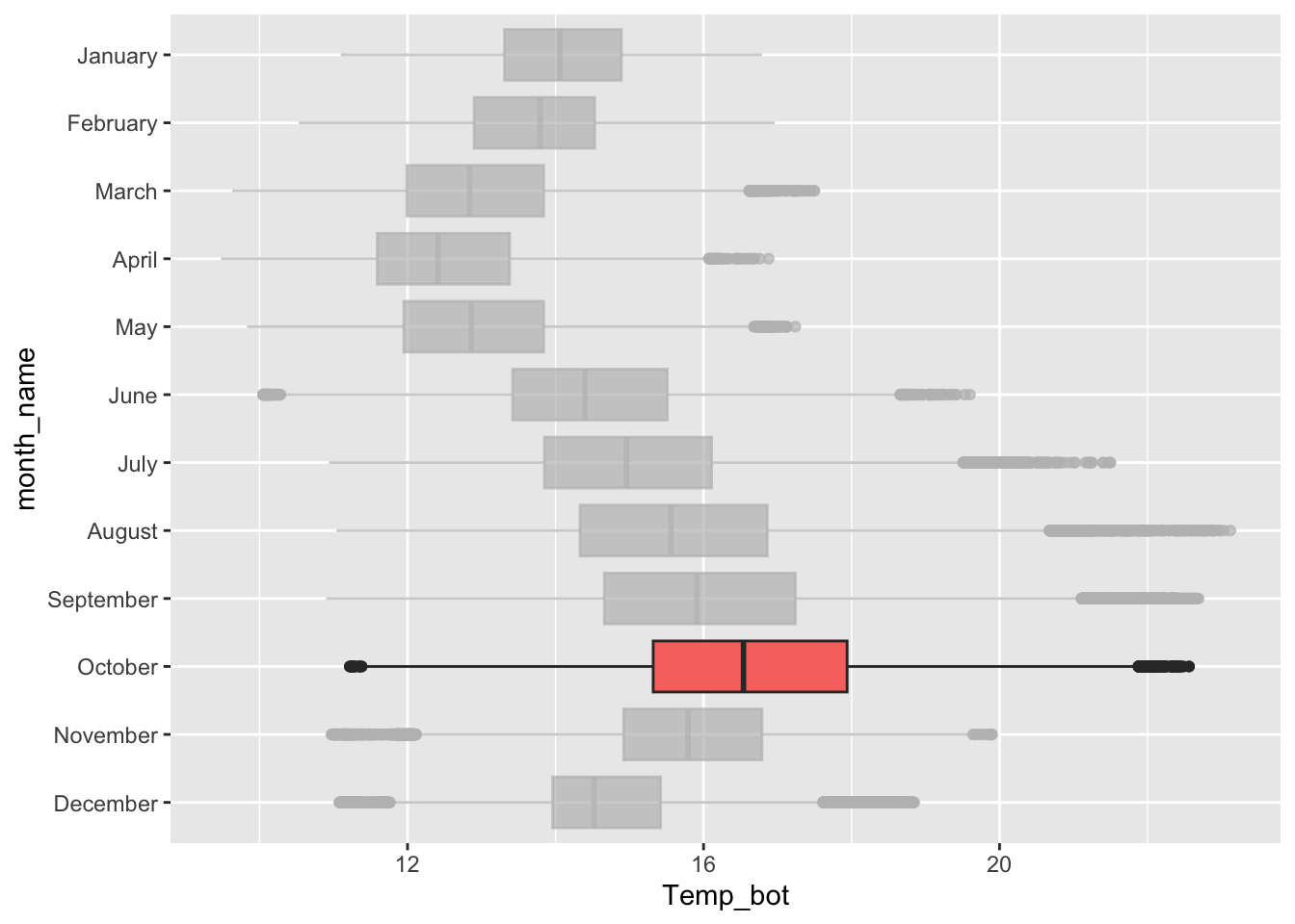
Alt 2: hightlight a group
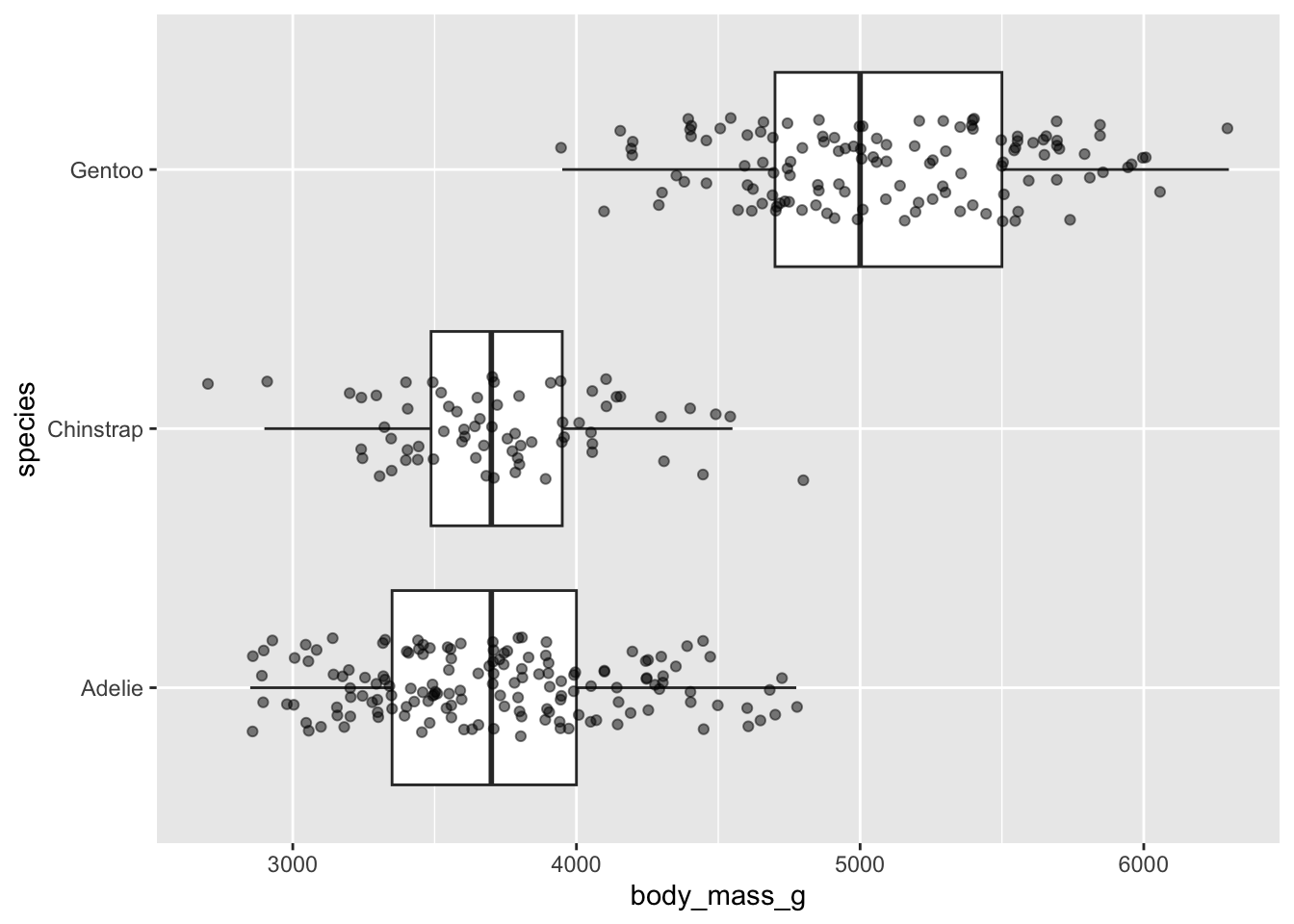
Alt 3: jitter raw data (using {palmerpenguins} data)
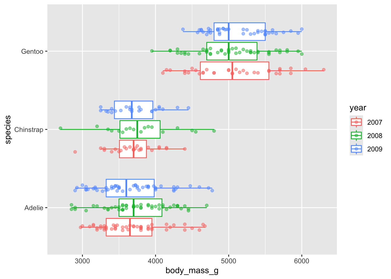
Alt 4: dodged groups

Alt 5: overlay beeswarm
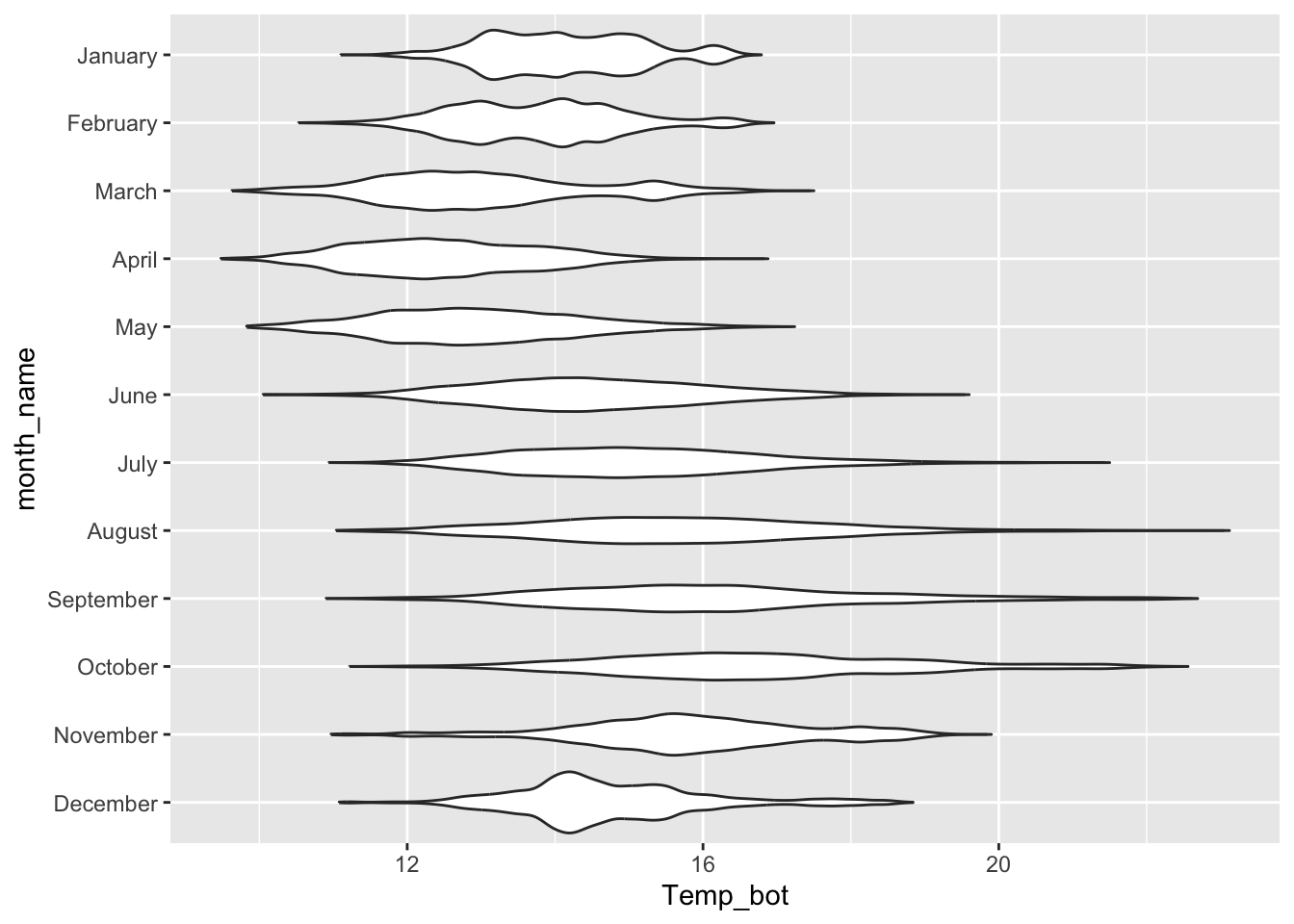
Violin plots:
- visualize distribution of a numeric variable for one or several groups; great for multiple groups with lots of data
# violin plot ----
ggplot(mko_clean, aes(x = month_name, y = Temp_bot)) +
  geom_violin() +
  scale_x_discrete(limits = rev(month.name)) +
  coord_flip()