##~~~~~~~~~~~~~~~~~~~~~~~~~~~~~~~~~~~~~~~~~~~~~~~~~~~~~~~~~~~~~~~~~~~~~~~~~~~~~~
##                                    setup                                 ----
##~~~~~~~~~~~~~~~~~~~~~~~~~~~~~~~~~~~~~~~~~~~~~~~~~~~~~~~~~~~~~~~~~~~~~~~~~~~~~~

#..........................load packages.........................
library(tidyverse)
library(scales)

#..........................import data...........................
jobs <- read_csv("https://raw.githubusercontent.com/rfordatascience/tidytuesday/master/data/2019/2019-03-05/jobs_gender.csv")

##~~~~~~~~~~~~~~~~~~~~~~~~~~~~~~~~~~~~~~~~~~~~~~~~~~~~~~~~~~~~~~~~~~~~~~~~~~~~~~
##                                wrangle data                              ----
##~~~~~~~~~~~~~~~~~~~~~~~~~~~~~~~~~~~~~~~~~~~~~~~~~~~~~~~~~~~~~~~~~~~~~~~~~~~~~~

jobs_clean <- jobs |>

  # add col with % men in a given occupation (% females in a given occupation is already included) ----
  mutate(percent_male = 100 - percent_female) |>

  # rearrange columns ----
  relocate(year, major_category, minor_category, occupation,
          total_workers, workers_male, workers_female,
          percent_male, percent_female,
          total_earnings, total_earnings_male, total_earnings_female,
          wage_percent_of_male) |>

  # drop rows with missing earnings data ----
  drop_na(total_earnings_male, total_earnings_female) |>

  # make occupation a factor (for reordering groups in our plot) ----
  mutate(occupation = as.factor(occupation)) |>

  # classify jobs by percentage male or female (these will become facet labels in our dumbbell plot) ----
  mutate(group_label = case_when(
    percent_female >= 75 ~ "Occupations that are 75%+ female",
    percent_female >= 45 & percent_female <= 55 ~ "Occupations that are 45-55% female",
    percent_male >= 75 ~ "Occupations that are 75%+ male"
  ))
Note
This template follows lecture 4.1 slides. Please be sure to cross-reference the slides, which contain important information and additional context!
Setup
Data are downloaded directly from the tidytuesday GitHub repository.
Bar chart vs. Lolliplot chart
- explore the top ten occupations with the highest median earnings in 2016 (full-time workers > 16 years old)
- for both examples, we’ll:
- flip axes to make space for labels
- reorder groups
- add scales labels
- add direct labels
Bar chart
# bar chart ----
jobs_clean |>
  filter(year == 2016) |>
  slice_max(order_by = total_earnings, n = 10) |>
  mutate(occupation = fct_reorder(.f = occupation, .x = total_earnings)) |>
  ggplot(aes(x = occupation, y = total_earnings)) +
  geom_col() +
  geom_text(aes(label = scales::dollar(total_earnings)), hjust = 1.2, color = "white") +
  scale_y_continuous(labels = scales::label_currency(accuracy = 1, scale = 0.001, suffix = "k")) +
  coord_flip()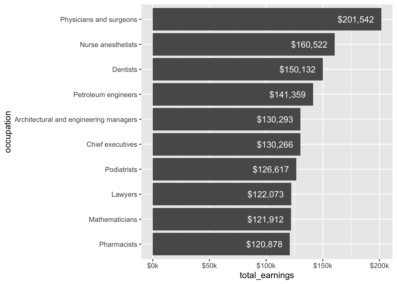
Lollipop chart
# lollipop chart ----
jobs_clean |>
  filter(year == 2016) |>
  slice_max(order_by = total_earnings, n = 10) |>
  mutate(occupation = fct_reorder(.f = occupation, .x = total_earnings)) |>
  ggplot(aes(x = occupation, y = total_earnings)) +
  geom_point() +
  geom_segment(aes(y = 0, yend = total_earnings)) +
  geom_text(aes(label = scales::dollar(total_earnings)), hjust = -0.2) +
  scale_y_continuous(labels = scales::label_currency(accuracy = 1, scale = 0.001, suffix = "k"),
                     limits = c(0, 250000)) + # expand axis to make room for values
  coord_flip()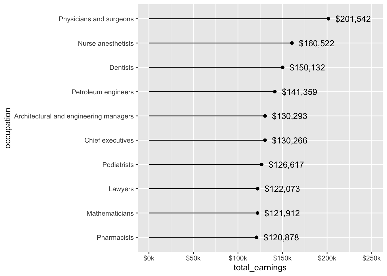
An aside: when to use geom_col() vs. geom_bar()
- use
geom_col()when you have data that’s already summarized
# geom_col() ----
jobs_clean |>
  filter(year == 2016) |>
  slice_max(order_by = total_earnings, n = 10) |>
  ggplot(aes(x = occupation, y = total_earnings)) +
  geom_col() +
  coord_flip()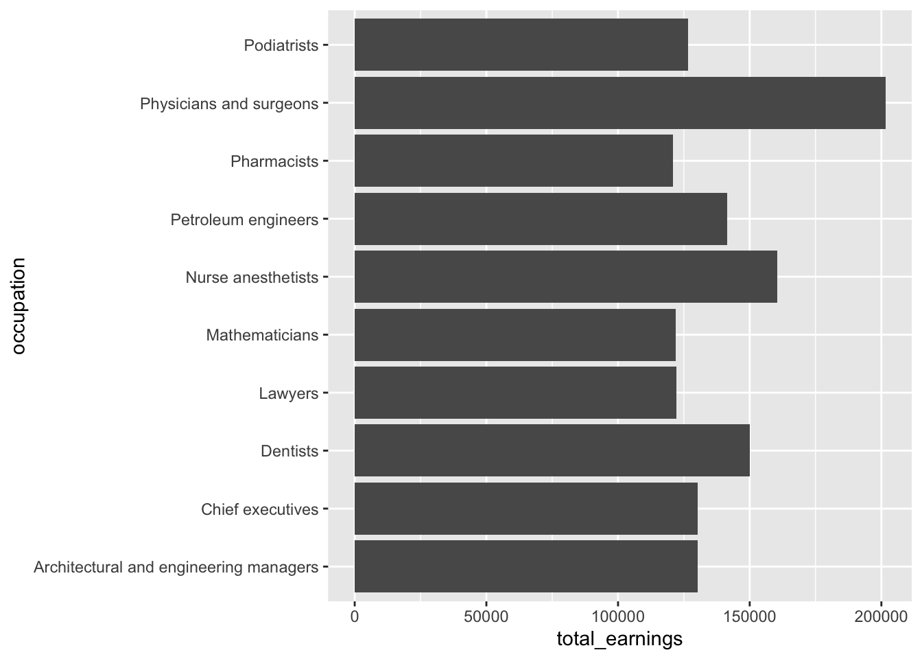
- use
geom_bar()when you need ggplot to count up the number of rows for you
Bar & lollipop charts for visualizing 2+ groups
- explore male and female salaries for the top ten occupations with the highest median earnings in 2016 (full-time workers > 16 years old)
- for both examples, we’ll:
- transform data from long to wide format
- color by sex
- dodge by sex
Bar chart (2 groups)
# bar chart ----
jobs_clean |>
  filter(year == 2016) |>
  slice_max(order_by = total_earnings, n = 10) |>
  pivot_longer(cols = c(total_earnings_female, total_earnings_male), names_to = "group", values_to = "earnings_by_group") |>
  mutate(sex = str_remove(group, pattern = "total_earnings_")) |>
  ggplot(aes(x = fct_reorder(occupation, earnings_by_group), y = earnings_by_group, fill = sex)) +
  geom_col(position = position_dodge()) +
  coord_flip()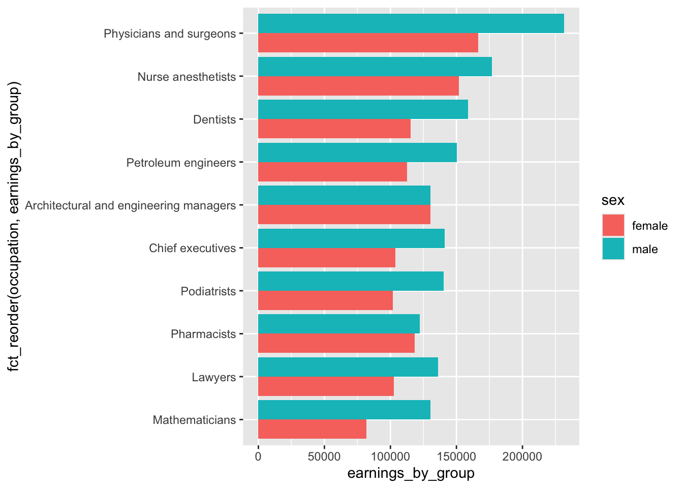
Lollipop chart (2 groups)
# lollipop chart ----
jobs_clean |>
  filter(year == 2016) |>
  slice_max(order_by = total_earnings, n = 10) |>
  pivot_longer(cols = c(total_earnings_female, total_earnings_male), names_to = "group", values_to = "earnings_by_group") |>
  mutate(sex = str_remove(group, pattern = "total_earnings_")) |>
  ggplot(aes(x = fct_reorder(occupation, earnings_by_group), y = earnings_by_group, color = sex)) +
  geom_point(position = position_dodge(width = 0.5)) +
  geom_linerange(aes(xmin = occupation, xmax = occupation,
                     ymin = 0, ymax = earnings_by_group),
                 position = position_dodge(width = 0.5)) +
  coord_flip()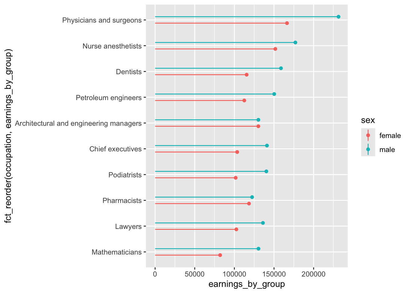
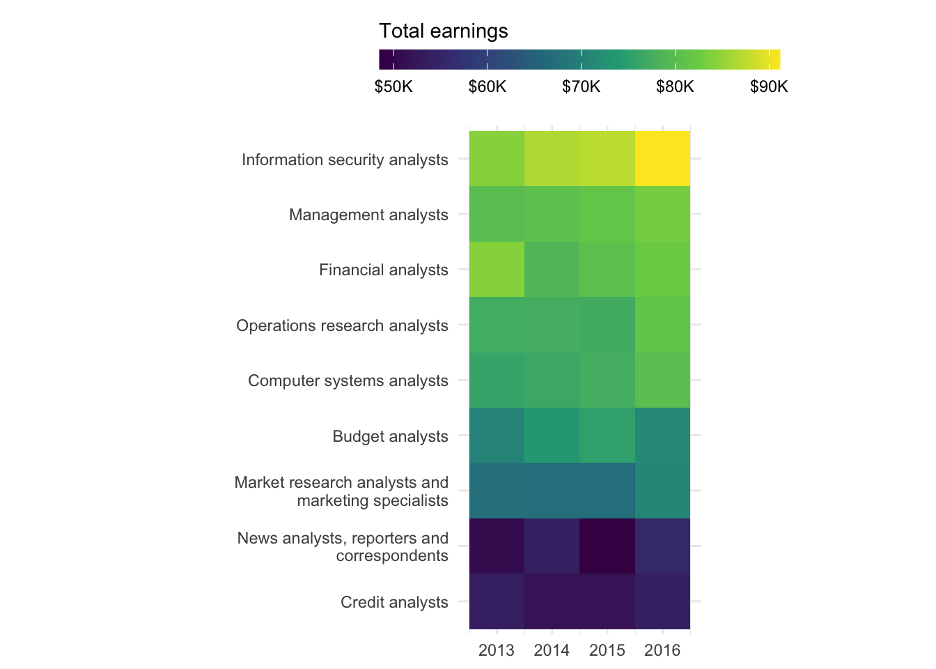
Heatmap
- explore the change in total earnings through time for any “analyst” positions
- for this example, we’ll:
- filter for only “analyst” occupations
- order occupations by the highest salary in 2016
First, some data wrangling
# filter for occupations that have the word "analyst" in title ----
analysts <- jobs_clean |>
  filter(str_detect(string = occupation, pattern = "analyst")) |>
  select(year, occupation, total_earnings)

# determine order of occupations based on highest total_earnings in 2016 ----
order_2016 <- analysts |>
  filter(year == 2016) |>
  arrange(total_earnings) |>
  mutate(order = row_number()) |>
  select(occupation, order)

# join order with rest of data to set factor levels ----
heatmap_order <- analysts |>
  left_join(order_2016, by = "occupation") |>
  mutate(occupation = fct_reorder(occupation, order))
Then build the heatmap
# create heatmap ----
ggplot(heatmap_order, aes(x = year, y = occupation, fill = total_earnings)) +
  geom_tile() +
  labs(fill = "Total earnings") +
  coord_fixed() +
  scale_fill_viridis_c(labels = scales::label_currency(scale = 0.001, suffix = "K")) +
  scale_y_discrete(labels = scales::label_wrap(30)) +
  guides(fill = guide_colorbar(barwidth = 15, barheight = 0.75, title.position = "top")) +
  theme_minimal() +
  theme(
    legend.position = "top",
    axis.title = element_blank()
  )
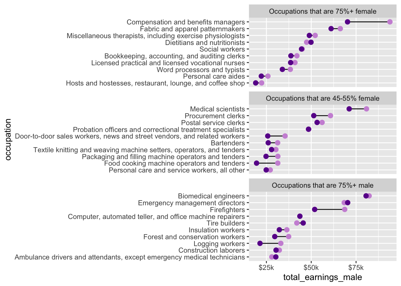
Dumbbell plot
(More) data wrangling
- explore the difference in median salaries between male and female workers, by occupation
- there are too many occupations to reasonably plot at once, so let’s take just 10 random occupations from each group (female-dominated, male-dominated, and evenly(ish) split); we’ll also only use 2016 data
#....guarantee the same random samples each time we run code.....
set.seed(0)

#.........get 10 random jobs that are 75%+ female (2016).........
f75 <- jobs_clean |>
  filter(year == 2016, group_label == "Occupations that are 75%+ female") |>
  slice_sample(n = 10)

#..........get 10 random jobs that are 75%+ male (2016)..........
m75 <- jobs_clean |>
  filter(year == 2016, group_label == "Occupations that are 75%+ male") |>
  slice_sample(n = 10)

#........get 10 random jobs that are 45-55%+ female (2016).......
f50 <- jobs_clean |>
  filter(year == 2016, group_label == "Occupations that are 45-55% female") |>
  slice_sample(n = 10)

#.......combine dfs & relevel factors (for plotting order).......
subset_jobs <- rbind(f75, m75, f50) |>
  mutate(group_label = fct_relevel(group_label,
                                   "Occupations that are 75%+ female",
                                   "Occupations that are 45-55% female",
                                   "Occupations that are 75%+ male"),
         occupation = fct_reorder(.f = occupation, .x = total_earnings))
Build dumbbell plot
# initialize plot (we'll map our aesthetics locally for each geom, below) ----
ggplot(subset_jobs) +

  # create dumbbells ----
  geom_linerange(aes(y = occupation,
                     xmin = total_earnings_female, xmax = total_earnings_male)) +
  geom_point(aes(x = total_earnings_male, y = occupation),
             color = "#CD93D8",
             size = 2.5) +
  geom_point(aes(x = total_earnings_female, y = occupation),
             color = "#6A1E99",
             size = 2.5) +

  # facet wrap by group ----
  facet_wrap(~group_label, nrow = 3, scales = "free_y") + # "free_y" plots only the axis labels that exist in each group

  # axis breaks & $ labels ----
  scale_x_continuous(labels = scales::label_currency(scale = 0.001, suffix = "k"),
                     breaks = c(25000, 50000, 75000, 100000, 125000))