Course materials are currently undergoing revision! EDS 240 will begin again in January 2026. In the meantime, things here might get a little messy
Lecture 6.1 KEY
Typography
Author
Your Name
Published
February 10, 2025
Note
This template follows lecture 6.1 slides. Please be sure to cross-reference the slides, which contain important information and additional context!
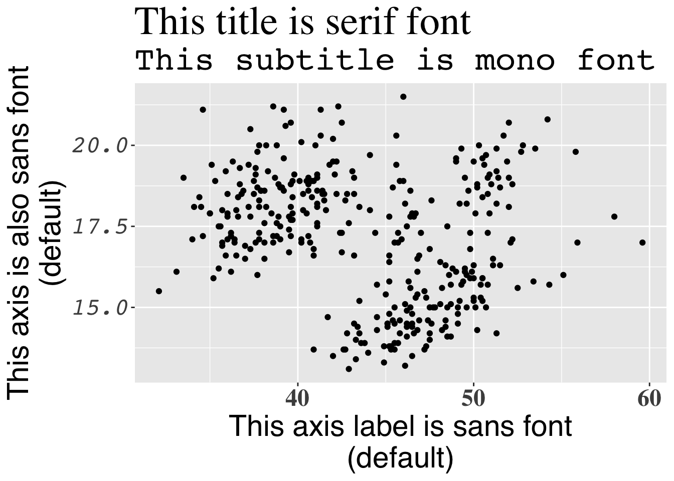
System fonts
# import packages ---- library(palmerpenguins)library(tidyverse)# create ggplot to demonstrate use of system fonts ----ggplot(penguins, aes(x = bill_length_mm, y = bill_depth_mm)) +geom_point() +labs(title ="This title is serif font",subtitle ="This subtitle is mono font",x ="This axis label is sans font\n(default)",y ="This axis is also sans font\n(default)") +theme(plot.title =element_text(family ="serif", size =30),plot.subtitle =element_text(family ="mono", size =25),axis.title =element_text(family ="sans", size =22),axis.text.x =element_text(family ="serif", face ="bold", size =18),axis.text.y =element_text(family ="mono", face ="italic", size =18) )
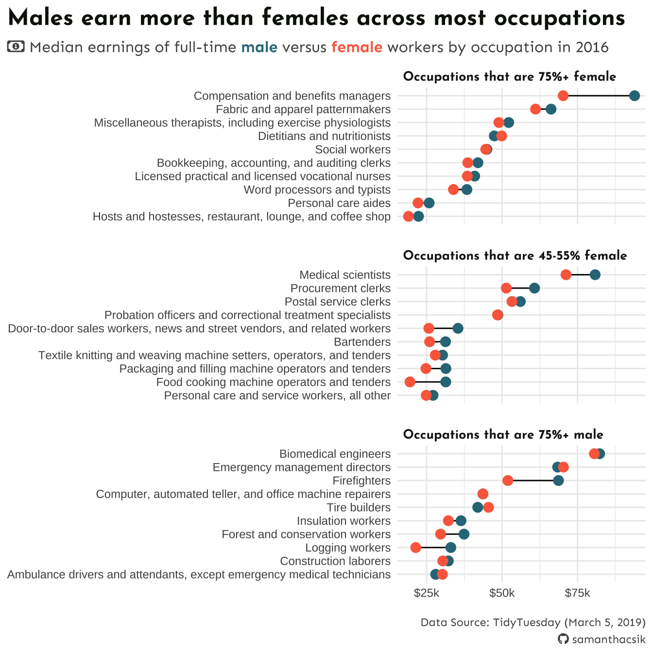
Our “first draft” of this plot began in week 4 during our amounts / rankings lecture. We’ll focus on improving colors and fonts today.
##~~~~~~~~~~~~~~~~~~~~~~~~~~~~~~~~~~~~~~~~~~~~~~~~~~~~~~~~~~~~~~~~~~~~~~~~~~~~~~## setup ----##~~~~~~~~~~~~~~~~~~~~~~~~~~~~~~~~~~~~~~~~~~~~~~~~~~~~~~~~~~~~~~~~~~~~~~~~~~~~~~#..........................load packages.........................library(tidyverse)library(showtext)library(glue)library(ggtext)#......................import Google fonts.......................# `name` is the name of the font as it appears in Google Fonts# `family` is the user-specified id that you'll use to apply a font in your ggpplotfont_add_google(name ="Josefin Sans", family ="josefin")font_add_google(name ="Sen", family ="sen")#....................import Font Awesome fonts...................font_add(family ="fa-brands",regular = here::here("fonts", "Font Awesome 6 Brands-Regular-400.otf"))font_add(family ="fa-regular",regular = here::here("fonts", "Font Awesome 6 Free-Regular-400.otf")) font_add(family ="fa-solid",regular = here::here("fonts", "Font Awesome 6 Free-Solid-900.otf"))#......enable {showtext} rendering for all newly opened GDs......showtext_auto()#..........................import data...........................# find import code at: https://github.com/rfordatascience/tidytuesday/tree/master/data/2019/2019-03-05#grab-the-clean-data-herejobs <-read_csv("https://raw.githubusercontent.com/rfordatascience/tidytuesday/master/data/2019/2019-03-05/jobs_gender.csv")
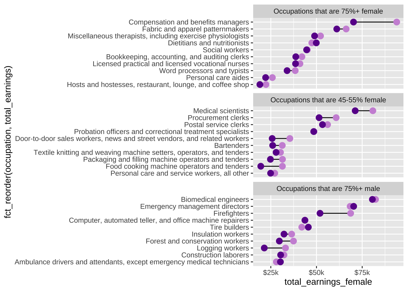
##~~~~~~~~~~~~~~~~~~~~~~~~~~~~~~~~~~~~~~~~~~~~~~~~~~~~~~~~~~~~~~~~~~~~~~~~~~~~~~## wrangle data ----##~~~~~~~~~~~~~~~~~~~~~~~~~~~~~~~~~~~~~~~~~~~~~~~~~~~~~~~~~~~~~~~~~~~~~~~~~~~~~~jobs_clean <- jobs |># add col with % men in a given occupation (% females in a given occupation is already included) ----mutate(percent_male =100- percent_female) |># rearrange columns ----relocate(year, major_category, minor_category, occupation, total_workers, workers_male, workers_female, percent_male, percent_female, total_earnings, total_earnings_male, total_earnings_female, wage_percent_of_male) |># drop rows with missing earnings data ----drop_na(total_earnings_male, total_earnings_female) |># make occupation a factor (for reordering groups in our plot) ----mutate(occupation =as.factor(occupation)) |># classify jobs by percentage male or female (these will become facet labels in our dumbbell plot) ----mutate(group_label =case_when( percent_female >=75~"Occupations that are 75%+ female", percent_female >=45& percent_female <=55~"Occupations that are 45-55% female", percent_male >=75~"Occupations that are 75%+ male" )) ##~~~~~~~~~~~~~~~~~~~~~~~~~~~~~~~~~~~~~~~~~~~~~~~~~~~~~~~~~~~~~~~~~~~~~~~~~~~~~~## create subset df ----##~~~~~~~~~~~~~~~~~~~~~~~~~~~~~~~~~~~~~~~~~~~~~~~~~~~~~~~~~~~~~~~~~~~~~~~~~~~~~~#....guarantee the same random samples each time we run code.....set.seed(0)#.........get 10 random jobs that are 75%+ female (2016).........f75 <- jobs_clean |>filter(year ==2016, group_label =="Occupations that are 75%+ female") |>slice_sample(n =10)#..........get 10 random jobs that are 75%+ male (2016)..........m75 <- jobs_clean |>filter(year ==2016, group_label =="Occupations that are 75%+ male") |>slice_sample(n =10)#........get 10 random jobs that are 45-55%+ female (2016).......f50 <- jobs_clean |>filter(year ==2016, group_label =="Occupations that are 45-55% female") |>slice_sample(n =10)#.......combine dfs & relevel factors (for plotting order).......subset_jobs <-rbind(f75, m75, f50) |>mutate(group_label =fct_relevel(.f = group_label, "Occupations that are 75%+ female", "Occupations that are 45-55% female", "Occupations that are 75%+ male"),occupation =fct_reorder(.f = occupation, .x = total_earnings))
# recreate original plot ----plot <-ggplot(subset_jobs) +# create dumbbells ----geom_linerange(aes(y = occupation,xmin = total_earnings_female, xmax = total_earnings_male)) +geom_point(aes(x = total_earnings_male, y = occupation), color ="#CD93D8", size =2.5) +geom_point(aes(x = total_earnings_female, y = occupation), color ="#6A1E99", size =2.5) +# facet wrap by group ----facet_wrap(~group_label, nrow =3, scales ="free_y") +# "free_y" plots only the axis labels that exist in each group# axis breaks & $ labels ----scale_x_continuous(labels = scales::label_currency(scale =0.001, suffix ="k"),breaks =c(25000, 50000, 75000, 100000))plot
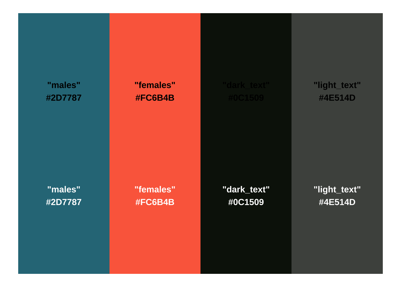
Create new palette
# create a named color palette ----earnings_pal <-c("males"="#2D7787","females"="#FC6B4B","dark_text"="#0C1509","light_text"="#4E514D") # preview it -----monochromeR::view_palette(earnings_pal)
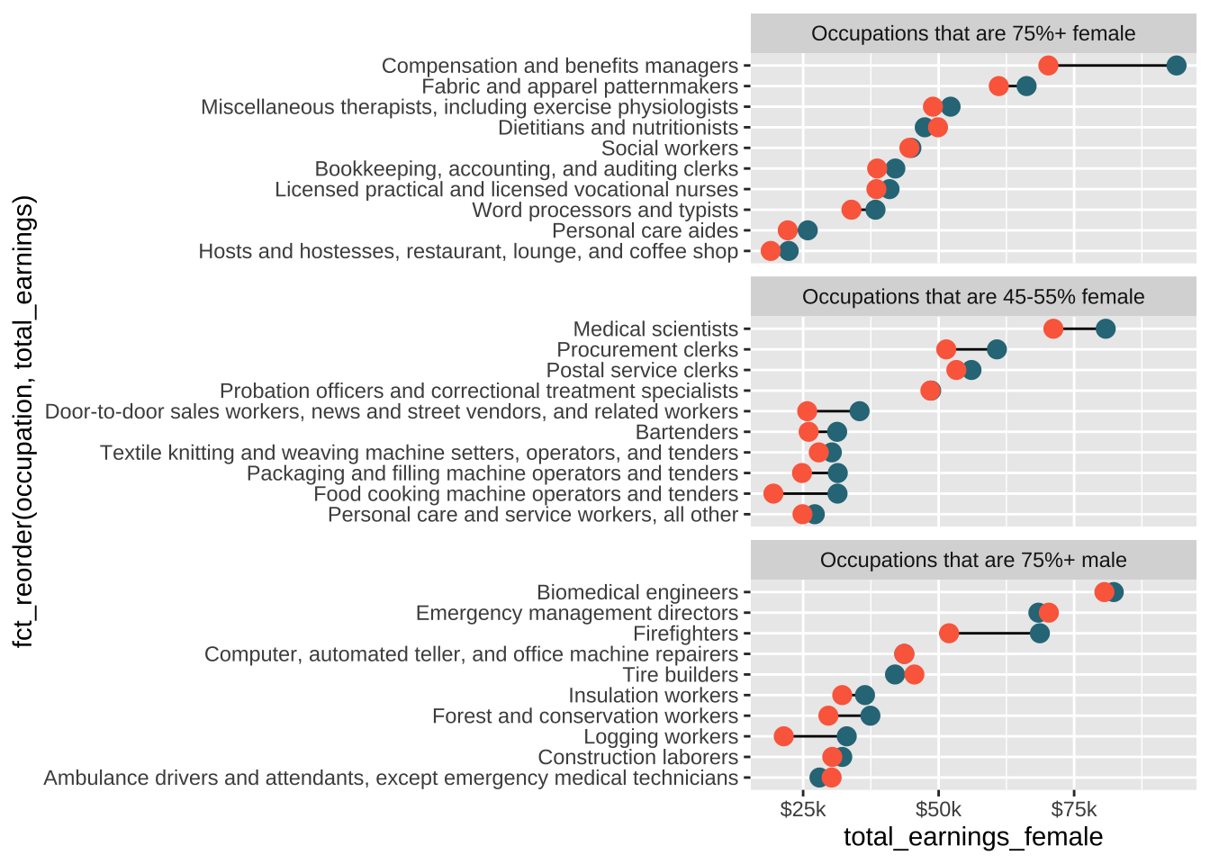
Update plot colors
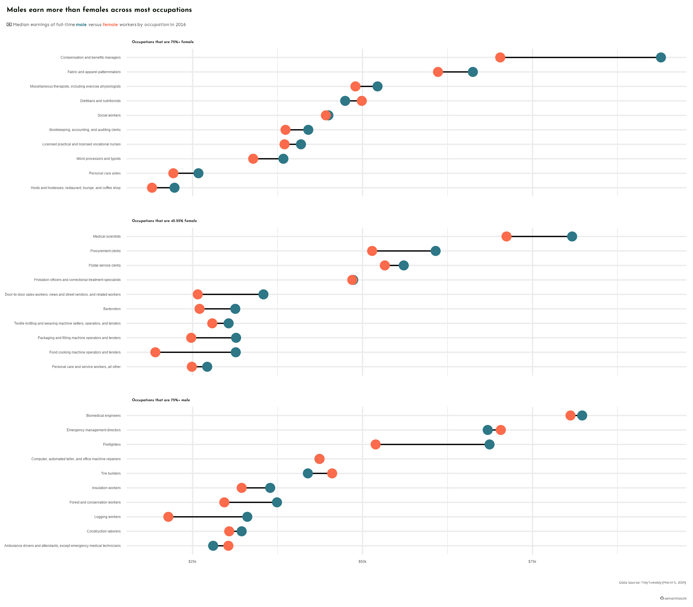
# update plot colors using palette ----plot <-ggplot(subset_jobs) +# create dumbbells ----geom_segment(aes(x = total_earnings_female, xend = total_earnings_male,y =fct_reorder(occupation, total_earnings), yend = occupation)) +geom_point(aes(x = total_earnings_male, y = occupation),color = earnings_pal["males"], size =3.25) +# update with colors from `earnings_pal`geom_point(aes(x = total_earnings_female, y = occupation),color = earnings_pal["females"], size =3.25) +# update with colors from `earnings_pal`# facet wrap by group ----facet_wrap(~group_label, nrow =3, scales ="free_y") +# "free_y" plots only the axis labels that exist in each group# axis breaks & $ labels ----scale_x_continuous(labels = scales::label_dollar(scale =0.001, suffix ="k"),breaks =c(25000, 50000, 75000, 100000, 125000))plot
Add titles & theme
#.........................create caption.........................github_icon <-""github_username <-"samanthacsik"caption <- glue::glue("Data Source: TidyTuesday (March 5, 2019)<br> <span style='font-family:fa-brands;'>{github_icon};</span> {github_username}")#........................create subtitle.........................money_icon <-""subtitle <- glue::glue("<span style='font-family:fa-regular;'>{money_icon};</span> Median earnings of full-time <span style='color:#2D7787;'>**male**</span> versus <span style='color:#FC6B4B;'>**female**</span> workers by occupation in 2016")#..........................updated plot..........................final_plot <- plot +labs(title ="Males earn more than females across most occupations",subtitle = subtitle,caption = caption) +theme_minimal() +theme(plot.title.position ="plot",plot.title =element_text(family ="josefin", face ="bold",size =18,color = earnings_pal["dark_text"]),plot.subtitle = ggtext::element_textbox(family ="sen",size =12,color = earnings_pal["light_text"],margin =margin(t =2, r =0, b =6, l =0)),plot.caption = ggtext::element_textbox(family ="sen", face ="italic",color = earnings_pal["light_text"],halign =1,lineheight =1.5,margin =margin(t =15, r =0, b =0, l =0)),strip.text =element_text(family ="josefin",face ="bold",size =10,hjust =0),panel.spacing.y =unit(x =0.5, units ="cm"),axis.text =element_text(size =9,color = earnings_pal["light_text"]),axis.title =element_blank() )final_plot
Save plot as a PNG file
# write plot to file (aka save as png) ----ggsave(filename = here::here("week6", "images", "salary-plot.png"),plot = final_plot, device ="png",width =8, height =7,unit ="in")
Our final plot, saved as a PNG file. We’ll learn about why this odd text rendering happens when we write plots to file, as well as strategies for fixing it in this week’s discussion section!
Turn off {showtext} text rendering
# turn off {showtext} text rendering ----showtext_auto(FALSE)